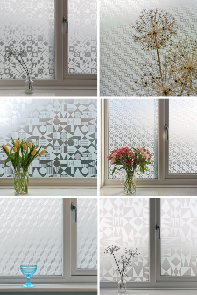
I’m excited to be finally bringing this collection of surface designs to market in collaboration with the Window Film Company. The inspiration for the patterns has stemmed from my fascination with geometric designs, taking the basic ingredients of triangles, circles and squares as my starting point.
I’ve been exploring geometric pattern structures in relation to design principles established by Lewis F. Day at the turn of the Twentieth century, exploring the equal distribution of motifs within a repeating tile to alter the visual rhythm within two-dimensional surface designs. I have also explored expectation and disruption within the repeat tiles. On establishing an apparent small-scale repeat, I play with unexpected shifts in the placement of motifs to disrupt the rhythm, challenging the sense of order. This work belongs to my ongoing practical pattern research as Associate Professor in Design at Norwich University of the Arts.

The six designs each have their own identity and yet belong together like siblings in a family, with shared features of geometric motifs and formal compositions throughout this collection. Some of the designs started their life as self-initiated physiotherapy back in 2020 / 21 following abdominal surgery and my subsequent recovery. The design challenge, to make small-scale lino blocks of repeating patterns to print by hand, provided me with small physical and mental tasks to focus on between the naps. I had hoped some of the designs would one day be leaving my studio, and I’m pleased and proud to share them now.
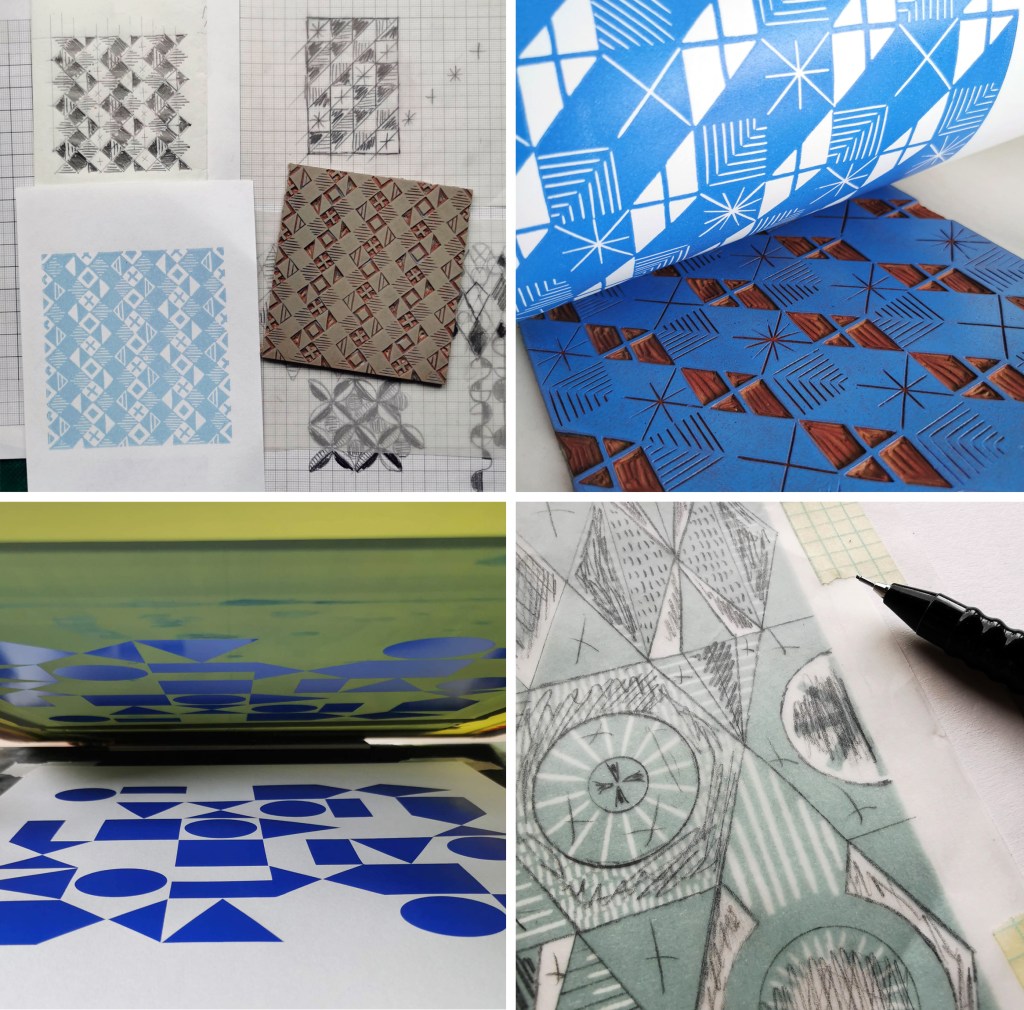
Designing for window film requires consideration of motif, shape and pattern construction without the aid of colour, requiring an absolute focus on negative and positive shapes. I enjoy working within design limitations in relation to production requirements and technical specifications, believing the challenges become design opportunities. I spent some time testing the various scale of patterns across the collection, including a micro pattern (Step), through to a much larger scaled pattern (Triangulate), considering window sizes in both domestic and commercial spaces in relation to the motif sizes.
I’ve worked with the very patient Steve at the Window Film Company for all my designs available on film, including the large-scale bespoke design for Birmingham Airport back in 2017. Previous designs from my Construct collection available from the Window Film Company won a House Beautiful award in 2018 too!
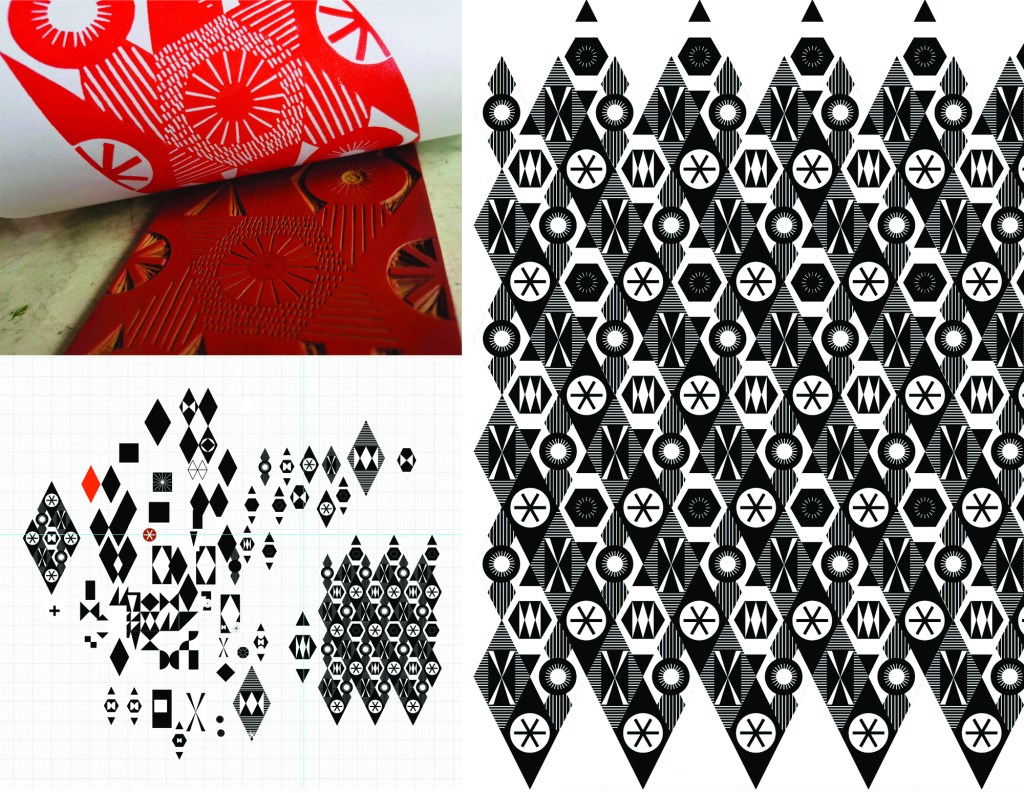
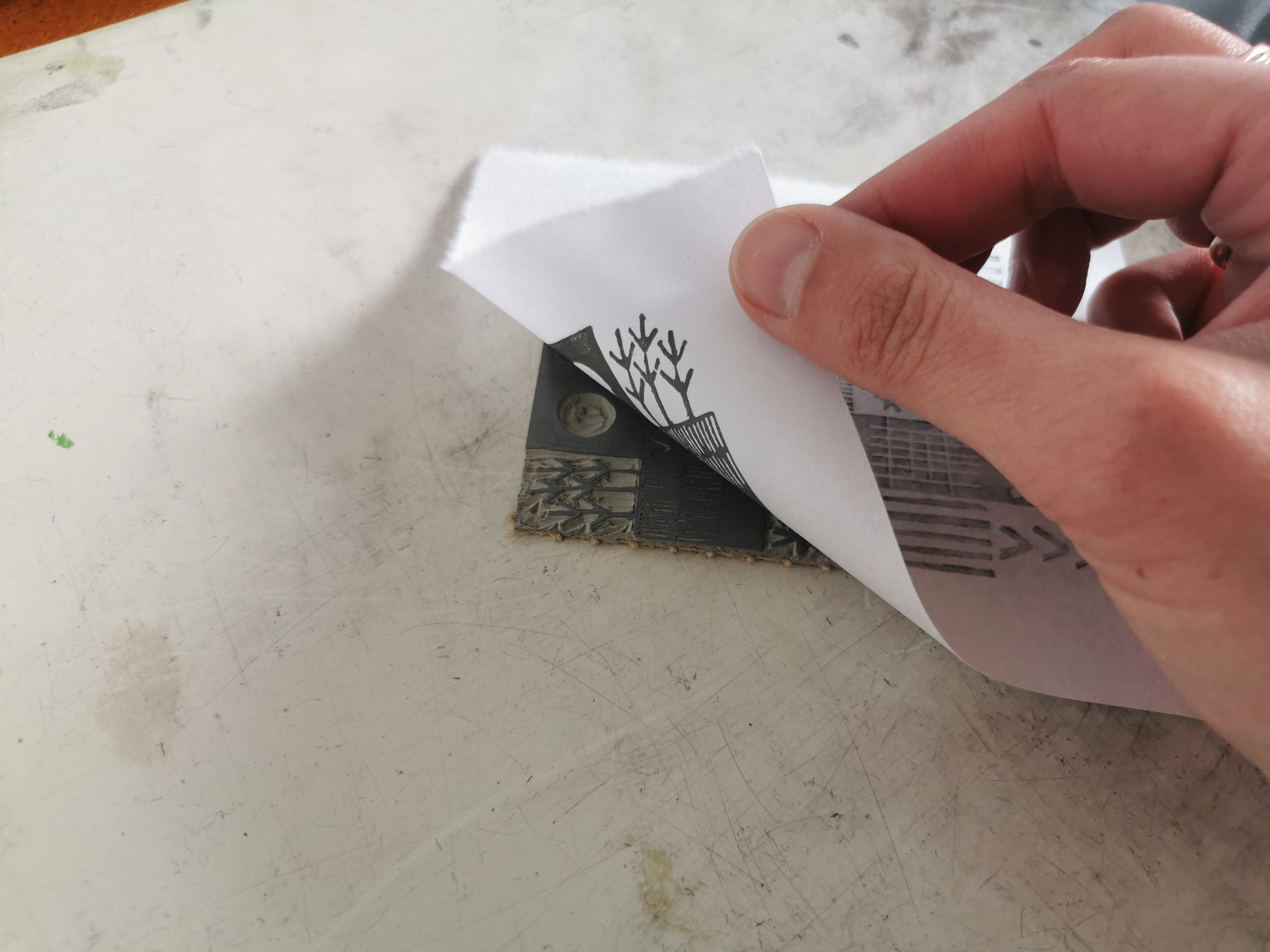
Steve worked with me to sample some of the early versions of these designs generated as digital scans from lino prints initially, but I didn’t like the visual quality in the translation of the prints. The original artworks for this collection were generated using collage and screen printing alongside the lino prints as I prefer designing with a physical relationship to image creation. After further consideration I opted to create each of the designs as vector-based files for production, providing sharp graphic quality to the patterns.
Mike at Window Film Co. was also fundamental in getting this collection established, off the computer, on to window film and ready for sale. Our conversations focused on understanding my design identity in relation to previous work. He ensured the designs felt authentic to me, while building on the existing designs I already license to the company.
It’s always exciting to receive a delivery of samples, and I’ve had a few of those over the last few months. The final product is very different to a digital file, so it is important to inspect the artwork as film installed on the window, checking the scale of repeat as well as any discrepancies in the artwork – you must have sharp eyes for detail! With final decisions made and sampling approved, as well as the small matter of naming the designs, we have been able to sign off the artwork, and launch the six designs in the collection: Circulate, Diamonds, Shift, Triangulate, Step, Pairings
Thanks to everyone at the Window Film Company!
The designs are available to order here