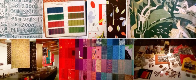
The Barbara Brown exhibition at the Whitworth in Manchester is really worth catching, especially if you like patterns.
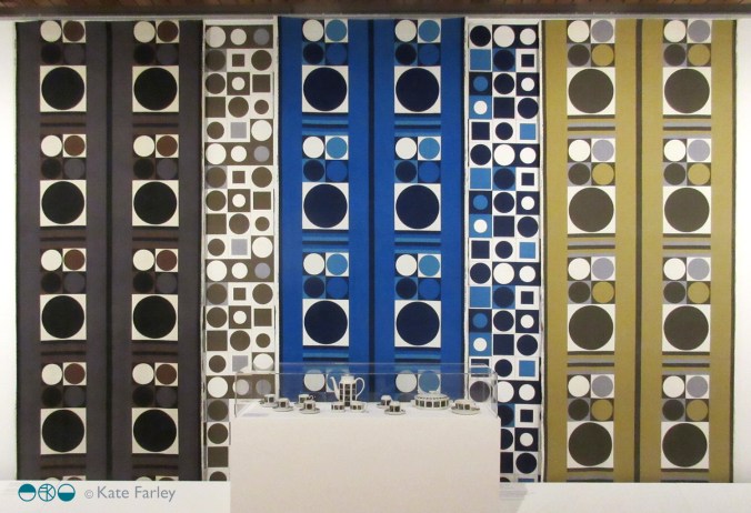
The layout of the gallery enables an overview; the broad visual statement of the textiles designed by Barbara Brown during the 1960s and 1970s, to be seen straight away and makes for a striking sight. Large-scale pattern in different colour-ways jostle for attention and yet the small gatherings of textile designs within the gallery also create more local dialogue for consideration. The repeats are large, not in the Marimekko sense but larger than we often see, taking the full width of the fabric to do the talking. Seeing the textile lengths on exhibition really shows off the bold rhythms of each pattern.
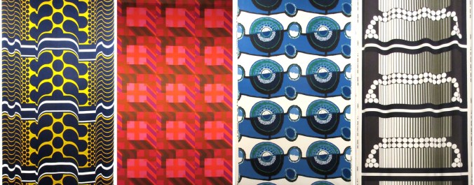
The designs on show demonstrate a variety of motif units across the fabric, some halved, some quartered, others full width. The corner of the gallery most impressive in my opinion was the monochrome series that really pushed her design prowess forward. Although strong graphic statements, these are far from flat patterns. The curves in Ikebana (below left) and Automation (below, third from right), both from 1970, differ in how they control and divide the space, toying with depth and dimensions. There is a sense of sci-fi and computer generated environments across this mono-chrome series. Escher should also get a mention as the optical illusions on the architectural scale appear to pay homage to him too.
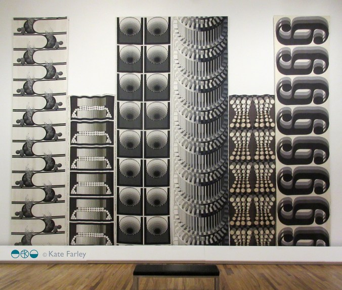
I have my favourites, but I really want to highlight the breadth of pattern compositions here. The design statements include many geometrics with cubes, columns and dots. There are stripes, spots, architectural themes and florals. I see more than a hint of Op Art, Psychedelia and modernism across the printed fabrics, some more than others, but the designs appear experts at communicating the populist aesthetic of those years.
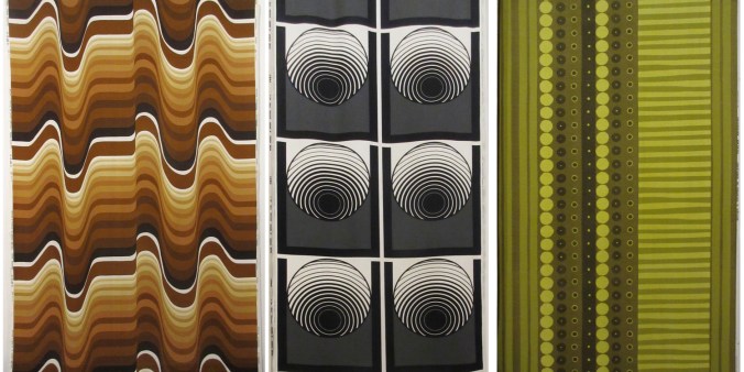
As a teaching aid for textile design, this exhibition does rather well. Design students can understand the potential to grow large repeats rather than stop at small ‘plonk – plonk’ designs we see far too much of – maybe a result of designing on computer screens. Designers need to understand that even domestic interiors can cope with so much more than a motif 10cm in diameter. Brown’s shapes are also not always contained by outlines, and this presents bold, solid shapes that hold their own. Colour statements include monochrome and full-on colour including oranges and blues. There is a sense of the colour palette dating the patterns but the combinations communicate bravery. The monochrome designs have a very formal spirit, and although different in style do remind me of some of the black and white, large classical columns Timney Fowler print designs of the 1980s.
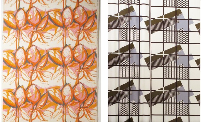
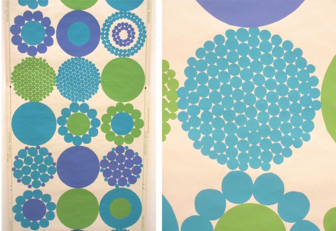
Barbara Brown was working in a very different time, and artwork was not created in Adobe Illustrator or Photoshop. Hand drawing full-scale repeats gives you a very different relationship with pattern compositions. Some designs appear not to show signs of drawing, but others do, almost standing out for doing so – particularly Sweet Briar, 1959 (above left).
The exhibition was dominated by the printed fabric lengths but a couple of later knitted pieces offered an insight in to the designer’s creative career progression, and reminded me of the direction Lucienne Day took with her silk mosaics, making a clear distinction away from the commercial print designs. The juxtaposition of some small ceramic pieces next to fabric lengths offered an interesting pause for thought too. Would you have matching china and curtains? Maybe not, but the patterns held their own at both scales and on the different surfaces.
This is one of those examples of why you need to see exhibitions in the flesh, and not rely on the computer or phone screen to do the job. Seeing Barbara Browns patterns are eye-catching on a small screen, but they are far more impressive in this setting.
The exhibition is on show until January 2018 (and they always have several interesting things on at the same time – and I can recommend the cafe!) NOW EXTENDED UNTIL MARCH 2018
http://www.whitworth.manchester.ac.uk/whats-on/exhibitions/currentexhibitions/barbarabrown/
