patterns: printed or not

My go-to process is print, therefore the majority of my commercial projects have included print outcomes, whether that is a commissioned limited edition print, wallpaper or my patterns available on Formica’s laminate. I design as a printer; thinking of layers of colour / texture / pattern, that build in stages.

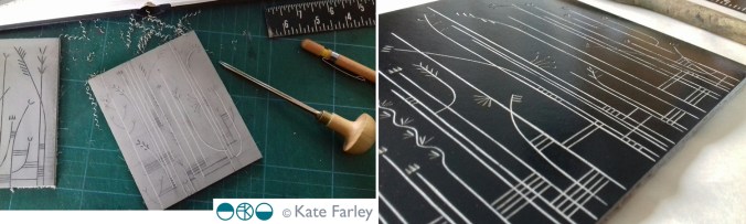
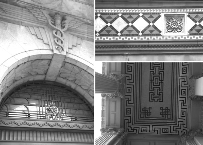
I knew early on that paint brushes are not really my friends, not unless they have to be, not compared to a print roller. When I was introduced to printing I vividly remember learning mono-printing in particular. I fell in love with the excitement of the hidden surface. I love the detachment, the indirect nature of printmaking, whether it be a lino block or litho plate, they offer a space away from the actual mark making that creates the image.

I’ve been spending the last few weeks writing lots of words with my academic hat on about my design practice in relation to my teaching practice, and this has made me think about how I learn, as well as how I teach. My design practice experience is so integrated in my teaching practice, they work so well together. I can be in a business meeting learning about an industrial print consideration I didn’t know about for a specific product and immediately I’m thinking of how I can feed that knowledge in to a module on the BA programme I lead. In my mind it makes perfect sense for academics to be practitioners too, albeit with lots of juggling!

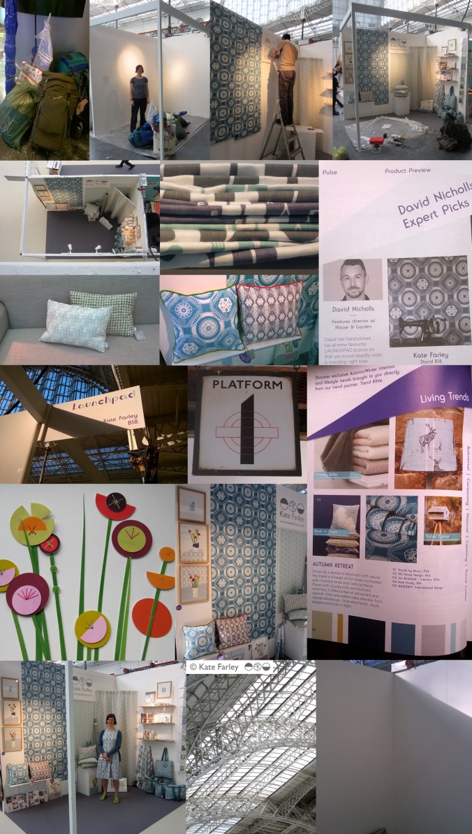
I love to learn, whether a process, a way to see in order to draw, or a new context to place work, I am excited about finding things out. It was this mindset that got me making rugs, to challenge my skills, and to test myself with another process that works with pattern, but with very different thinking. There has been much written about the need to play, but as designers it is so important that we take time to explore, to develop our thinking. This keeps ideas moving, and the sense of creativity at the forefront. I’m also fascinated how my patterns work across surfaces / materials, requiring consideration of colour matching, scale of motifs, line weight etc. and this expertise is learned as I work with manufacturers of different materials and products, and visit trade shows across the design sectors. Don’t get me started on brands that just print their patterns on every surface that sits still for long enough… my students hear this rant often enough!

I shall continue to explore, learn, design and teach… just after I’ve finished writing this next batch of academic words…

KFmaterialsBLOGpic120

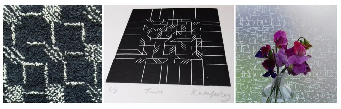
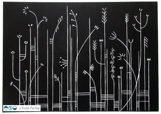
Images from my ‘Threads’ collection (L-R:) Latch-hook rug, original lino print: Twill, and the same design on window film from The Window Film Company.

yellows

I’ve always enjoyed working with colour; choosing combinations, mixing inks and matching colour. I am interested in how we relate colour to brands, how colour suggests quality, market levels, football teams, trends, and this week in particular political parties. Sometimes people say they do not really like colour – but what they often really mean is that they don’t like strong and vibrant colours, but in my mind bright colours are no more important than the whites on white; equally powerful if used well, just not so extrovert.

KFarley_TfL_tiles100

I like seeing the way an inky grey sky makes fields of corn glow golden, and how the crepuscular blue sings out before the night sky takes over. Relationships that colours have can bring connotations, evoke distant memories and create moods. I remember a bag of hand-me-down clothes was excitedly torn open by my twin sister and I, hoping for fabulous new items to wear – in the eighties, when what was actually presented was everything brown and purple – from the previous decade. So disappointing!

Getting the right colour isn’t about a broad brush of red, it’s about seeing the nuances. You’ve only got to see a sale-rail to see the buyer got the shade of mustard a bit too green, or the pink too candy, and not blush. Any colour can vary hugely, our personal perception of colour not only is affected by the technicalities of sight, but also our own relationships with colour, built on past experiences. It took me a while to wear navy, having had to endure it for school for several years.

A friend described my ‘black’ screen prints for the Barbican, and I had to explain it was actually dark grey – it makes a considerable difference to the final result, but if both examples are not shown side by side most people would be none the wiser that the designer made a conscious decision to make a grey look not quite a black.

So here’s some yellow, photographed in Norfolk a few weeks ago. Enjoy, what ever it means to you!

KFarley_yellow_norfolk100

drawing grass lines

I’ve written many times over the years on this blog about the themes that underpin my work, the approaches I take to develop new work, and the things that inspire me. Here I look again at the process of evolving ideas and visual language, to introduce my latest series of prints.

As I develop ideas, often in series of works on paper before any design solutions are considered, I explore the visual language of the subject through drawings, photography and printmaking. The aesthetic nature of the new work evolves and is tested in relation to compositions and rhythms. My knowledge of pattern design, in particular in relation to textiles, feeds this investigation. The motifs, the linking forms, the negative and positive shapes and the quality of line can suggest relationships with historical styles, international influence and contemporary trends. As a designer I use this knowledge to sometimes avoid, and sometimes align to this language, communicating a context far beyond the printed paper I create.

On a cycling and camping tour around Denmark back in 2004 we came across a small book shelf in the campsite shelter containing a range of books. I can’t read Danish. We picked out a few, judging them purely on the graphic design of the spine, and I found a science book of beautiful diagrams of plant structures. I have a photograph somewhere, but the impression those diagrams made on me does not require me to see that page again. I remember the look of those diagrams, and they have fed in to this collection many years from then.

Mid C20th pattern is also something I am interested in, and for this new body of work, particularly the development of stylised florals and diagrammatic interpretation of plants. Lucienne Day was particularly expert at creating designs in that manner, with simple black lines, herself inspired by Miro, Kandinsky and Klee. This is why it’s important to be aware of what has gone before. Not to imitate the past, but to take courage from previous developments in drawing, stylising and pattern making, so we don’t recreate the past, but so we push forward with our own journeys, liberated by not inventing the wheel. I was amused to discover the current exhibition at the brilliant Whitworth Art Gallery in Manchester is Lucienne Day: A sense of Growth – it seemed uncanny!

My photograph collection, both in print and digital form, contains many pictures of reeds; Danish reeds, Norfolk reeds, anywhere else reeds. I also have many records of grasses, and have always been attracted to the structure of such plants. These are often the unloved weeds that may be irrelevant and overlooked by many, but I come back from walks with handfuls of lines, some with seed heads, some without, but always lines of grass, as if nature had fun drawing them. Different stems, leaves and weights of line, and some suggesting very distinct natural habitats. I’ve always been more interested in line quality than texture, and my work over the last two decades demonstrates that very clearly.

KFarley_drawngrass

So that was a long-winded way of saying that this new series of works has been a long time coming, but makes perfect sense to me. I didn’t set out to create drawings of grasses, in fact I started screen printing flowers, but this evolved as part of the create process that is play. Colour came and went too, so as not to detract from the lines. There are some similarities with my threads printed editions and I have had the prints next to each other today – I think they make an interesting dialogue. This is the journey of idea development, by mixing drawing, thinking, printing, reflecting, contextualising, and doing it all again. By the way, this bit of the creative process is one that is very difficult to teach design students, more so with less and less studio time, and a full to bursting curriculum, but knowing your own creative process is halfway to success in my world. Take risks (it’s not rocket science we say) and work at playing.

KateFarley_grasslineslino

I digress. These few prints are only the start of this series, I already have new work evolving, but other projects are jostling for my time in the studio, so for now, I introduce you to Grasslines… and now you know a bit about how they came to be.

KateFarley_Grassline3

building aesthetics

For the last few years, I’ve been lecturing on the subject of design history to first year students of Textile Design at Birmingham City University as part of a module aimed at introducing historical design considerations. Styles specific to an era, the influence of globalisation, the role of Fine Art, architecture, film and graphic design in shaping textile design, and where we are now, in context to where we have come from are presented alongside social commentary, introductions to colourful characters, controversy and a spot of light entertainment! It’s a huge ask to expect students to remember all the information I share, but my main focus is showing them how much it matters that what has gone before are the results of the times in which things were designed, whether it be superfluous decoration or trailblazing technology. From contemporary trends in fashion, to why we don’t choose certain colours for our bedrooms, I think it vital that our students have a working knowledge of design history as a foundation of understanding, as designers themselves. This knowledge feeds back in to their studio projects in the working knowledge of aesthetics, linking the look of something with the connotations that others might bring to a piece. Is it beautiful? Now there’s a rather complex question!

katefarley_buildingdetail_blog100

Last week I shared my ‘interest’ in forks, and more can be read on that matter here. As I move towards the present day, bit by bit each week – Arts & Crafts, Morris et al, Art Nouveau etc this Friday, I introduce words to help grow their critical vocabulary, and help them to see and read this history that remains around us. Walking through Birmingham demonstrates how different styles of ornamentation jostle for attention. Arts and Crafts flourishes appear fussy in contrast to the rather robust Deco motifs. Twenty first century obsession with flimsy superficial solutions such as the facade of New Street station’s mirror panels, and other examples not far away, are put to shame by the care and craftsmanship of carved stone, worked iron, and intricate tile work of over a century ago – still intact. Now as the wrong library remains standing (in my opinion) I dread the day I hear that the concertina signal box loses the fight to stand. I digress…

katefarley_buildings1blog

I’m fascinated in how something can contain the belonging of a time, a style, a movement, just in the detail of a line, or a point in a curve – I’m specifically referring to pattern and decoration here but this observation can also be made with architectural detail. The shape of a leaf, the ‘stylisation’ of a flower, has the ability to communicate its belonging or differences in a glance. As a designer it’s important to know these references, especially in relation to a client’s brief – you wouldn’t want to offer Baroque when Neo-Classical is required! This knowledge of visual language crosses design disciplines and it’s fascinating to identify the same aesthetic approach on printed cloth that is also worked in silver with a terrine.

I enjoy the challenge of creating design motifs that tell the story, the unwritten references in the pattern, making a statement to belong. My recent commission for the Barbican shop illustrates this point; that architectural styles, in this case Brutalism, and the approach in which I take to the design process is fundamental in demonstrating through the aesthetic, the design language of the project.

It’s difficult for me to imagine not being able to hear the jazz age when spying an Art Deco border, or to think of Athens with the hint of the Greek key pattern. Despite not exactly loving history at school I now see the importance of it in adulthood. It’s a sad week as it’s announced we lose Art History A-Level as a subject in school, making it harder still for those with an interest in art and design to learn their passion. In Birmingham we have examples of Pugin’s design work in St. Chads cathedral and the hand of the Pre-Raphaelites in St. Phillips.  I hope my lectures feed the students’ imagination to want to know more, to feel proud when they differentiate the Deco from the Nouveau, and to go on to be informed designers, telling the right stories with the curve of a line and the style of a flower.

All photos taken in Birmingham by ©Kate Farley 2016

katefarley_buildingdetail1_blog100

katefarley_buildingdetail3_blog100

Plot to Plate printed pattern at Pulse 2015

It always takes far longer to prepare for a trade show than it does to be there but I thought I’d show a bit of the journey of my show. Rather substantial worries kicked in the night before when we feared the contents of my stand were not able to be carried by two human beings, and more worryingly, not allowed on the train to London. Somehow we managed what felt like a physical endurance test, in fact it was… and began to make it my home for the next few days. Olympia is a stunning building to spend time in and we got the show up in a few hours, ready for the off… and there was still time to admire the London Underground graphics at Earls Court.

The Plot to Plate collection has grown substantially since its first trip to Olympia when I was showing in the Spotted section, at Top Drawer back in 2012. I am delighted that the new Hanbury and Parterre cushions have been well received by visitors to the show. These are hand screen printed and then sewn in Birmingham by social enterprise Textiles by St. Annes. The patterns are inspired by National Trust’s Hanbury Hall and Gardens, near Bromsgrove. The Hanbury wallpaper was also popular with interior designers visiting the show and Plot to Plate VVV was the most admired of my fabrics. My ‘parterre’ show dress was also much commented upon, with orders keen to be placed!

I was pleased to be an ‘expert pick’ by David Nicholls of House and Garden in the Pulse Preview and also chosen by Trend Bible in the trend section of the show catalogue.

It was also a pleasure to meet ex students of mine, graduating from the Textile Design degree at Birmingham City University, as visitors to the show in their industry roles, and I could still remember their names! How nice of them to say hello and make time to find out what I was up to.

The new friends made of the exhibitors beside me was really special. Such a supportive group of people, helping out, freely sharing trade insights, generally lovely people really helping the show be a great experience. The end of the show, although a welcome relief to the hours of standing (I really couldn’t carry a chair on the train!) was almost a sad time, as we stripped the walls bare, packed up our belongings, said our farewells and left, with the most ridiculous load I ever plan to carry. Maybe I’ll start making paper thimbles!

Thanks to all who visited and thanks to all who helped along the way! Here are the images which represent in some small way the few days at Kensington Olympia, May 2015.

`KFarley_pulse15

Communicating Colour

Evocative, technical, predictive, informative, for matching, mixing, ordering, cataloguing, of materials, surfaces, finishes, whims and traditions…

Working across the fields of surface design, textiles, public art and fine art I have come across many ways to represent colour in order to communicate qualities. Whether it be for perfecting a match for production, or generating an evocative palette for a client, each niche within the industry has its way of doing things. Black for the Northern Line, double yellow for no parking, gold for the winner, and red for wrong. From Global Color, to Farrow & Ball, Pantone to Berisfords the language of colour is key. Some give codes, other names, sometimes a swatch, others a smudge, universal, local, a science and an art!

Seductive, formal, in a book, or on a card, each help to create the colours in the world around us, and while the skills of the individuals choosing, producing and matching will no doubt be overlooked by most, may the colours continue to sing, calm, provoke and much more.

I’ve brought some of the various forms of colour I work with together to brighten up this grey, wet Monday in February.

communicating-colour_web

July colours in the garden

Following on from the last few months of colour charts that I have created documenting colours growing in the garden I have made a July 13 one too. The weather has been hot and dry but somehow the slugs have enjoyed the marigolds so there is a lack of orange in this colour palette this year. The Foxgloves are pretty much over but the Hollyhocks and Dahlias are stunning in their part of the garden relay race through the summer schedule.

july13gardencolours_web

YELLOW April

Having noticed this week that the garden has suddenly started to change colour, I set about documenting all the yellow in the garden. Its not surprising at all that the photographs of the same flowers taken at different times of the day varied hugely, but I also recorded the range of yellows in the flowers of this very YELLOW season.

Image

Autumn Equinox colours

With the Autumn equinox upon us and a definite chill on the breeze a trip to the allotment today made me think of the preconceptions of seasonal colours we have, emphasised through school as we made ‘splodged’ leaf paintings and we sang the harvest songs having managed to pass on the marrow glut from home to the local community who would have preferred the old tin of sardines!

This morning we picked boxes of raspberries and bunches of sweet peas as well as carrots and beans so I thought I would provide an alternative to the conker colours and rusty hues we expect at this time of year, in acknowledgement to the Autumn sun, with the frost just round the corner…

The tip we received from the wise old-timers at the allotment today was to whistle while you pick raspberries to save yourself from eating too many. I understand the truth in that!


spreading the word…

The last month has been a good one in terms of getting some exposure for the Plot to Plate range and in particular the notebooks. As previously mentioned Elle Deco have included the books in their shopping pages, and WGSN Homebuildlife.com included them on their blog. Having had them also included on the beautiful Design Hunter blog(http://www.designhunter.co.uk) now I can add to that list Global Colour’s Mix magazine including the notebooks in their Micro Trends spread – thanks to all!