evolving colour in the making

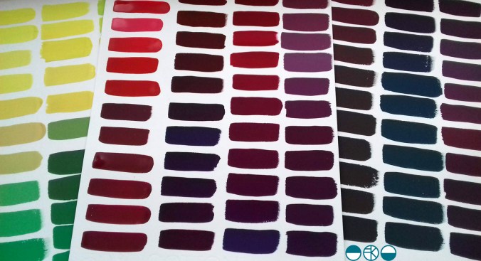
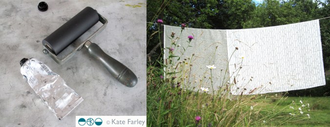
A walk in the Spring sunshine gave impetus to a very simple and mindful exercise back in the studio; to make the colour of the landscape. A sprig of willow contains so many different colours. Those colour qualities will alter as the clouds skud across the sky casting shadows, and as the sun ripens the buds.

KFarley_yellow_willow_1500_KF

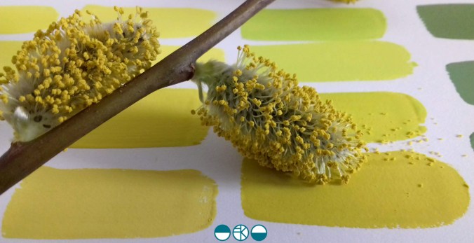
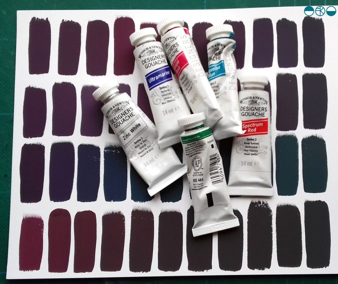
With paints at the ready I knew it wasn’t about making the one colour, but the narrative of generating colour as my process of journeying from one to the next. I wanted to paint each of the swatches of colour I mixed as I evolved the paint story, observing and recording the subtleties of the change in hues. Selecting a limited number of tubes of gouache to begin made it more interesting. To start I selected the dominant colour I was aiming for, and had a little piece of nature with me as reference. I developed the swatches of colour, selecting one, and then another hue to achieve, step by step, slowly and patiently filling the page.

KFarley_ycolourpalette_1500_KF

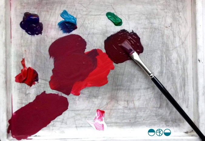
Gouache is a beautiful paint and this exercise reminded me of a wonderful morning teaching colour mixing to BA1 Textile Design students earlier this year. Getting the right amount of water, ensuring the colours are cleanly mixed, and then making that one painted line flat and even – it all takes practice.

KFarley_ytubes_colour_1500_KFI was lucky enough to have excellent colour teaching during my time at art school and consider myself strong at seeing and achieving the right colour mix. At uni I remembering saying to the print technician “it’s nearly right, I’m happy with it”, and she’d say, “Kate, it’s not what you set out to make, keep going until you get there!” I thank her for teaching me that persistence and these days my students know I’m particular (a preferred word to fussy!) when it comes to colour. Getting the colour right is so important and you may as well enjoy the journey to get it right. Textile products sit alongside fashion and interior items made from other materials, and the colours need to match / coordinate, so quitting before you get the right colour may be a sales / employment disaster too!

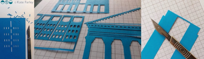
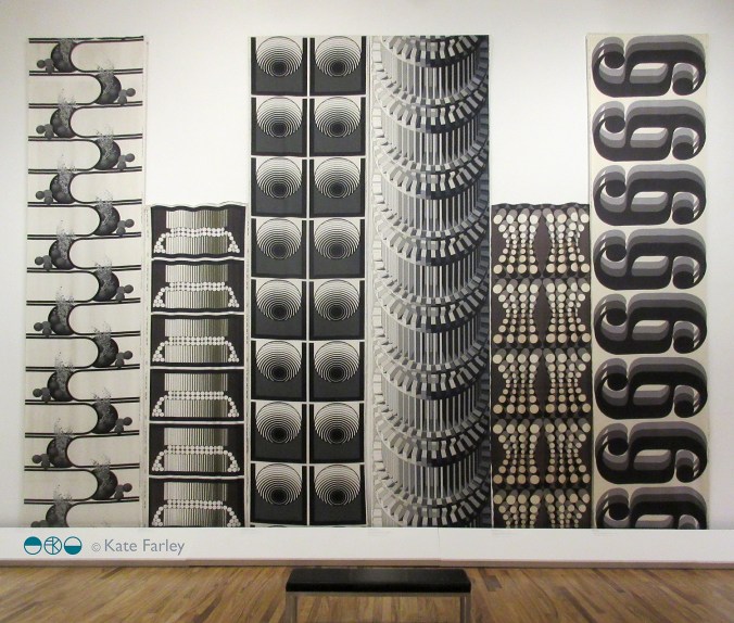
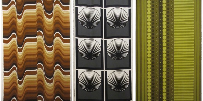
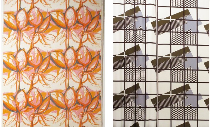
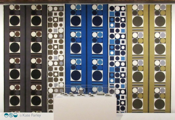
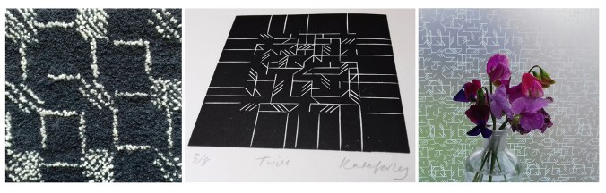
Interestingly, some of my current students were discussing my approach to colour recently and one shared that I’m not keen on black outlines around shapes in print designs. Another one commented that they hadn’t heard that, but would keep it in mind. I jumped in to defend the comment I’d originally made – a black outline is too obvious, unquestioning, the default, rather like Times New Roman black typeface when you open Microsoft Word. Too easy. I ask students and designers to think about whether the black line is the best for the design. If you think of all the other colours you can use, I think you may find another and better alternative!

At the end of this colour mixing time I am left with souvenirs of the process, memories of the walk and beautiful colour. This is real colour away from the back lit screen I too often see colour from. I shall do this again.

KFarley_y3xcolourswatches_1500_KF

pattern informs the piece: Zandra Rhodes exhibition review

Finding a couple of hours to spare in London last month I took the decision to head across the river to the Fashion and Textile Museum, and specifically, the Zandra Rhodes: 50 years of Fabulous exhibition. It proved to be a perfect visit for where my head was at; juggling fashion and textile design in both a design commission and my academic life.

Zandra Rhodes is first and foremost a textile designer although it is her fashion designs that carry the printed and embroidered pattern she is famous for. The silhouettes of the garments, constructed often from multi layered draping fabrics are guided in their execution, in fact dictated by, the pattern design of Zandra’s strong handwriting or pattern, and executed using print processes and surface manipulation.

I’ve included plenty of images of these outfits in university design lectures over the years, discussing how the designer maintains the focused design style and aesthetic but also manages to evolve the work through the decades.

As ever it is very different when you get the chance to see the fabrics in real life. The white printed pigment on chiffon from the ‘Lovely Lilies’ collection (below right) and the quilting over screen printing of her signature swirling motifs as borders and placement prints provides the evidence that Zandra Rhodes is first and foremost exploring fabrics to lead garment design.

ZH_highlights

The variety of fabric manipulation and surface embellishments was fascinating to see, some rather crude and some pieces held their own more than others. The ease in which the textiles worked as one with the garment design is certainly demonstrated throughout the exhibition, and it was useful to see the screens for printing to see the composition of the designs later on in the exhibition.

ZR_patterns

The theatricality of Zandra Rhodes’ work was a perfect match for opera costumes, and upstairs in the gallery a number of interesting examples were showcased. I also enjoyed seeing original sketchbooks alongside a film of the designer talking about how important drawing is to her. I hope many textile design students visit the show and take her advice.

ZR_dresses

There is a significant body of work on exhibition here and it is important to view it as a considerable output of a single designer with a thirst for carnival. Her practice spans fifty years, hence the exhibition title and although her style is not for everyone, her contribution of bravery, exuberance and fabric play should inspire others to take creative risks and find a way to make the work they want to make.

I would also recommend the small showcase of company overview and embroidery work by Norman Hartnell as you enter the gallery – stunning pieces from a different era.

The show is on until the 26th January, 2020.

bespoke pattern for Birmingham BHX

Designing bespoke pattern for clients is something that I have made a key professional design interest. Communicating a sense of place, historic reference or activity as pattern is what I really enjoy and over the years I’ve been on many site-visits to interesting places to learn about what the client would like or definitely not like. This visit was no different. I love the anticipation of finding out more, a new project to get to grips with, and all my design experience to apply to the challenge …

Some of my previous design work was used as a reference for context images by the original architects, proposing my patterns and stating my details – note – never send artwork without your contact details attached! Phone calls were made, samples were sent, bids were accepted and then a call-up. Please come to the airport for a meeting. There’s a tight deadline, a budget, and something the client knows they want. In a nutshell the brief: Celebrate Birmingham’s buildings in a one colour, repeating pattern that works close up in detail and from a distance as a visual rhythm. Buildings need to be identifiable.

katefarley_bhx_brumpic2_100

With any project I carry out research, ask the client lots of questions and evolve a design approach subject to the answers to my questions. Production methods, fabricators, material choices, colours, budgets, time-scales and of course client ambition for the project shape the design language and development of the project. I set off to take photographs of central Birmingham and climbed tall landmarks to get good views. I took photographs, made sketches as well as notes. I had some buildings in my mind I knew needed to be included but I also wanted to use others , less iconic ones, as visual rhythms to play with negative and positive shapes across the composition.

katefarley_bhxairport1_100

Back in the studio I chose paper cut-outs as a clear graphic way to create the buildings, as I have done for several commissions including for the Barbican and TfL posters. Once the individual buildings were cut out I scanned in the artwork and spent many hours moving everything around in Adobe Illustrator. I was testing rhythms in and out of repeat and shifting scale, proportions and pairings. This can send me back to re-cut something or add new details. To some people those hours of making subtle tweaks and changes wouldn’t even be noticed but to me it’s so important that every inch of the design works the best it can and it can be time-consuming – but it will be worth it. I can’t stress this enough to students embarking on their Final Major Projects at the moment! When you know what scale the final artwork will be produced at you need to check the correct level of detail as working at a computer screen can be very misleading for artwork several metres long!

A concept sheet and initial design piece was sent to the client for approval and at this point I had to label the buildings I’d included. Once approved I was able to continue building the full repeat, adding further buildings, and make test prints with the help of the team at the Window Film Company – who I already have award-winning work with! They really know their stuff and several phone calls later to check small details regarding file specifications and production issues resulted in the excitement of samples to sign off, both by me and the client. A couple more proofs for colour matching and scale of design was checked and then we were good to go. Quality is everything when it as your name on it, and making sure that everything about the design is right BEFORE it gets installed is rather important. Sleepless nights before installation of projects has been known!

katefarley_bhx_3

This project originally came my way almost a year ago with some scoping phone calls and emails, and now I’m able to share photographs with you. I’ve had people let me know they’ve seen work that looks like mine at the airport – hoping I hadn’t been copied – but no, this time it is mine! When Birmingham Airport tweeted the pictures last week I was delighted that I can now share images of this project from 2018 – when I was Birmingham-based as it states, and now it feels rather a fine farewell to the place I called home since 2005.

katefarley_bhx_official1

(onsite pictures – official photographs from Birmingham Airport)

Yes it is by the toilets, yes I have already worked on two commissions for public toilets (Colchester / Dedham many moons ago), and I can’t promise this will be my last!

Save

weaver extraordinaire: Anni Albers

If you are interested in textiles and haven’t heard about the Anni Albers show now on at Tate Modern in London, then a.) where have you been? and b.) get there fast if you can!

This has been a much anticipated show for me. Having been enjoying many other people’s pictures via Instagram since the exhibition opened I was most excited to get to the show and I’m so glad I did – I went round it several times and breathed in the history I had learned as an art student myself; typewriter patterns from Bauhaus lessons, the infamous diploma piece with sounds absorbing properties in the yarn, and those classic Bauhaus photographs, but there was so much more. Colour, cloth, pattern, rhythms, photographs, works on paper, products … The woven structures and yarns drew everyone in for a closer look – so much so that the alarms kept being set off and the guilty took a sheepish step back! There was a fascinating display of the research of historical textiles from Albers’ own collection that made perfect sense in how she interpreted and worked with the process of weaving.

annialbers_s

Experimental, commercial commissions, religious pieces and jewellery are some of the aspects of this considerable show. As with most well-received shows, the audience conversations themselves were fascinating; lots of discussions about experiences of weaving, hours at the loom as well as working out what she must have done.

It has been the architects, the painters and the product designers, usually men, who have become far more well known from the Bauhaus, including Anni’s husband Josef Albers. The avant-garde German art school’s first director Walter Gropius stated there were equal opportunities for all when it was established in 1919 and yet women were generally encouraged towards the textiles workshop, a place and craft deemed more suitable. Anni never let this distract from her focus despite wanting to be a painter. Her creative output of a lifetime, as edited in this exhibition, goes a long way to demonstrate her will to explore both the context of design and the development of art. She will have no doubt inspired many who have been introduced to her as a result of the show and her legacy will continue to influence far beyond the context of textiles as a craft for women. I came away with many notes and a head filled textile excitement – happy weaving everyone!

Exhibition ends: 27th January 2019

talking to myself through teaching

I’ve spent many hours over the last couple of years reflecting on my teaching career that stands at about 18 years, give or take a bit. In order to apply for Senior Fellow of the Higher Education Academy I had to write thousands of words that explain and reflect on the impact I have made on not only the students I have taught but the colleagues and peers across the industry I relate to in my professional practice. It has been a big ask to fit my diverse experiences in to the word count along with the cross referencing required, but I’m delighted to say my hard work over the ‘holidays’ and the work of my colleagues in writing supporting references has meant I achieved Senior Fellow and I’m rather relieved / proud. (I was however disappointed to discover that rather than receiving a fine water-marked, embossed and foil blocked certificate I had to download it! … I digress.)

I’ve written many times about how important it is for me to combine my design practice with my academic career and although it doesn’t make my life easier, it certainly makes it more fulfilling. They really are mutually supportive. The reason I am so driven to support the students in reaching their goals is because I know how rewarding a career in design can be. From having the confidence to draw in a different way, to picking up the phone to a new client, to realising your dream of seeing designs commercially available…, to be paid to do what you love doing… why would I not want to help others to do those things?

roller_fabric_blog

It’s also important to hear myself saying these things to students. It’s as if I am telling myself as well as the students! Yes I must chase that lead, make sure I’m paid a fair rate or keep my website up to date! Each creative has different ideas about how and where to move forward with their ambitions and the art of teaching is to work out how to nurture, support, push and challenge positively. Being creative is not easy. You put your sensitivities on the line to be judged, sometimes by those with less creativity than yourself, but who holds the budget. There are certainly pages in my sketchbook I wouldn’t choose to share at a group tutorial, but the process of knowing you are not alone in learning the creative process is so valuable. It’s also the case that it’s often easier to critique someone else other than yourself! Would you listen? Maybe one mis-perception is that once you graduate you stop learning – I plan to keep learning forever! Each project I work on is an excuse to learn more, not only about myself as a creative, but new practical or technical skills to take on board for me, as well as sharing with colleagues and students.

I’m very aware the reality behind social media may be far different than the stories being told online. I make sure students are made to think about that, – use the benefits of social media while considering the stories they read and the stories they create. While I like the way we can find out so much more about what’s going on, and who we need to know (can you imagine only having the yellow pages?!) there are complications with so many aspects of our practice being shared. Copying, audience expectation, peer competition versus mutual support, networking and peer validation are ups and downs of today’s design world. I approach my teaching very much like my designing. Honesty, integrity, and fulfillment…. support, encouragement and creative ambition! Even writing this is like giving myself a tutorial! What’s my homework?

KateFarley_grasslines_WIP_blog


evolution in practice

I’m thinking about different aspects of marketing and promoting businesses in textiles for a lecture tomorrow and I came across this image which got me thinking about how my practice has evolved and my priorities have changed since I took this picture only a few years ago. I’m so grateful for the opportunity to shape and alter the practice I have, to take on projects that suit me at the time. Hooray for portfolio careers! Right, what’s next?…

KFARLEY_cropped_tags140


telling stories

Each project I create is part of a longer narrative of my practice and as I look back over the years it is easy for me to see common aspects and joined up thinking spanning those projects. As I teach this year’s final year students on the BA programme I lead I am reminded of my own journey starting out in design, and the questioning I did to work out what sort of work I wanted to be represented by in my step beyond graduation. The challenge of the Final Major Project!

I understand the battle and pressure to work out your own style, the look or handwriting to be yourself, but funnily enough I don’t think that is the thing that holds my practice together anymore – you may disagree, and I’d be interested to know! What has become the common thread holding so many of my projects together has been the story, the narrative within each project. I could never have imagined this all those years ago, even though I was making books! I’ve made many artists books that contain single narratives, but I’ve also worked on large-scale projects that involve public toilet doors that act as pages of the book with a story across them. This is also true for the Queen Elizabeth Hospital in Birmingham where my designs are laid out in gravel across three huge roof-scapes. I’ve also been challenging how to place pattern within single designs, such as in my Plot to Plate tea towel design, telling the tale of growing, cooking and eating food. I’ve made series of prints, and a set of posters, all held together by a narrative. The more I look the more examples I can see.

If only the graduate me back then could have told me that the key aspects of my practice would work themselves out I would have worried less, but then again, it is the search for these answers that take you on the creative journey in the first place. Some people like to know what they are going to design, design it, then be pleased it looks as they planned. As for me, I like learning as I go, push myself that little bit more, find a bit of creative strength to step out of my comfort zone, and then be pleased I got somewhere I didn’t know existed. The creative process is a difficult thing to explain, but it’s all the more interesting for being that way.

KateFarley_narrative_blog

Top left: artists book in collaboration with Wes White for Sherborne House, Dorset, 2004

Bottom left: visualisation for the roof-scape at Queen Elizabeth University Hospital, Birmingham, 2009

Right: Plot to Plate tea towels, 2014

my motifs in design

I consider everyday design to be important in shaping our lives for the better or worse, and that includes cutlery design. For regular followers of this blog you will know I like cutlery. My special relation with cutlery started as a child, I collect forks, particularly disposable ones and now as an educator I use cutlery to teach design thinking despite my subject being textile design. I’ve also designed several pattern designs using motifs of cutlery including a collaboration with David Mellor Design.

The first time I made a formal design using cutlery I won a prize! I entered Formica’s Design-a-laminate competition in 2005 and won the Retro category for producing “a skillful houndstooth pattern using knives and forks, a reference to Formica’s conventional use if Fifties’ diners and kitchens”, (Blueprint magazine, April 2005). (top left pattern – made by a rubber stamp – see my instagram feed)

cutleryprojectsKF

Many years later, in 2012, I launched a new variation of this pattern on gift and home-ware products including a tea towel, and moved the dogtooth check pattern on by incorporating a visual narrative into the design. At the bottom of the graphic I had garden tools such as spades and a rake, then in the middle I incorporated kitchen utensils such as whisks, wooden spoons and fish slice, before topping the design with cutlery – therefore illustrating the journey of plot to plate, (garden, kitchen, dining) using the tools that we use. This has been really well received and I sell through my website and have shown the design at several trade shows and exhibitions. Subsequently I updated the colours to Brassica green and Brassica purple in 2014.

Continuing my design journey of cutlery I approached Corin Mellor to suggest we collaborate on a design to celebrate his Chelsea cutlery in 2013, inspired by the production method of making cutlery and the beautiful shapes of the salad servers. Following the success of this I was asked to create a second design in 2015 inspired by his father’s winning cutlery design ‘Pride’. Both designs of tea towels sell incredibly well both online and their three shops and I’m delighted with the responses I receive – from as far away as Japan!

So why do I remind you of when I designed these patterns…?

With my pattern designs of cutlery out in the public domain since 2005 I received a message from someone I know telling me they had seen my cutlery design on a surface I hadn’t applied it to…., was it new?… alarm bells! I haven’t designed this product! The feeling of being cheated, of being violated, ripped through me leaving anger and frustration at the lack of other people’s respect to a fellow designer – that’s putting it mildly. Don’t get me wrong, I’m grateful for being told, it just took my day in a different direction from my plans. My afternoon was spent searching online to find examples of this product, and there it was… I am offended!

I could take to social media and rant, name and shame and get it off my chest – that’s one way but I’m in a difficult position if I can’t prove someone has copied my work. If I’m not careful I can find myself being accused of slander – hence I’m not telling you the product the design is applied to, but you can see my designs here which gives a clue. You can do your own searches and draw your own conclusions, but please understand why I’m not making wild and angry claims. In the world of design law this is something of a challenge to prove, and having already gone through this with a dear design friend, know it’s a nightmare that is part and parcel of our design careers. The thing is we need to promote our work and get it seen by people. I can’t have a design career while hiding everything.

The internet enables us to share our design stories but also leaves a trail – and at this time I’m grateful my designs are well documented. I pride myself on originality, and for creating high quality designs. The pattern that I believe is too close to mine for comfort lacks any sort of rigour, consideration and refinement compared to mine. If I was going to copy I’d at least make mine better than the original! Why record a cover-version that doesn’t compete with the quality of the first song?

It is always a worry that someone looks at your work and thinks they can ‘take inspiration’ from it. I’m not saying I should be the only textile designer using cutlery as motifs – no way! Both as a designer and academic I take the issue of imitation very seriously, stressing the importance of originality to my undergraduate students to a point they  clearly know my thoughts on intellectual property. If anything, I drive a very wide path clear of anything that can be seen as similar, knowing how damaging it can be to a designer of being accused of copying… there are enough case studies out there! My reputation matters to me.

How can imitation be flattery, as we are told in primary school, if it makes me feel so angry and violated? I’m having to think about what to do next, and also I am rather in need of some time away from a very busy last few months… but I shall seek advice and work out what to do next.

Season’s greetings, and thanks for reading… I’ll let you know next time I design a cutlery pattern! If in doubt, ask…


Pattern appreciation at the Whitworth

The Barbara Brown exhibition at the Whitworth in Manchester is really worth catching, especially if you like patterns.
The layout of the gallery enables an overview; the broad visual statement of the textiles designed by Barbara Brown during the 1960s and 1970s, to be seen straight away and makes for a striking sight. Large-scale pattern in different colour-ways jostle for attention and yet the small gatherings of textile designs within the gallery also create more local dialogue for consideration. The repeats are large, not in the Marimekko sense but larger than we often see, taking the full width of the fabric to do the talking. Seeing the textile lengths on exhibition really shows off the bold rhythms of each pattern.

BarbaraBrown_prints

The designs on show demonstrate a variety of motif units across the fabric, some halved, some quartered, others full width. The corner of the gallery most impressive in my opinion was the monochrome series that really pushed her design prowess forward. Although strong graphic statements, these are far from flat patterns. The curves in Ikebana (below left) and Automation (below, third from right), both from 1970, differ in how they control and divide the space, toying with depth and dimensions. There is a sense of sci-fi and computer generated environments across this mono-chrome series. Escher should also get a mention as the optical illusions on the architectural scale appear to pay homage to him too.

BarbaraBrown_mono1_120

I have my favourites, but I really want to highlight the breadth of pattern compositions here. The design statements include many geometrics with cubes, columns and dots. There are stripes, spots, architectural themes and florals. I see more than a hint of Op Art, Psychedelia and modernism across the printed fabrics, some more than others, but the designs appear experts at communicating the populist aesthetic of those years.

BarbaraBrown_3

As a teaching aid for textile design, this exhibition does rather well. Design students can understand the potential to grow large repeats rather than stop at small ‘plonk – plonk’ designs we see far too much of – maybe a result of designing on computer screens. Designers need to understand that even domestic interiors can cope with so much more than a motif 10cm in diameter. Brown’s shapes are also not always contained by outlines, and this presents bold, solid shapes that hold their own. Colour statements include monochrome and full-on colour including oranges and blues. There is a sense of the colour palette dating the patterns but the combinations communicate bravery. The monochrome designs have a very formal spirit, and although different in style do remind me of some of the black and white, large classical columns Timney Fowler print designs of the 1980s.

BarbaraBrown_textiles

Barbara Brown was working in a very different time, and artwork was not created in Adobe Illustrator or Photoshop. Hand drawing full-scale repeats gives you a very different relationship with pattern compositions. Some designs appear not to show signs of drawing, but others do, almost standing out for doing so – particularly Sweet Briar, 1959 (above left).

The exhibition was dominated by the printed fabric lengths but a couple of later knitted pieces offered an insight in to the designer’s creative career progression, and reminded me of the direction Lucienne Day took with her silk mosaics, making a clear distinction away from the commercial print designs. The juxtaposition of some small ceramic pieces next to fabric lengths offered an interesting pause for thought too. Would you have matching china and curtains? Maybe not, but the patterns held their own at both scales and on the different surfaces.

BarbaraBrown_dots_120

This is one of those examples of why you need to see exhibitions in the flesh, and not rely on the computer or phone screen to do the job. Seeing Barbara Browns patterns are eye-catching on a small screen, but they are far more impressive in this setting.

The exhibition is on show until January 2018 (and they always have several interesting things on at the same time – and I can recommend the cafe!) NOW EXTENDED UNTIL MARCH 2018

http://www.whitworth.manchester.ac.uk/whats-on/exhibitions/currentexhibitions/barbarabrown/

patterns: printed or not

My go-to process is print, therefore the majority of my commercial projects have included print outcomes, whether that is a commissioned limited edition print, wallpaper or my patterns available on Formica’s laminate. I design as a printer; thinking of layers of colour / texture / pattern, that build in stages.

I knew early on that paint brushes are not really my friends, not unless they have to be, not compared to a print roller. When I was introduced to printing I vividly remember learning mono-printing in particular. I fell in love with the excitement of the hidden surface. I love the detachment, the indirect nature of printmaking, whether it be a lino block or litho plate, they offer a space away from the actual mark making that creates the image.

I’ve been spending the last few weeks writing lots of words with my academic hat on about my design practice in relation to my teaching practice, and this has made me think about how I learn, as well as how I teach. My design practice experience is so integrated in my teaching practice, they work so well together. I can be in a business meeting learning about an industrial print consideration I didn’t know about for a specific product and immediately I’m thinking of how I can feed that knowledge in to a module on the BA programme I lead. In my mind it makes perfect sense for academics to be practitioners too, albeit with lots of juggling!

I love to learn, whether a process, a way to see in order to draw, or a new context to place work, I am excited about finding things out. It was this mindset that got me making rugs, to challenge my skills, and to test myself with another process that works with pattern, but with very different thinking. There has been much written about the need to play, but as designers it is so important that we take time to explore, to develop our thinking. This keeps ideas moving, and the sense of creativity at the forefront. I’m also fascinated how my patterns work across surfaces / materials, requiring consideration of colour matching, scale of motifs, line weight etc. and this expertise is learned as I work with manufacturers of different materials and products, and visit trade shows across the design sectors. Don’t get me started on brands that just print their patterns on every surface that sits still for long enough… my students hear this rant often enough!

I shall continue to explore, learn, design and teach… just after I’ve finished writing this next batch of academic words…

KFmaterialsBLOGpic120

Images from my ‘Threads’ collection (L-R:) Latch-hook rug, original lino print: Twill, and the same design on window film from The Window Film Company.