seeing things

I’ve been giving a lot of thought to the idea of looking and seeing, and particularly how we evidence what we have seen. I have boxes of photographic prints of things I’ve seen: cracks in pavements, postboxes around the country, vapour trails in the sky, flowers I’ve grown and plants I wish I’d grown – and much more. When the world turned digital I stopped filling real boxes and filled virtual boxes, and some I look back at, but rarely do I touch the surface of the sights I have collected.

The engagement in social media, and the sharing of pictures begs me to think again about why we take pictures, and why we share them. As I spend most of my time in some sort of real or virtual context of people in the creative industries my Twitter and Instagram feeds are heavily laden with considerately photographed shadows of railings, colour combinations of socks on patterned tiles, recently obtained vintage finds, and dare I say it, beautiful breakfasts! Not only are we collecting imagery, we are proving that we are seeing and experiencing interesting / beautiful / different things and places, judged by us and hopefully ‘liked’ by others. Yes it’s marketing; a branding tool to evidence our aesthetic judgements.
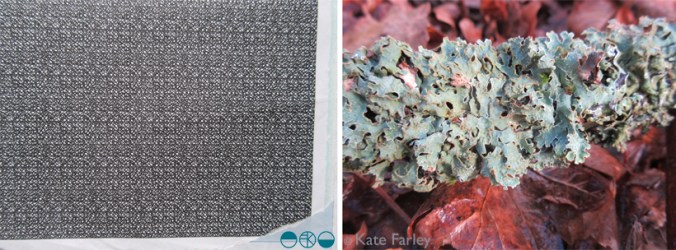
KateFarley_seeing things_detail

Some questions then, are we seeing more? Do we notice more, and appreciate more?

It does seem as if there have always been people who see faces in clouds, and beauty in peeling paint, but I wonder if social media is driving us to become a load of aesthetes. In my world it may seem that way.

As a pattern maker I’m always on the lookout for eye-candy, and usually of the ‘just happened to be there’ kind of pattern, rather than a designed pattern – having said that, I’m equally likely to be stopped in my tracks by a well-designed wallpaper. There have been many books over the years, and more recently blogs that feature the beauty in the overlooked, or the ugly, or the mundane. The desire to collate / curate these sights are no more in evidence than in the world of Patternity a design-savyy duo with a manifesto about pattern! Their stunning website and book and interesting collaborations are clearly tapping in to this moment of ‘seeing’. Check them out if you are so far unaware.

KateFarley_seeing things_stripes

Pattern really is everywhere, formally and informally and that’s the pleasure. I remember the day I was taught the mysteries of repeat pattern making, and that evening in a pub in Great Yarmouth, Norfolk, I took great pride in identifying the repeat ’tiles’ in the carpet, wallpaper and curtains of the glorious / hideous 1990s pub decor.

I had the pleasure to spend time with the fabulous Sarah Campbell last month, and much of our conversation, as we were at New Designers, was about pattern making; why we do it, how we do it, and getting people to pay for us to do it. During the conversation Sarah spotted a lady beside us in a polka dot blouse, and we noted that pattern-makers never really switch off from pattern spotting (pun intended!), pattern making, and pattern appreciating. When we departed we both commented that we look forward to reading each others next blog post – well here you are, this one is for you Sarah – it was a pleasure to see pattern with you!
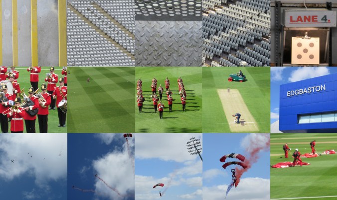
pattern at the pitch, up and down

Despite having lived in Headingley, Oval and near Edgbaston I’m not a great fan of cricket but today I spent a number of hours at Edgbaston, the home of Warwickshire County Cricket Club as they hosted a charity community day. The highlight for me was the arrival of the Red Devils, from the skies in the most fantastic spectacle, bringing the ball for the 20-20 match. The marching band looked fabulous in red to the complimentary green of the grass and I also discovered I have a skill in rifle shooting, so there you go, a surprising day.

I gathered lots of images of patterns too. Here’s the day in grey, green & blue pictures…

edgbaston_com_day_100riflecard_100

the patterns of 2014

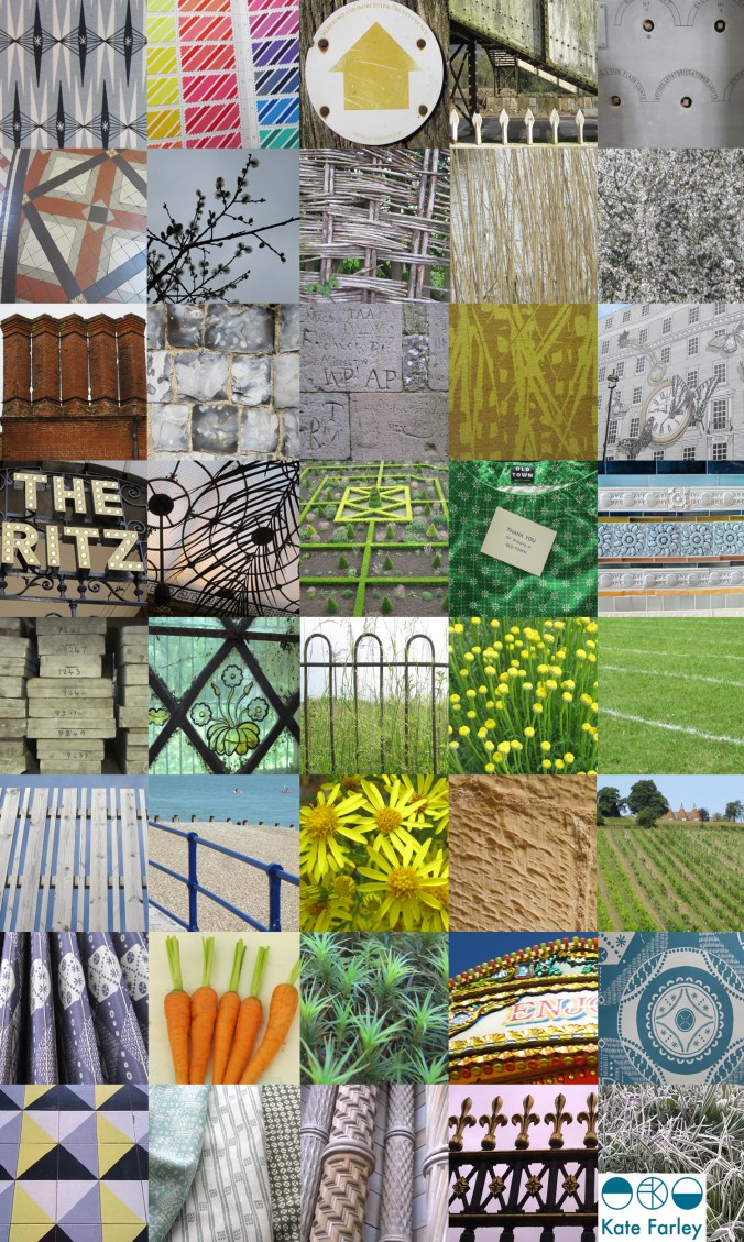
It’s been one of the years I shall remember as particularly busy, continuing to juggle the commitments of family life, my roles as artist, designer, lecturer and of course allotmenteer, and the small matter of a big Birthday. All the time spent doing any one of those things provided opportunities to spy inspiration, food for thought and visual stimuli for me so having looked back over the last twelve months I have enjoyed creating a record of the patterns I’ve seen. The record includes family holidays, research trips, and days out; from the school sports day track, Birthday celebrations, to the rivets in the railway bridge, the stately home and the walk to work, it’s a record of some of what I saw in 2014.

Key themes appear: geometry, stripes and railings and although in a chronological order, there are some great pairings in terms of colours, textures and pattern.

2014tiles_blog

back to the drawing board

The job of a freelance designer involves so many different tasks that many people with a variety of skills could be employed to keep the components of that designer’s working life going. Juggling what is needed to be done with what would be preferable to do is a tough call on some days. What is it that really makes that difference, to move the company vision forward? I could spend many hours a day sat in front of a screen communicating with manufacturers and stockists, preparing marketing and sales literature, and keeping the ever-growing consideration of social media alive.

There are times when it is so valuable to stop all of that and get back to what makes us creatives tick. There are personal risks involved with making; what if it’s rubbish? The fabulous ideas that roll round the head in the early hours, once realised, are open to harsh criticism in the light of the day – the danger of expressing ideas and developing new work. But for all of that it is so important to keep going back to the beginning, to test new ideas, stare at the blank white sheet of paper, take a deep breath and play – for my creative self!

KFarley_drawingboard

noticing Nottingham

Having had such a great ‘destination’ review from Cara of Patternbooth blog fame via Helen’s blog DesignHunter we chose Nottingham for a last minute weekend get-a-way. I had last visited the city as a student in about 1997 and this time we set off looking for a completely different experience from the cider-drinking ‘DM boot wearing’ art student of yesteryear.

We visited lots of independent cafes and restaurants, watched a great art-film in the Lounge at the Broadway Cinema, shopped in vintage shops & design shops and yes, we did find time to sup ale at Ye Olde Trip to Jerusalem. It is a city with a great variety of interesting buildings embracing a myriad of architectural styles; almost a timeline of the design history lectures I give to my Textile Design students. The lace trade is still visible in many ways, and contemporised on the exterior surface on Nottingham Contemporary.

We had a thoroughly great time and returned home with rounder tummies and fuller bags than when we left Brum on Friday night! Thanks Cara, Helen and Nottingham!

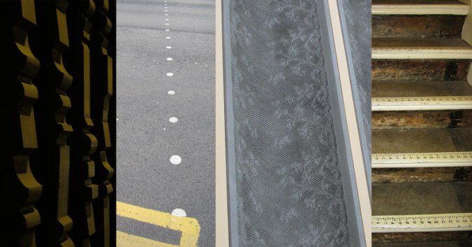
images L-R: exterior facade of a car park, dots on a crossing, Nottingham Contemporary exterior, stair detail from the Paul Smith shop

NG_stripe_web

geometrics out and about: PLAIDS

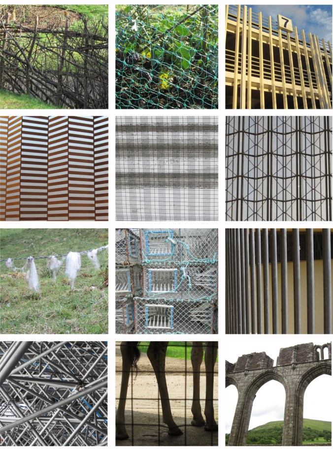
There are particular visual rhythms I seem to collect as photographs when out and about and so I thought it worth while putting them together as collections of patterns. I’ll leave you guessing what might also feature over the coming months but here’s the first: plaids.

Some are more obvious than others, and while you are looking, keep an eye out for the friendly robin. There’s a list of locations below for those who might be interested.

plaids_blog

1a Botanical Gardens, Birmingham
1b Plot 8, our allotment, Birmingham
1c University of Warwick car park

2a Aeneas Wilder, Mead Gallery, University of Warwick
2b Heeley Rd. Birmingham
2c Olympia, London

3a Newtonmore, Scotland
3b Hastings
3c Dudley Zoo

4a Hockey arena, London 2012
4b Dudley Zoo
4c Llanthony Priory, Wales

lines in the snow

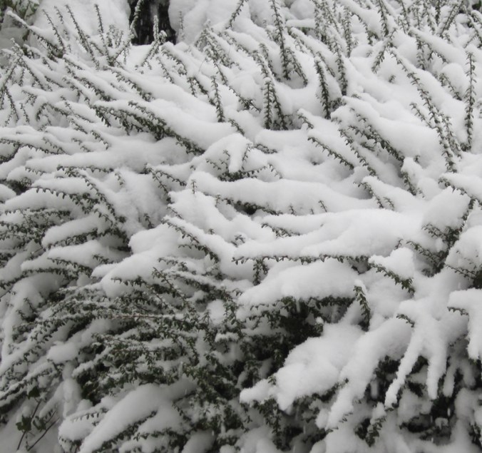
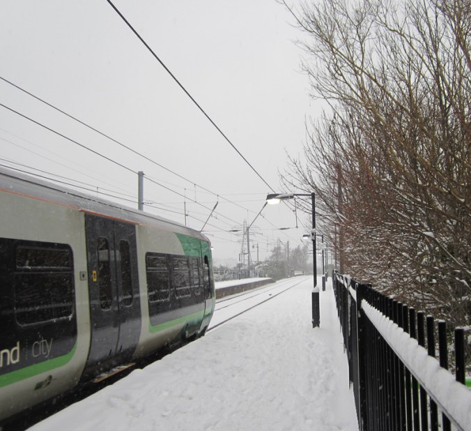
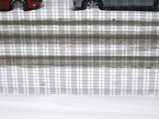
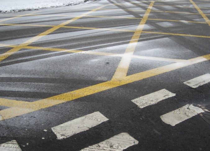
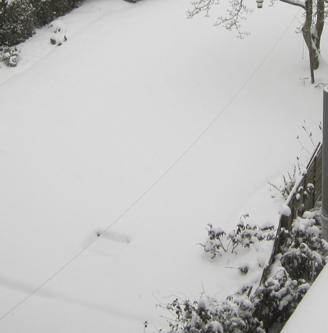
I took these photographs on my way home from Birmingham yesterday and like the way they show the different interpretations of lines and stripes in the snow I recorded. My last blog post was about colour, and so I like the fact that it is almost absent this time around. I’m sure there can be some design inspiration from these.

branchlines_snow
trainline_snowgrid_snowyellowlines_snow1washingline-snow