Over the last twenty years the contexts for which I have made work has varied considerably. The intimate space of a page in a book, a sequence of doors in public conveniences, a gallery wall, patterns made in gravel on three large roof-scapes of a hospital or the humble tea towel; they all require different considerations. The client, the audience, the buyer and the customer, each has different agendas, budget requirements, aesthetics and expectations – I enjoy each challenge and added dimension that brings. The opportunity to consider my practice in these differing environments creates a chance to reflect and develop a greater understanding of possibility and relationship with the context of known work while developing an understanding of those different people and their agenda and perspectives.
More recently I’ve been working on design projects away from gallery walls, but I was delighted to be asked to be involved with ‘Ambiguous Implements‘, a touring show featuring 17 practitioners across a wide range of creative disciplines, exploring domestic and familiar objects in alternative ways.
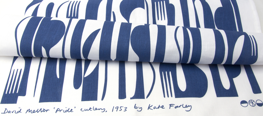
The contact came from a journal my ‘construct’ design work was reviewed in called Feast. I had been pleased with the care Laura Mansfield and the team had taken with understanding my work for the article in Feast, and for this new invitation I was delighted to include both some original drawings from my ‘Construct’ project, as well as metres of Construct: twist, in a bespoke colourway, as the nod to domestic interiors for the gallery settings. I was also asked if they could use my words, spoken casually during a conversation over the phone, but seemingly capturing the essence of the exhibition.
“a familiar object provides an unfamiliar forum for thinking” — Kate Farley
It’s funny how little conversations, and apparent one-off opportunities build networks to develop, support and enable both parties in different ways. I’ve been grateful to Laura and her team to be so considerate and inclusive, and to allow my work to sit in a very different context, thereby enabling me to consider the work further, evolving and existing in new ways. The other practitioners make very different work but the conceptual connections and mutual respect for others practices can also grow further understanding beyond the single opportunity. I’m pleased to be involved, for the development of my practice and the context of ‘construct’.

Information:
“Ambiguous Implements has been curated by Laura Mansfield in collaboration with Rachael Colley and Nuala Clooney. Funded by Arts Council England, supported by Dust and Simon Taylor Designs.” https://ambiguous-show.tumblr.com/about
Ambiguous Implements is at The Bl_nk Space Gallery, Roco Cooperative Sheffield until Saturday 15th July opening Tuesday to Saturday 11am- 6pm. Other venues
“Bringing together 17 practitioners from the fields of design, jewellery, ceramics, metalwork and sculpture Ambiguous Implements presents a collection of contemporary works that playfully reconsider the familiar objects of our day to day domestic life. Re-thinking the tools we use for eating, grooming, cooking and cleaning, the exhibiting artists have employed and subverted traditional craft techniques, reframed existing tools in new sculptural assemblages, or given seemingly banal objects new functions and effects. The collection of works present a twist on the familiar, bringing new perspectives to bare on the objects that populate contemporary domestic life.
Rob Anderson, Aimee Bollu, Caroline Broadhead, David Clarke, Nuala Clooney, Rachael Colley, Rosie Deegan, Kate Farley, Daniel Fogarty, Kate Haywood, Jasleen Kaur, Julie Mellor, Maria Militsi, Rebecca Ounstead, Matt Rowe, Jonathan Trayte and Abbie Williams each present new and existing works.”
text from https://ambiguous-show.tumblr.com/about