spring brings colourful joy

I feel as if I’ve dragged myself through the grey, wet and cold British winter, without the delight of deep snow to play in, and finally the signs of growth in the garden and country lanes are undeniably taking us in firmly to the middle of spring. The magnolias are blooming, the blossom of blackthorn has been and gone in Norfolk and the yellow of the daffodils is being overtaken by the yellow of the oilseed rape fields.

Almost without warning, as if overnight, the garden has transformed from bare earth to borders full of colour; clusters of yellow, of orange-red, hot pinks and fussy white frills. The tulips are here, and with them comes the idea summer may follow spring. I’m not rushing the time by, I’m just more appreciative of the brighter, warmer months.

With the threat of heavy rain over the weekend I gathered up some of the tulips for the house – bringing the outside in. They’ve brought with them such joy, I really do feel better with the colour around me. I spent a little while drawing them a couple of evenings ago to absorb the colour and form of each one, thanking them for bothering.

Tulips have featured in art and design for centuries, in drawings, paintings and textile design, but my favourite has to be by the Austrian designer, Josef Frank, in Tulpaner, see below, for Svensk Tennn. The different flower heads of the tulips bursting from the dark background as if the colour is jumping out of winter is just how I feel, as the warm spring sun encourages the garden to enable colour to thrive and for us all to spend more time enjoying it.

November colour palette, on the water

I love creating seasonal colour palettes, so here’s one from today, with our Mirror dinghy on the Norfolk Broads. The distinctive red sails stood against the neutral greys and greens of the November day. It’s not entirely proportionally correct but the red grabs the attention so I believe it’s okay to give it some extra width in the palette at the expense of more pale grey!

winter palettes

I’ve not had much time for colour mixing with gouache recently but I’ve really enjoyed noticing the contrasts of seasonal colours on our walks so I thought I’d celebrate that here. Some colours are exaggerated by bright sun, while the recent frosty mornings provide a muted coating.

Taking time to notice these small delights are ever more important as we spend few hours outside. I noticed today there was daylight in the sky at 5pm, so that and the first sights of snow drops and daffodils are putting me in the mood for springtime.

drawing to see, drawing to notice.

Drawing has always been a great leveller for me and now is no exception. I make drawings to capture something I like the look of even if I haven’t got a clue how it might be useful at that time. Picked grasses, a homegrown tulip or a fragment of fabric all provide challenges that relax me but also creatively inspire my lifetime of looking to draw – it’s not a coincidence there’s a play on words with drawing in my blog name.

Having some time spare while sat in the car at the local farm shop car park three weeks ago I took a good look around me at the view and with the luxury of time I took out my sketchbook and drew a line. This was a landscape already familiar, but in drawing a subject it is with a closer examination that one can see more.

Firstly I noticed the skyline meeting with the trees in the distance but as I drew that line it was being interrupted by the nearer trees cutting over the fluidity of the horizon. The trees contained strong shapes but not as the summer masses they will hold in full leaf in due course. The branches were clearly defined, but the added haze of smaller branches suggested the fuller form.

I made reasonably quick sketches of the same view several times, each time starting with a different area as a focus. Sometimes it was the gap between two trees, or a distant field and as I became more familiar with the shapes in front of me I engaged with details of branches to define the structures of the trees. I focused on three clusters of trees that provided different visual qualities but were united by the view.

KFarley_wk1_ALDIS_blog

The process of drawing and re-drawing the same thing is something I love to do – just as Monet would have painted the same cathedral or hay stacks. Where Monet was fascinated with the changing light and what that did to the colour and shadows, for me it is a process of understanding and familiarising in order to stylise and to interpret, usually in line and shape. As I get to know my subject I can edit in and out the information to simplify what I am seeing in working out how to record it.

This blog post shows the same landscape being drawn on three different trips to the farm and I think you can see the familiarity allows for more freedom of the information I saw and captured. In week 2 I also took to scissors to cut out the shapes in pieces of white paper, asking myself to identify the positive and negative shapes within the landscape – see the image below. I cut out the same trio of trees several times and they work well layered, as the interpretations of the same subject matter is similar but evolves too.

KFarley_wk2_ALDIS_blog

This notion of repetition in order to get to know something is a really key part of my practice as a pattern designer and I’ve evolved this relationship in my drawing over the years. As far back as art school I drew and printed in series of works on paper, with the evolution of seeing in order to pare back being the really important part of my process. I teach drawing as a ‘getting to know you’ strategy too. I suggest a student does not spend the first hour asking the really personal questions of the subject sat in front of them, but to make small talk, get to know the subject superficially first of all, then you can be more up close and personal over time. I think I’ve written about this somewhere on the blog before.

I’m really pleased that within a very short time of drawing I have looked, learned and recorded the view, and once again taken away my way of seeing that landscape overlooked by so many of us in our day to day routines. I’ve returned to this task and now have about twenty drawings from three consecutive visits. The trees are hinting at holding more green but the summer fullness is a while away for now. The buzzard circles and the tractor gets to work, I shall be back again, see below for the drawings in week 3.

KFarley_wk3_ALDIS_blog

gardening spirit

As this is the start of National Gardening Week it seems appropriate that I reflect on how important gardening is to me. Growing up in a gardening family, with a self-sufficient attitude to growing vegetables I suppose it was inevitable that one day I’d have a garden of my own to tend. For years I’d visit mum and be walked around the garden having updates on the state of things, nodding but never knowing the names of things, but seeing the pleasure the process of gardening gives to her. Now I understand.

Here in Birmingham we have an allotment to grow the vegetables and fruit in, and we grow flowers in our garden. We have spent over a decade digging and harvesting plot 8; learning to respect weeds for their various ways of making their presence known – I still want to try weaving couch grass. The feeling of success when we pick the first strawberries of the year, or fill the rucksack with runner beans that can be filling the freezer for wintertime is certainly worth the hours of graft. Last weekend I picked over a kilo of purple sprouting, and we commented that the harvest would probably cost well over £10 in the shops, as organic produce – but with no plastic wrapping or air miles included. Of course our food tastes so much better too! Gardening spells out the seasons as we check for frosts, or pick the first fruits, and enjoy the harvest and flowers of each changing month. The beds of wallflowers make me so happy this time each year, signalling the excitement of the growing year getting underway.

wallflowers_katefarley_blog

It was at the allotment plot that I first developed my pattern collection ‘Plot to Plate‘, launched in 2012. I had been drawing the allotment beds on the site, as well as National Trust kitchen gardens for a while, and a language of graphic pattern made from lino cuts evolved, firstly as limited edition prints, and secondly as motifs to explore repeat pattern with (for example: Plot to Plate VVV textile design – final image with the Auricula). The title design is slightly different in the fact that it was hand drawn, and is an over-sized dog tooth check featuring tools of growing, cooking and eating, such as garden rakes, spades, whisks, wooden spoons and cutlery as a visual narrative up the tea towel, celebrating the journey from plot to plate – available in Brassica green or Brassica purple. plottoplate_ttowels_katefarley150

This collection has evolved to incorporate more formal pattern compositions such as Parterre (below) and Hanbury, inspired by National Trust’s Hanbury Hall and Gardens in Worcestershire, featured on hand screen printed cushions and wallpaper, where I make links between pattern design for textiles and formal garden design.

parterre_katefarley_150

These days my design practice has moved away from the inspiration of the formal gardens but I continue to dig. Our potatoes are in the ground for this year and the greenhouse is working some magic. Gardening provides me with not only creative inspiration but also head-space – a highly valuable asset in today’s world. As a designer and an academic, juggling a young family too, things can be frantic and I’m often running for trains. Faced with two hours of hard clay to dig I’m actually very happy. I can focus on the job in hand while chatting to the friendly robins, making myself physically tired, seeing the result of the work, and at the same time having time to think and mull over some of the other stuff of life. There’s also the sense of community with other allotmenteers; we share the same weather and battles but also share the excess harvests. Every time we get to the point of questioning ourselves about the allotment and if we have time, I remember all that it does for me, how my hard work there actually keeps me well; gives me a sense of well-being I can’t imagine getting from anything else. I shall keep digging, and knowing, for so many reasons, why I do!  Happy National Gardening Week!

vvv_auricular_katefarley

Save

Save

an alternative view

I’m not so keen on this time of year. Despite the crocuses being up it doesn’t feel anywhere near summer, and there is still a small chance that snow will fall before anything but parsnips can be harvested on our plot. Having been brought up in the Norfolk countryside I miss what the countryside offers. It is important to me that I notice the seasonal changes that shape our year, despite the suburban home I find myself in, here in Birmingham. I miss the big skies, the open fields, and the greens of each season, still in existence, I just can’t see them from here.

ferryLakedistrict1

Looking though photographs from last summer I found this shot. I took it from the car as we sat aboard the Windermere ferry, crossing back towards the motorway, heading south to the Midlands from our final holiday of the season. It really was a grasped shot of the closing summer, peering through the window, breathing in the view. A last look across to the beautiful hills of the Lake District, unaware of what sort of wet winter was in store for so many in the region. In getting the link to the ferry for this post I’ve just discovered there’s a ferry-cam. I’ll check back to it in daylight, and dream of the summer holiday.

Today it was sunny in Birmingham. I had a short run around the park nearby and pretended it was the countryside, imagining I really could feel the heat of the sun through my hat, gloves and coat. I think we have a while to wait. The ground underfoot reminded me all to well of school cross-country in winter!

I think I’m in need of another holiday to the country!


summer to autumn colours

We’ve been treated to some clear blue sky days over the last few weeks and this makes the transition from summer to autumn a bit more tolerable. I always hate having to acknowledge that the summer warmth has gone for another year, and that the plot has given us most of the harvest for the year. We will wait for the frosts before we dig the parsnips, but I’ve gathered the squash and picked the final runner beans we will eat. The last of the sweet peas still offer their scent, but their strength of colour has passed. It’s a constructive time at the plot as we take down the netting, pull up the spent corns and clear ground for new anticipation.

Poppies, marigolds and nasturtiums still bloom such strong summer colours, daring the frost not to strike for a few more nights… I have my fingers crossed too…

KFarley_SummerAutumn_plot

the colours of 2014

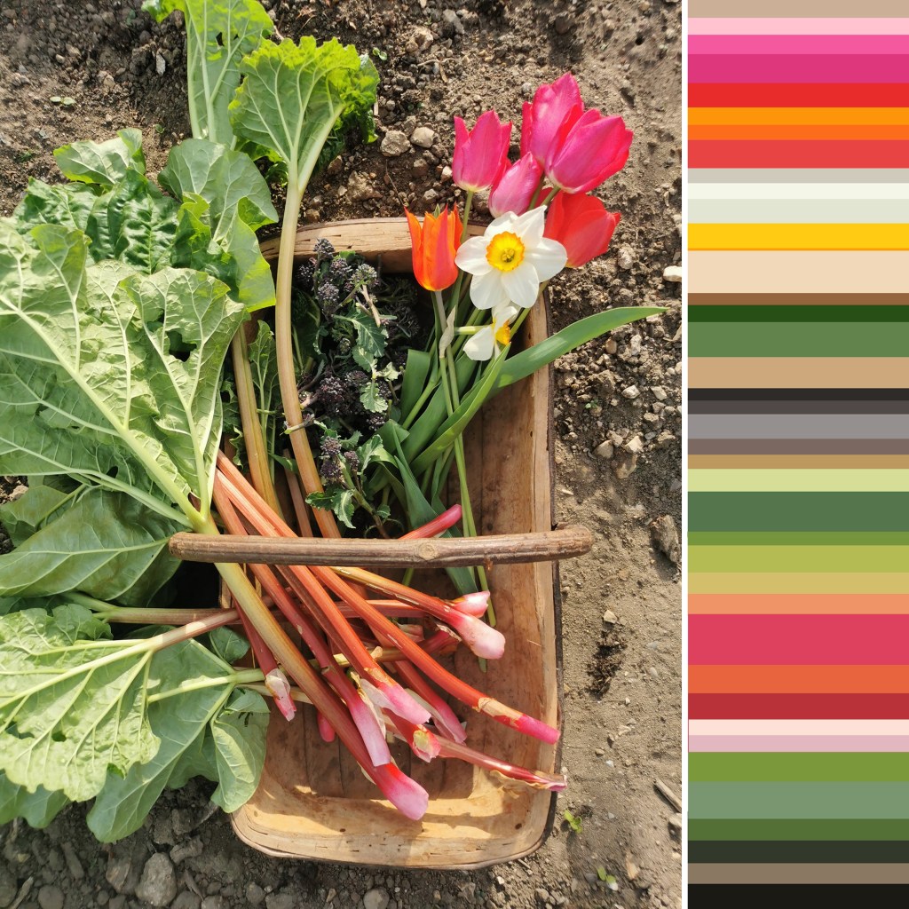
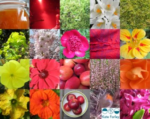
Back in 2012 I started a colour project on Twitter, using Pantone references ( @pantone ) that represent particular colours of the season, place or activity of the day alongside photographs that I have taken. The words relate to the language of colour, seasons and the activities so often word-play is used, particularly in relation to Coated, Uncoated or Process, as used in the Pantone system of colour. Having kept this going for over two years I decided to look back to see the colour swatches of 2014, a record of colour of my year, having recorded pattern of 2014 in my previous post. In chronological order under the swatches are the Tweets to tell you about the images, they read from top L to R, along each row ending with the hyacinth, bottom R.

From this point on we can look forward to 2015…. Happy New Year…

KFarley_colourof2014

Kate Farley @katefarleyprint  ·  Jan 27

ORANGES! A new breakfast treat, from @pantone180 solid to process = marmalade

Kate Farley @katefarleyprint  ·  Feb 12

Brilliant @pantone Red DS 75-1Uncoated; a gig of captured whispers & exploding electric noise @annacalvi Outstanding!

Kate Farley @katefarleyprint  ·  Mar 2

Yesterday: @pantone DS 290-1 Coated, sights of fresh green but otherwise muddy underfoot – Spring has sprung

Kate Farley @katefarleyprint  ·  Mar 9

Crocus delights: @pantone process, heading home, 49-1Uncoated, Spring sun

Kate Farley @katefarleyprint  ·  Mar 15

Malvern moss green @pantone DS 312-1U = process walking & uncoated. A beautiful spring day #Herefordshire

Kate Farley @katefarleyprint  ·  Mar 29

Spring green @pantone 389 Uncoated, on the eve of BST. Euphorbia at its best!

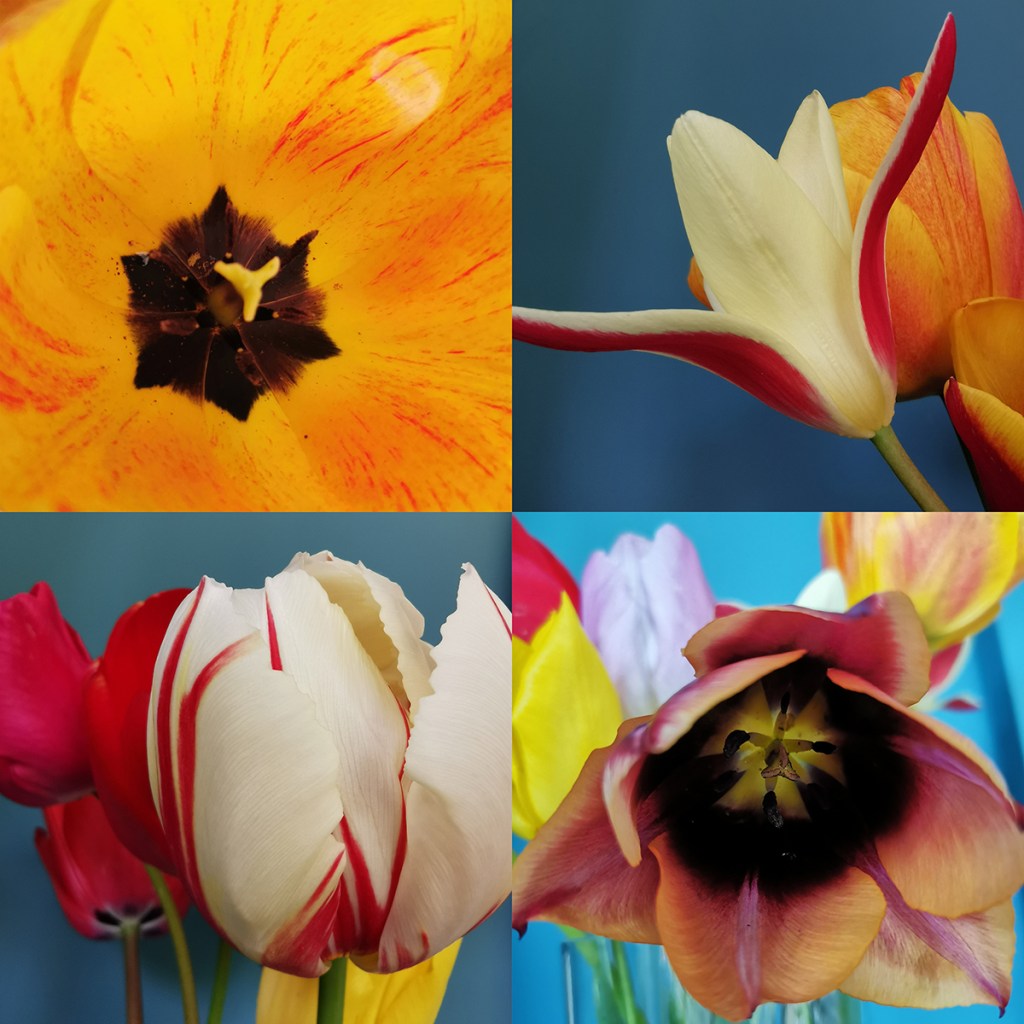
Kate Farley @katefarleyprint  ·  Apr 11

Bored of blossom? Beautiful @pantone 684 PC – Solid optimism to Process – the Spring growing season.

Kate Farley @katefarleyprint  ·  May 21

Okay so it’s not #RHSChelsea but stunning @pantone 806 Solid pink Uncoated. Sadly rain due to spoil it tonight!

Kate Farley @katefarleyprint  ·  Jun 27

A lot of @pantone 207 PC with @tiborreich on behalf of @textilesBCU Every colour under the sun and rain. #textiles

Kate Farley @katefarleyprint  ·  Jul 10

Today = A sunny @pantone yellow 604 Uncoated and optimistic on all fronts! #colour

Kate Farley @katefarleyprint  ·  Jul 21

A stunning yellow @pantone 386 Uncoated, hot & with plants growing in the wrong place across the plot. #weeds

Kate Farley @katefarleyprint  ·  Jul 25

A stunning, loud and proud @pantone Red hot 032 Uncoated and attracting the insects today. #dahlia #colour

Kate Farley @katefarleyprint  ·  Aug 1

RED! Harvest time with these @pantone 200 Coated at the moment crab apples, soon to become jelly! #colour #harvest

Kate Farley @katefarleyprint  ·  Aug 11

Pink @pantone 679 Uncoated, wild and fresh from #Dartmoor #heather #colour

Kate Farley @katefarleyprint  ·  Sep 3

Blooming special rose @pantone 7417 Uncoated & without an umbrella – let’s hope for no rain! #colour #rose #weather

Kate Farley @katefarleyprint  ·  Sep 8

A stunning @pantone 611 Solid Process flower but I’m waiting for the squash! #colour #PlottoPlate #runningoutoftime

Kate Farley @katefarleyprint  ·  Oct 6

It was sunny yesterday, Uncoated with @pantone orange 021 nasturtiums. #colour #autumn #allotment

Kate Farley @katefarleyprint  ·  Oct 20

Happy to receive @pantone Coated 201 red windfall apples from the allotment at the weekend. #harvest #sharing

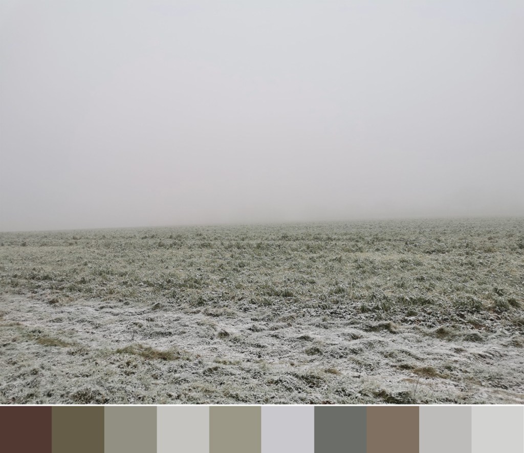
Kate Farley @katefarleyprint  ·  Dec 7

A stunning @pantone Solid 158 watching me dig at the plot today, Coated of course #colour #allotment #digging #robin

Kate Farley @katefarleyprint  ·  Dec 30

Blooming! We are enjoying the seasonal @pantone 226 Uncoated and indoors #hyacinth

July colours in the garden

Following on from the last few months of colour charts that I have created documenting colours growing in the garden I have made a July 13 one too. The weather has been hot and dry but somehow the slugs have enjoyed the marigolds so there is a lack of orange in this colour palette this year. The Foxgloves are pretty much over but the Hollyhocks and Dahlias are stunning in their part of the garden relay race through the summer schedule.

july13gardencolours_web