playing with print

I’ve been enjoying some studio time to explore my print research as works on paper with the hope of exhibiting the work. I enjoy paper engineering and construction (that’ll be the book artist in me!) and have previously tested paper manipulation in relation to this current pattern research. I tend to work in this way, creating drawings or prints to exhibit / sell alongside forming pattern ideas, and it has been useful to see the evolution of the sampling in this way here too.

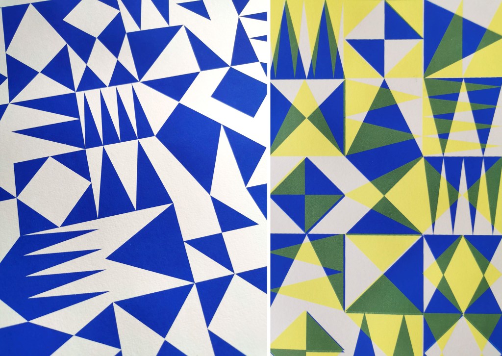
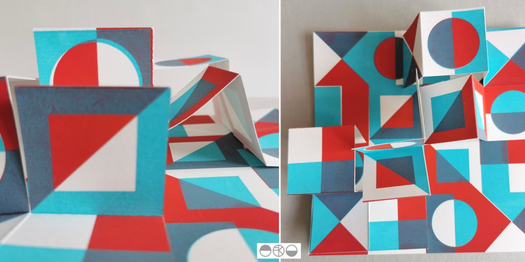
These new artworks utilise my screens of geometric artwork practically exploring research into motif distribution in printed pattern thinking formalised by Lewis Foreman Day in his book Pattern Design, published in 1901. Having printed the artwork in the first colour, I rotate the screen by 90-degrees and print the second colour, turning the artwork / screen up to four times for maximum complexity. To add a further dimension, I’ve been constructing works on paper that utilise several iterations of the prints to build new compositions by weaving and slotting strips of the printed papers in differing combinations of the four colours in the palette, providing the coherency across the series, and an injection of the spirit of summer fairgrounds through the colour and geometric visual language.

There are two screens of artwork used in this collection, therefore two series of original artwork (PLAY – circles and PLAY – triangles) and I shall continue to evolve the body of work over the coming months. I’d love to know your thoughts on this new work!

screen time!

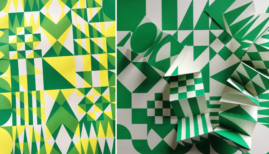
After the lovely summer I’ve been back printing in the studio, with some lino blocks on the go as well as two new screens I’ve had exposed as part of my pattern research. I’ve been exploring the rotation of the artwork as well as folding the prints to determine visual narratives.

I tend to not worry too much about colour palettes in this sampling phase, particularly as I’m focusing on the pattern building but also considering a range of material substrates for future outcomes. I appreciate this gives me freedom to test colours, some more successfully than others. After several days at the computer screen it can be a complete relief to spend time at another type of screen!

bacterial colour workshop

For a number of years I’ve been aware of the fascinating work of Colorifix, an award winning bacterial dye biotech start-up organisation based in Norwich leading the way for a more sustainable dye practice. Following some planning and support from our technical team I was able to host PhD researcher Ruth Lloyd in partnership with Colorifix to share with us their work and to lead a workshop for our BA3 students. Ruth is carrying out practice-based research “to develop and commercialise bacterial dyes, where she will further explore the capacity of colour producing microorganisms to create human designed patterns”.

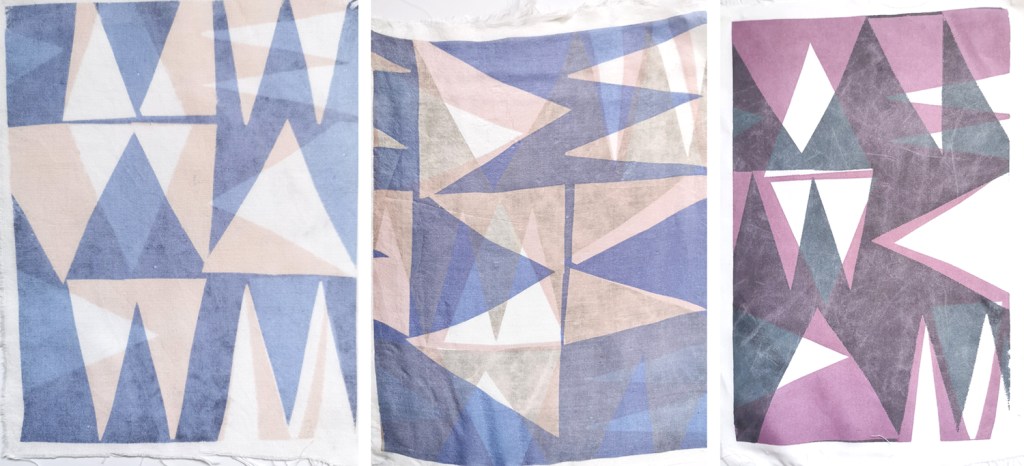
We were treated to a insightful presentation by Ruth about the science and development of the colours, before we were able to have a go at printing with the bacterial dye colours. The students and staff tested painting the colour directly on to the fabric as well as painting on the screen then transferring the colour, as well as using paper stencils with the open screens.

The range of colours is limited at the moment, so this is something being worked on by Ruth and the team at Colorifix. The different fibre content of the fabrics printed on can significantly impact on how the colour appears so we were testing natural and synthetic fabrics to build our technical files and our own understanding of colour and textiles. Thanks Ruth and Colorifix!

catching up with pattern

It’s been a while since posting here, but I’ve been busy enjoying summer adventures and developing exciting pattern research alongside getting the academic year underway. I’ve also moved in to a new studio space so I’ll share that in due course.

My pattern research focusing on the repeat print block and how it can be used to generate multiple variations to evolve pattern options continues, with sampling with screen and lino printing. I thought I’d share the more structural outcomes here, linking back to my book art practice. I enjoy discovering links that connect the broader practice I’ve developed over the last twenty five years.

As I folded the sheets of printed pattern the forms appeared to suggest a built environment so I explored the idea a little in how I photographed the pieces. Testing scale and contexts is a vital part in developing a pattern, and I enjoy the possibilities.

passion for passi flora pattern

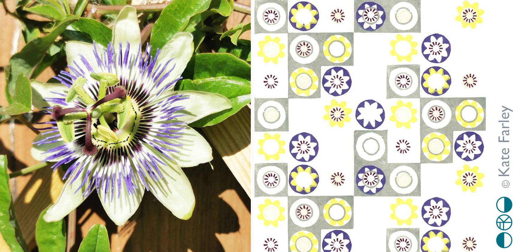
Many years ago my flatmate was given a passion flower plant and when the flowers came we were both in awe of their splendid form; a thing of beauty in our otherwise less than beautiful flat in Camberwell, south London. I made drawings of the flowers and sometime later developed some patterns from it, screen printing it as repeating designs and placement prints. I created the motifs by deconstructing the elements that constitute the flower head.

More years passed and sometime around 2012 I revisited those screen printed patterns, this time interpreting them as lino cuts as part of my Plot to Plate series of editioned lino prints. Last year I planted two passion flower plants in our new garden and last week we had the first bloom. It took me right back to that first flower in the flat in Camberwell, and was reminded of the pattern again.

passiflora_web

Whenever I look back at old work I’m likely to want to make changes, and this is the case here too, but each design also holds a moment, defines a time, and sometimes that makes it what it is. I’d not imagined I’d connect that flower to my practice almost twenty years later…

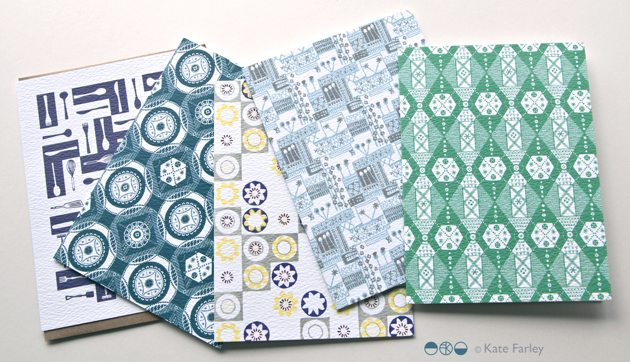
This pattern remains available as a set of patterned Plot to Plate greetings cards.

KateFarley_GC5002_blog

international pattern collaboration

It all began in an email with the subject line, ‘Hello from Tokyo’ I received in November 2017, letting me know how much my tea towels for David Mellor were admired in a Japanese design company. The email went on to ask if we could discuss a potential collaboration for a capsule fashion collection featuring a print designed by me. Firstly I was excited to think my patterns had made their way to Japan, but secondly, that sounded a great idea, tell me more! A few email exchanges later, and we agreed to meet the next time the company director of Stamps Inc. was in London so I could show him my portfolio to discuss the idea for the new pattern they would like to commission for their fashion collection.

The meeting with Shu and his colleague Yoko in a central London hotel was exciting; I showed my work and it was met with positive discussion. I was also reintroduced to the tea towels that had made it to Japan all the way from my studio, via a David Mellor Design shop! We sat at a large table and I showed them my portfolio, spreading the many sheets out covering the whole surface. Having shown all the other work and following some discussion in Japanese between colleagues, the director chose the very first page he had seen – the cover page! The choice was not what I was expecting but we shared and developed ideas for me to sample: colours, time-lines and garments. We then took some photographs to record the start of the project together, for when we would be able to share our story – and even asked the hotel doorman to take a pictures of the three of us with a London bus behind us.

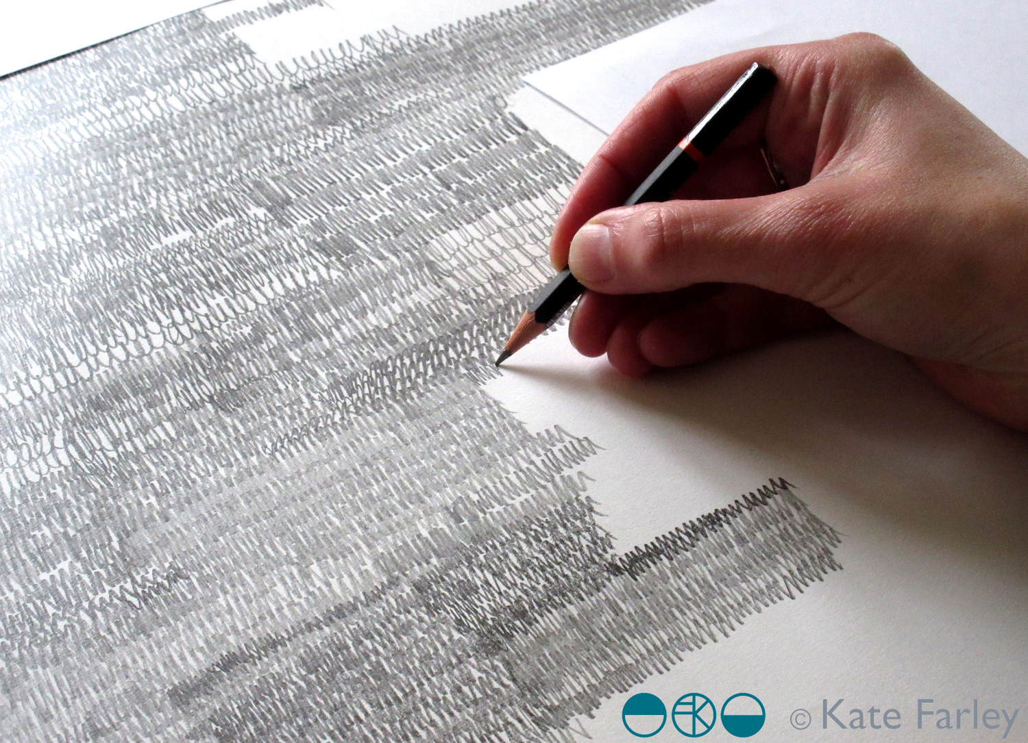
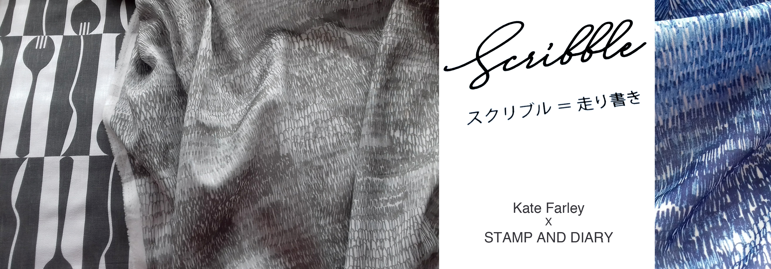
The selected design was a graphite pattern of pencil scribbles of varying tones and rhythms, later to become the title of the collection: Scribble. There are lots of variables such as scale, rhythm, tone and  overall order in the pattern we had to make decisions before I set about creating the final artwork. I emailed across some small sketches to explain the repeat process for production to check we were understanding each other as we had to ensure we understood the terminology that each of us used in our different languages.
KateFarley_SCRIBBLEwip_1_1500

I shared several images of new drawings to provide the variations / considerations over email before committing to the final design. The final fabrics were to be screen printed so I planned to draw out the whole design in full repeat by hand (approximately 60 x 90cm), scan it in and transfer it to Japan for screen print production. I started the large final drawing twice as I wasn’t happy with the first one. Initially the marks I drew appeared tense, but I also had to work out how to create the different qualities with the pencils across a vast piece of paper, and how not to smudge the areas I had drawn. I drew the design at 80% scale to make scanning it in possible, meaning I had to take in to account the slight increase in the size of the marks in the final result. I also had to ensure the top of the design matched the bottom, as the edges were to act as a cut-through for the screen printing process of repeating the pattern, fitting like a jigsaw, top to bottom. The design was edge to edge, left to right, fitting the width of the fabric so there was no horizontal pattern-repeat.

KFARLEY_SCRIBBLEwip_1500crop

The final artwork took almost ten hours to draw, and I did that mainly over two long evenings. I had it scanned in at a very high resolution, adapted the size of artwork to 100% and sent the digital file to Japan – with my fingers crossed that the printer could work their magic, including colour separating the graphite tones for the two screens each colourway would require!

There was a wholesale launch in Tokyo so I sent some of my original drawing samples over to feature as framed artwork in the exhibition and I was sent photographs of the lengths of fabric on show. Very exciting! Orders were placed and there was a good response. A further email request came from Japan, to meet again in London to see the fabric. Another exciting moment – also scary – what if I didn’t like the results!? In the stylish interior of the St Pancras Renaissance Hotel lounge there was no need to worry. Great care had been taken to translate my drawing to screen printed cotton lawn fabric, in two colours – referencing the two colours of my David Mellor patterns Chelsea, in grey, and Pride in blue. The fabric felt beautiful and the printing fabulous. It was a special meeting.

I was able to see the marketing material including my name alongside Japanese text I couldn’t decipher, describing our meeting and the collaboration. I have had to be patient while the wholesale launch orders were being produced before we can promote the project I’ve had to keep under wraps for well over a year … until now!

It has been an absolute pleasure working with Shu and Yoko, learning about the company and their pride in who they work with including the products they develop. It has been a highly successful collaboration from my perspective in that we have discussed all the aspects of the process and trusted each other to do the best for it, each learning about the other and having good communication throughout. We have shared news of the differing seasons and national events over the course of the project, and they’ve watched via instagram as I’ve moved homes and jobs. I’ve loved having this connection with people in another corner of our world, created as a result of some tea towels I designed over five years ago!
mellor_scribble_1500_banner

Save

‘Chelsea’ drawings to design for David Mellor Design

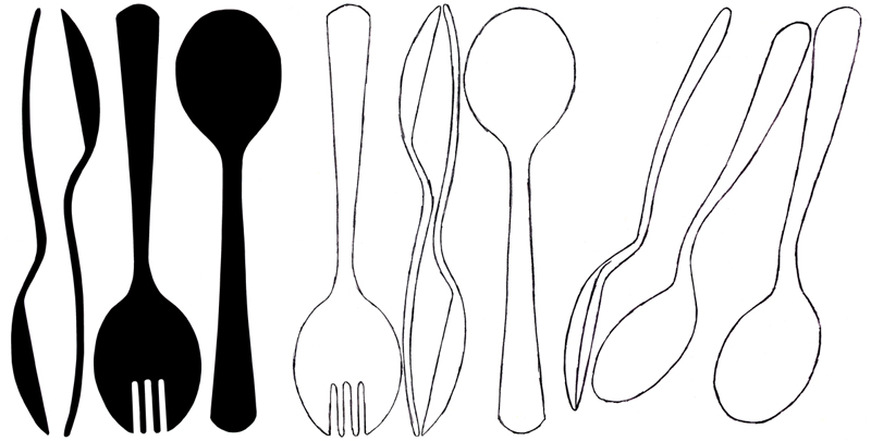
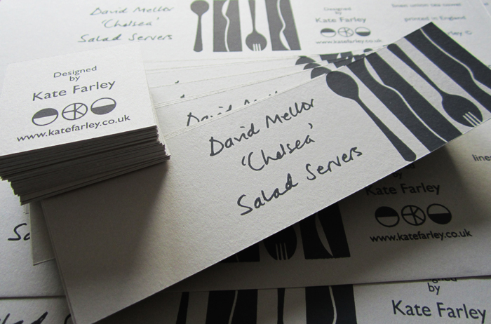
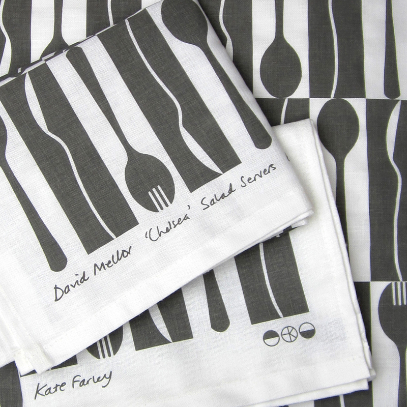
Many months ago I had the go-ahead from Corin Mellor to design a bespoke pattern to celebrate the fabulous ‘Chelsea’ salad servers that he designed for David Mellor Design. When I first saw the cutlery I immediately really liked the look of them and when I received the servers they were amazing to hold – they still are. Impressive in weight and size, the shape is simple yet stunning, and they inspired me to set about drawing. With a number of design options I provided Corin Mellor, Creative Director and his retail team, they discussed and advised, and before long we agreed on this design that is now printed on to linen union tea towels and sold on my website, David Mellor shops in Hathersage and London as well as Museums Sheffield.

With the tea towel now listed in the ‘Special Products’ section of the David Mellor catalogue I thought it time to show some of the images I have of the process. I took inspiration from my visit to the factory in Hathersage where they make and display the cutlery production process as well as the objects themselves.

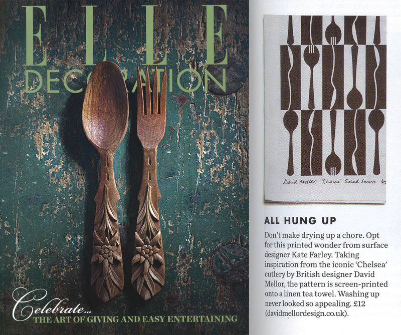
I’ve had great feedback and sales, we are having another print-run and they’ve received press in the form of Elle Decoration!

Thanks also to Patternbooth and Design Hunter:

drawing_mellor1webprintedMellorTags_webmellor_square_web

elledeco_Mellor_dec13_web