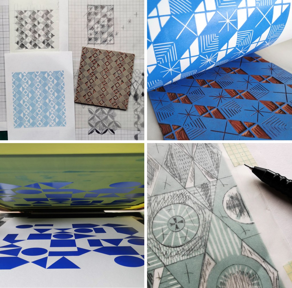
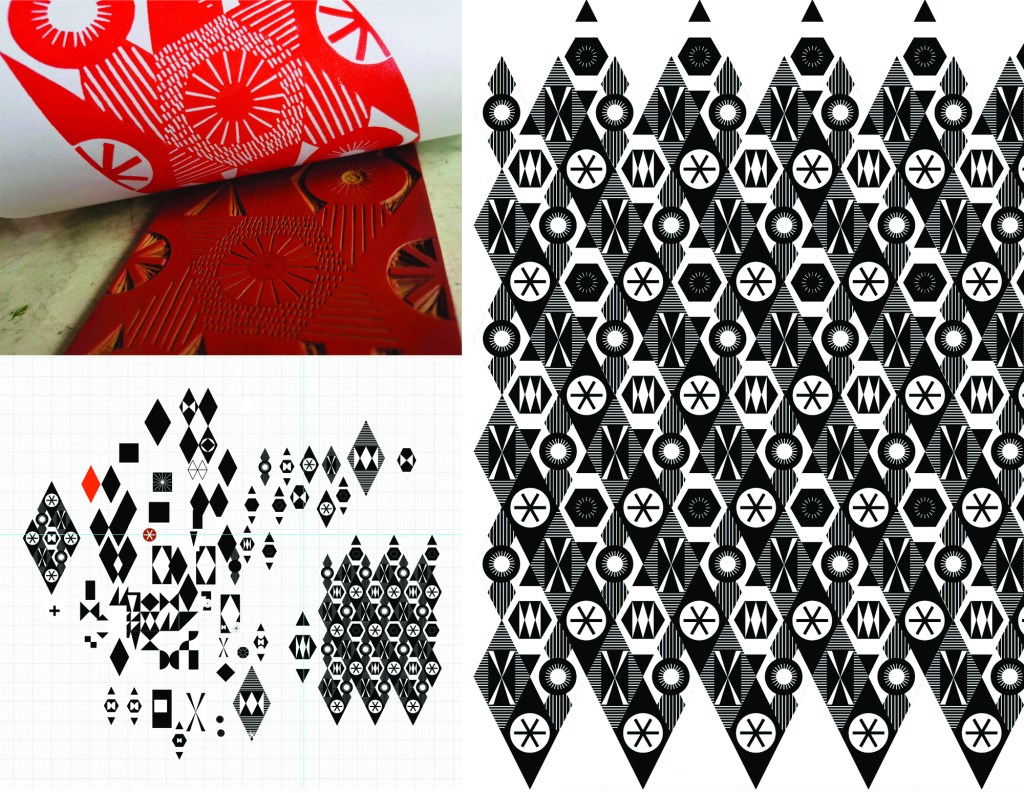
I’ve been busy printing and presenting my ongoing pattern research over the last few months, testing the design and print process, and receiving useful feedback – which may explain the lack of blog posts recently!
Last September I presented my work at the Fashion and Textiles Courses Association conference, Futurescan 6, held at De Montfort University in Leicester, and had a small exhibition of the work in progress during the conference. It was great to formalise my ongoing work at that time, and receive external feedback from the audience. It was useful to consider how I communicate the research, as the principle is simple but the process complex. I have also discussed this research as part of other presentations over the last few months, for colleagues, for undergraduate students as well as the audience of the Costume and Textiles Association’s programme of Heritage Open Week talks at the Forum in Norwich.
Last week I presented this research to the British Association of Paper Historians as part of their Spring Meeting held at St. Bride Foundation, having been invited to do so by the Wallpaper History Society. My fellow presenters covered wide ranging topics, from paper conservation, Japanese paper as cloth, the College of Arms and the current situation of the paper industry in the global context. It was a fascinating day with lots of common ideas and interests, and I received some very positive feedback to keep me on track.
I have further opportunities to share my research in a couple of months, so more news on that in due course!
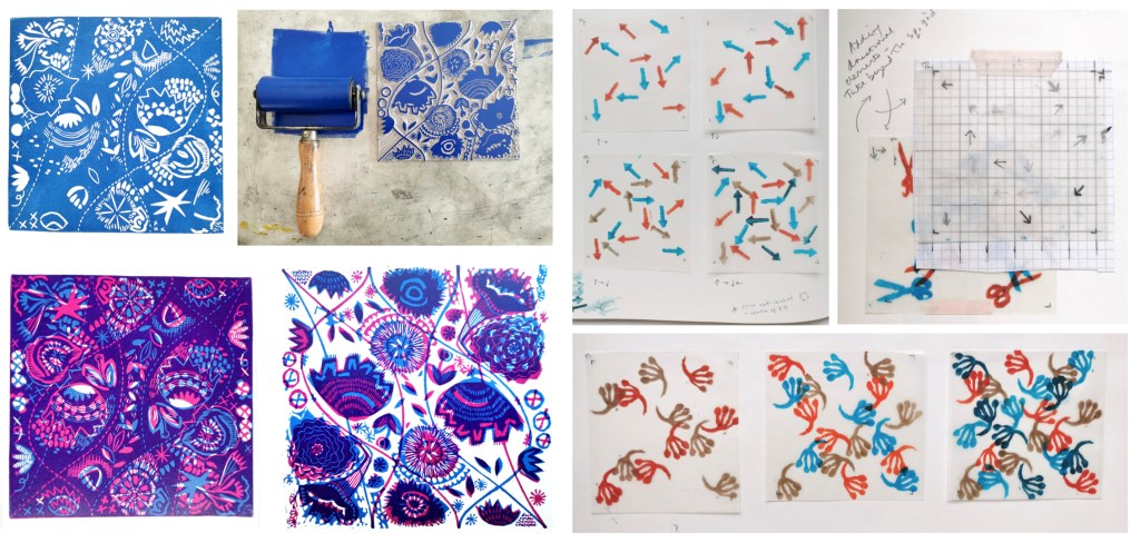
I am continuing to develop both lino blocks as well as artwork for screen printing, which enables me to test different colour handling and substrate options, for wallpaper and cloth. Colour is an important element of this research and particularly the transparency of colour in the overprinting, so the palettes will continue to evolve as I continue the exploration of primary and secondary colours.
As I gear up to making larger work for an upcoming showcase opportunity I look forward to sharing more of the work in progress.
After a long academic term leading the Textile Degree at Norwich University of the Arts I finally found some time to get in to the workshop and sample some designs on fabrics. I developed the patterns rather a while ago. I love the process of screen printing, from mixing the colours, exposing the screens, pulling the squeegee and of course lifting the screen to see the new print. I even enjoy washing the screens ready for the next time!
I’m not going to share all the outcomes at this point, but here’s a taster of the colours and a glimpse of one of the designs. I was working with transparencies in the pigment and binder to create the extra colours… and I’m really excited about the results!
I am really pleased to have had two of my most recent works on paper selected to be included in the Print Cromerexhibition this summer, with the Private View on 19th July. This new body of work has been developed as part of my academic practice at Norwich University of the Arts where I have been exploring pattern structures and repeat blocks. I have explored new pattern iterations by rotating the screens to add additional colours of the same artwork, thereby building greater complexity from limited design information. In an age where digital design and the use of Artificial Intelligence provides limitless opportunities, I want to explore the fundamentals of pattern creation to generate new possibilities that are led by the designer, ensuring the creative path is transparent.
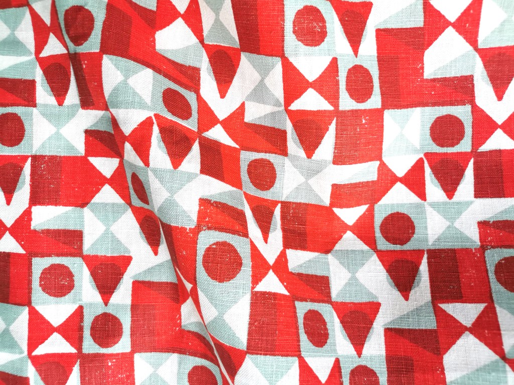
The theme of the exhibition is PLAY, and as a result the palette I created feels full of summer carnivals and fairgrounds. The overprinting of inks with differing levels of transparency provides a building of depth and subtlety of harmonious colour.
I created a number of one, two, three and four-colour prints initially, that featured the screen rotation in adding the colours. I then cut strips of the prints and with further rotation of the strips, interwove them into one base print that had been sliced to enable the slotting. I enjoyed bringing back an element of paper engineering from my book art practice into these new pieces.
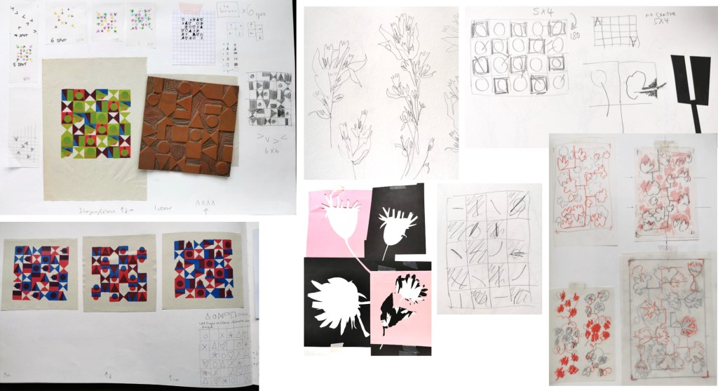
In designing each piece, I considered the placement of motifs and relationships of colour. The collection provides variation within a collective identity and belonging. Some pieces feature only triangular motifs, while most incorporate the circular and rectangular elements too. My research utilises design thinking by Lewis Foreman Day, and his distribution of elements. This approach results in scattered focal motifs that work across repeating patterns. Although this is not a feature of my new work, I recognise the placement considerations are also useful in this work too.
A number of these pieces will be for sale during the show.
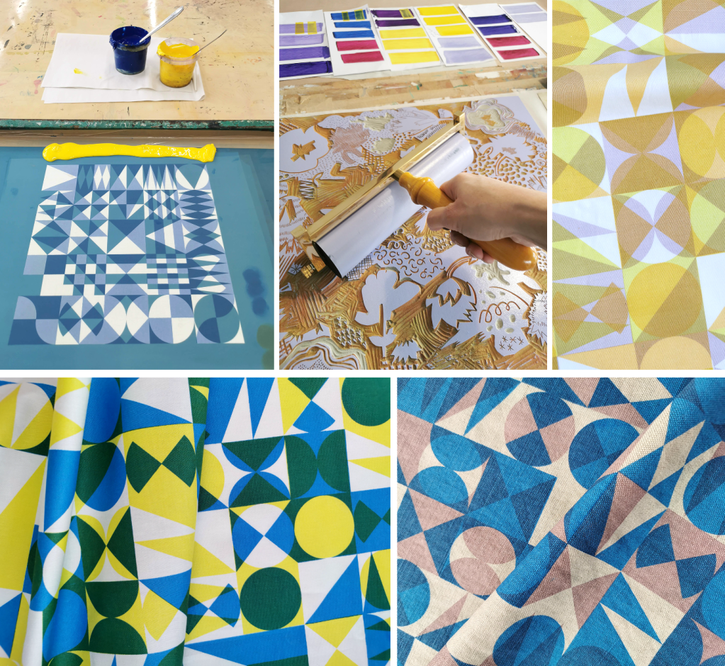
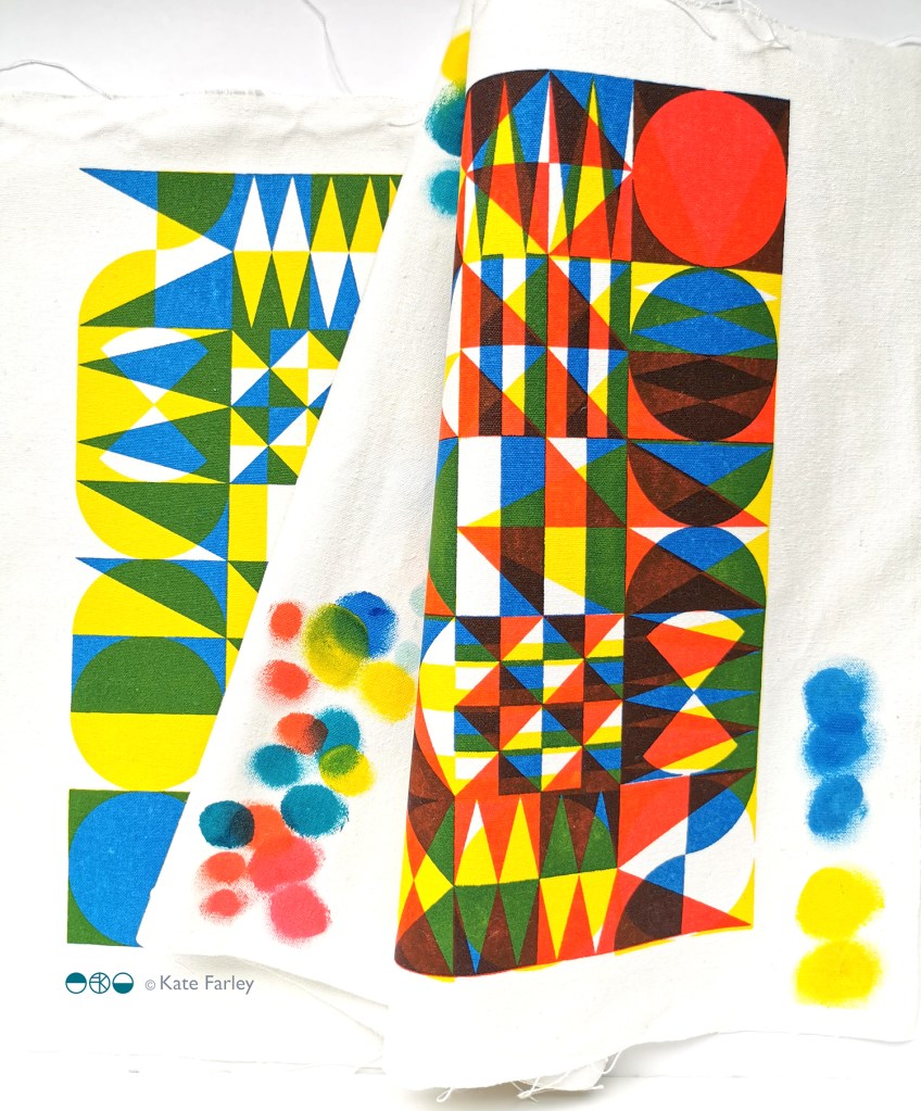
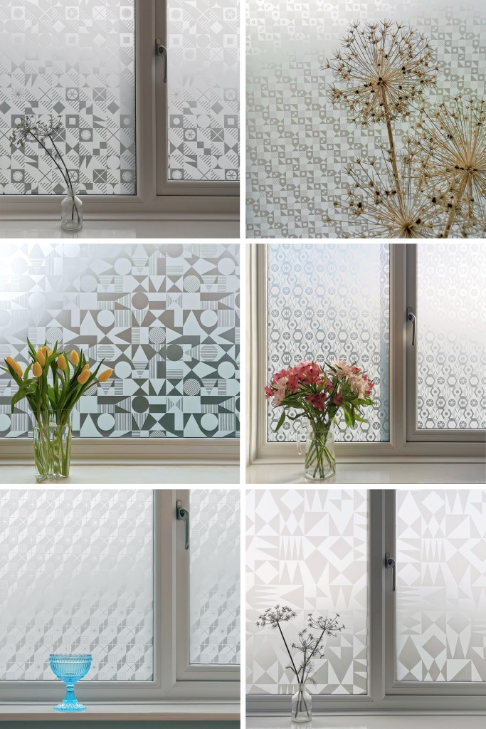
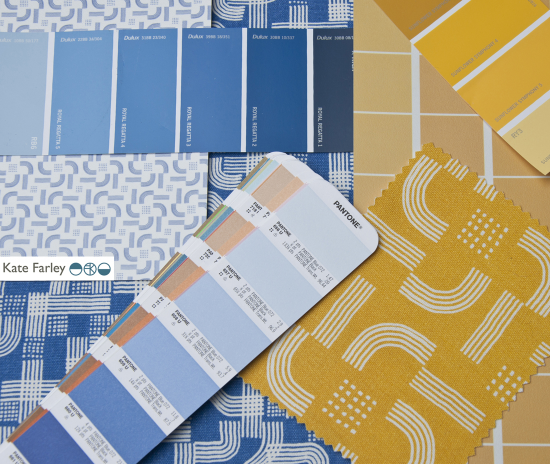
I’m excited to be finally bringing this collection of surface designs to market in collaboration with the Window Film Company. The inspiration for the patterns has stemmed from my fascination with geometric designs, taking the basic ingredients of triangles, circles and squares as my starting point.
I’ve been exploring geometric pattern structures in relation to design principles established by Lewis F. Day at the turn of the Twentieth century, exploring the equal distribution of motifs within a repeating tile to alter the visual rhythm within two-dimensional surface designs. I have also explored expectation and disruption within the repeat tiles. On establishing an apparent small-scale repeat, I play with unexpected shifts in the placement of motifs to disrupt the rhythm, challenging the sense of order. This work belongs to my ongoing practical pattern research as Associate Professor in Design at Norwich University of the Arts.
The six designs each have their own identity and yet belong together like siblings in a family, with shared features of geometric motifs and formal compositions throughout this collection. Some of the designs started their life as self-initiated physiotherapy back in 2020 / 21 following abdominal surgery and my subsequent recovery. The design challenge, to make small-scale lino blocks of repeating patterns to print by hand, provided me with small physical and mental tasks to focus on between the naps. I had hoped some of the designs would one day be leaving my studio, and I’m pleased and proud to share them now.
Designing for window film requires consideration of motif, shape and pattern construction without the aid of colour, requiring an absolute focus on negative and positive shapes. I enjoy working within design limitations in relation to production requirements and technical specifications, believing the challenges become design opportunities. I spent some time testing the various scale of patterns across the collection, including a micro pattern (Step), through to a much larger scaled pattern (Triangulate), considering window sizes in both domestic and commercial spaces in relation to the motif sizes.
I’ve worked with the very patient Steve at the Window Film Company for all my designs available on film, including the large-scale bespoke design for Birmingham Airport back in 2017. Previous designs from my Construct collection available from the Window Film Company won a House Beautiful award in 2018 too!
Steve worked with me to sample some of the early versions of these designs generated as digital scans from lino prints initially, but I didn’t like the visual quality in the translation of the prints. The original artworks for this collection were generated using collage and screen printing alongside the lino prints as I prefer designing with a physical relationship to image creation. After further consideration I opted to create each of the designs as vector-based files for production, providing sharp graphic quality to the patterns.
Mike at Window Film Co. was also fundamental in getting this collection established, off the computer, on to window film and ready for sale. Our conversations focused on understanding my design identity in relation to previous work. He ensured the designs felt authentic to me, while building on the existing designs I already license to the company.
It’s always exciting to receive a delivery of samples, and I’ve had a few of those over the last few months. The final product is very different to a digital file, so it is important to inspect the artwork as film installed on the window, checking the scale of repeat as well as any discrepancies in the artwork – you must have sharp eyes for detail! With final decisions made and sampling approved, as well as the small matter of naming the designs, we have been able to sign off the artwork, and launch the six designs in the collection: Circulate, Diamonds, Shift, Triangulate, Step, Pairings
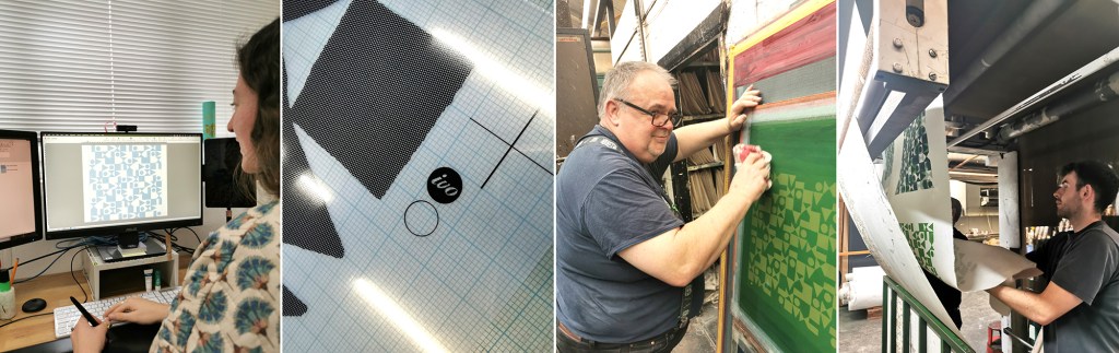
Part of my academic role at Norwich University of the Arts is dedicated to my research practice, exploring new knowledge in pattern and print design. Following on from the publication of my book I’ve been keen to get out in to industry and expand my practical experience of print production methods that could enable new ways of designing repeating patterns for paper and cloth. These visits also provide excellent opportunities for me to develop ideas for curriculum changes in the undergraduate course I lead, BA (Hons) Textile Design at Norwich University of the Arts, to ensure our graduates are competitive in securing roles on graduation.
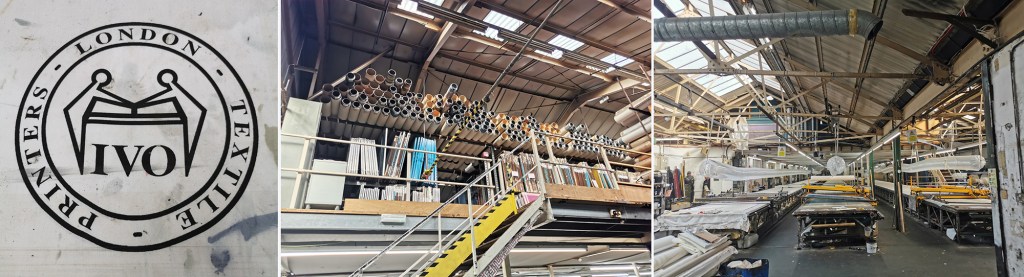
A couple of years ago I spoke to Director of Ivo Textiles Limited, Suzie Zatka-Haas following her visit to our stand at New Designers, a graduate showcase held annually in London. She was keen to understand the best way to promote opportunities in the company to graduates and we discussed the right terms and definitions to ensure textiles students were attracted to the roles. We also discussed the skills they value at Ivo’s and how we can ensure students understand the potential roles open to them, (we have had a Norwich graduate work at Ivo’s for the last few years). We are both passionate about printed cloth and Suzie invited me to visit the factory when I could fit it in around my teaching schedule.
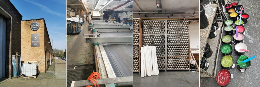
Fast-forward two years and I managed to secure some funding to spend two days onsite at Ivo’s to understand more about the technical constraints of the different printing processes they offer to clients. Suzie was brilliant in making this happen, being open to allowing me in to the factory to learn more. This felt very exciting but I wasn’t fully sure what I’d be able to help with although I offered to assist with anything. I was armed with my printing apron and old clothes—following advice from Suzie!—as well as my sketchbook of design ideas for my current research project in case I had time to talk it through with anyone.
The day before my visit I’d spent the afternoon with Marthe Armitage (blog post here) in her much smaller set-up so I knew this was going to be a contrast. Walking on to a large industrial estate in west London with huge lorries thundering by, the only clue of what was going on inside number 3 were some screen frames leaning up against the outside wall awaiting collection. I was greeted at Reception and my name had made it on to the board for the day.
Once the health and safety briefing was over I was led through the factory, trying to take it all in: sights, sounds and smells, and I was re-introduced to Maisie, one of Ivo’s designers that I’d met at New Designers last year. She was to be my host for my stay and ensure I didn’t do anything silly, like wander off and put my hands in the machines. I’m incredibly grateful to Maisie for her time and interest in what I am doing. We discussed university training, the Ivo design studio set-up and then I shared with her my project. It is so useful to talk it through with different people as they all bring ways of looking and new questions.
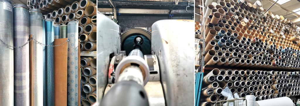
A full tour of the factory was next. There is a vast supply of cloth and screens in every space imaginable, alongside huge machines, some in action and some not, as the job list requires. The colouration department was a room of inks and colour swatches, and the colourist making and matching colour for all the processes. The colourist has been working for considerable time at Ivo’s, like so many there, they are absolute experts in what they do.
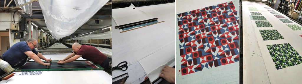
I saw the Flatbed printer working on my first day. Large flat screens raise and lower mechanically and the fabric is on the belt below, which moves along after every print is made for each colour to be printed with the subsequent screens. The belt is very long, with many metres passing by before all the colours are printed and the fabric heads off to be baked for the colour to be set at the far end of the table. I was busy taking notes and asking questions. That day a client was onsite to quality-control the printing before signing it off for production.
There is a large archive of artwork from decades ago, spanning the thousands of jobs that have been made here. Original acetates and drawings are rolled up in drawers holding the stories of design. I wasn’t able to photograph the examples – client confidentiality is important here, but it was exciting to see some key players of the 1960s featured. Maisie told me the incredible story of how Ivo’s came to be, and I met Michael, who’s family story it is, leading the company with Suzie.
Gali printing is a further printing process used at Ivo’s (the two tables with yellow frames in the picture above, right). The print tables are fifty metres long! The screens are set up in frames and are mechanically moved up and down, with a mechanised squeegee passing over the inked screen, before lifting up and moving down to the next place to print. It is carefully operated and requires skill and a keen eye to ensure everything is happening correctly with good quality each time. The screens are then changed for each colour and the same processes run again – the gali print operator will walk several miles in creating a ten colour design!
The process I was most intrigued to see was the Rotary printer. Unlike the flat screens, the artwork is prepared on a mesh that is on a cylinder (image below left). The circumference of the cylinder is the repeat size, creating a seamless repeat with fast production. A different cylinder is required for each colour, just as a flat screen per colour is required, but unlike flat bed / gali and hand printing, the squeegee sits inside the cylinder, and with the use of a magnet is pulled down to apply the pressure and add ink to the cloth through the mesh as it turns. Seeing these machines printing many colours at once is fascinating, unfortunately I couldn’t take pictures as it was printing for a client.
On my first day at Ivo’s I also saw a length being hand screen printed, but again, no pictures. It was a very slick operation that is clearly well-rehearsed!
Following the tour we returned to the design studio and I was introduced to some of the different design tasks the designers are involved in. A new graduate had recently started, Caris, so it was good to see her settling in well and enjoying her first professional experience, guided by Maisie. Putting original artwork in to repeat can take several weeks with meticulous digital design work using AVA software. Maisie upped the excitement by suggesting we could work on one of my designs that afternoon and have a day printing with Podge the Printer, a legend for those in the know – wow! Maisie prepped the artwork, with me taking notes and soon the screen positives were ready to be exposed.
Arriving on the second day, my screens were ready, Podge had prepped the table laying lots of fabric down for me to print on to. Podge is a character – we hit it off! At first he wasn’t quite sure what my research was about, but soon he was getting in to the spirit of it and suggesting options. He said it made a change to have someone exploring options rather than simply being in production mode. We chose some large screens from the archive to add a few tricks he had up his sleeve. Buckets of colour were mine to use. I had a lesson in printing the Podge way and he made sure I held the squeegee at the correct angle with hands over the top – he kept monitoring me so I had to stay on it! He also showed me the S-blade method of printing flat colour without the screen – surprisingly satisfying.
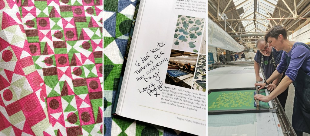
Factory lunch is a set 30 minutes and soon we were back in action. Each time I wanted to change colour, the screen was taken away to be washed / dried ready. I’m not used to having such (any) great service and support when I print in my own studio! It was a really productive day with many metres of fabric printed with several layers of colour, testing my research ideas. Podge’s son who spends lots of time on the Gali came to lend a hand at printing the larger screens, enabling me to try other prints over the top.
With the deadline to get my fabric set we had to stop printing, I watched as the fabric went through the baker and it came out very hot, but ready for home. I was exhausted, it was hot in the factory and I’d been busy on my feet since 8am. One of the last jobs was to ask Podge to write in the special copy of my book on pattern, as he was included in an image supplied by Fanny Shorter who prints here.
At the end of the day I caught back up with Suzie and thanked her for the opportunity she enabled me to have at Ivo’s. The factory has to run smoothly, meeting industry deadlines and costings for clients so to be open for me to learn from them and explore my research with their expertise was an absolute privilege – they were very generous. I headed home with a bag full of printed cloth and I ached all over from such a physical day, but with a head full of the experience I won’t forget in a hurry … Thank you all at Ivo’s!
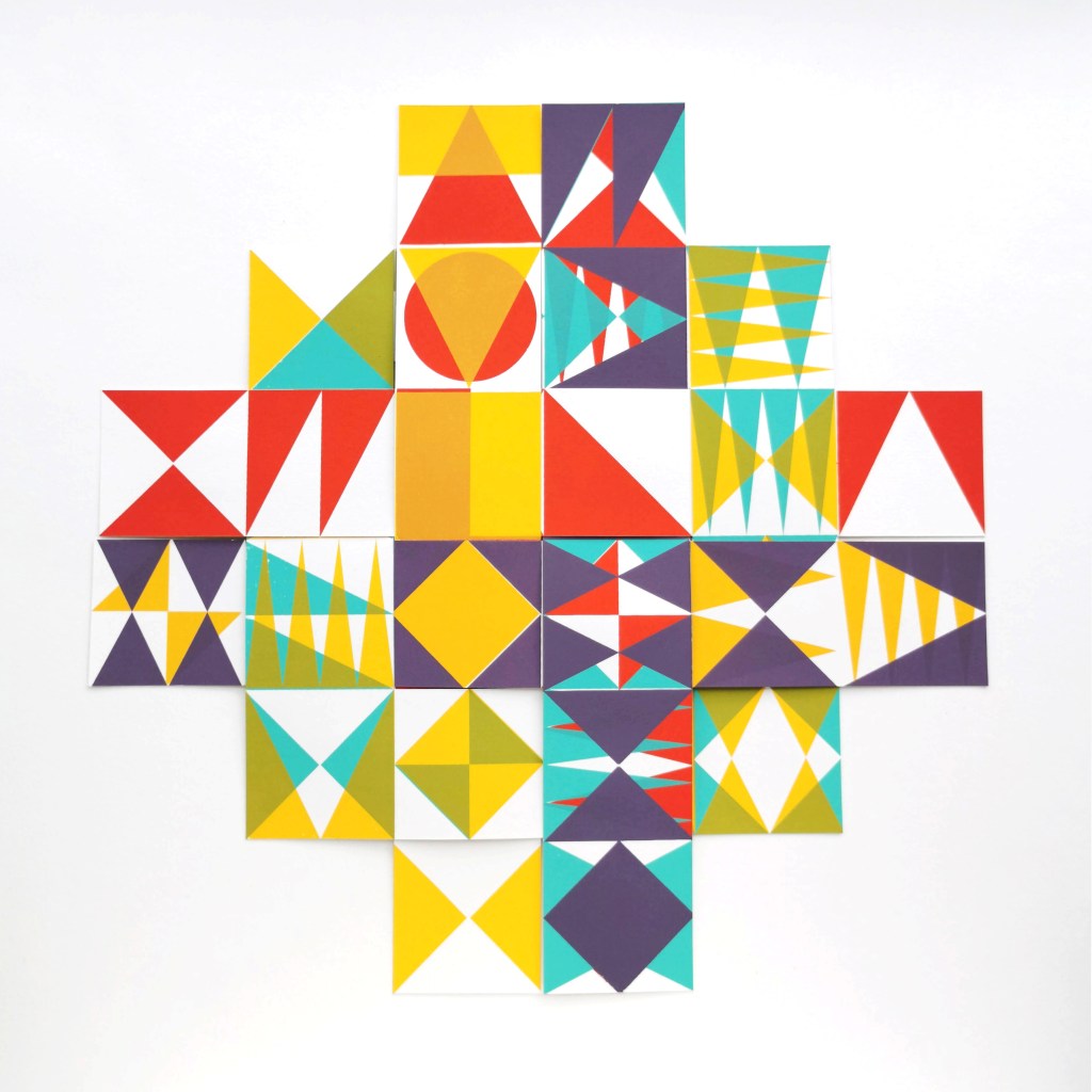
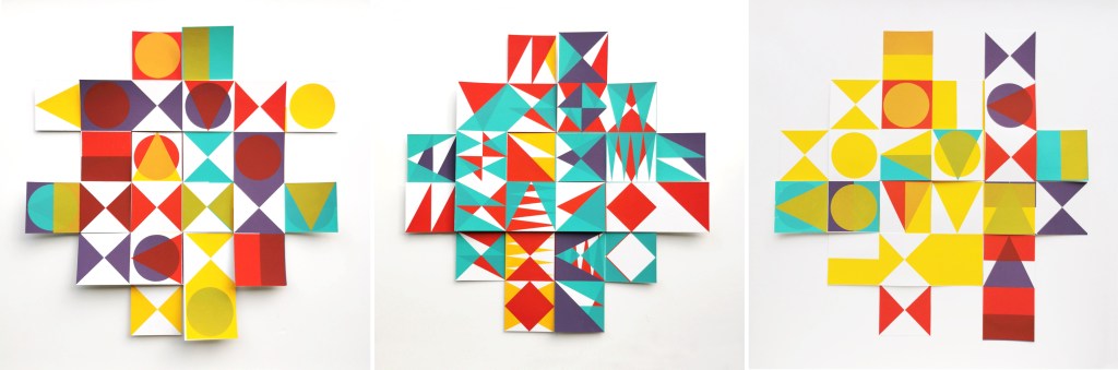
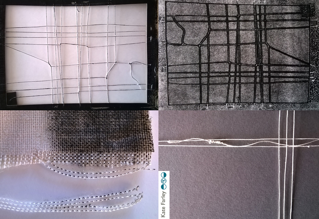
I’ve been keen to get back to designing and printing having spent my practice time writing and developing the book for publication over the last few years. I’ve been testing ideas of pattern evolution and pattern construction for some time in a limited way, specifically looking at pattern structure evolution through drawing investigations, but the ideas at the heart of this investigation have themselves evolved over the last couple of years.
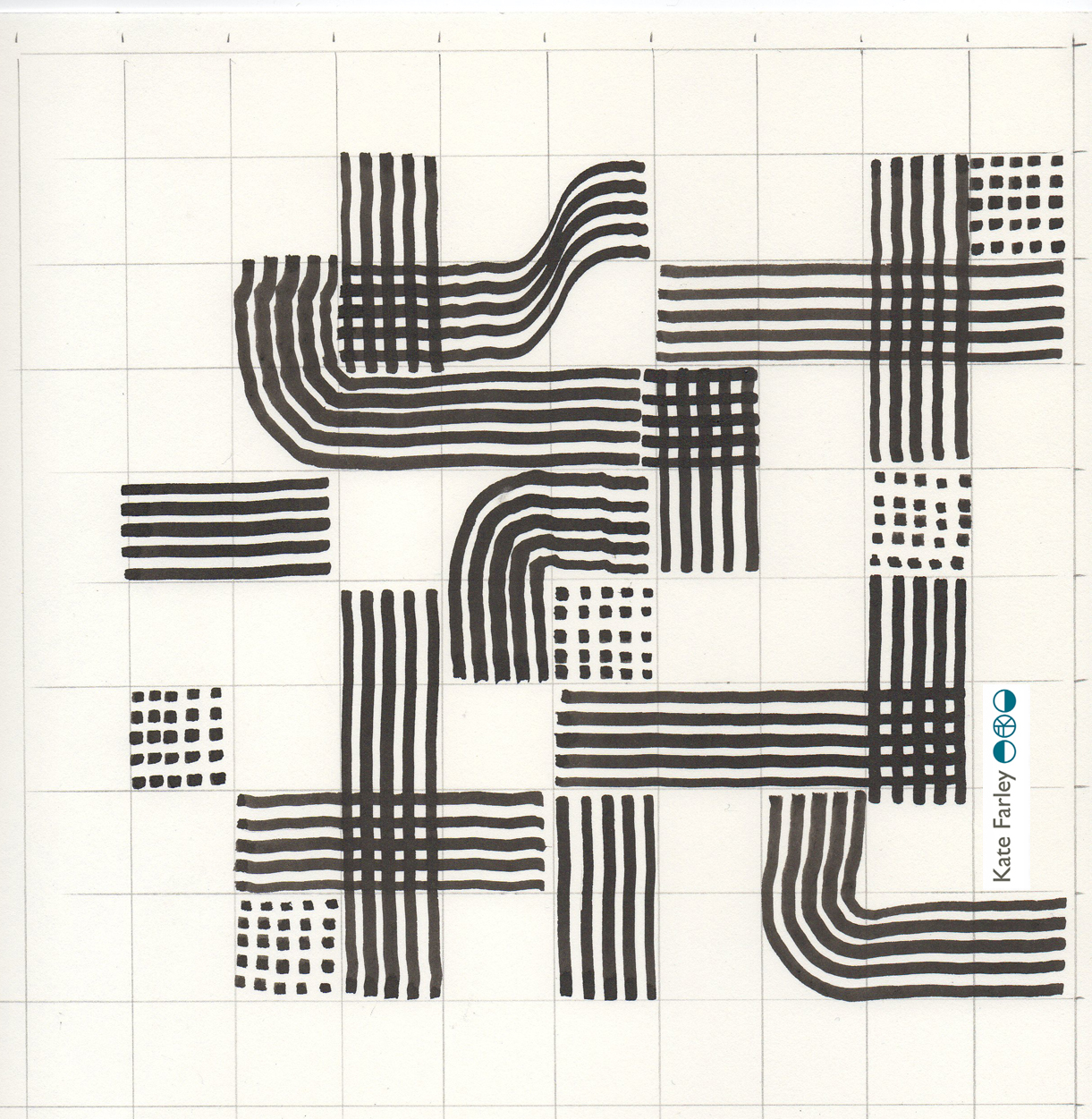
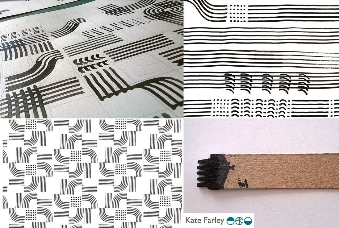
With more time and fresh energy I’ve defined a new project brief and research rationale, and I’m excited to have got off to a good start. I’m looking at repeat tiles and construction of pattern formations, so cut shapes and sketches were an obvious way in for idea development. I’m trying not to be too precious with outcomes at this stage, so I’m trusting the process.
I’ve started by testing ideas with geometric shapes as subject matter to keep the aesthetic clean and graphic, focusing on the laying down of colour blocks. I’ve started by working up some ideas for screen printing but anticipate many more drawings, maybe lino prints and certainly digital work will be created over time too. The colour palette will certainly change, but with an exhibition I’m making work for at the same time dictating pieces to be black and one other colour I’ve gone with black and green.
I don’t want to give too much away at this stage, but look forward to discovering the potential over the next few months.
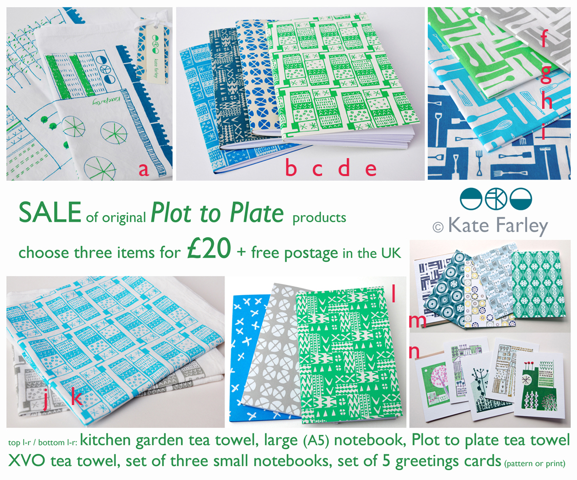
As I’ve had to move my studio I’ve put some products up for sale via social media in time for Christmas. Most of these products have been screen printed and made by me, and were the very first products I launched in the Plot to Plate collection. You can buy 3 items for £20, with free postage to UK addresses. All you need to do is decide which products in the picture you would like, head to https://www.paypal.me/KateFarley to pay the £20 or multiples of, list the letters relating to the items and add your postal address. I’ll notify you if any of the products are out of stock and suggest a replacement as appropriate.
Please note: if you would like to have the items before Christmas please order before midnight on Tuesday 18th December.
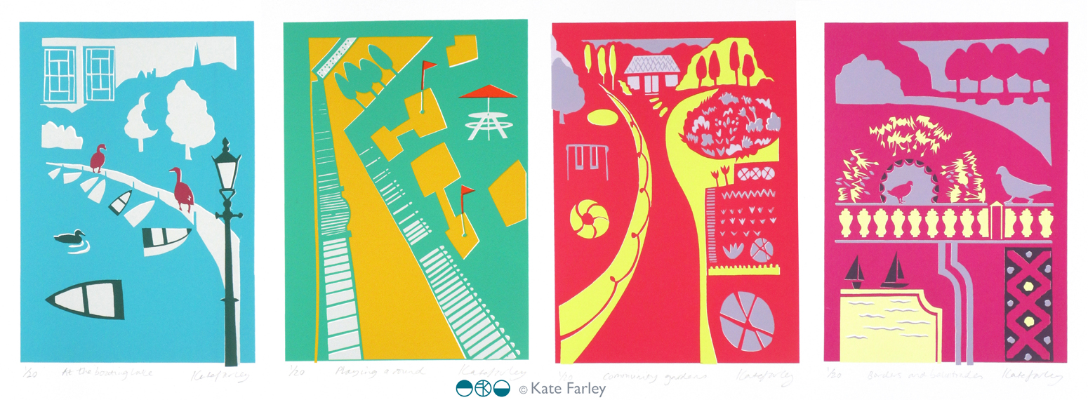
Following the success of my four posters for London Transport Museum, currently on the network of London underground stations, I have been asked by Michael, the commissioner, to edition the designs as screen prints. I jumped at the opportunity, and embraced the task!
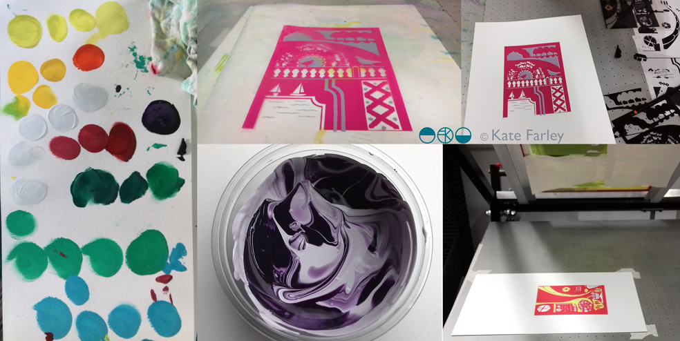
This has been an interesting challenge because although the artwork for the posters was made using paper cutouts, one great joy of digital print production means you don’t have to separate each colour to print; CMYK does it’s thing. However, screen printing requires far more consideration of separate colour on each of the layers as well as registration – the accuracy of each colour layer when printing. Overprinting can result in muddy colours if not fully considered. For the editions of prints I made some artwork adjustments on Adobe Illustrator enabling me to create the positive artwork for each of the four colours in each print, ready to expose photographically on the screens. You can see in my composite image, top right, the black print on acetates which are the screen positives, that I used to expose the images.
I love mixing colours to match my references and I take pride in not using colours straight from the pot, but to always see the nuance of hues. I make colours darker using purples and greens, rarely black. I used the final posters to get the right colours, and daylight is always essential. Ink and paper surfaces always give different qualities to contend with too. The final colours are certainly rather bright! Screen printing on paper is also very different to screen printing on fabric, so you have to get your head around the differences including remembering to flood your screen (pulling a layer of ink across) between each print, and using the vacuum on the print bed (to hold the paper firm).
However tired I am, when I am printing I am absorbed in the process – rarely noticing hours passing, and missing the need to feed. This is a good thing as my week as been ridiculously busy on all sides. Printing requires systematic thinking, and at least one clean hand. Preparing screens, mixing colours and registering each colour on the acetate first all needs to be organised. I love it when I’m in the rhythm of editioning.
A deadline to hand the first print from each edition to the commissioner this weekend focused the mind, and when trimmed, signed and wrapped I was really proud of the prints. I was even more pleased when I met up with Michael to give them to him. He appeared to be joyfully moved by the results – holding one print up to the fellow coffee drinkers in pride… phew! They are off to be framed and auctioned at a London Transport Museum event at the Victoria and Albert Museum later this week.
This whole project has taken so many months (years) to come good, but throughout the process I have felt trusted by Michael to do what I do best. He has great confidence in his choice of designers spanning the years, and allows us to get on with the job without interfering with the outcome. His twenty plus years of commissioning poster designers has led him to influence the direction of graphic artwork on London underground, creating the archive for the future through the choice of creative hands and minds, but not by telling the designers what to do. It takes trust and judgement on his part, but in turn I think I’ve created my best work yet. In the many conversations over these years I’ve had with Michael he listens, he wants to hear my opinion on things; we have good discussions – he knows about a lot of things. He also often gets carried away with future ideas and possibilities – I like that, we should all get excited by ideas. Thanks Michael!
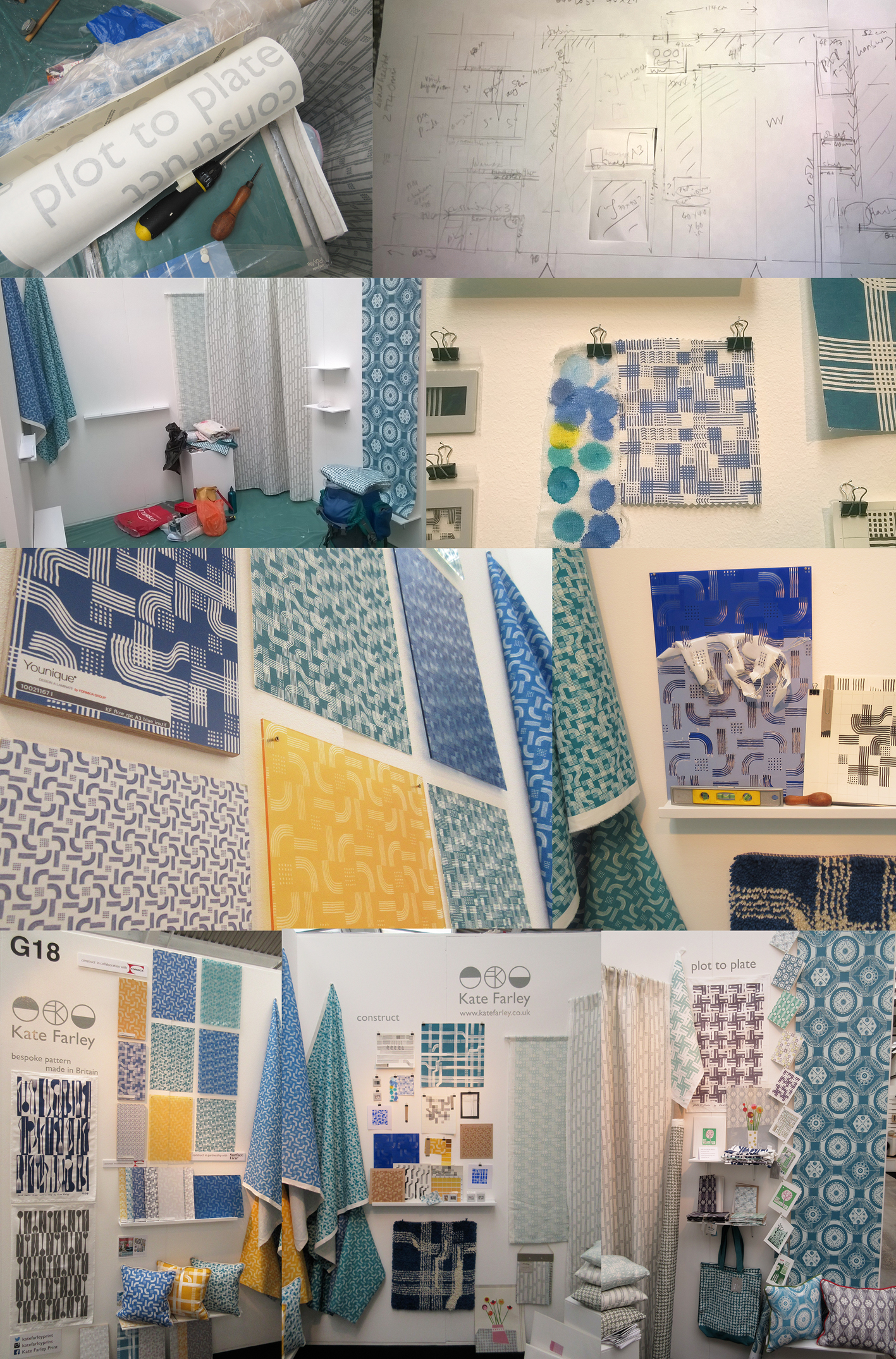
After months of planning, designing, making, printing, promoting and talking about the show… the time finally came… TENT LONDON! With very heavy bags, a display diagram, carefully planned tool kits, shelves, fabrics rolled, and so much more we set off to Brick Lane, London to put the show up. Our lives with small children are full of logistics, and this day tested us! Trains, tardy paint, luggage & childcare kept us busy and in relay between London and Birmingham so the show could take shape. By the end of the first day the majority of display items were on the right walls, fixed securely, and I headed home to the midlands.
The next day…. I set off again with ANOTHER heavy bag (these things don’t always get mentioned in trade show prep talks!) and completed the stand dressing, including the mood board for ‘construct’. It always takes longer than you think… I attached the vinyl, tidied up and left for a good nights sleep before the LONG first day of 10am – 11pm!
The first day of a launch / show is always exiting and scary. Will people understand the new work, and will they like it? This particular morning was not helped by being stuck in a lift across town with my dear sister and only what sounded like a fax machine to talk to. Eventually after 20 minutes we were told the lift engineer couldn’t get the door open, “you are in a precarious position”!!! I’m not sure what customer care training he had received about talking to distressed people stuck in a lift. For anyone in this job, do not use the word ‘precarious’! We got out after nearly half an hour…
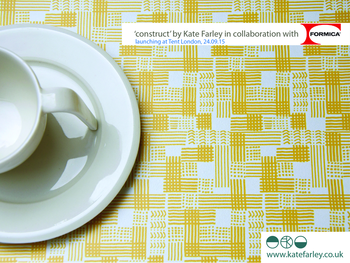
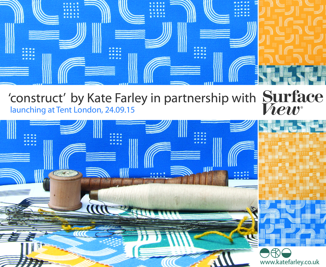
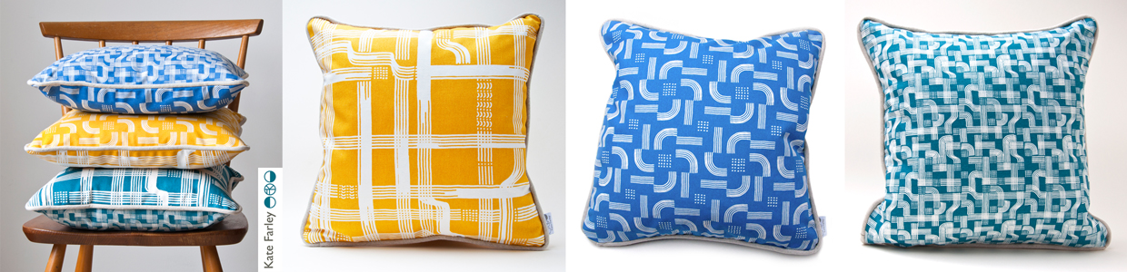
For the rest of the day I felt half an hour behind, but I launched my new collection with free limited edition screen prints which appeared to be gladly received by visitors. The collaboration with Formica Group was a really popular element to my new collection, and the mood board featuring my drawing tools as preliminary artwork inspired lots of really interesting conversations. Being a solo designer can be a very lonely, self-reflective existence so it’s great to get feedback from those you design the work for. Architects, interior designers, specifiers, stylists, press, retailers and many more visitors invested time to talk about all elements of my work, and for that I’m grateful. ‘Plot to Plate’ was launched in 2012 and has evolved over time to be a ready to buy interior and gift collection but ‘construct’ works differently. Only the cushions are available for immediate sale, and the rest is printed to order to allow for the distinctive element of the collection, the bespoke production. By working with Formica Group and Surface View my designs have been printed on a range of surfaces for the residential and contract markets.
When designing the stand I had to consider what I wanted to communicate and who I wanted to relate to. Over the years I’ve refined the ideas of what I want to do and the contexts in which I thrive creatively and this design show gave me the opportunity to put that understanding across. It was important to explain that I have lots of experience of creating bespoke pattern for clients and having just designed a new pattern for David Mellor celebrating the ‘Pride’ cutlery this was a great thing to show. It was really well received and orders have already been dispatched!
It is very hard work minding a stand of your own, by yourself for several days. Every show I’ve done has been helped by the wonderful community of fellow stand holders nearby and this year at Tent London was no different. I met kind and sharing exhibitors I hope to stay in touch with, and I will certainly watch and support their practices on social media with interest. Thanks to you!
I’ve written this previously too, but as ever, I was visited by past students of mine from both my CSM teaching days as well as BCU Textile Design graduates, some visiting to inform their practices, others in their roles in industry. It makes me proud! I am also pretty good at spotting students and as long as they don’t just grab the postcards I support their efforts and questions as they are being proactive and engaging with the industry. London Design Festival offers something for any creative so it’s good to support the next generation.
Last year I made a dress using one of my new prints, and I did the same this year, much to the delight of the Tent London ladies! It was a great way to demonstrate the flexibility of my print designs, and a good way to make conversations; it became my uniform.
I also won a design competition for tote bags at the show to be printed with a ‘construct’ placement print, so some lucky people have a very limited edition screen printed bag!
The end of the show has mixed blessings. After a long few days and months of preparation it’s great to have achieved a strong show – many kind people commented on how good my stand looked, but it also means the adventure is over, and it’s sad taking the show down, packing it up and saying farewells. Even in a few days routines are created. We struggled back on the trains with what we measured later as being 59Kgs of exhibition and assorted support luggage between two of us, ready to follow up the contacts made…. and to sit down!
So what have I learned?
I learned that I really am making the work that I want to make, and did manage to communicate that with the right people.
I’m really proud of both collections, and am delighted at the reception that ‘construct’ received
and latch hook rug making! I learned how to make a rug and now know why they cost so much… but really enjoyed making it… with British wool!
I learned how important it is to take risks, to put work out there to be judged… to keep learning
Thanks to all those involved: family helpers, the Tent team, Formica Group, Surface View, fellow exhibitors and for everyone who came to visit.
I’ve always started designing by picking up some sort of drawing tool, and exploring ideas that will have been developing in my head for some time. Concepts of pattern and purpose as well as communicating an idea using pattern is what really inspires me, this is no different for ‘construct’. A stunning image of lace in a book I was looking at while researching for one of my textile lectures on historical design caught my eye and an idea joined with other ideas of print looking like weave, as many people commented that my Plot to Plate VVV design did (left hand side of first image), when I was at Tent London in 2014. The seeds were sown.
I’ve never hidden my loathing for faux surface / material effect pattern such as printed wood effect flooring. Why do we have to lie, why can’t there be another stunning and suitable design alternative?! With this is mind I’ve played with the idea of taking textiles as a starting point for this collection with the intention of subversively adding textile-derived pattern to other surfaces but in an evocative statement rather than a digital print of textiles. This is not a collection that copies textiles, rather that textiles suggests a way to draw; provides a set of rules to begin playing with. The title ‘construct’ is a reference to constructed textiles such as weave, knit and lace but also refers to the putting together of a new way of thinking about pattern for surface, building a collection that has been designed to cross material specifications and provide bespoke solutions.
Having been working on my Plot to Plate collection and related prints for the last five years it was a big challenge to start from scratch and move away from the safety of a kitchen garden, but I was also excited about the challenge. I’d been working on some other pattern commissions and revisited drawing processes that had got me thinking. I didn’t rush to get somewhere; I designated studio days to play with thread, ink and paper. I created a sketchbook of so many ideas and directions but eventually I began to formalise ideas and work out which direction felt right for the collection. Some of the other directions have already been moved on to commercial projects, and the others I’ll revisit over the years as and when.
I usually sample patterns in black and white so I’m not swayed by colour rather than the success of the pattern. Having said that I was really adamant that blue was going to feature. Right from the beginning I was thinking of the strong Mediterranean blue of Greek churches, and the Blue Nude series by Matisse. Strong colour has been making a presence in interiors for a while, influenced by key exhibitions and trends. I knew I wanted to stay well away from Memphis colour palette and the reworking of 1980s colours. Sonia Delaunay has also inspired many designers and retailers thanks to the striking show at Tate Modern. I’m aware of trends, I have to be as an academic who teaches textile design, but I’ve never been inspired to follow them. I have my own creative path I’m on and I also would like my patterns to exist well beyond a season or two. Having said that one has to be aware of what drives buyers in retail to spend their money and for some it is likely to be informed by trends.
As those of you who have read more than this post might know, I like cutlery, and I can’t help laugh that the drawing tool that I’ve come to love is a sort of handmade fork! I’ve made many for this collection and they are so simple and inexpensive but all made by me to create exactly the right sized marks and the right sort of line. I’ve definitely got better at them. Weeks of testing many design structures and resulting rhythms left me with pages of patterns and the need to edit. Further weeks and I decided to test some screen printing on to fabric. Although I knew this collection was going to explore alternative surfaces I wanted it to work on fabric too. The weave of some of the fabrics was too dominant, and the scale of some of the patterns was less successful. Really valuable sampling!
I’d contacted and discussed collaborations with choice companies relating to my ambitions for the collection and it was very exciting to sample on a range of substrates. I really wanted to embrace the ‘bespoke’ capacity that several manufacturers in Britain offer as a way to provide interior designers and architects for example, a choice for their clients. Choosing from off-the-shelf surfaces is not always exciting – there are exceptions! I wanted this to be a collection of pattern in anticipation of the product. Ten years ago I was a winner in the Formica ‘design a laminate’ competition and it felt good to be in discussions with a company with such a strong heritage for pattern. Surface View also demonstrate a contemporary approach to wallcoverings and surface pattern, enabling me to discuss my intentions for the collection and the concept of bespoke production and it being met by expertise and clarity. Having carried out several public art commissions over the years I’ve become used to discussing colour systems and file types, tweaking of production elements to manage the different industry requirements. It’s good to have that experience behind me.
So here I am as Tent London is underway and I am extremely proud of the patterns that have made it to the final collection. There are repeat designs, small and larger scaled rhythms and placement patterns featured across the collection including a particular Tent London tote bag competition…. There are hand printed cushions ready for shop shelves or customers’ sofas and contemporary bespoke pattern for those wanting a graphic pattern rather than printed granite in their lives. The patterns can be licensed and collaborations can be discussed. Alongside all of this in order to fully convey the concept of the collection I’ve learned the skill of latch-hook rug making and committed many hours to mastering the skill of constructing pattern in yarn – not natural for me as a printer! I’ve sampled laser cutting and etching to varying degrees of success, I’ve made a dress for the show featuring ‘flow’ AND I’ve screen printed two limited editions of prints for launch day.
I’m interested to find out how it is received after so many solo months of nurturing, worrying and wondering. It’s time to let the pattern do the communicating…. do let me know what you think!