There are a flurry of exhibitions on and books out at the moment relating to Eric Ravilious and Edward Bawden, as well as their peers. Since the fabulous Ravilious show at the Imperial War Museum in 2003 / 04 curated by Alan Powers, it seems this really has been their revival. Certainly according to my social media feeds we are all loving this celebration of talent from days gone by, and many contemporary designers are inspired by the styles of these greats.
The exhibition, Ravilious & Co. at Compton Verney explores this network of friends and collaborators in an extensive and beautiful show of art and design pieces, demonstrating their skills, creativity and versatility across products and for varied clients. Having seen this show in Sheffield; a touring show curated by Andy Friend and the Towner Art Gallery, Eastbourne, and previously being familiar with much of the era’s iconic designs it’s nice to see some of the exhibits rather like old friends, as well as others new to me.
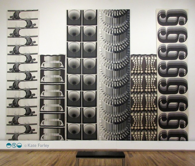
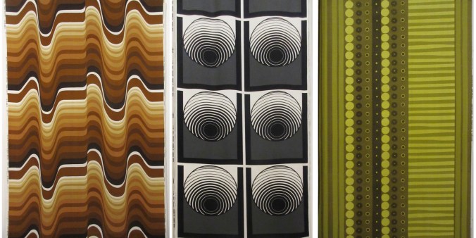
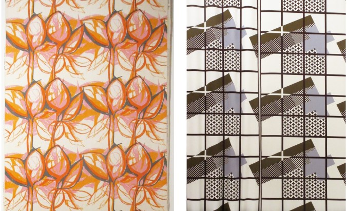
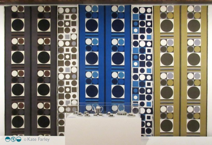
 images kindly shared by Compton Verney:
Eric Ravilious, Sussex Church, 1924. Towner Art Gallery, Eastbourne
Eric Ravilious, Portrait of Edward Bawden, 1930. Royal College of Art
There are also new pieces and names to discover. One thing that struck me was the talent of others in the group that have not received quite the same fanfare, but should be rewarded with the recognition – Helen Binyon in particular as a print-maker in my opinion. My notes recall ‘The Wire Fence’, 1935 specifically, such a beautiful interpretation of the subject through pattern and print. I kept returning to admire it!
A section of exhibition text also struck a chord for me. It stated that Paul Nash had “believed a good artist could turn his or her hand to many things – and would need to if they were to earn a living from their talent”. Nash had taught some of this new generation of designers at the Royal College and was also seen to live by this approach of traversing the landscape of art and design. Famous for his paintings both as a War Artist and not, he also carried out commercial design briefs for companies such as Cresta Silks (owned by Patrick Heron’s father) and Edinburgh Weavers (directed by Alastair Morton) and established the rather short-lived Unit One, bringing together artists and designers of the time.
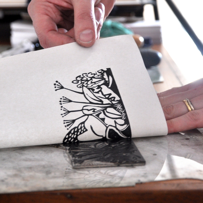
When the individuals such as Bawden and Ravilious turned their creative hands to making drawings and prints, or designing ceramics, book covers, end papers, posters, murals, fabrics and much more, they did so with such confidence and accomplishment – an understanding of each product, the form and audience, each outcome intelligently designed for the specific brief. This isn’t a case of one image translated on to multiple surfaces as so much of today’s designing tends to be – I feel strongly about this when educating my own design students! Don’t do a ‘Cath Kidston’, (not the only company to do this!) and apply any / every pattern to any surface, but consider the requirements and potential of each product, learn from the expert manufacturers about how the production of the image or pattern can work best, and learn from what has gone before while creating something of its time.
 Image details, photographs by Kate Farley from publications: Enid Marx by Alan Powers / Peggy Angus, by James Russell:
Enid Marx, study for ‘Spot and Stripe’ Utility fabric, 1945
Peggy Angus, Tile mural, staircase, Whitefield School, Barnet, 1953/4
Yes a designer can earn a living with their versatile skills, but I also have no doubt that Eric Ravilious, Edward Bawden, Enid Marx, Peggy Angus and others of this time thrived on the creative challenges of the commercial brief alongside their fine art practices. It’s known that Enid Marx liked the confines of designing Utility fabrics for the reason the design restrictions gave her boundaries to challenge. An open brief can be far more stifling! How would you hold the cup, turn the page or approach the wall, and how can pattern relate to the space? I love learning the particulars about each new production method or new application / context I design for.
Returning again to the subject of this particular exhibition at Compton Verney, items on show include drawing studies, proofs, original painting and drawings as well as commercially printed products. The most moving item was a letter from Bawden to Ravilious’ wife Tirzah after hearing news of Eric’s death, lost over Iceland on a mission as a War Artist, that demonstrated the strength of friendship the two men had for each other. Tears filled my eyes. It’s a big show, and it takes time – you will need to be fueled by cake!
My hope as a designer and educator is that this sustained interest in such a talented network of designers whose work reached across the public domain may rub off on the new generations of designers visiting this exhibition as well as on the vision and ambition of those who commission us too! While it’s lovely to see re-issues of these great designers work, I’d like us to move forward and create a new exciting design era built on this intelligence, empathy and skill. In the meantime, see this show if you can! It ends on 10th June – so get moving!
 Image detail, photograph by Kate Farley of plate by Eric Ravilious for Wedgwood
Also check out:
Edward Bawden at Dulwich Picture Gallery, London until 9th September 2018
Enid Marx, House of Illustration, London until 23rd September 2018
Bawden’s Beasts, The Higgins, Bedford until 27th January 2019