patterns: printed or not

My go-to process is print, therefore the majority of my commercial projects have included print outcomes, whether that is a commissioned limited edition print, wallpaper or my patterns available on Formica’s laminate. I design as a printer; thinking of layers of colour / texture / pattern, that build in stages.

I knew early on that paint brushes are not really my friends, not unless they have to be, not compared to a print roller. When I was introduced to printing I vividly remember learning mono-printing in particular. I fell in love with the excitement of the hidden surface. I love the detachment, the indirect nature of printmaking, whether it be a lino block or litho plate, they offer a space away from the actual mark making that creates the image.

I’ve been spending the last few weeks writing lots of words with my academic hat on about my design practice in relation to my teaching practice, and this has made me think about how I learn, as well as how I teach. My design practice experience is so integrated in my teaching practice, they work so well together. I can be in a business meeting learning about an industrial print consideration I didn’t know about for a specific product and immediately I’m thinking of how I can feed that knowledge in to a module on the BA programme I lead. In my mind it makes perfect sense for academics to be practitioners too, albeit with lots of juggling!

I love to learn, whether a process, a way to see in order to draw, or a new context to place work, I am excited about finding things out. It was this mindset that got me making rugs, to challenge my skills, and to test myself with another process that works with pattern, but with very different thinking. There has been much written about the need to play, but as designers it is so important that we take time to explore, to develop our thinking. This keeps ideas moving, and the sense of creativity at the forefront. I’m also fascinated how my patterns work across surfaces / materials, requiring consideration of colour matching, scale of motifs, line weight etc. and this expertise is learned as I work with manufacturers of different materials and products, and visit trade shows across the design sectors. Don’t get me started on brands that just print their patterns on every surface that sits still for long enough… my students hear this rant often enough!

I shall continue to explore, learn, design and teach… just after I’ve finished writing this next batch of academic words…

KFmaterialsBLOGpic120

Images from my ‘Threads’ collection (L-R:) Latch-hook rug, original lino print: Twill, and the same design on window film from The Window Film Company.
seeing red

My world is pretty colourful; on a daily basis I’m in contact with colourful textures, materials and surfaces from fashion, interior and architectural contexts. Not only do I work with hard and soft surfaces in my design practice, I also teach undergraduates to work with colour in relation to textile design. It’s important to see beyond the broad definition of colour by name and to think about the context of colour; the surface qualities in that colour, the effect the material has on colour, such as gloss, matt and opaque for example.

Last week I managed to update some colour charts in my studio resources and it made me think about how we tend to have particular favourites when it comes to colour. I certainly have a comfort zone in sections of the colour charts and other areas I’d have to be persuaded to go near. Commissions often include discussions with clients about the intended colours of products, and I enjoy the challenges of pushing the boundaries of my comfort zone – within reason! I have a different palette I’m happy to wear compared with what I’d live with, and I certainly dress in colour relating to the mood. I remember many years ago dressing in very colourful clothes only to receive a rejection for something that mattered. I felt gutted I’d dressed for the wrong outcome!

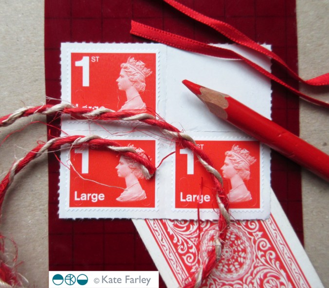
Here are some REDs… I love the border colours between red and orange.

katefarley_red_100


Modernist patterns in the making

Over the last few months, actually for most of this year, I’ve been working on a commission with the Barbican Centre London to create bespoke patterns for products in their newly developed retail space, ready to launch in the Autumn. It’s been a fabulous project as I’ve developed the designs with plenty of dialogue with Head of Retail, Adam Thow, to-ing & fro-ing by email. The brief has altered only slightly since the beginning and I feel really proud of what we’ve produced. There’s a more detailed interview about the project over on their blog.

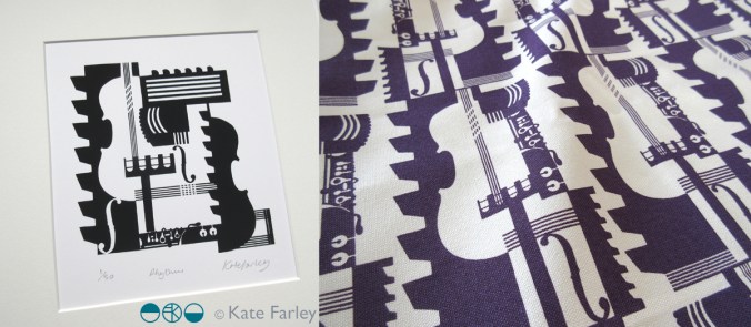
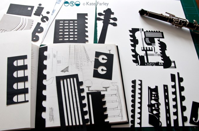
The idea was to explore the Barbican Centre, famous for its architecture, but to also include its activities as a cultural centre of music and performance. I explored lots of ideas and pattern compositions but settled on the idea of a sheet of music, and ended bottom right with the bold double bar lines. Within the patterns I referred to musical notation, and made links between the architectural features and those of instruments, including a violin and oboe, to create a sense of narrative, playing with strong negative and positive shapes. Each of the motifs were hand cut in paper, scanned in, and combined using Adobe Photoshop.

KF_Barbican_print_paperBLOG

Last week we shared the first images of the design work so I thought I’d share here too. The images here show my developmental design work above, and the final limited edition screen print and pattern for products. Visit @barbicancentre on instagram for more final product shots.

KateFarley_BarbicanPRINTPATTERN1200


Save