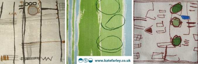
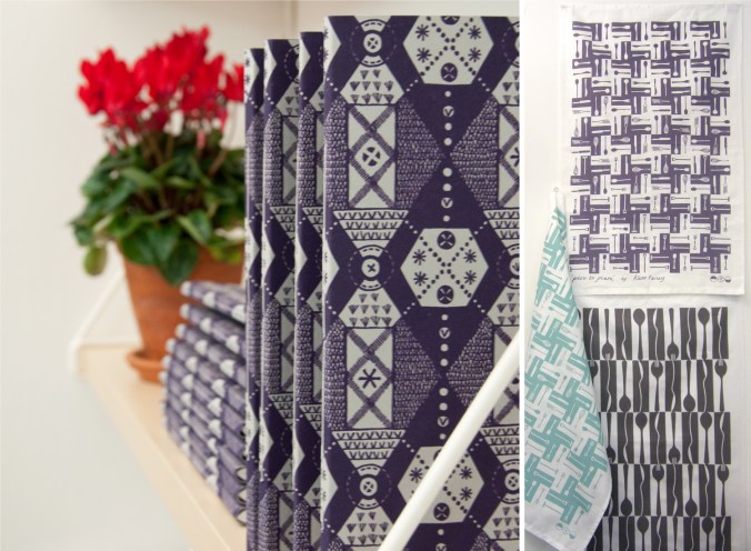
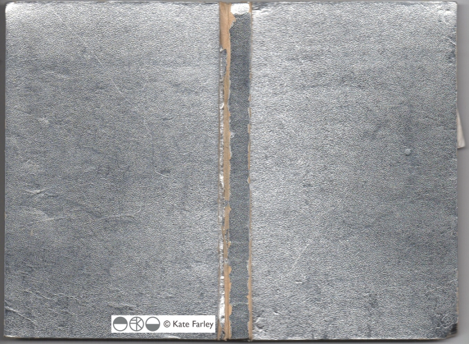
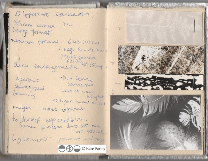
The season of textile design portfolios

As a student traveling up and down the country for interviews for a place on a degree course back in the mid 1990s I had little idea of what I would do on the degree course, let alone beyond the eternity of three years studying. My A1 black portfolio demonstrated my love of drawing, printmaking, pattern and ‘potential’. Now, in my role of lecturer at Birmingham City University each year I participate in the rounds of interviews to select the new members of our textile community and each year as I help them open the black A1 folio it reminds me of the journey I started all those year ago. The industry has changed, the world has changed, technology is utterly different and yet those nerves belonging to those individuals are as real as ever, and I remember that feeling so clearly. The unknown, the untrodden path I stumbled along; the Norfolk girl living in Leeds to turn drawings in to designs.

I’ve questioned most decisions I’ve made along the way, worrying about whether I should study art or design, printmaking or illustration, book art or textiles and yet somehow I seem to have all of those elements in my everyday practice, and that suits me fine. I remember the challenging task of confirming a description of myself and practice for my graduation show and degree postcard. (I opted for Artist / Designer, in case you wonder.) I couldn’t get the wording right, and really thought it mattered.

KF_degree_blog(images from degree study)

Having spent last Saturday interviewing students, on introduction I described myself to the visitors as a Printed Textile Designer, which in so many ways completely fails to describe what I do, but somehow seemed right to say at the time. Now I ask myself why it doesn’t fit and maybe I conclude that the term feels too predictable, so tidy, so comprehensive, and yet the thing I am most proud of in my career to date is the breadth of art and design experience I have gained, the materials I’ve designed for, the clients I’ve had, and the lessons I’ve learned, despite as a student, no idea that all that was possible on graduation.

Many times through the day I spoke with interviewees about their art and design experiences and came to realise that their own understanding of art and design had more to do with the educational delivery they were currently receiving and far less about how they defined themselves. An interesting conundrum, and after all that, does it really matter? What made me most excited about being part of the interview process was that all the students were starting out on their own journeys, some of which I hope I shall be involved in, and with the potential of a great course to guide them through, inspiring staff and great facilities they really can do all they understand they want, and so much more than that. Daunting, and exhilarating, and I wish them all good luck!

I didn’t know it at the time but the work I was creating all those years ago as a student still holds such relevance to me now, and it doesn’t matter what label I give myself, it’s all about the creative process, and I don’t worry about boundaries there…

Plot to Plate prints and patterns at Tent London

What a week! Several trips to London, lots of bubble-wrap, the wearing of a particular dress and stamina, all in the name of Tent London as part of London Design Festival 2014.

The preparation has taken months, alongside the development of patterns and printing I have worked on marketing & promotion, stand design, costings and sales. I’m delighted that my first commercially available wallpaper called ‘Hanbury’ (see previous blog post) has been really well received by interior designers, the public and the press and I look forward to working with really great people who have shown support.

The fabrics have been fairly consistently described as ‘restful’ and ‘calming’ with the muted colour palette being appreciated and described as ‘mid-century’ and ‘modernist’. Its difficult to know sometimes how much people want to know about the generation of pattern designs, but when I described the inspiration and showed the drawings and limited editions of prints of allotments that helped to generate the motifs there was a sense of pleasure and understanding, especially amongst the gardeners! The linens have been popular, especially the Plot to Plate VVV stripe design. I look forward to seeing these fabrics on chairs and hung as curtains in due course.

After months working away in the studio it’s been a great opportunity to have conversations and feedback, meeting like minded people and making the first steps to some fabulous opportunities and working relationships. Thanks to all who came by to meet me, I really value the feedback and support!

A huge thanks go to all of my sisters who played their significant part in keeping me upright, getting me and my work to where we needed to be, and keeping the children going. Thanks to Gavin, as well as Helen for living in the right place, and huge thanks to Stuart for being a great ‘intern’ – above and beyond!

If you didn’t get a chance to visit my stand here’s what it looked like…

KateFarley_Tent_N20_webKateFarley_stand_details1_1500web KateFarley_stand_details2_1500_web KateFarley_N20standdetail3_1500web

A new design: working it all out

I’ve created more designs than I can remember since I began ‘formal’ pattern making back in 1992. Some aren’t worth worrying about, some I’m still extremely proud of and some are still waiting for the right time to make their debut… (I can’t wait to show you some very special ones next year but I’m sworn to secrecy.)

Some designs work themselves out for themselves; I vividly remember shutting my eyes to get some sleep right in the middle of my final major project on my degree, when suddenly my mind spun in to action, and there in my mind was a design, colour separated and waiting to be drawn out for screen the very next day. Other designs I battle for days on, and eventually win through demonstrating more stubbornness than the design itself.  I don’t give up easily.

In all my designing, however hard or easy it was in the making, I aim for them to appear strikingly straightforward, as if they did just happen on their own. I was accused by a tutor for being lazy – he didn’t understand minimalism – when in actual fact, it’s far harder to let the negative space be as important as the motifs we can sometimes throw at a design like pennies to a pond. Space can be beautiful.

I’ve taken a slightly different direction to making the most recent patterns; some would argue they are more traditional, more formal, more fussy even. I’ve certainly battled with the minutiae. I thought it nice to share the journey a little, but do bear in mind, every dot, line AND space have been considered, reconfigured, tested, discussed and revised more times than I’m counting (and that’s before I even think about colour). I hope you like the results. The design will feature in my new work to launch at TentLondon in September, so watch this space.

KF_workings_1000web

The image shows: initial sketch / proportions of the motif, repeat / rhythm testing of the drawing before the lino block is cut, the lino block being printed, and the final digital artwork. The inspiration is a mix of kitchen gardens and formal gardens of the National Trust.


Communicating Colour

Evocative, technical, predictive, informative, for matching, mixing, ordering, cataloguing, of materials, surfaces, finishes, whims and traditions…

Working across the fields of surface design, textiles, public art and fine art I have come across many ways to represent colour in order to communicate qualities. Whether it be for perfecting a match for production, or generating an evocative palette for a client, each niche within the industry has its way of doing things. Black for the Northern Line, double yellow for no parking, gold for the winner, and red for wrong. From Global Color, to Farrow & Ball, Pantone to Berisfords the language of colour is key. Some give codes, other names, sometimes a swatch, others a smudge, universal, local, a science and an art!

Seductive, formal, in a book, or on a card, each help to create the colours in the world around us, and while the skills of the individuals choosing, producing and matching will no doubt be overlooked by most, may the colours continue to sing, calm, provoke and much more.

I’ve brought some of the various forms of colour I work with together to brighten up this grey, wet Monday in February.

communicating-colour_web

Kate Farley – Plotting Prints at Tinsmiths

It is a very exciting time for me. It has been about two years in the planning and preparation stages and now we are a week in to my show at Tinsmiths. For those of you unfamiliar with Tinsmiths, it is a beautiful textile and lighting shop in the lovely Herefordshire market town of Ledbury. It is a beautifully considered shop, owned by Phoebe Clive, selling a wide range of fabrics as well as home wares, crafted pieces and artists prints.

I have worked closely with Phoebe to translate my lino printed designs inspired by allotments, to become a collection of heavy weight linen, hand screen printed textiles available to buy as cushions. We have also created larger showroom pieces as curtains and upholstered chairs in preparation for selling some of the designs by the metre later in the year.

Phoebe and the team have styled my products throughout the top floor of the premises in such a way as to create a clean and fresh interior space, working with the other products and furniture pieces in the shop. My prints and drawings are set amongst other exciting colour statements in the form of ceramics & lighting with an understated aesthetic. With plenty of positive feedback at the PV as well as sales throughout the first week it’s a really exciting reward for the long journey to this point.

Tinsmithssofa_web

cushion2_tinsmiths_web

glassdisplayTinsmiths_web


cushionsTinsmiths1web curtain_tinsmiths_webchair_tinsmiths_web

the end of one season and the start of the new.

At the start of the harvest time last year I shared with you our first crops of the season. Today I cleared the brassicas that have been under attack from pigeons all winter – much to my distress, and planted in their place the potatoes for the coming year. It was a sign of handing over the baton to another year of potential, involving the weather, our effort, opportunities for head-space and the reward in what we get to eat.

Each year we start with a revised planting plan, more back ache, a new set of gloves and opportunities for me to draw and record the plants to provide further inspiration for my art and design work. As I have also spent the last few days designing, cutting and printing new lino blocks, the creative process of doing so reminds me very much of being a gardener; working with the elements and using knowledge, intuition, skill, time and desire to create something from small beginnings.

I remain positive about the growing season ahead, surely there cant be as many slugs and pigeons this year… can there? And as for cutting lino, I’m in it for the long haul.

plotplates_web

allotments2_web600

Art for all – good design for all

My design ethos is one of quality and appropriateness for the place. Good design should be all around us, big and small, the dot on the i, the cushion on the sofa, the roof on the building – no excuses. Why settle for second best, why copy others if you can be original? It is so sad to read of big companies risking reputations, not buying the best but producing poor quality copies – stealing designs. My students tolerate my monologues on the subject!

This blog entry celebrates some examples of quality design – because that’s what we should all aim for when making but also when buying. I have come across a great book called ‘Art for All’, telling the story of London Transport Posters. The book has black and white reproductions as well as colour, but the real charm is in the illustrations from original engravings of birds by Clare Leighton, printed in a salmon pink, as well as illustrations by Eric Ravilious (see below).

Image

Image Image

(Art for All – London Transport Posters 1908 – 1949, Art and Technics Ltd. London, 1949)

The quality of design in these images is inspiring, with a great sense of detail without being fussy, and such skill in creating these images in only one colour while containing so much information of texture and pattern. I admire these artists but also the people who commissioned the pieces and enabled these images to be ‘Art for All’. As an aside, Both Leighton and Ravilious produced stunning designs for Wedgwood too.

It makes me think of my own practice and how I generate imagery using drawing and printmaking to create the visual language. Yes, the computer plays a large part in ‘tweaking’ for final output / reproduction these days but it’s the marks and textures, the print quality, a smudge of graphite, that cannot be created by computer. It might be quicker creating the whole image on the computer but it wont be as good as I want it to be. Having said that, it is also the creative process of working out, testing and feeling the work resolve on paper that I most enjoy. Was the design process meant to be easy? Its the struggle and questioning that keeps me doing what I do – I’m enjoying the journey. When so much time as part of having a design practice can be spent on the computer it is important to remember to turn it off and walk away to DO the creative things…and to get better at it…

sharing the design process of Plot to Plate

Given that I am about to take my Plot to Plate collection of designs to Top Drawer this weekend I thought people might be interested in the design journey of ideas that result in such a collection of pattern.

My ideas tend to belong as series of thoughts that I explore in a number of drawings over months, and sometimes years. I challenge myself to explore many ways to represent the same things, often resulting in simplified motifs, some would say scribbles. Drawings are often in rather utilitarian handmade sketchbooks that are not precious so there is no fear of the white blank page before I start. Sometime, in fact quite often, I draw while walking, and trying not to look conspicuous or weird as I track my way round a National Trust kitchen garden, almost creating a diagram, literally a planting plan as I go. Sometimes I make notes in my drawings, of colours, names of plants from the labels in the ground, or note references to research at a later date.

The titles of some of my designs are: xvo, xo, xxvv and these come from the shorthand I created in order to document gardens and allotments as I paced.


In the studio, and for sometime after I dwell, I study, I revisit the motifs, rhythms and compositions I gathered, I redraw, formalise and create new pieces, as one-off drawings in series to exhibit and sell. Some compositions lend themselves to self-contained lino prints or screenprints and so I spend time developing the designs, cutting the plates, and enjoying the process of editioning. I could never imagine getting bored (my edition sizes are small!) of lifting the paper from an inked block, each time to discover the image. So low-tech, yet engaging.

At this point I notice elements that can be scanned in and reworked in Photoshop or Illustrator software to create repeat designs and colourways for further potential – and this is how I created the design collection of ‘Plot to Plate’.

The Plot to Plate signature design of garden, kitchen and dining tools also came from my playing with the dog-tooth check as a classic rhythm, and my keen interest in telling a story as a visual narrative. Pattern can of course be pretty, but I enjoy the challenge of asking it to communicate something beyond itself. In this instance my drawings were made directly for this purpose and I translated them for screen.

I hope the images explain the fun I have had, and the pride that I feel in this collection.


More examples of prints and drawings can be found on my website gallery pages

www.katefarley.co.uk

Save

sneak a peek

In the run up to my adventure at TopDrawer as part of Spotted I thought you might like to see some of my latest printing. It’s all systems go for my ‘Plot to Plate’ collection as I print, stitch and prepare for my stand SP6. If you plan to visit the show between the 16th and 18th September at Olympia, London, do come and say hello.

http://www.topdrawer.co.uk

Pom pom pom…

It’s been a long wait, but today our first Dahlia of the season has opened its petals and shown itself. This is a huge success given the battle of the slugs that I have been fighting – organically mind. We have more to come but today we celebrate – by morning it may well have been felled by slugs or rain.

I’ve been rather keen on dahlias for years and have admired the huge borders that the National Trust are able to show off at this time of year. I hope they are sharing in our success. The long border at Baddesley Clinton is usually well worth seeing and I think Packwood House may also have some. The second and third photos are from last summer – note sunshine! I also include an image of ‘pompom’, an editioned lino print I made a while ago, having been inspired by the dahlia season. Long may they bloom!…