Springtime shopping of Plot to Plate gifts

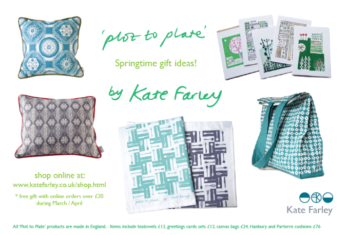
My ‘Plot to Plate’ collection inspired by gardening is celebrating Springtime with a special offer in my online shop. For orders over £20 placed during March and April there will be free gifts included.

All products are printed and made in England. Tea-towels, bags as well Hanbury and Parterre cushions are screen printed. Greetings cards are printed with British paper.

KateFarley_springtime16_Plottoplate

print progress

Recently I have been really busy with a variety of academic duties in Birmingham and further afield, taking me away from studio time, my freelance design practice, and of course blog writing. Also, in my teaching of Textile Design at Birmingham City University I have been leading a module of professional practice, assisting the students in learning about the life of a freelance designer. It’s definitely a double-edged sword, as the discussions between students and staff illustrated: It’s great to be your own boss, but you take all the blame when things don’t work out! You can get up when you want, but nobody pays you for just waking up!

The rhythm of freelance work is varied. Somehow it’s often the way of things that several deadlines coincide, and when you have a schedule to stick to, an urgent press request comes in. On the day you have time to make calls, those people are out of the office, and obviously you don’t get paid when you take a holiday. Yes there can be tough times, but I really like the variety of the weeks’ activities that freelancing gives me, certainly set in tandem with the academic life of very different demands. Each practice informs the other. Obviously there are freelance tasks I prefer and other ones I procrastinate over, lists are created, social media is checked and Radio 4 is listened too!

KFarley_knit1_blog.jpg

With so much to-ing and fro-ing on trains this last month or two and with several commercial projects on slow-cook I decided to give myself time to make, test and resolve some ideas that I have been exploring, with paper and print. The activity of printmaking is a fabulous discipline to work with. I love the excitement of planning a new print, and composing the plate, often taking me back to sketchbooks and previous ideas. The physical process of cutting the block can also be absorbing, and therapeutic and I have to decide the paper stock, the ink colour, and edition size too. It is important to maintain an experimental, inquiring practice and my prints and drawings are the evidence of ideas that have sustained my creative practice for the last twenty years. Between the commercial constraints of projects shaped by clients, costs and repeat patterns, printmaking can seem so free from limitations. This is why I make sure I keep printing – the creative sort, not just the invoices!

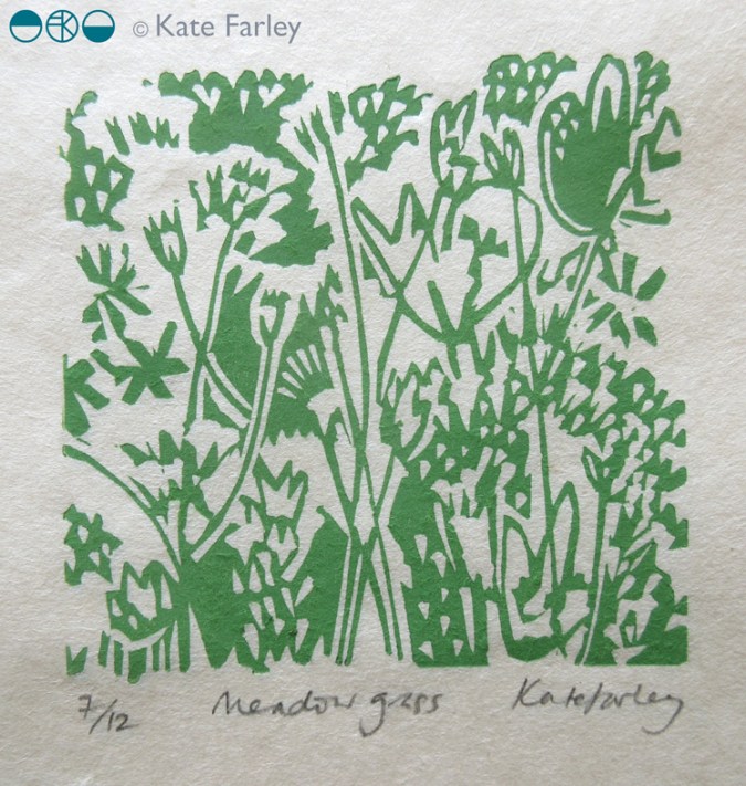
both prints featured here are available to buy, at £46 each unframed.

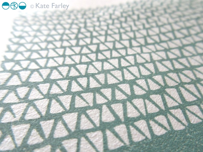
Knit 1, edition of 15, lino print, 9.5 x 9.5 cm print size

Meadow Grass, edition of 12, lino print, 9.5 x 9.5 cm print size

KFarley_meadowgrass_print_blog


printed mapping

Printed interpretations of landscape have been a challenge in my practice from the beginning, and really formed the backbone of my practice during my degree course in Printed Textiles at Leeds College of Art and Design in the 1990s. I explored various ways to represent the world around me, and although it might seem odd for those aware of my drawing, as there is little similarity now, I was really inspired by the Norwich School and painters such as Cotman and Crome. I saw the way they formed shapes of colours as elements in the landscape and I set about creating contemporary versions of Kirkstall Abbey in Leeds in term-time, and rural Norfolk in the holidays.

Over the years my focus has shifted from rural to urban, resulting in more geometric, grid-like patterns, fighting the urge to be illustrative. As Print Technician at Central Saint Martins I used to create mono-prints including embossed features, representing the Farringdon skyline and dominant buildings. I also explored experimental processes, such as liquid emulsion and photograms of drawings on acetate in the photographic darkroom. I had a fantastic year on a part-time printmaking course at the London College of Printing (now Communication) at Elephant & Castle, and despite a broken elbow I produced many prints including lithographs, screen prints, collagraphs, etchings and lino prints. The expertise of the staff, and the discipline of the day a week of technical experimentation was a brilliant thing.

KFarley_landscapePRINTSweb

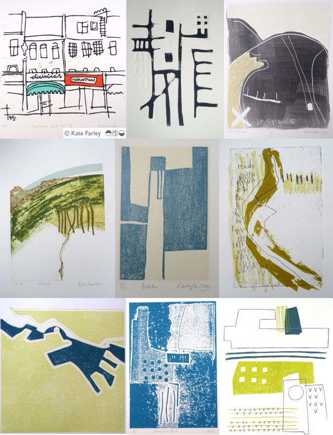
The images above include some of the many ways I have printed the landscapes I’ve experienced, and show some of the ways that I play with line, shape, texture and colour. Those of you who have seen my drawing evolve will probably recognise a preferred line quality, or mark I favour, the economy of mark, and visual rhythms. I am also interested in perspective, elevations and mapping interpretations. I continue to explore landscape in my ongoing sketchbooks, as part of commissions, but also because I simply want to draw and capture the flat fields, the lines of fence posts, and sweeping hills interrupted by a barn.

KFarley_landscapePRINTSbooksweb

I’ve also created many editions of bookworks over the years, and although I’ve written about them here before, I thought I’d include the ones predominantly featuring printed journeys. I love the way the sequence of pages, and folds of paper creates narratives through a landscape. Again there is maybe a familiarity of line quality, and drawn shape, as drawings, prints and books are often developed together, as part of the same creative process. Working summers in France, familiar territory in London and train journeys are regular inspiration for the books shown here. It is a challenge to design the book to work with a particular sized printing plate or sheet size of paper, considering grain direction and readability, but I enjoy the problem solving. Drawing and image has to work with structural content.

Often what is occupying my time in terms of design collections actually grow from ideas explored in those pages many years before. I like to see my relationship with landscape as the constant in the variety of what I do. Having spent some days in the country during the recent holiday I have refuelled that desire to draw horizons again.In hearing of the death of Ellsworth Kelly I am reminded of how instrumental he was at showing me how to see pattern in the environment we live in. I owe the excitement of the journey to many artists who themselves have worked hard to capture the places they know… Patrick Heron, Ben Nicholson, Eduardo Chillida, Eric Ravilious, to name a few.

Since creating these works on paper I show here (some over fifteen years old) I’ve launched ‘Plot to Plate’ and ‘Construct’, but they wouldn’t be here without the many sheets of paper before them. Who knows what else is in store in the next few years…

print pattern show up and down… at Tent London

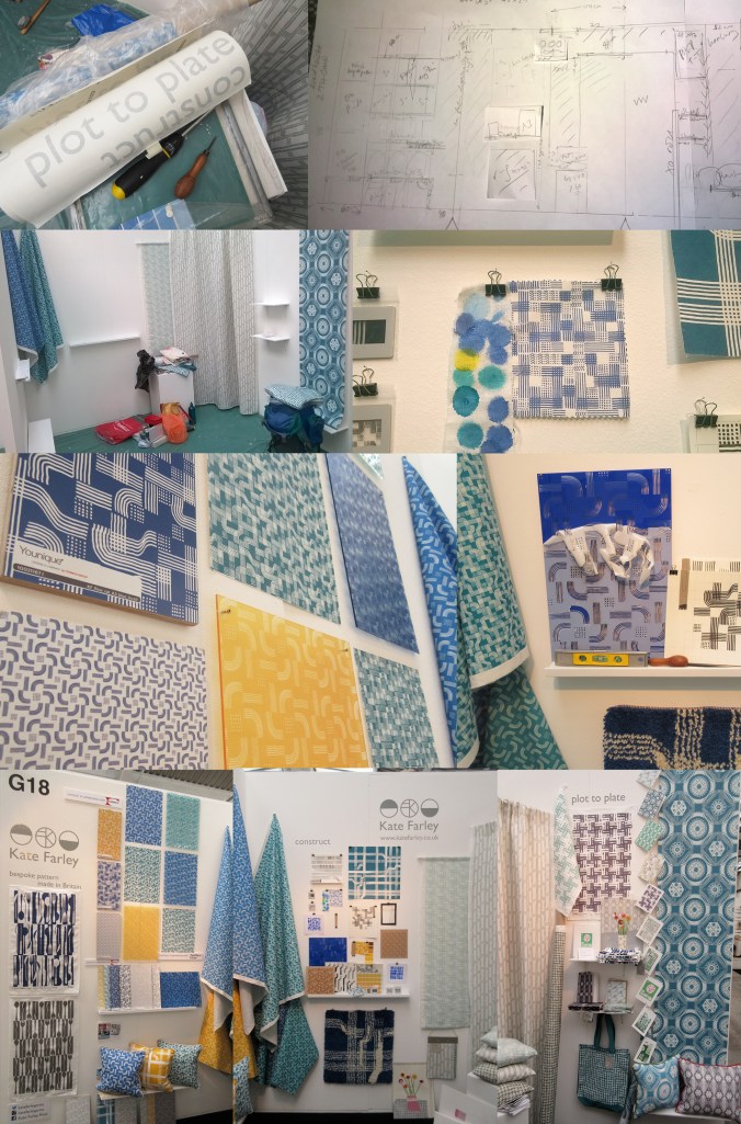
After months of planning, designing, making, printing, promoting and talking about the show… the time finally came… TENT LONDON! With very heavy bags, a display diagram, carefully planned tool kits, shelves, fabrics rolled, and so much more we set off to Brick Lane, London to put the show up. Our lives with small children are full of logistics, and this day tested us! Trains, tardy paint, luggage & childcare kept us busy and in relay between London and Birmingham so the show could take shape. By the end of the first day the majority of display items were on the right walls, fixed securely, and I headed home to the midlands.

The next day…. I set off again with ANOTHER heavy bag (these things don’t always get mentioned in trade show prep talks!) and completed the stand dressing, including the mood board for ‘construct’. It always takes longer than you think… I attached the vinyl, tidied up and left for a good nights sleep before the LONG first day of 10am – 11pm!
KF_tentstand1_G18_15web

The first day of a launch / show is always exiting and scary. Will people understand the new work, and will they like it? This particular morning was not helped by being stuck in a lift across town with my dear sister and only what sounded like a fax machine to talk to. Eventually after 20 minutes we were told the lift engineer couldn’t get the door open, “you are in a precarious position”!!! I’m not sure what customer care training he had received about talking to distressed people stuck in a lift. For anyone in this job, do not use the word ‘precarious’! We got out after nearly half an hour…

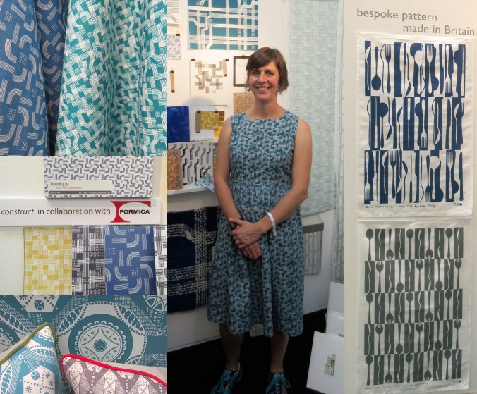
For the rest of the day I felt half an hour behind, but I launched my new collection with free limited edition screen prints which appeared to be gladly received by visitors. The collaboration with Formica Group was a really popular element to my new collection, and the mood board featuring my drawing tools as preliminary artwork inspired lots of really interesting conversations. Being a solo designer can be a very lonely, self-reflective existence so it’s great to get feedback from those you design the work for. Architects, interior designers, specifiers, stylists, press, retailers and many more visitors invested time to talk about all elements of my work, and for that I’m grateful. ‘Plot to Plate’ was launched in 2012 and has evolved over time to be a ready to buy interior and gift collection but ‘construct’ works differently. Only the cushions are available for immediate sale, and the rest is printed to order to allow for the distinctive element of the collection, the bespoke production. By working with Formica Group and Surface View my designs have been printed on a range of surfaces for the residential and contract markets.

When designing the stand I had to consider what I wanted to communicate and who I wanted to relate to. Over the years I’ve refined the ideas of what I want to do and the contexts in which I thrive creatively and this design show gave me the opportunity to put that understanding across. It was important to explain that I have lots of experience of creating bespoke pattern for clients and having just designed a new pattern for David Mellor celebrating the ‘Pride’ cutlery this was a great thing to show. It was really well received and orders have already been dispatched!
KF_tentstand2_G18_15web

It is very hard work minding a stand of your own, by yourself for several days. Every show I’ve done has been helped by the wonderful community of fellow stand holders nearby and this year at Tent London was no different. I met kind and sharing exhibitors I hope to stay in touch with, and I will certainly watch and support their practices on social media with interest. Thanks to you!

I’ve written this previously too, but as ever, I was visited by past students of mine from both my CSM teaching days as well as BCU Textile Design graduates, some visiting to inform their practices, others in their roles in industry. It makes me proud! I am also pretty good at spotting students and as long as they don’t just grab the postcards I support their efforts and questions as they are being proactive and engaging with the industry. London Design Festival offers something for any creative so it’s good to support the next generation.

Last year I made a dress using one of my new prints, and I did the same this year, much to the delight of the Tent London ladies! It was a great way to demonstrate the flexibility of my print designs, and a good way to make conversations; it became my uniform.

I also won a design competition for tote bags at the show to be printed with a ‘construct’ placement print, so some lucky people have a very limited edition screen printed bag!

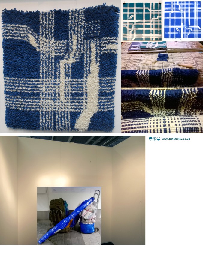
The end of the show has mixed blessings. After a long few days and months of preparation it’s great to have achieved a strong show – many kind people commented on how good my stand looked, but it also means the adventure is over, and it’s sad taking the show down, packing it up and saying farewells. Even in a few days routines are created. We struggled back on the trains with what we measured later as being 59Kgs of exhibition and assorted support luggage between two of us, ready to follow up the contacts made…. and to sit down!

So what have I learned?

  • I learned that I really am making the work that I want to make, and did manage to communicate that with the right people.
  • I’m really proud of both collections, and am delighted at the reception that ‘construct’ received
  • and latch hook rug making! I learned how to make a rug and now know why they cost so much… but really enjoyed making it… with British wool!
  • I learned how important it is to take risks, to put work out there to be judged… to keep learning

Thanks to all those involved: family helpers, the Tent team, Formica Group, Surface View, fellow exhibitors and for everyone who came to visit.
KF_tentstand3a_G18_15web

teaching for them and for us

I’ve combined my academic career with my art and design practice since the late 1990s and I’ve felt that each informs the other. Some weeks I’ve wished there were more hours for one than the other, but the two occupations are, for me, valuable and complementary to each other.

My art and design practice is one of learning, journeying and discovering new ways to look, to draw, to interpret the world about me in a visual, drawn or printed language. I feel as if I’m on a really long adventure that won’t stop until I get put in a box. Each commission, or self-established project offers a small experience that builds the bigger lesson that takes me further along that creative path to who knows where. Facilitating the discovery of this excitement in creative exploration is what drives me to teach students in Higher Education.

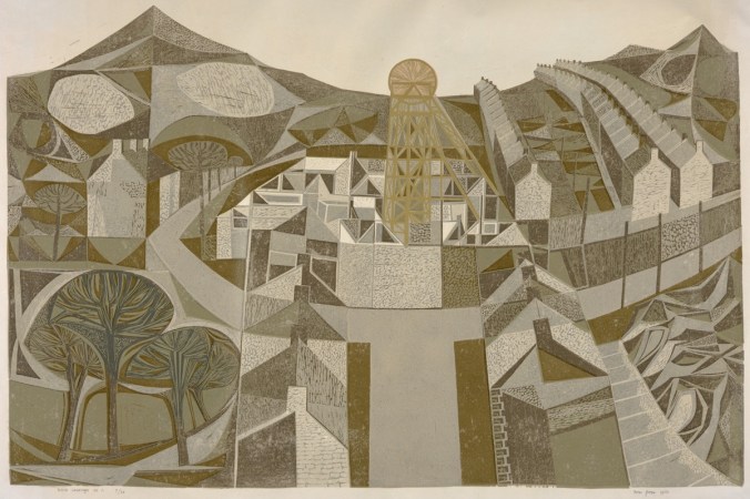
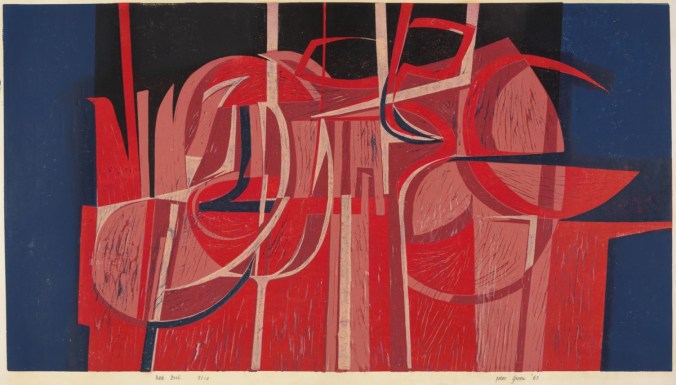
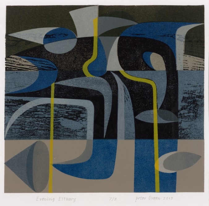
I have recently visited the excellent Peter Green exhibition: Sixty years of printmaking, at Mascalls Gallery, Kent (the exhibition has just finished I’m afraid), which got me thinking…  It was made clear in the design and content of the show (St. Judes and Emma Mason Gallery with Mascalls Gallery) that Peter combined his printmaking career with an academic one, and a high achieving one at that.

Printmaking is such a physical experience, and although simple in principle, the intricacies of a process and resulting prints can be hard earned. The exhibition of Peter Green’s work really demonstrated the pleasure of investigation, of material, colour and surface quality, not as passing ideas, but as a sustained dialogue between practitioner and process, and between ink and paper. The exhibition showed the drawings, the printing plates, the tools, the sampling and final resolutions. Peter’s vast experience and significant creative journey was evident; and through the exhibition I felt as if he is teaching us to learn from him, not for the technique, but for the commitment and value of doing and pursuing something. I believe that this is fundamental in teaching, whether in formal education or not.

Simon_Lewin_56

It was interesting to read in the catalogue that accompanies the exhibition that he said, “knowledge is about common ownership […] we should learn from each other.” This is how I feel about my relationship with education. We should not be masters to preach the skills and experience, but instead we could share in the experience of learning together. That’s not to deny that someone needs the skills and experience in the first place, but the attitude of someone like Peter who clearly enjoys the creative journey will inspire those a step or two behind him. I think it’s important that those who teach are also those who do.

Simon_Lewin_02

I strongly believe that there are no short cuts, or right answers along the path of art and design. There is no ‘one’ way of doing things. Sadly, so many students come through school thinking they are looking for the tick in the box, the correct result. We try at degree level study to nurture in them the understanding that you learn far more by investigating, questioning and journeying, rather than heading straight for one destination. This is again echoed in Peter’s investigative approach to printmaking – the finding out along the way is as important as the final state.

I read in the catalogue that Peter had moved away from wood engraving as a process as it required a more calculated journey and pre-determined images. I think I work like this too, looking to uncover the solution rather than to execute the obvious, not with wood but as a designer. This makes me think of new or less experienced teachers over-planning and worrying about the outcome of a session; what the students will achieve at the end, as a tangible result. Those with more experience and confidence in their teaching and the learning experience can take risks with that journey of learning and therefore participate rather than dictate. This sounds comparative to Peter’s more recent prints that evolve over time without the planning, but with an open-ended investigation. The exhibition celebrates sixty years of Peter printmaking [today in collaboration with wife Linda], so with such a busy and extensive journey the prints are an exciting archive of process and investigation, with common themes, colour relationships and familiar motifs in evidence during this time, as well as textile designs more recently in collaboration with St. Judes.

No doubt those of us who live with creative practices do so for many reasons, and those of us who teach will each tell of reasons why we do too. The combination of a creative practice and a teaching role is, in my mind, a really good combination, a two-sided relationship, where hopefully the give and the take work themselves out for the benefit of all! Thanks to Peter for reminding me of that good partnership as we embark on another academic year…

Simon_Lewin_36

Thanks to Simon Lewin of St. Judes for permission and access to the images of Peter Green’s prints:

top: Welsh Landscape No.1 1960

middle: Red Night 1963

bottom: Evening Estuary 2013

Useful links:

http://www.mascallsgallery.org

http://www.stjudesprints.co.uk

http://www.emmamason.co.uk

redesigning the ‘brand’ self

I’ve been out in the ‘real world’ so to speak for nearly twenty years, and while I found that such a scary idea during my time at art college, having little idea of what I really wanted to do, now I realise it’s okay.  I look back and remember so many exciting things that I’ve been up to and so many great people I’ve worked with that I am grateful for living the portfolio career in art and design.

I made the choice to lead an academic career alongside my own practice and both really support each other. I am sharing and honest in my own learning experiences from industry working across art and design contexts. The students’ creative journeys also inspire the creative investigation in me. We talk of ‘branding’ and ‘professional identities’ in the Second year that I am currently leading in the Textile Design degree course at Birmingham City University, and consider how we and others see us and what we can control and what others interpret. I’m not a corporation or multinational company and yet the word ‘brand’ is commonly used for the self-employed too. Language used in promotional material as well as social media build a story, whether we like the tale or not. Does my design integrity come across? what about my inspiration? is the market level clear?…

I’ve been redesigning my website over the last few months. This is always an opportunity to ask myself more questions, and to reflect on where I’ve come from, where I’ve been and where I plan to go within the world of design, and specifically pattern. I’ve been excited by the process. I’ve chosen headings / page titles that more accurately reflect my current practice and edited substantial information relating to projects of years gone by. I’ve made it more image-based and updated text, again to reflect the shift in my design practice interests. With social media being a really key part of building a ‘brand’ these days this process has been happening as I go, but I’ve finally embraced instagram, having enjoyed Twitter over the last three years.

So, for all the bookbinding workshops I’ve led, the public consultation exercises I’ve participated in, the colours and materials I’ve sourced, the flowers I’ve drawn and the prints that I’ve pulled, this is where I’m at now…

katefarley.co.uk

KFarley_making_blogcut

Plot to Plate printed pattern at Pulse 2015

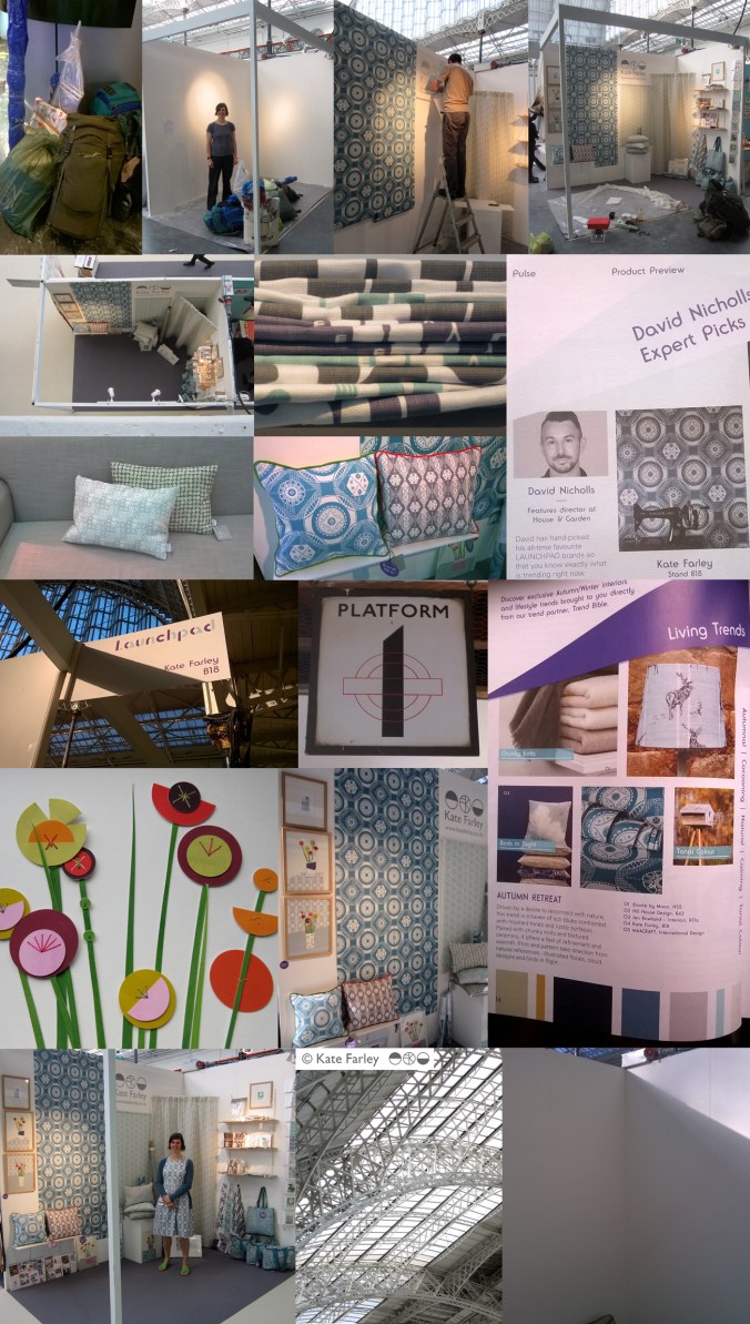
It always takes far longer to prepare for a trade show than it does to be there but I thought I’d show a bit of the journey of my show. Rather substantial worries kicked in the night before when we feared the contents of my stand were not able to be carried by two human beings, and more worryingly, not allowed on the train to London. Somehow we managed what felt like a physical endurance test, in fact it was… and began to make it my home for the next few days. Olympia is a stunning building to spend time in and we got the show up in a few hours, ready for the off… and there was still time to admire the London Underground graphics at Earls Court.

The Plot to Plate collection has grown substantially since its first trip to Olympia when I was showing in the Spotted section, at Top Drawer back in 2012. I am delighted that the new Hanbury and Parterre cushions have been well received by visitors to the show. These are hand screen printed and then sewn in Birmingham by social enterprise Textiles by St. Annes. The patterns are inspired by National Trust’s Hanbury Hall and Gardens, near Bromsgrove. The Hanbury wallpaper was also popular with interior designers visiting the show and Plot to Plate VVV was the most admired of my fabrics. My ‘parterre’ show dress was also much commented upon, with orders keen to be placed!

I was pleased to be an ‘expert pick’ by David Nicholls of House and Garden in the Pulse Preview and also chosen by Trend Bible in the trend section of the show catalogue.

It was also a pleasure to meet ex students of mine, graduating from the Textile Design degree at Birmingham City University, as visitors to the show in their industry roles, and I could still remember their names! How nice of them to say hello and make time to find out what I was up to.

The new friends made of the exhibitors beside me was really special. Such a supportive group of people, helping out, freely sharing trade insights, generally lovely people really helping the show be a great experience. The end of the show, although a welcome relief to the hours of standing (I really couldn’t carry a chair on the train!) was almost a sad time, as we stripped the walls bare, packed up our belongings, said our farewells and left, with the most ridiculous load I ever plan to carry. Maybe I’ll start making paper thimbles!

Thanks to all who visited and thanks to all who helped along the way! Here are the images which represent in some small way the few days at Kensington Olympia, May 2015.

`KFarley_pulse15

floral inspiration for textile patterns

One of the reasons I love to teach students drawing for textile design is the journey of enlightenment when introducing someone to the world of not only looking, but also of seeing. There are many ways to see when drawing and I’m really interested in the journey from reality to abstraction, whether its a state of mind, a way of transforming or whether it’s a methodical process applied to something in order to arrive at a motif for pattern.

My drawing process has evolved over years of practice but the way that I see is not so different to two decades ago. I remember reading the book ‘Drawing with the Right Side of your Brain’ by Betty Edwards and realising that I already did that and it all made sense. I enjoy playing with perspective, elevation, mapping of whatever it is I’m drawing, whether it’s a landscape or twig. Turning the three-dimensional thing in front of my eyes in to a two-dimensional drawing is always exciting, and challenging, but that’s half the fun. I think the process of printmaking that I further translate my drawings to really suit the clarity of motif dissection, separating colours or specific details on separate blocks or screens for printing for either a limited edition print or commercial textile design.

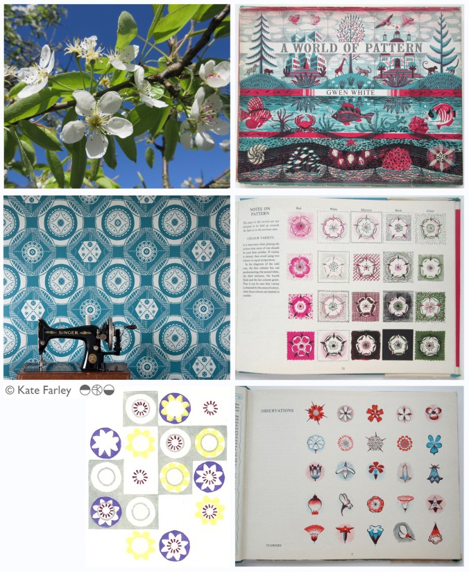
Each year the pear blossom at the allotment arrives and each year I’m reminded of how perfect they are in all ways. The beautiful petals and the bits I don’t know the names of, all there, waiting to be celebrated in drawing. No doubt Charles Rennie Mackintosh would have made an exquisite watercolour and graphite study. The flowers also remind me of drawings and prints I have made in the past, and not only of blossom, but of flowers that I make diagrammatic in a way to understand and explain the ingredients of the flower. When I discovered the work of Gwen White, and particularly the book ‘A World of Pattern’ I was excited to see someone else communicating what I see and how I translate form to pattern. This method doesn’t suite everybody and it would be a dull world if we all made drawings that looked the same, but every now and then it’s nice to know that my creative brain works like someone else’s brain and that my eyes see what others have seen before me.

KFarley_drawing_blossom_blog

Pear blossom, photograph, Kate Farley

‘Hanbury’ wallpaper, Kate Farley

Passiflora, lino print, Kate Farley

illustrations from Gwen White’s ‘A World of Pattern’ (RH column)


Design inspirations 3: winning games

I have always felt that one’s upbringing has a huge influence over the aesthetics of that designer. The house, the landscape, the products and fabrics that are present in the early years; everyday things, that at the time may not have been seen as important then can be blamed or celebrated in the later career of artists and designers. No doubt plenty of people would disagree with me, that’s not the point. I can clearly see a link between my own aesthetic, and my upbringing, and I’ve written about it in the past- read here  &  read here

On a trip back to the family home in Norfolk I came across the old games we used to play and was mentally transported back years before, simply by seeing the beautiful graphic qualities, clean lines and visual communication that I hold dear in my own practice. My visual language doesn’t necessarily mimic those designs but it’s more of an approach, a set of values & expectations that I set myself. We can expect things to be very different in the future with such digital aesthetics taking firm hold of so much of every day lives for my children and those of tomorrow. From how we create art and design, to how we view it on screen as well as on fabrics and surfaces much is very different. It is not necessarily a criticism of today, but more an appreciation of the inspiration I had and continue to thrive by. I sincerely hope that there will be art and design education in place over the next few years which will inspire the future textile designers, setting the benchmark for beyond that.

Here’s some of the graphic wonders. Red is a very popular box colour and it’s worth noting that many of the games proudly state they were made in England. Pieces were metal, wooden, proper card, nicely printed and beautifully boxed… there, a bit of nostalgia too! It also might be worth noting that in the ‘careers’ game The Arts was kept firmly in the box while ecology, sports, politics and big business made it on to the cover of the box!

KateFarley_games_blog


photographic memories and a bit of a political rant…

I’ve had rather a large sort through my creative archives in the last few days and I’ve been rediscovering drawings and designs from the last twenty years and more. I’ll share some of those finds another time. Amongst the formal sketchbook projects and portfolio sheets from art college days I found an old handmade notebook I used to record my photographic experiments and darkroom technical details / testing in. With it’s silver cover I chose to use, especially fitting with photographic techniques, I was reminded so distinctly of the days I spent in the dark room at Leeds College of Art and Design testing ways to create images and pattern – I could almost feel my Doc Martin boots on my feet!

silver photogrpahybookLCAD

The book reminds me of the hours I ‘played’ with creative and technical processes, with no sense of employ-ability issues burning, and I can’t really remember many project deadlines or talk of Learning Outcomes but assume there must have been. Those hours helped me to work out what I wanted to do, what sort of design language I would develop, and how my designs fit in the real world. Even now I can look back to that book and see creative sparks being established that have continue with me and what focuses my practice today. I feel lucky.

silverphotobookLCAD

It’s having this time to experiment and nurture creative ideas that all students at all stages of education need to have access to in order to understand the possibilities of aesthetics, innovation and design. This can’t be rushed and won’t be replaced if lost. It’s not just the artists and designers that lose out, its everyone! Maybe politicians who lack the understanding and foresight to retain sufficient art and design in formal education ought to consider how their material worlds came to be. It certainly isn’t all about money, even if it is beautifully designed and printed money!

This isn’t meant to be a rant, but somehow this luxury of creative time I remember having shouldn’t be considered a luxury, it’s a necessity, and my small silver notebook reminds me of the importance of learning time. We all need things designed and made, from the fork you eat with, to the car you might drive, and wouldn’t it be good if those things could be the best they could possibly be, and beautiful too, given half the chance! It’s no surprise to me that brilliant artists and designers don’t wake up one day, fully formed and ready for the off… It would be like a politician having had no time to live and work in the real world before becoming an expert on how to run the country for the rest of us.