I’m currently working on some large scale lino blocks to print floral patterns as part of my continuing pattern research. At the same time I’m also teaching our BA2 group how to create repeating printed patterns, so it’s always nice when there is some parallels between what I’m up to and what the students are doing.
I have been returning to my sketchbook of floral drawings I made from my trip to the Italian Alps, and exploring them again with new paper cutouts as I think about overprinting and block rotation. I’ve not proofed the plate yet, but here’s some work in progress images from the studio.
Part of my academic role at Norwich University of the Arts is dedicated to my research practice, exploring new knowledge in pattern and print design. Following on from the publication of my book I’ve been keen to get out in to industry and expand my practical experience of print production methods that could enable new ways of designing repeating patterns for paper and cloth. These visits also provide excellent opportunities for me to develop ideas for curriculum changes in the undergraduate course I lead, BA (Hons) Textile Design at Norwich University of the Arts, to ensure our graduates are competitive in securing roles on graduation.
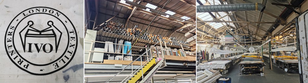
A couple of years ago I spoke to Director of Ivo Textiles Limited, Suzie Zatka-Haas following her visit to our stand at New Designers, a graduate showcase held annually in London. She was keen to understand the best way to promote opportunities in the company to graduates and we discussed the right terms and definitions to ensure textiles students were attracted to the roles. We also discussed the skills they value at Ivo’s and how we can ensure students understand the potential roles open to them, (we have had a Norwich graduate work at Ivo’s for the last few years). We are both passionate about printed cloth and Suzie invited me to visit the factory when I could fit it in around my teaching schedule.
Fast-forward two years and I managed to secure some funding to spend two days onsite at Ivo’s to understand more about the technical constraints of the different printing processes they offer to clients. Suzie was brilliant in making this happen, being open to allowing me in to the factory to learn more. This felt very exciting but I wasn’t fully sure what I’d be able to help with although I offered to assist with anything. I was armed with my printing apron and old clothes—following advice from Suzie!—as well as my sketchbook of design ideas for my current research project in case I had time to talk it through with anyone.
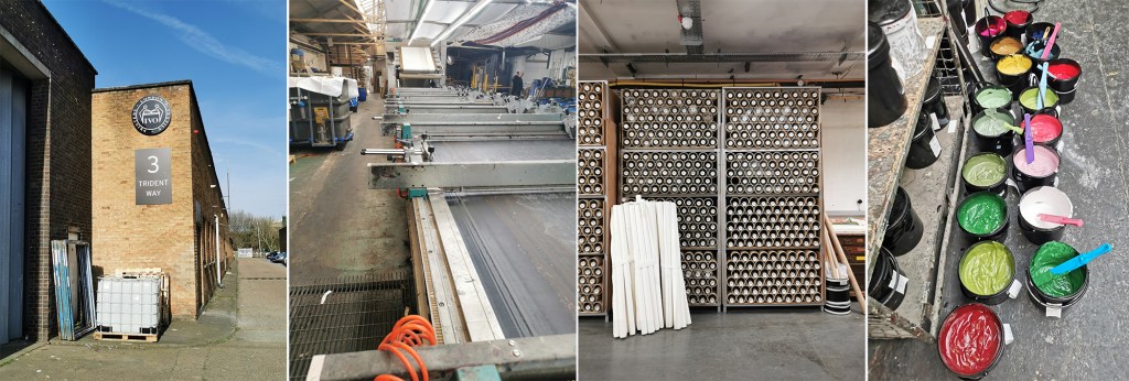
The day before my visit I’d spent the afternoon with Marthe Armitage (blog post here) in her much smaller set-up so I knew this was going to be a contrast. Walking on to a large industrial estate in west London with huge lorries thundering by, the only clue of what was going on inside number 3 were some screen frames leaning up against the outside wall awaiting collection. I was greeted at Reception and my name had made it on to the board for the day.
Once the health and safety briefing was over I was led through the factory, trying to take it all in: sights, sounds and smells, and I was re-introduced to Maisie, one of Ivo’s designers that I’d met at New Designers last year. She was to be my host for my stay and ensure I didn’t do anything silly, like wander off and put my hands in the machines. I’m incredibly grateful to Maisie for her time and interest in what I am doing. We discussed university training, the Ivo design studio set-up and then I shared with her my project. It is so useful to talk it through with different people as they all bring ways of looking and new questions.
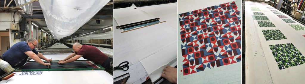
A full tour of the factory was next. There is a vast supply of cloth and screens in every space imaginable, alongside huge machines, some in action and some not, as the job list requires. The colouration department was a room of inks and colour swatches, and the colourist making and matching colour for all the processes. The colourist has been working for considerable time at Ivo’s, like so many there, they are absolute experts in what they do.
I saw the Flatbed printer working on my first day. Large flat screens raise and lower mechanically and the fabric is on the belt below, which moves along after every print is made for each colour to be printed with the subsequent screens. The belt is very long, with many metres passing by before all the colours are printed and the fabric heads off to be baked for the colour to be set at the far end of the table. I was busy taking notes and asking questions. That day a client was onsite to quality-control the printing before signing it off for production.
There is a large archive of artwork from decades ago, spanning the thousands of jobs that have been made here. Original acetates and drawings are rolled up in drawers holding the stories of design. I wasn’t able to photograph the examples – client confidentiality is important here, but it was exciting to see some key players of the 1960s featured. Maisie told me the incredible story of how Ivo’s came to be, and I met Michael, who’s family story it is, leading the company with Suzie.
Gali printing is a further printing process used at Ivo’s (the two tables with yellow frames in the picture above, right). The print tables are fifty metres long! The screens are set up in frames and are mechanically moved up and down, with a mechanised squeegee passing over the inked screen, before lifting up and moving down to the next place to print. It is carefully operated and requires skill and a keen eye to ensure everything is happening correctly with good quality each time. The screens are then changed for each colour and the same processes run again – the gali print operator will walk several miles in creating a ten colour design!
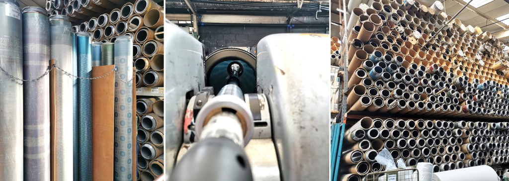
The process I was most intrigued to see was the Rotary printer. Unlike the flat screens, the artwork is prepared on a mesh that is on a cylinder (image below left). The circumference of the cylinder is the repeat size, creating a seamless repeat with fast production. A different cylinder is required for each colour, just as a flat screen per colour is required, but unlike flat bed / gali and hand printing, the squeegee sits inside the cylinder, and with the use of a magnet is pulled down to apply the pressure and add ink to the cloth through the mesh as it turns. Seeing these machines printing many colours at once is fascinating, unfortunately I couldn’t take pictures as it was printing for a client.
On my first day at Ivo’s I also saw a length being hand screen printed, but again, no pictures. It was a very slick operation that is clearly well-rehearsed!
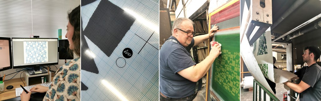
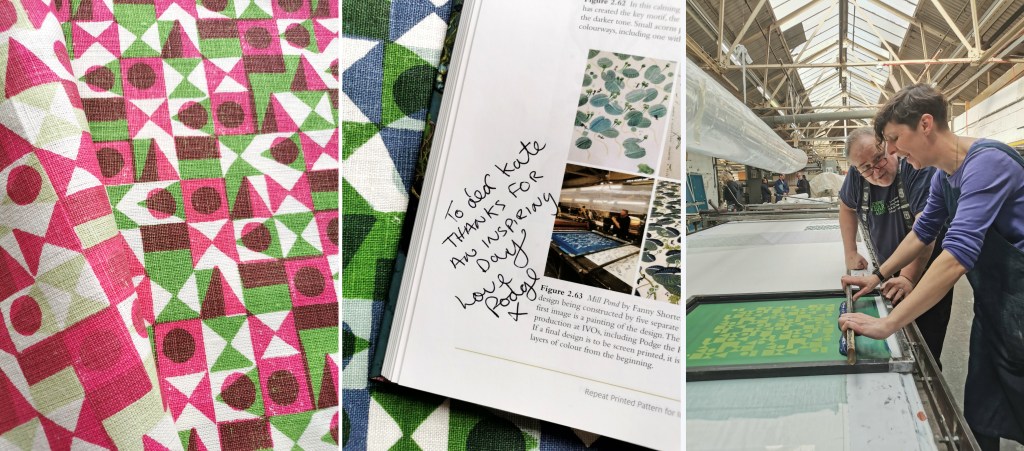
Following the tour we returned to the design studio and I was introduced to some of the different design tasks the designers are involved in. A new graduate had recently started, Caris, so it was good to see her settling in well and enjoying her first professional experience, guided by Maisie. Putting original artwork in to repeat can take several weeks with meticulous digital design work using AVA software. Maisie upped the excitement by suggesting we could work on one of my designs that afternoon and have a day printing with Podge the Printer, a legend for those in the know – wow! Maisie prepped the artwork, with me taking notes and soon the screen positives were ready to be exposed.
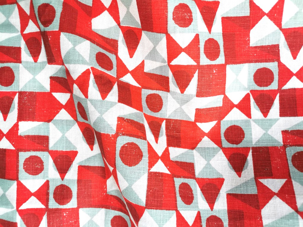
Arriving on the second day, my screens were ready, Podge had prepped the table laying lots of fabric down for me to print on to. Podge is a character – we hit it off! At first he wasn’t quite sure what my research was about, but soon he was getting in to the spirit of it and suggesting options. He said it made a change to have someone exploring options rather than simply being in production mode. We chose some large screens from the archive to add a few tricks he had up his sleeve. Buckets of colour were mine to use. I had a lesson in printing the Podge way and he made sure I held the squeegee at the correct angle with hands over the top – he kept monitoring me so I had to stay on it! He also showed me the S-blade method of printing flat colour without the screen – surprisingly satisfying.
Factory lunch is a set 30 minutes and soon we were back in action. Each time I wanted to change colour, the screen was taken away to be washed / dried ready. I’m not used to having such (any) great service and support when I print in my own studio! It was a really productive day with many metres of fabric printed with several layers of colour, testing my research ideas. Podge’s son who spends lots of time on the Gali came to lend a hand at printing the larger screens, enabling me to try other prints over the top.
With the deadline to get my fabric set we had to stop printing, I watched as the fabric went through the baker and it came out very hot, but ready for home. I was exhausted, it was hot in the factory and I’d been busy on my feet since 8am. One of the last jobs was to ask Podge to write in the special copy of my book on pattern, as he was included in an image supplied by Fanny Shorter who prints here.
At the end of the day I caught back up with Suzie and thanked her for the opportunity she enabled me to have at Ivo’s. The factory has to run smoothly, meeting industry deadlines and costings for clients so to be open for me to learn from them and explore my research with their expertise was an absolute privilege – they were very generous. I headed home with a bag full of printed cloth and I ached all over from such a physical day, but with a head full of the experience I won’t forget in a hurry … Thank you all at Ivo’s!
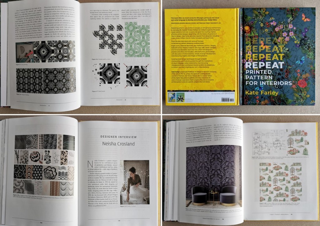
Here we are, the book project is complete with publication in the UK and US today. It’s been a journey!
With the first thoughts of writing a book about pattern back in late 2015, the development of some draft scopes, the contract signed with Bloomsbury in early 2019, a first draft of Chapter 1 delivered in late 2019, a global pandemic from 2020, unscheduled health issues requiring hospitalisation & surgery in 20/21, final manuscript submitted in June 2021, and proofreading / layout until June 2022 I have had to be very focused and patient – and all this while leading two degree courses until this Autumn (I now only lead one!).
Writing a design book had never previously been a consideration of mine, but since I’d been reviewing books a few years ago it got me thinking that this was the perfect place to bring together my design practice experience with my academic role. The idea grew on me. I’ve spent years teaching pattern design and as a result tried and tested hundreds of ways to deliver inspiring and informative design workshops. I spend lots of time analysing pattern to support my lectures, and in my spare time … and so in hindsight maybe it was a natural next step.
The introduction includes me taking the reader through my journey of designing Hanbury, my wallpaper, as well as my relationship with pattern. The three chapters are very different in nature which helped to focus the research and writing at each stage, and provides the reader with a broad look at the subject of pattern design in relation to history – Chapter 1, how to create pattern – Chapter 2, and how others do, through nine feature interviews in Chapter 3. I have to comment on the cover … I love the cover, so a huge shout out to Paul and Ali of Timorous Beasties and to my publisher Georgia at Bloomsbury who allowed me to have it just as I wanted. In fact I owe so much of this project to Georgia’s belief in me to get this done, and her unwavering support throughout. Who’d be a publisher?
Many years ago a previous boss asked me to take on delivering the design history lectures to first year undergraduates and with panic and fear I embarked on what I can now describe as one of the most overwhelmingly frightening but important career defining undertakings. I was given an opportunity to challenge myself while presenting to a lecture theatre of students on a Friday morning in Birmingham, and the result was empowerment. Without high school History qualifications behind me but a passion and base knowledge of design history I decided to engage students in how history is relevant to us now, what we can learn from, challenge and move on from. I needed it to be immediately relevant to their design projects to help them understand history is important to designers today. It took some years before I felt on top of it, but many years on I comprehend the legacy of those hours of learning in order to teach, and how that substantial investment of time led to the knowledge and experience to write Chapter 1 of this book. I could have written many thousands of words more to cover the history of pattern across the globe, but word limits provided boundaries, and without a deadline I may still be writing!
I enjoy learning. I am hugely grateful to all the students I have had the pleasure to work with over the years, for sharing their creative journeys as we discuss drawing, rhythms, compositions and colour proportions to make the most interesting repeating outcomes. I’ve learned so much along the way, and that’s what keeps me interested and passionate about the discipline of pattern design. Every studio session is an exchanging of ideas, with no single correct answer, but plenty of opportunities – a privilege to be a part of, and the inspiration behind Chapter 2. It explores the practice of repeat pattern making, presenting considerations to build stronger outcomes without stipulating one right answer. I encourage designers to embrace the process of testing variations in pattern construction so the final result has learned from all that has gone before. The designers I include to illustrate the text offer so many styles and approaches and have been so generous in sharing their working practice with me and future readers.
Just as I did with my degree dissertation back in 1996/97 there were times that required drastic measures to get things right in the writing of the book – many sheets of paper were laid out across the floor and I took scissors to the pages, literally cutting and pasting paragraphs in the process of reordering the narrative. Other times I had to diligently input data on a spreadsheet, chase consent forms or simply focus on writing.
Obtaining image permissions was probably the most arduous and stressful process of the project. Keeping to budget while securing the images from archives, individuals, estates and designers I really wished for was difficult, and sometimes I had to admit defeat and find alternatives. My editor and publisher (Faith & Georgia) were both brilliant at talking this over and I’ve been so pleased to include some absolute favourites such as Lucienne Day’s Spectators and Calyx and Josef Frank’s Mirakel – I danced when these came through! It’s also been a pleasure to include a number of works by students I have taught, some in the last five years, but also Emma J Shipley back in 2005/6 – I still remember her tour bus interior for Madonna in BA1 (one of the interviewees in Chapter 3). How time flies!
I’m grateful to all the designers / archivists who have contributed images and details of the patterns throughout the book. Quick check-ins to confirm the number of screens used, or what digital software the designer prefers was all part and parcel of getting details as correct as possible. One memorable highlight on a day of writing was a phone call from the brilliant pattern designer Marthe Armitage to talk through her contributing images for the book. I was so surprised I was rather lost for words initially, but soon we were chatting all things pattern, and I’m delighted to feature her printed wallpaper patterns in the book, as they regularly feature in my teaching presentations. A shout out goes to Sophie at Warner Textile Archive who went above and beyond tolerating last minute requests for photography to get just what I wanted! Much of my clear headed thinking happened late at night as I juggled leading two courses in the day job, and I’m grateful for all who made sense of my communications at this time.
Who knew it took so long and so many people to get a book to be a physical artefact? The proof reader was brilliant as we fired queries and answers to and fro for a frantic few weeks, and then she was gone. Then the layout was taking shape – and I think I must have been a nightmare – sorry Deborah! – I wanted every page to look its best and sent diagrams and descriptions to make that happen. Finally, following last minute queries while I was at New Designers showcase in London with my graduates in late June I had to step away and the book went off for print production.
I’ve been asked several times if there will be a second book, even before I held this one in my hands…! I’m not sure, maybe one day, but today I’m celebrating this one.
I’m grateful to all who have helped make this happen, from my tutors back at art school, to friends and colleagues who have tolerated and supported me in this project. Thanks to the brilliant team and associated individuals from team Bloomsbury and to everyone who buys a copy to share the joy of printed pattern – thank you!
I’d like to dedicate the book to my parents in deepest gratitude for providing an upbringing where experiencing art, design & culture was a given. Thanks to my mum who has survived the ups and downs of raising a creative child, I know it wasn’t always easy. My sorrow remains that I never had the chance to have an adult to adult conversation with my dad about the things we would have no doubt had as common passions, but who inadvertently taught us Farley girls that if you put your mind to something there is no reason why it won’t work out. A lasting legacy & mindset.
On the 12th January 2023 my book for Bloomsbury on the subject of repeat printed pattern for interiors will be published, … finally there’s not long to wait having worked on it for years!
If you want to order a copy at a pre-publication discount you can do that here.
As a keen lover of patterns I’m always on the look out for interesting examples to add to my consciousness. I do like a good geometric as well as micro (small scale) repeating patterns so despite being immensely annoyed to find myself back in hospital on a ward for a week I did spot the odd pattern of interest…
I’m interested in small details that make patterns work, and I spend time in my teaching analysing successes and failures of patterns in relation to motifs, pattern structures and repeats to teach the students how to improve their own designs. These NHS designs, printed on fabric for hospital nighties (left), pyjamas (middle) and the surgical gown (right) do demonstrate merit.
Small details on the pyjamas / nighties, such as the spot actually being a hexagon, the less obvious choice, and the squares making up the bigger square block including smaller squares in the darker colour, means they contrast with the larger mid green colour bring visual interest. If the darker squares were the same size they may well appear too dominant. Interestingly, the pyjamas had the green colourway as vertical stripes, and yet the same design in red was placed as horizonal stripes on the nightie. I wonder why this was. Let’s not talk of the fit of these garments! The surgical gown is more simple, but I appreciate the fact that the cross is made up of broken lines, with a small dot in the middle – so much more interesting that if it had been two lines crossing.
These are tiny details that most people will overlook, I know I was probably not the most typical of inpatients, but if you spend any length of time on a ward, nil by mouth for several days your mind wonders. I found there to be a significant challenge in retaining something of myself as a person beyond the sick patient, with all the focus and attention on your health, or lack of. The pattern spotting was a way of still being me.
As I said at the top, I like micro patterns and have shared my collection of envelope insides on the blog before. I like the smaller scale patterns that provide visual rhythms and noise, that get on with doing their job, in a simple utilitarian manner. These patterns on hospital garments also got me thinking about moquette, the hard-wearing fabrics on transport upholstery, and how those patterns signs are there to conceal dirt and wear, whereas these hospital ones with the white background were doing the opposite.
I hope you don’t find yourselves in hospital to have the chance to analyse patterns on your gown, but if you do, I hope you like the ones you’ve got!
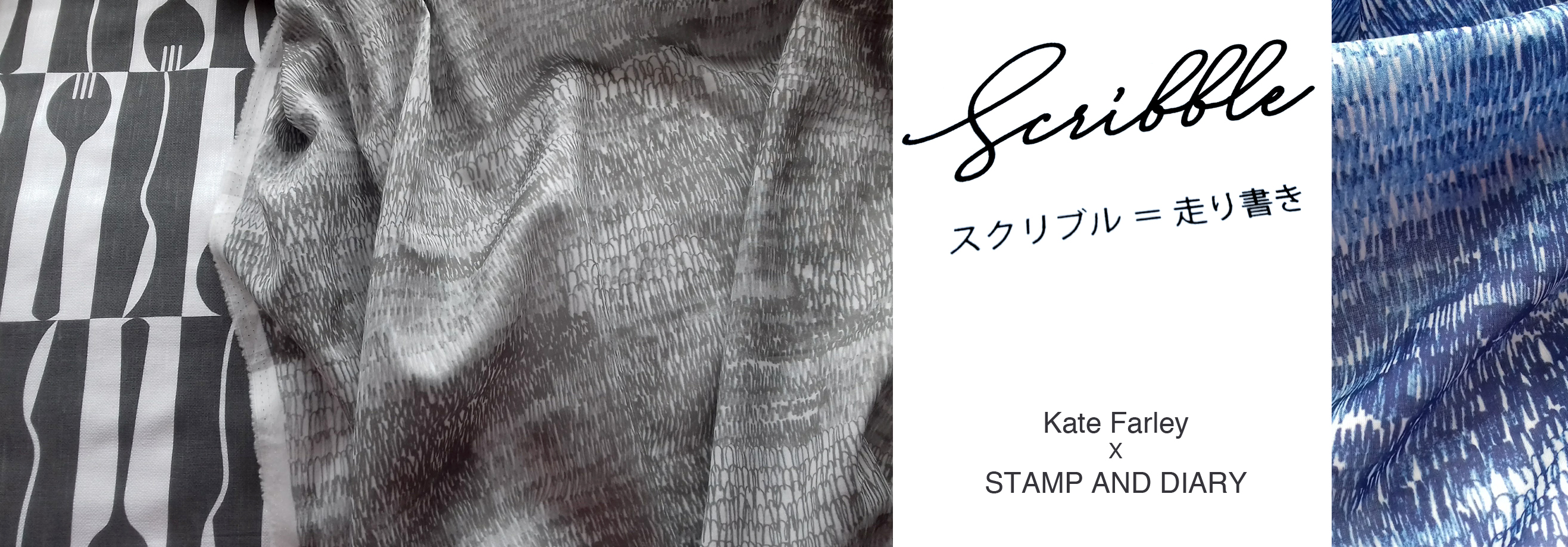
It all began in an email with the subject line, ‘Hello from Tokyo’ I received in November 2017, letting me know how much my tea towels for David Mellor were admired in a Japanese design company. The email went on to ask if we could discuss a potential collaboration for a capsule fashion collection featuring a print designed by me. Firstly I was excited to think my patterns had made their way to Japan, but secondly, that sounded a great idea, tell me more! A few email exchanges later, and we agreed to meet the next time the company director of Stamps Inc. was in London so I could show him my portfolio to discuss the idea for the new pattern they would like to commission for their fashion collection.
The meeting with Shu and his colleague Yoko in a central London hotel was exciting; I showed my work and it was met with positive discussion. I was also reintroduced to the tea towels that had made it to Japan all the way from my studio, via a David Mellor Design shop! We sat at a large table and I showed them my portfolio, spreading the many sheets out covering the whole surface. Having shown all the other work and following some discussion in Japanese between colleagues, the director chose the very first page he had seen – the cover page! The choice was not what I was expecting but we shared and developed ideas for me to sample: colours, time-lines and garments. We then took some photographs to record the start of the project together, for when we would be able to share our story – and even asked the hotel doorman to take a pictures of the three of us with a London bus behind us.
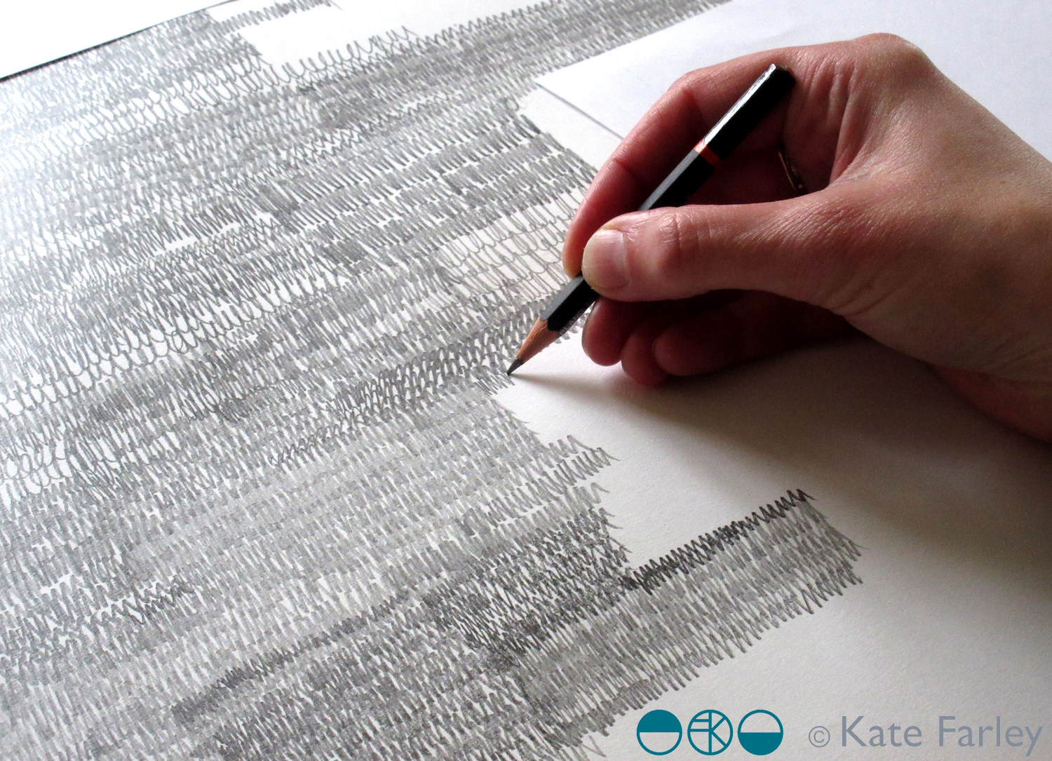
The selected design was a graphite pattern of pencil scribbles of varying tones and rhythms, later to become the title of the collection: Scribble. There are lots of variables such as scale, rhythm, tone and overall order in the pattern we had to make decisions before I set about creating the final artwork. I emailed across some small sketches to explain the repeat process for production to check we were understanding each other as we had to ensure we understood the terminology that each of us used in our different languages.
I shared several images of new drawings to provide the variations / considerations over email before committing to the final design. The final fabrics were to be screen printed so I planned to draw out the whole design in full repeat by hand (approximately 60 x 90cm), scan it in and transfer it to Japan for screen print production. I started the large final drawing twice as I wasn’t happy with the first one. Initially the marks I drew appeared tense, but I also had to work out how to create the different qualities with the pencils across a vast piece of paper, and how not to smudge the areas I had drawn. I drew the design at 80% scale to make scanning it in possible, meaning I had to take in to account the slight increase in the size of the marks in the final result. I also had to ensure the top of the design matched the bottom, as the edges were to act as a cut-through for the screen printing process of repeating the pattern, fitting like a jigsaw, top to bottom. The design was edge to edge, left to right, fitting the width of the fabric so there was no horizontal pattern-repeat.
The final artwork took almost ten hours to draw, and I did that mainly over two long evenings. I had it scanned in at a very high resolution, adapted the size of artwork to 100% and sent the digital file to Japan – with my fingers crossed that the printer could work their magic, including colour separating the graphite tones for the two screens each colourway would require!
There was a wholesale launch in Tokyo so I sent some of my original drawing samples over to feature as framed artwork in the exhibition and I was sent photographs of the lengths of fabric on show. Very exciting! Orders were placed and there was a good response. A further email request came from Japan, to meet again in London to see the fabric. Another exciting moment – also scary – what if I didn’t like the results!? In the stylish interior of the St Pancras Renaissance Hotel lounge there was no need to worry. Great care had been taken to translate my drawing to screen printed cotton lawn fabric, in two colours – referencing the two colours of my David Mellor patterns Chelsea, in grey, and Pride in blue. The fabric felt beautiful and the printing fabulous. It was a special meeting.
I was able to see the marketing material including my name alongside Japanese text I couldn’t decipher, describing our meeting and the collaboration. I have had to be patient while the wholesale launch orders were being produced before we can promote the project I’ve had to keep under wraps for well over a year … until now!
It has been an absolute pleasure working with Shu and Yoko, learning about the company and their pride in who they work with including the products they develop. It has been a highly successful collaboration from my perspective in that we have discussed all the aspects of the process and trusted each other to do the best for it, each learning about the other and having good communication throughout. We have shared news of the differing seasons and national events over the course of the project, and they’ve watched via instagram as I’ve moved homes and jobs. I’ve loved having this connection with people in another corner of our world, created as a result of some tea towels I designed over five years ago!
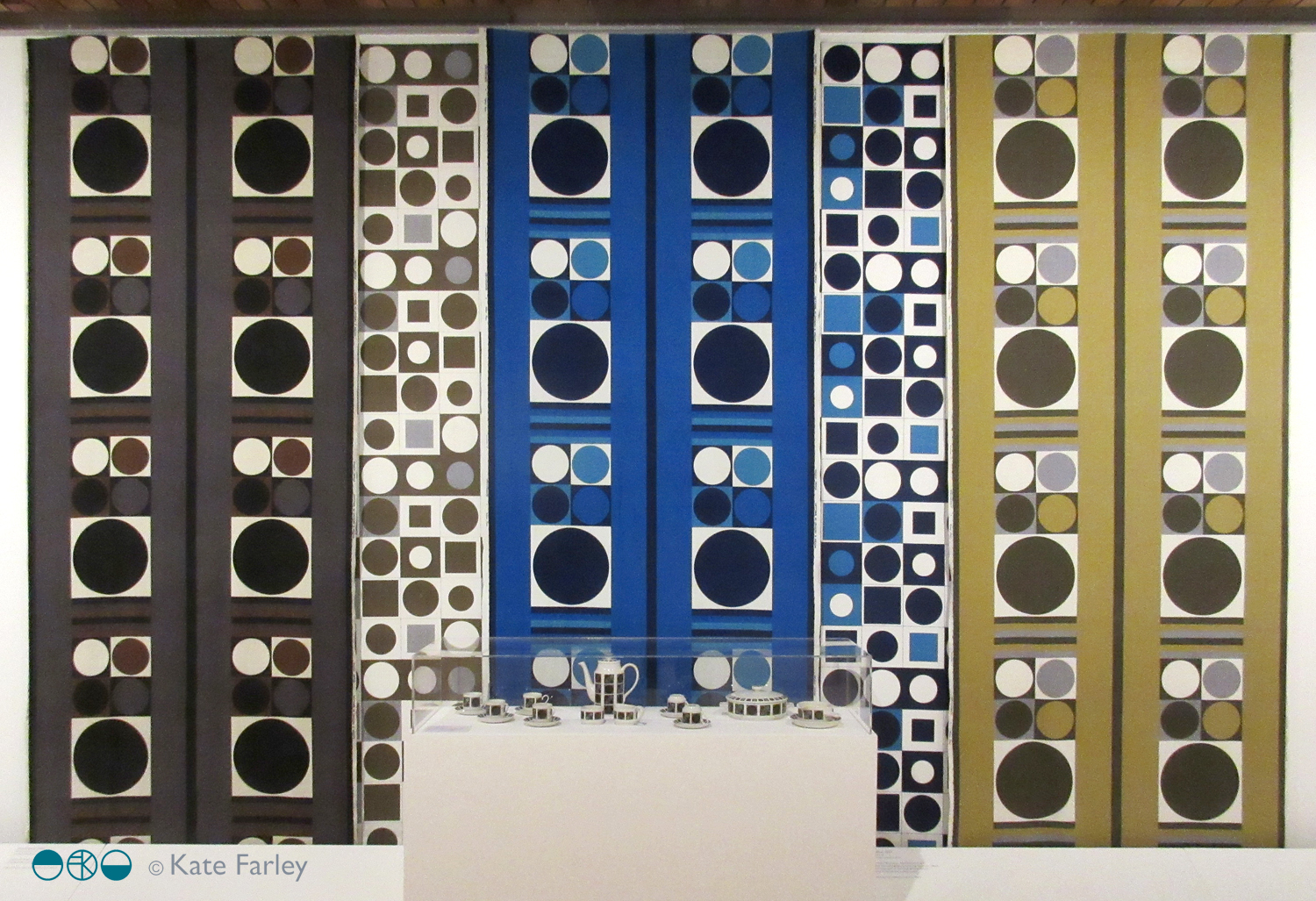
The Barbara Brown exhibition at the Whitworth in Manchester is really worth catching, especially if you like patterns.
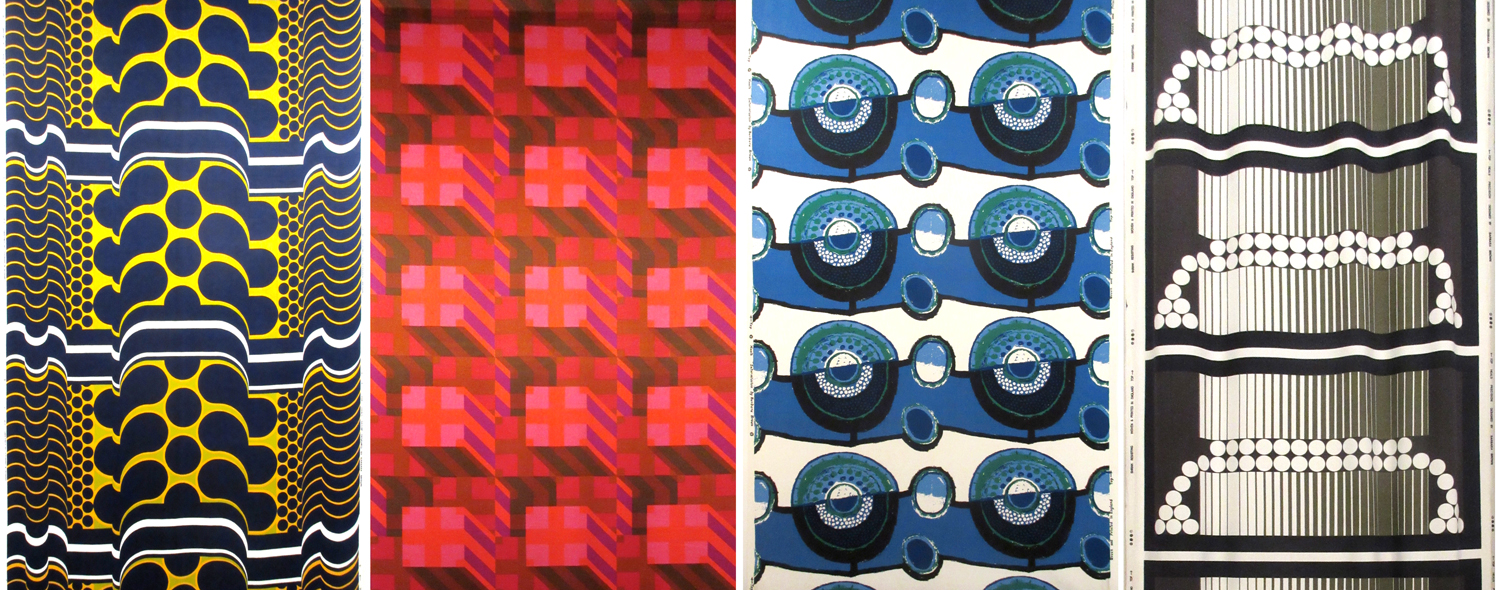
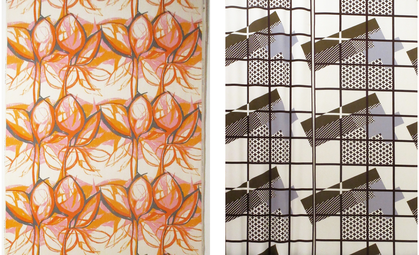
The layout of the gallery enables an overview; the broad visual statement of the textiles designed by Barbara Brown during the 1960s and 1970s, to be seen straight away and makes for a striking sight. Large-scale pattern in different colour-ways jostle for attention and yet the small gatherings of textile designs within the gallery also create more local dialogue for consideration. The repeats are large, not in the Marimekko sense but larger than we often see, taking the full width of the fabric to do the talking. Seeing the textile lengths on exhibition really shows off the bold rhythms of each pattern.
The designs on show demonstrate a variety of motif units across the fabric, some halved, some quartered, others full width. The corner of the gallery most impressive in my opinion was the monochrome series that really pushed her design prowess forward. Although strong graphic statements, these are far from flat patterns. The curves in Ikebana (below left) and Automation (below, third from right), both from 1970, differ in how they control and divide the space, toying with depth and dimensions. There is a sense of sci-fi and computer generated environments across this mono-chrome series. Escher should also get a mention as the optical illusions on the architectural scale appear to pay homage to him too.
I have my favourites, but I really want to highlight the breadth of pattern compositions here. The design statements include many geometrics with cubes, columns and dots. There are stripes, spots, architectural themes and florals. I see more than a hint of Op Art, Psychedelia and modernism across the printed fabrics, some more than others, but the designs appear experts at communicating the populist aesthetic of those years.
As a teaching aid for textile design, this exhibition does rather well. Design students can understand the potential to grow large repeats rather than stop at small ‘plonk – plonk’ designs we see far too much of – maybe a result of designing on computer screens. Designers need to understand that even domestic interiors can cope with so much more than a motif 10cm in diameter. Brown’s shapes are also not always contained by outlines, and this presents bold, solid shapes that hold their own. Colour statements include monochrome and full-on colour including oranges and blues. There is a sense of the colour palette dating the patterns but the combinations communicate bravery. The monochrome designs have a very formal spirit, and although different in style do remind me of some of the black and white, large classical columns Timney Fowler print designs of the 1980s.
Barbara Brown was working in a very different time, and artwork was not created in Adobe Illustrator or Photoshop. Hand drawing full-scale repeats gives you a very different relationship with pattern compositions. Some designs appear not to show signs of drawing, but others do, almost standing out for doing so – particularly Sweet Briar, 1959 (above left).
The exhibition was dominated by the printed fabric lengths but a couple of later knitted pieces offered an insight in to the designer’s creative career progression, and reminded me of the direction Lucienne Day took with her silk mosaics, making a clear distinction away from the commercial print designs. The juxtaposition of some small ceramic pieces next to fabric lengths offered an interesting pause for thought too. Would you have matching china and curtains? Maybe not, but the patterns held their own at both scales and on the different surfaces.
This is one of those examples of why you need to see exhibitions in the flesh, and not rely on the computer or phone screen to do the job. Seeing Barbara Browns patterns are eye-catching on a small screen, but they are far more impressive in this setting.
The exhibition is on show until January 2018 (and they always have several interesting things on at the same time – and I can recommend the cafe!) NOW EXTENDED UNTIL MARCH 2018
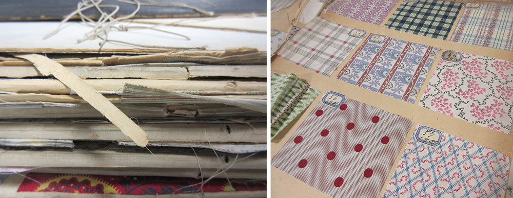
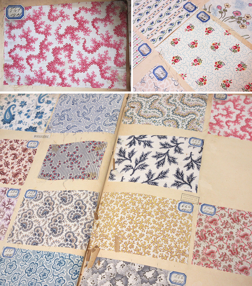
Recently I have been sharing joys from the fabulous archive of textile samples belonging to Birmingham City University’s library, some dating back from 1901. Myself and a colleague have been showing these treasures to our students, helping them to see their own learning as part of a history of design practices. In an age of the digital file it’s been fabulous to see how much interest these portfolios have generated with our students. It’s a tough call as we worry for the protection of these fragile items, and yet value being able to see and interact with them.
Being able to turn the pages, and reveal the hundreds of printed swatches is really an exciting journey and the students really engaged with the quality and preciousness of the items. The fact that all the samples are beautifully hand mounted and labelled adds to the beauty and experience. The range of design compositions is considerable, and the detail stunning. Tiny little flecks of print; an anchor, a petal of a flower, or coral texture printed on fine cloth demonstrate quality of the day. We noted the generosity of many designs, and discussed commercial appeal and production methods available before screen printing and digital printing possibilities. Of course this is pertinent at this time of financial cuts in the support to local and national libraries and associated archives, and with arts and culture being sold to the nation as a rather nice hobby we just can’t afford at the moment.
Seeing things with our own eyes helps to engage with the subject, making things real, and adding value to the experience. I spent an extremely insightful day at London College of Communication’s Learning Through Objects event #UALOBL last month discussing this subject with fellow academics, researchers and archivists. Yes it’s easier to deliver another ppt to a large group of students, but sessions with objects and physical activity are the ones that are likely to make far more impression, and make the difference to learning we are aiming for.
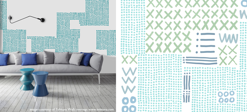
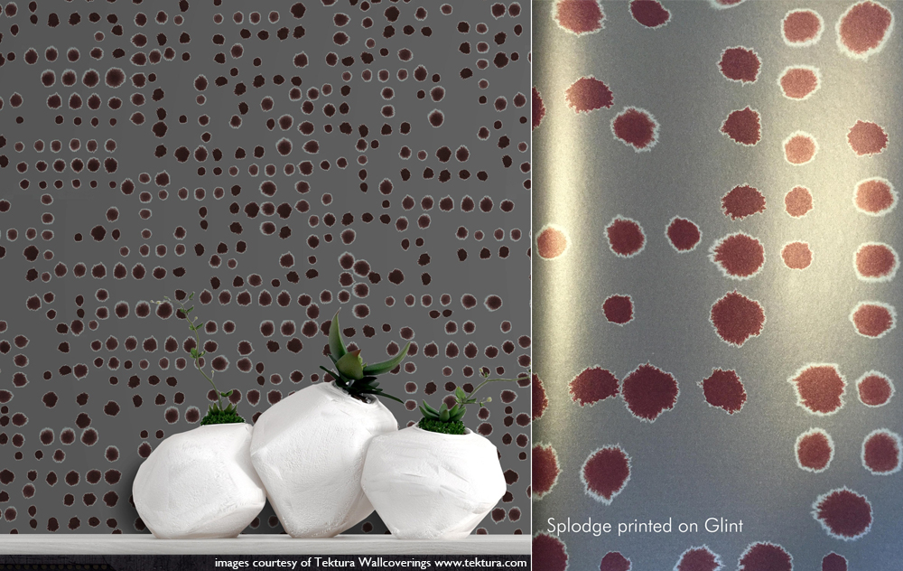
They have been a while in the making, with lots of drawing, designing, discussions and sampling over the last ten months but my designs for Tektura Wallcoverings have been launched, and I’m delighted to be able to share them here. There are five in total so do visit the Tektura website to see them all. The images of the drawings are mine, the product shots are courtesy of Tektura.
I was working on the designs at the same time that I was developing my ‘construct’ collection and Tektura really liked the look and potential of those designs but I needed to build two distinct looks to avoid a conflict of interest. You will see similarities but I utilised different drawing tools and pattern systems to explore a variety of options in my markmaking. I created many sheets of paper full of inky motifs that eventually, after a lot of design development over several weeks both on paper and at the computer screen, became digital artwork to hand-over for production. At Tektura the colours and scale of pattern were sampled and marketing / sales information was created for the launch. One thing I find hard is naming the designs, and this was no exception. The thesaurus was called upon, as was Google to check existing references, and a colleague at BCU also contributed – thanks Clare! In the end the names pretty much describe the pattern. I won’t be a poet anytime soon!
My past experiences of working on large interior / public art projects enabled me to work with the scale of the potential interior environments that Tektura provide for in my mind the whole time. These designs for Tektura can be customised and applied to wall and glass surfaces and so as I designed I maintained modular components that can be re-coloured or omitted for each client’s specifications. This is a wonder that digital production can provide; enabling bespoke solutions.
For me this project highlights key values in my practice: the importance of drawing and hands on image-making, knowledge and understanding of digital production and product context, and the value of working relationships and good communication. Each client I’ve had the pleasure of working with over the last fifteen years or more, whether it’s the design director, art officer or buyer can really shape the design process they are commissioning. From outlining the brief, to negotiating the design direction as well as final sign off, these things make a big difference to the designer, often working far beyond the hours intended in order to allow sufficient time to reflect on the design process and outcomes. Digital communication allows artwork and thoughts to be shared and discussed in minutes, and decisions can be made together.
The great thing about working with companies such as Formica and Tektura is that they are industry experts with fabulous products, trusted by the market. By working with this expertise I learn more and get to understand the design world from their standpoint. Who would have thought my patterns would be on such a stunning shiny surface as Glint (below)! Working with Tektura Wallcoverings has been a pleasure and I’m proud to show the designs off. Thanks to Angela and the team!
It’s the holiday season but that’s a tricky thing when it comes to being freelance. Yes I have leave from being an academic at this time of year but the design jobs seem to know when it might be good to take a holiday, then the projects pile up, each with a deadline that results in juggling. I’ve made lists of lists, with schedules and then more lists. Each task gets ticked off, only to be joined by a further task, only to discover that some of the industry does take a holiday and instigate factory shutdowns – good on them! I like their style…
I’m not complaining, it’s just always the way of things, and I actually like times like this. This is the portfolio career that I wanted and imagined. Over the last two weeks I’ve lost count of the number of designs I’ve completed, the different colourways, the scale testing, the rhythms, repeats and patterns I’ve honed. In each project the client has been very different, with highly specialised requirements, and again, that’s really exciting.
Alongside all of this I am also preparing to launch my ‘construct’ collection, and as I can’t share the other design projects yet I thought I’d share one of the images I’ve prepared for the press release. The project has been months in the making, and has been growing in so many exciting directions I’m really looking forward to setting up my stand at Tent London in September. If you think you might visit the show as a trade visitor don’t forget to register for a ticket: http://www.tentlondon.co.uk/trade-registration