nature: holiday inspiration for the sketchbook

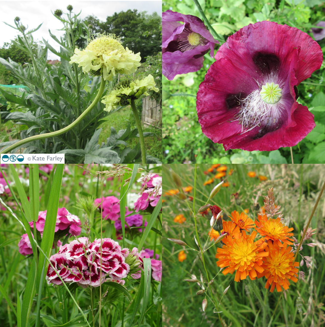
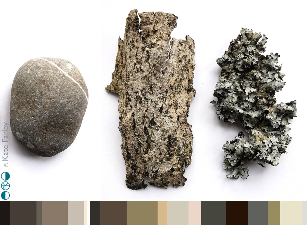
This holiday time has provided an opportunity to go to new places, see new things and return to the sketchbook just for fun. A week at Ilkley Moor enabled lots of time for walking and seeking out inspiration from the natural world, with distinct differences to the landscape I’m used to day to day. Up hill and down dale saw me amongst mosses and lichens, pebbles and boulders, grouse, larch trees, heathers and bogs … and even a fragment of pottery.

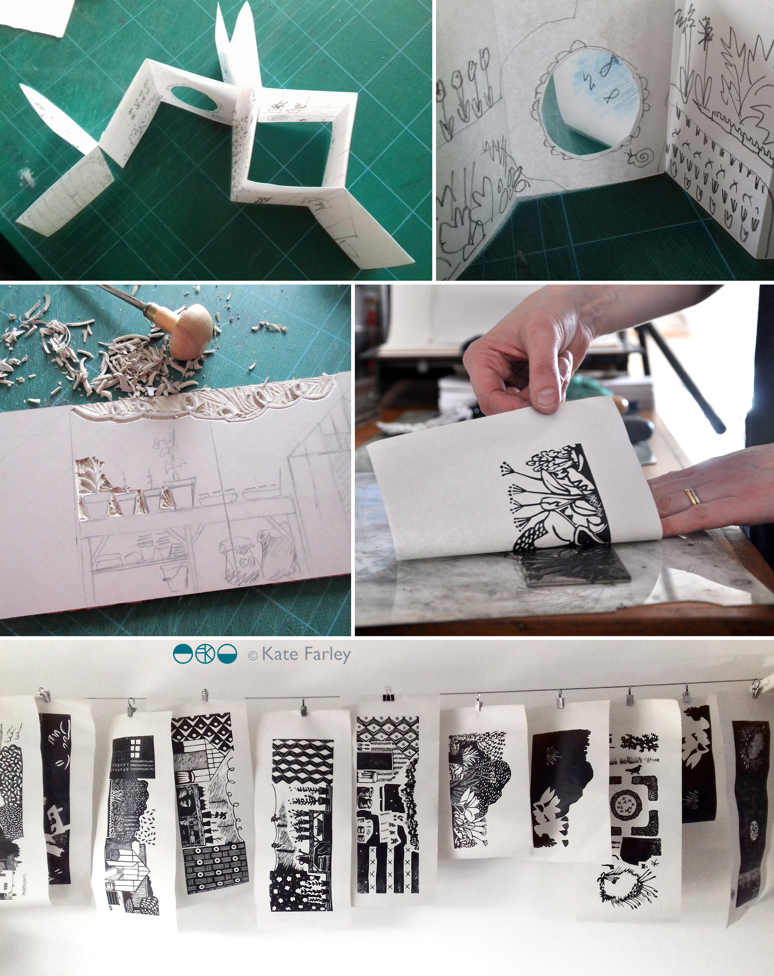
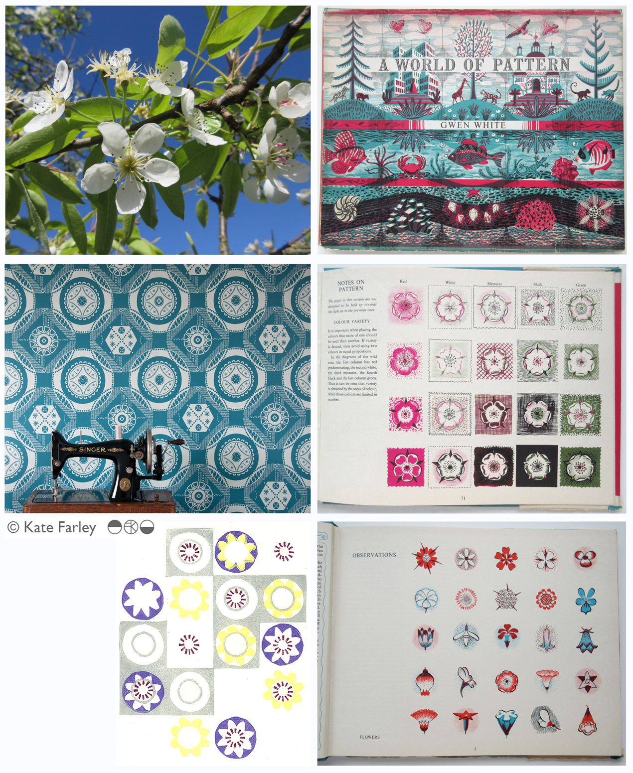
Rucksack pockets were filled with samples of treasure ready to investigate later. The process of drawing enables me to get to know an object, and by making several studies of each item I enjoy developing a stylised representation. I hope never to tire of the getting-to-know-you drawing process I have practised for thirty years.

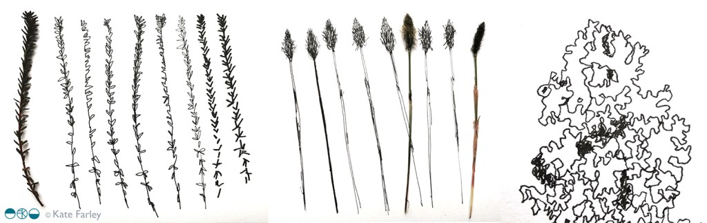
By looking closely and seeing through drawing I can work out the essential elements of surface, form and texture to record, but also I love to play with the appearance of elevation and structure of three dimensional objects, such as the pebbles, to explore their new form as they appear on the page, as flat motifs.

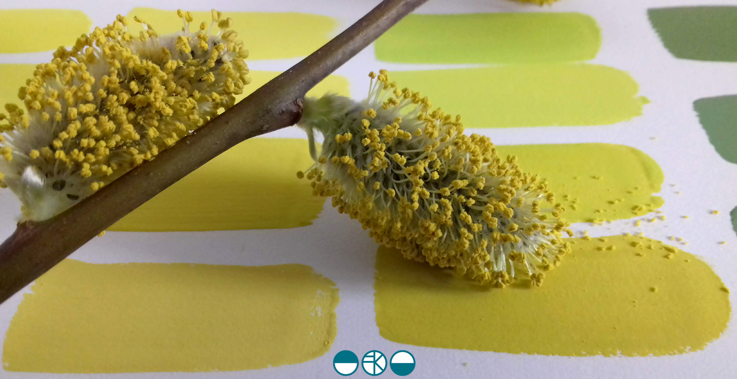
The textures and colours of the items I gathered provide macro evidence of the vast landscape I walked through and connected with. As this was springtime there were pockets of fresh green bursting through winter foliage, demonstrating the natural cycle awakes again. The geology of Yorkshire provided variety in coloured greys and texture under hand and foot as we bouldered, scrambled and hiked, notable in contrast to the soft wet bogs and spongy moss beds amongst the heather.

Without going all John Ruskin about it, the natural world really is amazing, and full of inspiration for anyone inclined to notice. Anyway, back to the rather flatter fields of Norfolk …

evolving colour in the making

A walk in the Spring sunshine gave impetus to a very simple and mindful exercise back in the studio; to make the colour of the landscape. A sprig of willow contains so many different colours. Those colour qualities will alter as the clouds skud across the sky casting shadows, and as the sun ripens the buds.

KFarley_yellow_willow_1500_KF

With paints at the ready I knew it wasn’t about making the one colour, but the narrative of generating colour as my process of journeying from one to the next. I wanted to paint each of the swatches of colour I mixed as I evolved the paint story, observing and recording the subtleties of the change in hues. Selecting a limited number of tubes of gouache to begin made it more interesting. To start I selected the dominant colour I was aiming for, and had a little piece of nature with me as reference. I developed the swatches of colour, selecting one, and then another hue to achieve, step by step, slowly and patiently filling the page.

KFarley_ycolourpalette_1500_KF

Gouache is a beautiful paint and this exercise reminded me of a wonderful morning teaching colour mixing to BA1 Textile Design students earlier this year. Getting the right amount of water, ensuring the colours are cleanly mixed, and then making that one painted line flat and even – it all takes practice.

KFarley_ytubes_colour_1500_KF
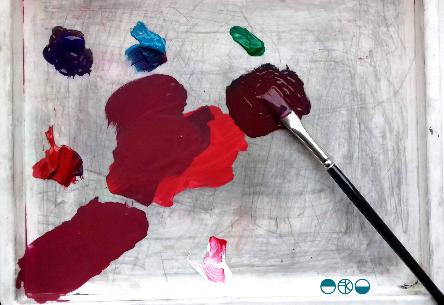
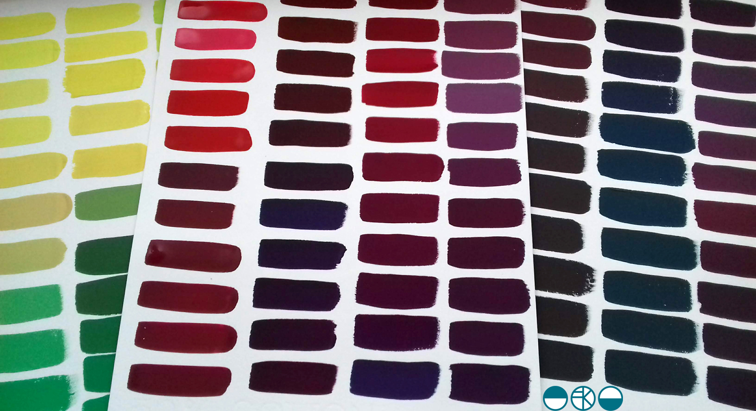
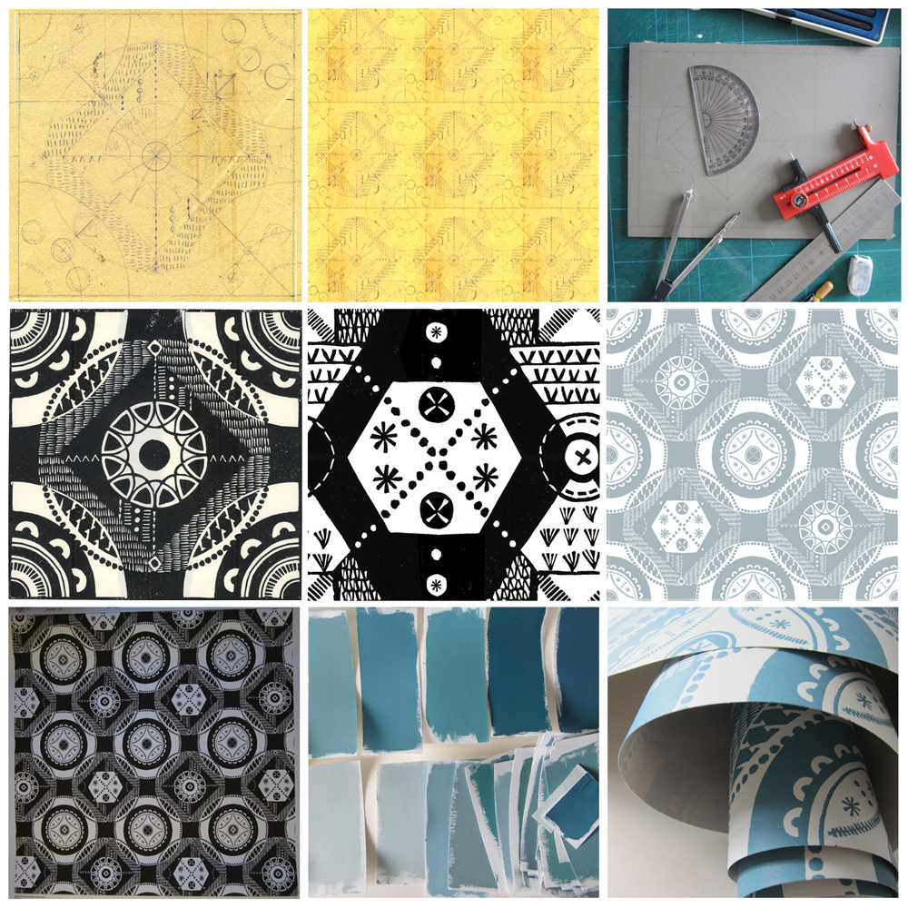
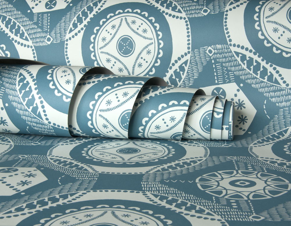
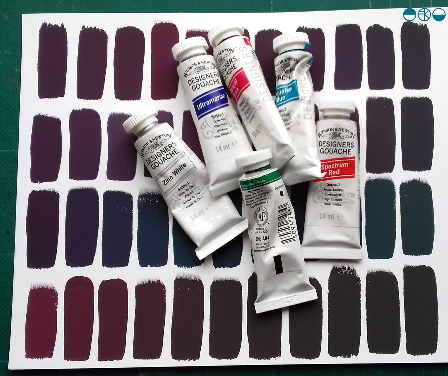
I was lucky enough to have excellent colour teaching during my time at art school and consider myself strong at seeing and achieving the right colour mix. At uni I remembering saying to the print technician “it’s nearly right, I’m happy with it”, and she’d say, “Kate, it’s not what you set out to make, keep going until you get there!” I thank her for teaching me that persistence and these days my students know I’m particular (a preferred word to fussy!) when it comes to colour. Getting the colour right is so important and you may as well enjoy the journey to get it right. Textile products sit alongside fashion and interior items made from other materials, and the colours need to match / coordinate, so quitting before you get the right colour may be a sales / employment disaster too!

Interestingly, some of my current students were discussing my approach to colour recently and one shared that I’m not keen on black outlines around shapes in print designs. Another one commented that they hadn’t heard that, but would keep it in mind. I jumped in to defend the comment I’d originally made – a black outline is too obvious, unquestioning, the default, rather like Times New Roman black typeface when you open Microsoft Word. Too easy. I ask students and designers to think about whether the black line is the best for the design. If you think of all the other colours you can use, I think you may find another and better alternative!

At the end of this colour mixing time I am left with souvenirs of the process, memories of the walk and beautiful colour. This is real colour away from the back lit screen I too often see colour from. I shall do this again.

KFarley_y3xcolourswatches_1500_KF

Gardening with Mr Bawden

So this is the week my book ‘Gardening with Mr Bawden’ is being published by Design for Today. It’s been many months in the making, so I’m very excited to be able to share the details and for other people to hold the book in their hands.

What began as a project brief for a book with interesting folds that celebrates Edward Bawden’s love of gardening has become a project I am very proud of and have thoroughly enjoyed for lots of different reasons, pushing me creatively along the way. I love a design challenge and returning to the subject of gardens has been a pleasure, having launched my garden-inspired Plot to Plate collection back in 2012 and being a keen allotmenteer. I’ve moved away from my usual diagrammatic visual interpretation of gardens, towards a more illustrative manner, following on from my Parks and Gardens commission for posters for London Underground last year. It has also been a joy going back to paper engineering and book art – having made many editions of artists books over the years following an MA in the subject from Camberwell in 1998.

The images below show some design stages of this project with Design for Today. There is an early paper maquette as I worked out the structural narrative in relation to the imagery. Several of these were posted between us to allow for discussion and deliberation. At one point there was a cut-out pond but I was unhappy with how it worked on the back of the page so I left that behind. I cut lots of lino, with each page requiring at least two blocks – one for each colour. Although I had an idea of the key focus and composition for each spread it wasn’t until I was cutting the lino did I tie precise detail down. Only a couple of times I decided to completely abandon a page spread and rework it – and I’m so glad I did! Each block was hand-printed and hung to dry in the studio before being scanned to make a digital file that could be prepared for the lithographic printing process of the final edition at Calverts.

wip_Bawdenbook_flat

Once the final sheets were litho printed and die-cut / creased we have had to fold them one by one, sign the special edition and pack them up. We even decided to hand-cut out a window pane of the greenhouse in the edition of 100. We are delighted that the Special Edition sold out fast, well before the publishing date – thanks all! Those lucky people will receive the book along with a little booklet of the project and greetings cards, any day now!

signing booksMay18_1

This collaboration with Joe has been a really positive experience as we are both passionate about doing a great job. He was always happy for me to tweak something one last time as we signed off proofs, and understood the reasons why I turned sentences inside out in the booklet, to say exactly what I wanted to. Joe and I have discussed page size, paper weight and the folded structure on several occasions as well as how you take inspiration without copying, and the issue of creating something in relation to, but not derivative of.

I am sure people who know my work will recognise my style in there, despite it being a little bit more illustrative. Pattern making relates to both Bawden, and myself, so it made sense to include a nod to wallpaper designs too, inside the greenhouse, as pots of plants become floral wallpaper. I wanted to use lino because both Bawden and I have used the printmaking process. I also wanted to create a light-hearted feel to the imagery, that is so often in Bawden’s commercial illustrations. As I wrote before in a previous post, we researched lots of snippets of information to guide the imagery and are grateful for there to be so much writing and research available at the moment, but it was never intending to be a guide to the garden at Brick House, more to express the pleasure Bawden would have got from his garden, as so many of us do. I also wanted to take the reader on a journey through a garden, rather than show you all in one go, so I hope the reader can navigate their way around!

KFarley_GardeningwithMrBawden1

This book is the outcome of a great collaboration. (Thanks Joe!) So as the book is published today we celebrate this journey of designing and making, and can announce it will be stocked by some great places, including the Dulwich Picture Gallery, where a brand new Bawden show opens this week. Check out the social media accounts of Design for Today for updates. Final thanks ought to go to Mr Bawden himself, who has inspired so many of us, and who gave Joe and I cause to make this book.

seeing things

I’ve been giving a lot of thought to the idea of looking and seeing, and particularly how we evidence what we have seen. I have boxes of photographic prints of things I’ve seen: cracks in pavements, postboxes around the country, vapour trails in the sky, flowers I’ve grown and plants I wish I’d grown – and much more. When the world turned digital I stopped filling real boxes and filled virtual boxes, and some I look back at, but rarely do I touch the surface of the sights I have collected.

The engagement in social media, and the sharing of pictures begs me to think again about why we take pictures, and why we share them. As I spend most of my time in some sort of real or virtual context of people in the creative industries my Twitter and Instagram feeds are heavily laden with considerately photographed shadows of railings, colour combinations of socks on patterned tiles, recently obtained vintage finds, and dare I say it, beautiful breakfasts! Not only are we collecting imagery, we are proving that we are seeing and experiencing interesting / beautiful / different things and places, judged by us and hopefully ‘liked’ by others. Yes it’s marketing; a branding tool to evidence our aesthetic judgements.

KateFarley_seeing things_detail

Some questions then, are we seeing more? Do we notice more, and appreciate more?

It does seem as if there have always been people who see faces in clouds, and beauty in peeling paint, but I wonder if social media is driving us to become a load of aesthetes. In my world it may seem that way.

As a pattern maker I’m always on the lookout for eye-candy, and usually of the ‘just happened to be there’ kind of pattern, rather than a designed pattern – having said that, I’m equally likely to be stopped in my tracks by a well-designed wallpaper. There have been many books over the years, and more recently blogs that feature the beauty in the overlooked, or the ugly, or the mundane. The desire to collate / curate these sights are no more in evidence than in the world of Patternity a design-savyy duo with a manifesto about pattern! Their stunning website and book and interesting collaborations are clearly tapping in to this moment of ‘seeing’. Check them out if you are so far unaware.

KateFarley_seeing things_stripes

Pattern really is everywhere, formally and informally and that’s the pleasure. I remember the day I was taught the mysteries of repeat pattern making, and that evening in a pub in Great Yarmouth, Norfolk, I took great pride in identifying the repeat ’tiles’ in the carpet, wallpaper and curtains of the glorious / hideous 1990s pub decor.

I had the pleasure to spend time with the fabulous Sarah Campbell last month, and much of our conversation, as we were at New Designers, was about pattern making; why we do it, how we do it, and getting people to pay for us to do it. During the conversation Sarah spotted a lady beside us in a polka dot blouse, and we noted that pattern-makers never really switch off from pattern spotting (pun intended!), pattern making, and pattern appreciating. When we departed we both commented that we look forward to reading each others next blog post – well here you are, this one is for you Sarah – it was a pleasure to see pattern with you!

Plot plants and design musings

It’s that time of year when the weeds seem to grow faster than the vegetables, and with so much rain this last month, the slugs have found it very easy to slide across the plot to our crops. The courgettes have started cropping but the peas lost the fight. This has got me thinking… This gardening game is very much like the designing game.

There are highs and lows with both, rewards and lessons to learn too. Progress can at times come easy, and with other situations hindrance can be everywhere, and not of your doing. There are also joys in the changing seasons, the changing pace, the focus of attention. Preparation is needed in both garden and design studio; good tools, knowledge of good practice, even ethics come in to both!  Experience and maturity can guide you, but even then, elements beyond your control can create a set-back. How the gardener, and how the designer copes and picks themselves back up also has similarities. Both disciplines demand attention, can’t quite be put down, often filling my mind with excitement of what is happening, what is growing in to something beautiful, edible, or with great potential.

plotflowers_100

I hadn’t really thought of this before, but now I can see the similarities I can see the sense of purpose in both, as well as the patience required. Neither can be rushed if you really want quality outcomes. You can buy a box of plants ready to put straight in the ground but the satisfaction is never the same as when you nurture the seed in to a strong plant, eat the fruit, gather the seeds and start again. Isn’t that exactly the same with designing? You can start from the very beginning, and own the entire idea, or you can take a short cut, see someone’s beginning, and take it from there. Not at all as satisfying.

There’s many ways of being a gardener, and there’s many ways of being a designer. I think what’s important is that find the thing that feels right, and works for you. Then, tired from the tasks, you can sleep well, knowing the process will keep you strong.

For reference, sadly none of the flowers above were grown by me, but by my fellow gardeners at the allotment. I did take the photos though!


summer to autumn colours

We’ve been treated to some clear blue sky days over the last few weeks and this makes the transition from summer to autumn a bit more tolerable. I always hate having to acknowledge that the summer warmth has gone for another year, and that the plot has given us most of the harvest for the year. We will wait for the frosts before we dig the parsnips, but I’ve gathered the squash and picked the final runner beans we will eat. The last of the sweet peas still offer their scent, but their strength of colour has passed. It’s a constructive time at the plot as we take down the netting, pull up the spent corns and clear ground for new anticipation.

Poppies, marigolds and nasturtiums still bloom such strong summer colours, daring the frost not to strike for a few more nights… I have my fingers crossed too…

KFarley_SummerAutumn_plot

Sissinghurst in full bloom

We had a great day out at National Trust’s Sissinghurst gardens in Kent last week even though the weather gave us several seasons in one day. It has been a number of years since my last visit and I’ve spent those years becoming more of a gardener, and launched my Plot to Plate collection of garden inspired patterns in that time so my reasons for observing, taking photographs and drawings have changed. The planting was fantastic; the combinations of colours and textures in particular were stunning. Here’s a few examples:

KFarley_sissinghurst_blogweb

floral inspiration for textile patterns

One of the reasons I love to teach students drawing for textile design is the journey of enlightenment when introducing someone to the world of not only looking, but also of seeing. There are many ways to see when drawing and I’m really interested in the journey from reality to abstraction, whether its a state of mind, a way of transforming or whether it’s a methodical process applied to something in order to arrive at a motif for pattern.

My drawing process has evolved over years of practice but the way that I see is not so different to two decades ago. I remember reading the book ‘Drawing with the Right Side of your Brain’ by Betty Edwards and realising that I already did that and it all made sense. I enjoy playing with perspective, elevation, mapping of whatever it is I’m drawing, whether it’s a landscape or twig. Turning the three-dimensional thing in front of my eyes in to a two-dimensional drawing is always exciting, and challenging, but that’s half the fun. I think the process of printmaking that I further translate my drawings to really suit the clarity of motif dissection, separating colours or specific details on separate blocks or screens for printing for either a limited edition print or commercial textile design.

Each year the pear blossom at the allotment arrives and each year I’m reminded of how perfect they are in all ways. The beautiful petals and the bits I don’t know the names of, all there, waiting to be celebrated in drawing. No doubt Charles Rennie Mackintosh would have made an exquisite watercolour and graphite study. The flowers also remind me of drawings and prints I have made in the past, and not only of blossom, but of flowers that I make diagrammatic in a way to understand and explain the ingredients of the flower. When I discovered the work of Gwen White, and particularly the book ‘A World of Pattern’ I was excited to see someone else communicating what I see and how I translate form to pattern. This method doesn’t suite everybody and it would be a dull world if we all made drawings that looked the same, but every now and then it’s nice to know that my creative brain works like someone else’s brain and that my eyes see what others have seen before me.

KFarley_drawing_blossom_blog

Pear blossom, photograph, Kate Farley

‘Hanbury’ wallpaper, Kate Farley

Passiflora, lino print, Kate Farley

illustrations from Gwen White’s ‘A World of Pattern’ (RH column)


the patterns of 2014

It’s been one of the years I shall remember as particularly busy, continuing to juggle the commitments of family life, my roles as artist, designer, lecturer and of course allotmenteer, and the small matter of a big Birthday. All the time spent doing any one of those things provided opportunities to spy inspiration, food for thought and visual stimuli for me so having looked back over the last twelve months I have enjoyed creating a record of the patterns I’ve seen. The record includes family holidays, research trips, and days out; from the school sports day track, Birthday celebrations, to the rivets in the railway bridge, the stately home and the walk to work, it’s a record of some of what I saw in 2014.

Key themes appear: geometry, stripes and railings and although in a chronological order, there are some great pairings in terms of colours, textures and pattern.

2014tiles_blog

Wallpaper in the creating…

The process of designing my first commercially available wallpaper has been a long & highly considered journey and one I thought would be interesting to share.

Research: I first made drawings in my sketchbook last summer when I visited the National Trust property Hanbury Hall & Gardens in Worcestershire. I really liked the formal parterre and saw a really close link between garden design and textile design – I wrote about this in a previous blog post: https://katefarley.wordpress.com/2014/05/11/pattern-design-outdoors-and-in/

Composition: Sketches became drawings that became more detailed designs, that were then tested in repeat by scanning them in to the computer and using Photoshop. Edge details, scale of motifs, pattern and textural rhythm all needed to be considered.

Cutting the block: I measured and cut the lino block before taking a really clean print in order to scan the print in to work digitally with the repeat tile.

Editing: Further refinements, several print outs and more alterations took place over several weeks as I got used to seeing and living with the design. Additional lino blocks were cut in order to add different motifs to the design. Additional variations across the larger repeat file create visual interests and a play on the traditional repeat expectations. Some tweaks were so minimal that people unfamiliar to the design wouldn’t be able to spot the changes without having them pointed out, but it’s so important that every dot, dash and space has been considered before the production process is underway, saving time and lots of money.

Production: The digital artwork was sent off to the manufacturers of the roller in order for the design to be printed, and a technical proof was sent back for my approval – exciting and scary times!

Colours: Much thought, research, trying and testing went in to the colour combinations and I painted lots of colour chips using gouache in order to communicate the choice to the printer.

Printing: After signing off the colour proof provided by the printer, the wallpaper went in to production, labels were designed and printed, rolls created.

Results: I’m delighted with the results, the efforts by all those involved with the production process, and look forward to launching this at TENT London very soon.

hanbury_BLOGtile1000rolls_100_DSC_0227