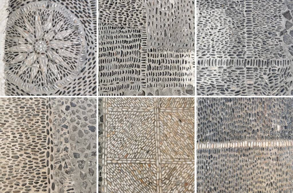
Designing bespoke pattern for clients is something that I have made a key professional design interest. Communicating a sense of place, historic reference or activity as pattern is what I really enjoy and over the years I’ve been on many site-visits to interesting places to learn about what the client would like or definitely not like. This visit was no different. I love the anticipation of finding out more, a new project to get to grips with, and all my design experience to apply to the challenge …
Some of my previous design work was used as a reference for context images by the original architects, proposing my patterns and stating my details – note – never send artwork without your contact details attached! Phone calls were made, samples were sent, bids were accepted and then a call-up. Please come to the airport for a meeting. There’s a tight deadline, a budget, and something the client knows they want. In a nutshell the brief: Celebrate Birmingham’s buildings in a one colour, repeating pattern that works close up in detail and from a distance as a visual rhythm. Buildings need to be identifiable.
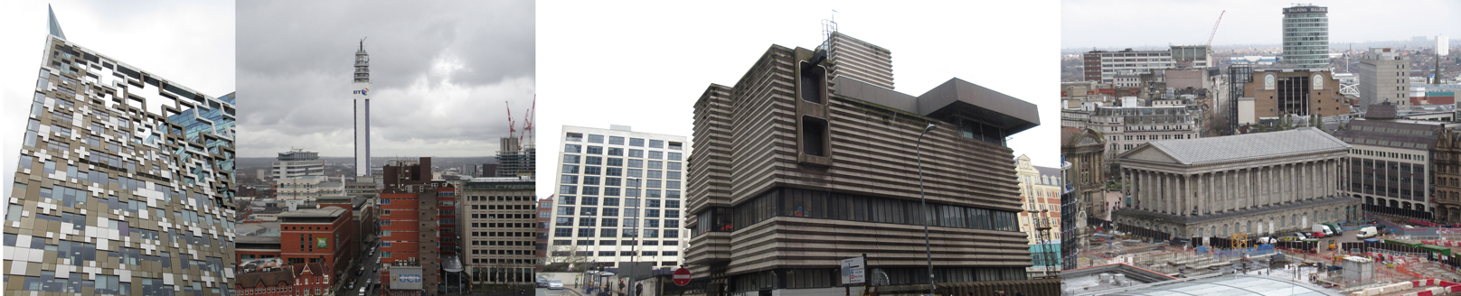
With any project I carry out research, ask the client lots of questions and evolve a design approach subject to the answers to my questions. Production methods, fabricators, material choices, colours, budgets, time-scales and of course client ambition for the project shape the design language and development of the project. I set off to take photographs of central Birmingham and climbed tall landmarks to get good views. I took photographs, made sketches as well as notes. I had some buildings in my mind I knew needed to be included but I also wanted to use others , less iconic ones, as visual rhythms to play with negative and positive shapes across the composition.
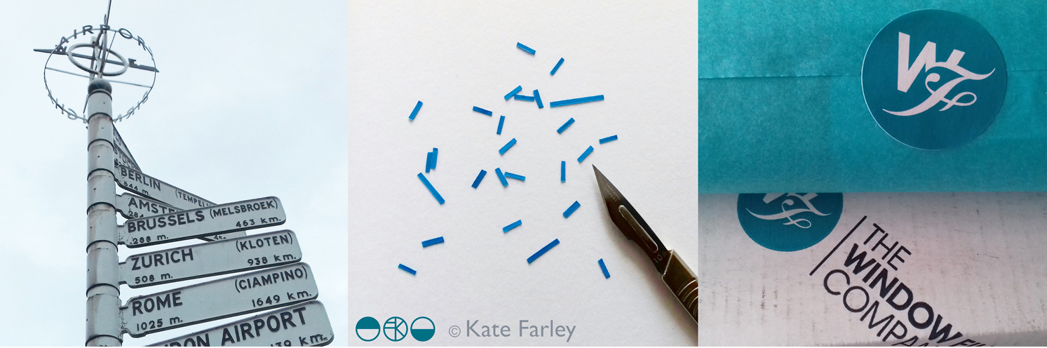
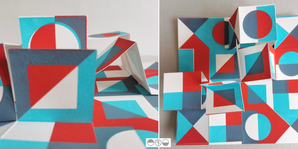
Back in the studio I chose paper cut-outs as a clear graphic way to create the buildings, as I have done for several commissions including for the Barbican and TfL posters. Once the individual buildings were cut out I scanned in the artwork and spent many hours moving everything around in Adobe Illustrator. I was testing rhythms in and out of repeat and shifting scale, proportions and pairings. This can send me back to re-cut something or add new details. To some people those hours of making subtle tweaks and changes wouldn’t even be noticed but to me it’s so important that every inch of the design works the best it can and it can be time-consuming – but it will be worth it. I can’t stress this enough to students embarking on their Final Major Projects at the moment! When you know what scale the final artwork will be produced at you need to check the correct level of detail as working at a computer screen can be very misleading for artwork several metres long!
A concept sheet and initial design piece was sent to the client for approval and at this point I had to label the buildings I’d included. Once approved I was able to continue building the full repeat, adding further buildings, and make test prints with the help of the team at the Window Film Company – who I already have award-winning work with! They really know their stuff and several phone calls later to check small details regarding file specifications and production issues resulted in the excitement of samples to sign off, both by me and the client. A couple more proofs for colour matching and scale of design was checked and then we were good to go. Quality is everything when it as your name on it, and making sure that everything about the design is right BEFORE it gets installed is rather important. Sleepless nights before installation of projects has been known!

This project originally came my way almost a year ago with some scoping phone calls and emails, and now I’m able to share photographs with you. I’ve had people let me know they’ve seen work that looks like mine at the airport – hoping I hadn’t been copied – but no, this time it is mine! When Birmingham Airport tweeted the pictures last week I was delighted that I can now share images of this project from 2018 – when I was Birmingham-based as it states, and now it feels rather a fine farewell to the place I called home since 2005.
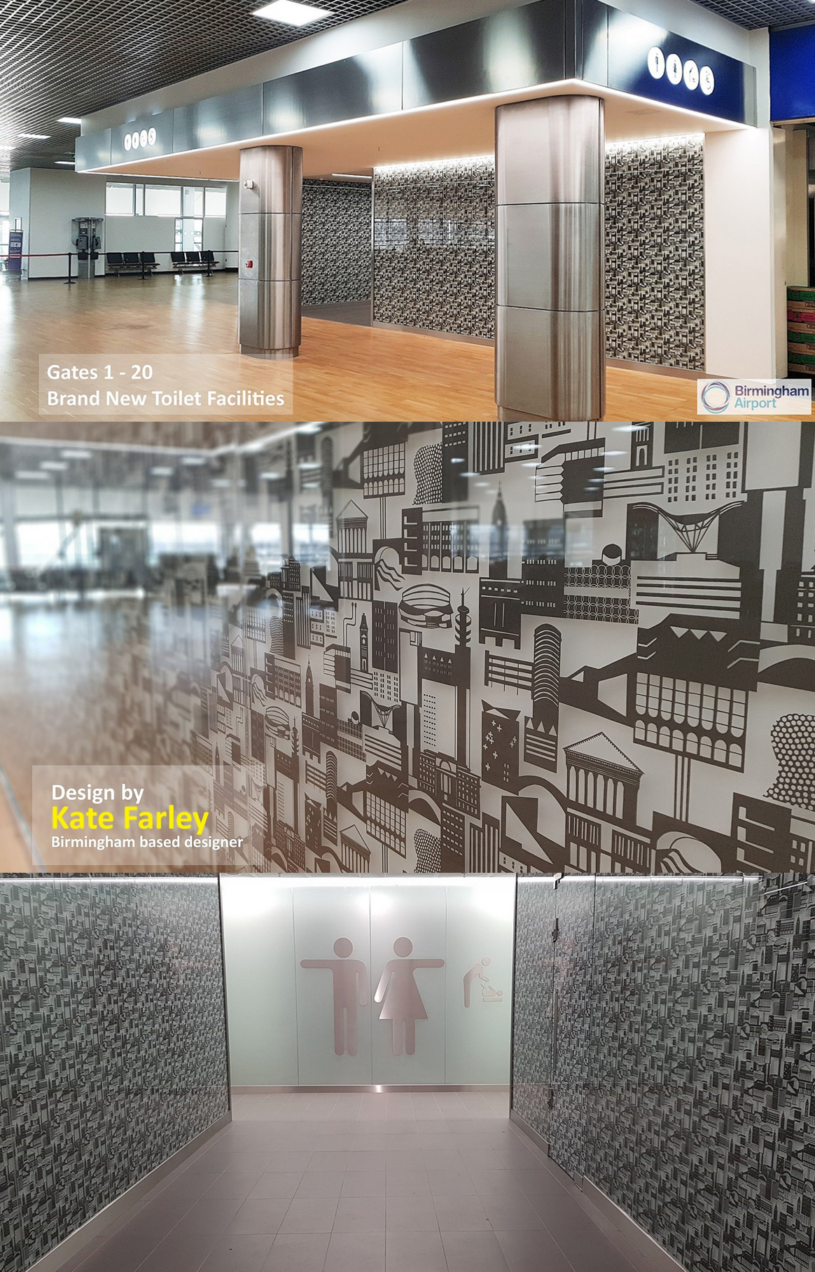
(onsite pictures – official photographs from Birmingham Airport)
Yes it is by the toilets, yes I have already worked on two commissions for public toilets (Colchester / Dedham many moons ago), and I can’t promise this will be my last!
Save
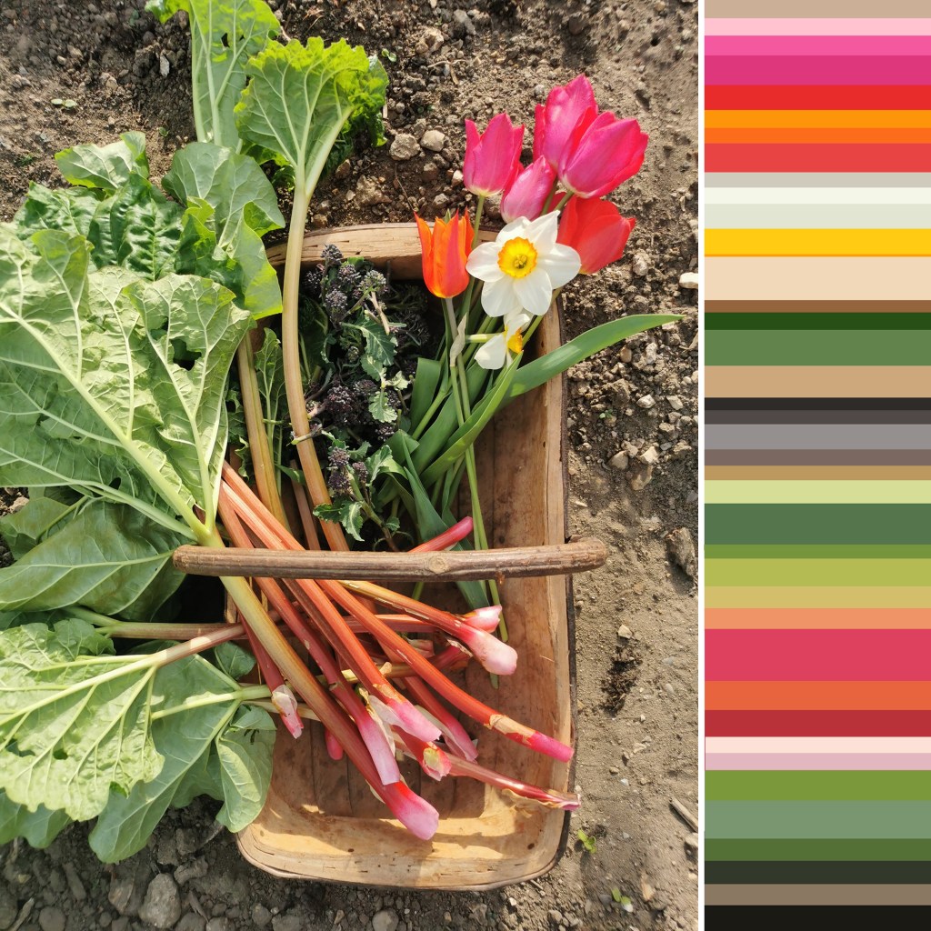

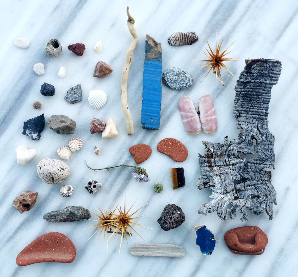
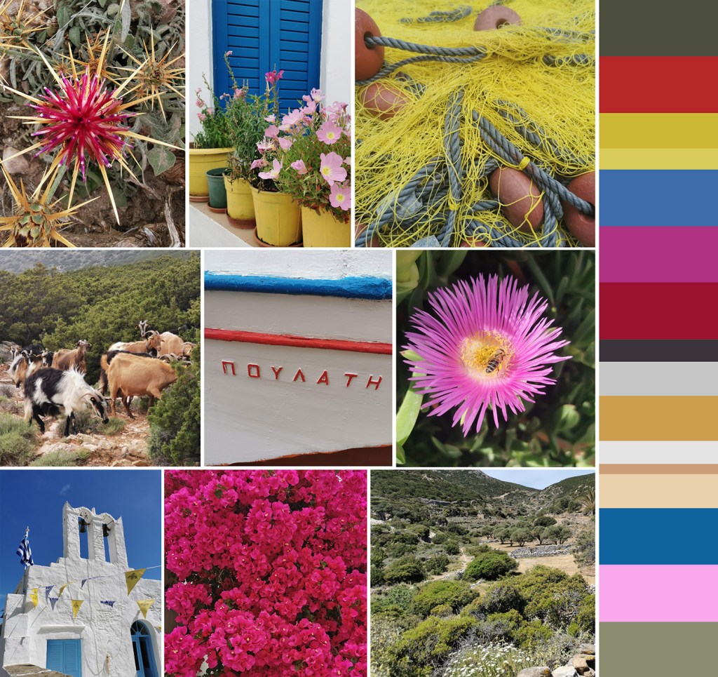
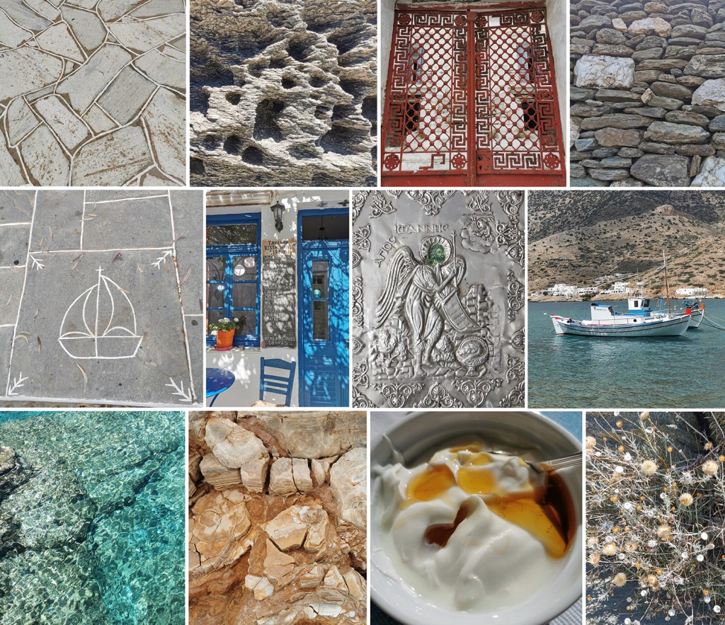


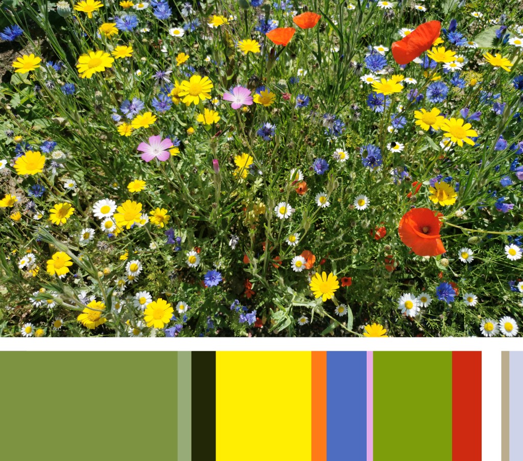

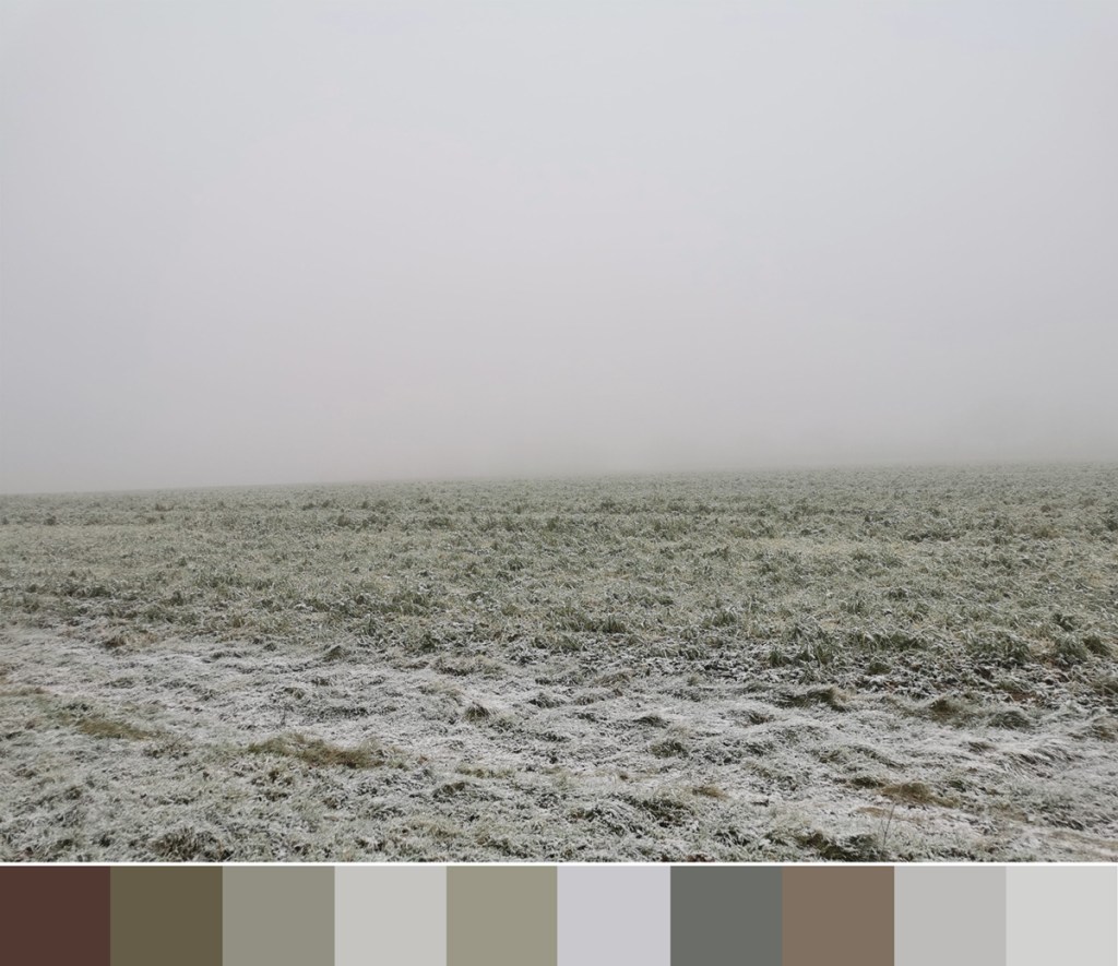
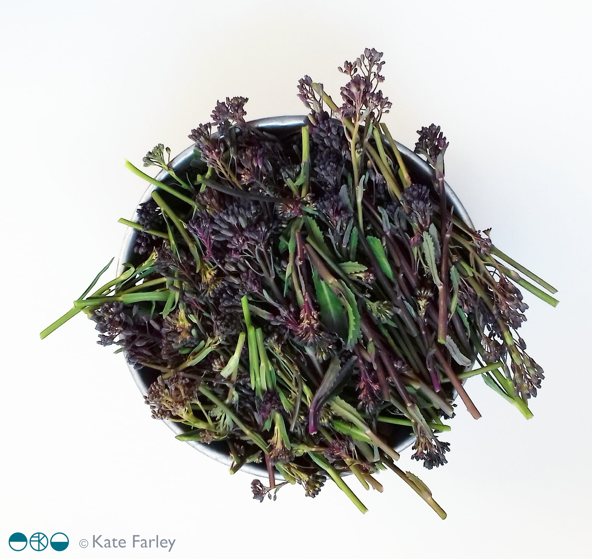
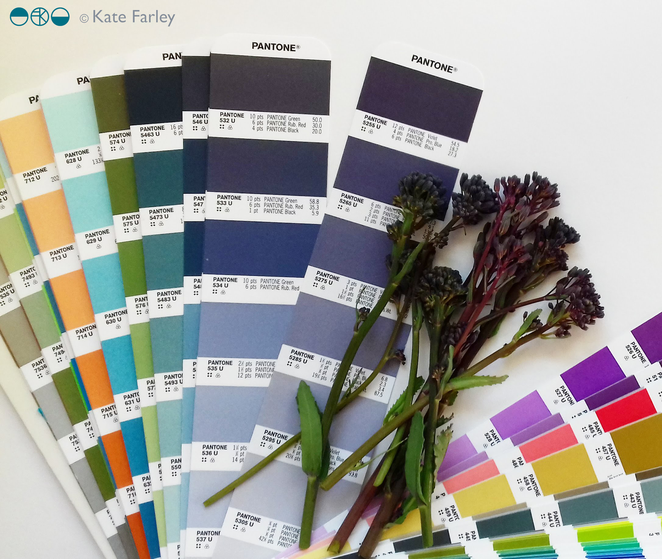
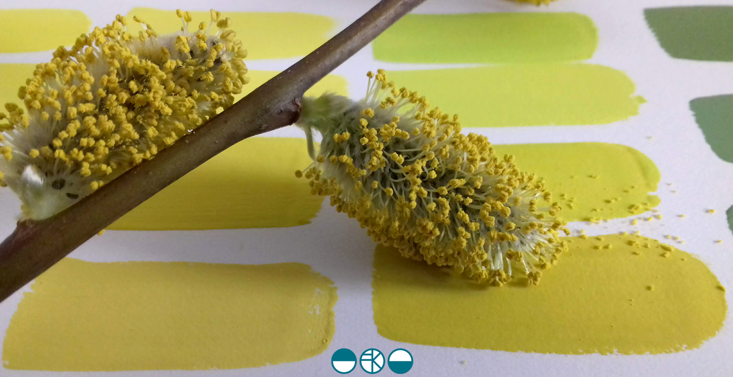
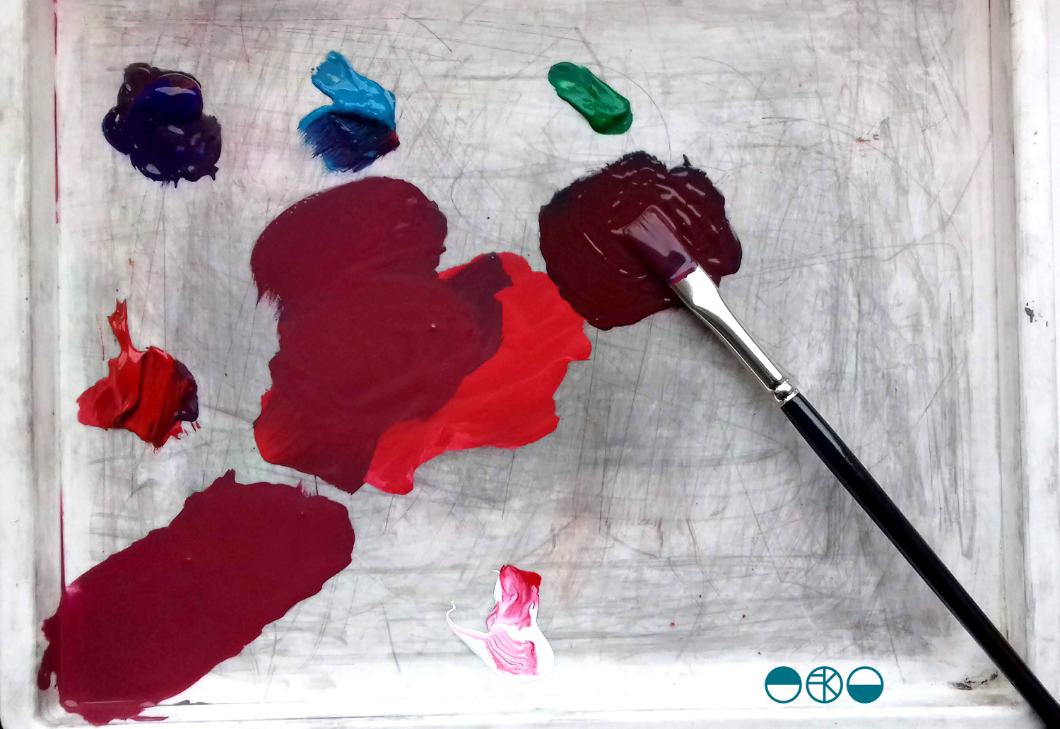
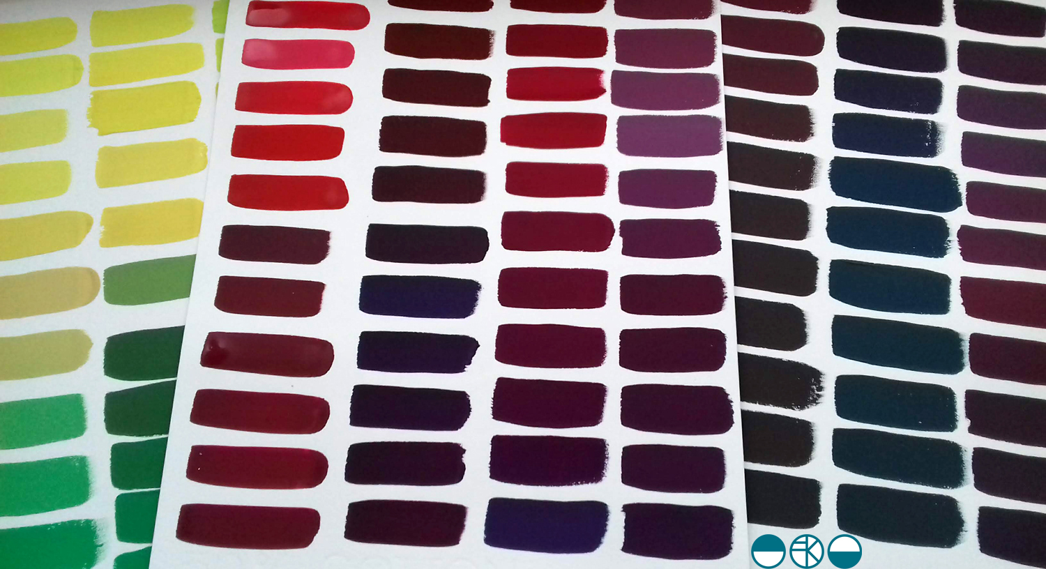
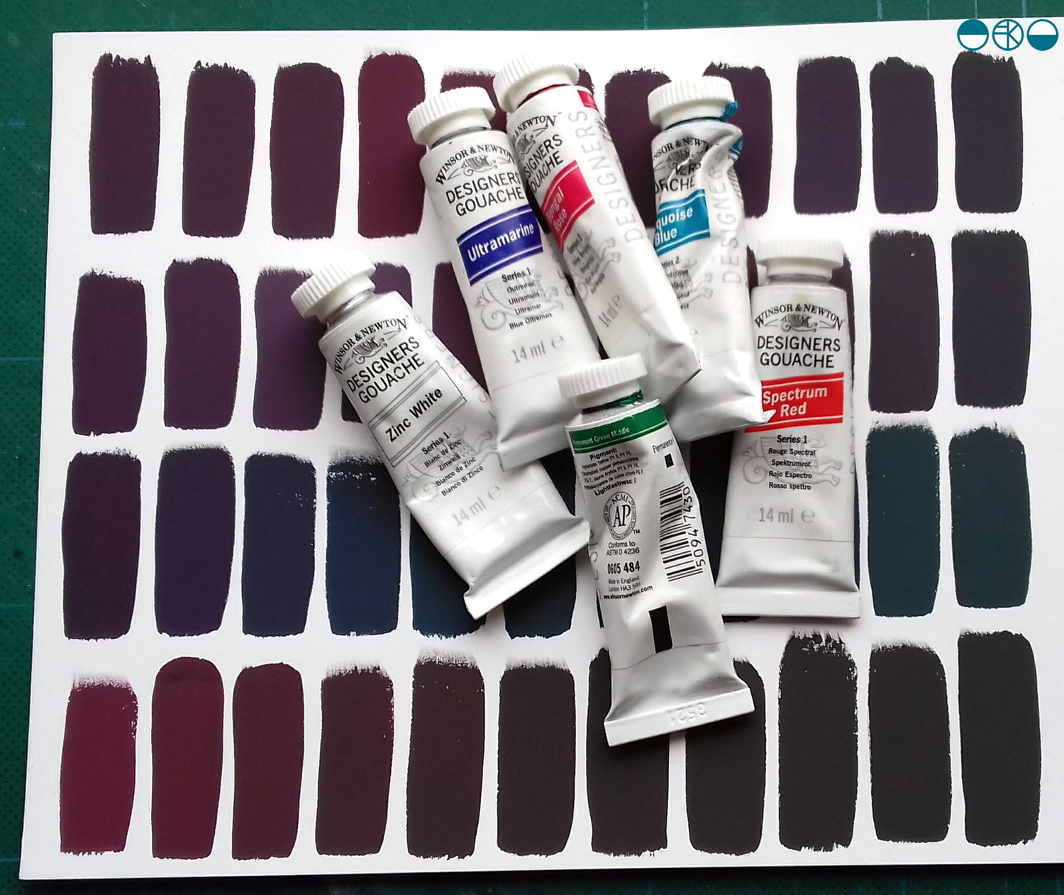 I was lucky enough to have excellent colour teaching during my time at art school and consider myself strong at seeing and achieving the right colour mix. At uni I remembering saying to the print technician “it’s nearly right, I’m happy with it”, and she’d say, “Kate, it’s not what you set out to make, keep going until you get there!” I thank her for teaching me that persistence and these days my students know I’m particular (a preferred word to fussy!) when it comes to colour. Getting the colour right is so important and you may as well enjoy the journey to get it right. Textile products sit alongside fashion and interior items made from other materials, and the colours need to match / coordinate, so quitting before you get the right colour may be a sales / employment disaster too!