Colours from the Italian Alps

A grey-sky day slowly peeled back by mid-afternoon to reveal beautiful blue sky and high mountains with patches of snow. Following a slow late lunch of polenta and other local cuisine we prepped our bags and headed for the hills. Most people were coming down from the mountain as we started to climb, but we were well prepared, with tummies full ready for the walk upwards, not quite sure how far we’d get or how far we would see, but willing to make the most of the fine weather.

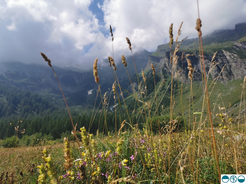
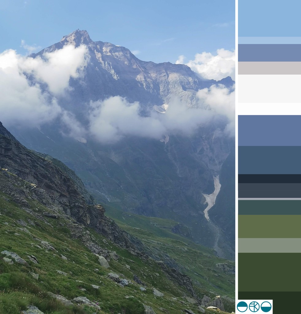
Walking in this sort of landscape can be overwhelming seeing as we live in the famously flat county of Norfolk. The vast scale of the mountains and the views stretching across the valley grabbed our attention initially. The purple greys and intense greens of the mountain sides played with the ever-shifting fluffy pale clouds. As we climbed along with the vastness of the mountain hues it was the pockets of colour, highlights of white, patches of sunshine yellow, pinks and mauves, acid green and deep crimsons and blue that competed as I put one foot in front of the other in the steep ascent. As we climbed new flowers became our companions beside the path, in the nooks and crannies of the rocks and high on the mountain pass.

Edelweiss and buttercups, scabious and azalea amongst plenty of others I was not familiar with. Although late in the summer there was so much colour to enjoy as there had been a very wet spell a few weeks before. Looking back up the valley as we drove back along the valley there was no sign of the colours we had walked amongst, but we knew they were there, ready for others to enjoy.

November colour palette, on the water

I love creating seasonal colour palettes, so here’s one from today, with our Mirror dinghy on the Norfolk Broads. The distinctive red sails stood against the neutral greys and greens of the November day. It’s not entirely proportionally correct but the red grabs the attention so I believe it’s okay to give it some extra width in the palette at the expense of more pale grey!

colour around the garden

When my children were very young I remember having to occupy them in a park near a hospital and as the time dragged on they were clearly finding the wait too long and boring. I came up with the task of finding colour to entertain them, so they dashed here and there with specs of colour. Sometime later we had little piles of different colour from leaves, petals, grass etc. and we were surprised by how colourful the park was when we first thought it was all green.

Many years on this week I found them doing it again, for fun… as the garden was so full of colour. It was wonderful to see them noticing the extent of some colours such as reds, and difficulties with blue, but with lots of rushing around again they made an impressive rainbow. Me being me I stepped in to organise the colour a little bit more, order some specifics … and then got told off for styling it for social media… oops!

The garden in June

nature: holiday inspiration for the sketchbook

This holiday time has provided an opportunity to go to new places, see new things and return to the sketchbook just for fun. A week at Ilkley Moor enabled lots of time for walking and seeking out inspiration from the natural world, with distinct differences to the landscape I’m used to day to day. Up hill and down dale saw me amongst mosses and lichens, pebbles and boulders, grouse, larch trees, heathers and bogs … and even a fragment of pottery.

Rucksack pockets were filled with samples of treasure ready to investigate later. The process of drawing enables me to get to know an object, and by making several studies of each item I enjoy developing a stylised representation. I hope never to tire of the getting-to-know-you drawing process I have practised for thirty years.

By looking closely and seeing through drawing I can work out the essential elements of surface, form and texture to record, but also I love to play with the appearance of elevation and structure of three dimensional objects, such as the pebbles, to explore their new form as they appear on the page, as flat motifs.

The textures and colours of the items I gathered provide macro evidence of the vast landscape I walked through and connected with. As this was springtime there were pockets of fresh green bursting through winter foliage, demonstrating the natural cycle awakes again. The geology of Yorkshire provided variety in coloured greys and texture under hand and foot as we bouldered, scrambled and hiked, notable in contrast to the soft wet bogs and spongy moss beds amongst the heather.

Without going all John Ruskin about it, the natural world really is amazing, and full of inspiration for anyone inclined to notice. Anyway, back to the rather flatter fields of Norfolk …

winter palettes

I’ve not had much time for colour mixing with gouache recently but I’ve really enjoyed noticing the contrasts of seasonal colours on our walks so I thought I’d celebrate that here. Some colours are exaggerated by bright sun, while the recent frosty mornings provide a muted coating.

Taking time to notice these small delights are ever more important as we spend few hours outside. I noticed today there was daylight in the sky at 5pm, so that and the first sights of snow drops and daffodils are putting me in the mood for springtime.

Autumn colour swatches

I’m not the biggest fan of Autumn, mainly as I hate to accept the end of summer, but every year the colours of the new season are beautiful so it is difficult to stay disappointed for long. Having spent a week in hospital recently I really missed seeing nature so once out again I noticed a heightened awareness; my senses really enjoyed connecting with the outdoors again.

Wheatfen Nature Reserve, Norfolk

Over the last few months I’ve been paying more attention to colours of nature, gathering plants, feathers, shells etc and mixing the colours using gouache – see previous posts – I find it a wonderfully meditative process and one that brings great results too. The process really makes me look at the colours of the artefact and work out the nuances of hues, tints and shades. I’ve taken some slow recuperative walks in the countryside to rebuild my strength, allowing me to gather colour and appreciate Autumn. The colour chips here were made from the leaves from one tree, arranged in colour order. I wanted the colour to be the main thing to identify rather than them being leaves, so by trimming the edges of the leaves I’ve made them more like swatches.

leaf colour chips

mixing and matching colour from the beach

I’ve been continuing my colour mixing series, this time taking inspiration from the beach and the artefacts I gathered. The gouache works wonderfully to capture the colour, responding to small specks of added colour as I take the starting colour on a journey to and past the colours of the item I am studying.

Some new drawings are taking shape that use these colour chips and I am excited about where they are going – one day I’ll share them. In the meantime I hope you enjoy the colour of the beach of north Norfolk.

colour mixing nature

Back in March I began a new series of colour of works on paper that were simply about mixing and matching colour, evolving hues through the process of painting individual swatches to build the narrative in a sequence, as if a technical exercise at art school. You can read about those pieces here.

KFarley_grass_gouache
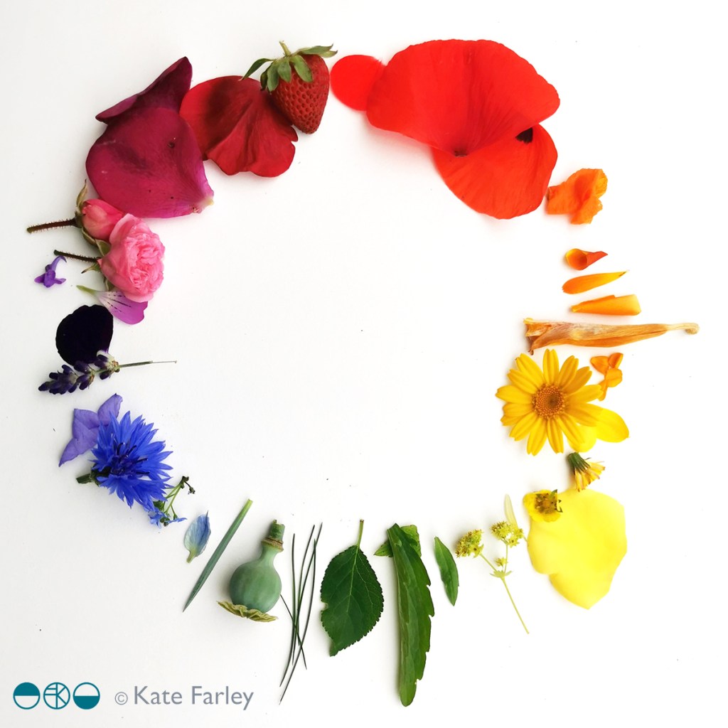
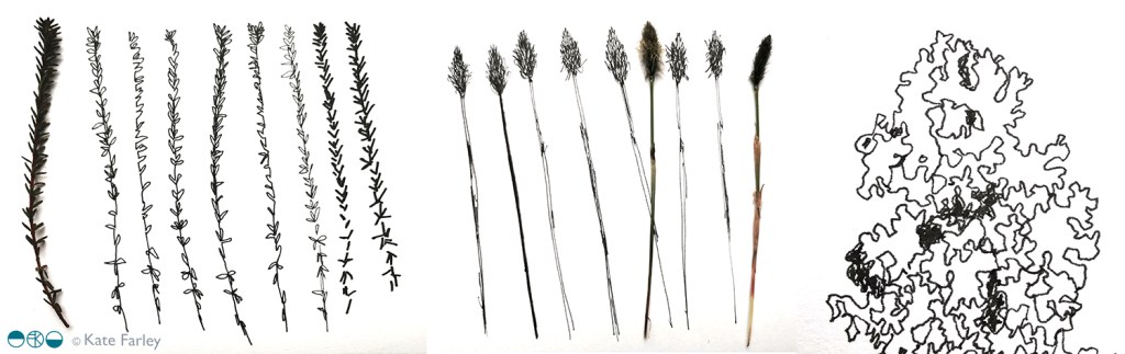
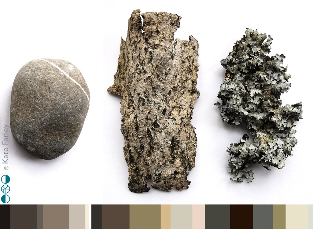
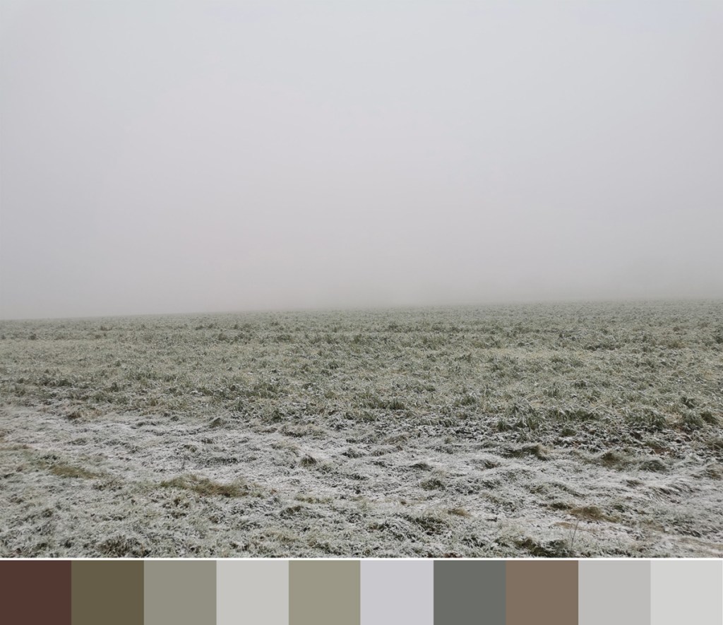
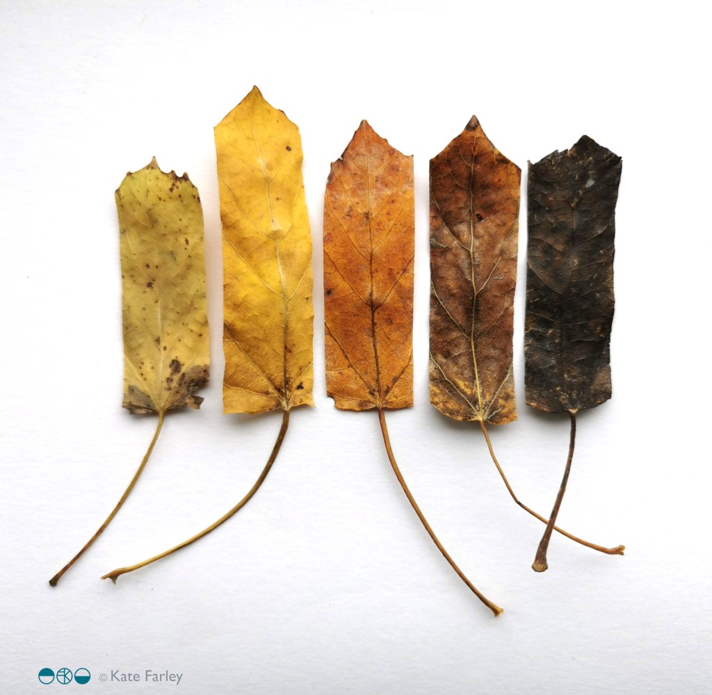
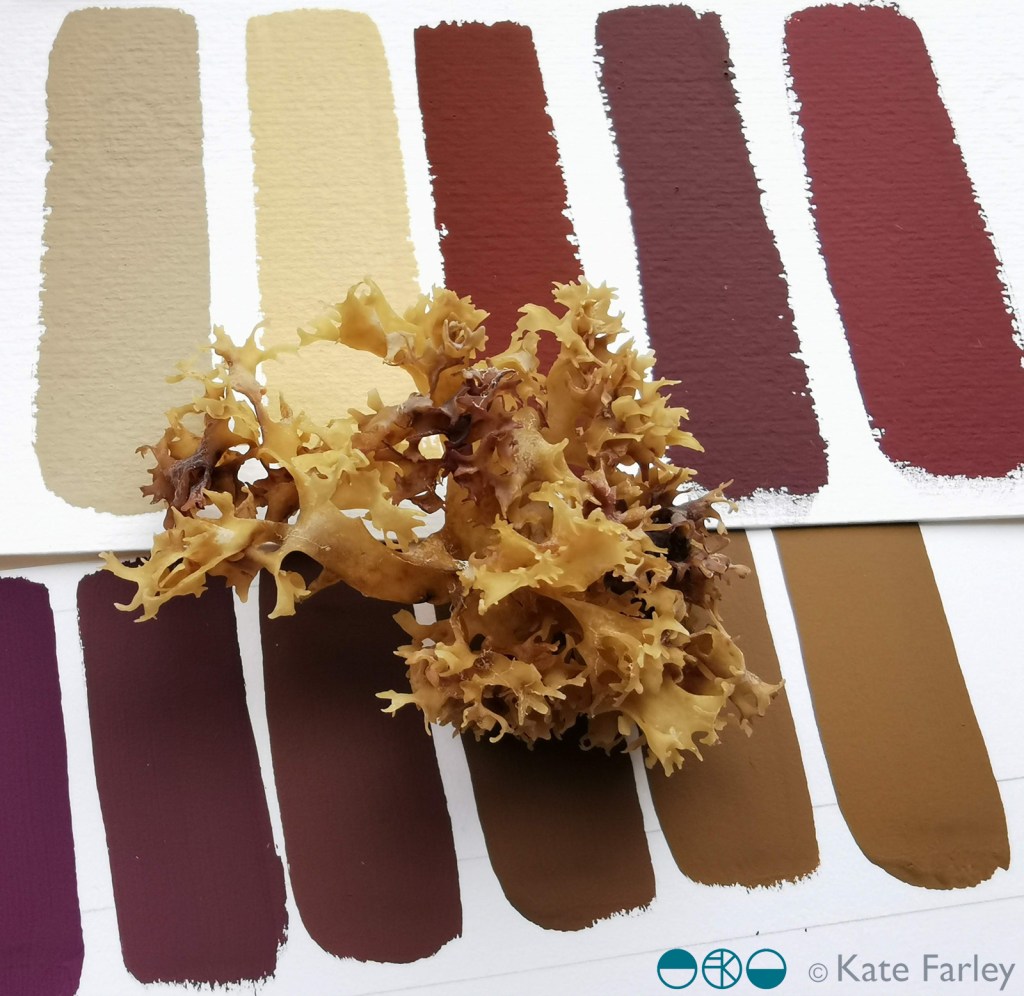
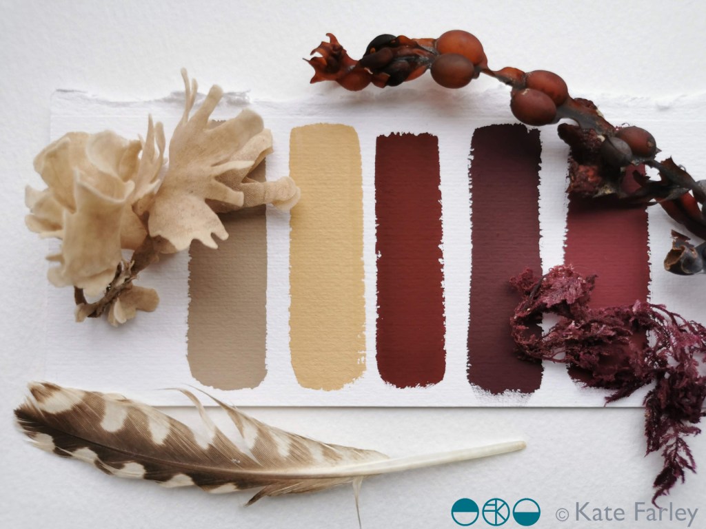
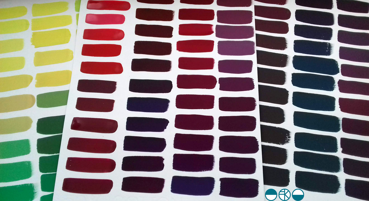
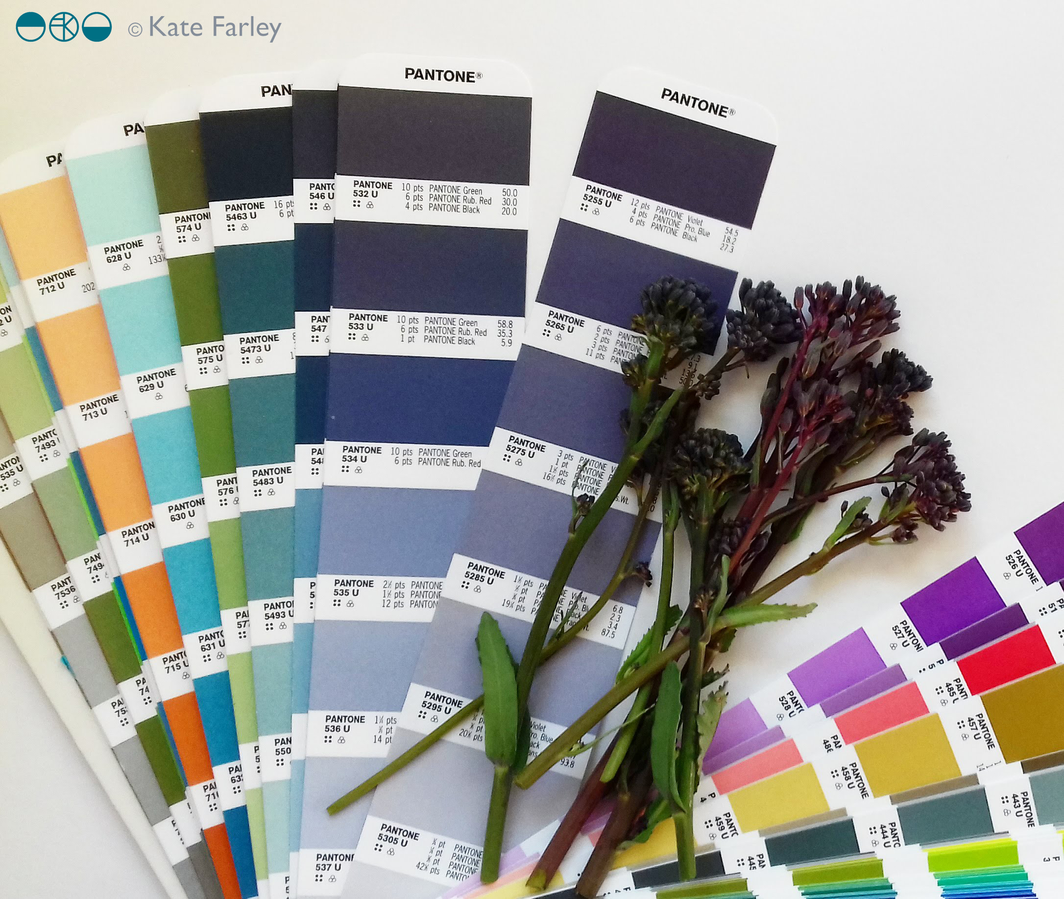
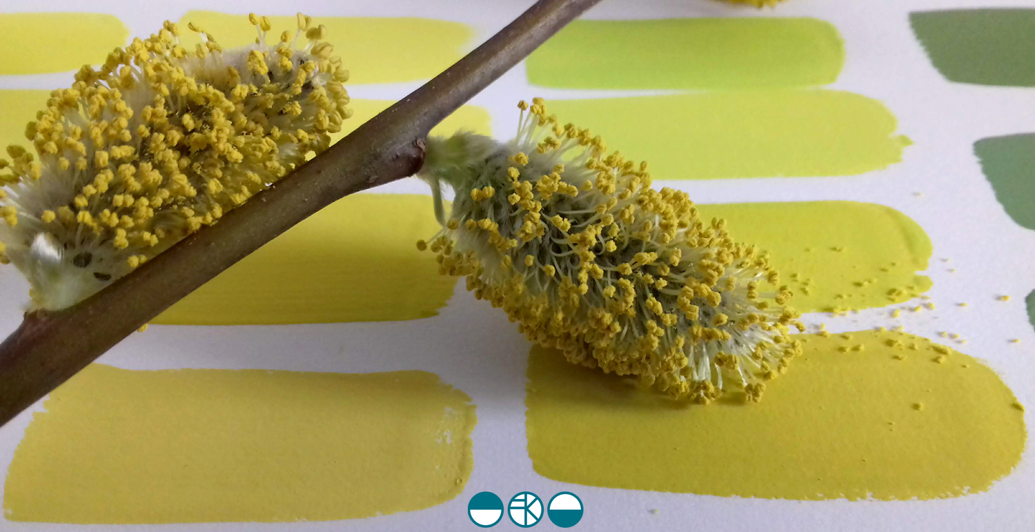
I’ve continued to gather pieces from nature on the walks I’ve been on this summer and have continued with the process of mixing colour and so I thought I’d share some here.

KFarley_wheat_gouache

I’m doing this simply as I love to make colour, and really enjoy working with the gouache paint for its colour qualities. The process occupies my mind, suggests potential avenues for future work and connects me with nature through the mementoes I make. The seasons change and the colours alter, but the swatches hold memories in the process of mixing, and I can almost smell the dry heat of the corn, and the cool shade of the wood where I found the Jay feather.

qrf


Brassica purple, harvest time

Having sown the seeds for purple sprouting last summer it has been the usual long wait until harvest time, but we have been picking it for the last few weeks. It always feels good to pick the brassica because the new season of crops are a while off harvesting.

KFarley_Brassica1a

The purple of the sprouting inspired my colour palette for the Plot to Plate tea towels.

plottoplate_brassica_KF

I can’t resist colour matching, so here we are again …

KFarley_brassica1

evolving colour in the making

A walk in the Spring sunshine gave impetus to a very simple and mindful exercise back in the studio; to make the colour of the landscape. A sprig of willow contains so many different colours. Those colour qualities will alter as the clouds skud across the sky casting shadows, and as the sun ripens the buds.

KFarley_yellow_willow_1500_KF

With paints at the ready I knew it wasn’t about making the one colour, but the narrative of generating colour as my process of journeying from one to the next. I wanted to paint each of the swatches of colour I mixed as I evolved the paint story, observing and recording the subtleties of the change in hues. Selecting a limited number of tubes of gouache to begin made it more interesting. To start I selected the dominant colour I was aiming for, and had a little piece of nature with me as reference. I developed the swatches of colour, selecting one, and then another hue to achieve, step by step, slowly and patiently filling the page.

KFarley_ycolourpalette_1500_KF

Gouache is a beautiful paint and this exercise reminded me of a wonderful morning teaching colour mixing to BA1 Textile Design students earlier this year. Getting the right amount of water, ensuring the colours are cleanly mixed, and then making that one painted line flat and even – it all takes practice.

KFarley_ytubes_colour_1500_KF
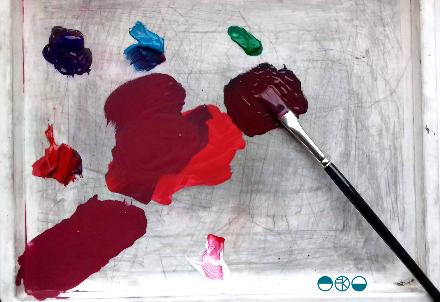
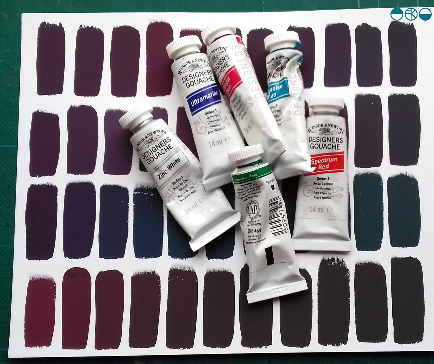
I was lucky enough to have excellent colour teaching during my time at art school and consider myself strong at seeing and achieving the right colour mix. At uni I remembering saying to the print technician “it’s nearly right, I’m happy with it”, and she’d say, “Kate, it’s not what you set out to make, keep going until you get there!” I thank her for teaching me that persistence and these days my students know I’m particular (a preferred word to fussy!) when it comes to colour. Getting the colour right is so important and you may as well enjoy the journey to get it right. Textile products sit alongside fashion and interior items made from other materials, and the colours need to match / coordinate, so quitting before you get the right colour may be a sales / employment disaster too!

Interestingly, some of my current students were discussing my approach to colour recently and one shared that I’m not keen on black outlines around shapes in print designs. Another one commented that they hadn’t heard that, but would keep it in mind. I jumped in to defend the comment I’d originally made – a black outline is too obvious, unquestioning, the default, rather like Times New Roman black typeface when you open Microsoft Word. Too easy. I ask students and designers to think about whether the black line is the best for the design. If you think of all the other colours you can use, I think you may find another and better alternative!

At the end of this colour mixing time I am left with souvenirs of the process, memories of the walk and beautiful colour. This is real colour away from the back lit screen I too often see colour from. I shall do this again.

KFarley_y3xcolourswatches_1500_KF