pattern and textiles spotting

A weekend walk in the search of headspace following a busy week in academia led me to the Suffolk coast and a beautiful 13km walk, down and back, along the beach. Always with an eye on the hunt for pattern, colour and cloth I found all three, relating to the topics of my teaching. Of course I also had a handful of stones and other ‘precious’ detritus.

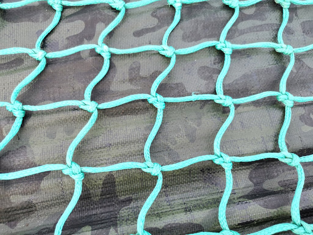
Having spent the week talking textiles, including pattern structures and repeating designs I was amused to connect the patterns on the beach made from the waves running back across the sand being echoed in the fishing nets on the boats higher up the beach.

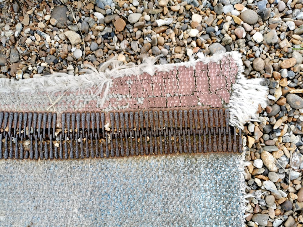
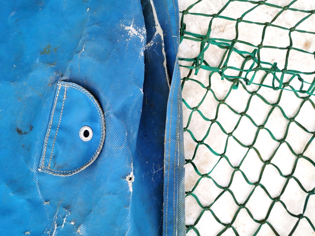
I have also been discussing with the students the broad application of textiles in the everyday world around us beyond fashion and interior applications and our walk gave me good examples to illustrate my point. We use traditional textile techniques including knitting, crochet, printing or weaving, with the addition of a coating or finish to create materials for practical applications.

seeing red

My world is pretty colourful; on a daily basis I’m in contact with colourful textures, materials and surfaces from fashion, interior and architectural contexts. Not only do I work with hard and soft surfaces in my design practice, I also teach undergraduates to work with colour in relation to textile design. It’s important to see beyond the broad definition of colour by name and to think about the context of colour; the surface qualities in that colour, the effect the material has on colour, such as gloss, matt and opaque for example.

Last week I managed to update some colour charts in my studio resources and it made me think about how we tend to have particular favourites when it comes to colour. I certainly have a comfort zone in sections of the colour charts and other areas I’d have to be persuaded to go near. Commissions often include discussions with clients about the intended colours of products, and I enjoy the challenges of pushing the boundaries of my comfort zone – within reason! I have a different palette I’m happy to wear compared with what I’d live with, and I certainly dress in colour relating to the mood. I remember many years ago dressing in very colourful clothes only to receive a rejection for something that mattered. I felt gutted I’d dressed for the wrong outcome!

Here are some REDs… I love the border colours between red and orange.

katefarley_red_100