REPEAT panel and contributor book signing

It’s been a while since I last wrote here – the summer term at university has been very busy, … I’ve hosted an Industry Awards Day, assessed a lot of work, put up a degree show and taken students to the graduate showcase of New Designers in London, to name a few activities, so not much headspace I’m afraid.

In the middle of all that I agreed to chair a panel at New Designers titled Contemporary Printed Textiles and Surface Design Practice. I had the amazing designers Emma J Shipley, Sarah Campbell and Deborah Bowness as panellists, sharing their expertise – all three designers are interviewees in my REPEAT book. I had some questions up my sleeves to shape the discussions, and despite not having done this sort of thing before I thoroughly enjoyed leading it. To a pretty much packed venue we discussed our individual design processes, clients and customers, how we work through licensing deals, and the decisions behind establishing brand identities. Sarah, Emma and Deborah have decades of experience between them so it was so valuable to share their generous and hard-earned experiences with the attentive audience. We could have carried on for much longer! There was also the highlight of meeting my publisher from Bloomsbury, Georgia, who I’d not met in real life before then, but came along to support me.

I also had another idea in my mind, to ask Sarah, Emma and Deborah to sign my REPEAT book to make it a special keepsake. As New Designers is a textile design industry event I also managed to cross paths with several other contributors and asked them to sign it too, including Mark and Keith of Mini Moderns, Clarissa Hulse, Daniel Heath, Jules of @thepatternsocial fame, as well as past students Tasha, now designer at Habitat and Molly, currently floral print designer at Bay and Brown. It has become a mission to find opportunities to cross paths with the many others included, but this could be a very long task!

The day ended in celebration for my colleague Jill, who retired this month after 38+ years at Norwich University of the Arts. Jill taught me when I was 18 years old, and we’ve worked together over the last five years in Norwich. She came along with Grainne, also one of my tutors, to support our graduates on the stand at the show, so I grabbed a picture with them both and the book. They earned a mention in the acknowledgments as they were hugely supportive of me as a student, introducing me to their love of drawing, colour and pattern that has stood me in the many years since.

It was a really successful few days in London with our graduates doing themselves and us proud, as they jumped with both feet in to this great industry experience, just weeks before I proudly read their names out as they crossed the graduation stage at Norwich City football ground. Now it’s time for some holiday!

pattern informs the piece: Zandra Rhodes exhibition review

Finding a couple of hours to spare in London last month I took the decision to head across the river to the Fashion and Textile Museum, and specifically, the Zandra Rhodes: 50 years of Fabulous exhibition. It proved to be a perfect visit for where my head was at; juggling fashion and textile design in both a design commission and my academic life.

Zandra Rhodes is first and foremost a textile designer although it is her fashion designs that carry the printed and embroidered pattern she is famous for. The silhouettes of the garments, constructed often from multi layered draping fabrics are guided in their execution, in fact dictated by, the pattern design of Zandra’s strong handwriting or pattern, and executed using print processes and surface manipulation.

I’ve included plenty of images of these outfits in university design lectures over the years, discussing how the designer maintains the focused design style and aesthetic but also manages to evolve the work through the decades.

As ever it is very different when you get the chance to see the fabrics in real life. The white printed pigment on chiffon from the ‘Lovely Lilies’ collection (below right) and the quilting over screen printing of her signature swirling motifs as borders and placement prints provides the evidence that Zandra Rhodes is first and foremost exploring fabrics to lead garment design.

ZH_highlights

The variety of fabric manipulation and surface embellishments was fascinating to see, some rather crude and some pieces held their own more than others. The ease in which the textiles worked as one with the garment design is certainly demonstrated throughout the exhibition, and it was useful to see the screens for printing to see the composition of the designs later on in the exhibition.

ZR_patterns

The theatricality of Zandra Rhodes’ work was a perfect match for opera costumes, and upstairs in the gallery a number of interesting examples were showcased. I also enjoyed seeing original sketchbooks alongside a film of the designer talking about how important drawing is to her. I hope many textile design students visit the show and take her advice.

ZR_dresses

There is a significant body of work on exhibition here and it is important to view it as a considerable output of a single designer with a thirst for carnival. Her practice spans fifty years, hence the exhibition title and although her style is not for everyone, her contribution of bravery, exuberance and fabric play should inspire others to take creative risks and find a way to make the work they want to make.

I would also recommend the small showcase of company overview and embroidery work by Norman Hartnell as you enter the gallery – stunning pieces from a different era.

The show is on until the 26th January, 2020.

weaver extraordinaire: Anni Albers

If you are interested in textiles and haven’t heard about the Anni Albers show now on at Tate Modern in London, then a.) where have you been? and b.) get there fast if you can!

This has been a much anticipated show for me. Having been enjoying many other people’s pictures via Instagram since the exhibition opened I was most excited to get to the show and I’m so glad I did – I went round it several times and breathed in the history I had learned as an art student myself; typewriter patterns from Bauhaus lessons, the infamous diploma piece with sounds absorbing properties in the yarn, and those classic Bauhaus photographs, but there was so much more. Colour, cloth, pattern, rhythms, photographs, works on paper, products … The woven structures and yarns drew everyone in for a closer look – so much so that the alarms kept being set off and the guilty took a sheepish step back! There was a fascinating display of the research of historical textiles from Albers’ own collection that made perfect sense in how she interpreted and worked with the process of weaving.

annialbers_s

Experimental, commercial commissions, religious pieces and jewellery are some of the aspects of this considerable show. As with most well-received shows, the audience conversations themselves were fascinating; lots of discussions about experiences of weaving, hours at the loom as well as working out what she must have done.

It has been the architects, the painters and the product designers, usually men, who have become far more well known from the Bauhaus, including Anni’s husband Josef Albers. The avant-garde German art school’s first director Walter Gropius stated there were equal opportunities for all when it was established in 1919 and yet women were generally encouraged towards the textiles workshop, a place and craft deemed more suitable. Anni never let this distract from her focus despite wanting to be a painter. Her creative output of a lifetime, as edited in this exhibition, goes a long way to demonstrate her will to explore both the context of design and the development of art. She will have no doubt inspired many who have been introduced to her as a result of the show and her legacy will continue to influence far beyond the context of textiles as a craft for women. I came away with many notes and a head filled textile excitement – happy weaving everyone!

Exhibition ends: 27th January 2019

taking some time from tasks..

It’s the end of the academic year and I’ve got lots of admin tasks to complete and fortunately some trips to prepare for. The life of an academic is no longer one of summer holidays stretching out ahead of us until leaves turn red with plenty of time to catch up with rediscovering the in-tray, or making time for creative practice. Graduate shows, marking retrievals, timetables and planning new modules are only some of the things have been on my list. Many jobs fight for my attention – including the veg plot! Despite the jobs it’s so important to get out and about, see things and make time for oneself! I’ve got a number of projects planned for the next few months and taking stock is always a good start. Here’s to some time to think, and some time to draw, amongst the admin of the summer!

If you want inspiration and have time to see an exhibition I can suggest the Edward Bawden show at the Dulwich Picture Gallery – it’s brilliant. My daughter and I got chatting to two ladies who were enjoying it as much as us; spotting small details and playful touches in the commercial designs including the London Underground roundel as a pigeon’s eye, and several cats lurking! The versatility of processes and visual language, the playfulness, the draughtsmanship and scope of commercial clients is all there to admire. As ever, seeing the old favourites as well as those works new to me, in the flesh is always better than on a screen … Do go if you can – before September 9th!

I was very proud to also see my ‘Gardening with Mr Bawden‘ book published by Design For Today in the exhibition shop. The handling copy was a shadow of its former self, so I did my duty and folded it up properly again. The sales assistant commented on how well they are selling, so I’m grateful to those customers too!

Bawden_bookshop


Gardening with Mr Bawden

So this is the week my book ‘Gardening with Mr Bawden’ is being published by Design for Today. It’s been many months in the making, so I’m very excited to be able to share the details and for other people to hold the book in their hands.

What began as a project brief for a book with interesting folds that celebrates Edward Bawden’s love of gardening has become a project I am very proud of and have thoroughly enjoyed for lots of different reasons, pushing me creatively along the way. I love a design challenge and returning to the subject of gardens has been a pleasure, having launched my garden-inspired Plot to Plate collection back in 2012 and being a keen allotmenteer. I’ve moved away from my usual diagrammatic visual interpretation of gardens, towards a more illustrative manner, following on from my Parks and Gardens commission for posters for London Underground last year. It has also been a joy going back to paper engineering and book art – having made many editions of artists books over the years following an MA in the subject from Camberwell in 1998.

The images below show some design stages of this project with Design for Today. There is an early paper maquette as I worked out the structural narrative in relation to the imagery. Several of these were posted between us to allow for discussion and deliberation. At one point there was a cut-out pond but I was unhappy with how it worked on the back of the page so I left that behind. I cut lots of lino, with each page requiring at least two blocks – one for each colour. Although I had an idea of the key focus and composition for each spread it wasn’t until I was cutting the lino did I tie precise detail down. Only a couple of times I decided to completely abandon a page spread and rework it – and I’m so glad I did! Each block was hand-printed and hung to dry in the studio before being scanned to make a digital file that could be prepared for the lithographic printing process of the final edition at Calverts.

wip_Bawdenbook_flat

Once the final sheets were litho printed and die-cut / creased we have had to fold them one by one, sign the special edition and pack them up. We even decided to hand-cut out a window pane of the greenhouse in the edition of 100. We are delighted that the Special Edition sold out fast, well before the publishing date – thanks all! Those lucky people will receive the book along with a little booklet of the project and greetings cards, any day now!

signing booksMay18_1

This collaboration with Joe has been a really positive experience as we are both passionate about doing a great job. He was always happy for me to tweak something one last time as we signed off proofs, and understood the reasons why I turned sentences inside out in the booklet, to say exactly what I wanted to. Joe and I have discussed page size, paper weight and the folded structure on several occasions as well as how you take inspiration without copying, and the issue of creating something in relation to, but not derivative of.

I am sure people who know my work will recognise my style in there, despite it being a little bit more illustrative. Pattern making relates to both Bawden, and myself, so it made sense to include a nod to wallpaper designs too, inside the greenhouse, as pots of plants become floral wallpaper. I wanted to use lino because both Bawden and I have used the printmaking process. I also wanted to create a light-hearted feel to the imagery, that is so often in Bawden’s commercial illustrations. As I wrote before in a previous post, we researched lots of snippets of information to guide the imagery and are grateful for there to be so much writing and research available at the moment, but it was never intending to be a guide to the garden at Brick House, more to express the pleasure Bawden would have got from his garden, as so many of us do. I also wanted to take the reader on a journey through a garden, rather than show you all in one go, so I hope the reader can navigate their way around!

KFarley_GardeningwithMrBawden1

This book is the outcome of a great collaboration. (Thanks Joe!) So as the book is published today we celebrate this journey of designing and making, and can announce it will be stocked by some great places, including the Dulwich Picture Gallery, where a brand new Bawden show opens this week. Check out the social media accounts of Design for Today for updates. Final thanks ought to go to Mr Bawden himself, who has inspired so many of us, and who gave Joe and I cause to make this book.

window film wins gold

In my design practice spanning over almost twenty years I’ve been really keen to test my design skills in relation to different products and this has resulted in me working with some really great companies. I’ve learned lots and have got to test my pattern making skills for the different applications I’m working in relation to, learning from industry partners with their experience and expertise.

I’m really proud of my Construct collection as I set out to combine my interest in constucted cloth (weave in this instance) to inspire a print language, with the final surface designs being applied to hard surfaces. I was inspired by Augustus Pugin’s phrase “truth to materials”, in defiance against fake digitally printed wood-effect interior surfaces and I was interested in presenting a subversive outcome. My designs are not copies or imitations, they are a creative response to the material. I made tools to draw with; forks dipped in ink, relating to the threads of cloth and then manipulated the scans of the drawings in Photoshop to generate the repeat patterns.

KF Construct_blog_p2

When the opportunity came to work with The Window Film Company I was really impressed with their willingness to sample a range of designs and to discuss what worked. We explored the scale of the designs and sampled a number of patterns, resolved the repeating artwork to create the final collection. The products are brilliant, the window film is so easy to install and looks great. The idea of placing the woven textile inspired patterns on the window relates to the idea of hanging curtains. The graphic patterns are soft and calm, and yet provide privacy at the window. I then went on to develop my Threads collection to extend this idea further but employed lino cutting as the visual process, also available at The Window Film Company.

I was delighted to learn back in September that we had been shortlisted in the Best home improvement category at the House Beautiful awards 2017, for both mine, and the designs by Layla Faye, and they were going to be held in central London in November. Last week I went along with some of the The Window Film Company team to the awards and we are delighted to have won gold! It was a complete surprise as the category had some stiff competition, but we are so pleased to have this work recognised.

In the words of Micky Calcott, Director of The Window Film Company, “We’re thrilled to have won gold at such a prestigious and well respected awards ceremony. We work hard to provide customers with products that are practical, but also inspiration and stylish. We’re incredibly proud of our designer ranges and are delighted that our Kate Farley collection has been recognised as delivering something that customers want, enjoy and appreciate.”

My designs have been created with lots of consideration to hand-generated imagery, and in relation to the material it is printed on. The patterns appear straight forward but have involved many decisions along the way, testing the combination of marks and the rhythms that are created, as well as the repeat structures and the positive / negative details. I know the customers don’t have to know the entire creative process to like the designs, but I’m delighted to have the opportunity to reflect on this collection. Winning with this great company is something I’m really proud of. Thank you to Micky and the team, as well as to House Beautiful!WindowFilm_awards17

poster proud

Every designer is likely to have a goal or two, a particular ambition to aim for. Last week I reached one of mine… I have designed posters for London Underground. They are up on the system as I write. I’ve been bursting to share the prospect that this may happen for several years, and now it’s real!

The underground poster archive at London Transport Museum is full of great examples of graphic design, with work by my heroes such as Edward McKnight Kauffer and Abram Games. These designers have inspired me in my quest to explore visual communication through print and pattern for as long as I can remember and now my design work is on the network hopefully catching the eyes of commuters in London, as theirs did.

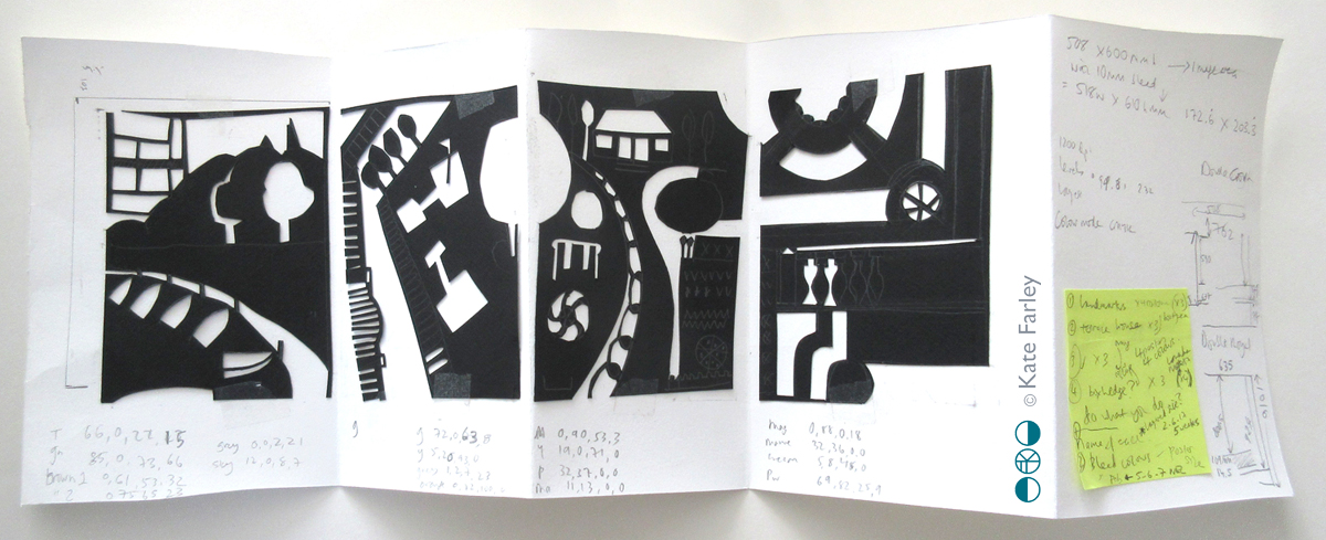
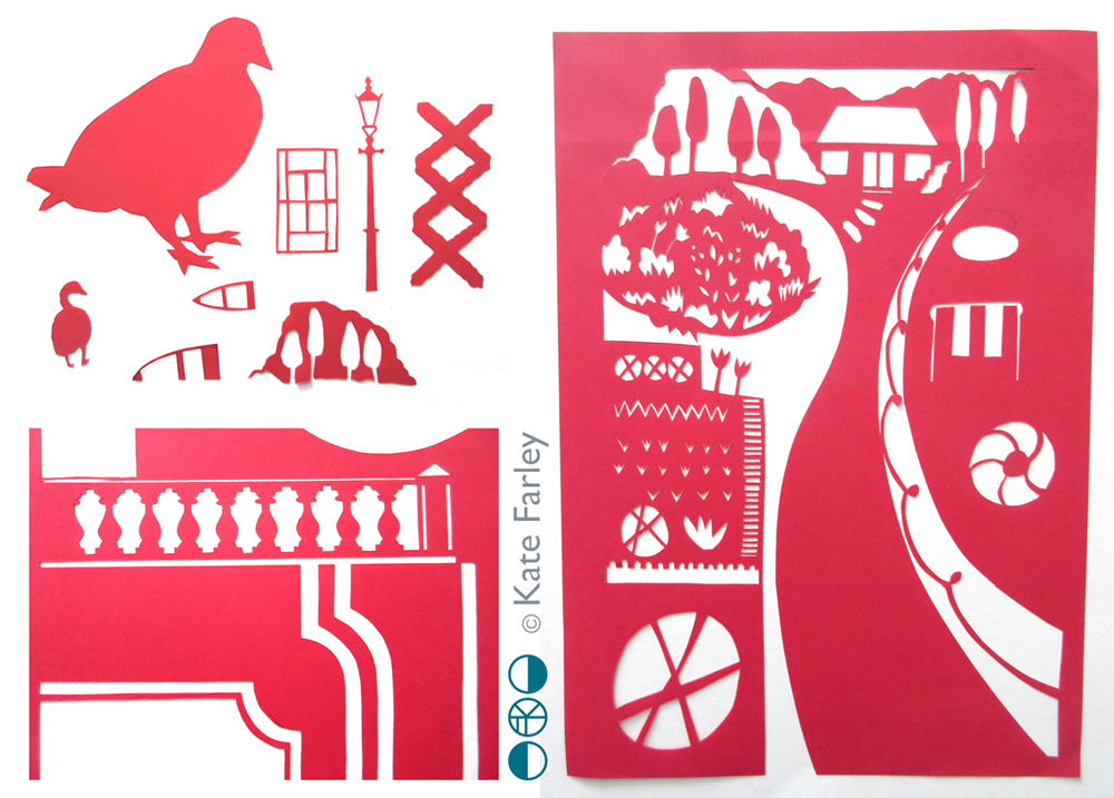
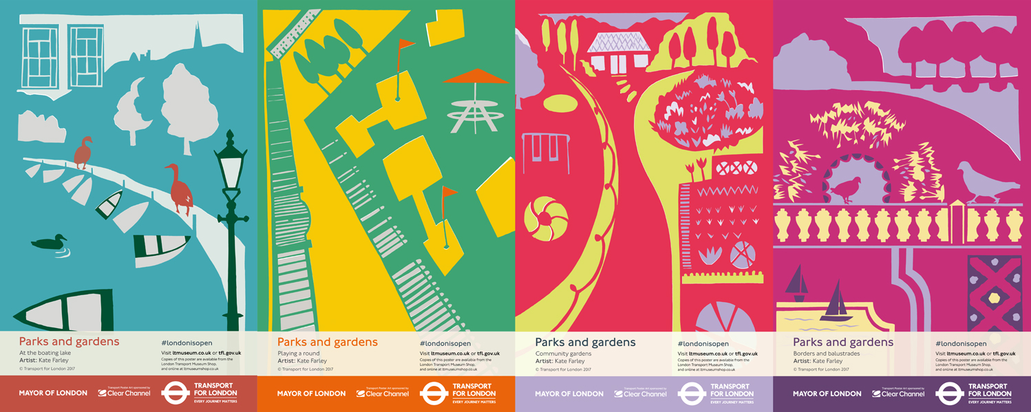
I was pleased to be given the brief of ‘Parks and Gardens’ and was keen to move the visual qualities on from my Plot to Plate collection of kitchen gardens and parterres, although you may recognise in poster 3, ‘Community Gardens’ some of my motifs from that time. I have continued to play with elevations and perspective, while giving a polite nod to one of the other poster giants, Tom Purvis, whose poster I’ve had on a wall in our home for more than a decade, enjoying it every day. His series for LNER, ‘East Coast Joys’ appears to be made from cut out paper, the picture is made from flat colour in bold shapes. Having used this method for my commission for the Barbican last year I was keen to explore this again. You can see in my first cutout sequence I did begin to connect each poster to the next, as Tom Purvis had in his 6 LNER posters but I found this limited the scope for each poster composition in this instance.

KateFarley_ParksGardens_book_100

I began by gathering lots of imagery by making drawings and taking photographs and considered four different approaches to parks in London, one for each of the posters, from traditional activities such as rowing, to pitch & putt and the formal model boating lake. I wanted to create nostalgic content combined with a contemporary aesthetic. I remembered a hot day rowing on the Serpentine with a friend, I thought of many visits to Brockwell Park and all the different aspects of the ‘rooms’ it has within it. Greenwich was also an obvious one, Clapham Common and Hampstead Heath too. The posters represent lots of different aspects of parks, not four specific ones, and only one suggests a particular skyline looking across at the city.

Once the initial ideas were set I began to cut out the posters as general compositions, as well as single details / motifs to add. I combine both traditional drawing skills and digital manipulation in my practice, and this is how I worked here, scanning in paper drawings (cutouts) and subsequently working in Adobe Illustrator for final compositions / print artwork. I was able to make changes as required, including colour and motif placement options.

KateFarley_papercutouts_LTM17

As a designer I’ve always loved working across different surfaces and products, working with the industry experts in order to learn the best approaches and pitfalls of each context. Posters are large, but someone may look at it for less than a second… it needs to grab attention without being noisy. Large areas of pale colour might encourage graffiti… edges are as important as the centre, and so on. For people who have known my work for many years the look of the posters might not surprise, but my more recent work has been much more graphic, and understated so maybe some of you may not see these as so clearly of my handwriting. Let me know what you think!

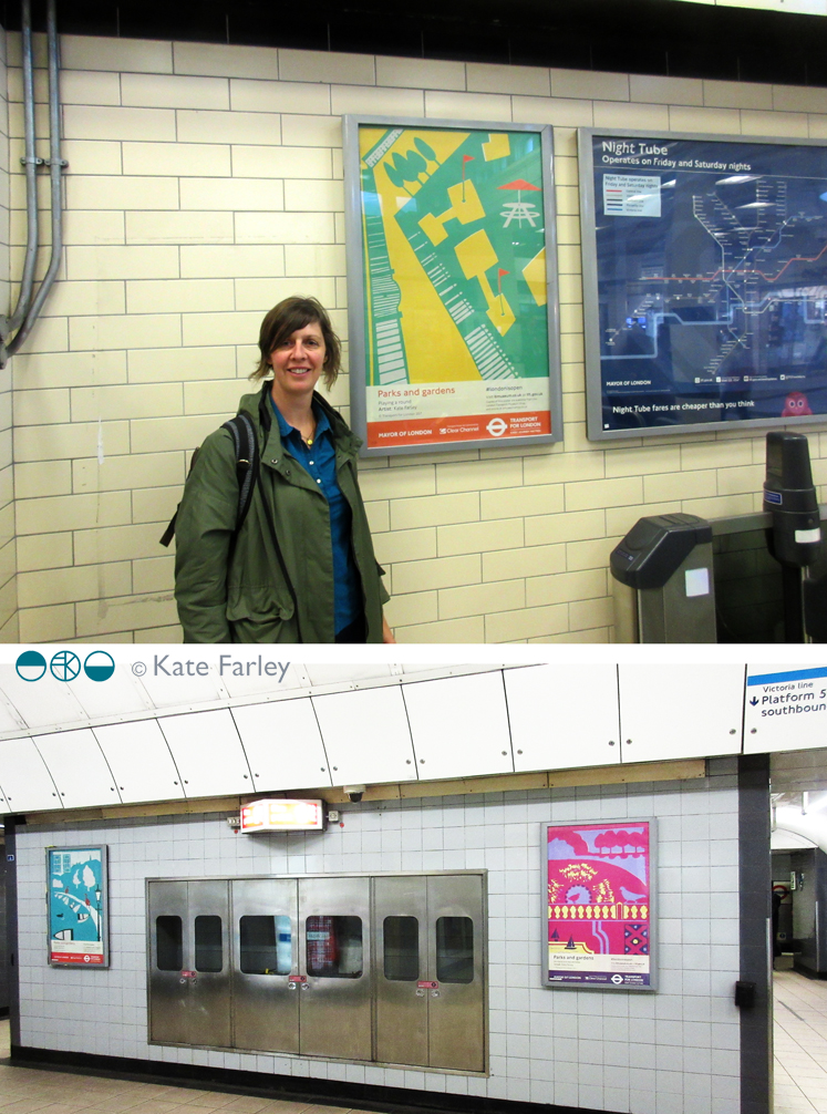
Once I was told the posters were going up I had to go and find one. Luckily I was in London for the Design Festival so with wide-open eyes I took to the system and eventually found my first one at Embankment. I’m not sure I can put in to words what that felt like – I wanted to point and shout they were mine! The ticket barrier chap kindly took a picture of me alongside ‘playing a round’. Later that day I came across two more at Euston, and friends have let me know their sightings too!

KateFarley_ontheunderground_pics100

Design projects can take a long time to get to fruition, it is not unusual for years to pass. This can be frustrating when you want to shout out and tell everyone what you’ve been doing in the studio each week. I am always mindful of what I can share on social media, respecting my clients who might want to have control over a specific product launch. Now the posters are up I’m delighted and proud to shout about it… let me know if you see one on your travels!

parksandgardensPOSTERSseries100

You can also buy them from the London Transport Museum shop.

Modernist patterns in the making

Over the last few months, actually for most of this year, I’ve been working on a commission with the Barbican Centre London to create bespoke patterns for products in their newly developed retail space, ready to launch in the Autumn. It’s been a fabulous project as I’ve developed the designs with plenty of dialogue with Head of Retail, Adam Thow, to-ing & fro-ing by email. The brief has altered only slightly since the beginning and I feel really proud of what we’ve produced. There’s a more detailed interview about the project over on their blog.

The idea was to explore the Barbican Centre, famous for its architecture, but to also include its activities as a cultural centre of music and performance. I explored lots of ideas and pattern compositions but settled on the idea of a sheet of music, and ended bottom right with the bold double bar lines. Within the patterns I referred to musical notation, and made links between the architectural features and those of instruments, including a violin and oboe, to create a sense of narrative, playing with strong negative and positive shapes. Each of the motifs were hand cut in paper, scanned in, and combined using Adobe Photoshop.

KF_Barbican_print_paperBLOG

Last week we shared the first images of the design work so I thought I’d share here too. The images here show my developmental design work above, and the final limited edition screen print and pattern for products. Visit @barbicancentre on instagram for more final product shots.

KateFarley_BarbicanPRINTPATTERN1200


Save