London pattern and surfaces

Each time I visit London I enjoy spotting the iconic patterns and designs on the underground as I rush through the tunnels and rattle along on the trains. This weekend I had my first trip on the Elizabeth Line and enjoyed seeing the Wallace Sewell moquette upholstery. I always enjoy seeing the tile designs across the network too, especially the designs at Tottenham Court Road by Eduardo Paolozzi.

Having lived in London between 1997 and 2005 I became very familiar with the network but over the last decade there has been so much change I was at times completely thrown by he updates.

I hope you enjoy the pics.

limited edition prints from posters

Following the success of my four posters for London Transport Museum, currently on the network of London underground stations, I have been asked by Michael, the commissioner, to edition the designs as screen prints. I jumped at the opportunity, and embraced the task!

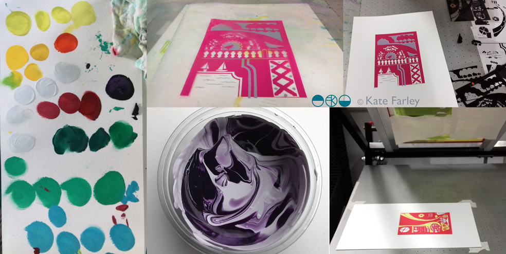
This has been an interesting challenge because although the artwork for the posters was made using paper cutouts, one great joy of digital print production means you don’t have to separate each colour to print; CMYK does it’s thing. However, screen printing requires far more consideration of separate colour on each of the layers as well as registration – the accuracy of each colour layer when printing. Overprinting can result in muddy colours if not fully considered. For the editions of prints I made some artwork adjustments on Adobe Illustrator enabling me to create the positive artwork for each of the four colours in each print, ready to expose photographically on the screens. You can see in my composite image, top right, the black print on acetates which are the screen positives, that I used to expose the images.

poster_print_processlayers100dpi

I love mixing colours to match my references and I take pride in not using colours straight from the pot, but to always see the nuance of hues. I make colours darker using purples and greens, rarely black. I used the final posters to get the right colours, and daylight is always essential. Ink and paper surfaces always give different qualities to contend with too. The final colours are certainly rather bright! Screen printing on paper is also very different to screen printing on fabric, so you have to get your head around the differences including remembering to flood your screen (pulling a layer of ink across) between each print, and using the vacuum on the print bed (to hold the paper firm).

However tired I am, when I am printing I am absorbed in the process – rarely noticing hours passing, and missing the need to feed. This is a good thing as my week as been ridiculously busy on all sides. Printing requires systematic thinking, and at least one clean hand. Preparing screens, mixing colours and registering each colour on the acetate first all needs to be organised. I love it when I’m in the rhythm of editioning.

A deadline to hand the first print from each edition to the commissioner this weekend focused the mind, and when trimmed, signed and wrapped I was really proud of the prints. I was even more pleased when I met up with Michael to give them to him. He appeared to be joyfully moved by the results – holding one print up to the fellow coffee drinkers in pride… phew! They are off to be framed and auctioned at a London Transport Museum event at the Victoria and Albert Museum later this week.

This whole project has taken so many months (years) to come good, but throughout the process I have felt trusted by Michael to do what I do best. He has great confidence in his choice of designers spanning the years, and allows us to get on with the job without interfering with the outcome. His twenty plus years of commissioning poster designers has led him to influence the direction of graphic artwork on London underground, creating the archive for the future through the choice of creative hands and minds, but not by telling the designers what to do. It takes trust and judgement on his part, but in turn I think I’ve created my best work yet. In the many conversations over these years I’ve had with Michael he listens, he wants to hear my opinion on things; we have good discussions – he knows about a lot of things. He also often gets carried away with future ideas and possibilities – I like that, we should all get excited by ideas. Thanks Michael!

LTM_poster_prints2017_1_150


poster proud

Every designer is likely to have a goal or two, a particular ambition to aim for. Last week I reached one of mine… I have designed posters for London Underground. They are up on the system as I write. I’ve been bursting to share the prospect that this may happen for several years, and now it’s real!

The underground poster archive at London Transport Museum is full of great examples of graphic design, with work by my heroes such as Edward McKnight Kauffer and Abram Games. These designers have inspired me in my quest to explore visual communication through print and pattern for as long as I can remember and now my design work is on the network hopefully catching the eyes of commuters in London, as theirs did.

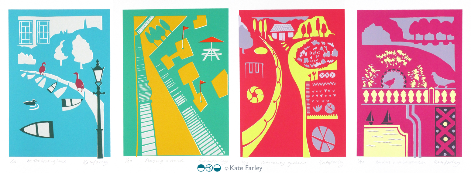
I was pleased to be given the brief of ‘Parks and Gardens’ and was keen to move the visual qualities on from my Plot to Plate collection of kitchen gardens and parterres, although you may recognise in poster 3, ‘Community Gardens’ some of my motifs from that time. I have continued to play with elevations and perspective, while giving a polite nod to one of the other poster giants, Tom Purvis, whose poster I’ve had on a wall in our home for more than a decade, enjoying it every day. His series for LNER, ‘East Coast Joys’ appears to be made from cut out paper, the picture is made from flat colour in bold shapes. Having used this method for my commission for the Barbican last year I was keen to explore this again. You can see in my first cutout sequence I did begin to connect each poster to the next, as Tom Purvis had in his 6 LNER posters but I found this limited the scope for each poster composition in this instance.
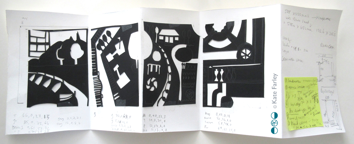
KateFarley_ParksGardens_book_100

I began by gathering lots of imagery by making drawings and taking photographs and considered four different approaches to parks in London, one for each of the posters, from traditional activities such as rowing, to pitch & putt and the formal model boating lake. I wanted to create nostalgic content combined with a contemporary aesthetic. I remembered a hot day rowing on the Serpentine with a friend, I thought of many visits to Brockwell Park and all the different aspects of the ‘rooms’ it has within it. Greenwich was also an obvious one, Clapham Common and Hampstead Heath too. The posters represent lots of different aspects of parks, not four specific ones, and only one suggests a particular skyline looking across at the city.

Once the initial ideas were set I began to cut out the posters as general compositions, as well as single details / motifs to add. I combine both traditional drawing skills and digital manipulation in my practice, and this is how I worked here, scanning in paper drawings (cutouts) and subsequently working in Adobe Illustrator for final compositions / print artwork. I was able to make changes as required, including colour and motif placement options.
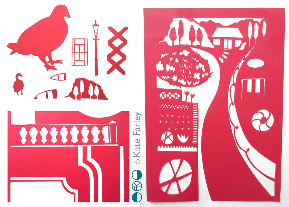
KateFarley_papercutouts_LTM17

As a designer I’ve always loved working across different surfaces and products, working with the industry experts in order to learn the best approaches and pitfalls of each context. Posters are large, but someone may look at it for less than a second… it needs to grab attention without being noisy. Large areas of pale colour might encourage graffiti… edges are as important as the centre, and so on. For people who have known my work for many years the look of the posters might not surprise, but my more recent work has been much more graphic, and understated so maybe some of you may not see these as so clearly of my handwriting. Let me know what you think!

Once I was told the posters were going up I had to go and find one. Luckily I was in London for the Design Festival so with wide-open eyes I took to the system and eventually found my first one at Embankment. I’m not sure I can put in to words what that felt like – I wanted to point and shout they were mine! The ticket barrier chap kindly took a picture of me alongside ‘playing a round’. Later that day I came across two more at Euston, and friends have let me know their sightings too!
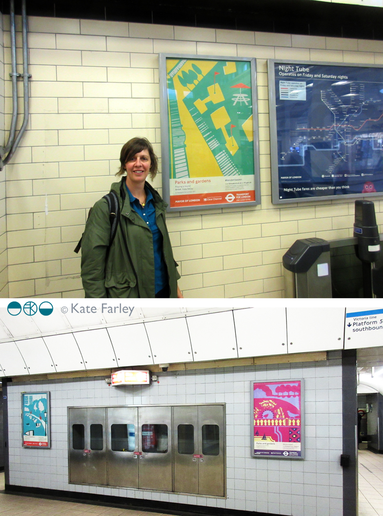
KateFarley_ontheunderground_pics100

Design projects can take a long time to get to fruition, it is not unusual for years to pass. This can be frustrating when you want to shout out and tell everyone what you’ve been doing in the studio each week. I am always mindful of what I can share on social media, respecting my clients who might want to have control over a specific product launch. Now the posters are up I’m delighted and proud to shout about it… let me know if you see one on your travels!
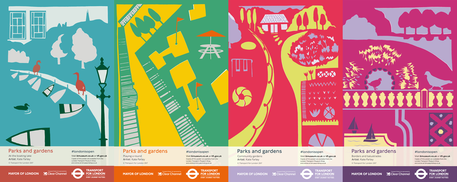
parksandgardensPOSTERSseries100

You can also buy them from the London Transport Museum shop.