Printing at Ivo Textiles, London

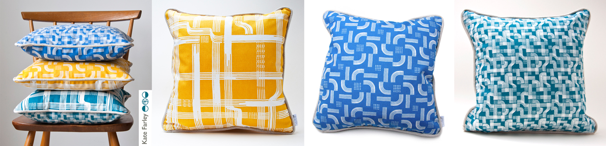
Part of my academic role at Norwich University of the Arts is dedicated to my research practice, exploring new knowledge in pattern and print design. Following on from the publication of my book I’ve been keen to get out in to industry and expand my practical experience of print production methods that could enable new ways of designing repeating patterns for paper and cloth. These visits also provide excellent opportunities for me to develop ideas for curriculum changes in the undergraduate course I lead, BA (Hons) Textile Design at Norwich University of the Arts, to ensure our graduates are competitive in securing roles on graduation.

A couple of years ago I spoke to Director of Ivo Textiles Limited, Suzie Zatka-Haas following her visit to our stand at New Designers, a graduate showcase held annually in London. She was keen to understand the best way to promote opportunities in the company to graduates and we discussed the right terms and definitions to ensure textiles students were attracted to the roles. We also discussed the skills they value at Ivo’s and how we can ensure students understand the potential roles open to them, (we have had a Norwich graduate work at Ivo’s for the last few years). We are both passionate about printed cloth and Suzie invited me to visit the factory when I could fit it in around my teaching schedule.

Fast-forward two years and I managed to secure some funding to spend two days onsite at Ivo’s to understand more about the technical constraints of the different printing processes they offer to clients. Suzie was brilliant in making this happen, being open to allowing me in to the factory to learn more. This felt very exciting but I wasn’t fully sure what I’d be able to help with although I offered to assist with anything. I was armed with my printing apron and old clothes—following advice from Suzie!—as well as my sketchbook of design ideas for my current research project in case I had time to talk it through with anyone.

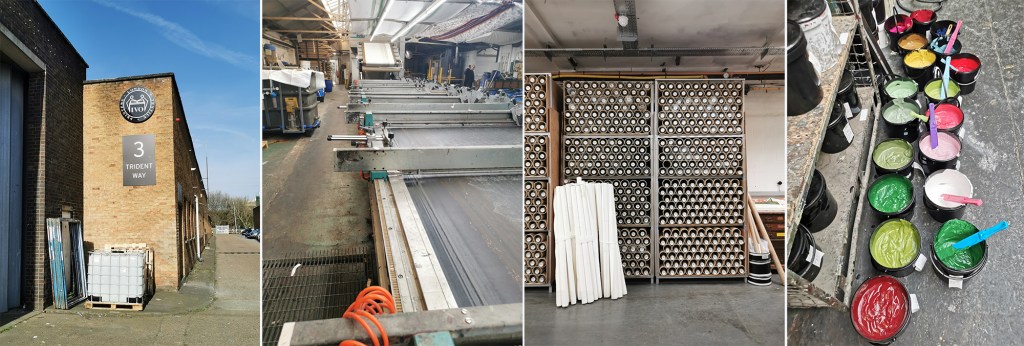
The day before my visit I’d spent the afternoon with Marthe Armitage (blog post here) in her much smaller set-up so I knew this was going to be a contrast. Walking on to a large industrial estate in west London with huge lorries thundering by, the only clue of what was going on inside number 3 were some screen frames leaning up against the outside wall awaiting collection. I was greeted at Reception and my name had made it on to the board for the day.

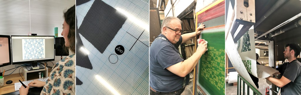
Once the health and safety briefing was over I was led through the factory, trying to take it all in: sights, sounds and smells, and I was re-introduced to Maisie, one of Ivo’s designers that I’d met at New Designers last year. She was to be my host for my stay and ensure I didn’t do anything silly, like wander off and put my hands in the machines. I’m incredibly grateful to Maisie for her time and interest in what I am doing. We discussed university training, the Ivo design studio set-up and then I shared with her my project. It is so useful to talk it through with different people as they all bring ways of looking and new questions.

A full tour of the factory was next. There is a vast supply of cloth and screens in every space imaginable, alongside huge machines, some in action and some not, as the job list requires. The colouration department was a room of inks and colour swatches, and the colourist making and matching colour for all the processes. The colourist has been working for considerable time at Ivo’s, like so many there, they are absolute experts in what they do.

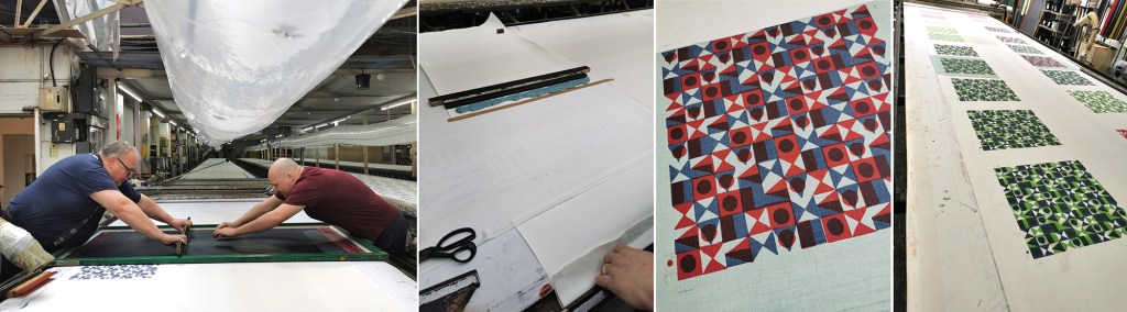
I saw the Flatbed printer working on my first day. Large flat screens raise and lower mechanically and the fabric is on the belt below, which moves along after every print is made for each colour to be printed with the subsequent screens. The belt is very long, with many metres passing by before all the colours are printed and the fabric heads off to be baked for the colour to be set at the far end of the table. I was busy taking notes and asking questions. That day a client was onsite to quality-control the printing before signing it off for production.

There is a large archive of artwork from decades ago, spanning the thousands of jobs that have been made here. Original acetates and drawings are rolled up in drawers holding the stories of design. I wasn’t able to photograph the examples – client confidentiality is important here, but it was exciting to see some key players of the 1960s featured. Maisie told me the incredible story of how Ivo’s came to be, and I met Michael, who’s family story it is, leading the company with Suzie.

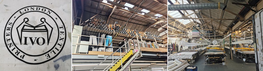
Gali printing is a further printing process used at Ivo’s (the two tables with yellow frames in the picture above, right). The print tables are fifty metres long! The screens are set up in frames and are mechanically moved up and down, with a mechanised squeegee passing over the inked screen, before lifting up and moving down to the next place to print. It is carefully operated and requires skill and a keen eye to ensure everything is happening correctly with good quality each time. The screens are then changed for each colour and the same processes run again – the gali print operator will walk several miles in creating a ten colour design!

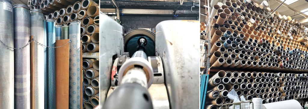
The process I was most intrigued to see was the Rotary printer. Unlike the flat screens, the artwork is prepared on a mesh that is on a cylinder (image below left). The circumference of the cylinder is the repeat size, creating a seamless repeat with fast production. A different cylinder is required for each colour, just as a flat screen per colour is required, but unlike flat bed / gali and hand printing, the squeegee sits inside the cylinder, and with the use of a magnet is pulled down to apply the pressure and add ink to the cloth through the mesh as it turns. Seeing these machines printing many colours at once is fascinating, unfortunately I couldn’t take pictures as it was printing for a client.

On my first day at Ivo’s I also saw a length being hand screen printed, but again, no pictures. It was a very slick operation that is clearly well-rehearsed!

Following the tour we returned to the design studio and I was introduced to some of the different design tasks the designers are involved in. A new graduate had recently started, Caris, so it was good to see her settling in well and enjoying her first professional experience, guided by Maisie. Putting original artwork in to repeat can take several weeks with meticulous digital design work using AVA software. Maisie upped the excitement by suggesting we could work on one of my designs that afternoon and have a day printing with Podge the Printer, a legend for those in the know – wow! Maisie prepped the artwork, with me taking notes and soon the screen positives were ready to be exposed.

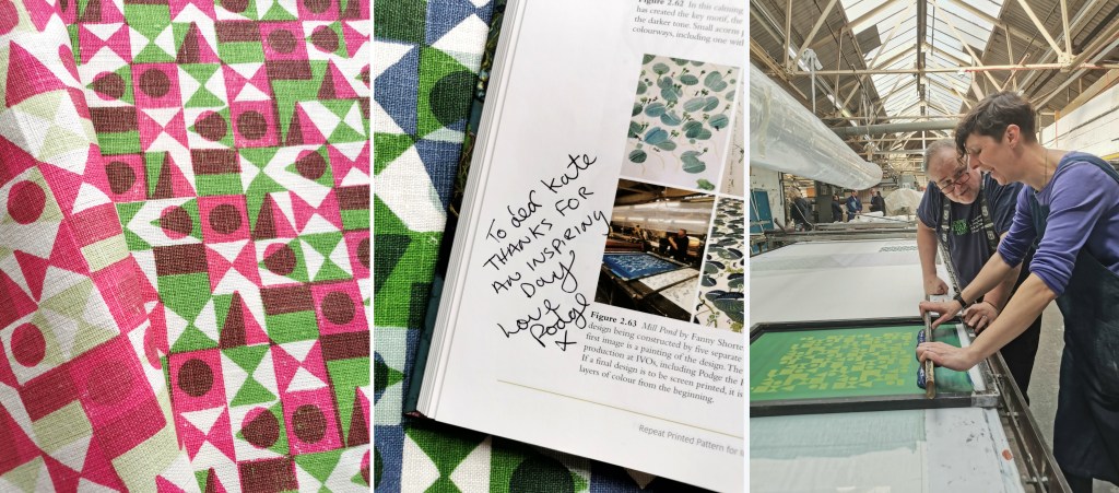
Arriving on the second day, my screens were ready, Podge had prepped the table laying lots of fabric down for me to print on to. Podge is a character – we hit it off! At first he wasn’t quite sure what my research was about, but soon he was getting in to the spirit of it and suggesting options. He said it made a change to have someone exploring options rather than simply being in production mode. We chose some large screens from the archive to add a few tricks he had up his sleeve. Buckets of colour were mine to use. I had a lesson in printing the Podge way and he made sure I held the squeegee at the correct angle with hands over the top – he kept monitoring me so I had to stay on it! He also showed me the S-blade method of printing flat colour without the screen – surprisingly satisfying.

Factory lunch is a set 30 minutes and soon we were back in action. Each time I wanted to change colour, the screen was taken away to be washed / dried ready. I’m not used to having such (any) great service and support when I print in my own studio! It was a really productive day with many metres of fabric printed with several layers of colour, testing my research ideas. Podge’s son who spends lots of time on the Gali came to lend a hand at printing the larger screens, enabling me to try other prints over the top.

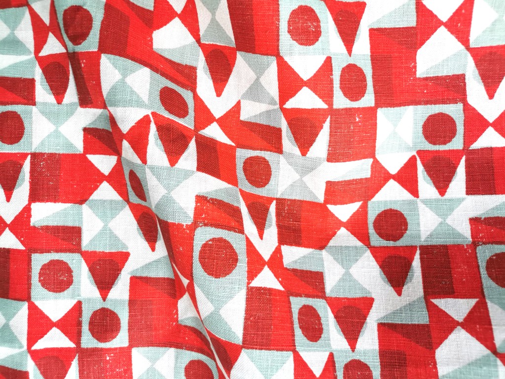
With the deadline to get my fabric set we had to stop printing, I watched as the fabric went through the baker and it came out very hot, but ready for home. I was exhausted, it was hot in the factory and I’d been busy on my feet since 8am. One of the last jobs was to ask Podge to write in the special copy of my book on pattern, as he was included in an image supplied by Fanny Shorter who prints here.

At the end of the day I caught back up with Suzie and thanked her for the opportunity she enabled me to have at Ivo’s. The factory has to run smoothly, meeting industry deadlines and costings for clients so to be open for me to learn from them and explore my research with their expertise was an absolute privilege – they were very generous. I headed home with a bag full of printed cloth and I ached all over from such a physical day, but with a head full of the experience I won’t forget in a hurry … Thank you all at Ivo’s!

Repeat Printed Pattern for Interiors

The process of writing a book has been a long one for me, but we are a step closer to publication … January 2023. I can’t quite believe I am an author of a book!

I’ve recently received the pre-publication inspection copies and I’m so excited to be able to share the first glimpse. I’ve been really touched by the initial responses from the contributors who have been receiving their copies, who without them, this project wouldn’t have got off the ground.

I’m waiting patiently till the new year, but here it is, the beautiful cover, featuring the pattern Bloomsbury Garden by Timorous Beasties. The book is designed to inspire and inform people about the complexities of designing pattern for interiors, and is an ideal core text for undergraduate studies. I’m delighted to be featuring the work of students I had the pleasure to teach, as well as more well known names including Angie Lewin, Sarah Campbell, Timorous Beasties, Oral Kiely and Neisha Crosland.

You can pre-order your copy here

Me with the book, in front of my Hanbury wallpaper

seeing red

My world is pretty colourful; on a daily basis I’m in contact with colourful textures, materials and surfaces from fashion, interior and architectural contexts. Not only do I work with hard and soft surfaces in my design practice, I also teach undergraduates to work with colour in relation to textile design. It’s important to see beyond the broad definition of colour by name and to think about the context of colour; the surface qualities in that colour, the effect the material has on colour, such as gloss, matt and opaque for example.

Last week I managed to update some colour charts in my studio resources and it made me think about how we tend to have particular favourites when it comes to colour. I certainly have a comfort zone in sections of the colour charts and other areas I’d have to be persuaded to go near. Commissions often include discussions with clients about the intended colours of products, and I enjoy the challenges of pushing the boundaries of my comfort zone – within reason! I have a different palette I’m happy to wear compared with what I’d live with, and I certainly dress in colour relating to the mood. I remember many years ago dressing in very colourful clothes only to receive a rejection for something that mattered. I felt gutted I’d dressed for the wrong outcome!

Here are some REDs… I love the border colours between red and orange.

katefarley_red_100


Launching the pattern collection: ‘construct’

I’ve always started designing by picking up some sort of drawing tool, and exploring ideas that will have been developing in my head for some time. Concepts of pattern and purpose as well as communicating an idea using pattern is what really inspires me, this is no different for ‘construct’. A stunning image of lace in a book I was looking at while researching for one of my textile lectures on historical design caught my eye and an idea joined with other ideas of print looking like weave, as many people commented that my Plot to Plate VVV design did (left hand side of first image), when I was at Tent London in 2014. The seeds were sown.

KateFarley_startingLine

I’ve never hidden my loathing for faux surface / material effect pattern such as printed wood effect flooring. Why do we have to lie, why can’t there be another stunning and suitable design alternative?! With this is mind I’ve played with the idea of taking textiles as a starting point for this collection with the intention of subversively adding textile-derived pattern to other surfaces but in an evocative statement rather than a digital print of textiles. This is not a collection that copies textiles, rather that textiles suggests a way to draw; provides a set of rules to begin playing with. The title ‘construct’ is a reference to constructed textiles such as weave, knit and lace but also refers to the putting together of a new way of thinking about pattern for surface, building a collection that has been designed to cross material specifications and provide bespoke solutions.

Having been working on my Plot to Plate collection and related prints for the last five years it was a big challenge to start from scratch and move away from the safety of a kitchen garden, but I was also excited about the challenge. I’d been working on some other pattern commissions and revisited drawing processes that had got me thinking. I didn’t rush to get somewhere; I designated studio days to play with thread, ink and paper. I created a sketchbook of so many ideas and directions but eventually I began to formalise ideas and work out which direction felt right for the collection. Some of the other directions have already been moved on to commercial projects, and the others I’ll revisit over the years as and when.

construct_blog_p1

I usually sample patterns in black and white so I’m not swayed by colour rather than the success of the pattern. Having said that I was really adamant that blue was going to feature. Right from the beginning I was thinking of the strong Mediterranean blue of Greek churches, and the Blue Nude series by Matisse. Strong colour has been making a presence in interiors for a while, influenced by key exhibitions and trends. I knew I wanted to stay well away from Memphis colour palette and the reworking of 1980s colours. Sonia Delaunay has also inspired many designers and retailers thanks to the striking show at Tate Modern. I’m aware of trends, I have to be as an academic who teaches textile design, but I’ve never been inspired to follow them. I have my own creative path I’m on and I also would like my patterns to exist well beyond a season or two. Having said that one has to be aware of what drives buyers in retail to spend their money and for some it is likely to be informed by trends.

As those of you who have read more than this post might know, I like cutlery, and I can’t help laugh that the drawing tool that I’ve come to love is a sort of handmade fork! I’ve made many for this collection and they are so simple and inexpensive but all made by me to create exactly the right sized marks and the right sort of line. I’ve definitely got better at them. Weeks of testing many design structures and resulting rhythms left me with pages of patterns and the need to edit. Further weeks and I decided to test some screen printing on to fabric. Although I knew this collection was going to explore alternative surfaces I wanted it to work on fabric too. The weave of some of the fabrics was too dominant, and the scale of some of the patterns was less successful. Really valuable sampling!

construct_drawinggrid_101_blog

KF Construct_blog_p2

I’d contacted and discussed collaborations with choice companies relating to my ambitions for the collection and it was very exciting to sample on a range of substrates. I really wanted to embrace the ‘bespoke’ capacity that several manufacturers in Britain offer as a way to provide interior designers and architects for example, a choice for their clients. Choosing from off-the-shelf surfaces is not always exciting – there are exceptions! I wanted this to be a collection of pattern in anticipation of the product. Ten years ago I was a winner in the Formica ‘design a laminate’ competition and it felt good to be in discussions with a company with such a strong heritage for pattern. Surface View also demonstrate a contemporary approach to wallcoverings and surface pattern, enabling me to discuss my intentions for the collection and the concept of bespoke production and it being met by expertise and clarity. Having carried out several public art commissions over the years I’ve become used to discussing colour systems and file types, tweaking of production elements to manage the different industry requirements. It’s good to have that experience behind me.

KFarley_construct_colour2_150PrintPrint

So here I am as Tent London is underway and I am extremely proud of the patterns that have made it to the final collection. There are repeat designs, small and larger scaled rhythms and placement patterns featured across the collection including a particular Tent London tote bag competition…. There are hand printed cushions ready for shop shelves or customers’ sofas and contemporary bespoke pattern for those wanting a graphic pattern rather than printed granite in their lives. The patterns can be licensed and collaborations can be discussed. Alongside all of this in order to fully convey the concept of the collection I’ve learned the skill of latch-hook rug making and committed many hours to mastering the skill of constructing pattern in yarn – not natural for me as a printer! I’ve sampled laser cutting and etching to varying degrees of success, I’ve made a dress for the show featuring ‘flow’ AND I’ve screen printed two limited editions of prints for launch day.

I’m interested to find out how it is received after so many solo months of nurturing, worrying and wondering. It’s time to let the pattern do the communicating…. do let me know what you think!

KateFarley_construct_cushions