Wallpaper in the creating…

The process of designing my first commercially available wallpaper has been a long & highly considered journey and one I thought would be interesting to share.

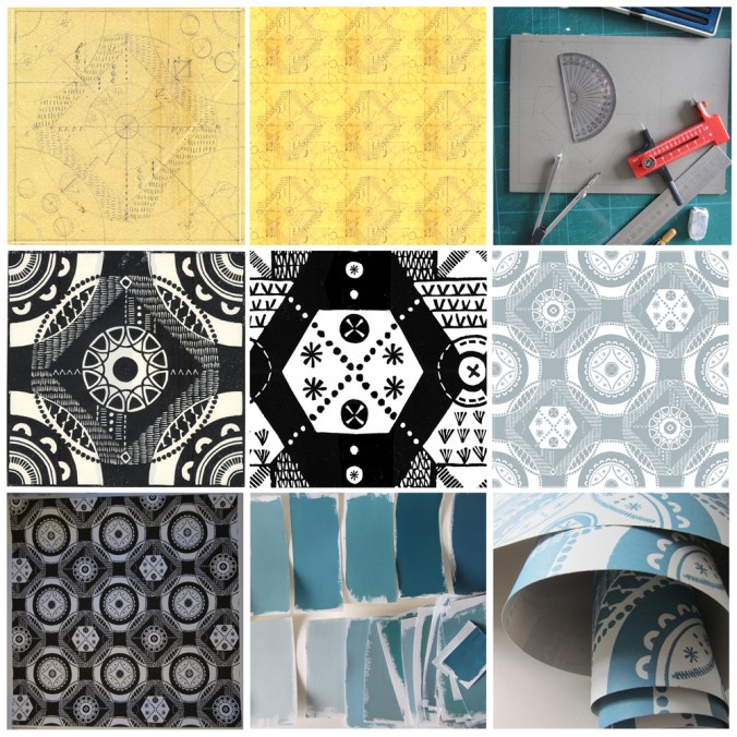
Research: I first made drawings in my sketchbook last summer when I visited the National Trust property Hanbury Hall & Gardens in Worcestershire. I really liked the formal parterre and saw a really close link between garden design and textile design – I wrote about this in a previous blog post: https://katefarley.wordpress.com/2014/05/11/pattern-design-outdoors-and-in/

Composition: Sketches became drawings that became more detailed designs, that were then tested in repeat by scanning them in to the computer and using Photoshop. Edge details, scale of motifs, pattern and textural rhythm all needed to be considered.

Cutting the block: I measured and cut the lino block before taking a really clean print in order to scan the print in to work digitally with the repeat tile.

Editing: Further refinements, several print outs and more alterations took place over several weeks as I got used to seeing and living with the design. Additional lino blocks were cut in order to add different motifs to the design. Additional variations across the larger repeat file create visual interests and a play on the traditional repeat expectations. Some tweaks were so minimal that people unfamiliar to the design wouldn’t be able to spot the changes without having them pointed out, but it’s so important that every dot, dash and space has been considered before the production process is underway, saving time and lots of money.

Production: The digital artwork was sent off to the manufacturers of the roller in order for the design to be printed, and a technical proof was sent back for my approval – exciting and scary times!

Colours: Much thought, research, trying and testing went in to the colour combinations and I painted lots of colour chips using gouache in order to communicate the choice to the printer.

Printing: After signing off the colour proof provided by the printer, the wallpaper went in to production, labels were designed and printed, rolls created.

Results: I’m delighted with the results, the efforts by all those involved with the production process, and look forward to launching this at TENT London very soon.
hanbury_BLOGtile1000rolls_100_DSC_0227

box of colour

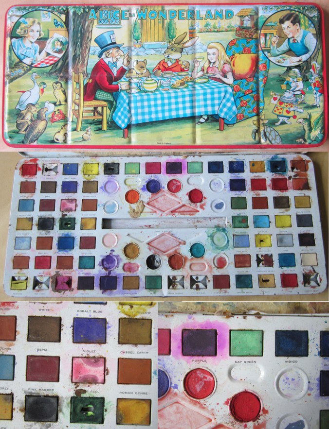
I was shown this wonderful Alice in Wonderland paint box that has been looked after for many years. It is so much nicer than much of the branded, TV themed products of today. I especially like the labeling of the names of the colours. Is sap really that green? I would have been a very happy child to have received a box of such size and potential. Note: Made in England!

alice_paintbox_web


Art for all – good design for all

My design ethos is one of quality and appropriateness for the place. Good design should be all around us, big and small, the dot on the i, the cushion on the sofa, the roof on the building – no excuses. Why settle for second best, why copy others if you can be original? It is so sad to read of big companies risking reputations, not buying the best but producing poor quality copies – stealing designs. My students tolerate my monologues on the subject!

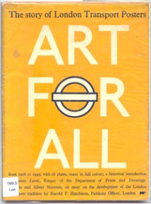
This blog entry celebrates some examples of quality design – because that’s what we should all aim for when making but also when buying. I have come across a great book called ‘Art for All’, telling the story of London Transport Posters. The book has black and white reproductions as well as colour, but the real charm is in the illustrations from original engravings of birds by Clare Leighton, printed in a salmon pink, as well as illustrations by Eric Ravilious (see below).

Image

Image Image

(Art for All – London Transport Posters 1908 – 1949, Art and Technics Ltd. London, 1949)

The quality of design in these images is inspiring, with a great sense of detail without being fussy, and such skill in creating these images in only one colour while containing so much information of texture and pattern. I admire these artists but also the people who commissioned the pieces and enabled these images to be ‘Art for All’. As an aside, Both Leighton and Ravilious produced stunning designs for Wedgwood too.

It makes me think of my own practice and how I generate imagery using drawing and printmaking to create the visual language. Yes, the computer plays a large part in ‘tweaking’ for final output / reproduction these days but it’s the marks and textures, the print quality, a smudge of graphite, that cannot be created by computer. It might be quicker creating the whole image on the computer but it wont be as good as I want it to be. Having said that, it is also the creative process of working out, testing and feeling the work resolve on paper that I most enjoy. Was the design process meant to be easy? Its the struggle and questioning that keeps me doing what I do – I’m enjoying the journey. When so much time as part of having a design practice can be spent on the computer it is important to remember to turn it off and walk away to DO the creative things…and to get better at it…