Summer gold

As the weather turns I always feel a sense of sadness for the summer that is over. The start of term arrives and soon it is coat weather, and lights on to read in the evening.

I have taken many photos over the summer, some for projects that are taking shape and some for my archive, waiting for their turn. These two photographs go rather well together to remind me of the warmth of summer and the beauty that is East Anglia.

KateFarley_summergold17_100

Top image is from inside the light house at Southwold, Suffolk, and the second one is a view across the marshes at Stiffkey in Norfolk. Each a special place in my heart.

drawing grass lines

I’ve written many times over the years on this blog about the themes that underpin my work, the approaches I take to develop new work, and the things that inspire me. Here I look again at the process of evolving ideas and visual language, to introduce my latest series of prints.

As I develop ideas, often in series of works on paper before any design solutions are considered, I explore the visual language of the subject through drawings, photography and printmaking. The aesthetic nature of the new work evolves and is tested in relation to compositions and rhythms. My knowledge of pattern design, in particular in relation to textiles, feeds this investigation. The motifs, the linking forms, the negative and positive shapes and the quality of line can suggest relationships with historical styles, international influence and contemporary trends. As a designer I use this knowledge to sometimes avoid, and sometimes align to this language, communicating a context far beyond the printed paper I create.

On a cycling and camping tour around Denmark back in 2004 we came across a small book shelf in the campsite shelter containing a range of books. I can’t read Danish. We picked out a few, judging them purely on the graphic design of the spine, and I found a science book of beautiful diagrams of plant structures. I have a photograph somewhere, but the impression those diagrams made on me does not require me to see that page again. I remember the look of those diagrams, and they have fed in to this collection many years from then.

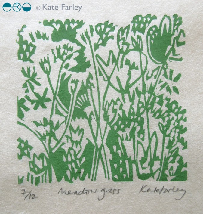
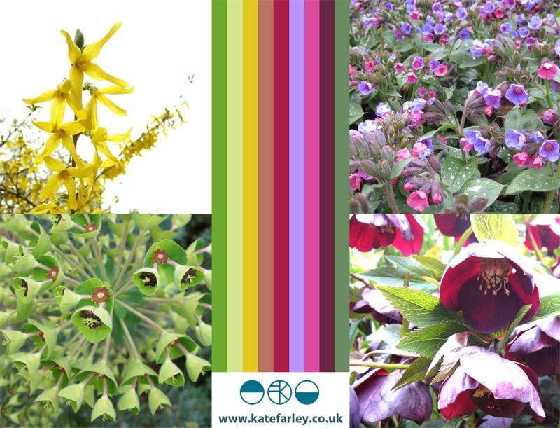
Mid C20th pattern is also something I am interested in, and for this new body of work, particularly the development of stylised florals and diagrammatic interpretation of plants. Lucienne Day was particularly expert at creating designs in that manner, with simple black lines, herself inspired by Miro, Kandinsky and Klee. This is why it’s important to be aware of what has gone before. Not to imitate the past, but to take courage from previous developments in drawing, stylising and pattern making, so we don’t recreate the past, but so we push forward with our own journeys, liberated by not inventing the wheel. I was amused to discover the current exhibition at the brilliant Whitworth Art Gallery in Manchester is Lucienne Day: A sense of Growth – it seemed uncanny!

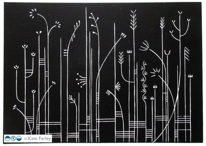
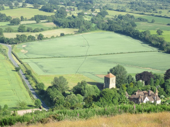
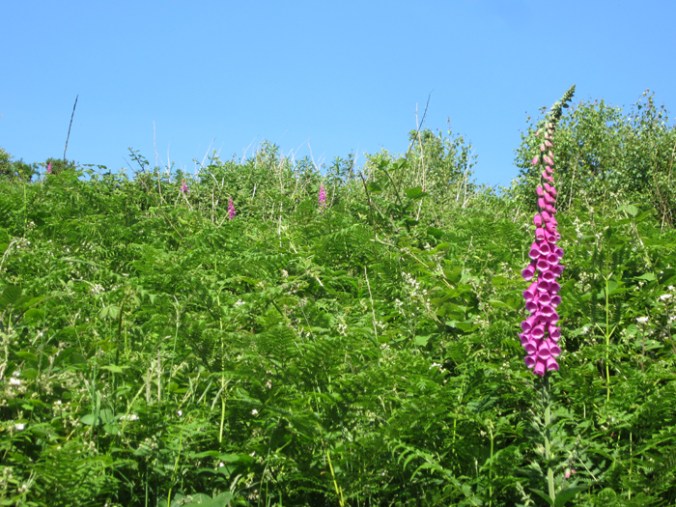
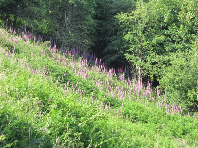
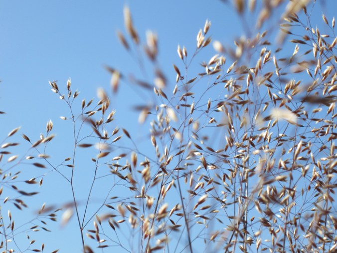
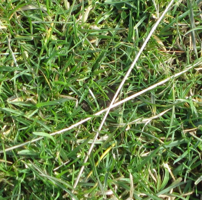
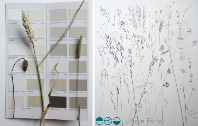
My photograph collection, both in print and digital form, contains many pictures of reeds; Danish reeds, Norfolk reeds, anywhere else reeds. I also have many records of grasses, and have always been attracted to the structure of such plants. These are often the unloved weeds that may be irrelevant and overlooked by many, but I come back from walks with handfuls of lines, some with seed heads, some without, but always lines of grass, as if nature had fun drawing them. Different stems, leaves and weights of line, and some suggesting very distinct natural habitats. I’ve always been more interested in line quality than texture, and my work over the last two decades demonstrates that very clearly.

KFarley_drawngrass

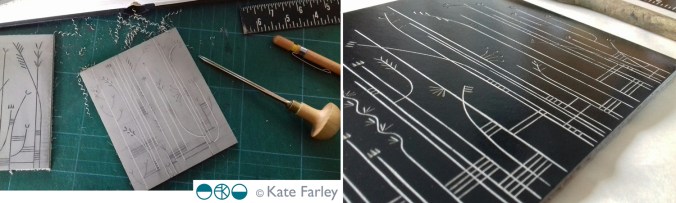
So that was a long-winded way of saying that this new series of works has been a long time coming, but makes perfect sense to me. I didn’t set out to create drawings of grasses, in fact I started screen printing flowers, but this evolved as part of the create process that is play. Colour came and went too, so as not to detract from the lines. There are some similarities with my threads printed editions and I have had the prints next to each other today – I think they make an interesting dialogue. This is the journey of idea development, by mixing drawing, thinking, printing, reflecting, contextualising, and doing it all again. By the way, this bit of the creative process is one that is very difficult to teach design students, more so with less and less studio time, and a full to bursting curriculum, but knowing your own creative process is halfway to success in my world. Take risks (it’s not rocket science we say) and work at playing.

KateFarley_grasslineslino

I digress. These few prints are only the start of this series, I already have new work evolving, but other projects are jostling for my time in the studio, so for now, I introduce you to Grasslines… and now you know a bit about how they came to be.

KateFarley_Grassline3

print progress

Recently I have been really busy with a variety of academic duties in Birmingham and further afield, taking me away from studio time, my freelance design practice, and of course blog writing. Also, in my teaching of Textile Design at Birmingham City University I have been leading a module of professional practice, assisting the students in learning about the life of a freelance designer. It’s definitely a double-edged sword, as the discussions between students and staff illustrated: It’s great to be your own boss, but you take all the blame when things don’t work out! You can get up when you want, but nobody pays you for just waking up!

The rhythm of freelance work is varied. Somehow it’s often the way of things that several deadlines coincide, and when you have a schedule to stick to, an urgent press request comes in. On the day you have time to make calls, those people are out of the office, and obviously you don’t get paid when you take a holiday. Yes there can be tough times, but I really like the variety of the weeks’ activities that freelancing gives me, certainly set in tandem with the academic life of very different demands. Each practice informs the other. Obviously there are freelance tasks I prefer and other ones I procrastinate over, lists are created, social media is checked and Radio 4 is listened too!

KFarley_knit1_blog.jpg

With so much to-ing and fro-ing on trains this last month or two and with several commercial projects on slow-cook I decided to give myself time to make, test and resolve some ideas that I have been exploring, with paper and print. The activity of printmaking is a fabulous discipline to work with. I love the excitement of planning a new print, and composing the plate, often taking me back to sketchbooks and previous ideas. The physical process of cutting the block can also be absorbing, and therapeutic and I have to decide the paper stock, the ink colour, and edition size too. It is important to maintain an experimental, inquiring practice and my prints and drawings are the evidence of ideas that have sustained my creative practice for the last twenty years. Between the commercial constraints of projects shaped by clients, costs and repeat patterns, printmaking can seem so free from limitations. This is why I make sure I keep printing – the creative sort, not just the invoices!

both prints featured here are available to buy, at £46 each unframed.

Knit 1, edition of 15, lino print, 9.5 x 9.5 cm print size

Meadow Grass, edition of 12, lino print, 9.5 x 9.5 cm print size

KFarley_meadowgrass_print_blog


A change of background colour

It’s the holiday season and we’ve been taking part. A camping trip to the Lake District offered a dramatic difference to the usual scenery we live within here in the Midlands, and it was refreshing change for being so. Everywhere seemed so green, really really green, not just the local park green but intense, vivid greens that lush meadows could offer. Naturally with that comes rain, but even then the colours were vibrant. Lichen was glowing, moss saturated, even the sheep were blue! Some colours took me back to studio projects, Pantone references, British Standard colours and colour choices, others offered a welcome diversion.The strange thing is, that when I compiled the image to include with this post the images looked really grey, but it really wasn’t like that through my eyes!

This change of scene is just what the mind needed after an intense workload juggling several design projects and at the end of a hectic academic year. I like what the seasons do to us, make us adapt and notice the time passing. This time of year feels like a celebration, as harvests ripen in the sun (ummm..) and we prepare for a new season of productive design work, education and research.

I shall remember the vivid greens, the birds circling overhead in the sky of blue; the vast views that some people get to enjoy day in day out. I shall remember the feeling of change, and rest, and stopping just for a short while, as a warm memory in the depths of winter when working in the studio. I am bound by the academic year, as well as the seasons on the allotment, the trade show calendar, and birthdays, as so many people are. It’s good to recognise the rhythms and differences brought on by change. Hooray for holidays!

KFarley_lakes_blogpics_web

pattern at the pitch, up and down

Despite having lived in Headingley, Oval and near Edgbaston I’m not a great fan of cricket but today I spent a number of hours at Edgbaston, the home of Warwickshire County Cricket Club as they hosted a charity community day. The highlight for me was the arrival of the Red Devils, from the skies in the most fantastic spectacle, bringing the ball for the 20-20 match. The marching band looked fabulous in red to the complimentary green of the grass and I also discovered I have a skill in rifle shooting, so there you go, a surprising day.

I gathered lots of images of patterns too. Here’s the day in grey, green & blue pictures…

edgbaston_com_day_100riflecard_100

Colours for the arrival of BST

Today we welcome British Summer Time and the weather has been kind. The colours of spring always seem so purposeful after the winter months, with pink trees and purple or yellow blankets of flowers spread across the parks. At the allotment the grass is rearing its greens, and yet the purple sprouting broccoli let us down. Today I celebrate the colours of our garden, noticing the yellows and purples as predominate hues.

Image

The English countryside

We had a beautiful day yesterday involving a quick trip to Ledbury, and specifically Tinsmiths to sort out post-show details. Our visit to this lovely market town coincided with the poetry festival so we also picked up some verse, locally-made pork pies, beer and ice-cream!

It was so hot in the afternoon sun but we did manage to enjoy the scenery around the Malvern Hills to-ing and fro-ing between trees for shade. It’s a stunning landscape, and one that feels so English. I first encountered the area when I cycled Lands End to John O’ Groats back in 1994 and it left its impression on me even then.

The views from the ridge make you feel as if you are a giant overseeing a toy model landscape but it is with this viewpoint I can capture my key interest in the landscape. If I was to draw the view I would have started with lines that recorded the field boundaries defined hundreds of years ago, the footpaths etched in to the land by endless walkers and roads enabling others to pass through. The lines become shapes and a record of that moment of my experience, but what is also captured is hundreds of experiences, of us, living in this English landscape.

summer2

In terms of colours, I was struck by the stark contrast of the dry grass tones compared to the striking pink of the foxgloves and the very green bracken.

summer6 summer5

I’m also a collector of photos of grasses and such-like against blue skies, and so I happily added further imagesummer1s to that collection.

summer4

All in all, a very lovely English day.

Looking up, looking down – X marks the YSP

We had a fantastic time at the Yorkshire Sculpture Park en route north to friends this weekend catching the penultimate day of Mark Hearld’s show there. Its such a great venue and there’s always something to discover. We managed to walk some of the grounds and the weather was stunning for the time of year. One problem was the saturated ground, particularly on the slopes which had become rather slippery as a result of snow and rain over the last few weeks. (Three out of the four of us fell to the muddy ground – okay for toddlers, rather less stylish for fully-grown adults!)

While exploring the sculptures I noticed the cross being drawn in the sky, then looked down to the ground by my feet to notice the second made in the grass. With X, V & O letters featuring heavily in my current design collection it shouted out to me. X marked a really beautiful spot up there in Yorkshire.

http://www.ysp.co.uk

sky_X_yspgrass_X_ysp

English meadow grass

Today we enjoyed exploring the site and old ruins of the castle in Berkhamstead and found a lovely patch of meadow grass to study. In between the showers I gathered some lines and stripes…

www.berkhamsted-castle.org.uk/

north of the border

We escaped Brum for Scotland to see some countryside in order to recharge our batteries and climb the odd hill. Beautiful colours and textures were inspiring after the wet concrete pavements I’m used to. Crossing waterfalls, wading through bogs and dodging midges were all part of the fun. We had no idea what surprises would greet us in the shape of cats too in Newtonmore. Great fun for all the family.
www.newtonmore.com/things-to-do/in-newtonmore/wildcats/wildcat-experience.html

ImageImage