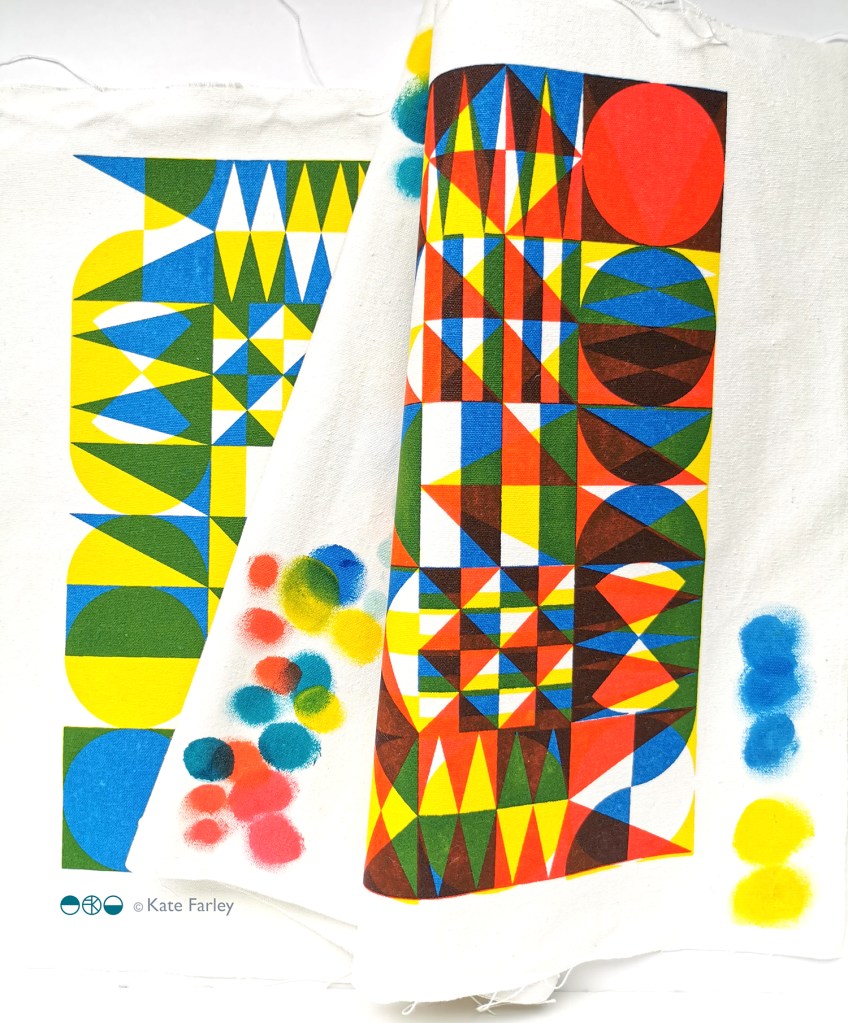
After a long academic term leading the Textile Degree at Norwich University of the Arts I finally found some time to get in to the workshop and sample some designs on fabrics. I developed the patterns rather a while ago. I love the process of screen printing, from mixing the colours, exposing the screens, pulling the squeegee and of course lifting the screen to see the new print. I even enjoy washing the screens ready for the next time!
I’m not going to share all the outcomes at this point, but here’s a taster of the colours and a glimpse of one of the designs. I was working with transparencies in the pigment and binder to create the extra colours… and I’m really excited about the results!
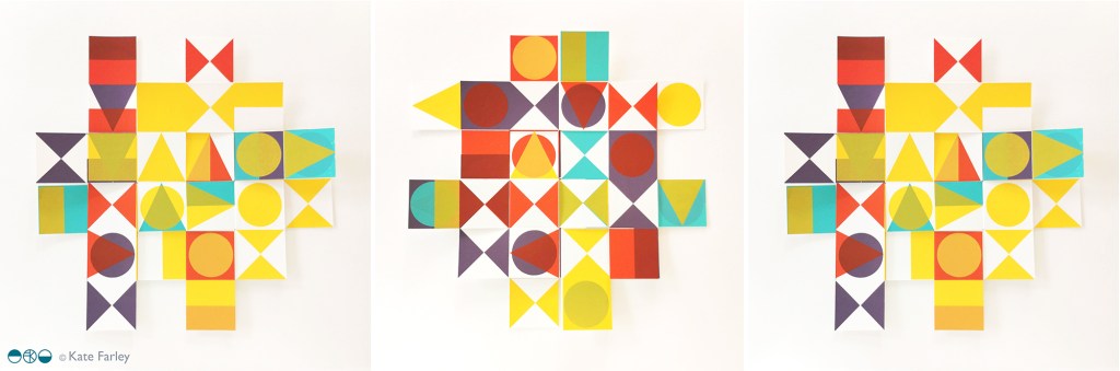
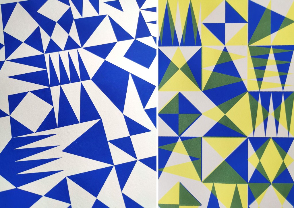
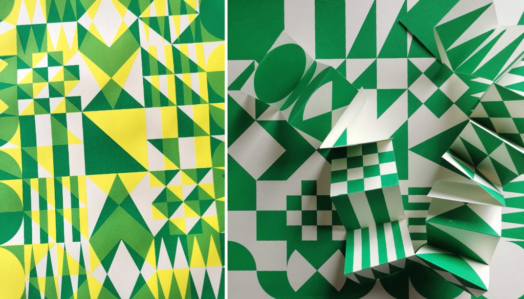
I’ve been enjoying some studio time to explore my print research as works on paper with the hope of exhibiting the work. I enjoy paper engineering and construction (that’ll be the book artist in me!) and have previously tested paper manipulation in relation to this current pattern research. I tend to work in this way, creating drawings or prints to exhibit / sell alongside forming pattern ideas, and it has been useful to see the evolution of the sampling in this way here too.
These new artworks utilise my screens of geometric artwork practically exploring research into motif distribution in printed pattern thinking formalised by Lewis Foreman Day in his book Pattern Design, published in 1901. Having printed the artwork in the first colour, I rotate the screen by 90-degrees and print the second colour, turning the artwork / screen up to four times for maximum complexity. To add a further dimension, I’ve been constructing works on paper that utilise several iterations of the prints to build new compositions by weaving and slotting strips of the printed papers in differing combinations of the four colours in the palette, providing the coherency across the series, and an injection of the spirit of summer fairgrounds through the colour and geometric visual language.
There are two screens of artwork used in this collection, therefore two series of original artwork (PLAY – circles and PLAY – triangles) and I shall continue to evolve the body of work over the coming months. I’d love to know your thoughts on this new work!
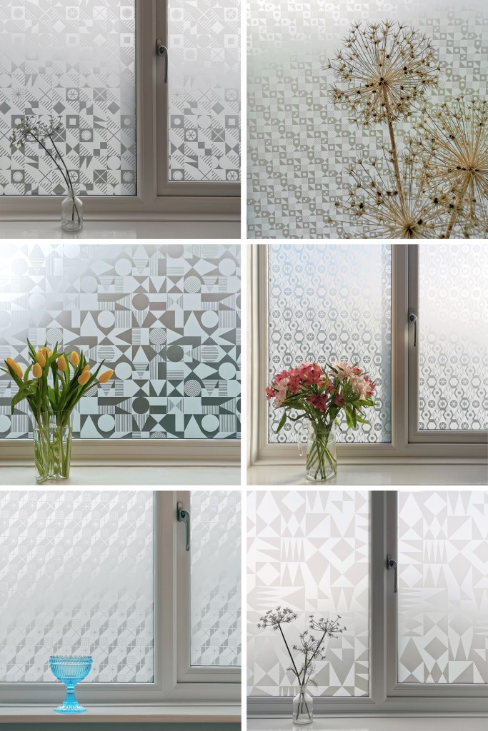
I’m excited to be finally bringing this collection of surface designs to market in collaboration with the Window Film Company. The inspiration for the patterns has stemmed from my fascination with geometric designs, taking the basic ingredients of triangles, circles and squares as my starting point.
I’ve been exploring geometric pattern structures in relation to design principles established by Lewis F. Day at the turn of the Twentieth century, exploring the equal distribution of motifs within a repeating tile to alter the visual rhythm within two-dimensional surface designs. I have also explored expectation and disruption within the repeat tiles. On establishing an apparent small-scale repeat, I play with unexpected shifts in the placement of motifs to disrupt the rhythm, challenging the sense of order. This work belongs to my ongoing practical pattern research as Associate Professor in Design at Norwich University of the Arts.
The six designs each have their own identity and yet belong together like siblings in a family, with shared features of geometric motifs and formal compositions throughout this collection. Some of the designs started their life as self-initiated physiotherapy back in 2020 / 21 following abdominal surgery and my subsequent recovery. The design challenge, to make small-scale lino blocks of repeating patterns to print by hand, provided me with small physical and mental tasks to focus on between the naps. I had hoped some of the designs would one day be leaving my studio, and I’m pleased and proud to share them now.
Designing for window film requires consideration of motif, shape and pattern construction without the aid of colour, requiring an absolute focus on negative and positive shapes. I enjoy working within design limitations in relation to production requirements and technical specifications, believing the challenges become design opportunities. I spent some time testing the various scale of patterns across the collection, including a micro pattern (Step), through to a much larger scaled pattern (Triangulate), considering window sizes in both domestic and commercial spaces in relation to the motif sizes.
I’ve worked with the very patient Steve at the Window Film Company for all my designs available on film, including the large-scale bespoke design for Birmingham Airport back in 2017. Previous designs from my Construct collection available from the Window Film Company won a House Beautiful award in 2018 too!
Steve worked with me to sample some of the early versions of these designs generated as digital scans from lino prints initially, but I didn’t like the visual quality in the translation of the prints. The original artworks for this collection were generated using collage and screen printing alongside the lino prints as I prefer designing with a physical relationship to image creation. After further consideration I opted to create each of the designs as vector-based files for production, providing sharp graphic quality to the patterns.
Mike at Window Film Co. was also fundamental in getting this collection established, off the computer, on to window film and ready for sale. Our conversations focused on understanding my design identity in relation to previous work. He ensured the designs felt authentic to me, while building on the existing designs I already license to the company.
It’s always exciting to receive a delivery of samples, and I’ve had a few of those over the last few months. The final product is very different to a digital file, so it is important to inspect the artwork as film installed on the window, checking the scale of repeat as well as any discrepancies in the artwork – you must have sharp eyes for detail! With final decisions made and sampling approved, as well as the small matter of naming the designs, we have been able to sign off the artwork, and launch the six designs in the collection: Circulate, Diamonds, Shift, Triangulate, Step, Pairings
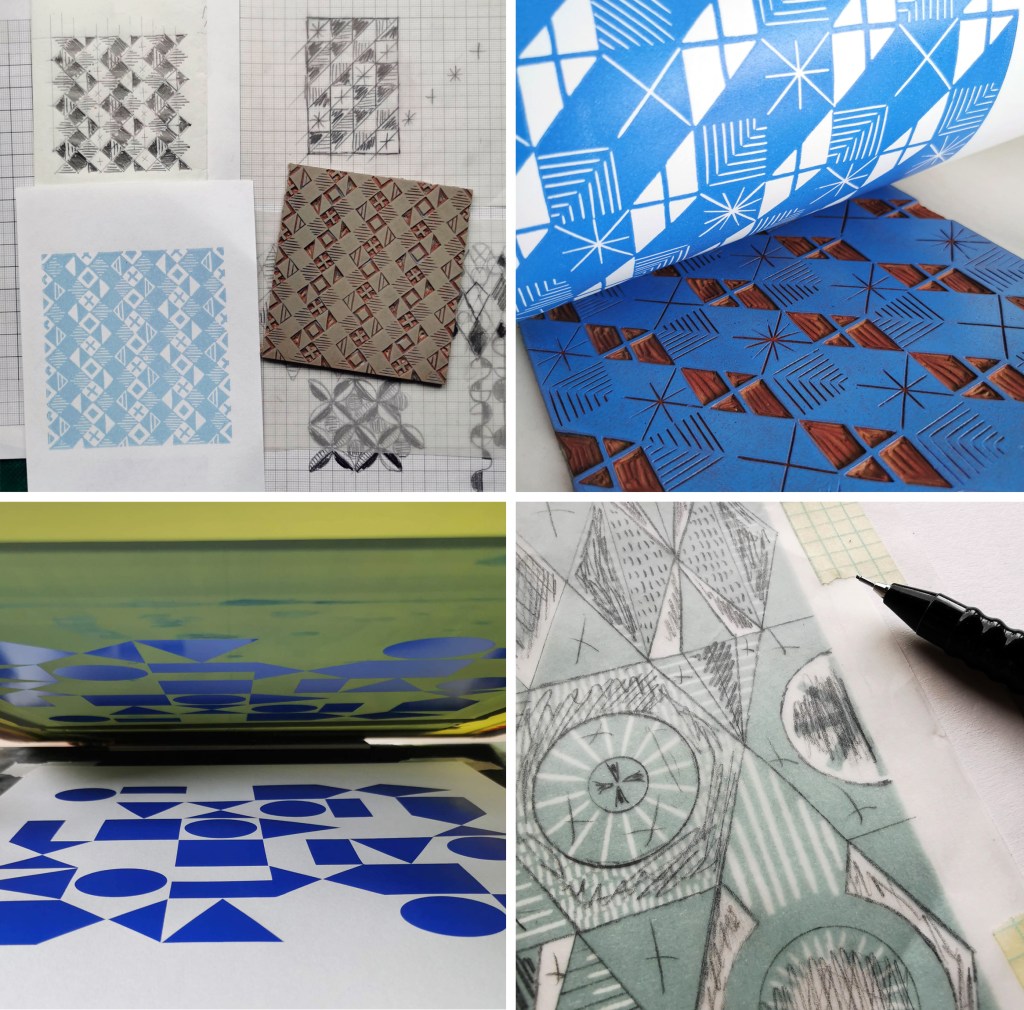
After the lovely summer I’ve been back printing in the studio, with some lino blocks on the go as well as two new screens I’ve had exposed as part of my pattern research. I’ve been exploring the rotation of the artwork as well as folding the prints to determine visual narratives.
I tend to not worry too much about colour palettes in this sampling phase, particularly as I’m focusing on the pattern building but also considering a range of material substrates for future outcomes. I appreciate this gives me freedom to test colours, some more successfully than others. After several days at the computer screen it can be a complete relief to spend time at another type of screen!
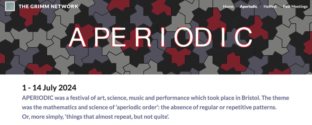
I have been fortunate in having my pattern research selected for inclusion in a really exciting exhibition opportunity in Bristol, led by academic Lucy Ward from University of the West of England.
“APERIODIC brings together artists, scientists, musicians and others in an exhibition about pattern. The show presents work that explores ideas relating to the mathematics and science of ‘aperiodic order’: the absence of regular or repetitive patterns. Or, more simply, ‘things that almost repeat, but not quite’. The exhibition is part of the APERIODIC festival of art, science, music and performance taking place this July in Bristol.” official exhibition text(APERIODIC, 3-14 July 2024 at Kit Form Gallery, Bristol)
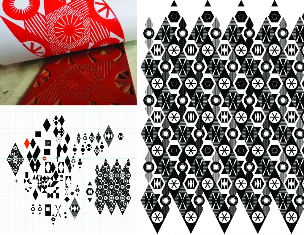
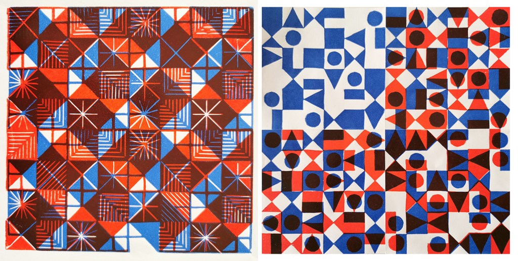
The two pieces I had selected explore block rotation in the over printing of further colour layers, resulting in a building up of a more complex design:
Geo / grid / starLino print
Fields of seemingly reliable compositions of geometric motifs provide the rhythm of assurance through repetition of geometric rhythms but the swapping of small details amongst the motifs unsettles the overall pattern and disrupts the repeating design. The block is rotated before printing of the second colour.
6-spot rotation, multi-direction Lino print
Built upon Lewis F. Days’ principles of distribution of motifs in pattern design (1901), motifs are placed within a tile, 6 x 6 to provide balance and direction when repeated. As the second colour is applied the block has been rotated by 90 degrees in each printing of the tile over the original blue. The repeat is broken and a disorder is established.
One of the highlights of having the work selected for exhibition was the opportunity to have a mathematician review my work aligned to their own interests in pattern. Yotam Smilansky is a Lecturer in Dynamical Systems and Analysis at the University of Manchester, with a special interest in aspects of order and disorder in geometric patterns so I was interested in what they had to say about the work on exhibition.
Yotam Smilansky on Kate Farley, ‘Geo / grid / star’ and ‘6-spot rotation, multi-direction’:
“We notice a certain form, a sense balance, but it might take us a little while before we realise exactly what’s going on. Then we get it: the complicated object before us is made of a single ingredient, copied and superpositioned. It is surprising, even magical, how the unassuming process of layering rotated copies of a single pattern can result in a rich family of objects with a wide range of properties. This is evident, for example, in the moiré patterns of twisted bilayer graphene, where a slight change of angle results in completely different electrical properties, and is beautifully demonstrated in Farley’s mesmerising prints.“
Yotam’s response interested me as I’ve been exploring ways to disrupt and challenge the repeating tiles through transformation and evolution of individual elements within an apparently repeating pattern. I’m certainly keen to continue with this work and am grateful for this opportunity to gain feedback as well as discover the work of other pattern-makers. You can read other reviews of exhibiting artists by mathematicians here.
Thank you Lucy, Yotam and all those supporting the event.
I’ve been keen to get back to designing and printing having spent my practice time writing and developing the book for publication over the last few years. I’ve been testing ideas of pattern evolution and pattern construction for some time in a limited way, specifically looking at pattern structure evolution through drawing investigations, but the ideas at the heart of this investigation have themselves evolved over the last couple of years.
With more time and fresh energy I’ve defined a new project brief and research rationale, and I’m excited to have got off to a good start. I’m looking at repeat tiles and construction of pattern formations, so cut shapes and sketches were an obvious way in for idea development. I’m trying not to be too precious with outcomes at this stage, so I’m trusting the process.
I’ve started by testing ideas with geometric shapes as subject matter to keep the aesthetic clean and graphic, focusing on the laying down of colour blocks. I’ve started by working up some ideas for screen printing but anticipate many more drawings, maybe lino prints and certainly digital work will be created over time too. The colour palette will certainly change, but with an exhibition I’m making work for at the same time dictating pieces to be black and one other colour I’ve gone with black and green.
I don’t want to give too much away at this stage, but look forward to discovering the potential over the next few months.
As a keen lover of patterns I’m always on the look out for interesting examples to add to my consciousness. I do like a good geometric as well as micro (small scale) repeating patterns so despite being immensely annoyed to find myself back in hospital on a ward for a week I did spot the odd pattern of interest…
I’m interested in small details that make patterns work, and I spend time in my teaching analysing successes and failures of patterns in relation to motifs, pattern structures and repeats to teach the students how to improve their own designs. These NHS designs, printed on fabric for hospital nighties (left), pyjamas (middle) and the surgical gown (right) do demonstrate merit.
Small details on the pyjamas / nighties, such as the spot actually being a hexagon, the less obvious choice, and the squares making up the bigger square block including smaller squares in the darker colour, means they contrast with the larger mid green colour bring visual interest. If the darker squares were the same size they may well appear too dominant. Interestingly, the pyjamas had the green colourway as vertical stripes, and yet the same design in red was placed as horizonal stripes on the nightie. I wonder why this was. Let’s not talk of the fit of these garments! The surgical gown is more simple, but I appreciate the fact that the cross is made up of broken lines, with a small dot in the middle – so much more interesting that if it had been two lines crossing.
These are tiny details that most people will overlook, I know I was probably not the most typical of inpatients, but if you spend any length of time on a ward, nil by mouth for several days your mind wonders. I found there to be a significant challenge in retaining something of myself as a person beyond the sick patient, with all the focus and attention on your health, or lack of. The pattern spotting was a way of still being me.
As I said at the top, I like micro patterns and have shared my collection of envelope insides on the blog before. I like the smaller scale patterns that provide visual rhythms and noise, that get on with doing their job, in a simple utilitarian manner. These patterns on hospital garments also got me thinking about moquette, the hard-wearing fabrics on transport upholstery, and how those patterns signs are there to conceal dirt and wear, whereas these hospital ones with the white background were doing the opposite.
I hope you don’t find yourselves in hospital to have the chance to analyse patterns on your gown, but if you do, I hope you like the ones you’ve got!
There are particular visual rhythms I seem to collect as photographs when out and about and so I thought it worth while putting them together as collections of patterns. I’ll leave you guessing what might also feature over the coming months but here’s the first: plaids.
Some are more obvious than others, and while you are looking, keep an eye out for the friendly robin. There’s a list of locations below for those who might be interested.
1a Botanical Gardens, Birmingham
1b Plot 8, our allotment, Birmingham
1c University of Warwick car park
2a Aeneas Wilder, Mead Gallery, University of Warwick
2b Heeley Rd. Birmingham
2c Olympia, London
3a Newtonmore, Scotland
3b Hastings
3c Dudley Zoo
4a Hockey arena, London 2012
4b Dudley Zoo
4c Llanthony Priory, Wales