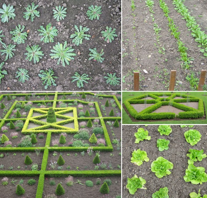
We had a great day out at National Trust’s Sissinghurst gardens in Kent last week even though the weather gave us several seasons in one day. It has been a number of years since my last visit and I’ve spent those years becoming more of a gardener, and launched my Plot to Plate collection of garden inspired patterns in that time so my reasons for observing, taking photographs and drawings have changed. The planting was fantastic; the combinations of colours and textures in particular were stunning. Here’s a few examples:
flowers
floral inspiration for textile patterns
One of the reasons I love to teach students drawing for textile design is the journey of enlightenment when introducing someone to the world of not only looking, but also of seeing. There are many ways to see when drawing and I’m really interested in the journey from reality to abstraction, whether its a state of mind, a way of transforming or whether it’s a methodical process applied to something in order to arrive at a motif for pattern.
My drawing process has evolved over years of practice but the way that I see is not so different to two decades ago. I remember reading the book ‘Drawing with the Right Side of your Brain’ by Betty Edwards and realising that I already did that and it all made sense. I enjoy playing with perspective, elevation, mapping of whatever it is I’m drawing, whether it’s a landscape or twig. Turning the three-dimensional thing in front of my eyes in to a two-dimensional drawing is always exciting, and challenging, but that’s half the fun. I think the process of printmaking that I further translate my drawings to really suit the clarity of motif dissection, separating colours or specific details on separate blocks or screens for printing for either a limited edition print or commercial textile design.
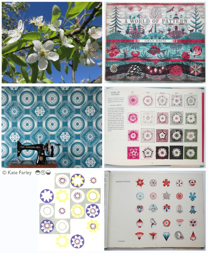
Each year the pear blossom at the allotment arrives and each year I’m reminded of how perfect they are in all ways. The beautiful petals and the bits I don’t know the names of, all there, waiting to be celebrated in drawing. No doubt Charles Rennie Mackintosh would have made an exquisite watercolour and graphite study. The flowers also remind me of drawings and prints I have made in the past, and not only of blossom, but of flowers that I make diagrammatic in a way to understand and explain the ingredients of the flower. When I discovered the work of Gwen White, and particularly the book ‘A World of Pattern’ I was excited to see someone else communicating what I see and how I translate form to pattern. This method doesn’t suite everybody and it would be a dull world if we all made drawings that looked the same, but every now and then it’s nice to know that my creative brain works like someone else’s brain and that my eyes see what others have seen before me.
Pear blossom, photograph, Kate Farley
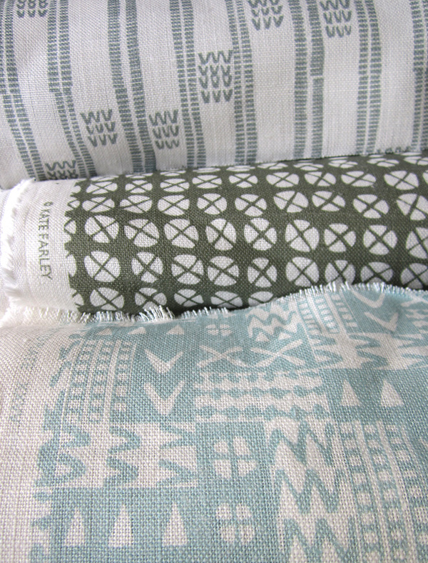
‘Hanbury’ wallpaper, Kate Farley
Passiflora, lino print, Kate Farley
illustrations from Gwen White’s ‘A World of Pattern’ (RH column)
the colours of 2014
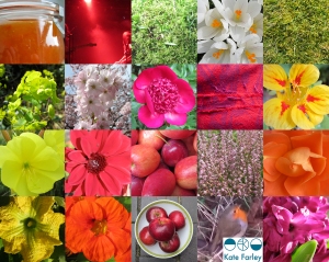
Back in 2012 I started a colour project on Twitter, using Pantone references ( @pantone ) that represent particular colours of the season, place or activity of the day alongside photographs that I have taken. The words relate to the language of colour, seasons and the activities so often word-play is used, particularly in relation to Coated, Uncoated or Process, as used in the Pantone system of colour. Having kept this going for over two years I decided to look back to see the colour swatches of 2014, a record of colour of my year, having recorded pattern of 2014 in my previous post. In chronological order under the swatches are the Tweets to tell you about the images, they read from top L to R, along each row ending with the hyacinth, bottom R.
From this point on we can look forward to 2015…. Happy New Year…
Kate Farley @katefarleyprint · Jan 27
ORANGES! A new breakfast treat, from @pantone180 solid to process = marmalade
Kate Farley @katefarleyprint · Feb 12
Brilliant @pantone Red DS 75-1Uncoated; a gig of captured whispers & exploding electric noise @annacalvi Outstanding!
Kate Farley @katefarleyprint · Mar 2
Yesterday: @pantone DS 290-1 Coated, sights of fresh green but otherwise muddy underfoot – Spring has sprung
Kate Farley @katefarleyprint · Mar 9
Crocus delights: @pantone process, heading home, 49-1Uncoated, Spring sun
Kate Farley @katefarleyprint · Mar 15
Malvern moss green @pantone DS 312-1U = process walking & uncoated. A beautiful spring day #Herefordshire
Kate Farley @katefarleyprint · Mar 29
Spring green @pantone 389 Uncoated, on the eve of BST. Euphorbia at its best!
Kate Farley @katefarleyprint · Apr 11
Bored of blossom? Beautiful @pantone 684 PC – Solid optimism to Process – the Spring growing season.
Kate Farley @katefarleyprint · May 21
Okay so it’s not #RHSChelsea but stunning @pantone 806 Solid pink Uncoated. Sadly rain due to spoil it tonight!
Kate Farley @katefarleyprint · Jun 27
A lot of @pantone 207 PC with @tiborreich on behalf of @textilesBCU Every colour under the sun and rain. #textiles
Kate Farley @katefarleyprint · Jul 10
Today = A sunny @pantone yellow 604 Uncoated and optimistic on all fronts! #colour
Kate Farley @katefarleyprint · Jul 21
A stunning yellow @pantone 386 Uncoated, hot & with plants growing in the wrong place across the plot. #weeds
Kate Farley @katefarleyprint · Jul 25
A stunning, loud and proud @pantone Red hot 032 Uncoated and attracting the insects today. #dahlia #colour
Kate Farley @katefarleyprint · Aug 1
RED! Harvest time with these @pantone 200 Coated at the moment crab apples, soon to become jelly! #colour #harvest
Kate Farley @katefarleyprint · Aug 11
Pink @pantone 679 Uncoated, wild and fresh from #Dartmoor #heather #colour
Kate Farley @katefarleyprint · Sep 3
Blooming special rose @pantone 7417 Uncoated & without an umbrella – let’s hope for no rain! #colour #rose #weather
Kate Farley @katefarleyprint · Sep 8
A stunning @pantone 611 Solid Process flower but I’m waiting for the squash! #colour #PlottoPlate #runningoutoftime
Kate Farley @katefarleyprint · Oct 6
It was sunny yesterday, Uncoated with @pantone orange 021 nasturtiums. #colour #autumn #allotment
Kate Farley @katefarleyprint · Oct 20
Happy to receive @pantone Coated 201 red windfall apples from the allotment at the weekend. #harvest #sharing
Kate Farley @katefarleyprint · Dec 7
A stunning @pantone Solid 158 watching me dig at the plot today, Coated of course #colour #allotment #digging #robin
Kate Farley @katefarleyprint · Dec 30
Blooming! We are enjoying the seasonal @pantone 226 Uncoated and indoors #hyacinth
the patterns of 2014
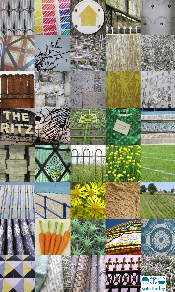
It’s been one of the years I shall remember as particularly busy, continuing to juggle the commitments of family life, my roles as artist, designer, lecturer and of course allotmenteer, and the small matter of a big Birthday. All the time spent doing any one of those things provided opportunities to spy inspiration, food for thought and visual stimuli for me so having looked back over the last twelve months I have enjoyed creating a record of the patterns I’ve seen. The record includes family holidays, research trips, and days out; from the school sports day track, Birthday celebrations, to the rivets in the railway bridge, the stately home and the walk to work, it’s a record of some of what I saw in 2014.
Key themes appear: geometry, stripes and railings and although in a chronological order, there are some great pairings in terms of colours, textures and pattern.
Wallpaper in the creating…
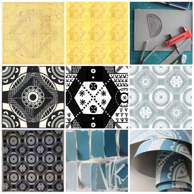
The process of designing my first commercially available wallpaper has been a long & highly considered journey and one I thought would be interesting to share.
Research: I first made drawings in my sketchbook last summer when I visited the National Trust property Hanbury Hall & Gardens in Worcestershire. I really liked the formal parterre and saw a really close link between garden design and textile design – I wrote about this in a previous blog post: https://katefarley.wordpress.com/2014/05/11/pattern-design-outdoors-and-in/
Composition: Sketches became drawings that became more detailed designs, that were then tested in repeat by scanning them in to the computer and using Photoshop. Edge details, scale of motifs, pattern and textural rhythm all needed to be considered.
Cutting the block: I measured and cut the lino block before taking a really clean print in order to scan the print in to work digitally with the repeat tile.
Editing: Further refinements, several print outs and more alterations took place over several weeks as I got used to seeing and living with the design. Additional lino blocks were cut in order to add different motifs to the design. Additional variations across the larger repeat file create visual interests and a play on the traditional repeat expectations. Some tweaks were so minimal that people unfamiliar to the design wouldn’t be able to spot the changes without having them pointed out, but it’s so important that every dot, dash and space has been considered before the production process is underway, saving time and lots of money.
Production: The digital artwork was sent off to the manufacturers of the roller in order for the design to be printed, and a technical proof was sent back for my approval – exciting and scary times!
Colours: Much thought, research, trying and testing went in to the colour combinations and I painted lots of colour chips using gouache in order to communicate the choice to the printer.
Printing: After signing off the colour proof provided by the printer, the wallpaper went in to production, labels were designed and printed, rolls created.
Results: I’m delighted with the results, the efforts by all those involved with the production process, and look forward to launching this at TENT London very soon.
Pattern design, outdoors and in…
If you are a regular reader of this blog you will already know that for the last few years my personal design practice has been inspired by garden design, and most specifically allotments and kitchen gardens in my ‘Plot to Plate‘ collection, launched in 2012. I have spent many hours walking, almost patrolling, up and down rows of National Trust cabbages and onions, armed with my sketchbook, annotating the patterns, translating them to motifs, documenting the small irregularities, the planting plans, the labeling – fruit and vegetables up and down the country, as well as our allotment, plot 8 in Birmingham. Upton, Packwood, Baddesley Clinton, Blickling, Felbrigg, to name a few National Trust gardens I have surveyed and taken inspiration from. Hanbury is my current favourite garden and I have been working on a number of patterns inspired by this property that will one day be complete, to launch at Tent London this September.
It is with this in mind that I write my thoughts. There are so many similarities between garden design and textile design they seem perfect companions in my practice. Long before Mr W. Morris picked up a pencil the natural world of flora has been a dominant subject of inspiration for pattern in the home. Rather than the bouquets and sprigs, posies and trellis it is the formal gardens, the parterres and kitchen gardens that hold the structure and compositional language that we textile designers and design educators regularly refer to…
Stripes, spot repeats, all-overs and multi-directionals, geometric grids and diamonds, checks and plaids are all to see. And so it is, that it makes sense that I really have brought two things that I do enjoy together in my creative practice. It’s too early to share artwork for my new ‘Hanbury’ designs but I will share some garden pattern from Hanbury, and my ‘new’ fabrics by the metre, available very soon, in anticipation…
Colours for the arrival of BST
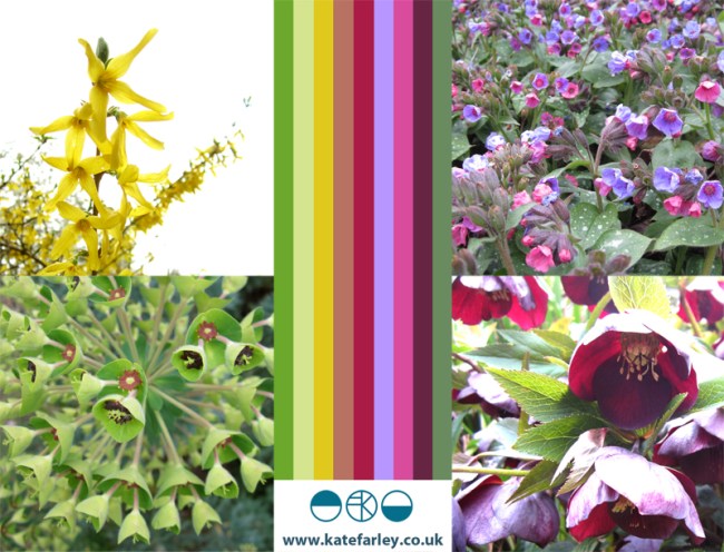
Today we welcome British Summer Time and the weather has been kind. The colours of spring always seem so purposeful after the winter months, with pink trees and purple or yellow blankets of flowers spread across the parks. At the allotment the grass is rearing its greens, and yet the purple sprouting broccoli let us down. Today I celebrate the colours of our garden, noticing the yellows and purples as predominate hues.
spring in a vase
Despite us not having had snow yet this winter we have the pleasure of seasonal flowers that are so beautiful and distinctive, its time to celebrate them here, captured today on digital ‘film’.
I’ve drawn both the snow drop and the daffodil so many times over the years (mending from a broken elbow led me to a season of endless daffs drawings as a way to pass time) and yet each year they surprise me in their beauty. Is it too much to expect that spring will be just around the corner, and we can start this year’s digging?
micro florals
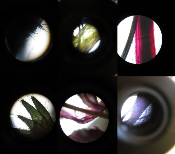
I’m used to gathering flowers and then drawing them over and over in order to learn more about their colours, shapes, forms and structures in order to develop imagery for prints and textile designs. At home this weekend we looked at flowers in a different way. We investigated last years plants that my daughter had pressed safely, and looked at them under the microscope that my son had become rather too keen on discovering inside the utilitarian wooden box it lives in.
We had great excitement as some rather plain plants revealed stunning patterns and textures and were disappointed when something beautiful at full-scale looked rather scary close-up. On trying to capture these images on camera the results were reminiscent of Len Lye animations and got me thinking about other ideas. Here’s a few images to share…
Design inspirations 2: the natural world
Second in the series of ‘Design Inspirations’ blog entries…
The natural world has long been an inspiration for textile designers. Many years on from William Morris celebrating the natural world of flora and fauna as decoration for textiles we have had Laura Ashley, Marimekko and Orla Kiely, to only name three companies, who have interpreted the natural world and created stylised patterns and imagery which continue to inspire design students of today.
At times the worst thing as a lecturer of design we can hear from a student is that their project will be “about shells” and we dread the worst examples of static and bland studies which do little to explore the beauty and wonder of the natural world’s creations of form, structure, surface, pattern, colour and more, before approaching the bountiful concepts and metaphors in the ‘dot to dot’ of design processing hidden around the shell!
In my drawings I often aim to distil and to simplify a plant structure or shape of a flower in order to create motifs for prints and surface patterns, exploring perspective, diagrammatic language and relationships with place / context. I have a huge archive of drawings made on locations as well as boxes and bags of samples including plants, stones & leaves and one day they may well feature in designs. You never now what you might need! Going anywhere new, even for a holiday means that I keep my eyes open and often pockets filled as a result of finding new things.
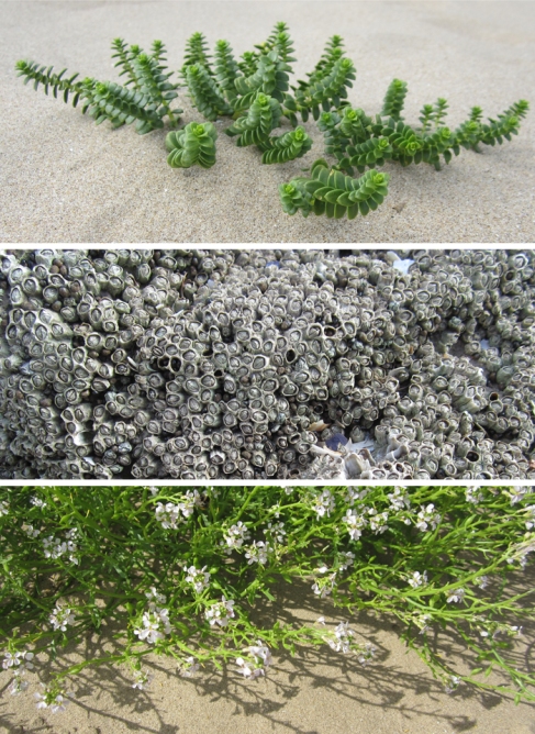
Having visited the Gower peninsula for one last summer camping trip I came across these examples of natural forms, which could and would create different visual interpretations in the hands of each creative prepared for the job. That is one reason why I like to play a part in design education; to facilitate the looking, seeing and interpreting, and it is certainly why I like to keep on collecting, and keep on drawing.

