I spent a busy day in London this week, with focus on print and pattern. It was fabulous! My first destination was the William Morris Gallery, Walthamstow in east London. I can thoroughly recommend the exhibition, Women in Print: 150 years of Liberty Textiles, on until Sunday 21st June 2026, in conjunction with Liberty Fabrics.
The exhibition spread across two floors of the gallery with a number of rooms and corridors showcasing some old favourites of printed textiles and related works on papers, alongside some lesser known pieces and associated garments.
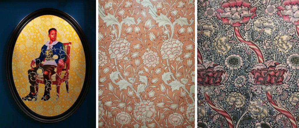
The introductory video for the exhibition gave an insight to the role of women at Liberty with old photographs and recent interviews. I thoroughly enjoyed seeing old favourites throughout the exhibition, with works by Sonia Delaunay, Althea McNish, Jacqueline Groag and Susan Collier & Sarah Campbell as well as being introduced to names I wasn’t aware of, including Mrs Stoneley and Winifred Mold. I hadn’t realised Lucienne Day only designed one design (Fritillary) for Liberty, with it being agreed she would design for Heals while Robert Stewart would design for Liberty!
There was a second video upstairs, filmed in the 1970s that showcased the print and dye work with some rather random models in Liberty clothes wandering in and out of shot, by the print tables and dye vats in swimwear! When I discussed this with Sarah Campbell later that evening she joked it was her and Susan, the design duo behind Collier Campbell – exhibition now on in London’s Fashion and Textile Museum and featured in my next blog post!
The exhibition is free to attend, with donations to the gallery gratefully received.
Congratulations to curators, Rowan Bain and Róisín Inglesby.
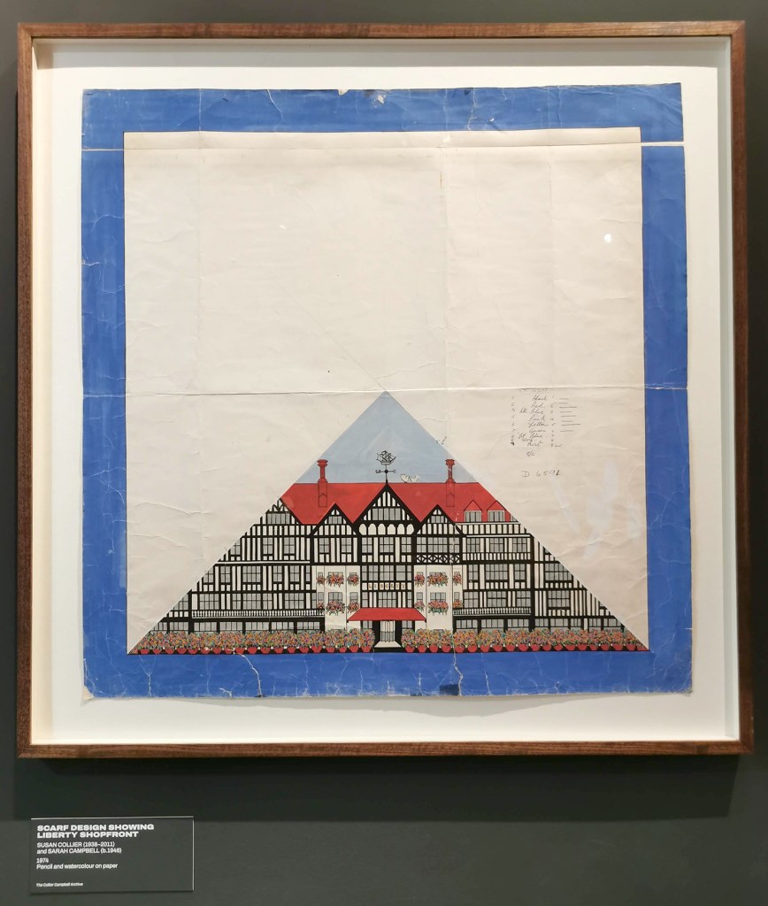
Susan Collier & Sarah Campbell, scarf design featuring the Liberty shopfront
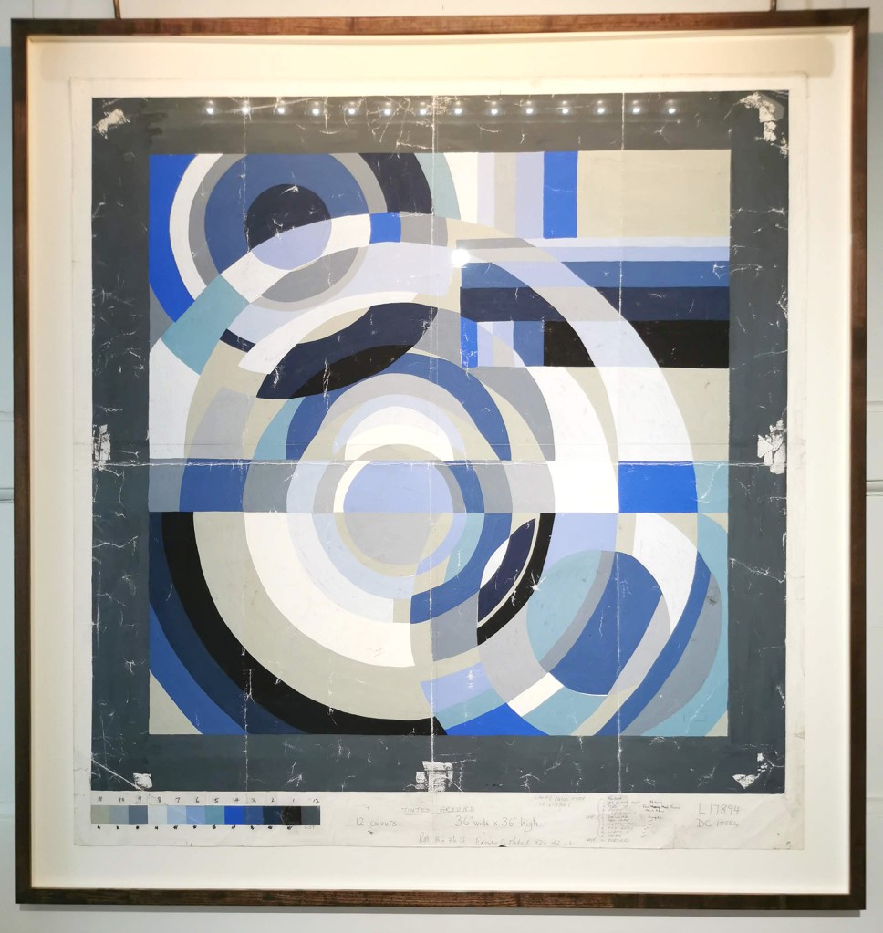
Sonia Delaunay scarf design
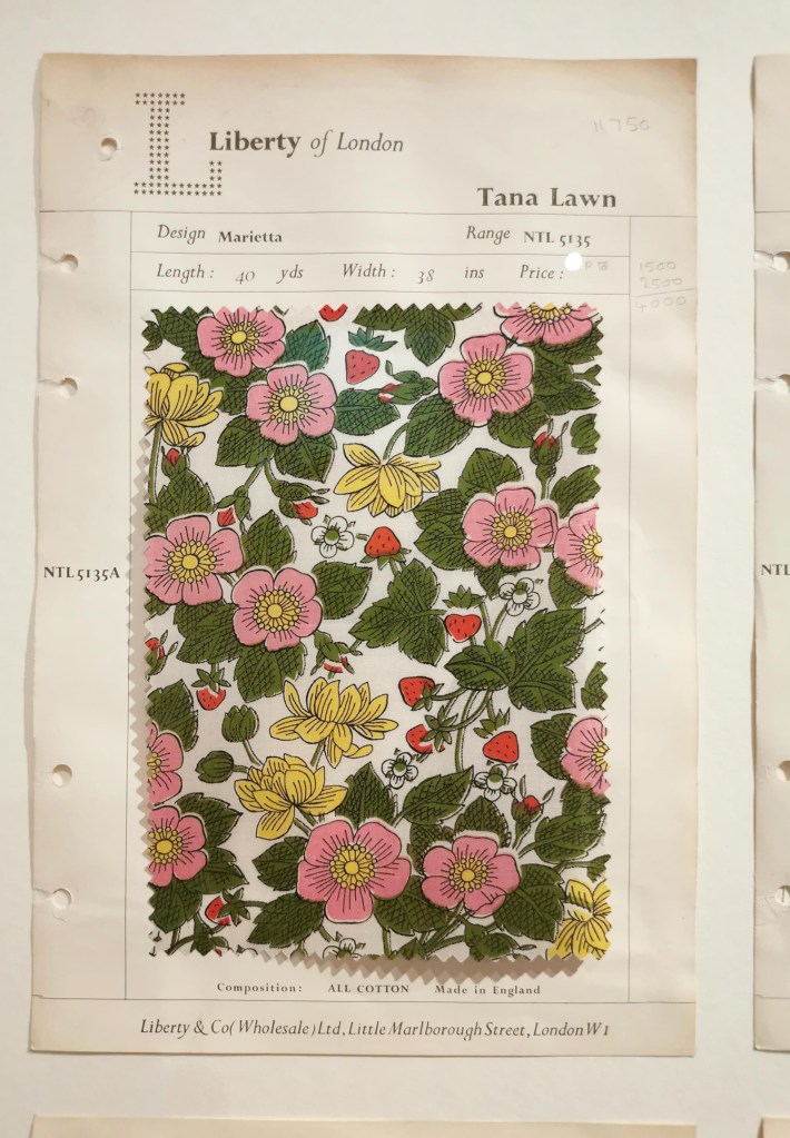
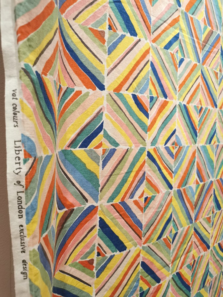
Liberty swatch

Lucienne Day’s ‘Fritillary’, her only design for Liberty
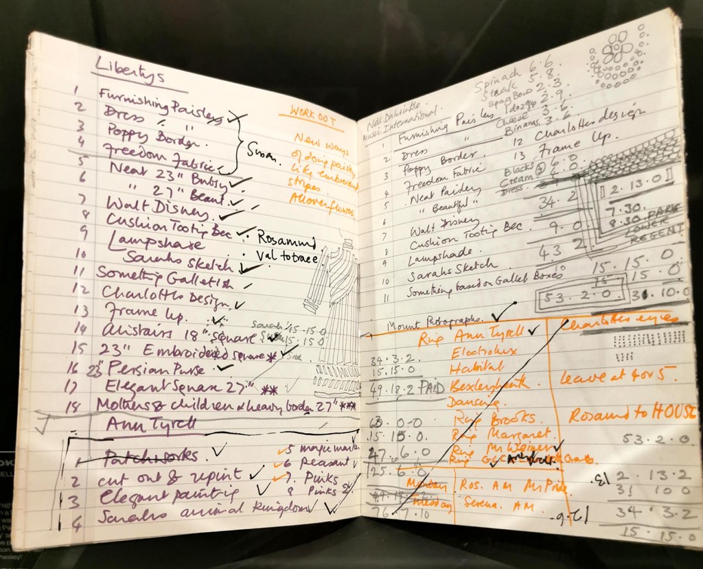
Sarah Campbell’s notebook, double-spread
Collier Campbell ‘Kazak’ design
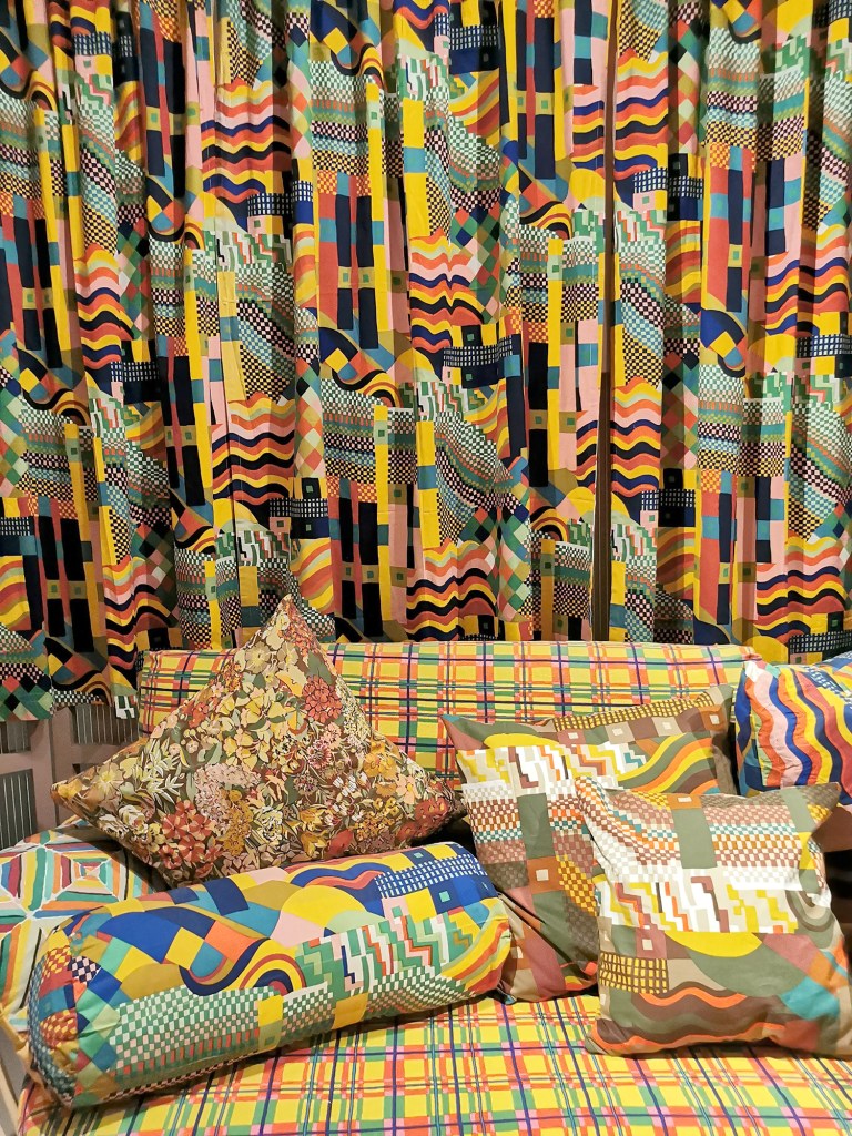
Collier Campbell for Liberty, featuring Bauhaus, inspired by Gunta Stolzl, the weave master at the Bauhaus, Germany