well-travelled textiles

A while ago I received a message from a friend over in America, and knowing of my career and personal interest in textiles, she was writing to see if I’d like to receive some old but special textiles she had spare that made her think of me… I was intrigued what might arrive in the post… How could I refuse!? A few days later two beautiful squares of cloth arrived, one with a woman and the other a man stitched in to the cloth across one corner, with gently ornate decorative edges and corner details.

[details: one piece features a woman, the other a man]

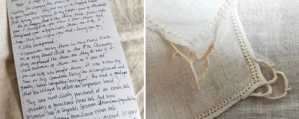
She thinks they are napkins, they are very light weight cloth. Accompanying the two pieces was a note sharing what she knew of the provenance, and how she had acquired them to share with me. Emily remembers them in her mother’s ‘stash’ of things in the 1970s, when she must have been only about 4 years old, so they made an impression on her.

They were possibly bought by her Grandma Daisy (an accomplished and frankly, rather compulsive ‘antiquer’), at an estate sale, maybe a farmhouse estate sale. She had a good eye and built an impressive hoard! Emily told me there is a sizeable German-American population in Wisconsin, so this might be part of the story too.

[the letter and edge details of the pieces]

I’ve consulted my panel of experts as I’m no embroidery expert myself, and they’ve been a great help (thanks particularly to Grainne & Liss) … I think it’s safe to say it’s a combination of techniques, including cut work and stump work. One of my experts suggests stump work is the overarching technique, particularly to create the woven style stitches of the figures. Often more three-dimensional than these examples, stump work can be highly ornate with raised areas, but these squares appear rather low in relief.

We can also see whitework embroidery, a broad term including a number of different techniques, working with white thread, often linen, pulling the warp and weft threads to form motifs. Pulled or drawn thread work are examples of whitework where no cuts are made. Cutwork is a form of whitework where areas of woven cloth are cut away and stitched in new configurations. These samples include cutwork featuring buttonhole stitch & buttonhole bars with detached needlelace. I hope I’ve got all this down correctly!

There is an amazing online Royal School of Needlework resource here for more stitch information – you might be lost for hours!

A detail to note is that the figures have been created on the bias of the cloth, set diagonally on the weave near the corners, rather than the straight line of the weave. This may be a specific approach preferred by a particular maker, region or process, so might help identify the provenance.

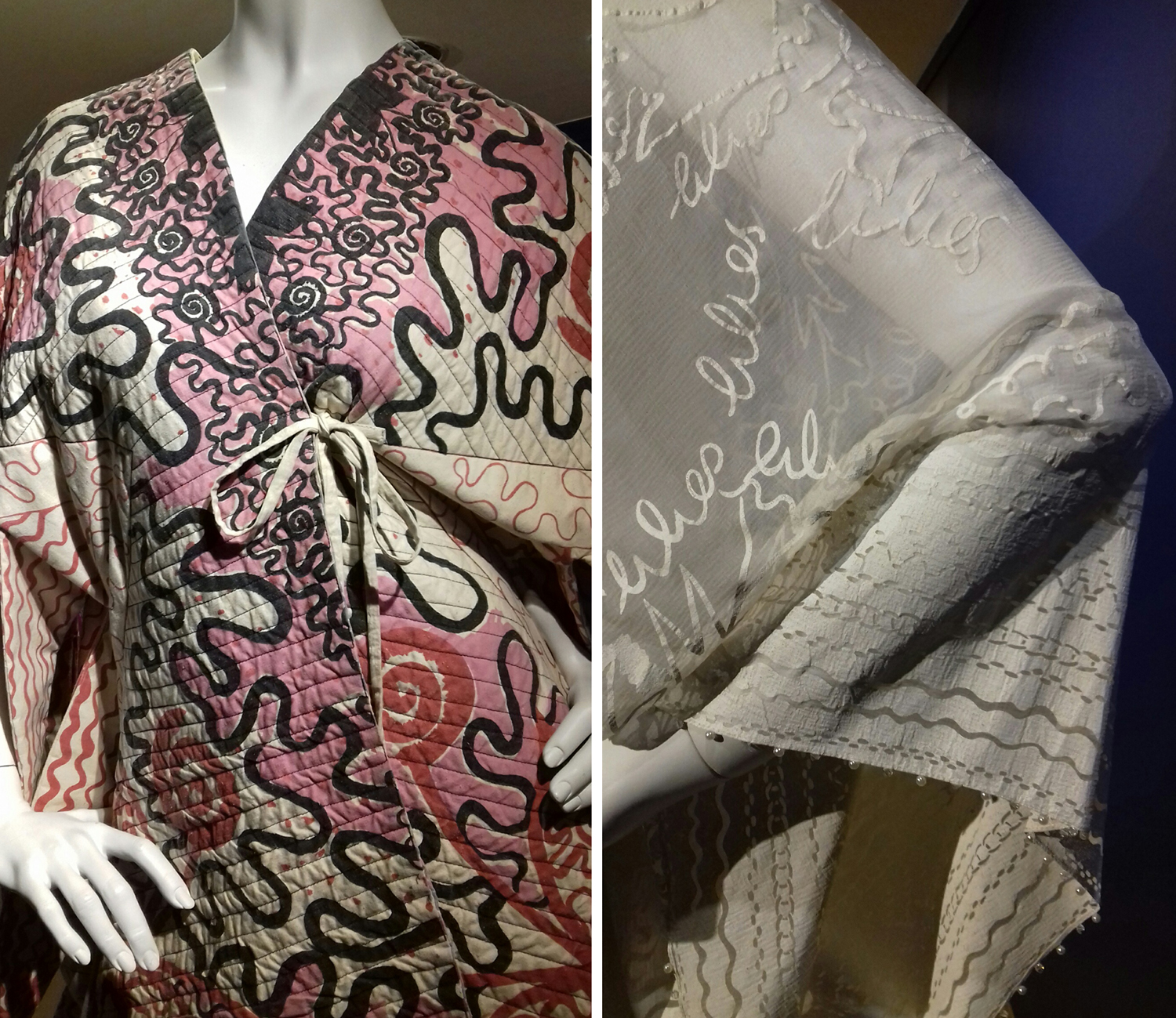
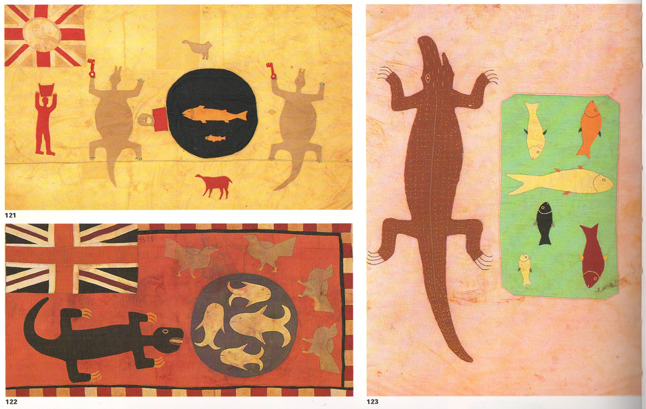
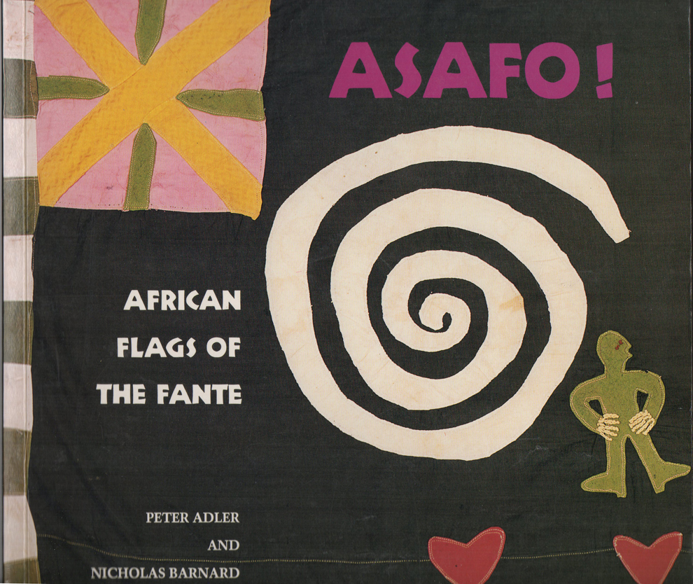
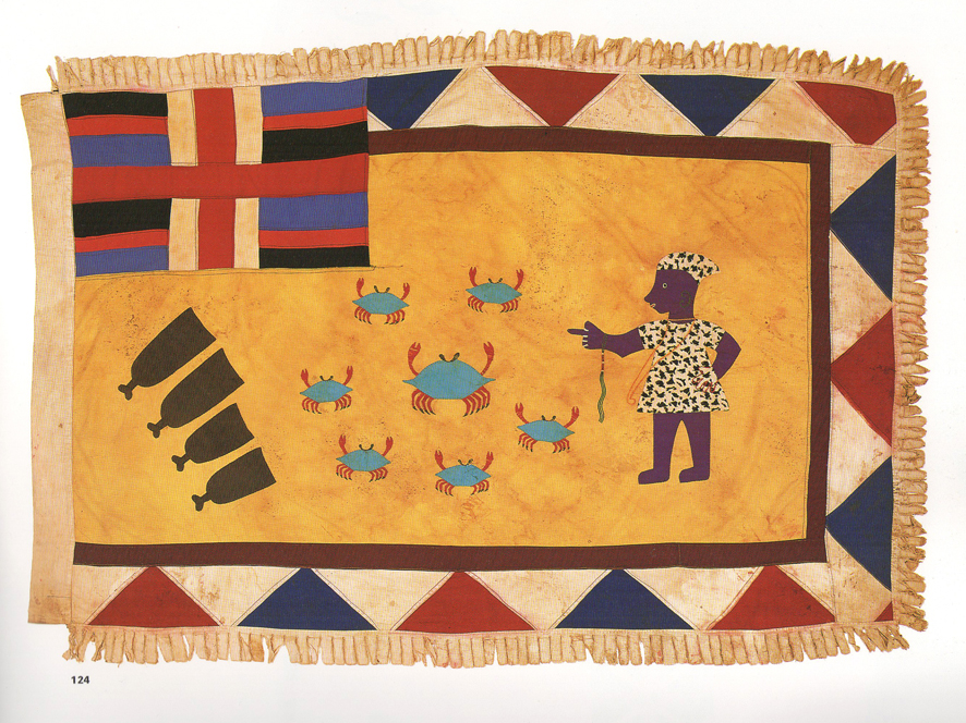
The figures are wonderfully stylised as a result of the stitching process, naive and full of character. They remind me of folk art examples I’ve seen before and historic world textile samples at the Pitt Rivers collection in Oxford only a week or so ago. Also the characters are not dissimilar to the figures on the Asafo flags of the Asante in Ghana I’ve written about before. Once again, the process of stylising and representing imagery as motifs is shown to be one of my favourite subjects!

Textiles, although fragile, can survive in the right conditions for centuries, and can hint at stories of society, status, lifestyle and identity. The textile skills required to make these pieces are likely to be far more commonplace at the time these pieces were made too. Lightweight, portable and often with specific uses, textiles have been transported all over the world with people travelling for all manner of reasons. These two pieces have their own history I’d love to know more about, not only to understand where they were made and by whom, but also to understand the journey they have been on since their creation.

Despite not knowing more I shall continue to enjoy them, and in the process of writing this post I’ve learned a bit more about embroidery too… I am grateful to have been sent them to care for. Thanks Emily!

pattern informs the piece: Zandra Rhodes exhibition review

Finding a couple of hours to spare in London last month I took the decision to head across the river to the Fashion and Textile Museum, and specifically, the Zandra Rhodes: 50 years of Fabulous exhibition. It proved to be a perfect visit for where my head was at; juggling fashion and textile design in both a design commission and my academic life.

Zandra Rhodes is first and foremost a textile designer although it is her fashion designs that carry the printed and embroidered pattern she is famous for. The silhouettes of the garments, constructed often from multi layered draping fabrics are guided in their execution, in fact dictated by, the pattern design of Zandra’s strong handwriting or pattern, and executed using print processes and surface manipulation.

I’ve included plenty of images of these outfits in university design lectures over the years, discussing how the designer maintains the focused design style and aesthetic but also manages to evolve the work through the decades.

As ever it is very different when you get the chance to see the fabrics in real life. The white printed pigment on chiffon from the ‘Lovely Lilies’ collection (below right) and the quilting over screen printing of her signature swirling motifs as borders and placement prints provides the evidence that Zandra Rhodes is first and foremost exploring fabrics to lead garment design.

ZH_highlights

The variety of fabric manipulation and surface embellishments was fascinating to see, some rather crude and some pieces held their own more than others. The ease in which the textiles worked as one with the garment design is certainly demonstrated throughout the exhibition, and it was useful to see the screens for printing to see the composition of the designs later on in the exhibition.

ZR_patterns

The theatricality of Zandra Rhodes’ work was a perfect match for opera costumes, and upstairs in the gallery a number of interesting examples were showcased. I also enjoyed seeing original sketchbooks alongside a film of the designer talking about how important drawing is to her. I hope many textile design students visit the show and take her advice.

ZR_dresses

There is a significant body of work on exhibition here and it is important to view it as a considerable output of a single designer with a thirst for carnival. Her practice spans fifty years, hence the exhibition title and although her style is not for everyone, her contribution of bravery, exuberance and fabric play should inspire others to take creative risks and find a way to make the work they want to make.

I would also recommend the small showcase of company overview and embroidery work by Norman Hartnell as you enter the gallery – stunning pieces from a different era.

The show is on until the 26th January, 2020.

Visual proverbs – in Ghana and Cheltenham!

As a young student in the 1990s I became aware of the amazing Asafo flags of the Fante, from Ghana. I’d seen an article in a magazine in the college library about an exhibition on at the time, and unable to afford the trip to London I telephoned Peter Adler, curator of the exhibition, as his number was listed in the article, to share my enthusiasm. I’m not sure what I thought I’d achieve but we did have a conversation and I was inspired to find out more about the colourful appliqued flags.

asafo_flags_croc100

What struck me about the flags was the bold shapes of animals and people that were communicating warnings to other units of warriors of the Fante people. Proverbs such as ‘The crab is feared for its claws’, or ‘Fish grow fat for the benefit of the crocodile’ attempt to ridicule the rival warrior groups and set a tone of fear, as if toying with opponents. With influence from the European flags they had seen as adventurers explored West African coastlines and from international trading ships the flags also featured elements of geometric borders and the Union Jack. I like the stylised imagery, but particularly the visual communication of a story in one textile image. I remember I wrote an essay on the subject for a Contextual Studies assignment and I went to great lengths to dye fabric and create my own textile illustrations and book cover – I still have it somewhere.

I’ve shared images of the flags with many groups of students over the years, but as I write a research paper on the subject of visual communication in pattern I am once again reminded of these beauties, and back I go, to the wonderful book: Asafo! African Flags of the Fante, written by Peter Adler and Nicholas Barnard in 1992, published by Thames and Hudson. I recommend this really informative book.

asafo_bookcover100

asafoflags_crabs100

When walking from Cheltenham railway station to the town the other week along the off-road path I came across some graffiti in an underpass that reminded me of the flags, and particularly in the way the animals were used to goad. The images felt as if they were provoking and taunting rival groups by showing off their prowess in the way the artwork of the Asafo flags did. I could imagine the jibes represented in the images of the cats, and in the way the badger is attempting to deflect the attention away from his kind, to the lizards, maybe another urban tribe. I’ll share the images here.

CheltenhamGraffiti150images:

Asafo flags, scans of the pages from the book by Peter Adler & Nicholas Barnard, referenced in the text

Cheltenham graffiti, photograph by Kate Farley