I’ve spent many hours over the last couple of years reflecting on my teaching career that stands at about 18 years, give or take a bit. In order to apply for Senior Fellow of the Higher Education Academy I had to write thousands of words that explain and reflect on the impact I have made on not only the students I have taught but the colleagues and peers across the industry I relate to in my professional practice. It has been a big ask to fit my diverse experiences in to the word count along with the cross referencing required, but I’m delighted to say my hard work over the ‘holidays’ and the work of my colleagues in writing supporting references has meant I achieved Senior Fellow and I’m rather relieved / proud. (I was however disappointed to discover that rather than receiving a fine water-marked, embossed and foil blocked certificate I had to download it! … I digress.)
I’ve written many times about how important it is for me to combine my design practice with my academic career and although it doesn’t make my life easier, it certainly makes it more fulfilling. They really are mutually supportive. The reason I am so driven to support the students in reaching their goals is because I know how rewarding a career in design can be. From having the confidence to draw in a different way, to picking up the phone to a new client, to realising your dream of seeing designs commercially available…, to be paid to do what you love doing… why would I not want to help others to do those things?
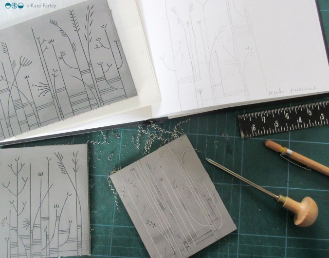
It’s also important to hear myself saying these things to students. It’s as if I am telling myself as well as the students! Yes I must chase that lead, make sure I’m paid a fair rate or keep my website up to date! Each creative has different ideas about how and where to move forward with their ambitions and the art of teaching is to work out how to nurture, support, push and challenge positively. Being creative is not easy. You put your sensitivities on the line to be judged, sometimes by those with less creativity than yourself, but who holds the budget. There are certainly pages in my sketchbook I wouldn’t choose to share at a group tutorial, but the process of knowing you are not alone in learning the creative process is so valuable. It’s also the case that it’s often easier to critique someone else other than yourself! Would you listen? Maybe one mis-perception is that once you graduate you stop learning – I plan to keep learning forever! Each project I work on is an excuse to learn more, not only about myself as a creative, but new practical or technical skills to take on board for me, as well as sharing with colleagues and students.
I’m very aware the reality behind social media may be far different than the stories being told online. I make sure students are made to think about that, – use the benefits of social media while considering the stories they read and the stories they create. While I like the way we can find out so much more about what’s going on, and who we need to know (can you imagine only having the yellow pages?!) there are complications with so many aspects of our practice being shared. Copying, audience expectation, peer competition versus mutual support, networking and peer validation are ups and downs of today’s design world. I approach my teaching very much like my designing. Honesty, integrity, and fulfillment…. support, encouragement and creative ambition! Even writing this is like giving myself a tutorial! What’s my homework?