an alternative view

I’m not so keen on this time of year. Despite the crocuses being up it doesn’t feel anywhere near summer, and there is still a small chance that snow will fall before anything but parsnips can be harvested on our plot. Having been brought up in the Norfolk countryside I miss what the countryside offers. It is important to me that I notice the seasonal changes that shape our year, despite the suburban home I find myself in, here in Birmingham. I miss the big skies, the open fields, and the greens of each season, still in existence, I just can’t see them from here.

ferryLakedistrict1

Looking though photographs from last summer I found this shot. I took it from the car as we sat aboard the Windermere ferry, crossing back towards the motorway, heading south to the Midlands from our final holiday of the season. It really was a grasped shot of the closing summer, peering through the window, breathing in the view. A last look across to the beautiful hills of the Lake District, unaware of what sort of wet winter was in store for so many in the region. In getting the link to the ferry for this post I’ve just discovered there’s a ferry-cam. I’ll check back to it in daylight, and dream of the summer holiday.

Today it was sunny in Birmingham. I had a short run around the park nearby and pretended it was the countryside, imagining I really could feel the heat of the sun through my hat, gloves and coat. I think we have a while to wait. The ground underfoot reminded me all to well of school cross-country in winter!

I think I’m in need of another holiday to the country!


Visual proverbs – in Ghana and Cheltenham!

As a young student in the 1990s I became aware of the amazing Asafo flags of the Fante, from Ghana. I’d seen an article in a magazine in the college library about an exhibition on at the time, and unable to afford the trip to London I telephoned Peter Adler, curator of the exhibition, as his number was listed in the article, to share my enthusiasm. I’m not sure what I thought I’d achieve but we did have a conversation and I was inspired to find out more about the colourful appliqued flags.

asafo_flags_croc100

What struck me about the flags was the bold shapes of animals and people that were communicating warnings to other units of warriors of the Fante people. Proverbs such as ‘The crab is feared for its claws’, or ‘Fish grow fat for the benefit of the crocodile’ attempt to ridicule the rival warrior groups and set a tone of fear, as if toying with opponents. With influence from the European flags they had seen as adventurers explored West African coastlines and from international trading ships the flags also featured elements of geometric borders and the Union Jack. I like the stylised imagery, but particularly the visual communication of a story in one textile image. I remember I wrote an essay on the subject for a Contextual Studies assignment and I went to great lengths to dye fabric and create my own textile illustrations and book cover – I still have it somewhere.

I’ve shared images of the flags with many groups of students over the years, but as I write a research paper on the subject of visual communication in pattern I am once again reminded of these beauties, and back I go, to the wonderful book: Asafo! African Flags of the Fante, written by Peter Adler and Nicholas Barnard in 1992, published by Thames and Hudson. I recommend this really informative book.

asafo_bookcover100

asafoflags_crabs100

When walking from Cheltenham railway station to the town the other week along the off-road path I came across some graffiti in an underpass that reminded me of the flags, and particularly in the way the animals were used to goad. The images felt as if they were provoking and taunting rival groups by showing off their prowess in the way the artwork of the Asafo flags did. I could imagine the jibes represented in the images of the cats, and in the way the badger is attempting to deflect the attention away from his kind, to the lizards, maybe another urban tribe. I’ll share the images here.

CheltenhamGraffiti150images:

Asafo flags, scans of the pages from the book by Peter Adler & Nicholas Barnard, referenced in the text

Cheltenham graffiti, photograph by Kate Farley

summer to autumn colours

We’ve been treated to some clear blue sky days over the last few weeks and this makes the transition from summer to autumn a bit more tolerable. I always hate having to acknowledge that the summer warmth has gone for another year, and that the plot has given us most of the harvest for the year. We will wait for the frosts before we dig the parsnips, but I’ve gathered the squash and picked the final runner beans we will eat. The last of the sweet peas still offer their scent, but their strength of colour has passed. It’s a constructive time at the plot as we take down the netting, pull up the spent corns and clear ground for new anticipation.

Poppies, marigolds and nasturtiums still bloom such strong summer colours, daring the frost not to strike for a few more nights… I have my fingers crossed too…

KFarley_SummerAutumn_plot

pride in the pattern of Pride cutlery

Two years ago I produced a bespoke pattern design for David Mellor Design celebrating the ‘Chelsea‘ salad servers that Creative Director Corin Mellor, (David’s son) had designed. The pattern was screen printed on to tea towels, being a highly appropriate product for the cutlery, and they continue to sell very well through the David Mellor shops and their online store. I took inspiration from the Hathersage factory and the production methods used for the making of the cutlery pieces. I like the fact that Corin sees and appreciates the relevance of the design to his company. Although I can create pattern for pattern’s sake, I am really interested in pattern that belongs to particular brands, to communicate a belonging, of distinctiveness.

This summer I was delighted to be contacted again by Corin as the buying team were keen to add a new pattern. Starting any new commission is exciting as the conversations about the intentions of the artwork, the concepts that need building on, the production methods, colour and material choices, expectations and of course… deadlines!

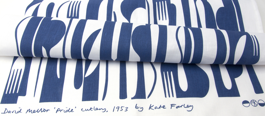
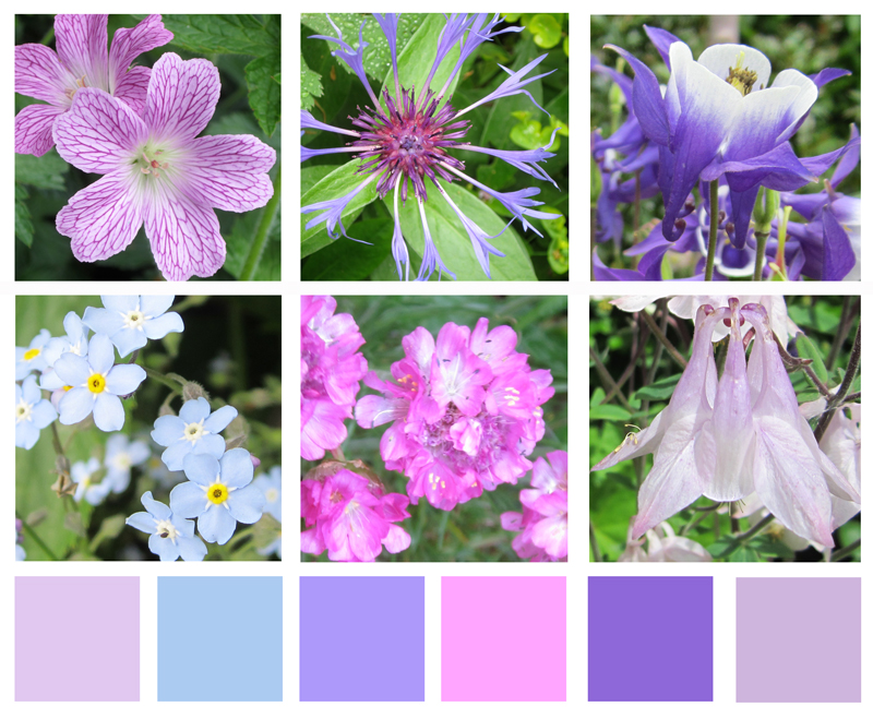
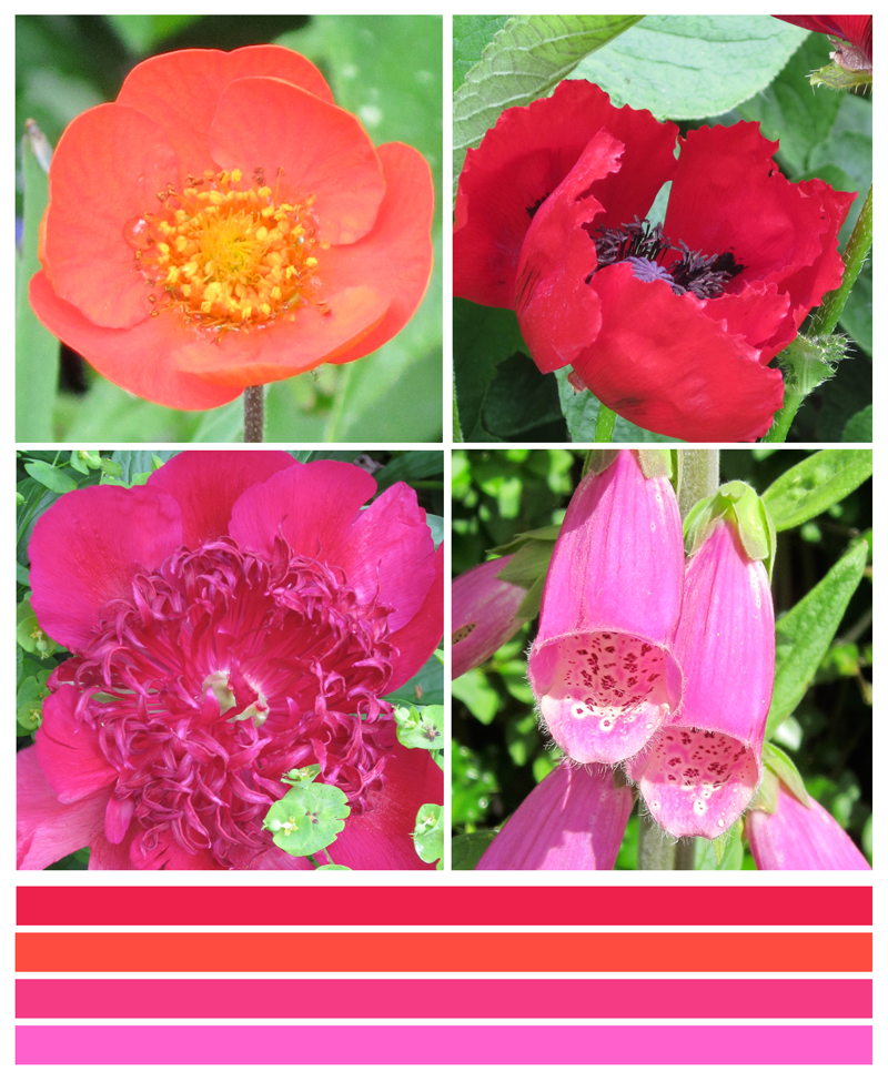
With all of that taken care of I received a beautiful box of cutlery to draw from. Corin had decided he wanted to celebrate his father’s first cutlery, Pride, designed in 1953. It is so elegant, beautiful to hold, and a joy to draw from let alone to eat from! I worked the same way I had done before, developing sketches and informal compositions, working up motifs and rhythms in a sketchbook first before generating final drawings and paper cut outs to scan to digital artwork.

KF_drawingMELLOR_100dpi

I work across a number of software packages depending on what is required, and always bearing in mind the final artwork requirements for production. It matters right from the beginning whether the production method is traditional printing or digital as I will design accordingly, limiting numbers of colours in the design if required, and using colour in the most appropriate way. This summer with several design projects on the go I’ve worked with Pantone references, RAL, NCS, pigment ink swatches and CMYK values. For this project we used British Standard colour relating it to other products that are stocked by David Mellor Design but I had to convert it to modern day language!

Having completed a few different designs I sent them through to Corin and his buying team and was of course really pleased when they got back to me with the same choice as me. I’ve learned never to send anything I’m not quite happy with or proud of, as that will be the one the buyer picks! Sampling and production were the next steps as well as designing the new swing tag to suit both the “Chelsea’ and the Pride tea towels. I screen print these in my studio on to beautiful G.F. Smith paper.

I’ve worked with the same fabulous British company to screen print textile products several times before and it’s always a delight to take a further project to production with them. They understand that it’s not that I’m fussy, but rather ‘particular’ about details, and we work together well. Signing off proofs, forwarding woven designer logo tags to be sewn in and waiting for the order delivery sees the weeks go past, and very soon there will be two patterns of cutlery.

KFarley_mellorPride_tt_roll_150dpi

I’m a cutlery fan any day of the week, and this really has been a fabulous commission to work on. To create a pattern for a client where the design relates to the product it is destined for, and its job is to visually communicate the heritage, culture and ethos of the company is a very fine challenge to take on. Proud of Pride!

Keep an eye out for ‘Pride’ in the David Mellor shops next month…

A change of background colour

It’s the holiday season and we’ve been taking part. A camping trip to the Lake District offered a dramatic difference to the usual scenery we live within here in the Midlands, and it was refreshing change for being so. Everywhere seemed so green, really really green, not just the local park green but intense, vivid greens that lush meadows could offer. Naturally with that comes rain, but even then the colours were vibrant. Lichen was glowing, moss saturated, even the sheep were blue! Some colours took me back to studio projects, Pantone references, British Standard colours and colour choices, others offered a welcome diversion.The strange thing is, that when I compiled the image to include with this post the images looked really grey, but it really wasn’t like that through my eyes!

This change of scene is just what the mind needed after an intense workload juggling several design projects and at the end of a hectic academic year. I like what the seasons do to us, make us adapt and notice the time passing. This time of year feels like a celebration, as harvests ripen in the sun (ummm..) and we prepare for a new season of productive design work, education and research.

I shall remember the vivid greens, the birds circling overhead in the sky of blue; the vast views that some people get to enjoy day in day out. I shall remember the feeling of change, and rest, and stopping just for a short while, as a warm memory in the depths of winter when working in the studio. I am bound by the academic year, as well as the seasons on the allotment, the trade show calendar, and birthdays, as so many people are. It’s good to recognise the rhythms and differences brought on by change. Hooray for holidays!

KFarley_lakes_blogpics_web

Colours for the arrival of BST

Today we welcome British Summer Time and the weather has been kind. The colours of spring always seem so purposeful after the winter months, with pink trees and purple or yellow blankets of flowers spread across the parks. At the allotment the grass is rearing its greens, and yet the purple sprouting broccoli let us down. Today I celebrate the colours of our garden, noticing the yellows and purples as predominate hues.

Image

Communicating Colour

Evocative, technical, predictive, informative, for matching, mixing, ordering, cataloguing, of materials, surfaces, finishes, whims and traditions…

Working across the fields of surface design, textiles, public art and fine art I have come across many ways to represent colour in order to communicate qualities. Whether it be for perfecting a match for production, or generating an evocative palette for a client, each niche within the industry has its way of doing things. Black for the Northern Line, double yellow for no parking, gold for the winner, and red for wrong. From Global Color, to Farrow & Ball, Pantone to Berisfords the language of colour is key. Some give codes, other names, sometimes a swatch, others a smudge, universal, local, a science and an art!

Seductive, formal, in a book, or on a card, each help to create the colours in the world around us, and while the skills of the individuals choosing, producing and matching will no doubt be overlooked by most, may the colours continue to sing, calm, provoke and much more.

I’ve brought some of the various forms of colour I work with together to brighten up this grey, wet Monday in February.

communicating-colour_web

the CURRANT project – black and white

Harvest is such a great time for gardeners and at this time of year we have fruit and vegetables making up for the muddy digging in the winter and months of patience paying off.

In the first few years after these currant bushes were planted on our plot I had to commit myself to the practice of hand-squashing the caterpillars of the sawfly as they crawled and ate their way across the leaves, stripping the plants bare as they left their homes in the earth below to climb up the bushes. I ticked the box of organic, even if it wasn’t particularly vegetarian of me, but now we have stronger plants that can provide us with ingredients for Summer Pudding – and that’s not bad!

blackcurrants_webwhitecurrants_webgooseberries_web

The English countryside

We had a beautiful day yesterday involving a quick trip to Ledbury, and specifically Tinsmiths to sort out post-show details. Our visit to this lovely market town coincided with the poetry festival so we also picked up some verse, locally-made pork pies, beer and ice-cream!

It was so hot in the afternoon sun but we did manage to enjoy the scenery around the Malvern Hills to-ing and fro-ing between trees for shade. It’s a stunning landscape, and one that feels so English. I first encountered the area when I cycled Lands End to John O’ Groats back in 1994 and it left its impression on me even then.

The views from the ridge make you feel as if you are a giant overseeing a toy model landscape but it is with this viewpoint I can capture my key interest in the landscape. If I was to draw the view I would have started with lines that recorded the field boundaries defined hundreds of years ago, the footpaths etched in to the land by endless walkers and roads enabling others to pass through. The lines become shapes and a record of that moment of my experience, but what is also captured is hundreds of experiences, of us, living in this English landscape.

summer2

In terms of colours, I was struck by the stark contrast of the dry grass tones compared to the striking pink of the foxgloves and the very green bracken.

summer6 summer5

I’m also a collector of photos of grasses and such-like against blue skies, and so I happily added further imagesummer1s to that collection.

summer4

All in all, a very lovely English day.

Garden flower colour calendar 2013

I posted a ‘yellow’ set of photographs of flowers from our garden for the month of April a few weeks ago and have since noticed quite a change of colour in the garden over the weeks. I have created a May (pinks and purples) and June (reds, orange and magenta) record of flowers too. With such gloomy weather recently its worth noting that some refer to June as ‘flaming June’ – not my thoughts in this particular June 2013!

ImageImage