Colours from the Italian Alps

A grey-sky day slowly peeled back by mid-afternoon to reveal beautiful blue sky and high mountains with patches of snow. Following a slow late lunch of polenta and other local cuisine we prepped our bags and headed for the hills. Most people were coming down from the mountain as we started to climb, but we were well prepared, with tummies full ready for the walk upwards, not quite sure how far we’d get or how far we would see, but willing to make the most of the fine weather.

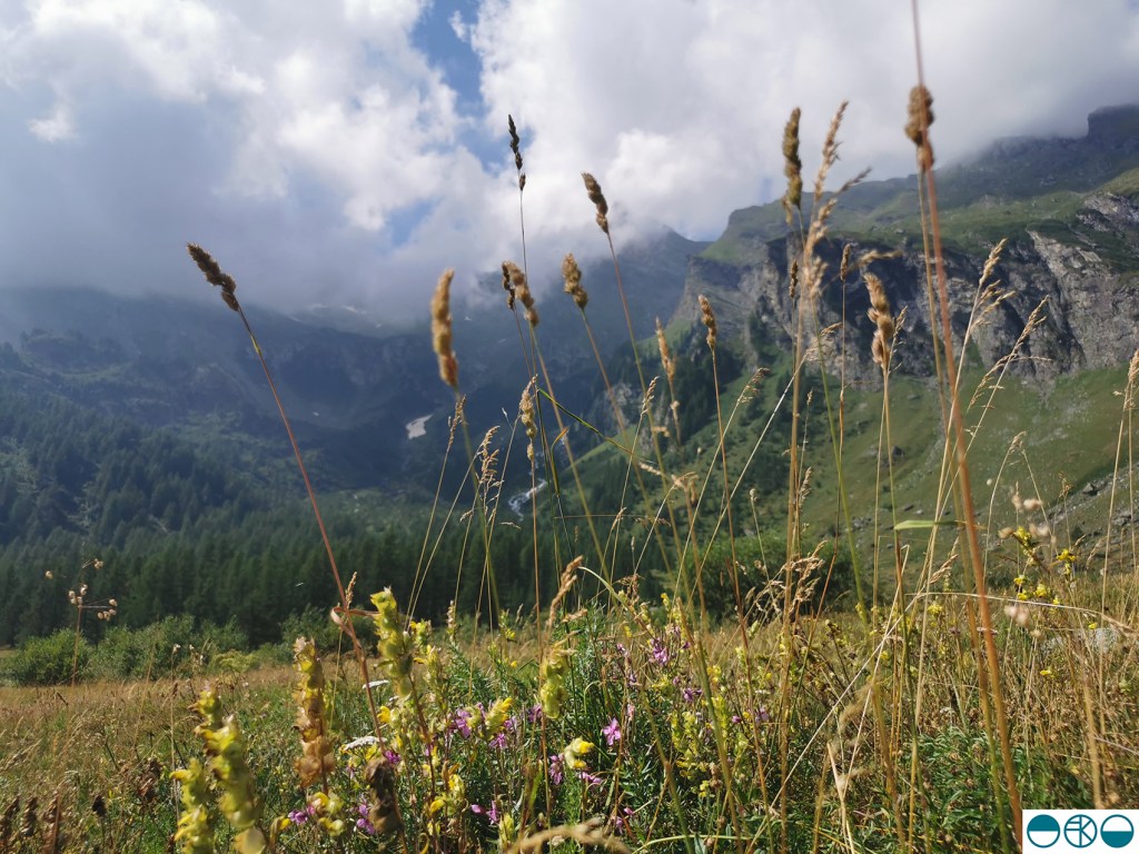
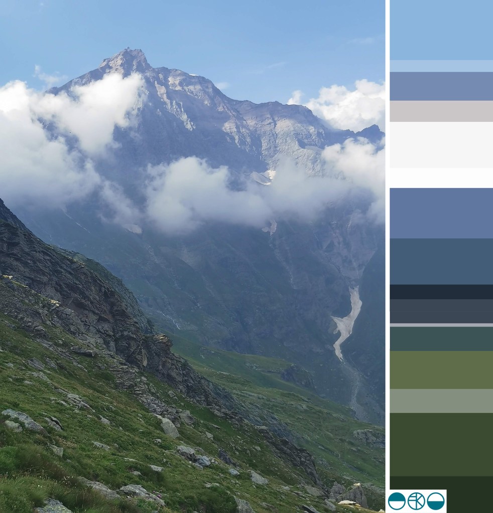
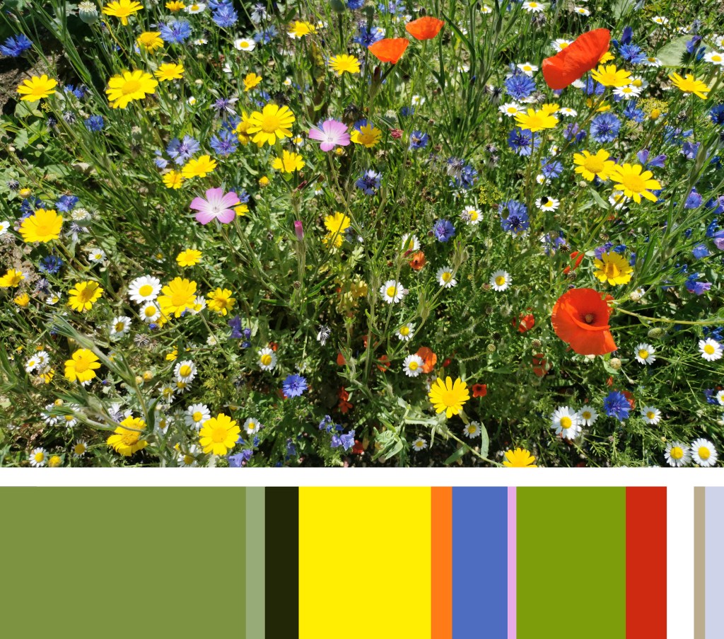
Walking in this sort of landscape can be overwhelming seeing as we live in the famously flat county of Norfolk. The vast scale of the mountains and the views stretching across the valley grabbed our attention initially. The purple greys and intense greens of the mountain sides played with the ever-shifting fluffy pale clouds. As we climbed along with the vastness of the mountain hues it was the pockets of colour, highlights of white, patches of sunshine yellow, pinks and mauves, acid green and deep crimsons and blue that competed as I put one foot in front of the other in the steep ascent. As we climbed new flowers became our companions beside the path, in the nooks and crannies of the rocks and high on the mountain pass.

Edelweiss and buttercups, scabious and azalea amongst plenty of others I was not familiar with. Although late in the summer there was so much colour to enjoy as there had been a very wet spell a few weeks before. Looking back up the valley as we drove back along the valley there was no sign of the colours we had walked amongst, but we knew they were there, ready for others to enjoy.

summer colour palettes

Colour inspires me. I love to work with colours; creating pairings and partnerships of colour to build reactions between them, evoking moods and setting a spirit through colour choices. I notice colour relationships every day, and enjoy considering why certain colours thrive alongside others. I love to wear colours too, and like to contrast materials as well as colour to create interesting relationships. I do worry if I find myself in brown trousers and a green top – I don’t want to look like a tree!

Over the last eighteen months I’ve spent time mixing colour using gouache paints, matching colours perfectly with items collected from walks. Little collections of seaweed, shells, catkins, feathers and leaves have sat patiently in the studio while I mix and match. I’m good at matching colours and would be perfectly happy spending hours a week doing just that.

I also enjoy creating colour palettes, sometimes for projects, or my teaching sessions, and sometimes just because what I see around me suggests a perfect palette to explore and create. Our garden has been a bit of a project over the last two years and this summer the new borders are filled with colour that bring such joy to me. My mood is lifted when I see colours working together well. Here are two results from a photograph taken in the garden earlier this month, just because the splashes of colour were pleasing enough to capture.

I like the dominant green that provides the backdrop for the brighter colour accents, and the shapes of the flowers are like splashes of colour dropped in to the soothing green. The pink, red and orange provide the warmth, while the blues are calming and restful. The depths of the border at the bottom of the flower stems are dark, no doubt cool away from the summer sun.

I decided to explore the role proportions of colour play in a palette in the second image. The width of each colour stripe is representative of the area it covers in the image. Back in 1994 this was one of the summer projects I was tasked with as I started my degree in textile design – and all these years on I still enjoy doing it! You can see how the colours perform when dominant, or work as accent colours in thin slithers. There are always main characters and supporting roles in a palette, but it takes all sorts to put on a performance!

When selecting the colours in the image for the palette I worked with the larger areas of colour first, then looked to see how the colours had natural partners to sit next to in the stripe. The accent colours grab the attention of my eyes. Both images reflect the same colour palette, but present themselves quite differently.