seasonal colour palettes in the garden

I love the signs of Spring. The yellow of the primroses in the banks, and the brighter yellow of the daffodils. The optimistic pink of the blossom on the fruit trees is here and the fresh green leaves are unfurling in the hedgerows. The garden has transformed in the last two weeks, from the yellows of the daffodils to the shocking pink, orange and red tulips. The rhubarb is in full swing and the purple sprouting continues. The garden is full of activity, with birds building nests, and plants reawakening. We’ve made it through the cold of winter, the days are longer and with any luck, warmer!

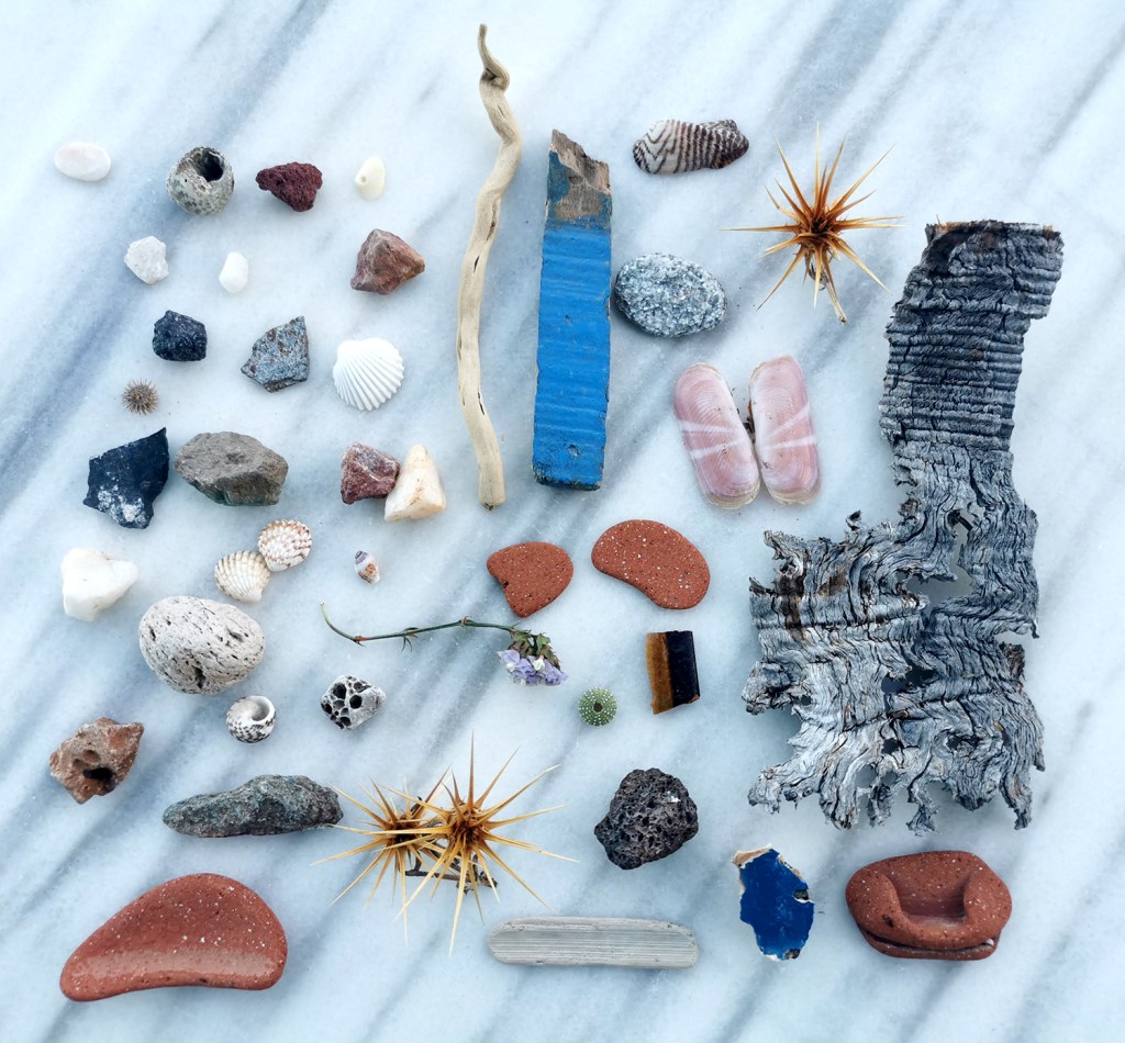
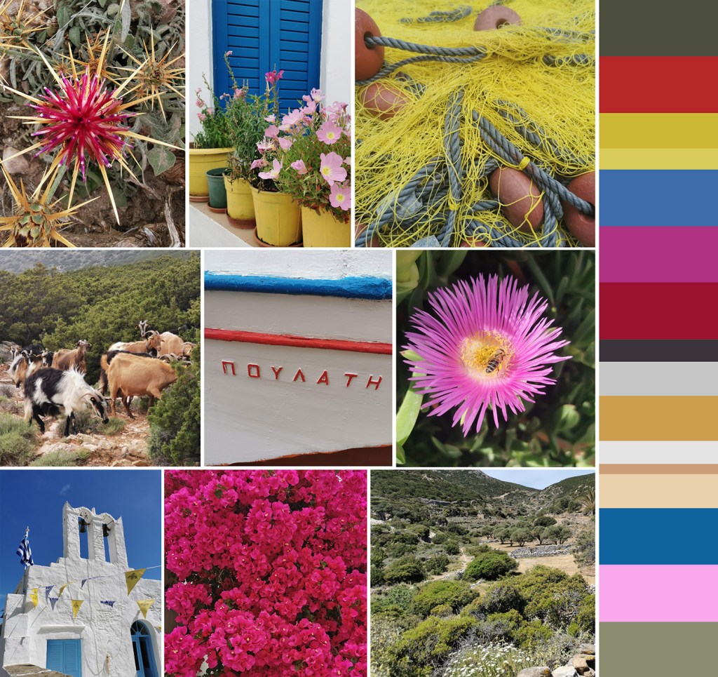
In celebration I’ve made two colour palettes from the photographs I took this weekend. Making coloured stripes from photographs was a holiday project we were set before starting art school, but we had to paint the stripes, rather than digitally capture them in pixels. Some things change, but my love of capturing colour continues! I’ve made a few palettes over the years, so check back over the blog posts and you can see more.

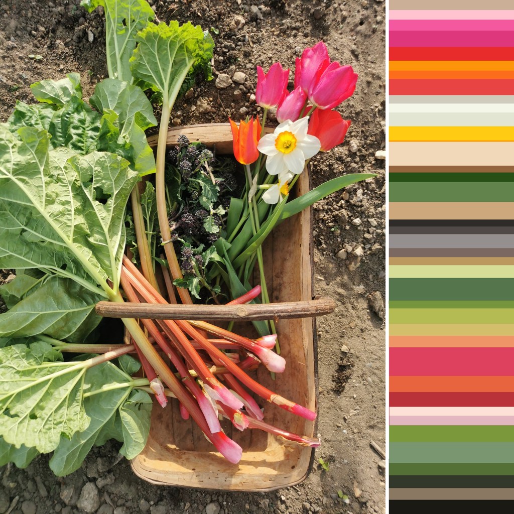
A trug of harvest – rhubarb, purple sprouting, tulips and daffodils, and a vase of daffodils and tulips

Greece: pattern, colour, material, finish

A precious holiday to Greece in the early summer has provided plenty of nourishment for my creativity, as well as excellent down-time, walking and eating. It’s just taken me a long time to get this post together!

I’ve been creating photographic records of artefacts collected on holidays for some time – a great way of remembering the specifics of a walk without having to bring it all home! I’ve also enjoyed creating composite images to represent experiences over the years, some featured on the posts here, so I’ve done the same for Greece.

We visited the Cyclades, and specifically the islands of Santorini and Sifnos. The night on Santorini was for old-time’s sake, and the stay on Sifnos was to get to know an island we’d not been to before. It is a beautiful island, with lots to explore – I’d love to go back to one day!

Here’s a collection of precious finds from the 70+km of walks across Sifnos on their excellent trails, some very prickly! As marble was everywhere I thought it appropriate to use the marble table by our room as the background surface:

First up with the composite images – colour:

Next up: pattern, material & finish, including Greek yoghurt and honey of course:

and finally, the streets of Santorini:

November colour palette, on the water

I love creating seasonal colour palettes, so here’s one from today, with our Mirror dinghy on the Norfolk Broads. The distinctive red sails stood against the neutral greys and greens of the November day. It’s not entirely proportionally correct but the red grabs the attention so I believe it’s okay to give it some extra width in the palette at the expense of more pale grey!

winter palettes

I’ve not had much time for colour mixing with gouache recently but I’ve really enjoyed noticing the contrasts of seasonal colours on our walks so I thought I’d celebrate that here. Some colours are exaggerated by bright sun, while the recent frosty mornings provide a muted coating.

Taking time to notice these small delights are ever more important as we spend few hours outside. I noticed today there was daylight in the sky at 5pm, so that and the first sights of snow drops and daffodils are putting me in the mood for springtime.

whites in paint

Having enjoyed putting the red palette together I have made a more neutral one using the white end of the Farrow & Ball paint chart and a number of ‘finds’ I have in the studio, reminding me of happy times away from the city. The subtlety of the shades and hues of white are beautiful. The textures of the grasses and feathers work really well with the paint and paper qualities too.

katefarley_white_100

Save

season’s colour

A beautiful pocket of Norfolk provided this colour palette for us at the weekend. Surrounded by greying reeds and rotting down leaves the bright sunshine lit up the sulphur-yellow lichens, orange shooting willow whips and mauve feathery seed heads of the reeds. The more we looked the more colour we saw. I took several photos and as I focused the lens on details the overall variety of colour and tones were lost, hence the palette I’ve made here.

tedellis_naturereserve_palette_100

If you ever get the chance to visit, I strongly recommend this place. Wheatfen is a nature reserve in Norfolk, managed by the Ted Ellis Trust, founded to continue his valuable work in raising awareness of this fragile environment and to make accessible this landscape for others to learn about and to enjoy. It doesn’t feature dramatic mountain passes or high waterfalls, but for me it is perfect. If you are lucky, as we have been over the years, you might spot an otter, a heron or a Swallowtail butterfly, and lots of reeds! It’s a pocket of tranquility that I could lose myself in for hours.

Save