weaving the timeline

Dates and anniversaries matter to me, personally and professionally. They record the passing of time, the gaining of experience, the rhythms of life and death. I bemuse my family & friends by remembering apparently irrelevant dates, including the birthday of Roland Rat, (12th March if you are wondering!). 

Seven years ago this week I started working at Norwich University of the Arts as Course Leader of both the Fashion and Textile Design degree courses.  I undertook this role for four years before focusing on the BA Textile Design course for the last three. I am immensely proud of the course and community I lead, with a strong network of colleagues supporting me with the wobbles while celebrating the wins. 

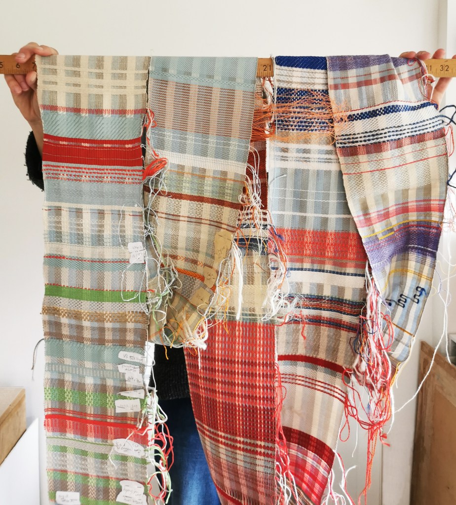
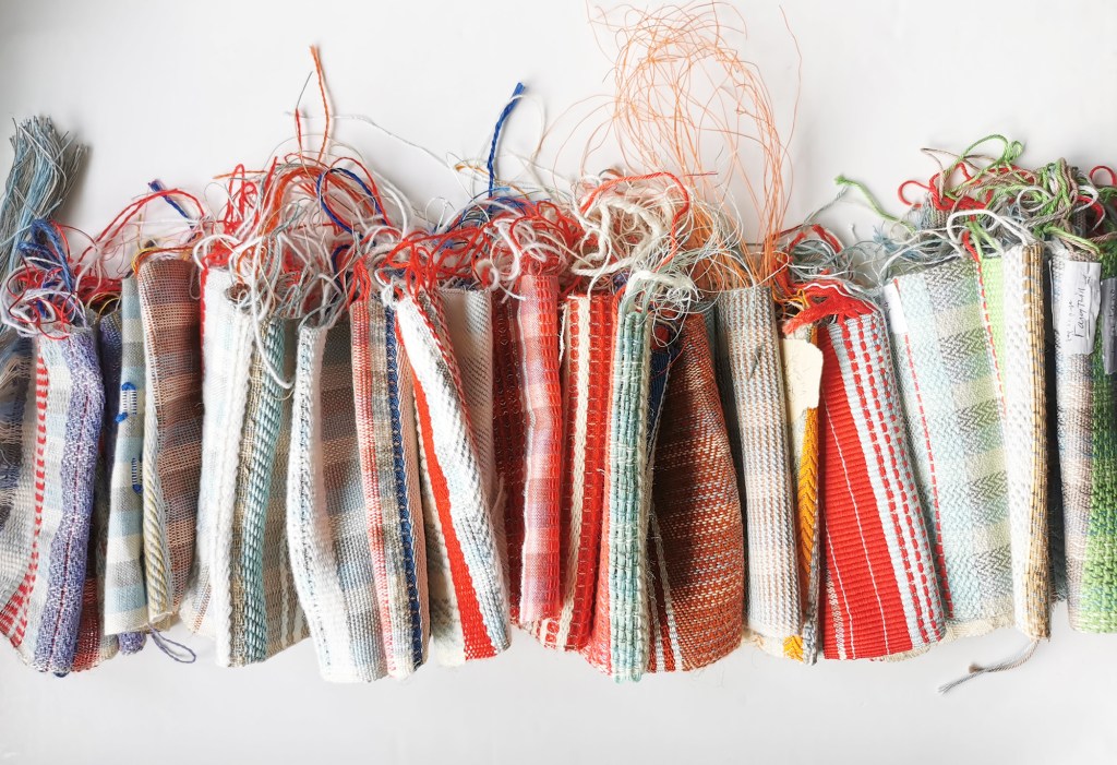
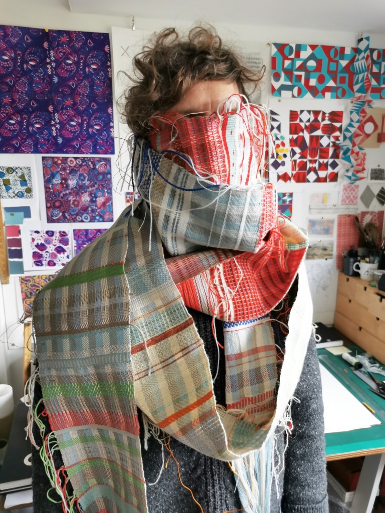
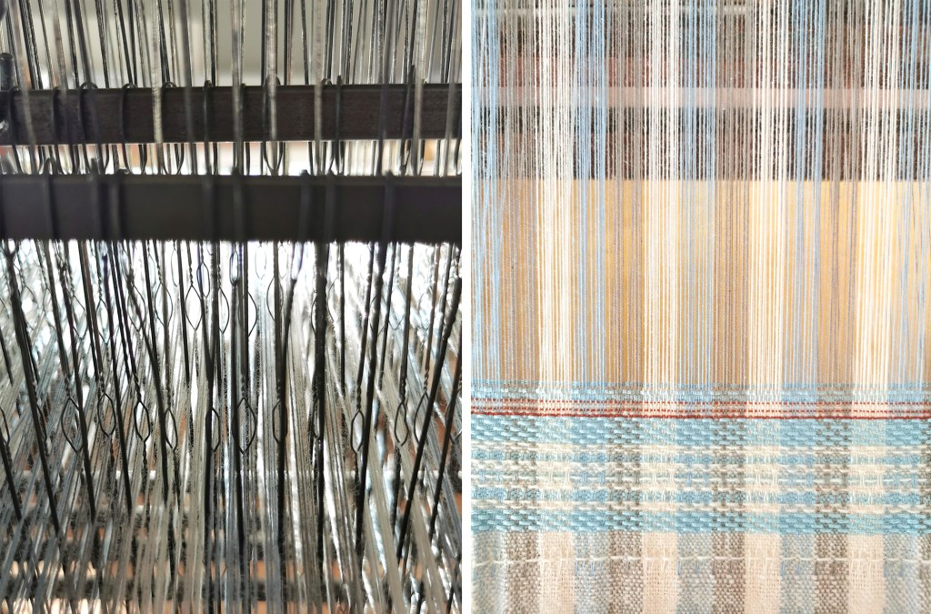
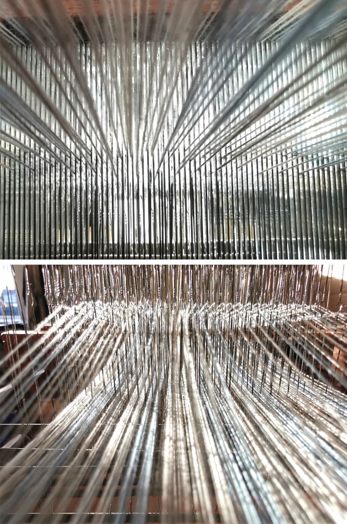
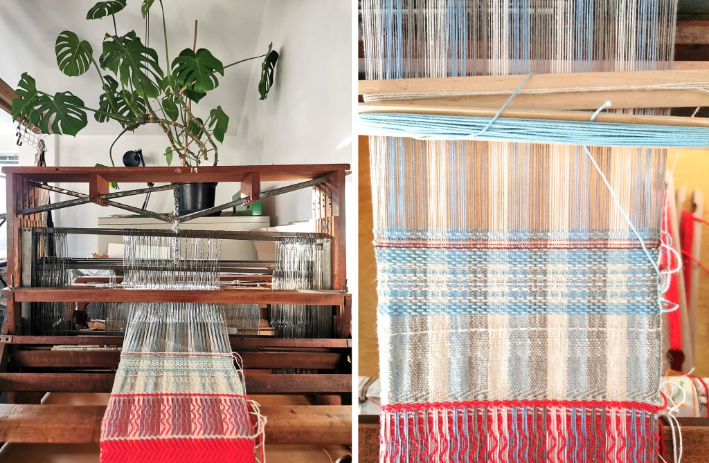
One of my leaving gifts from my colleagues at Birmingham City University back in 2018 was a warped-up 8-shaft Harris loom – it’s important to note I’m a printed textile designer, not a weaver! This week I have finished weaving the warp – over 5 and a half metres of weaving – certainly not a commercially viable rate!  I haven’t committed a huge amount of time, more short bursts over the years when the mood took me. I was surprisingly sad as well as excited that there was no more cloth to weave and I’d be able to see the entirety of the weaving away from the loom.

The completion of the warp coinciding with this work anniversary has made me reflect on these years, there have been highs and lows in both work and life. Learning to weave has given me a process to occupy my head with away from everything else, without any pressure but to play and explore. It has been so helpful for me to have this space and activity. As I cut the warp threads and unwound the length the bands of colour and materials I selected at various times revealed themselves, reminding me of how I was feeling as well as specific experiences. 

In parallel to making this cloth, I’ve developed my role in academia – developing curriculums and strong student experience, achieving the title of Associate Professor in Design, writing a book, and developing my role of advocate for others and the discipline of textiles both in education and industry. It’s nice to have something tangible to mark these years. I’m ready to get stuck into the next chapter of academia but I’ll have to find another hobby or learn how to warp the loom up myself … here’s to the next year of learning and teaching! 

print / pattern / cloth

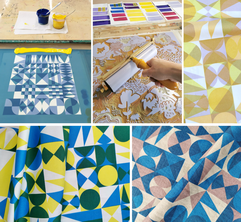
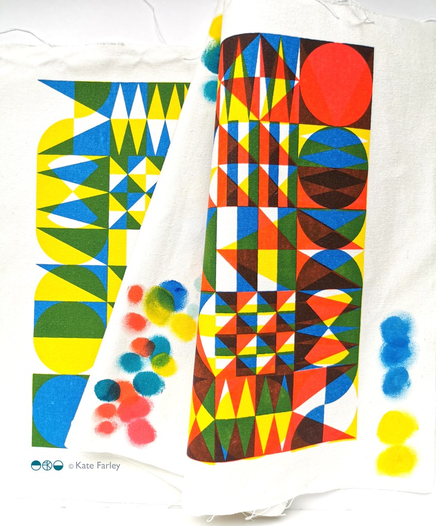
After a long academic term leading the Textile Degree at Norwich University of the Arts I finally found some time to get in to the workshop and sample some designs on fabrics. I developed the patterns rather a while ago. I love the process of screen printing, from mixing the colours, exposing the screens, pulling the squeegee and of course lifting the screen to see the new print. I even enjoy washing the screens ready for the next time!

I’m not going to share all the outcomes at this point, but here’s a taster of the colours and a glimpse of one of the designs. I was working with transparencies in the pigment and binder to create the extra colours… and I’m really excited about the results!

PLAY prints on show

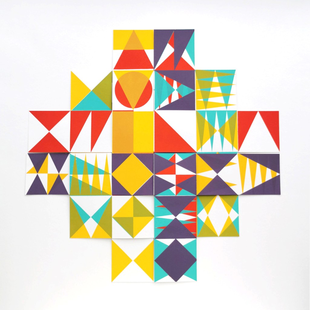
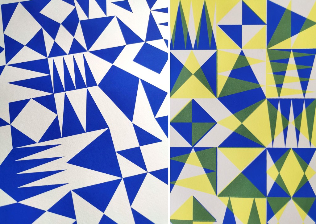
I am really pleased to have had two of my most recent works on paper selected to be included in the Print Cromer exhibition this summer, with the Private View on 19th July. This new body of work has been developed as part of my academic practice at Norwich University of the Arts where I have been exploring pattern structures and repeat blocks. I have explored new pattern iterations by rotating the screens to add additional colours of the same artwork, thereby building greater complexity from limited design information. In an age where digital design and the use of Artificial Intelligence provides limitless opportunities, I want to explore the fundamentals of pattern creation to generate new possibilities that are led by the designer, ensuring the creative path is transparent.

The theme of the exhibition is PLAY, and as a result the palette I created feels full of summer carnivals and fairgrounds. The overprinting of inks with differing levels of transparency provides a building of depth and subtlety of harmonious colour.

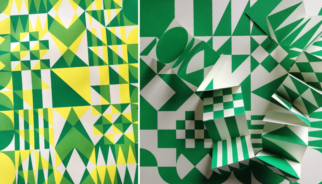
I created a number of one, two, three and four-colour prints initially, that featured the screen rotation in adding the colours. I then cut strips of the prints and with further rotation of the strips, interwove them into one base print that had been sliced to enable the slotting. I enjoyed bringing back an element of paper engineering from my book art practice into these new pieces.

In designing each piece, I considered the placement of motifs and relationships of colour. The collection provides variation within a collective identity and belonging. Some pieces feature only triangular motifs, while most incorporate the circular and rectangular elements too. My research utilises design thinking by Lewis Foreman Day, and his distribution of elements. This approach results in scattered focal motifs that work across repeating patterns. Although this is not a feature of my new work, I recognise the placement considerations are also useful in this work too.

A number of these pieces will be for sale during the show.

playing with print

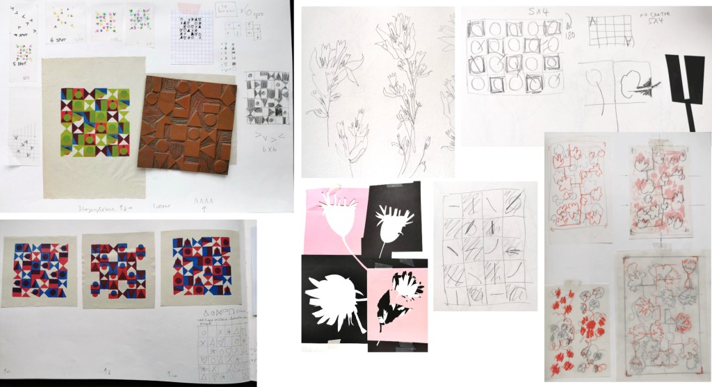
I’ve been enjoying some studio time to explore my print research as works on paper with the hope of exhibiting the work. I enjoy paper engineering and construction (that’ll be the book artist in me!) and have previously tested paper manipulation in relation to this current pattern research. I tend to work in this way, creating drawings or prints to exhibit / sell alongside forming pattern ideas, and it has been useful to see the evolution of the sampling in this way here too.

These new artworks utilise my screens of geometric artwork practically exploring research into motif distribution in printed pattern thinking formalised by Lewis Foreman Day in his book Pattern Design, published in 1901. Having printed the artwork in the first colour, I rotate the screen by 90-degrees and print the second colour, turning the artwork / screen up to four times for maximum complexity. To add a further dimension, I’ve been constructing works on paper that utilise several iterations of the prints to build new compositions by weaving and slotting strips of the printed papers in differing combinations of the four colours in the palette, providing the coherency across the series, and an injection of the spirit of summer fairgrounds through the colour and geometric visual language.

There are two screens of artwork used in this collection, therefore two series of original artwork (PLAY – circles and PLAY – triangles) and I shall continue to evolve the body of work over the coming months. I’d love to know your thoughts on this new work!

seasonal colour palettes in the garden

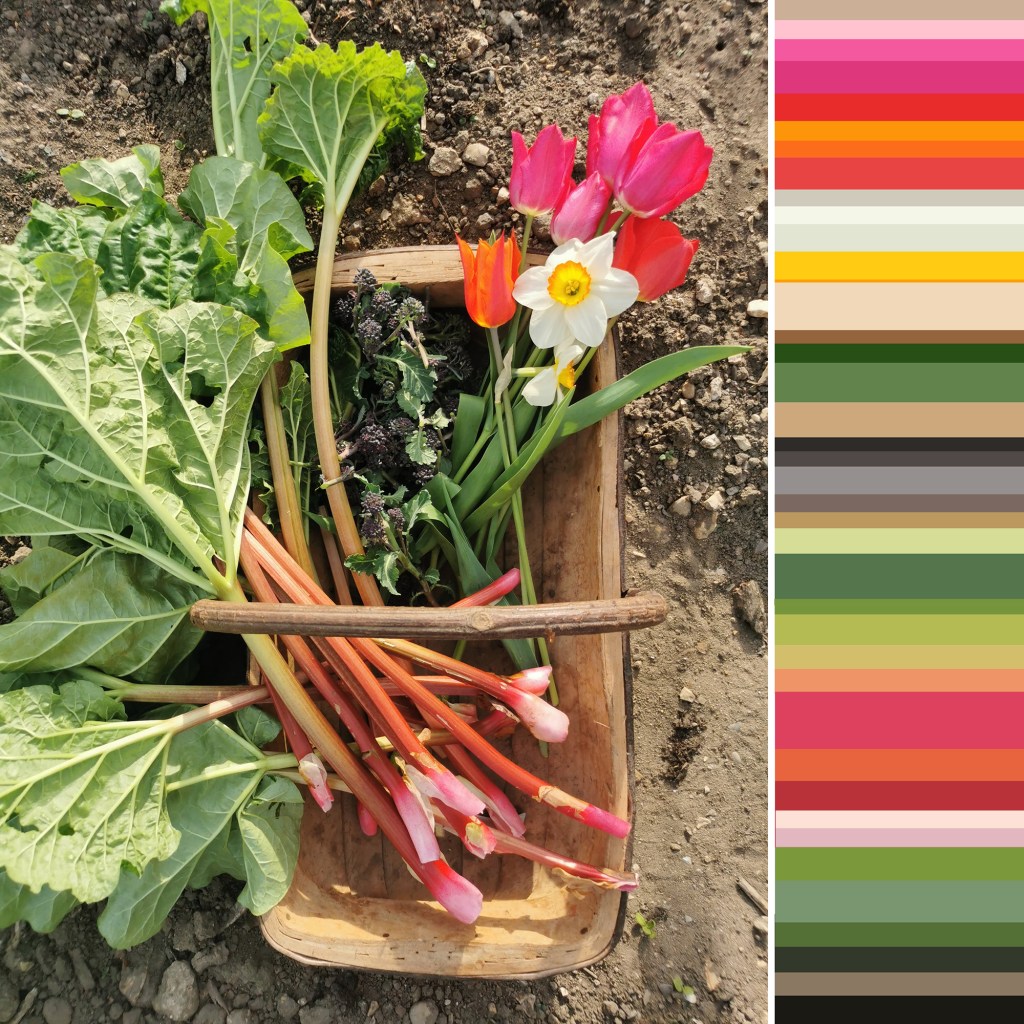
I love the signs of Spring. The yellow of the primroses in the banks, and the brighter yellow of the daffodils. The optimistic pink of the blossom on the fruit trees is here and the fresh green leaves are unfurling in the hedgerows. The garden has transformed in the last two weeks, from the yellows of the daffodils to the shocking pink, orange and red tulips. The rhubarb is in full swing and the purple sprouting continues. The garden is full of activity, with birds building nests, and plants reawakening. We’ve made it through the cold of winter, the days are longer and with any luck, warmer!

In celebration I’ve made two colour palettes from the photographs I took this weekend. Making coloured stripes from photographs was a holiday project we were set before starting art school, but we had to paint the stripes, rather than digitally capture them in pixels. Some things change, but my love of capturing colour continues! I’ve made a few palettes over the years, so check back over the blog posts and you can see more.

A trug of harvest – rhubarb, purple sprouting, tulips and daffodils, and a vase of daffodils and tulips

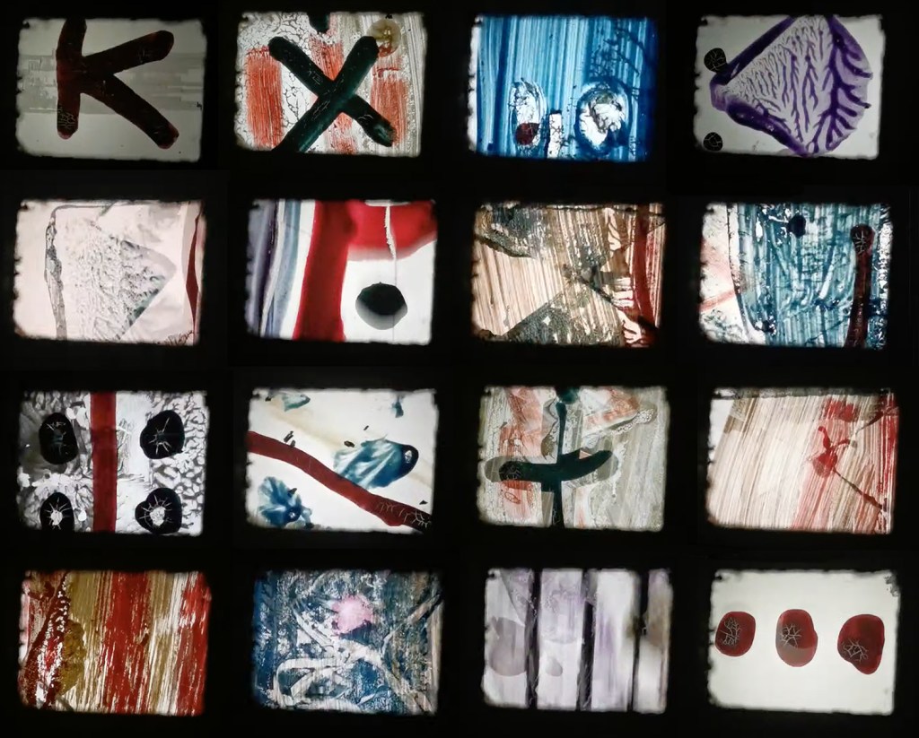
Moving pattern – 16mm cameraless animation

I’m always looking for other ways to explore my pattern ideas and have been keen to consider options for film making to explore sequential narratives. Animation processes fit well with the work I’ve been doing with pattern evolution I have been testing across pages of books over the years.

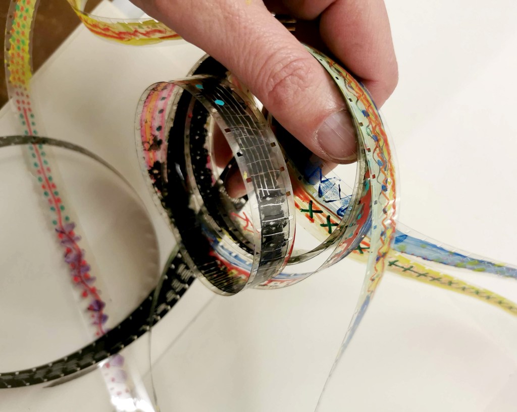
Having been a fan of Len Lye’s paintings on film from the 1930s, including A Colour Box from 1935 commissioned to promote the General Post Office I was pleased to be able to attend a workshop in Norwich to to spend a few hours working on strips of 16mm film to make my own experimental animation. We were shown some examples of other people’s films and could then explore the process ourselves. The workshop was led by Jacob Watkinson and was hosted by The Holloway in Norwich.

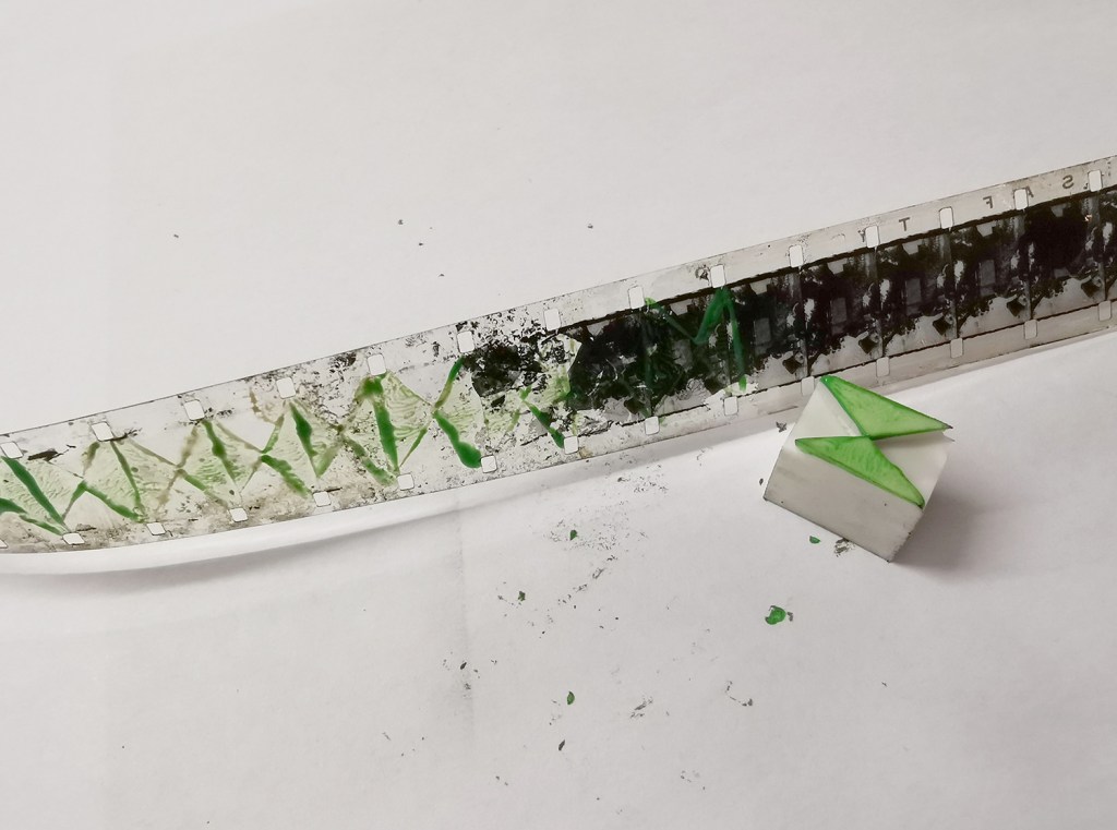
We were given strips of clear 16mm film I was able to use pens, paint, rubber stamps and Letraset on, as well as pre-exposed film with archive films that we could scratch away the black with a scalpel beautifully. I know it’s obvious to say, but 16mm is tiny, and I’d forgotten my glasses, so that added to the issue of seeing what I was working on! It’s a tiny space to include anything too complex and I was unsure initially how many times to repeat motifs and at what pace to move motifs across the film, but I just had a go and tried not to be too precious. 

Once we’d all had a chance to work on several pieces Jacob spliced the pieces of film together and we ended the session with a screening of everybody’s efforts – it was great to see individual approaches with the same processes and the outcomes have certainly got me thinking about taking my pattern evolution ideas in this direction again. The image below shows some stills from the film I made – all 20 seconds of it! Len Lye’s films are brilliantly paired with music so maybe I need to think about that too – but I’m not sure today’s Post Office will be knocking on my door anytime soon!

If you want to read more about Len Lye this article from the Tate is a good one.

weekend weaving

I was gifted my loom as a leaving gift from my colleagues at Birmingham City University six years ago and I’ve still got a little of the seven yards left. I’ve thoroughly enjoyed spending some spare hours over the last few years making cloth and the chapters of weaving are a record of my relationship with colours, found materials, and technical tests I’ve undertaken at the loom. As a printer this is not my natural habitat!

With a newly sorted studio space I noticed the sun was streaming in through the windows and on to the loom, so I made time last weekend to get back to my warp and weft threads. I am using the process a bit like drawing as I create marks and rhythms through textures and colour. While I’m looking forward to being able to see the entire warp woven, it’s more about the process of weaving that I’m really enjoying, and in some ways I don’t want the length to end… that’s my excuse anyway!

screen time!

After the lovely summer I’ve been back printing in the studio, with some lino blocks on the go as well as two new screens I’ve had exposed as part of my pattern research. I’ve been exploring the rotation of the artwork as well as folding the prints to determine visual narratives.

I tend to not worry too much about colour palettes in this sampling phase, particularly as I’m focusing on the pattern building but also considering a range of material substrates for future outcomes. I appreciate this gives me freedom to test colours, some more successfully than others. After several days at the computer screen it can be a complete relief to spend time at another type of screen!

Colours from the Italian Alps

A grey-sky day slowly peeled back by mid-afternoon to reveal beautiful blue sky and high mountains with patches of snow. Following a slow late lunch of polenta and other local cuisine we prepped our bags and headed for the hills. Most people were coming down from the mountain as we started to climb, but we were well prepared, with tummies full ready for the walk upwards, not quite sure how far we’d get or how far we would see, but willing to make the most of the fine weather.

Walking in this sort of landscape can be overwhelming seeing as we live in the famously flat county of Norfolk. The vast scale of the mountains and the views stretching across the valley grabbed our attention initially. The purple greys and intense greens of the mountain sides played with the ever-shifting fluffy pale clouds. As we climbed along with the vastness of the mountain hues it was the pockets of colour, highlights of white, patches of sunshine yellow, pinks and mauves, acid green and deep crimsons and blue that competed as I put one foot in front of the other in the steep ascent. As we climbed new flowers became our companions beside the path, in the nooks and crannies of the rocks and high on the mountain pass.

Edelweiss and buttercups, scabious and azalea amongst plenty of others I was not familiar with. Although late in the summer there was so much colour to enjoy as there had been a very wet spell a few weeks before. Looking back up the valley as we drove back along the valley there was no sign of the colours we had walked amongst, but we knew they were there, ready for others to enjoy.

patterns and maths

I have been fortunate in having my pattern research selected for inclusion in a really exciting exhibition opportunity in Bristol, led by academic Lucy Ward from University of the West of England.

“APERIODIC brings together artists, scientists, musicians and others in an exhibition about pattern. The show presents work that explores ideas relating to the mathematics and science of ‘aperiodic order’: the absence of regular or repetitive patterns. Or, more simply, ‘things that almost repeat, but not quite’. The exhibition is part of the APERIODIC festival of art, science, music and performance taking place this July in Bristol.” official exhibition text (APERIODIC, 3-14 July 2024 at Kit Form Gallery, Bristol)

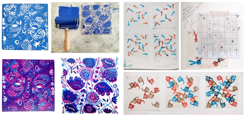
The two pieces I had selected explore block rotation in the over printing of further colour layers, resulting in a building up of a more complex design:

Geo / grid / star Lino print

Fields of seemingly reliable compositions of geometric motifs provide the rhythm of assurance through repetition of geometric rhythms but the swapping of small details amongst the motifs unsettles the overall pattern and disrupts the repeating design. The block is rotated before printing of the second colour.

6-spot rotation, multi-direction Lino print

Built upon Lewis F. Days’ principles of distribution of motifs in pattern design (1901), motifs are placed within a tile, 6 x 6 to provide balance and direction when repeated. As the second colour is applied the block has been rotated by 90 degrees in each printing of the tile over the original blue. The repeat is broken and a disorder is established.

One of the highlights of having the work selected for exhibition was the opportunity to have a mathematician review my work aligned to their own interests in pattern. Yotam Smilansky is a Lecturer in Dynamical Systems and Analysis at the University of Manchester, with a special interest in aspects of order and disorder in geometric patterns so I was interested in what they had to say about the work on exhibition.

Yotam Smilansky on Kate Farley, ‘Geo / grid / star’ and ‘6-spot rotation, multi-direction’:

We notice a certain form, a sense balance, but it might take us a little while before we realise exactly what’s going on. Then we get it: the complicated object before us is made of a single ingredient, copied and superpositioned. It is surprising, even magical, how the unassuming process of layering rotated copies of a single pattern can result in a rich family of objects with a wide range of properties. This is evident, for example, in the moiré patterns of twisted bilayer graphene, where a slight change of angle results in completely different electrical properties, and is beautifully demonstrated in Farley’s mesmerising prints.

Yotam’s response interested me as I’ve been exploring ways to disrupt and challenge the repeating tiles through transformation and evolution of individual elements within an apparently repeating pattern. I’m certainly keen to continue with this work and am grateful for this opportunity to gain feedback as well as discover the work of other pattern-makers. You can read other reviews of exhibiting artists by mathematicians here.

Thank you Lucy, Yotam and all those supporting the event.