colour mixing nature

Back in March I began a new series of colour of works on paper that were simply about mixing and matching colour, evolving hues through the process of painting individual swatches to build the narrative in a sequence, as if a technical exercise at art school. You can read about those pieces here.

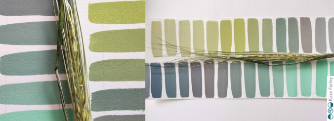
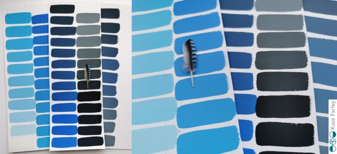
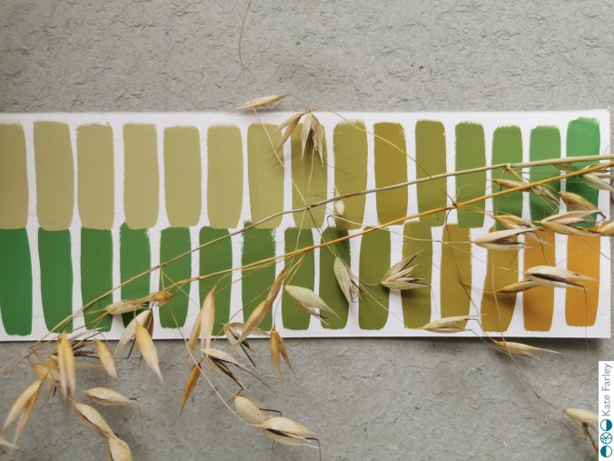
KFarley_grass_gouacheI’ve continued to gather pieces from nature on the walks I’ve been on this summer and have continued with the process of mixing colour and so I thought I’d share some here.

KFarley_wheat_gouache

I’m doing this simply as I love to make colour, and really enjoy working with the gouache paint for its colour qualities. The process occupies my mind, suggests potential avenues for future work and connects me with nature through the mementoes I make. The seasons change and the colours alter, but the swatches hold memories in the process of mixing, and I can almost smell the dry heat of the corn, and the cool shade of the wood where I found the Jay feather.

qrf


my motifs in design

I consider everyday design to be important in shaping our lives for the better or worse, and that includes cutlery design. For regular followers of this blog you will know I like cutlery. My special relation with cutlery started as a child, I collect forks, particularly disposable ones and now as an educator I use cutlery to teach design thinking despite my subject being textile design. I’ve also designed several pattern designs using motifs of cutlery including a collaboration with David Mellor Design.

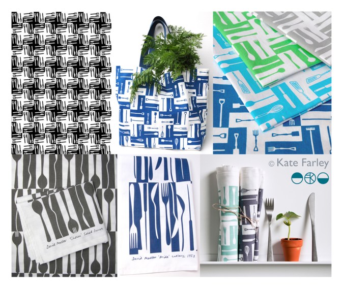
The first time I made a formal design using cutlery I won a prize! I entered Formica’s Design-a-laminate competition in 2005 and won the Retro category for producing “a skillful houndstooth pattern using knives and forks, a reference to Formica’s conventional use if Fifties’ diners and kitchens”, (Blueprint magazine, April 2005). (top left pattern – made by a rubber stamp – see my instagram feed)
cutleryprojectsKF

Many years later, in 2012, I launched a new variation of this pattern on gift and home-ware products including a tea towel, and moved the dogtooth check pattern on by incorporating a visual narrative into the design. At the bottom of the graphic I had garden tools such as spades and a rake, then in the middle I incorporated kitchen utensils such as whisks, wooden spoons and fish slice, before topping the design with cutlery – therefore illustrating the journey of plot to plate, (garden, kitchen, dining) using the tools that we use. This has been really well received and I sell through my website and have shown the design at several trade shows and exhibitions. Subsequently I updated the colours to Brassica green and Brassica purple in 2014.

Continuing my design journey of cutlery I approached Corin Mellor to suggest we collaborate on a design to celebrate his Chelsea cutlery in 2013, inspired by the production method of making cutlery and the beautiful shapes of the salad servers. Following the success of this I was asked to create a second design in 2015 inspired by his father’s winning cutlery design ‘Pride’. Both designs of tea towels sell incredibly well both online and their three shops and I’m delighted with the responses I receive – from as far away as Japan!

So why do I remind you of when I designed these patterns…?

With my pattern designs of cutlery out in the public domain since 2005 I received a message from someone I know telling me they had seen my cutlery design on a surface I hadn’t applied it to…., was it new?… alarm bells! I haven’t designed this product! The feeling of being cheated, of being violated, ripped through me leaving anger and frustration at the lack of other people’s respect to a fellow designer – that’s putting it mildly. Don’t get me wrong, I’m grateful for being told, it just took my day in a different direction from my plans. My afternoon was spent searching online to find examples of this product, and there it was… I am offended!

I could take to social media and rant, name and shame and get it off my chest – that’s one way but I’m in a difficult position if I can’t prove someone has copied my work. If I’m not careful I can find myself being accused of slander – hence I’m not telling you the product the design is applied to, but you can see my designs here which gives a clue. You can do your own searches and draw your own conclusions, but please understand why I’m not making wild and angry claims. In the world of design law this is something of a challenge to prove, and having already gone through this with a dear design friend, know it’s a nightmare that is part and parcel of our design careers. The thing is we need to promote our work and get it seen by people. I can’t have a design career while hiding everything.

The internet enables us to share our design stories but also leaves a trail – and at this time I’m grateful my designs are well documented. I pride myself on originality, and for creating high quality designs. The pattern that I believe is too close to mine for comfort lacks any sort of rigour, consideration and refinement compared to mine. If I was going to copy I’d at least make mine better than the original! Why record a cover-version that doesn’t compete with the quality of the first song?

It is always a worry that someone looks at your work and thinks they can ‘take inspiration’ from it. I’m not saying I should be the only textile designer using cutlery as motifs – no way! Both as a designer and academic I take the issue of imitation very seriously, stressing the importance of originality to my undergraduate students to a point they  clearly know my thoughts on intellectual property. If anything, I drive a very wide path clear of anything that can be seen as similar, knowing how damaging it can be to a designer of being accused of copying… there are enough case studies out there! My reputation matters to me.

How can imitation be flattery, as we are told in primary school, if it makes me feel so angry and violated? I’m having to think about what to do next, and also I am rather in need of some time away from a very busy last few months… but I shall seek advice and work out what to do next.

Season’s greetings, and thanks for reading… I’ll let you know next time I design a cutlery pattern! If in doubt, ask…


posted pattern

As those nearest to me know too well I am something of a collector, and regular readers of this blog will have been rewarded for their time, by being lucky enough to read of some of those precious collections.

As printed pattern is my thing it’s not a surprise this collection is all about pattern, but I also have a thing for post, and stationery, and graphic / lined paper, so this collection is really a celebration of many things.

kfarley_envelopeinsides1

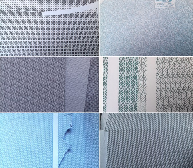
So when did it become a collection? I remember collecting – I’m not so keen on the word hoarding! – when I was an undergrad textile design student as I made lots of collages using the inside of envelopes as visual noise. I also read something about Matisse saying that drawn and printed patterns were rhythms, as if textures in his work – I think in relation to his Jazz collages, and I completely agreed, sat there on the college library floor making sense of what I had been doing in my sketchbook and being excited at the verification. I worked for Royal Mail in the sorting office in both Norwich and Leeds during my college holidays and I was fascinated by the thousands of envelopes I saw each night shift, making their way across the world, from the sorting frames we sat at. I still have a fairly impressive memory for postcodes as a result of this time twenty years ago! I also realised at that time that if you didn’t pay your BT bill on time they sent the red reminder, and that envelope had the same criss-cross pattern but printed in red – I have a few of those. So this collection started two decades ago!

What is it about the envelope insides? I like the idea that the feature is hidden; a discreet treasure tucked away rather like an exciting lining in a suit pocket. Some of these patterns are busy performing a task that may go unnoticed. Particularly with pay-slips with number-related graphic rhythms, the patterns act in a similar way to patterns of the dazzle ships: distorting, obstructing or distracting from reality.

The inside of envelopes are not the most popular context designers dream of but despite the inconspicuous nature of the envelope interior, even if it’s lucky enough to have a window, I like the fact that someone somewhere was commissioned to design a pattern for the humble envelope. Some of the patterns are fabulous examples of micro prints and I can be partial to those tightly repeating and often graphic rhythms. The colours are rather limited to blue, a rather institutional hue, but there are greys, greens and of course the red of the debt reminder.

Having moved boxes of this archive around the country to various addresses I have lived at I formalised the collection in to sections in lever-arch files, including variations of colour and scale, with another box I’m prepared to sacrifice to collage. Over the last few years, and with a clearer idea of what design, and specifically pattern interests me I’m really proud of the collection. Brick patterns feature, as well as checks, the ones with numbers and the few flowing, more organic ones. Some feature company logos, there are envelope graphics and the beautiful and no-messing dots. Some people still send me ones to add to the collection, and I do still keep an eye out, but sadly there are fewer new ones being added. These days I can appreciate a beautiful pattern but if I have some already (note: obviously I need more than one sample of each!) I can even get them in to the recycling bag! … only to be discovered by the next generation of collage makers in the family, and it comes back out as treasure to someone else. Oh well!

If you want to see more, or share your envelope treasures head to instagram and use #envelopeinsides

kfarley_envelopeinsides2


Plot to Plate archaeology

When I was a small child there was a time when I wanted to be an archaeologist. Having been lucky enough to have visited several Greek archaeological sites and been inspired by the possible finds underground I was convinced I had the patience and where-with-all to try. That particular career plan didn’t last long but something of the magic of unearthing lost treasures, and working through the soil of past generations has most certainly been re-awakened through my adult years of gardening – and beach-combing come to think of it!

Over the last few years I’ve represented this process of working with the soil and bearing witness to nature’s materials in many drawings and prints, working to represent layers of gardening, as if strata of dinner preparations. I like the continuum of being a gardener, as the current occupier and protector of a long line of gardeners, each winning and losing the battles of nature and harvests for generations.

As I have dug the plot for nearly a decade I’ve discovered many broken bits of pottery, and some I’ve kept and others I’ve turned back to the earth to be found again at a different time. With no rationale to what I have kept but having created little gatherings; pieces turned out from my gardening trouser pockets, I have realised I’ve started another collection. (check out www.obsessionistas.co.uk for two more of my collections)

I like to see the different surfaces, the whites, the blues, and the hints of familiar patterns. Why do people plant their broken plates? It’s certainly a different narrative to my Plot to Plate collection…

KFarleyplotPotsdrawing100ahttp://www.katefarley.co.uk


micro florals

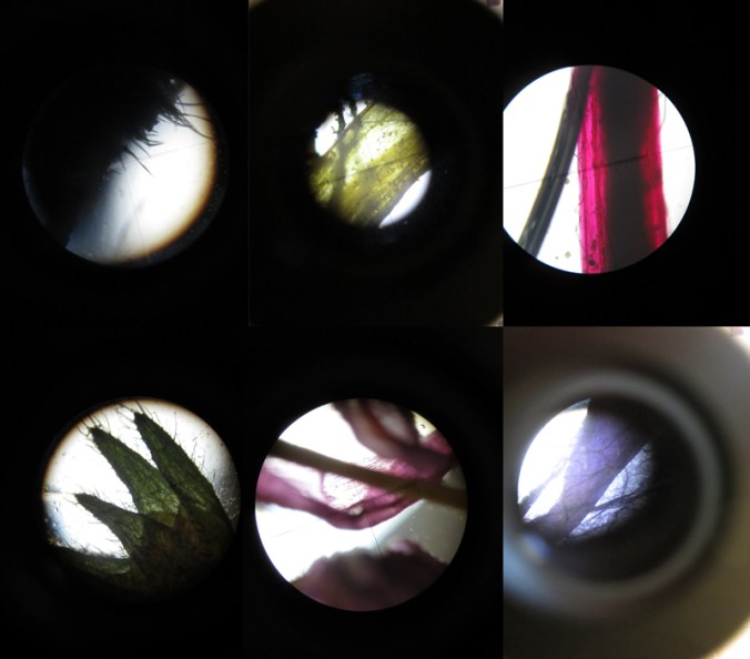
I’m used to gathering flowers and then drawing them over and over in order to learn more about their colours, shapes, forms and structures in order to develop imagery for prints and textile designs. At home this weekend we looked at flowers in a different way. We investigated last years plants that my daughter had pressed safely, and looked at them under the microscope that my son had become rather too keen on discovering inside the utilitarian wooden box it lives in.

We had great excitement as some rather plain plants revealed stunning patterns and textures and were disappointed when something beautiful at full-scale looked rather scary close-up. On trying to capture these images on camera the results were reminiscent of Len Lye animations and got me thinking about other ideas. Here’s a few images to share…

micro_6_web

box of colour

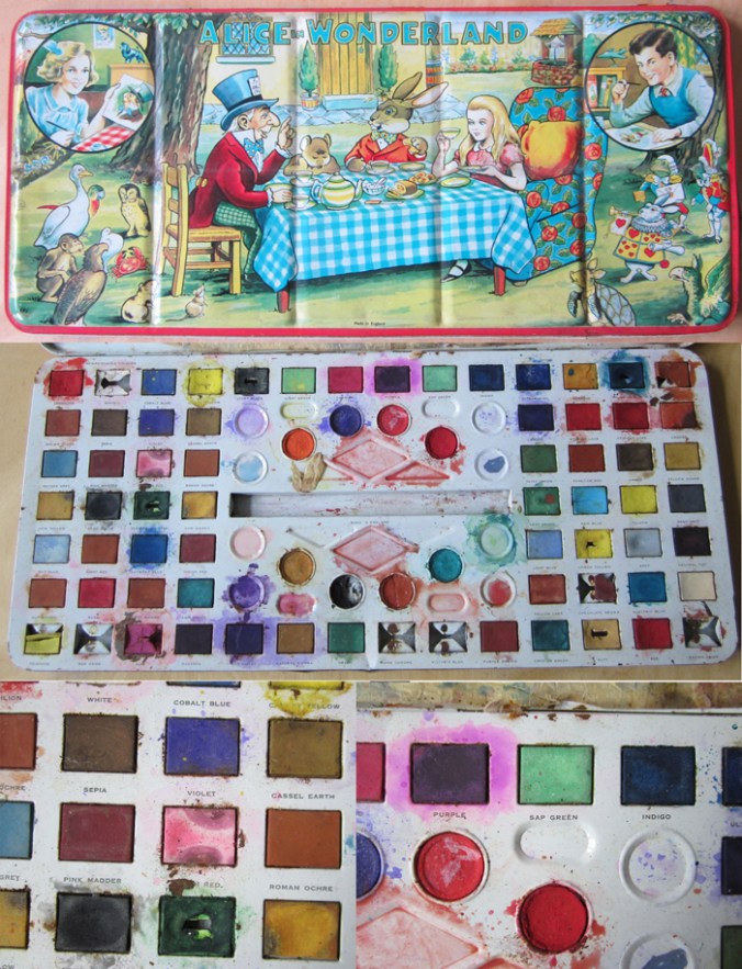
I was shown this wonderful Alice in Wonderland paint box that has been looked after for many years. It is so much nicer than much of the branded, TV themed products of today. I especially like the labeling of the names of the colours. Is sap really that green? I would have been a very happy child to have received a box of such size and potential. Note: Made in England!

alice_paintbox_web


Design inspirations 2: the natural world

Second in the series of ‘Design Inspirations’ blog entries…

The natural world has long been an inspiration for textile designers. Many years on from William Morris celebrating the natural world of flora and fauna as decoration for textiles we have had Laura Ashley, Marimekko and Orla Kiely, to only name three companies, who have interpreted the natural world and created stylised patterns and imagery which continue to inspire design students of today.

At times the worst thing as a lecturer of design we can hear from a student is that their project will be “about shells” and we dread the worst examples of static and bland studies which do little to explore the beauty and wonder of the natural world’s creations of form, structure, surface, pattern, colour and more, before approaching the bountiful concepts and metaphors in the ‘dot to dot’ of design processing hidden around the shell!

In my drawings I often aim to distil and to simplify a plant structure or shape of a flower in order to create motifs for prints and surface patterns, exploring perspective, diagrammatic language and relationships with place / context. I have a huge archive of drawings made on locations as well as boxes and bags of samples including plants, stones & leaves and one day they may well feature in designs. You never now what you might need! Going anywhere new, even for a holiday means that I keep my eyes open and often pockets filled as a result of finding new things.

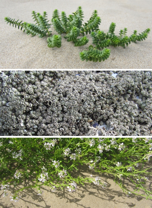
Having visited the Gower peninsula for one last summer camping trip I came across these examples of natural forms, which could and would create different visual interpretations in the hands of each creative prepared for the job. That is one reason why I like to play a part in design education; to facilitate the looking, seeing and interpreting, and it is certainly why I like to keep on collecting, and keep on drawing.


Image

form and function of forks

It has transpired that I have accidentally started to collect forks of the dining variety. Having grown up with the beautiful three-pronged Focus flatware designed by Folke Arstrom for Gense, Sweden, and considering that as perfectly normal I have, as far as I remember been interested in cutlery. I am the proud owner of Arne Jacobsen cutlery and our everyday utensils are ‘cafe’ by David Mellor.

Café Stainless Steel

Arne Jacobsen image from: royaldesign.co.uk  David Mellor image from: davidmellordesign.com

Why are some so awkward to use, and why are others a complete joy? I have been discussing this with my textile design students in relation to the principles of Form and Function in design. Before I know it I have rounded up many forks to illustrate my point and I feel rather proud. This collection is underway and its got me keeping my eyes open for new pieces to find. I am particularly keen on the ‘disposable’ not-for-ever kind, and here’s some examples to show you how exciting things are getting!