catching up with pattern

It’s been a while since posting here, but I’ve been busy enjoying summer adventures and developing exciting pattern research alongside getting the academic year underway. I’ve also moved in to a new studio space so I’ll share that in due course.

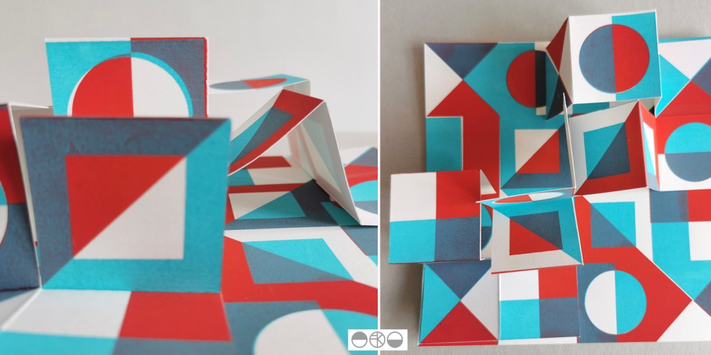
My pattern research focusing on the repeat print block and how it can be used to generate multiple variations to evolve pattern options continues, with sampling with screen and lino printing. I thought I’d share the more structural outcomes here, linking back to my book art practice. I enjoy discovering links that connect the broader practice I’ve developed over the last twenty five years.

As I folded the sheets of printed pattern the forms appeared to suggest a built environment so I explored the idea a little in how I photographed the pieces. Testing scale and contexts is a vital part in developing a pattern, and I enjoy the possibilities.

Gardening with Mr Bawden

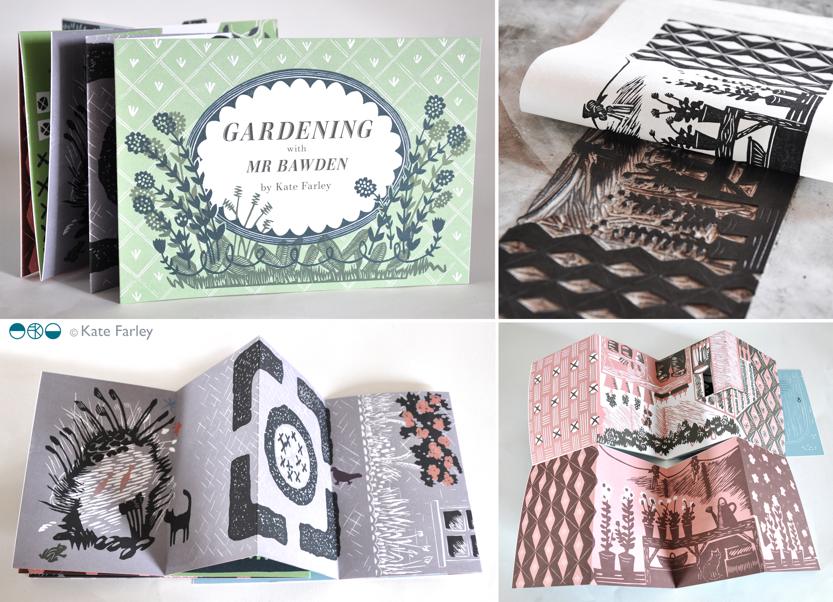
So this is the week my book ‘Gardening with Mr Bawden’ is being published by Design for Today. It’s been many months in the making, so I’m very excited to be able to share the details and for other people to hold the book in their hands.

What began as a project brief for a book with interesting folds that celebrates Edward Bawden’s love of gardening has become a project I am very proud of and have thoroughly enjoyed for lots of different reasons, pushing me creatively along the way. I love a design challenge and returning to the subject of gardens has been a pleasure, having launched my garden-inspired Plot to Plate collection back in 2012 and being a keen allotmenteer. I’ve moved away from my usual diagrammatic visual interpretation of gardens, towards a more illustrative manner, following on from my Parks and Gardens commission for posters for London Underground last year. It has also been a joy going back to paper engineering and book art – having made many editions of artists books over the years following an MA in the subject from Camberwell in 1998.

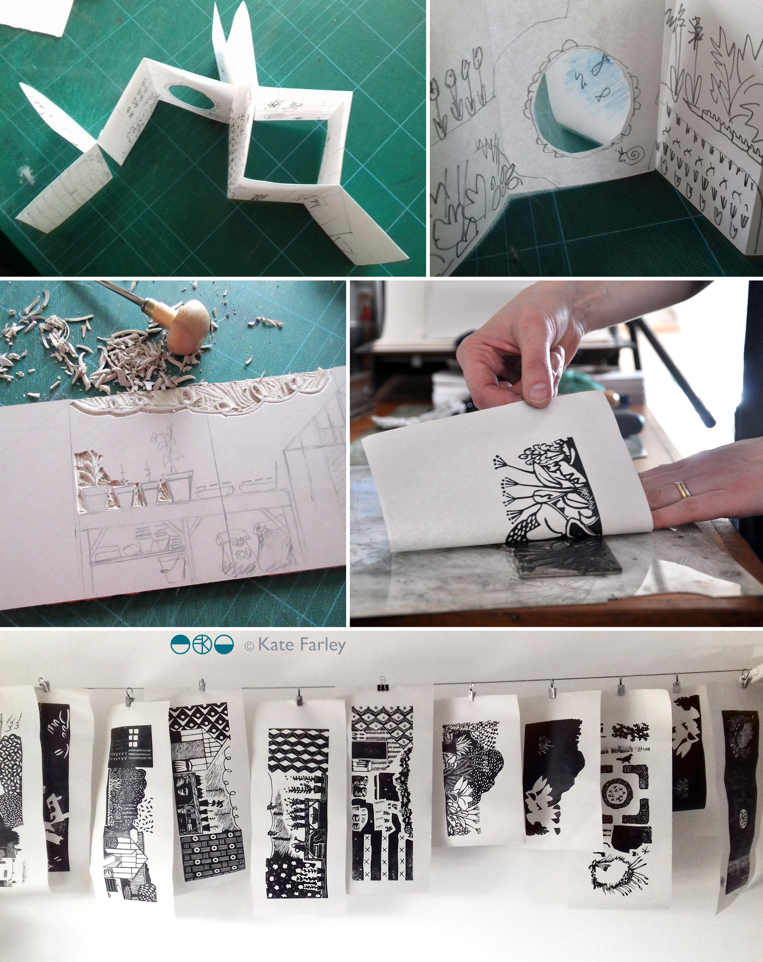
The images below show some design stages of this project with Design for Today. There is an early paper maquette as I worked out the structural narrative in relation to the imagery. Several of these were posted between us to allow for discussion and deliberation. At one point there was a cut-out pond but I was unhappy with how it worked on the back of the page so I left that behind. I cut lots of lino, with each page requiring at least two blocks – one for each colour. Although I had an idea of the key focus and composition for each spread it wasn’t until I was cutting the lino did I tie precise detail down. Only a couple of times I decided to completely abandon a page spread and rework it – and I’m so glad I did! Each block was hand-printed and hung to dry in the studio before being scanned to make a digital file that could be prepared for the lithographic printing process of the final edition at Calverts.

wip_Bawdenbook_flat

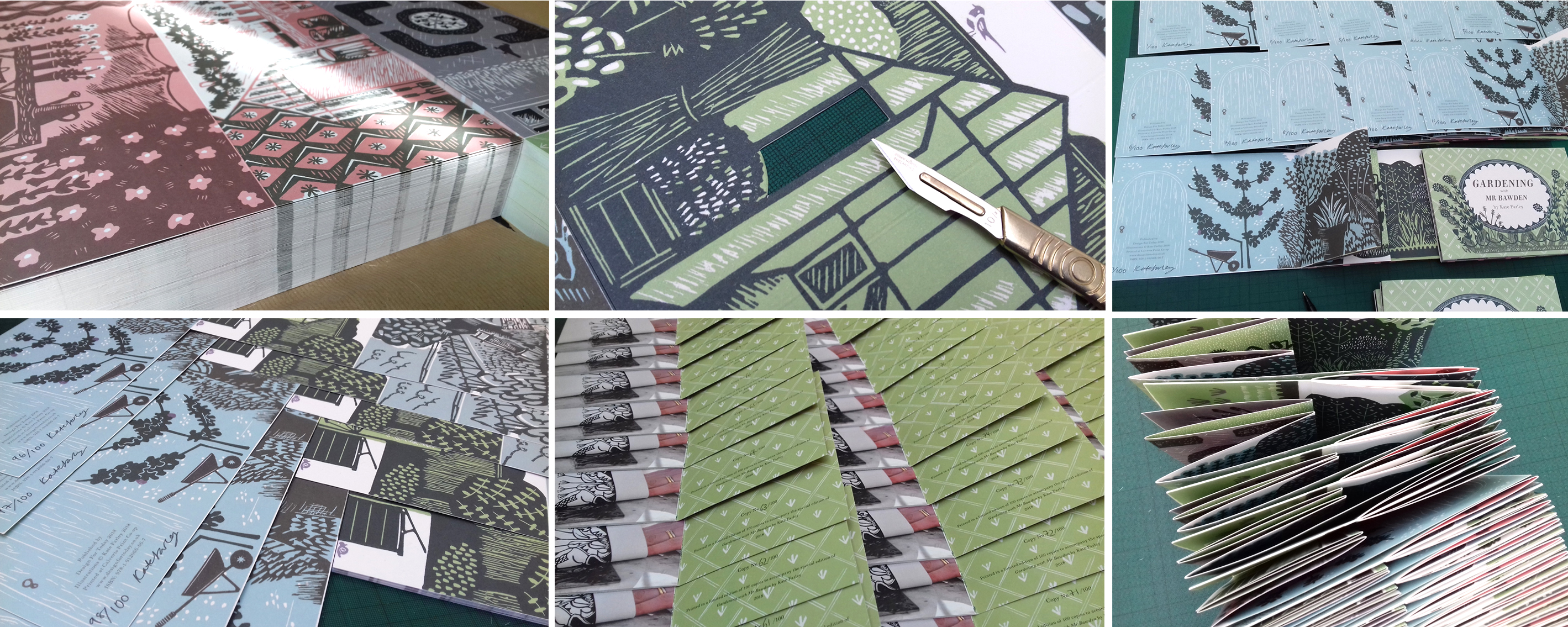
Once the final sheets were litho printed and die-cut / creased we have had to fold them one by one, sign the special edition and pack them up. We even decided to hand-cut out a window pane of the greenhouse in the edition of 100. We are delighted that the Special Edition sold out fast, well before the publishing date – thanks all! Those lucky people will receive the book along with a little booklet of the project and greetings cards, any day now!

signing booksMay18_1

This collaboration with Joe has been a really positive experience as we are both passionate about doing a great job. He was always happy for me to tweak something one last time as we signed off proofs, and understood the reasons why I turned sentences inside out in the booklet, to say exactly what I wanted to. Joe and I have discussed page size, paper weight and the folded structure on several occasions as well as how you take inspiration without copying, and the issue of creating something in relation to, but not derivative of.

I am sure people who know my work will recognise my style in there, despite it being a little bit more illustrative. Pattern making relates to both Bawden, and myself, so it made sense to include a nod to wallpaper designs too, inside the greenhouse, as pots of plants become floral wallpaper. I wanted to use lino because both Bawden and I have used the printmaking process. I also wanted to create a light-hearted feel to the imagery, that is so often in Bawden’s commercial illustrations. As I wrote before in a previous post, we researched lots of snippets of information to guide the imagery and are grateful for there to be so much writing and research available at the moment, but it was never intending to be a guide to the garden at Brick House, more to express the pleasure Bawden would have got from his garden, as so many of us do. I also wanted to take the reader on a journey through a garden, rather than show you all in one go, so I hope the reader can navigate their way around!

KFarley_GardeningwithMrBawden1

This book is the outcome of a great collaboration. (Thanks Joe!) So as the book is published today we celebrate this journey of designing and making, and can announce it will be stocked by some great places, including the Dulwich Picture Gallery, where a brand new Bawden show opens this week. Check out the social media accounts of Design for Today for updates. Final thanks ought to go to Mr Bawden himself, who has inspired so many of us, and who gave Joe and I cause to make this book.

garden cuttings

I’ve been working away in the studio on a wonderful project with Joe Pearson of publishing company Design for Today for a while and time has come for us to begin to share the results. It is a book inspired by Edward Bawden and his love of gardening. The content of the book has been informed by my research into his garden at Brick House, Great Bardfield in Essex. Bawden was a very keen gardener and I have researched and worked with anecdotes and visual references to build a picture of what his garden may well have been like and designed the artwork of the fold book with lino prints, a process he used many, many times.

revealingprint_200jpg

Keep an eye on social media for more updates as we lead up to the official launch in May.

light and dark, total eclipse

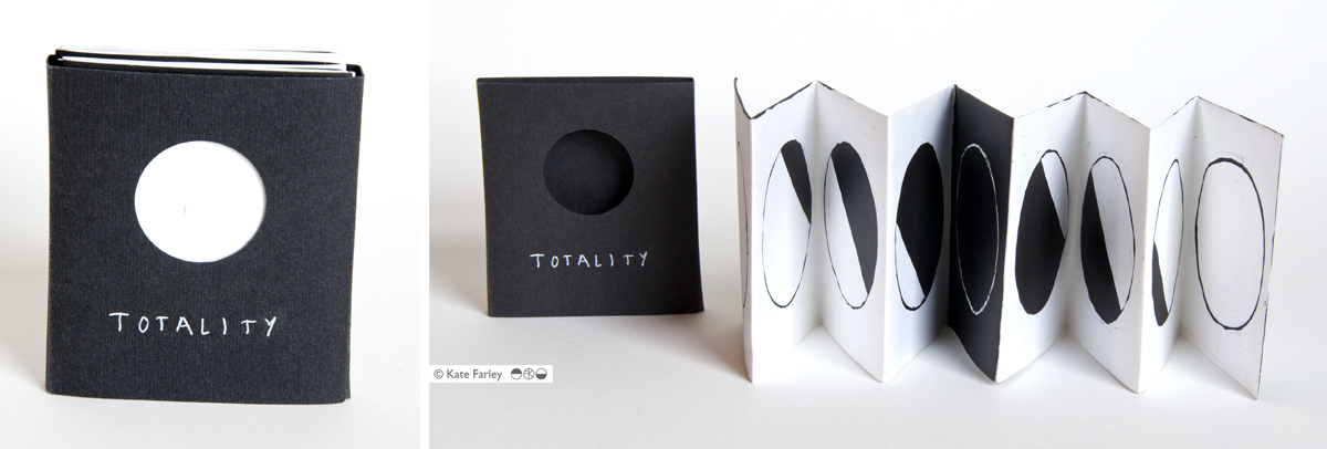
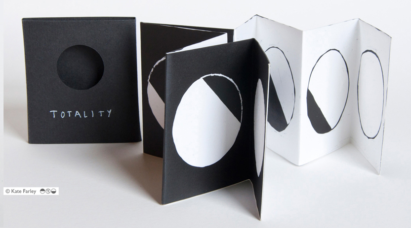
With the eclipse taking place this week, and the process of archiving lots of my old work also underway I’ve been reminded of an artists book I made to celebrate the solar eclipse that took place in 1999 as well as the total lunar eclipse that took place not long after. ‘Totality’ was made as a photogram, a photographic process blocking out areas of the light from an enlarger, on to a piece of light-sensitive paper. I made drawings of the stages of the eclipses as diagrams on to acetate using a chino-graph pencil that sat on top of a Kentmere photographic paper because it was able to fold without tearing or splitting the coating. It’s a great paper.

The process of the making of the images was completely in line with the concept of the book, blocking out light and revealing light. Light was the subject and medium – I like that simplicity. I had to work in the bathroom of my flat in Camberwell in the middle of the night hoping that the neighbour wouldn’t turn a light on which would shine in to the room and ruin the exposure of each sheet of paper. To make an edition of these books it was a production line of carefully timed stages, as I had to fold the sheets of photographic paper when damp for the cleanest fold in to the concertina structure. This was a project of problem solving but I really enjoyed it. The lunar eclipse is on one side and the solar eclipse is on the other. The slipcase included a cut-out circle in order for the reader to create the image of an eclipse when taking the book from the case. The book is pocket sized, as if it is a useful guide.

I have uncovered the last remaining few so get in touch if you are interested in buying one, £20 each, let me know by email in the first instance: kate@katefarley.co.uk

Enjoy the eclipse on Friday – don’t stare at the sun! I’ll be using a pinhole in paper and hoping for a cloudless day…

KateFarley_TOTALITY

KateFarley_Totality1

knowledge of books

I have taught hundreds of people how to make books. Folded, stitched, and even stuck books have been made under my guidance in school rooms, art college studios, village halls, hospital rehab. suites, commercial company meeting rooms, and at dining room tables, at the very least. Every time I teach a bookbinding workshop there is a sense of wonderment from the participants, a proud moment when they hold the completed book for the first time, and realise what they have made. It’s a good feeling being the facilitator of that experience. Books are one of those objects that carries so much potential; an object that can contain private thoughts, or public rule, but is portable and very cheap to make using very few tools. We bond with books.

I was first taught about Book Art by Les Bicknell of ‘bookness’ fame. He made a studio full of Norfolk kids studying textiles question our preconceived ideas of what a book can be, and I was unique in that group – I saw a future of work that I wanted to make. On my degree course I was taught more practical bookbinding skills, and eventually wrote a 12000 word dissertation on the subject, researching in key collections at the V&A and Manchester Met. as well as interviewing some leading figures of the genre. Books for me at that time fulfilled learning requirements on my design degree while becoming vessels to explore my ‘fine art’ ideas, and this eventually led me to study for the MA in Book Art at Camberwell College of Arts, London. I spent the year investigating a ‘sense of place’ of south London, driven to create a more personal map of my London in contrast to the A-Z map, exploring cinematic flip books, and architecturally inspired structures.
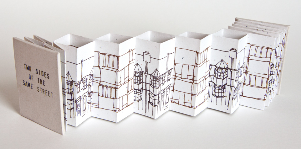
KF_2sides_web

There are tools and skills that are beneficial to know; I was taught by the old boys at London College of Printing, as it was then, how to stitch with curved needles, cover the boards, and press the blocks. More useful to me though was the challenging of how we ‘read’ the book form, how one can be directed by the designer to progress through both visual and structural narratives across pages and along folds. I’ve explored these ideas in many of my limited editions of books I made and exhibited between 1998 and 2008. I’m very proud of this body of work, and I know many people appreciated the pieces. I have work in the Tate collection, the British Library, Manchester Met. to name a few, as well as overseas in collection in America, France and Ireland and within the small world of artists books I became known for the structural book forms I created. Many of my books were inspired by journeys and places I experienced, or events and mindsets I found myself in. A broken elbow falling off a bicycle really did inspire ‘Bloom’ which I describe as the ‘measure of my healing’, as I challenged myself each week to cope with the physical tasks required of printing the book. I have always taken on and enjoyed the challenge of transforming a two-dimensional sheet of paper in to a three-dimensional book structure appropriate for its narrative.

KF_Bloom_web

Sadly not many people make a living selling artists books. It frustrated me that I could sell a print for £80 but once I had folded and stitched it in to a complex structure I couldn’t sell it for £20. So strong is our association with art, that if it can be framed and put on a wall it had greater value. I also got fed up with the ‘I can see how she’s made it’ statements as visitors to shows photographed my work without the courtesy to ask, as if I was a learning resource centre, having paid for the pleasure myself. I see now an increase in awareness of book art and hope things have changed in these regards.
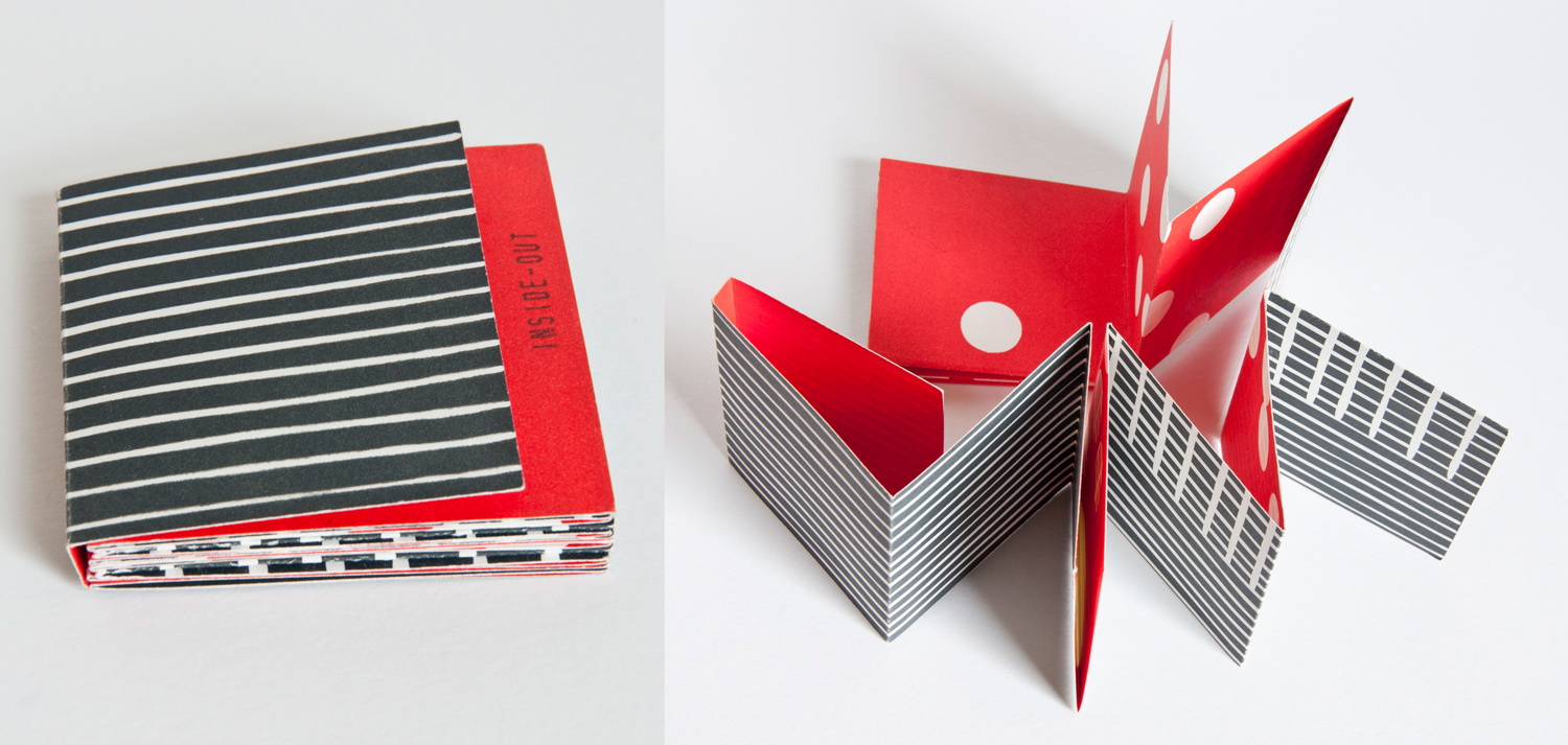
KF_insideout_web

I have continued to use the practical and conceptual skills in my public art commissions, with large-scale visual narratives explored as if pages held in my hand. The sequence of toilet doors in a central Colchester public convenience was just that, a story of passing time. My current design practice benefits from my bookbinding skills and visual communication knowledge, as well as my book art thinking in the design of my marketing material, and sample books. I also continue to produce hand printed and stitched notebooks featuring my patterns – Parterre is the latest.

KF_parterre_toolkit_web

As I pack up my box of tricks ready to teach another fifty students the basics of books let’s hope some of that joy and creative potential is passed on to the next generation, for whatever context they want to think about books in.

Useful links:

http://www.tate.org.uk/research/library/artists-books
http://www.bookarts.uwe.ac.uk/about.htm
http://www.specialcollections.mmu.ac.uk/artists.php
http://www.katefarley.co.uk/gallery/bookworks2.htm

If you haven’t seen the new IKEA video about the book book, check it out: http://www.youtube.com/watch?v=MOXQo7nURs0