A little over a year ago I started to collaborate with my mum on a very special creative project. My mother has been a potter all of my life and family meals at home would mean eating from hand-thrown stoneware bowls, plates and cups made by her. During the 1970s and early ’80s she exhibited her goods at craft fairs in and around Wymondham, Norfolk and we would hang around watching as mum demonstrated her craft alongside her creative friends. We were lucky enough to have personalised birthday gifts made by mum during our childhood, and when I left home I was given a homemade teapot, cups and bowls that I still have, three decades later! My sister and I used to play at the potter’s wheel and hand build the odd ornament. I vividly remember the smell of burning clay dust on the bar heater and the feeling of dry clay on my hands.
Last winter, as a way to spend time together at a sad time of family loss, I suggested we try collaborating, sharing our skills to see what we could come up with. I made a project sketchbook to outline a few thoughts and approaches to form and visual language, and handed it over for mum to think about what chimed with her. Although I’m a surface pattern designer, I’ve no experience of hand painting on ceramics beyond art school. Mum has switched to hand building her vessels in recent years so this was how we started. After a morning in my studio pressing tools into damp clay, drawing forms and testing colours, the project was underway.
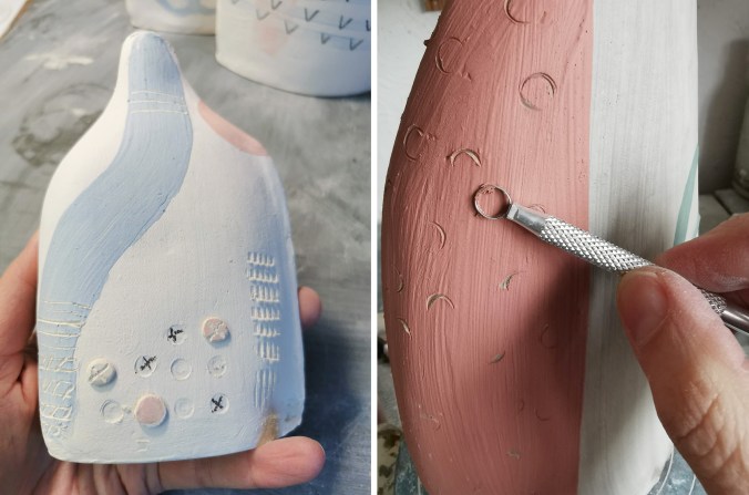
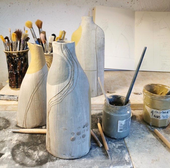
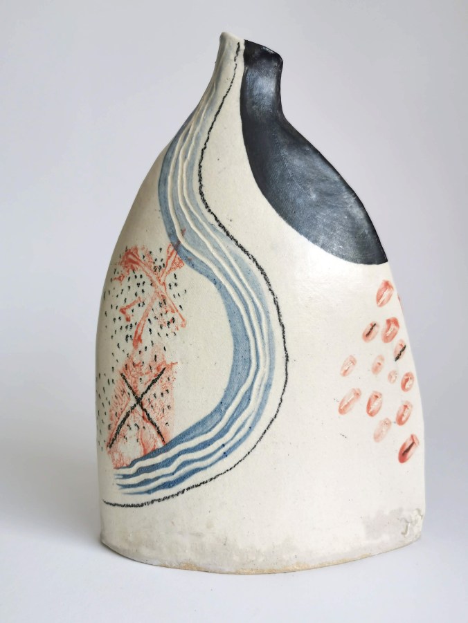
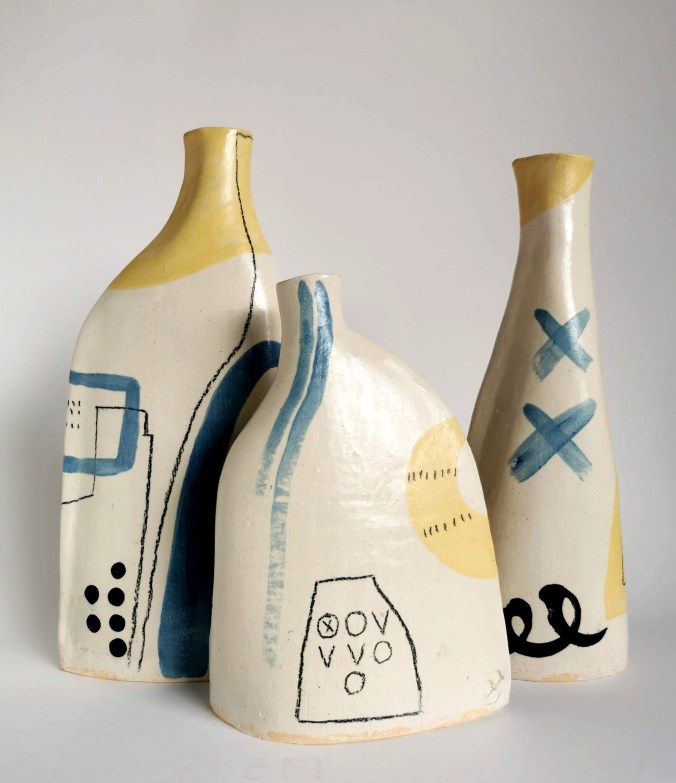
Mum tested a few ways to construct the vessels and I responded to the forms with drawn and painted marks inspired by our mutual appreciation for landscape. I had to learn how to load the brush and use the colour on the clay. I monoprinted texture and marks by painting newspaper with colour then drawing on the back of it on the damp clay. I drew with the ceramics pencil and scratched through shapes of colour with different tools. I’d hold my breath in anticipation as I planned a long line of colour, top to bottom, over the neck and shoulders of the form. We also added buttons as visual and textural interest. We had some gentle discussions about my preference for marks mum was less keen on, and we egged each other on each time we returned to the pottery. I’d receive a message, “Kate darling, I’ve made some more for you!” and soon the weekend arrived and we were nattering away, having our creative fun together again.
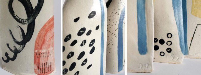
We have learned lots about what we have both wanted with the shapes and surface pattern of the pots, and I’ve tried my best to understand slips, engobes and underglazes. Our techniques have been refined, and standards raised during the year. I’ve definitely got better at drawing on three-dimensional forms – I’m even more in awe of Clarice Cliff! There are three series so far, exploring different forms, colourways and surface decoration, with approximately ten flasks in each.
I’ve thoroughly enjoyed the opportunity to work with mum on this project, it genuinely feels an absolute privilege to be able to work in this way. This collaboration has been one of united adventure, sharing each other’s creative decision making and discipline expertise to guide us, learning to make more than we could individually, sitting beside each other in a conversation between clay form and mark making.
I also think we may not be done yet … we shall see! We are looking at options to exhibit them and would very much like to share them with others.