drawing, looking and seeing

I’ve recently returned from a lovely family holiday, traveling by train from Norfolk to London and via Paris through France to the south and on in to Italy, up into the foothills of the Alps via Turin … and back again. I made lots of small sketchbooks so I could have one close at hand at all times, with a selection of pens and pencils. I’ve always enjoyed drawing from trains, preferably sitting backwards, looking, identifying shapes and details, then hastily capturing what I saw in a few lines.

It’s a great exercise to keep the hand, brain and eyes in check, and although I have previously used this sort of drawing for my design work – including my degree Final Major Project back in 1997 – I only really do it now as a good activity to check in with the view and focus on the places, stations and landscapes I journey between, and as exercise for keeping my drawing practice fit and healthy. A gable-end of a barn, a cluster of trees or mountain horizons can be documented and it’s amazing how these drawings are then able to capture and remind me of the journey years later.

Here are some of the drawing from the trains. I sometimes get a bit more detail down if we sit in the station for a few minutes, and I jot the station name down for interest.

I also managed to do a small amount of drawing while sat in cafes or sheltering from sun while other family members were up to something else. They take a few minutes each, so still pretty quick observations. It’s clear my interest in pattern comes in to how I see the world. Rhythms of windows and balconies, railings, ornamental buildings….

I also made a couple of sketchbooks using tracing paper as I was interested to see how I worked with the transparent pages as the drawings built. I quite like the results and reminds me of how I plan lino blocks and screen prints with the layers of tracing paper.

It was definitely good to spend time drawing and I’m thinking of revisiting some in the studio, no pressure, just a few ideas. I hope you like them, let me know if / how you make drawings from trains!

creative sparks in Armenia

Combining a design career with an academic role often means my weeks are busy and varied, but I had a week at the beginning of this month that was very different to the rest! I’ve been lucky enough to be given an amazing experience as academic at Norwich University of the Arts – a trip to Armenia. The university was successful in securing a British Council bid to work with students at the Tumo Institute in Yerevan, Armenia to help students to create design work with the aim of making products to sell when they come to work at the university in a few weeks time. This is speed educating! A team of three of us, Will – a business mentor from the university, Mia – a graduate from the BA in Textile Design and me – the lead subject academic. Fortunately we all got on brilliantly, complimenting each others’ skills and all being very happy to adapt in order to make the most of the experience. I was only able to be there a few days, while the other two stayed longer.

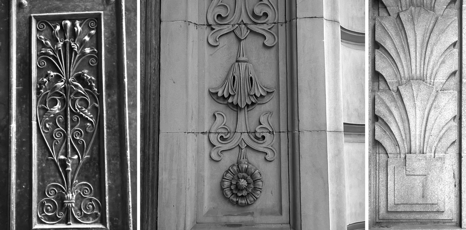
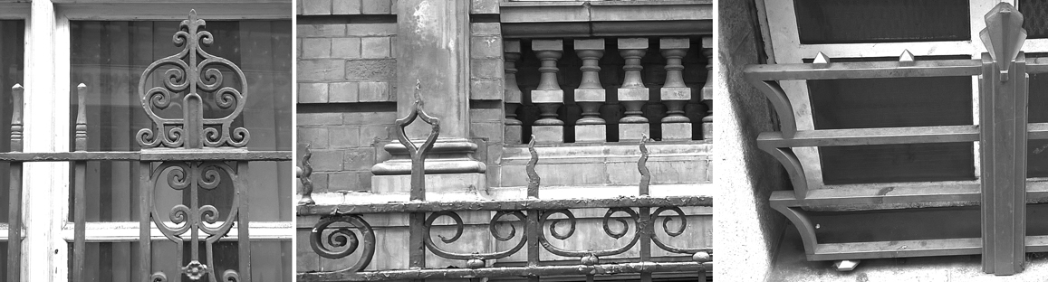
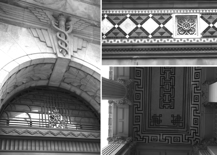
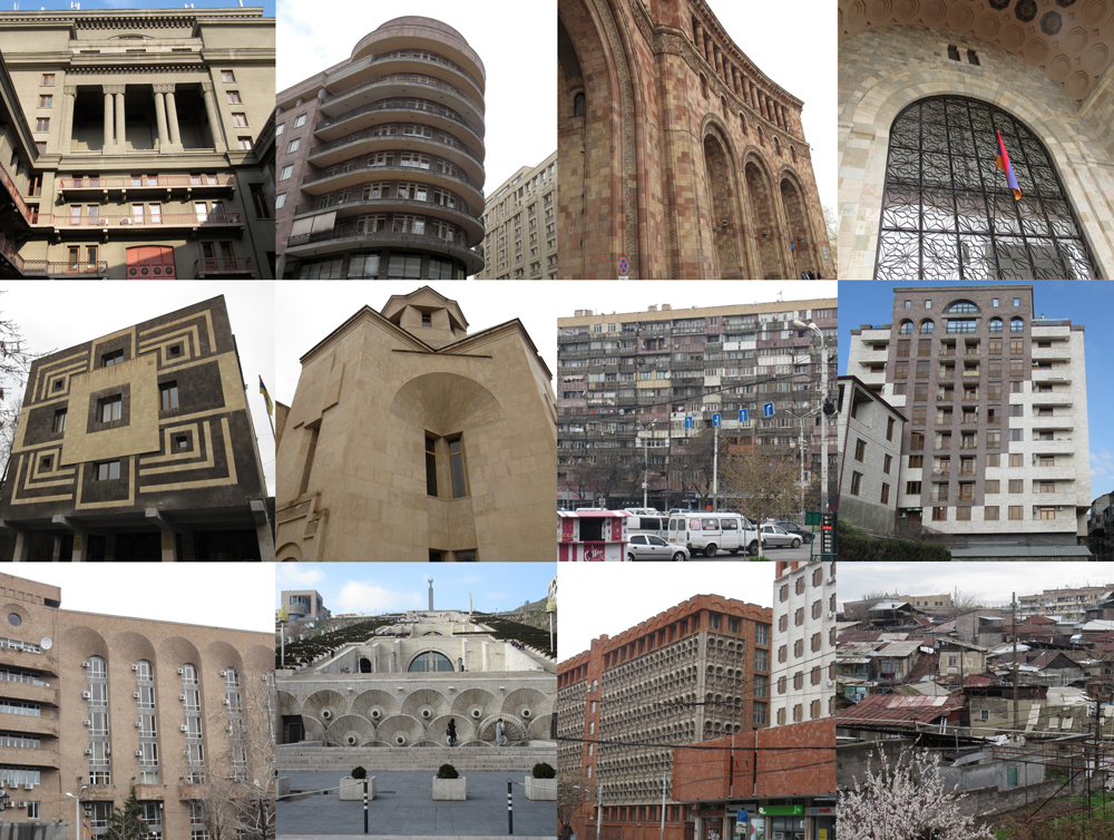
The journey was long, transferring in Istanbul and we arrived in Yerevan in the middle of the night so it wasn’t until the morning that we could see what the city looked like. We had some time to rest, so we didn’t! … and instead got up and explored … of course! The architecture was a mix of Modernist Brutalism, Art Deco and Post-Modernism mainly and a pink stone was dominant. Many of the buildings featured wonderful carvings and at many points all three of us were heads and cameras up capturing the city. The food in Yerevan was a complete hit with us and I could have stayed far longer and become far wider. Everywhere we went there was wonderful fresh produce: cheeses and meats, pastries, vegetables and breads, all beautifully presented. Luckily we were all happy to share the dishes to ensure we could try as much as possible.

Armenia_architecture_1000

There was much excitement as we went to meet the team of students we were going to be working with, and we took examples of our work to introduce ourselves as well as a general plan, and open ears, so we could discuss with them all their own creative ambitions. These first few days were really important to get the project up and running before I had to return to the UK. Tumo studios was set up on the first floor of what was previously home to a wealthy family and there were signs of the better days including murals on the ceilings and ornate tiles. The workshop spaces were really inspiring, catering for print, ceramics, jewellery, sewing and more. Products made by students were available for sale too.

Everyone was very friendly and helpful, as well as really excited to get stuck in. We shared our ideas and thoughts about the project and Mia and I talked briefly through some of our own work. The first afternoon went by quickly and then the three of us were off to explore the city again – I really wanted to see Mount Ararat – the mountain taller than Mont Blanc, (and apparent resting place of Noah’s ark) that has in history been on Armenian soil, but is now behind a Turkish border. We climbed steps and more steps to the highest part of the city giving us views over the varied levels of prosperity in the capital . With sunglasses on, when there was a break in the clouds we could just spot the snow and shady top of Ararat, but sadly the view was not easily captured on camera – Wikipedia has better pics!

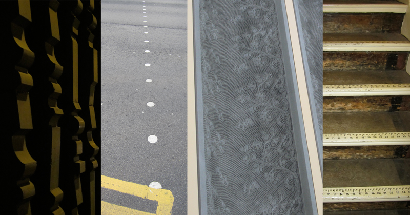
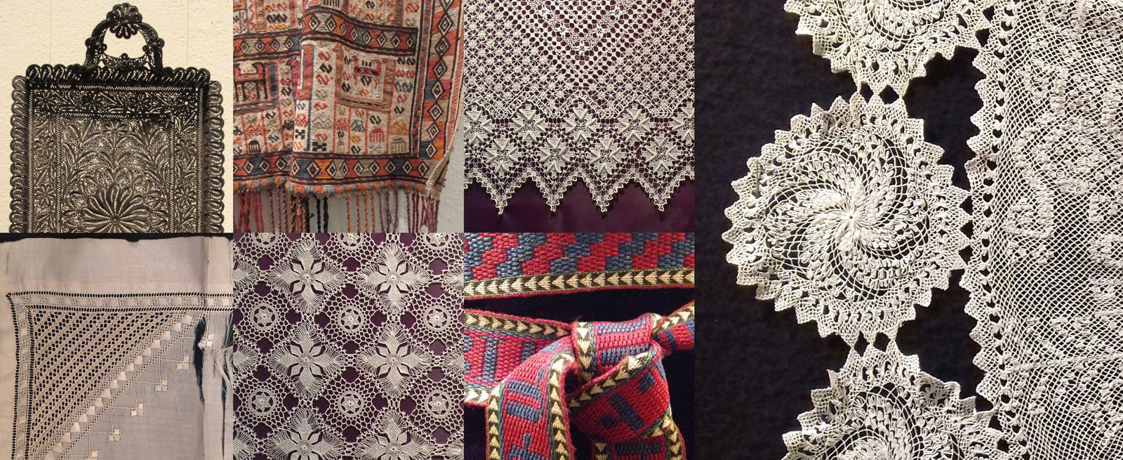
The next day was a very long but hugely inspiring one. With our local guides and our researcher eyes in we set off to visit three fabulous places to gain inspiration. The city museum presented the history of Armenia. We learned about traditions, society, historic events and politics, and of course the section about the Armenian genocide was hugely upsetting. We were not allowed to take photographs there but we had other places to go so we crossed the city, including a short trip on the metro (it has one line) to get to the Folk Museum. This was a smaller museum but packed with so much beauty! Here we heard about and saw the traditional crafts and our guide explained the processes, tools and materials involved. I took many photographs! The lace and filigree were particular favourites of mine.

KFarley_folkmuseum_blog1600

We were full of inspiration but needed energy so lunch was in a restaurant with our hosts helping us to navigate a menu of local dishes – I had lamb soup with pomegranate and mint – it was very good! Soon we were whisked off to the carpet museum / factory and the journey was a great opportunity to see more of the city and suburbs. It was fascinating to hear the history of carpet / rug making in Armenia and I even had a go at learning the right knot but I was very slow in comparison – there is video footage somewhere – and in the picture below, top row, right hand side, you can see my four cream coloured tufts that they have no doubt got rid of once I turned my eyes!

KFARLEY_Megerian_carpets_blog1600

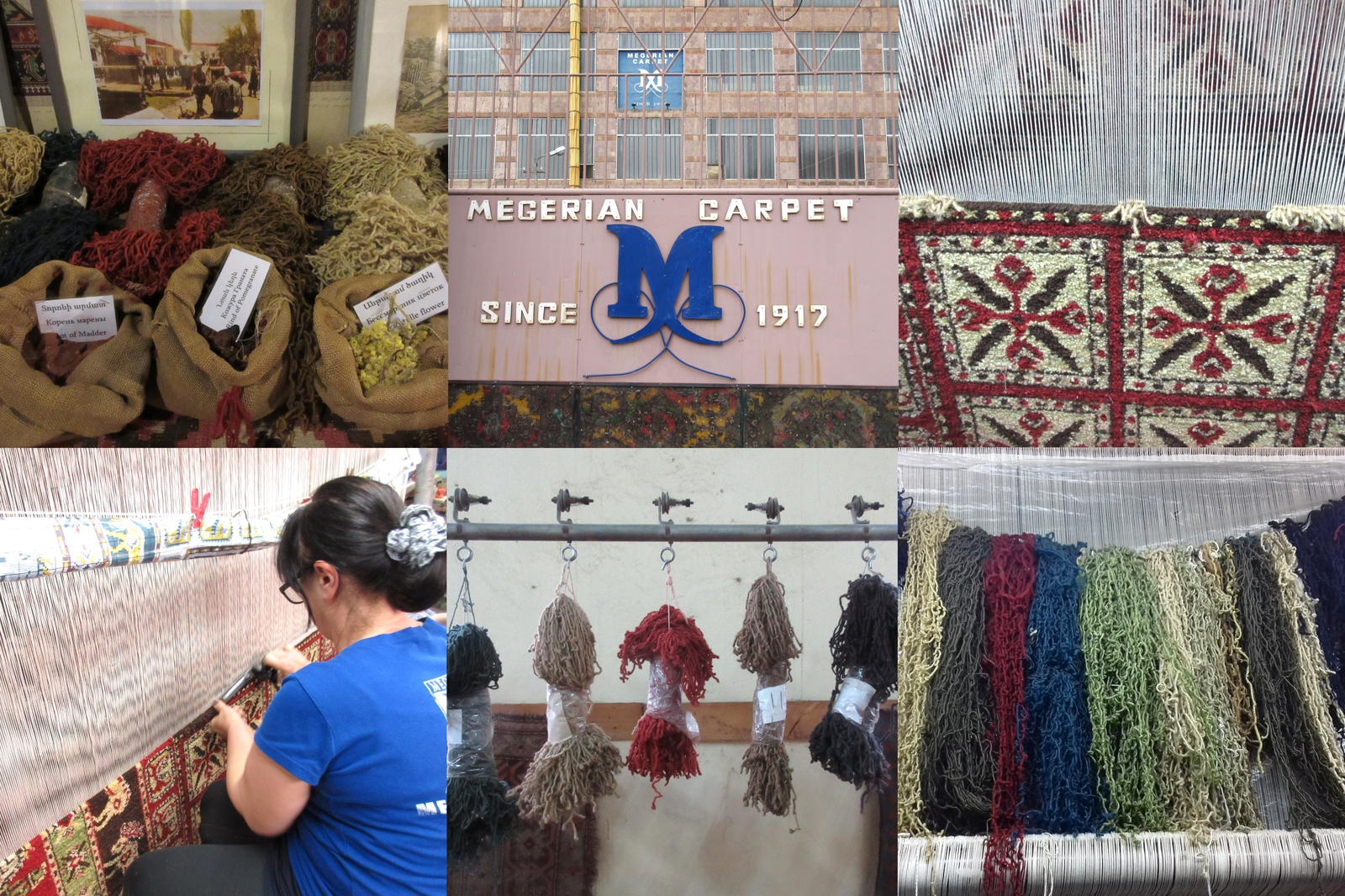
The colours used to dye the yarns are still made from natural ingredients and it was right up Mia’s street! There were some secret ingredients of course! We were all inspired by the sights, stories and the motifs, border patterns and processes involved. What an amazing day. We headed back to the studio to think about what we had seen, captured some ideas on some post-it notes and discussed the plans for the next day. Another evening of foraging fabulous food in the restaurants of Yerevan did us well – we all ate too much again.

My final full day was spent in Tumo studios leading some workshops to develop the projects. Will, Mia and I planned the next week of workshops and activities, sharing all our different knowledge and experience, alongside talking through the individual ideas with the participants. I ran a session about motif and composition development and it was fascinating to see how differently these young people took on the challenge compared to the undergraduates in England I have worked with. These students were far happier to play with the process and not worry about it not working, and gave the testing much more time. Can this be the different schooling? Several attempts at the same thing, sharing and much discussion, lots of giggling and trying again got us to where we needed to be, lunch!

KFARLEY_tumo_workshops_blog

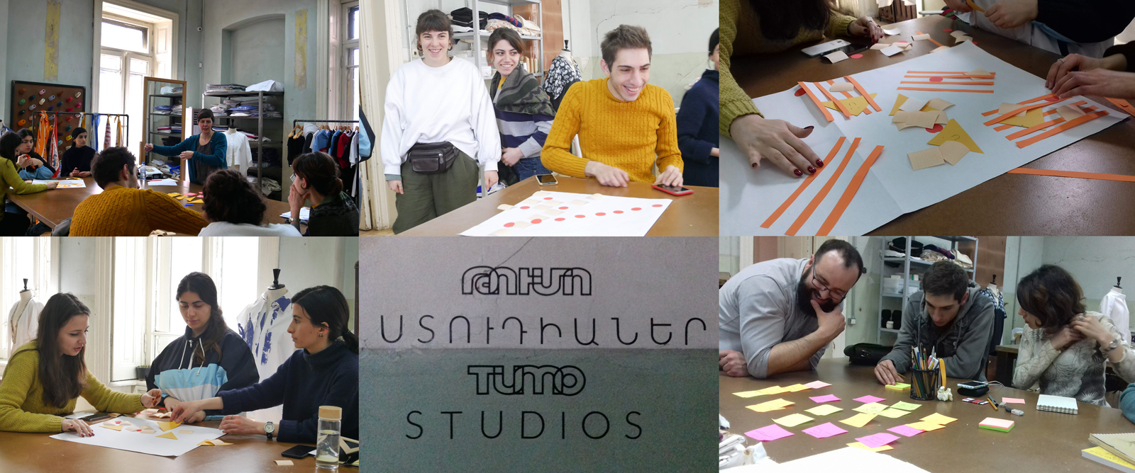
We decided to eat all together in the studio so we ordered in food, (I tried cheese soup – it really is like fondue) and as we sat together we tried to learn some of the language … we laughed a lot. We were also bought a local honey cake to try which was very good. In the afternoon I led a practical session about repeat patterns and design rhythms, and again we talked through individual ambitions for design ideas and product potential. The participants will be heading to Norwich next month to develop and resolve product outcomes to test in a commercial setting. We discussed differences between Norwich and Yerevan and about the next phase of the project. At times we had visitors popping in to see what was going on but we kept on track and too soon I was having to say my farewells and leave the group – with the silver lining of knowing I’d see them in Norwich in May.

One more meal, a final evening with Will and Mia, a supermarket sweep around a 24/7 shop to buy gifts, back to the hotel to pack up, a twenty minute nap and that was that, it was Thursday – I flew out of Yerevan in the very early hours, swapping ‘planes in Istanbul and on to home.

I was so sad to leave the people and city, and was so envious that Mia and Will had another week to see more. In only a few days I had experienced somewhere so interesting that before getting there had felt daunting. Everyone we met were so friendly, helpful and proud of the city and country. I had the chance to learn about a different country and textile culture while working on a really different project, testing my teaching in a very different situation. It really was a great opportunity, hooray for saying yes!

factory_groupimage_blog

Thanks to Will and Mia for some of the photography and being such great team mates!

bespoke pattern for Birmingham BHX

Designing bespoke pattern for clients is something that I have made a key professional design interest. Communicating a sense of place, historic reference or activity as pattern is what I really enjoy and over the years I’ve been on many site-visits to interesting places to learn about what the client would like or definitely not like. This visit was no different. I love the anticipation of finding out more, a new project to get to grips with, and all my design experience to apply to the challenge …

Some of my previous design work was used as a reference for context images by the original architects, proposing my patterns and stating my details – note – never send artwork without your contact details attached! Phone calls were made, samples were sent, bids were accepted and then a call-up. Please come to the airport for a meeting. There’s a tight deadline, a budget, and something the client knows they want. In a nutshell the brief: Celebrate Birmingham’s buildings in a one colour, repeating pattern that works close up in detail and from a distance as a visual rhythm. Buildings need to be identifiable.

katefarley_bhx_brumpic2_100

With any project I carry out research, ask the client lots of questions and evolve a design approach subject to the answers to my questions. Production methods, fabricators, material choices, colours, budgets, time-scales and of course client ambition for the project shape the design language and development of the project. I set off to take photographs of central Birmingham and climbed tall landmarks to get good views. I took photographs, made sketches as well as notes. I had some buildings in my mind I knew needed to be included but I also wanted to use others , less iconic ones, as visual rhythms to play with negative and positive shapes across the composition.

katefarley_bhxairport1_100

Back in the studio I chose paper cut-outs as a clear graphic way to create the buildings, as I have done for several commissions including for the Barbican and TfL posters. Once the individual buildings were cut out I scanned in the artwork and spent many hours moving everything around in Adobe Illustrator. I was testing rhythms in and out of repeat and shifting scale, proportions and pairings. This can send me back to re-cut something or add new details. To some people those hours of making subtle tweaks and changes wouldn’t even be noticed but to me it’s so important that every inch of the design works the best it can and it can be time-consuming – but it will be worth it. I can’t stress this enough to students embarking on their Final Major Projects at the moment! When you know what scale the final artwork will be produced at you need to check the correct level of detail as working at a computer screen can be very misleading for artwork several metres long!

A concept sheet and initial design piece was sent to the client for approval and at this point I had to label the buildings I’d included. Once approved I was able to continue building the full repeat, adding further buildings, and make test prints with the help of the team at the Window Film Company – who I already have award-winning work with! They really know their stuff and several phone calls later to check small details regarding file specifications and production issues resulted in the excitement of samples to sign off, both by me and the client. A couple more proofs for colour matching and scale of design was checked and then we were good to go. Quality is everything when it as your name on it, and making sure that everything about the design is right BEFORE it gets installed is rather important. Sleepless nights before installation of projects has been known!

katefarley_bhx_3

This project originally came my way almost a year ago with some scoping phone calls and emails, and now I’m able to share photographs with you. I’ve had people let me know they’ve seen work that looks like mine at the airport – hoping I hadn’t been copied – but no, this time it is mine! When Birmingham Airport tweeted the pictures last week I was delighted that I can now share images of this project from 2018 – when I was Birmingham-based as it states, and now it feels rather a fine farewell to the place I called home since 2005.

katefarley_bhx_official1

(onsite pictures – official photographs from Birmingham Airport)

Yes it is by the toilets, yes I have already worked on two commissions for public toilets (Colchester / Dedham many moons ago), and I can’t promise this will be my last!

Save

seeing red

My world is pretty colourful; on a daily basis I’m in contact with colourful textures, materials and surfaces from fashion, interior and architectural contexts. Not only do I work with hard and soft surfaces in my design practice, I also teach undergraduates to work with colour in relation to textile design. It’s important to see beyond the broad definition of colour by name and to think about the context of colour; the surface qualities in that colour, the effect the material has on colour, such as gloss, matt and opaque for example.

Last week I managed to update some colour charts in my studio resources and it made me think about how we tend to have particular favourites when it comes to colour. I certainly have a comfort zone in sections of the colour charts and other areas I’d have to be persuaded to go near. Commissions often include discussions with clients about the intended colours of products, and I enjoy the challenges of pushing the boundaries of my comfort zone – within reason! I have a different palette I’m happy to wear compared with what I’d live with, and I certainly dress in colour relating to the mood. I remember many years ago dressing in very colourful clothes only to receive a rejection for something that mattered. I felt gutted I’d dressed for the wrong outcome!

Here are some REDs… I love the border colours between red and orange.

katefarley_red_100


building aesthetics

For the last few years, I’ve been lecturing on the subject of design history to first year students of Textile Design at Birmingham City University as part of a module aimed at introducing historical design considerations. Styles specific to an era, the influence of globalisation, the role of Fine Art, architecture, film and graphic design in shaping textile design, and where we are now, in context to where we have come from are presented alongside social commentary, introductions to colourful characters, controversy and a spot of light entertainment! It’s a huge ask to expect students to remember all the information I share, but my main focus is showing them how much it matters that what has gone before are the results of the times in which things were designed, whether it be superfluous decoration or trailblazing technology. From contemporary trends in fashion, to why we don’t choose certain colours for our bedrooms, I think it vital that our students have a working knowledge of design history as a foundation of understanding, as designers themselves. This knowledge feeds back in to their studio projects in the working knowledge of aesthetics, linking the look of something with the connotations that others might bring to a piece. Is it beautiful? Now there’s a rather complex question!

katefarley_buildingdetail_blog100

Last week I shared my ‘interest’ in forks, and more can be read on that matter here. As I move towards the present day, bit by bit each week – Arts & Crafts, Morris et al, Art Nouveau etc this Friday, I introduce words to help grow their critical vocabulary, and help them to see and read this history that remains around us. Walking through Birmingham demonstrates how different styles of ornamentation jostle for attention. Arts and Crafts flourishes appear fussy in contrast to the rather robust Deco motifs. Twenty first century obsession with flimsy superficial solutions such as the facade of New Street station’s mirror panels, and other examples not far away, are put to shame by the care and craftsmanship of carved stone, worked iron, and intricate tile work of over a century ago – still intact. Now as the wrong library remains standing (in my opinion) I dread the day I hear that the concertina signal box loses the fight to stand. I digress…

katefarley_buildings1blog

I’m fascinated in how something can contain the belonging of a time, a style, a movement, just in the detail of a line, or a point in a curve – I’m specifically referring to pattern and decoration here but this observation can also be made with architectural detail. The shape of a leaf, the ‘stylisation’ of a flower, has the ability to communicate its belonging or differences in a glance. As a designer it’s important to know these references, especially in relation to a client’s brief – you wouldn’t want to offer Baroque when Neo-Classical is required! This knowledge of visual language crosses design disciplines and it’s fascinating to identify the same aesthetic approach on printed cloth that is also worked in silver with a terrine.

I enjoy the challenge of creating design motifs that tell the story, the unwritten references in the pattern, making a statement to belong. My recent commission for the Barbican shop illustrates this point; that architectural styles, in this case Brutalism, and the approach in which I take to the design process is fundamental in demonstrating through the aesthetic, the design language of the project.

It’s difficult for me to imagine not being able to hear the jazz age when spying an Art Deco border, or to think of Athens with the hint of the Greek key pattern. Despite not exactly loving history at school I now see the importance of it in adulthood. It’s a sad week as it’s announced we lose Art History A-Level as a subject in school, making it harder still for those with an interest in art and design to learn their passion. In Birmingham we have examples of Pugin’s design work in St. Chads cathedral and the hand of the Pre-Raphaelites in St. Phillips.  I hope my lectures feed the students’ imagination to want to know more, to feel proud when they differentiate the Deco from the Nouveau, and to go on to be informed designers, telling the right stories with the curve of a line and the style of a flower.

All photos taken in Birmingham by ©Kate Farley 2016

katefarley_buildingdetail1_blog100

katefarley_buildingdetail3_blog100

black, white and a hint of chocolate

I remember my father turning our bathroom in to a photographic darkroom, not really understanding what was happening, and not being allowed in. A few years later it was my turn to stand in the dark bathroom to transfer the film from the camera to the spool ready for developing the images, eyes wide open – as if that would help! At art college the group of us headed to the beach with the college stock of Pentax K1000s to photograph the fairground, and then returned to fumble our way through the same process. I loved the wet developing; watching the first signs of imagery appear, and then head to the corridor, blinking to the light, to check the exposure required for the ‘portfolio’ piece. I also enjoyed the more experimental side of printing. Photograms, multiple exposures and liquid emulsion kept me captivated during my college days and holidays back home-home meant the use of that bathroom darkroom.

pinhole_flora_web

Years later at the turn of this century I became Print and Photomedia Technician at Central Saint Martins, and then Lecturer in Visual Communication, with the territory of a darkroom. I lost count of how many students I introduced the idea of experimental photography too but one of my tricks was the Pin-hole camera. The students and I turned empty hot-chocolate tins from sweet smelling rubbish to state of the art cameras, and captured the sites of the Back Hill campus. The wonderment experienced by the students, mixed with the realisation that they had made a photograph without using a ‘camera’ was priceless. But why was the photograph upside-down? Why was it a negative?…. Some students took this far further than I had and became rather good at controlling the timings and light readings.

I spent hours leaning out of the window of my flat in Camberwell clutching my hot chocolate tins, photographing the street. It became clear I had attracted attention of the guy opposite who wondered what on earth I was doing! I had to save the exposed papers to develop in the middle of the night so as not to disturb my flatmate, and so the house was dark. At this time I was also experimenting with photograms, and I made a book titled ‘Totality’ about the solar and lunar eclipse that had occurred, and realising that by using light, and obstructing light to make the book, the very concept I was exploring was creating the book. Apart from ‘sun prints’ in the garden with my own children I haven’t had time to use a darkroom, ready-made or not, for a number of years. pinhole_SE5img022web

I was reminded of the joy and simple elements of photography a few days ago. I was in bed, on holiday and happened to look up to find we had our very own camera obscura! Through the smallest gap in the blind was sufficient light to project the curve of distortion and the negative image of the view of the houses, window frames and all, at the end of the garden, on to the ceiling above us, in colour. The magic and the science of seeing was right there. Trying then to capture that image using a digital camera felt rather wrong. Where did I put that collection of drinking chocolate tins?

cameraobscuraKent_web


noticing Nottingham

Having had such a great ‘destination’ review from Cara of Patternbooth blog fame via Helen’s blog DesignHunter we chose Nottingham for a last minute weekend get-a-way. I had last visited the city as a student in about 1997 and this time we set off looking for a completely different experience from the cider-drinking ‘DM boot wearing’ art student of yesteryear.

We visited lots of independent cafes and restaurants, watched a great art-film in the Lounge at the Broadway Cinema, shopped in vintage shops & design shops and yes, we did find time to sup ale at Ye Olde Trip to Jerusalem. It is a city with a great variety of interesting buildings embracing a myriad of architectural styles; almost a timeline of the design history lectures I give to my Textile Design students. The lace trade is still visible in many ways, and contemporised on the exterior surface on Nottingham Contemporary.

We had a thoroughly great time and returned home with rounder tummies and fuller bags than when we left Brum on Friday night! Thanks Cara, Helen and Nottingham!

images L-R: exterior facade of a car park, dots on a crossing, Nottingham Contemporary exterior, stair detail from the Paul Smith shop

NG_stripe_web

My Olympic experience

Wild flower planting, fantastic structures, good spirit, great weather and a bit of sporting competition – having spent two fantastic days at the Olympic Park of London 2012 here are some images I’ve put together.

– an alternative Olympic gold, silver and bronze… structures, site and occasion

Image

– the diagonal trend…

Image

– a few chances too many…?

Image

we went to the zoo today…

Today we visited Dudley Zoo. Until today I had no idea that we had such a prized set of buildings of international importance only two trains and one bus away from our house! The great man of London Zoo’s penguin pool, Berthold Lubetkin designed this Modernist set of reinforced concrete buildings – Tectons, which were granted World Monuments Fund status two years ago. I include some photos but I recommend a visit to fully appreciate them. The Kiosk reminded me of Arne Jacobsen’s petrol station just outside Copenhagen, also from 1937, and of concrete – but that’s another story!

Lots of care and attention are still needed to get the Tectons back to their 1937 former glory, but they still represent an ideal and aesthetic relevant for today. I have only hinted at what to see there – I wouldn’t want to ruin your search, but the entrance is rather fantastic too. (I thought I ought to include some shots of animals seeing as it was a zoo trip! The penguins are another nod to Lubetkin.)

ImageImageImageImageImage

http://www.dudleyzoo.org.uk/around-dzg/tectons