‘Chelsea’ drawings to design for David Mellor Design

Many months ago I had the go-ahead from Corin Mellor to design a bespoke pattern to celebrate the fabulous ‘Chelsea’ salad servers that he designed for David Mellor Design. When I first saw the cutlery I immediately really liked the look of them and when I received the servers they were amazing to hold – they still are. Impressive in weight and size, the shape is simple yet stunning, and they inspired me to set about drawing. With a number of design options I provided Corin Mellor, Creative Director and his retail team, they discussed and advised, and before long we agreed on this design that is now printed on to linen union tea towels and sold on my website, David Mellor shops in Hathersage and London as well as Museums Sheffield.

With the tea towel now listed in the ‘Special Products’ section of the David Mellor catalogue I thought it time to show some of the images I have of the process. I took inspiration from my visit to the factory in Hathersage where they make and display the cutlery production process as well as the objects themselves.

I’ve had great feedback and sales, we are having another print-run and they’ve received press in the form of Elle Decoration!

Thanks also to Patternbooth and Design Hunter:

drawing_mellor1webprintedMellorTags_webmellor_square_web

elledeco_Mellor_dec13_web

Design inspirations 2: the natural world

Second in the series of ‘Design Inspirations’ blog entries…

The natural world has long been an inspiration for textile designers. Many years on from William Morris celebrating the natural world of flora and fauna as decoration for textiles we have had Laura Ashley, Marimekko and Orla Kiely, to only name three companies, who have interpreted the natural world and created stylised patterns and imagery which continue to inspire design students of today.

At times the worst thing as a lecturer of design we can hear from a student is that their project will be “about shells” and we dread the worst examples of static and bland studies which do little to explore the beauty and wonder of the natural world’s creations of form, structure, surface, pattern, colour and more, before approaching the bountiful concepts and metaphors in the ‘dot to dot’ of design processing hidden around the shell!

In my drawings I often aim to distil and to simplify a plant structure or shape of a flower in order to create motifs for prints and surface patterns, exploring perspective, diagrammatic language and relationships with place / context. I have a huge archive of drawings made on locations as well as boxes and bags of samples including plants, stones & leaves and one day they may well feature in designs. You never now what you might need! Going anywhere new, even for a holiday means that I keep my eyes open and often pockets filled as a result of finding new things.

Having visited the Gower peninsula for one last summer camping trip I came across these examples of natural forms, which could and would create different visual interpretations in the hands of each creative prepared for the job. That is one reason why I like to play a part in design education; to facilitate the looking, seeing and interpreting, and it is certainly why I like to keep on collecting, and keep on drawing.


Image

Kate Farley – Plotting Prints at Tinsmiths

It is a very exciting time for me. It has been about two years in the planning and preparation stages and now we are a week in to my show at Tinsmiths. For those of you unfamiliar with Tinsmiths, it is a beautiful textile and lighting shop in the lovely Herefordshire market town of Ledbury. It is a beautifully considered shop, owned by Phoebe Clive, selling a wide range of fabrics as well as home wares, crafted pieces and artists prints.

I have worked closely with Phoebe to translate my lino printed designs inspired by allotments, to become a collection of heavy weight linen, hand screen printed textiles available to buy as cushions. We have also created larger showroom pieces as curtains and upholstered chairs in preparation for selling some of the designs by the metre later in the year.

Phoebe and the team have styled my products throughout the top floor of the premises in such a way as to create a clean and fresh interior space, working with the other products and furniture pieces in the shop. My prints and drawings are set amongst other exciting colour statements in the form of ceramics & lighting with an understated aesthetic. With plenty of positive feedback at the PV as well as sales throughout the first week it’s a really exciting reward for the long journey to this point.

Tinsmithssofa_web

cushion2_tinsmiths_web

glassdisplayTinsmiths_web


cushionsTinsmiths1web curtain_tinsmiths_webchair_tinsmiths_web

Hanbury Hall delights

My creative practice has been inspired by National Trust gardens for the last few years and as a result I’ve had a number of people suggest I visit Hanbury Hall – finally I got round to it at the weekend. Despite the poor weather it was a delight to discover all the pockets of gardens, each carefully considered, and demonstrating the wide variety of formal and informal planting the National Trust excels at.

ImageImageImageImageImageblossom_webImageImageImageImage

Armed with my sketchbook and camera I gathered plenty of inspiration for new prints and will definitely be back later in the season.

Image

Its also a fantastic building inside and out. I dashed around the inside and a particular wallpaper caught my attention.

Image

All in all, I left feeling excited about making new work again having spent so long preparing for my solo show at Tinsmiths, opening later this month… now where did I put that lino?

tulipsHH_web

the end of one season and the start of the new.

At the start of the harvest time last year I shared with you our first crops of the season. Today I cleared the brassicas that have been under attack from pigeons all winter – much to my distress, and planted in their place the potatoes for the coming year. It was a sign of handing over the baton to another year of potential, involving the weather, our effort, opportunities for head-space and the reward in what we get to eat.

Each year we start with a revised planting plan, more back ache, a new set of gloves and opportunities for me to draw and record the plants to provide further inspiration for my art and design work. As I have also spent the last few days designing, cutting and printing new lino blocks, the creative process of doing so reminds me very much of being a gardener; working with the elements and using knowledge, intuition, skill, time and desire to create something from small beginnings.

I remain positive about the growing season ahead, surely there cant be as many slugs and pigeons this year… can there? And as for cutting lino, I’m in it for the long haul.

plotplates_web

allotments2_web600

Design inspirations 1: horizon lines

For a while now I’ve been thinking about what has shaped my visual language and informed my art and design tastes. As a result I have planned a few blog entries in which I will evidence some of my thoughts in terms of influence and my art / design practice.

In some recent press interviews I’ve been asked about my inspiration and I tend to consider the formative years as pretty vital in this regard. It makes sense that we develop strong feelings and bonds to what we experience as children, either to reject them or embrace them – either way I believe those early years help to form our adult judgements.

Looking beyond the windows of the house in rural Norfolk where I was brought up is what I consider one of the greatest inspirations to my work. The open fields, the clear horizon lines and sparse distractions across the farmland of Norfolk have stayed with me in relation to my way of seeing, composition and economy of information in much of my work. Why draw ten lines when I can say it with one? I had a particularly horrid visiting tutor in the beginning of my training who felt that I was lazy in my designing, when actually it was he who struggled with some of the simplicity I was aiming for.

Looking back over some of the works I have made in the last fifteen years there are a few key pieces that explain that relationship with the horizon.

‘Nine Perspectives’, a linocut is made up of diagrams where I explore the land, sea and sky in a variety of ways. I consider the horizon in two-dimensional form, in plan view, elevations and diagrammatic perspectives in order to gain a sense of order.

9perspectives_web

‘Meadows (France)’ is a drawing of a beautifully simple valley near Gourdon. It gave me a perfect view to explore further skewed interpretations of perspectives seen in the landscape. I worked with a sense of the view working round a set square, with two horizons, as I looked in front and to the side of me.

stgermain_webThe final image is from a screen printed artist’s book I made several years ago exploring the idea of ‘half full’ as a state of mind, but also from each side of the horizon line. I have used the blue areas as either half full of water (the Norfolk Broads specifically) or half full of sky above the chickens. The folded structure implies a view through the use of perspective, looking in to the distance or reflecting on oneself.

kf_half-full_web

These three works are very old as far as I’m concerned. I have new creative concerns now but they have helped me to test and explore principles in the way that I see and draw that have been important along the way.

a colour survey of the plot

Today was my first plot visit of the year and I set about digging over the strawberry patch – an important job given the lousy harvest of last year. I also took time to survey the rather heartless cabbages we have managed to grow and this inspired me to record the beautiful colours of the season from all round the plot. This reminded me of my Autumn survey some months ago, recorded on this blog. No doubt these colours will inspire my drawings and prints of the year to come. Sadly I didn’t get a picture of the robin who hopped about glad of the worms I uncovered but he made me smile all the same.

firstplotvisit2013

drawing anywhere and everywhere

The last few weeks have been rather busy so I close the year with a brief blog entry which will lead on to a new post in the new year about how we draw what we see… I’m still working it out in my mind but watch this space!

In the meantime I will share with you a drawing made by my daughter this summer, then four years old, of a lady. She made this while on the beach at Cromer, Norfolk. I love the way she started to build up a patterned dress using pebbles and placing sea weed for hair. I hope she never loses her love of drawing – she is a great source of inspiration to my design work and also in my teaching of design.

sandgirl_2012

Art for all – good design for all

My design ethos is one of quality and appropriateness for the place. Good design should be all around us, big and small, the dot on the i, the cushion on the sofa, the roof on the building – no excuses. Why settle for second best, why copy others if you can be original? It is so sad to read of big companies risking reputations, not buying the best but producing poor quality copies – stealing designs. My students tolerate my monologues on the subject!

This blog entry celebrates some examples of quality design – because that’s what we should all aim for when making but also when buying. I have come across a great book called ‘Art for All’, telling the story of London Transport Posters. The book has black and white reproductions as well as colour, but the real charm is in the illustrations from original engravings of birds by Clare Leighton, printed in a salmon pink, as well as illustrations by Eric Ravilious (see below).

Image

Image Image

(Art for All – London Transport Posters 1908 – 1949, Art and Technics Ltd. London, 1949)

The quality of design in these images is inspiring, with a great sense of detail without being fussy, and such skill in creating these images in only one colour while containing so much information of texture and pattern. I admire these artists but also the people who commissioned the pieces and enabled these images to be ‘Art for All’. As an aside, Both Leighton and Ravilious produced stunning designs for Wedgwood too.

It makes me think of my own practice and how I generate imagery using drawing and printmaking to create the visual language. Yes, the computer plays a large part in ‘tweaking’ for final output / reproduction these days but it’s the marks and textures, the print quality, a smudge of graphite, that cannot be created by computer. It might be quicker creating the whole image on the computer but it wont be as good as I want it to be. Having said that, it is also the creative process of working out, testing and feeling the work resolve on paper that I most enjoy. Was the design process meant to be easy? Its the struggle and questioning that keeps me doing what I do – I’m enjoying the journey. When so much time as part of having a design practice can be spent on the computer it is important to remember to turn it off and walk away to DO the creative things…and to get better at it…

sharing the design process of Plot to Plate

Given that I am about to take my Plot to Plate collection of designs to Top Drawer this weekend I thought people might be interested in the design journey of ideas that result in such a collection of pattern.

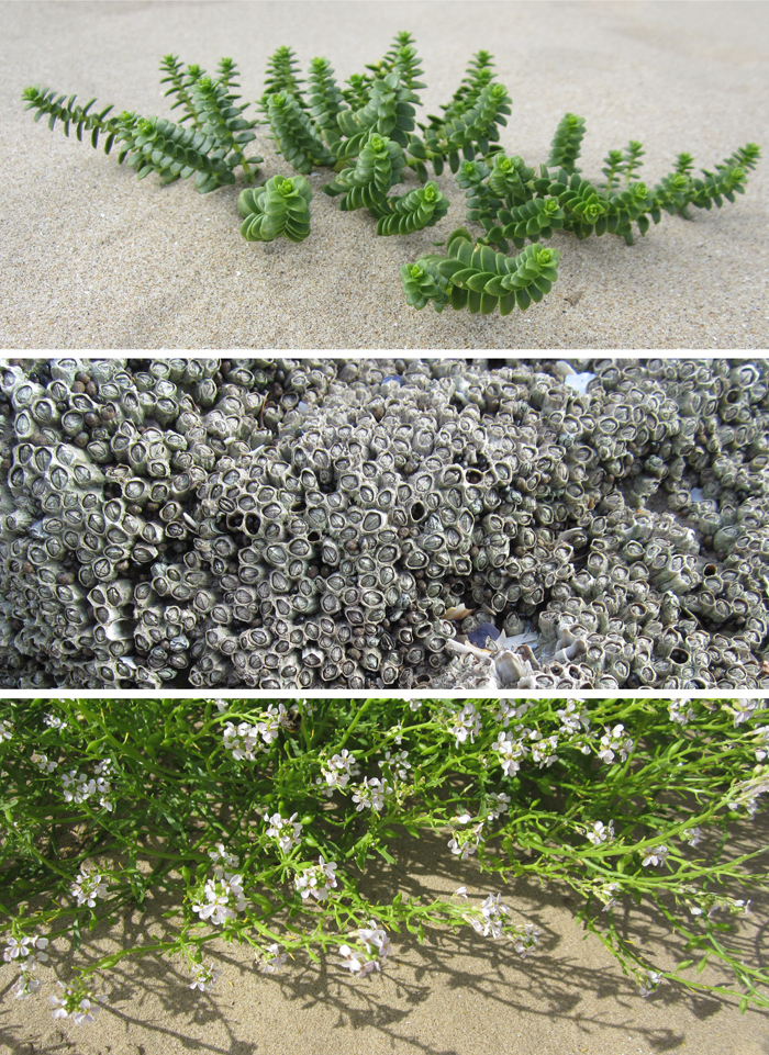
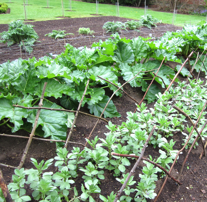
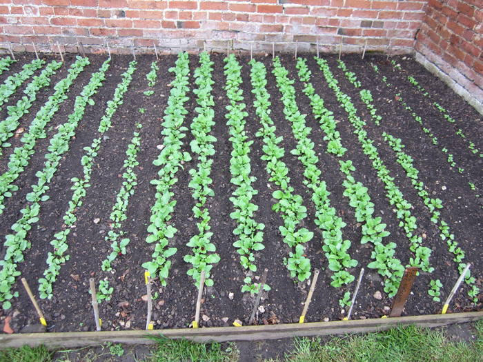
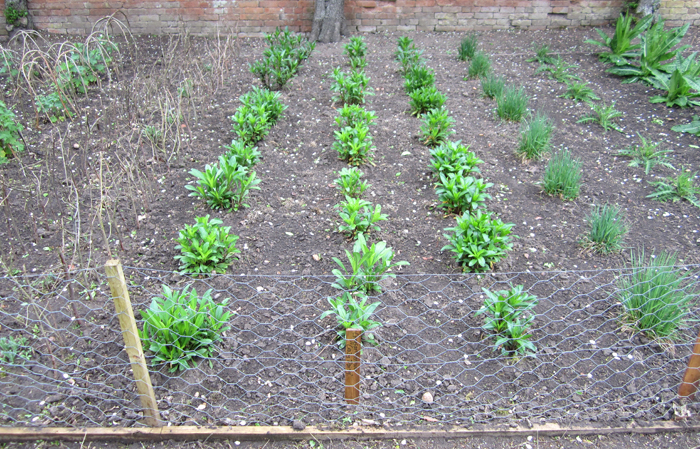
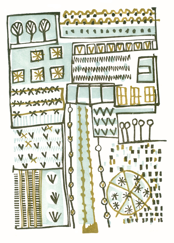
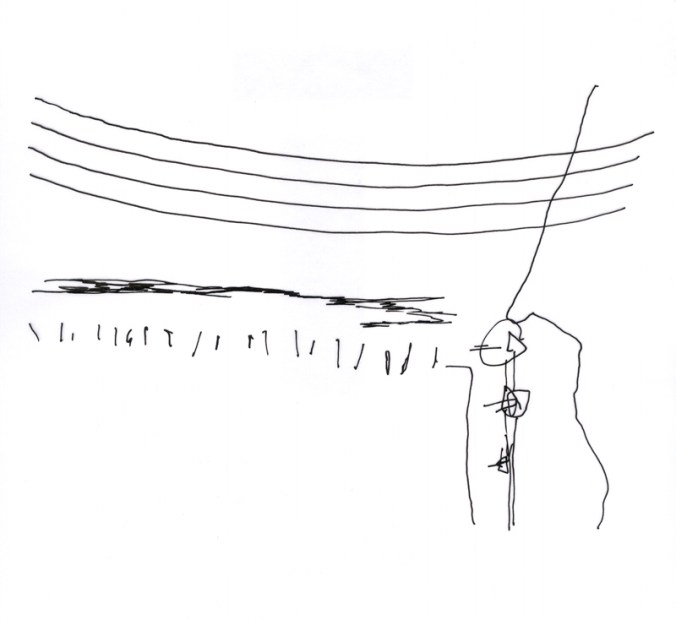
My ideas tend to belong as series of thoughts that I explore in a number of drawings over months, and sometimes years. I challenge myself to explore many ways to represent the same things, often resulting in simplified motifs, some would say scribbles. Drawings are often in rather utilitarian handmade sketchbooks that are not precious so there is no fear of the white blank page before I start. Sometime, in fact quite often, I draw while walking, and trying not to look conspicuous or weird as I track my way round a National Trust kitchen garden, almost creating a diagram, literally a planting plan as I go. Sometimes I make notes in my drawings, of colours, names of plants from the labels in the ground, or note references to research at a later date.

The titles of some of my designs are: xvo, xo, xxvv and these come from the shorthand I created in order to document gardens and allotments as I paced.


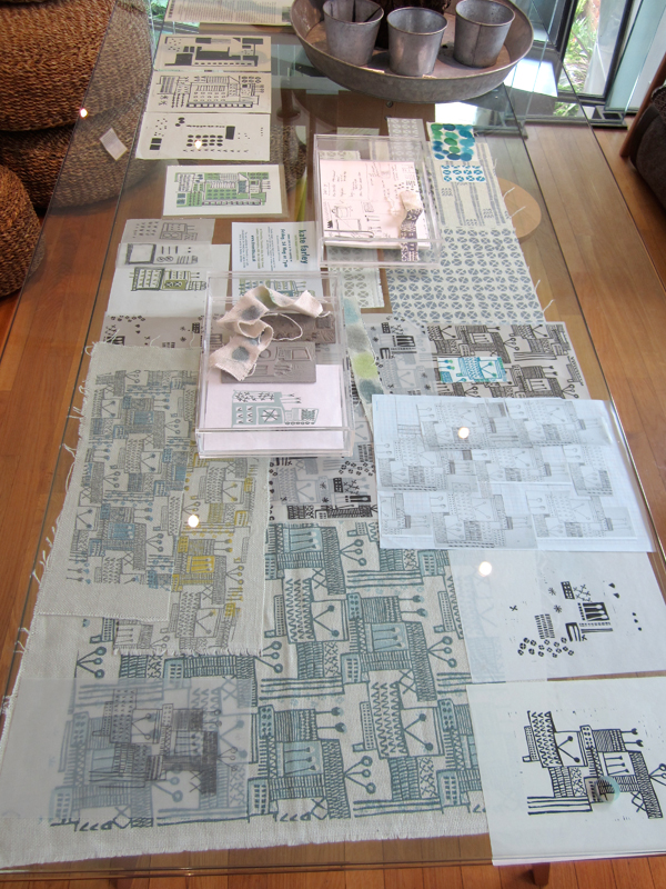
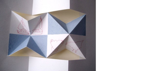
In the studio, and for sometime after I dwell, I study, I revisit the motifs, rhythms and compositions I gathered, I redraw, formalise and create new pieces, as one-off drawings in series to exhibit and sell. Some compositions lend themselves to self-contained lino prints or screenprints and so I spend time developing the designs, cutting the plates, and enjoying the process of editioning. I could never imagine getting bored (my edition sizes are small!) of lifting the paper from an inked block, each time to discover the image. So low-tech, yet engaging.

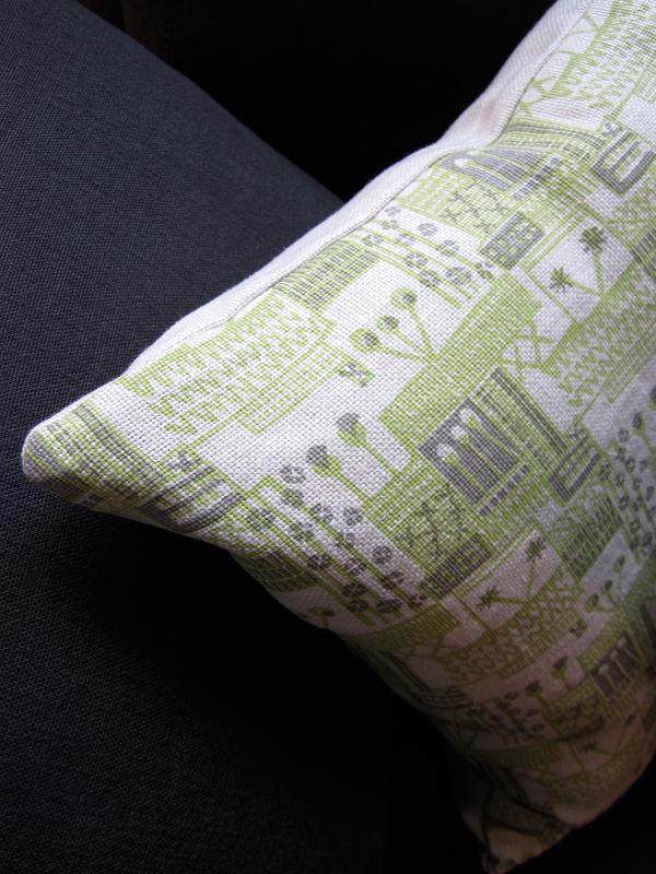
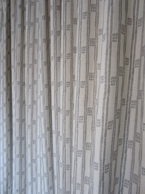
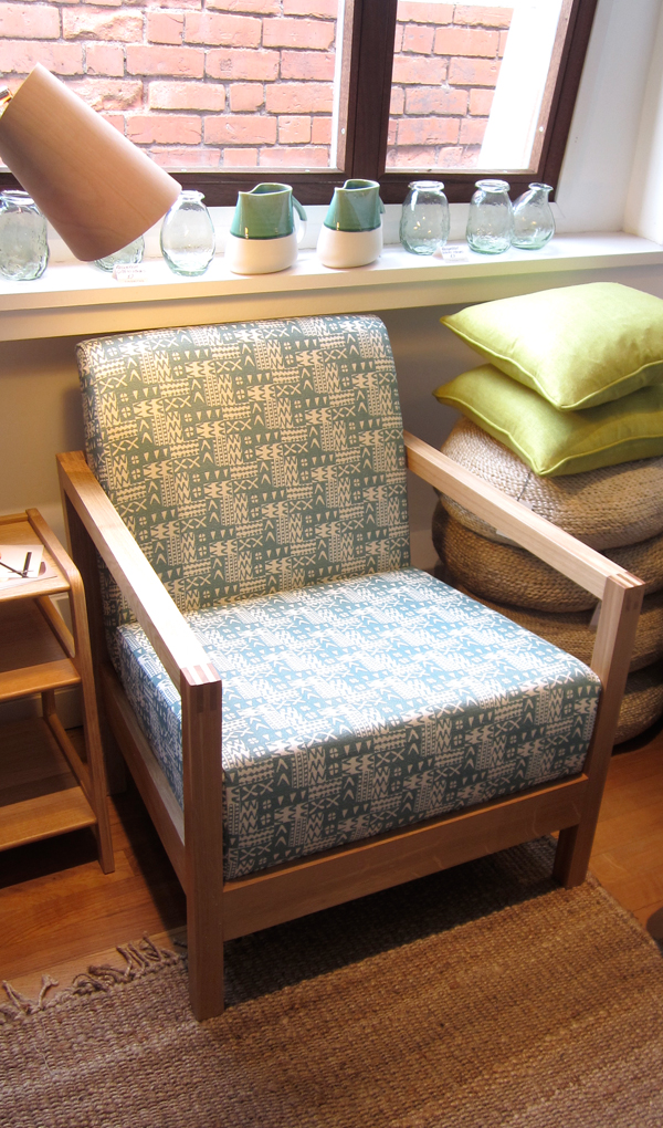
At this point I notice elements that can be scanned in and reworked in Photoshop or Illustrator software to create repeat designs and colourways for further potential – and this is how I created the design collection of ‘Plot to Plate’.

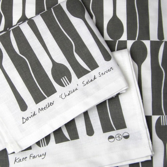
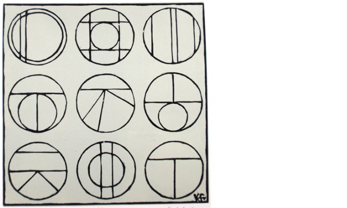
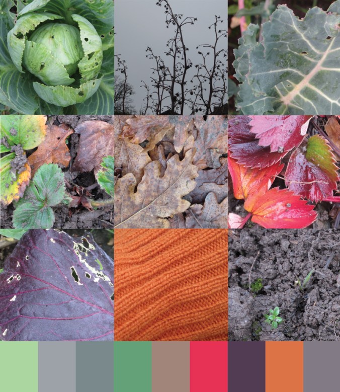
The Plot to Plate signature design of garden, kitchen and dining tools also came from my playing with the dog-tooth check as a classic rhythm, and my keen interest in telling a story as a visual narrative. Pattern can of course be pretty, but I enjoy the challenge of asking it to communicate something beyond itself. In this instance my drawings were made directly for this purpose and I translated them for screen.

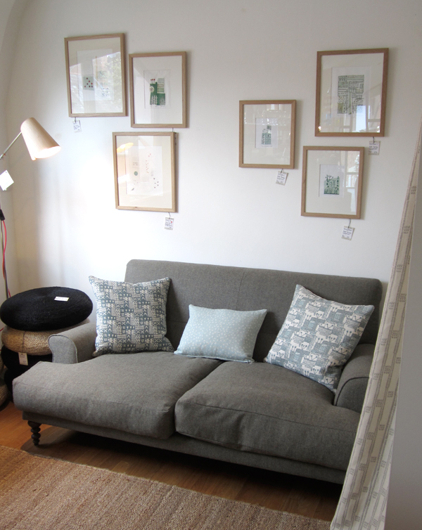
I hope the images explain the fun I have had, and the pride that I feel in this collection.


More examples of prints and drawings can be found on my website gallery pages

www.katefarley.co.uk

Save