pattern prints

I’ve been working behind the scenes, offline at least, making new prints, mainly lino prints, and developing repeat patterns with them. I’ve not wanted to show the progress until I’ve worked out where I’m going with them, but finally I’ve decided to go public, in a small way, revealing one of the new prints, hinting at the direction my new patterns are going in…

KateFarley_weave2

I’m exhibiting at TentLondon again in September so between now and then I’ll show more on instagram, Twitter, Facebook and here on my blog.

patterned walls and windows

They have been a while in the making, with lots of drawing, designing, discussions and sampling over the last ten months but my designs for Tektura Wallcoverings have been launched, and I’m delighted to be able to share them here. There are five in total so do visit the Tektura website to see them all. The images of the drawings are mine, the product shots are courtesy of Tektura.

I was working on the designs at the same time that I was developing my ‘construct’ collection and Tektura really liked the look and potential of those designs but I needed to build two distinct looks to avoid a conflict of interest. You will see similarities but I utilised different drawing tools and pattern systems to explore a variety of options in my markmaking. I created many sheets of paper full of inky motifs that eventually, after a lot of design development over several weeks both on paper and at the computer screen, became digital artwork to hand-over for production. At Tektura the colours and scale of pattern were sampled and marketing / sales information was created for the launch. One thing I find hard is naming the designs, and this was no exception. The thesaurus was called upon, as was Google to check existing references, and a colleague at BCU also contributed – thanks Clare! In the end the names pretty much describe the pattern. I won’t be a poet anytime soon!

KFarley_TekturaDrawings_blog

My past experiences of working on large interior / public art projects enabled me to work with the scale of the potential interior environments that Tektura provide for in my mind the whole time. These designs for Tektura can be customised and applied to wall and glass surfaces and so as I designed I maintained modular components that can be re-coloured or omitted for each client’s specifications. This is a wonder that digital production can provide; enabling bespoke solutions.

KFarley_point_tektura_blog

For me this project highlights key values in my practice: the importance of drawing and hands on image-making, knowledge and understanding of digital production and product context, and the value of working relationships and good communication. Each client I’ve had the pleasure of working with over the last fifteen years or more, whether it’s the design director, art officer or buyer can really shape the design process they are commissioning. From outlining the brief, to negotiating the design direction as well as final sign off, these things make a big difference to the designer, often working far beyond the hours intended in order to allow sufficient time to reflect on the design process and outcomes. Digital communication allows artwork and thoughts to be shared and discussed in minutes, and decisions can be made together.

The great thing about working with companies such as Formica and Tektura is that they are industry experts with fabulous products, trusted by the market. By working with this expertise I learn more and get to understand the design world from their standpoint. Who would have thought my patterns would be on such a stunning shiny surface as Glint (below)! Working with Tektura Wallcoverings has been a pleasure and I’m proud to show the designs off. Thanks to Angela and the team!

KFarley_splodgeTektura_Blog

building / constructing / space / paper

I’ve been working on a new series of works on paper that have evolved from paper cutouts and manipulations I first created over ten years ago. Back then I was experimenting with sculptural paper engineering that aimed to convey meaning through the structural content as well as the printed image. This may sound very much like ‘bookart’ talk, and it is really, as I moved from artists book maker to something different, including public artist and surface pattern designer, see below.

KFpaper_structure1000blog

It’s a strange thing when ideas that had seemed so disparate appear to come together to form a ‘whole’ different idea – and feels right. I’m sharing the first of many new prints evolving along these lines here.

As a result of my design collection ‘construct’ I launched last year I’ve explored the idea of woven threads and constructed surfaces. This led me to explore the space and environment of a page, a sheet of paper, and what could constitute the printed page. I used embossing to create a sense of space and depth, and slotted the ‘print’ to the paper as if floating. I am keeping the ink a neutral Payne’s grey so it doesn’t conflict or distract from the structure. I explored several different printed patterns too, and this, a lino print provided me with sufficient visual noise, but allows the embossing to be seen too.

KF_build_blog1000

So, what do you think? Does it make sense? I’m looking forward to exploring this further over the next few months.

How will these pieces link to the work I shall make in another ten years?

print progress

Recently I have been really busy with a variety of academic duties in Birmingham and further afield, taking me away from studio time, my freelance design practice, and of course blog writing. Also, in my teaching of Textile Design at Birmingham City University I have been leading a module of professional practice, assisting the students in learning about the life of a freelance designer. It’s definitely a double-edged sword, as the discussions between students and staff illustrated: It’s great to be your own boss, but you take all the blame when things don’t work out! You can get up when you want, but nobody pays you for just waking up!

The rhythm of freelance work is varied. Somehow it’s often the way of things that several deadlines coincide, and when you have a schedule to stick to, an urgent press request comes in. On the day you have time to make calls, those people are out of the office, and obviously you don’t get paid when you take a holiday. Yes there can be tough times, but I really like the variety of the weeks’ activities that freelancing gives me, certainly set in tandem with the academic life of very different demands. Each practice informs the other. Obviously there are freelance tasks I prefer and other ones I procrastinate over, lists are created, social media is checked and Radio 4 is listened too!

KFarley_knit1_blog.jpg

With so much to-ing and fro-ing on trains this last month or two and with several commercial projects on slow-cook I decided to give myself time to make, test and resolve some ideas that I have been exploring, with paper and print. The activity of printmaking is a fabulous discipline to work with. I love the excitement of planning a new print, and composing the plate, often taking me back to sketchbooks and previous ideas. The physical process of cutting the block can also be absorbing, and therapeutic and I have to decide the paper stock, the ink colour, and edition size too. It is important to maintain an experimental, inquiring practice and my prints and drawings are the evidence of ideas that have sustained my creative practice for the last twenty years. Between the commercial constraints of projects shaped by clients, costs and repeat patterns, printmaking can seem so free from limitations. This is why I make sure I keep printing – the creative sort, not just the invoices!

both prints featured here are available to buy, at £46 each unframed.

Knit 1, edition of 15, lino print, 9.5 x 9.5 cm print size

Meadow Grass, edition of 12, lino print, 9.5 x 9.5 cm print size

KFarley_meadowgrass_print_blog


printed mapping

Printed interpretations of landscape have been a challenge in my practice from the beginning, and really formed the backbone of my practice during my degree course in Printed Textiles at Leeds College of Art and Design in the 1990s. I explored various ways to represent the world around me, and although it might seem odd for those aware of my drawing, as there is little similarity now, I was really inspired by the Norwich School and painters such as Cotman and Crome. I saw the way they formed shapes of colours as elements in the landscape and I set about creating contemporary versions of Kirkstall Abbey in Leeds in term-time, and rural Norfolk in the holidays.

Over the years my focus has shifted from rural to urban, resulting in more geometric, grid-like patterns, fighting the urge to be illustrative. As Print Technician at Central Saint Martins I used to create mono-prints including embossed features, representing the Farringdon skyline and dominant buildings. I also explored experimental processes, such as liquid emulsion and photograms of drawings on acetate in the photographic darkroom. I had a fantastic year on a part-time printmaking course at the London College of Printing (now Communication) at Elephant & Castle, and despite a broken elbow I produced many prints including lithographs, screen prints, collagraphs, etchings and lino prints. The expertise of the staff, and the discipline of the day a week of technical experimentation was a brilliant thing.

KFarley_landscapePRINTSweb

The images above include some of the many ways I have printed the landscapes I’ve experienced, and show some of the ways that I play with line, shape, texture and colour. Those of you who have seen my drawing evolve will probably recognise a preferred line quality, or mark I favour, the economy of mark, and visual rhythms. I am also interested in perspective, elevations and mapping interpretations. I continue to explore landscape in my ongoing sketchbooks, as part of commissions, but also because I simply want to draw and capture the flat fields, the lines of fence posts, and sweeping hills interrupted by a barn.

KFarley_landscapePRINTSbooksweb

I’ve also created many editions of bookworks over the years, and although I’ve written about them here before, I thought I’d include the ones predominantly featuring printed journeys. I love the way the sequence of pages, and folds of paper creates narratives through a landscape. Again there is maybe a familiarity of line quality, and drawn shape, as drawings, prints and books are often developed together, as part of the same creative process. Working summers in France, familiar territory in London and train journeys are regular inspiration for the books shown here. It is a challenge to design the book to work with a particular sized printing plate or sheet size of paper, considering grain direction and readability, but I enjoy the problem solving. Drawing and image has to work with structural content.

Often what is occupying my time in terms of design collections actually grow from ideas explored in those pages many years before. I like to see my relationship with landscape as the constant in the variety of what I do. Having spent some days in the country during the recent holiday I have refuelled that desire to draw horizons again.In hearing of the death of Ellsworth Kelly I am reminded of how instrumental he was at showing me how to see pattern in the environment we live in. I owe the excitement of the journey to many artists who themselves have worked hard to capture the places they know… Patrick Heron, Ben Nicholson, Eduardo Chillida, Eric Ravilious, to name a few.

Since creating these works on paper I show here (some over fifteen years old) I’ve launched ‘Plot to Plate’ and ‘Construct’, but they wouldn’t be here without the many sheets of paper before them. Who knows what else is in store in the next few years…

print pattern show up and down… at Tent London

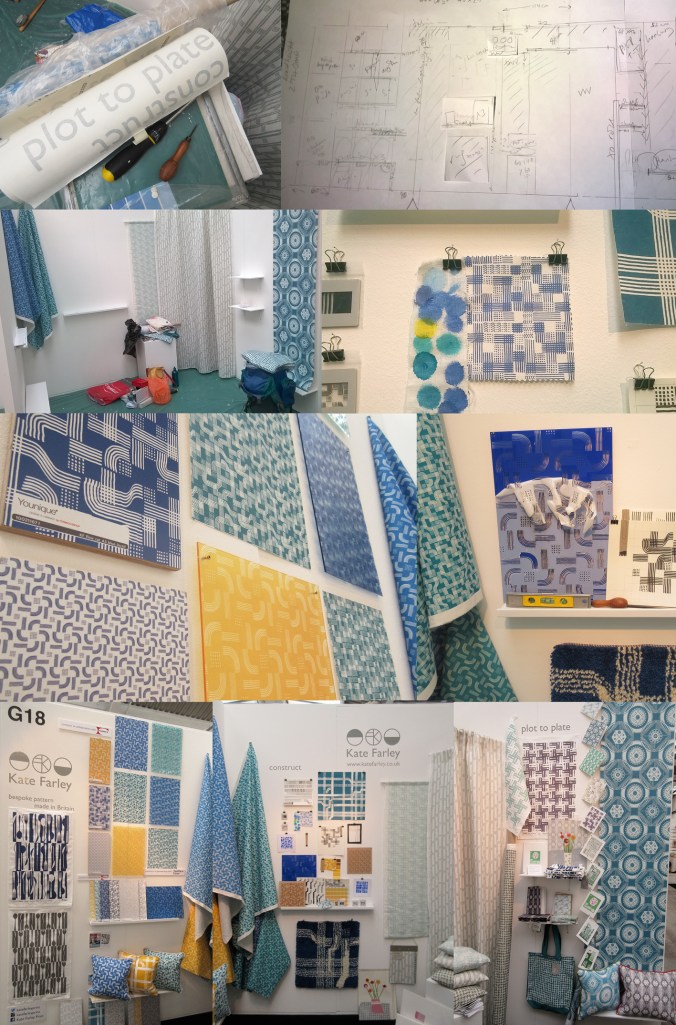
After months of planning, designing, making, printing, promoting and talking about the show… the time finally came… TENT LONDON! With very heavy bags, a display diagram, carefully planned tool kits, shelves, fabrics rolled, and so much more we set off to Brick Lane, London to put the show up. Our lives with small children are full of logistics, and this day tested us! Trains, tardy paint, luggage & childcare kept us busy and in relay between London and Birmingham so the show could take shape. By the end of the first day the majority of display items were on the right walls, fixed securely, and I headed home to the midlands.

The next day…. I set off again with ANOTHER heavy bag (these things don’t always get mentioned in trade show prep talks!) and completed the stand dressing, including the mood board for ‘construct’. It always takes longer than you think… I attached the vinyl, tidied up and left for a good nights sleep before the LONG first day of 10am – 11pm!

KF_tentstand1_G18_15web

The first day of a launch / show is always exiting and scary. Will people understand the new work, and will they like it? This particular morning was not helped by being stuck in a lift across town with my dear sister and only what sounded like a fax machine to talk to. Eventually after 20 minutes we were told the lift engineer couldn’t get the door open, “you are in a precarious position”!!! I’m not sure what customer care training he had received about talking to distressed people stuck in a lift. For anyone in this job, do not use the word ‘precarious’! We got out after nearly half an hour…

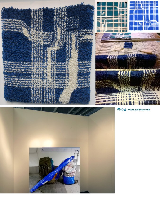
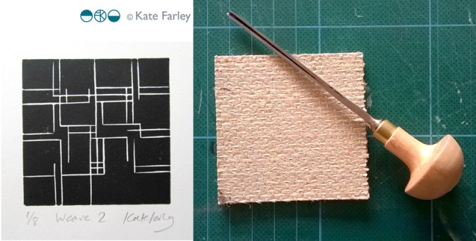
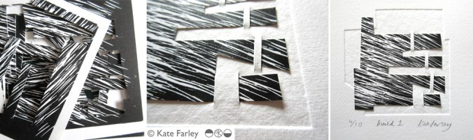
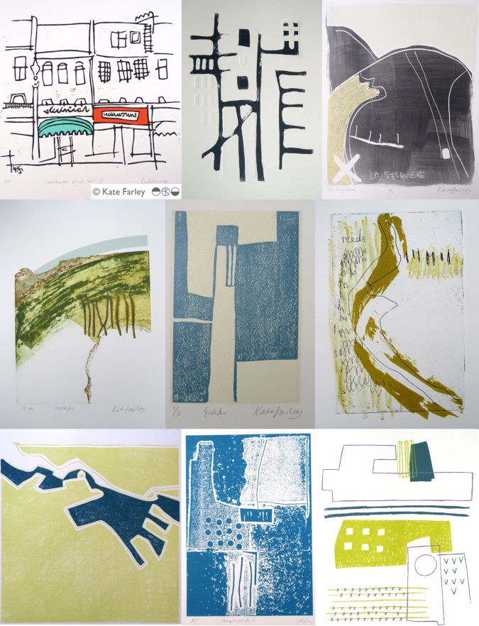
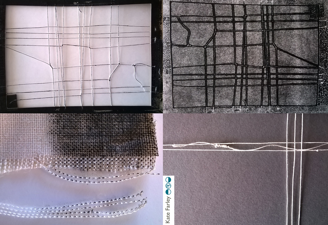
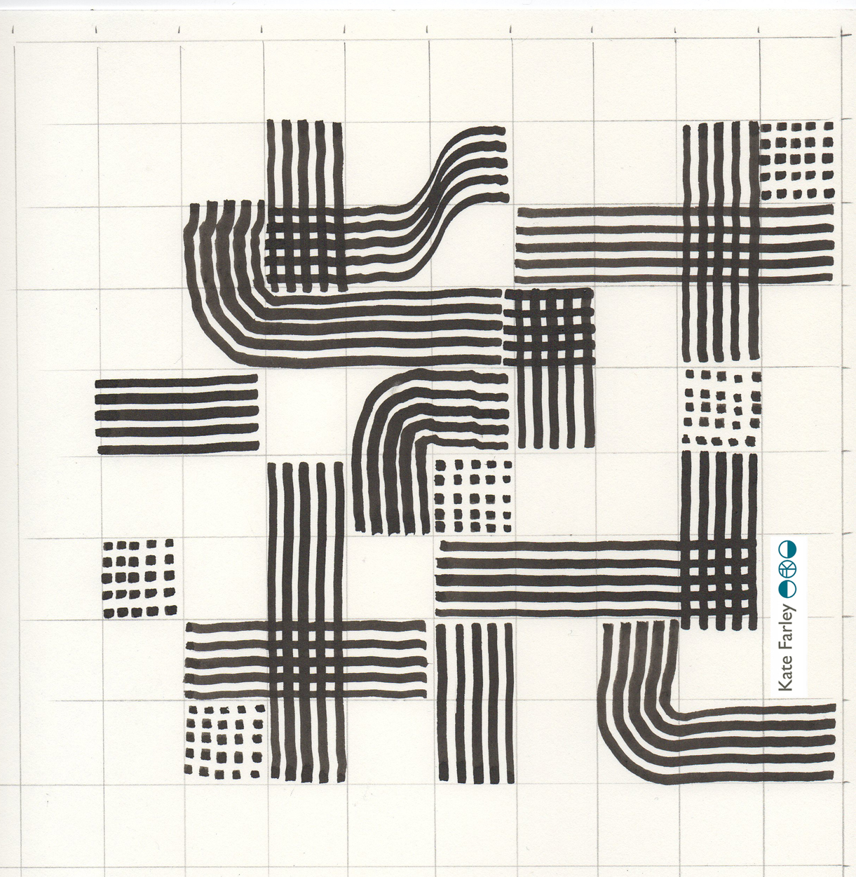
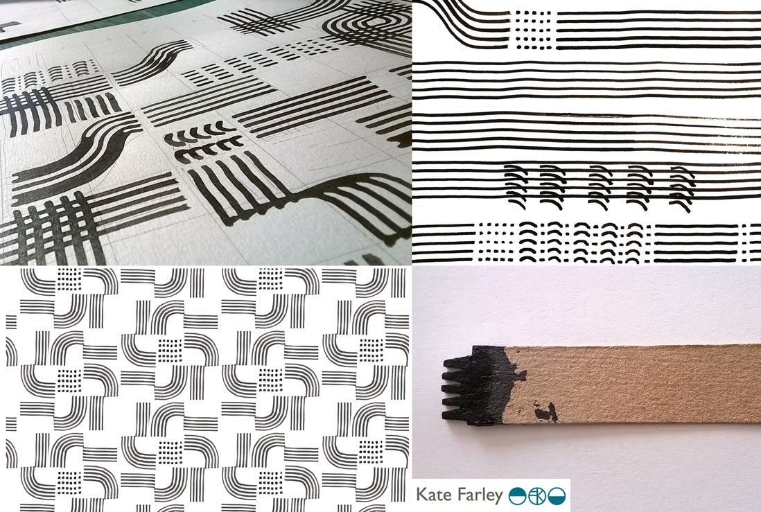
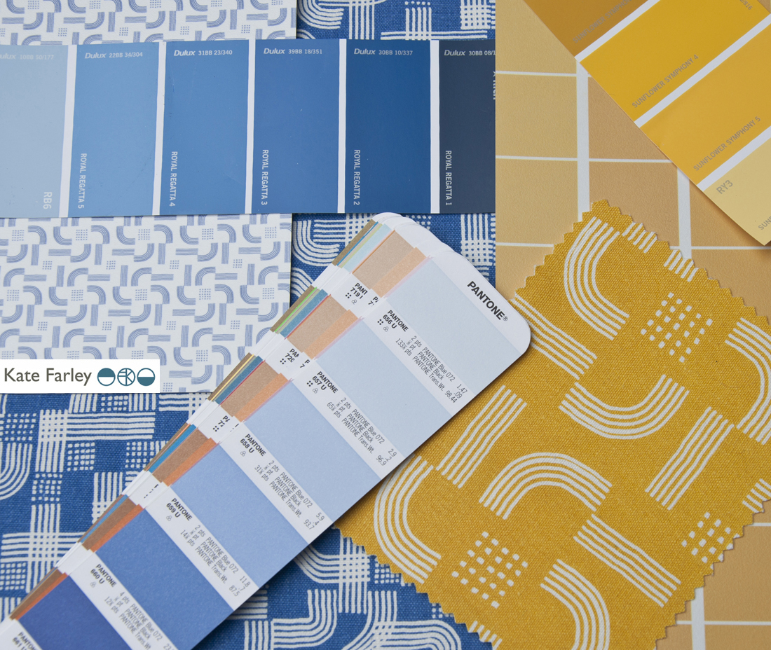
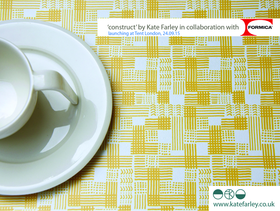
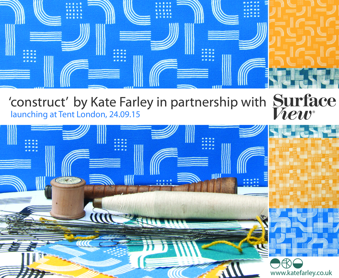
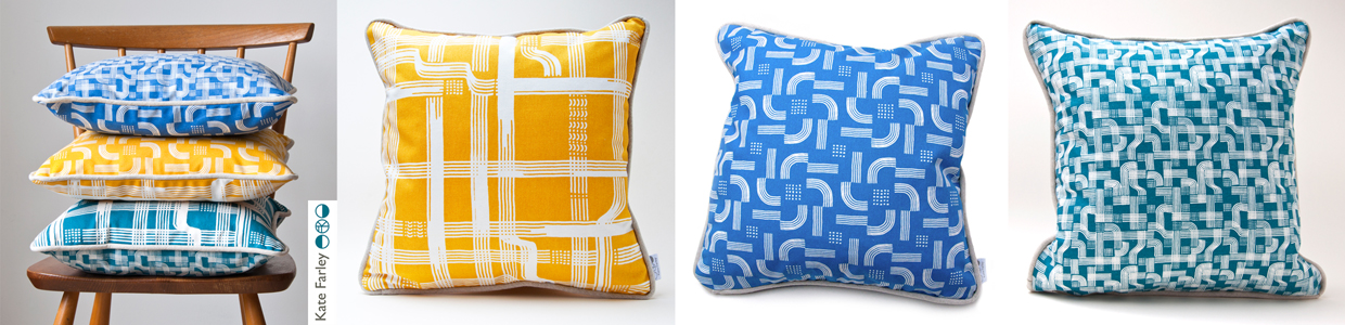
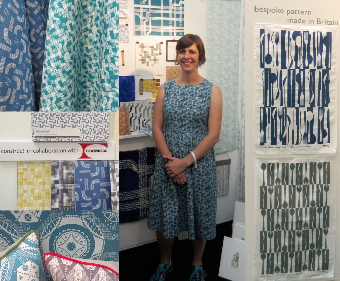
For the rest of the day I felt half an hour behind, but I launched my new collection with free limited edition screen prints which appeared to be gladly received by visitors. The collaboration with Formica Group was a really popular element to my new collection, and the mood board featuring my drawing tools as preliminary artwork inspired lots of really interesting conversations. Being a solo designer can be a very lonely, self-reflective existence so it’s great to get feedback from those you design the work for. Architects, interior designers, specifiers, stylists, press, retailers and many more visitors invested time to talk about all elements of my work, and for that I’m grateful. ‘Plot to Plate’ was launched in 2012 and has evolved over time to be a ready to buy interior and gift collection but ‘construct’ works differently. Only the cushions are available for immediate sale, and the rest is printed to order to allow for the distinctive element of the collection, the bespoke production. By working with Formica Group and Surface View my designs have been printed on a range of surfaces for the residential and contract markets.

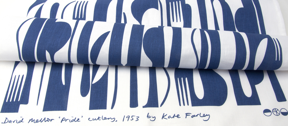
When designing the stand I had to consider what I wanted to communicate and who I wanted to relate to. Over the years I’ve refined the ideas of what I want to do and the contexts in which I thrive creatively and this design show gave me the opportunity to put that understanding across. It was important to explain that I have lots of experience of creating bespoke pattern for clients and having just designed a new pattern for David Mellor celebrating the ‘Pride’ cutlery this was a great thing to show. It was really well received and orders have already been dispatched!

KF_tentstand2_G18_15web

It is very hard work minding a stand of your own, by yourself for several days. Every show I’ve done has been helped by the wonderful community of fellow stand holders nearby and this year at Tent London was no different. I met kind and sharing exhibitors I hope to stay in touch with, and I will certainly watch and support their practices on social media with interest. Thanks to you!

I’ve written this previously too, but as ever, I was visited by past students of mine from both my CSM teaching days as well as BCU Textile Design graduates, some visiting to inform their practices, others in their roles in industry. It makes me proud! I am also pretty good at spotting students and as long as they don’t just grab the postcards I support their efforts and questions as they are being proactive and engaging with the industry. London Design Festival offers something for any creative so it’s good to support the next generation.

Last year I made a dress using one of my new prints, and I did the same this year, much to the delight of the Tent London ladies! It was a great way to demonstrate the flexibility of my print designs, and a good way to make conversations; it became my uniform.

I also won a design competition for tote bags at the show to be printed with a ‘construct’ placement print, so some lucky people have a very limited edition screen printed bag!

The end of the show has mixed blessings. After a long few days and months of preparation it’s great to have achieved a strong show – many kind people commented on how good my stand looked, but it also means the adventure is over, and it’s sad taking the show down, packing it up and saying farewells. Even in a few days routines are created. We struggled back on the trains with what we measured later as being 59Kgs of exhibition and assorted support luggage between two of us, ready to follow up the contacts made…. and to sit down!

So what have I learned?

  • I learned that I really am making the work that I want to make, and did manage to communicate that with the right people.
  • I’m really proud of both collections, and am delighted at the reception that ‘construct’ received
  • and latch hook rug making! I learned how to make a rug and now know why they cost so much… but really enjoyed making it… with British wool!
  • I learned how important it is to take risks, to put work out there to be judged… to keep learning

Thanks to all those involved: family helpers, the Tent team, Formica Group, Surface View, fellow exhibitors and for everyone who came to visit.

KF_tentstand3a_G18_15web

Launching the pattern collection: ‘construct’

I’ve always started designing by picking up some sort of drawing tool, and exploring ideas that will have been developing in my head for some time. Concepts of pattern and purpose as well as communicating an idea using pattern is what really inspires me, this is no different for ‘construct’. A stunning image of lace in a book I was looking at while researching for one of my textile lectures on historical design caught my eye and an idea joined with other ideas of print looking like weave, as many people commented that my Plot to Plate VVV design did (left hand side of first image), when I was at Tent London in 2014. The seeds were sown.

KateFarley_startingLine

I’ve never hidden my loathing for faux surface / material effect pattern such as printed wood effect flooring. Why do we have to lie, why can’t there be another stunning and suitable design alternative?! With this is mind I’ve played with the idea of taking textiles as a starting point for this collection with the intention of subversively adding textile-derived pattern to other surfaces but in an evocative statement rather than a digital print of textiles. This is not a collection that copies textiles, rather that textiles suggests a way to draw; provides a set of rules to begin playing with. The title ‘construct’ is a reference to constructed textiles such as weave, knit and lace but also refers to the putting together of a new way of thinking about pattern for surface, building a collection that has been designed to cross material specifications and provide bespoke solutions.

Having been working on my Plot to Plate collection and related prints for the last five years it was a big challenge to start from scratch and move away from the safety of a kitchen garden, but I was also excited about the challenge. I’d been working on some other pattern commissions and revisited drawing processes that had got me thinking. I didn’t rush to get somewhere; I designated studio days to play with thread, ink and paper. I created a sketchbook of so many ideas and directions but eventually I began to formalise ideas and work out which direction felt right for the collection. Some of the other directions have already been moved on to commercial projects, and the others I’ll revisit over the years as and when.

construct_blog_p1

I usually sample patterns in black and white so I’m not swayed by colour rather than the success of the pattern. Having said that I was really adamant that blue was going to feature. Right from the beginning I was thinking of the strong Mediterranean blue of Greek churches, and the Blue Nude series by Matisse. Strong colour has been making a presence in interiors for a while, influenced by key exhibitions and trends. I knew I wanted to stay well away from Memphis colour palette and the reworking of 1980s colours. Sonia Delaunay has also inspired many designers and retailers thanks to the striking show at Tate Modern. I’m aware of trends, I have to be as an academic who teaches textile design, but I’ve never been inspired to follow them. I have my own creative path I’m on and I also would like my patterns to exist well beyond a season or two. Having said that one has to be aware of what drives buyers in retail to spend their money and for some it is likely to be informed by trends.

As those of you who have read more than this post might know, I like cutlery, and I can’t help laugh that the drawing tool that I’ve come to love is a sort of handmade fork! I’ve made many for this collection and they are so simple and inexpensive but all made by me to create exactly the right sized marks and the right sort of line. I’ve definitely got better at them. Weeks of testing many design structures and resulting rhythms left me with pages of patterns and the need to edit. Further weeks and I decided to test some screen printing on to fabric. Although I knew this collection was going to explore alternative surfaces I wanted it to work on fabric too. The weave of some of the fabrics was too dominant, and the scale of some of the patterns was less successful. Really valuable sampling!

construct_drawinggrid_101_blog

KF Construct_blog_p2

I’d contacted and discussed collaborations with choice companies relating to my ambitions for the collection and it was very exciting to sample on a range of substrates. I really wanted to embrace the ‘bespoke’ capacity that several manufacturers in Britain offer as a way to provide interior designers and architects for example, a choice for their clients. Choosing from off-the-shelf surfaces is not always exciting – there are exceptions! I wanted this to be a collection of pattern in anticipation of the product. Ten years ago I was a winner in the Formica ‘design a laminate’ competition and it felt good to be in discussions with a company with such a strong heritage for pattern. Surface View also demonstrate a contemporary approach to wallcoverings and surface pattern, enabling me to discuss my intentions for the collection and the concept of bespoke production and it being met by expertise and clarity. Having carried out several public art commissions over the years I’ve become used to discussing colour systems and file types, tweaking of production elements to manage the different industry requirements. It’s good to have that experience behind me.

KFarley_construct_colour2_150PrintPrint

So here I am as Tent London is underway and I am extremely proud of the patterns that have made it to the final collection. There are repeat designs, small and larger scaled rhythms and placement patterns featured across the collection including a particular Tent London tote bag competition…. There are hand printed cushions ready for shop shelves or customers’ sofas and contemporary bespoke pattern for those wanting a graphic pattern rather than printed granite in their lives. The patterns can be licensed and collaborations can be discussed. Alongside all of this in order to fully convey the concept of the collection I’ve learned the skill of latch-hook rug making and committed many hours to mastering the skill of constructing pattern in yarn – not natural for me as a printer! I’ve sampled laser cutting and etching to varying degrees of success, I’ve made a dress for the show featuring ‘flow’ AND I’ve screen printed two limited editions of prints for launch day.

I’m interested to find out how it is received after so many solo months of nurturing, worrying and wondering. It’s time to let the pattern do the communicating…. do let me know what you think!

KateFarley_construct_cushions

pride in the pattern of Pride cutlery

Two years ago I produced a bespoke pattern design for David Mellor Design celebrating the ‘Chelsea‘ salad servers that Creative Director Corin Mellor, (David’s son) had designed. The pattern was screen printed on to tea towels, being a highly appropriate product for the cutlery, and they continue to sell very well through the David Mellor shops and their online store. I took inspiration from the Hathersage factory and the production methods used for the making of the cutlery pieces. I like the fact that Corin sees and appreciates the relevance of the design to his company. Although I can create pattern for pattern’s sake, I am really interested in pattern that belongs to particular brands, to communicate a belonging, of distinctiveness.

This summer I was delighted to be contacted again by Corin as the buying team were keen to add a new pattern. Starting any new commission is exciting as the conversations about the intentions of the artwork, the concepts that need building on, the production methods, colour and material choices, expectations and of course… deadlines!

With all of that taken care of I received a beautiful box of cutlery to draw from. Corin had decided he wanted to celebrate his father’s first cutlery, Pride, designed in 1953. It is so elegant, beautiful to hold, and a joy to draw from let alone to eat from! I worked the same way I had done before, developing sketches and informal compositions, working up motifs and rhythms in a sketchbook first before generating final drawings and paper cut outs to scan to digital artwork.

KF_drawingMELLOR_100dpi

I work across a number of software packages depending on what is required, and always bearing in mind the final artwork requirements for production. It matters right from the beginning whether the production method is traditional printing or digital as I will design accordingly, limiting numbers of colours in the design if required, and using colour in the most appropriate way. This summer with several design projects on the go I’ve worked with Pantone references, RAL, NCS, pigment ink swatches and CMYK values. For this project we used British Standard colour relating it to other products that are stocked by David Mellor Design but I had to convert it to modern day language!

Having completed a few different designs I sent them through to Corin and his buying team and was of course really pleased when they got back to me with the same choice as me. I’ve learned never to send anything I’m not quite happy with or proud of, as that will be the one the buyer picks! Sampling and production were the next steps as well as designing the new swing tag to suit both the “Chelsea’ and the Pride tea towels. I screen print these in my studio on to beautiful G.F. Smith paper.

I’ve worked with the same fabulous British company to screen print textile products several times before and it’s always a delight to take a further project to production with them. They understand that it’s not that I’m fussy, but rather ‘particular’ about details, and we work together well. Signing off proofs, forwarding woven designer logo tags to be sewn in and waiting for the order delivery sees the weeks go past, and very soon there will be two patterns of cutlery.

KFarley_mellorPride_tt_roll_150dpi

I’m a cutlery fan any day of the week, and this really has been a fabulous commission to work on. To create a pattern for a client where the design relates to the product it is destined for, and its job is to visually communicate the heritage, culture and ethos of the company is a very fine challenge to take on. Proud of Pride!

Keep an eye out for ‘Pride’ in the David Mellor shops next month…

teaching for them and for us

I’ve combined my academic career with my art and design practice since the late 1990s and I’ve felt that each informs the other. Some weeks I’ve wished there were more hours for one than the other, but the two occupations are, for me, valuable and complementary to each other.

My art and design practice is one of learning, journeying and discovering new ways to look, to draw, to interpret the world about me in a visual, drawn or printed language. I feel as if I’m on a really long adventure that won’t stop until I get put in a box. Each commission, or self-established project offers a small experience that builds the bigger lesson that takes me further along that creative path to who knows where. Facilitating the discovery of this excitement in creative exploration is what drives me to teach students in Higher Education.

I have recently visited the excellent Peter Green exhibition: Sixty years of printmaking, at Mascalls Gallery, Kent (the exhibition has just finished I’m afraid), which got me thinking…  It was made clear in the design and content of the show (St. Judes and Emma Mason Gallery with Mascalls Gallery) that Peter combined his printmaking career with an academic one, and a high achieving one at that.

Printmaking is such a physical experience, and although simple in principle, the intricacies of a process and resulting prints can be hard earned. The exhibition of Peter Green’s work really demonstrated the pleasure of investigation, of material, colour and surface quality, not as passing ideas, but as a sustained dialogue between practitioner and process, and between ink and paper. The exhibition showed the drawings, the printing plates, the tools, the sampling and final resolutions. Peter’s vast experience and significant creative journey was evident; and through the exhibition I felt as if he is teaching us to learn from him, not for the technique, but for the commitment and value of doing and pursuing something. I believe that this is fundamental in teaching, whether in formal education or not.

Simon_Lewin_56

It was interesting to read in the catalogue that accompanies the exhibition that he said, “knowledge is about common ownership […] we should learn from each other.” This is how I feel about my relationship with education. We should not be masters to preach the skills and experience, but instead we could share in the experience of learning together. That’s not to deny that someone needs the skills and experience in the first place, but the attitude of someone like Peter who clearly enjoys the creative journey will inspire those a step or two behind him. I think it’s important that those who teach are also those who do.

Simon_Lewin_02

I strongly believe that there are no short cuts, or right answers along the path of art and design. There is no ‘one’ way of doing things. Sadly, so many students come through school thinking they are looking for the tick in the box, the correct result. We try at degree level study to nurture in them the understanding that you learn far more by investigating, questioning and journeying, rather than heading straight for one destination. This is again echoed in Peter’s investigative approach to printmaking – the finding out along the way is as important as the final state.

I read in the catalogue that Peter had moved away from wood engraving as a process as it required a more calculated journey and pre-determined images. I think I work like this too, looking to uncover the solution rather than to execute the obvious, not with wood but as a designer. This makes me think of new or less experienced teachers over-planning and worrying about the outcome of a session; what the students will achieve at the end, as a tangible result. Those with more experience and confidence in their teaching and the learning experience can take risks with that journey of learning and therefore participate rather than dictate. This sounds comparative to Peter’s more recent prints that evolve over time without the planning, but with an open-ended investigation. The exhibition celebrates sixty years of Peter printmaking [today in collaboration with wife Linda], so with such a busy and extensive journey the prints are an exciting archive of process and investigation, with common themes, colour relationships and familiar motifs in evidence during this time, as well as textile designs more recently in collaboration with St. Judes.

No doubt those of us who live with creative practices do so for many reasons, and those of us who teach will each tell of reasons why we do too. The combination of a creative practice and a teaching role is, in my mind, a really good combination, a two-sided relationship, where hopefully the give and the take work themselves out for the benefit of all! Thanks to Peter for reminding me of that good partnership as we embark on another academic year…

Simon_Lewin_36

Thanks to Simon Lewin of St. Judes for permission and access to the images of Peter Green’s prints:

top: Welsh Landscape No.1 1960

middle: Red Night 1963

bottom: Evening Estuary 2013

Useful links:

http://www.mascallsgallery.org

http://www.stjudesprints.co.uk

http://www.emmamason.co.uk

floral inspiration for textile patterns

One of the reasons I love to teach students drawing for textile design is the journey of enlightenment when introducing someone to the world of not only looking, but also of seeing. There are many ways to see when drawing and I’m really interested in the journey from reality to abstraction, whether its a state of mind, a way of transforming or whether it’s a methodical process applied to something in order to arrive at a motif for pattern.

My drawing process has evolved over years of practice but the way that I see is not so different to two decades ago. I remember reading the book ‘Drawing with the Right Side of your Brain’ by Betty Edwards and realising that I already did that and it all made sense. I enjoy playing with perspective, elevation, mapping of whatever it is I’m drawing, whether it’s a landscape or twig. Turning the three-dimensional thing in front of my eyes in to a two-dimensional drawing is always exciting, and challenging, but that’s half the fun. I think the process of printmaking that I further translate my drawings to really suit the clarity of motif dissection, separating colours or specific details on separate blocks or screens for printing for either a limited edition print or commercial textile design.

Each year the pear blossom at the allotment arrives and each year I’m reminded of how perfect they are in all ways. The beautiful petals and the bits I don’t know the names of, all there, waiting to be celebrated in drawing. No doubt Charles Rennie Mackintosh would have made an exquisite watercolour and graphite study. The flowers also remind me of drawings and prints I have made in the past, and not only of blossom, but of flowers that I make diagrammatic in a way to understand and explain the ingredients of the flower. When I discovered the work of Gwen White, and particularly the book ‘A World of Pattern’ I was excited to see someone else communicating what I see and how I translate form to pattern. This method doesn’t suite everybody and it would be a dull world if we all made drawings that looked the same, but every now and then it’s nice to know that my creative brain works like someone else’s brain and that my eyes see what others have seen before me.

KFarley_drawing_blossom_blog

Pear blossom, photograph, Kate Farley

‘Hanbury’ wallpaper, Kate Farley

Passiflora, lino print, Kate Farley

illustrations from Gwen White’s ‘A World of Pattern’ (RH column)