It’s been a while since posting here, but I’ve been busy enjoying summer adventures and developing exciting pattern research alongside getting the academic year underway. I’ve also moved in to a new studio space so I’ll share that in due course.
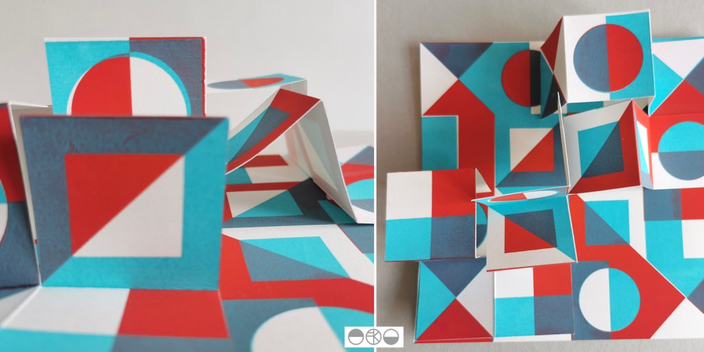
My pattern research focusing on the repeat print block and how it can be used to generate multiple variations to evolve pattern options continues, with sampling with screen and lino printing. I thought I’d share the more structural outcomes here, linking back to my book art practice. I enjoy discovering links that connect the broader practice I’ve developed over the last twenty five years.
As I folded the sheets of printed pattern the forms appeared to suggest a built environment so I explored the idea a little in how I photographed the pieces. Testing scale and contexts is a vital part in developing a pattern, and I enjoy the possibilities.
I’ve been keen to get back to designing and printing having spent my practice time writing and developing the book for publication over the last few years. I’ve been testing ideas of pattern evolution and pattern construction for some time in a limited way, specifically looking at pattern structure evolution through drawing investigations, but the ideas at the heart of this investigation have themselves evolved over the last couple of years.
With more time and fresh energy I’ve defined a new project brief and research rationale, and I’m excited to have got off to a good start. I’m looking at repeat tiles and construction of pattern formations, so cut shapes and sketches were an obvious way in for idea development. I’m trying not to be too precious with outcomes at this stage, so I’m trusting the process.
I’ve started by testing ideas with geometric shapes as subject matter to keep the aesthetic clean and graphic, focusing on the laying down of colour blocks. I’ve started by working up some ideas for screen printing but anticipate many more drawings, maybe lino prints and certainly digital work will be created over time too. The colour palette will certainly change, but with an exhibition I’m making work for at the same time dictating pieces to be black and one other colour I’ve gone with black and green.
I don’t want to give too much away at this stage, but look forward to discovering the potential over the next few months.
Drawing has always been an important element of my design practice. It gives me time to refocus, to get away from everything else, to appreciate the beauty in things and keeps my eyes and hand working together in my lifelong investigation of how I look and how I record what I see.
The flowers drawn here were some of the last from the summer borders, consisting of dahlias, sunflowers, hollyhocks and verbena, captured quickly in pen, while I sat by the window, enjoying the warmth of the sun and the shadows that the flowers created while I drew.
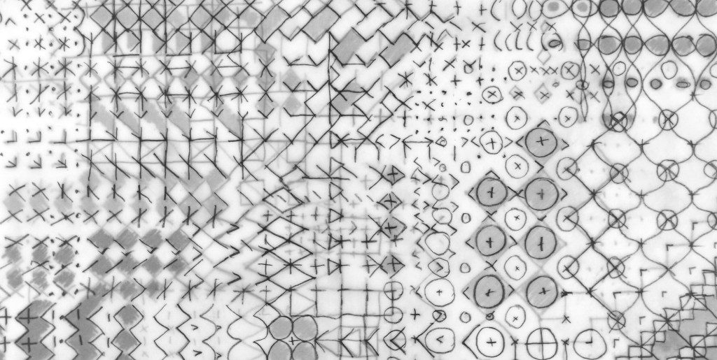
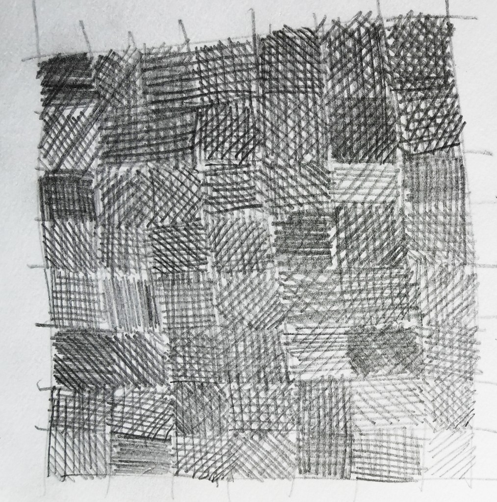
My ongoing research practice of drawing and design regularly explores pattern structures within the family of geometrics. I enjoy testing motifs and rhythms that belong to traditional compositions, and deconstruct the scaffolding to look for new iterations.
In this recent work I am looking to the concept of themes and variations in music to drive the visual investigation. Repeat doesn’t feature, but it’s certainly a consideration for the future.
layers of tracing paper with graphite drawing
With a short break between academic years, and the book in production I hope to find some time to take this project forward over the coming few weeks.
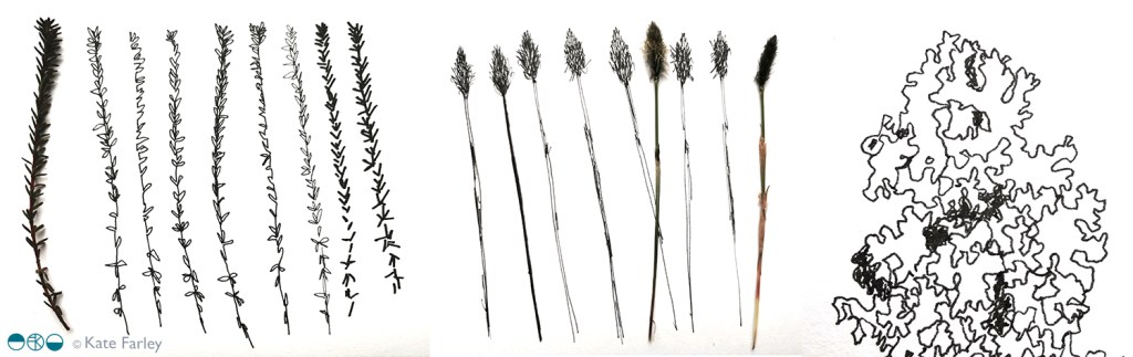
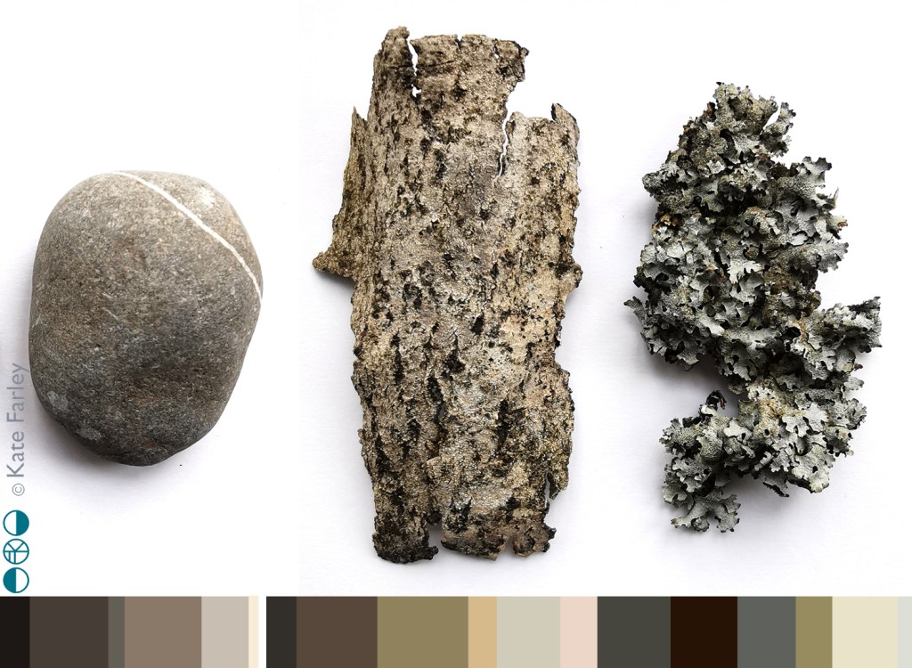
This holiday time has provided an opportunity to go to new places, see new things and return to the sketchbook just for fun. A week at Ilkley Moor enabled lots of time for walking and seeking out inspiration from the natural world, with distinct differences to the landscape I’m used to day to day. Up hill and down dale saw me amongst mosses and lichens, pebbles and boulders, grouse, larch trees, heathers and bogs … and even a fragment of pottery.
Rucksack pockets were filled with samples of treasure ready to investigate later. The process of drawing enables me to get to know an object, and by making several studies of each item I enjoy developing a stylised representation. I hope never to tire of the getting-to-know-you drawing process I have practised for thirty years.
By looking closely and seeing through drawing I can work out the essential elements of surface, form and texture to record, but also I love to play with the appearance of elevation and structure of three dimensional objects, such as the pebbles, to explore their new form as they appear on the page, as flat motifs.
The textures and colours of the items I gathered provide macro evidence of the vast landscape I walked through and connected with. As this was springtime there were pockets of fresh green bursting through winter foliage, demonstrating the natural cycle awakes again. The geology of Yorkshire provided variety in coloured greys and texture under hand and foot as we bouldered, scrambled and hiked, notable in contrast to the soft wet bogs and spongy moss beds amongst the heather.
Without going all John Ruskin about it, the natural world really is amazing, and full of inspiration for anyone inclined to notice. Anyway, back to the rather flatter fields of Norfolk …
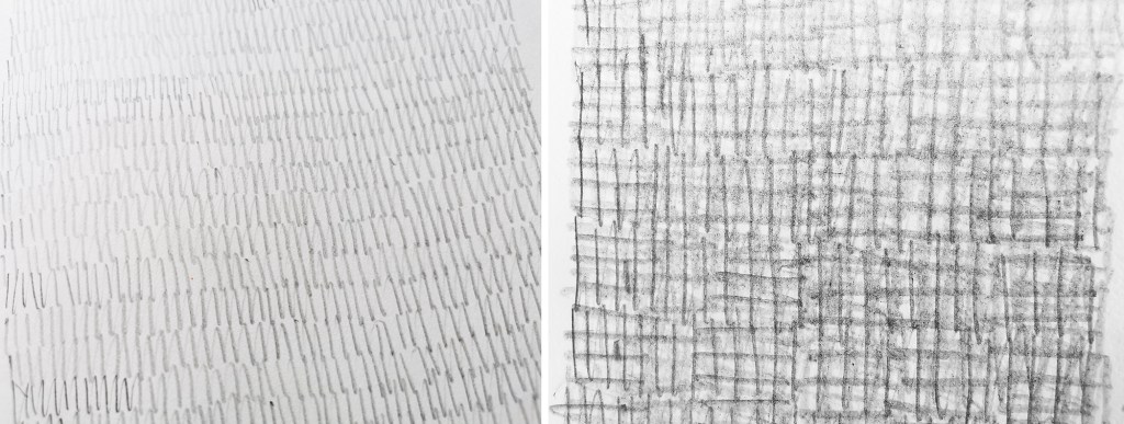
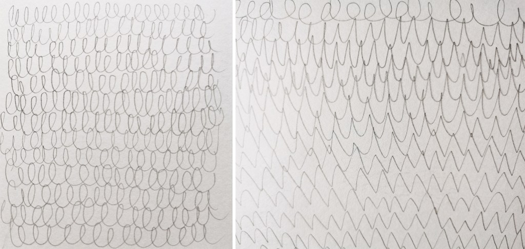
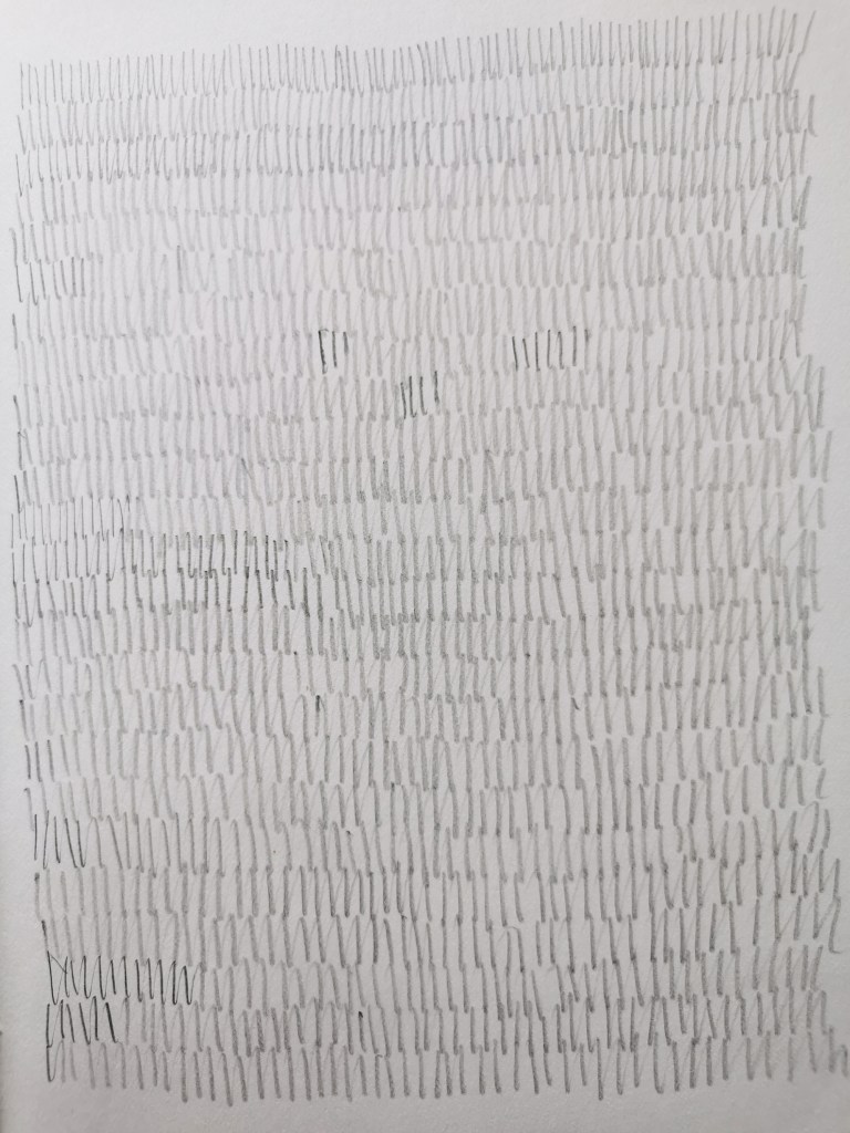
I’m often juggling lots of tasks in my head, but when my mind is busy I can find focus and space to think within and around the process of drawing. The time occupied by my hand drawing gives my head some freedom to work things through. Distraction, mindfulness, process-led, thinking time…
Drawing also creates time to explore rhythms that are playing out more formally in other sketchbooks for other projects. I find it interesting that certain motifs appear in the margins of my notebooks time and time again, made while my mind is occupied. Often those shapes are geometric, but sometimes the circle dominates, at other times, squares. Regularly they link to designs I’m working on and resolving somewhere else, subconsciously seeking solutions.
I enjoy the simplicity of paper and pencil in a world where so much of my time is spent in front of a screen. The physical process of drawing; the feel of the friction between graphite and paper, the sounds created by the rhythmic gestures, are vital to the experience. Satisfaction comes from a page of evolving rhythm and more pattern potential. We know there is seduction in the multiple; the repetition of tins on a supermarket shelf, for example.
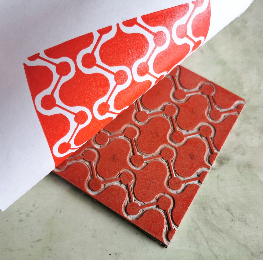
A year ago I was recovering from stomach surgery and had some time away from my academic role while I mended. Not one to be idle, when I was well enough to wield a lino cutting tool and had the energy to sit up I set myself some simple design challenges to focus my brain and help myself get better. This became my physiotherapy and creative distraction from what was a really hard period of time.
With pattern design as my go-to healer, I decided to explore formal pattern structures, including the ogee, diaper and check, featuring geometric elements. I created lino cut tiles with a small element of repeat pattern, usually but not always in two colours. The lino blocks were small, enabling me to feel as if I was making progress while able to retain focus in short bursts. The printing was another process that tested my physical strength and stamina!
I thought I’d share this one, the ogee structure – one of my favourite pattern structures – I love the play of the negative and positive S-curved forms. I think it is under-represented in contemporary design…
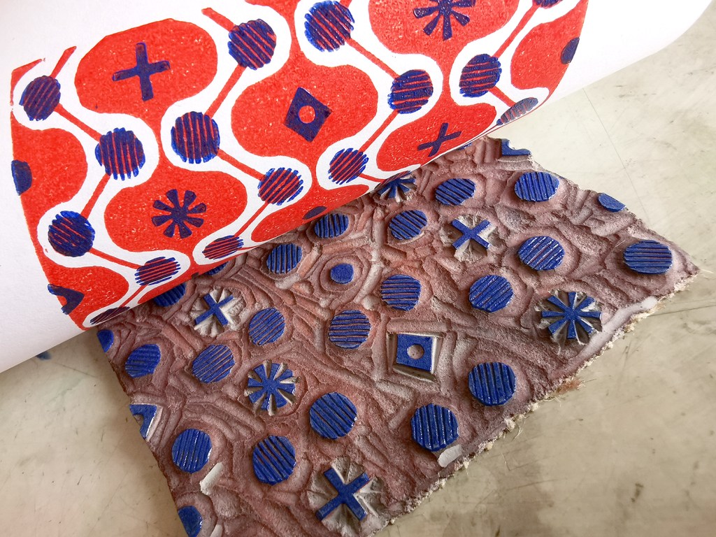
printing the first colouradding the second colour, blue
I often test prints in different colour combinations, as I have done here, below.
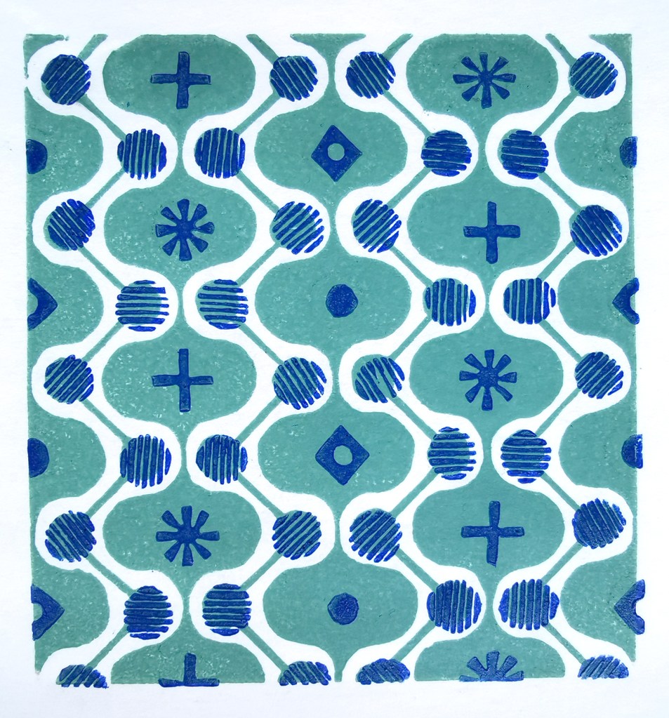
alternative colourway
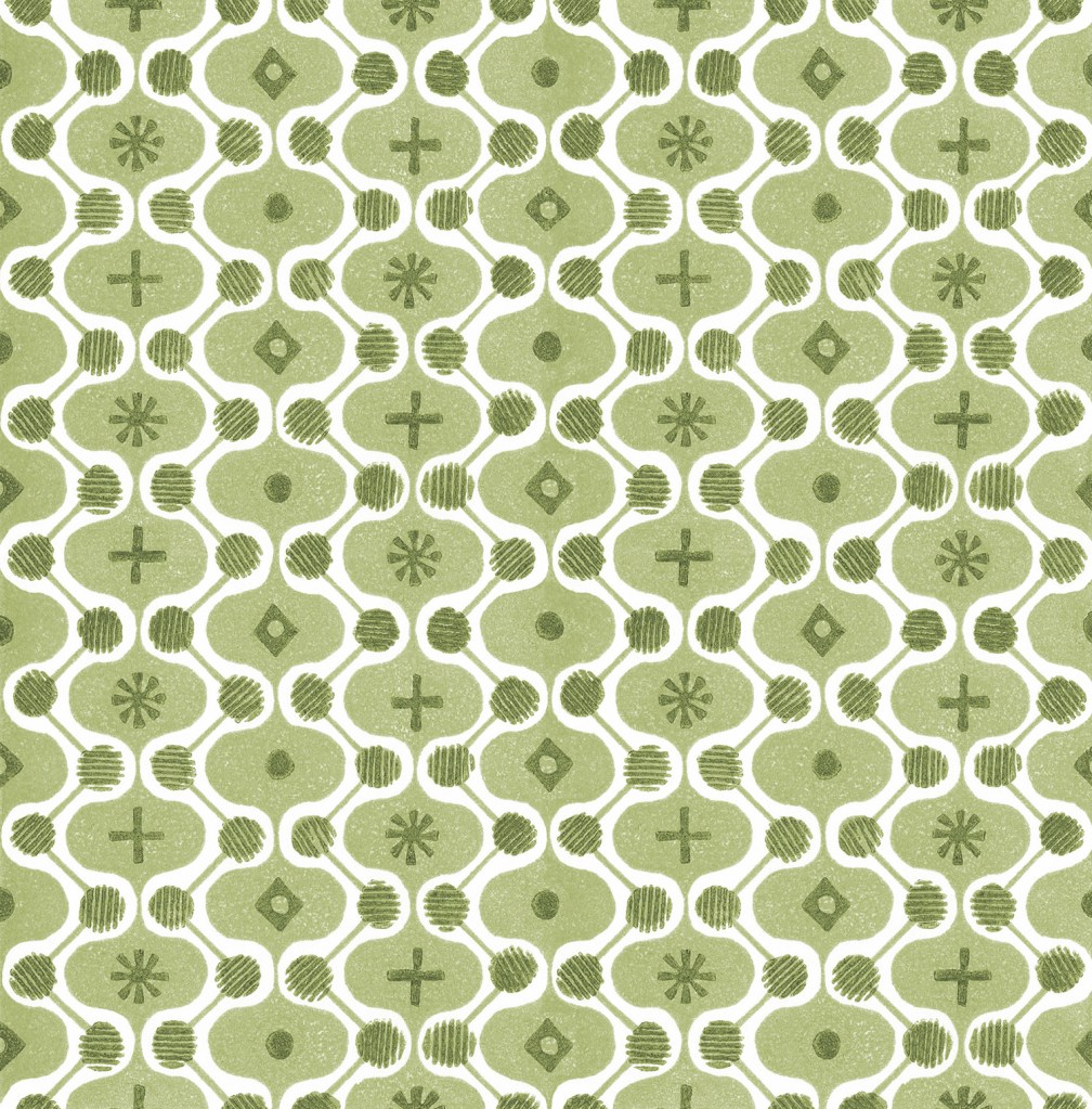
It is a natural desire for a pattern designer to want to test the repeat so you can see a digital outcome below too. I decided to test the two colours as two tones of green for some reason. It has a vague hint of avocado bathrooms of the 1970s now!
digital repeat of the lino printed tile
Unknown to me at that time, I had a further hospital stay and recovery a few months on, and so the collection of patterns grew once more, as my healing and self-prescribed occupational therapy – a career I had once considered!
I’ve had little time to revisit this collection since my recovery but I hope one day soon I will. I’m not sure where this design and its siblings will venture next … any suggestions?
I’m sure I’ve written about it before, but I’m often intrigued how an idea can rattle about in my head for years, exist as drawings or collages, but not quite feel right… then manifest in a way that makes those years of waiting make sense. I’ve recently created a sequence of three drawings that appear to have done just that.
Drawing is a key creative process for me. I don’t always find as much time as I’d like but I draw to capture the beauty of a flower, or the shape of a field, and often have no planned use for the image; the drawing exists for itself. Over the years I can see drawings are linked by a longer-term inquiry, and these single elements collectively define the aesthetic of my practice.
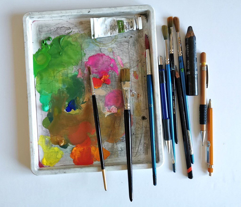
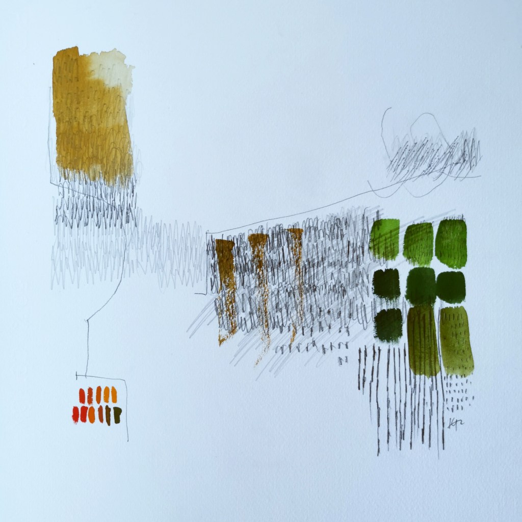
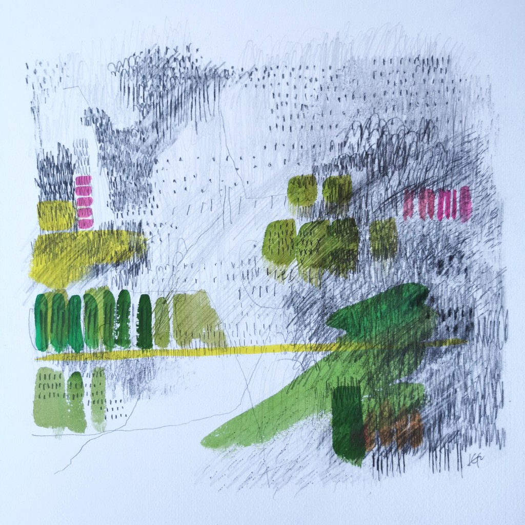
I’ve been working on some new landscape-inspired drawings, bringing together some colour mixing and the monochrome marks, rhythms and textures relating to the Norfolk landscape. I began with a journey through the drawers of my plan chest to pull together a dictionary of visual language to guide me, and following a cycle ride in the landscape I took pencil in hand, and began to draw. Painting features very little in my practice, really only for colour-mixing but this time it felt right to capture the colour in gouache and apply directly with brushes on to the paper, layered up with the graphite of the drawing.
These drawings are part of the ongoing journey, but I do think it’s important to stop and notice when something feels right, like a good fitting piece of jigsaw in the puzzle.
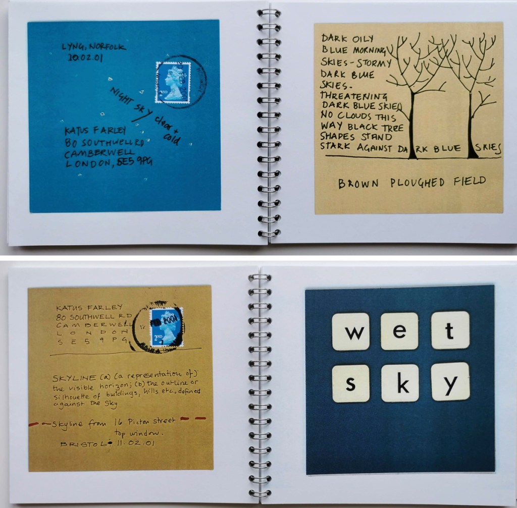
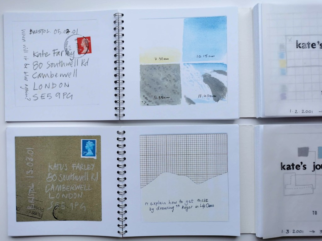
Twenty years ago, in January 2001 two friends established a creative challenge as a way of sharing their days, while living in different British cities, through daily production of artwork. The idea of mail art had already been of interest to them both, and this project formalised the process of sending pieces of artwork through the postal system. It was highly likely that the outcomes would also find themselves featuring in an artists’ book in some shape or form, as so many of our individual creative ideas did at that time.
Rules: Every day in the month of February 2001 we (Kate Farley and Imi Maufe) would make a postcard inspired by the sky that particular day. In fact two identical postcards were made each day by each friend – in case one got lost in the post. The size of each card was agreed to be 11cm square, and it would need to be in the postal system that day.
postcards in Sky Blue Pink, from February 2001, by Kate Farley
February 2001. SKY BLUE PINK
Each day, between Bristol and London, and sometimes Norwich, these postcards crossed the country representing the experiences of lives being lived under the skies of winter. Postcards were made using a combination of image and text, suggesting downpours or sunshine, colours and times of the day. The artwork includes a mix of drawing, paint, printing, photography including a pinhole camera photograph, and collage. Each participant’s creative journey and personal style shines through.
Alongside references to the sky and weather there are details of exhibitions, bicycle rides, parties, shopping, college and work. At one point cards were delivered by hand as they shared a weekend in Bristol. Only one postcard was lost in the system – a post-it note breaks the news.
postcards in Sky Blue Pink, from February 2001, by Imi Maufe
MARCH: TO AND FRO
Having enjoyed the task of finding a few creative minutes, however busy we were each day, to keep the project on track it was decided to try another month on a different theme. To & fro represents the journeys of the month of March 2001, keeping to the same rules apart from the theme, and the interpretation of what a journey could be was up to the individual. Postcards recalling more cycling, mapping around buildings, postcodes passed through, my birthday, journeys by bus, emotional journeys, creative processes and even a Spanish holiday gets a mention. The artwork is varied throughout the month, and between the two participants as with the previous month.
postcards in To and Fro, from March 2001, by Kate Farley
I was working part time as Print and Photomedia Technician at Central Saint Martins in London, alongside design and making artists books, hence the access to the darkroom to make the photogram. I taught pin-hole photography and the view from the 4th floor window at Back Hill across Clerkenwell features. I had bought my Turkish Green Brompton (folding bike) and it gets a mention a few times. Imi was studying in Bristol, and continues her interest in journeys in her practice today.
postcards in To and Fro, from March 2001, by Imi Maufe
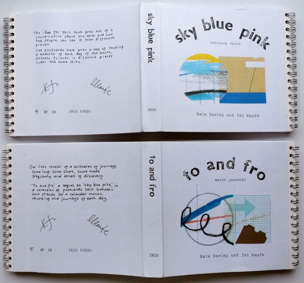
In April there was an exciting day when the postcards were gathered and shared. The next stage of the project was to design and construct the book showcasing the original collection of postcards between two friends in order for us to create editions. The book structure needed to show each of the postcards sent on the same day, and reveal the front and back of each. As there were two of each postcard the pages of the book could be designed by sticking each pair of cards on a single page and fold the sheet to indicate the back and front of each card – and also allowing the book to be made and editioned by printing single-sided. My grandma used to say the term Sky Blue Pink and so the phrase became our book title for the weather, and To and Fro was an obvious choice for March.
There was a stressful afternoon of hunting around Bristol-based printers to carry out the colour copying and bind the book. One chap managed to shuffle the pages out of order almost by simply looking at them – we couldn’t entrust the postcards to him – but eventually we found someone who understand the peculiarities of the project and how the two editions needed to be constructed. Wire-binding held the two sets of postcards in individual books, united by the wide and folded cover, nestling the books in to one. They were in editions of 10, published under the IKUS press, formed for this purpose.
both editions: Sky Blue Pink & To and Fro, published 2001
We exhibited these books at artists book fairs, launching them at the International Contemporary Artists Book Fair in Yorkshire and received a really positive response. We sold the majority of the first edition of the books in the first year, including to significant collections such as the British Library, and produced a second limited edition soon after.
This was a time before social media, and today, thinking back over the design process of the book, it’s worth remembering we didn’t have access to scanners and computers, so it really was a rather handmade effort, but I think the outcome is better for it and I can’t believe we are looking at these, twenty years on. Having made those postcards and revisited them again now, it has surprised me how much I remember from those specific days I lived, that I could easily have forgotten entirely if it was not for the act of making time to be creative.
I also take from this, the value of making time to be creative, and to be aware of the world around me. I was busy rushing about but always in my mind I had to notice something and work out how to create the two postcards to visually communicate that day. Maybe I should start this up again, although Covid lockdown makes my life considerably less interesting!
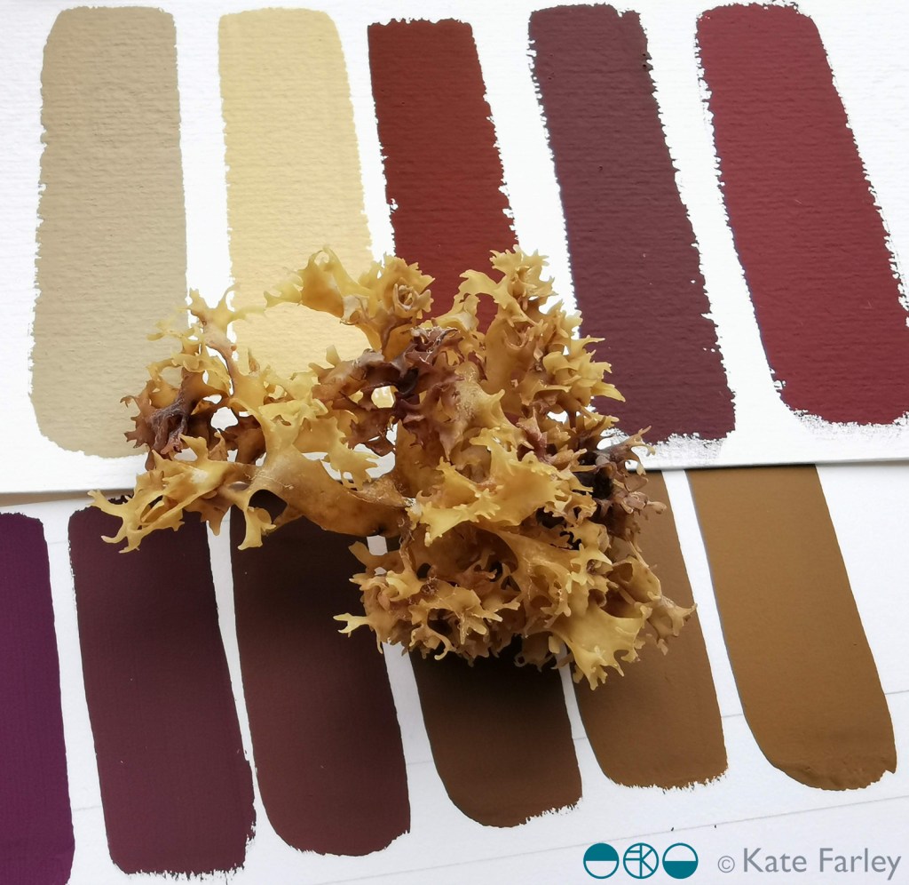
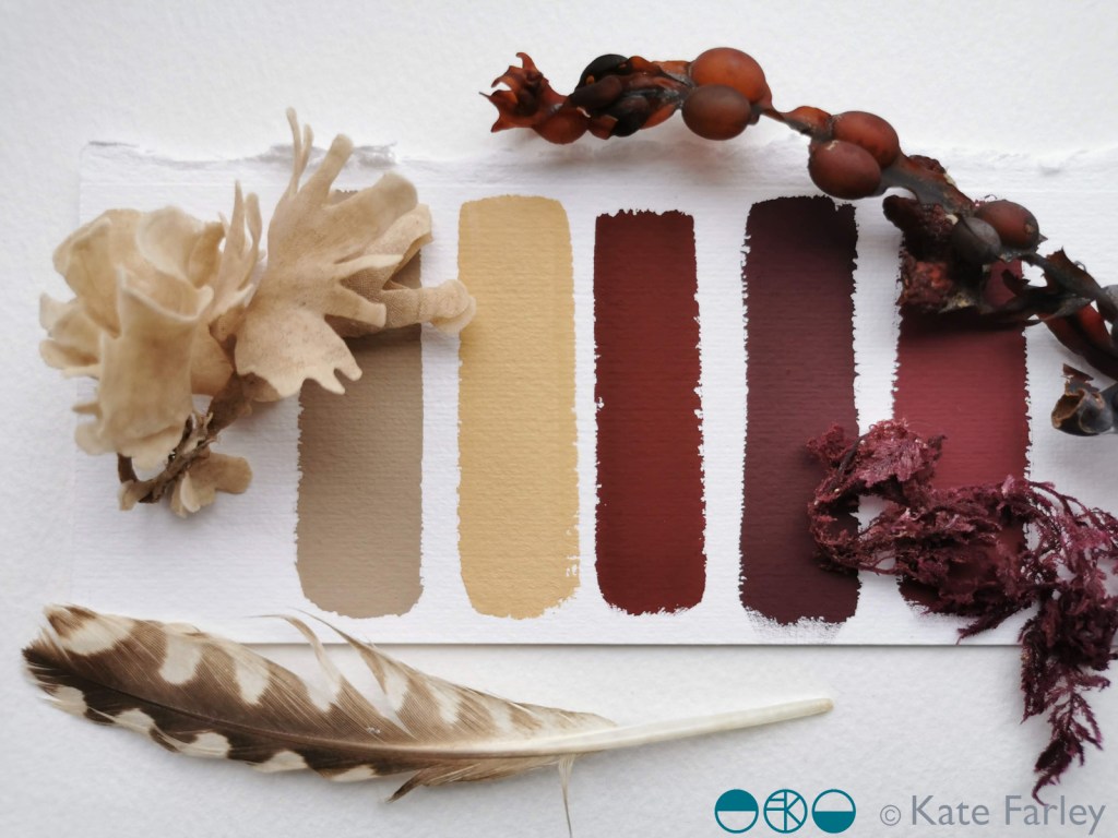
I’ve been continuing my colour mixing series, this time taking inspiration from the beach and the artefacts I gathered. The gouache works wonderfully to capture the colour, responding to small specks of added colour as I take the starting colour on a journey to and past the colours of the item I am studying.
Some new drawings are taking shape that use these colour chips and I am excited about where they are going – one day I’ll share them. In the meantime I hope you enjoy the colour of the beach of north Norfolk.