yellows

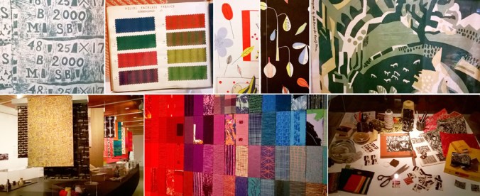
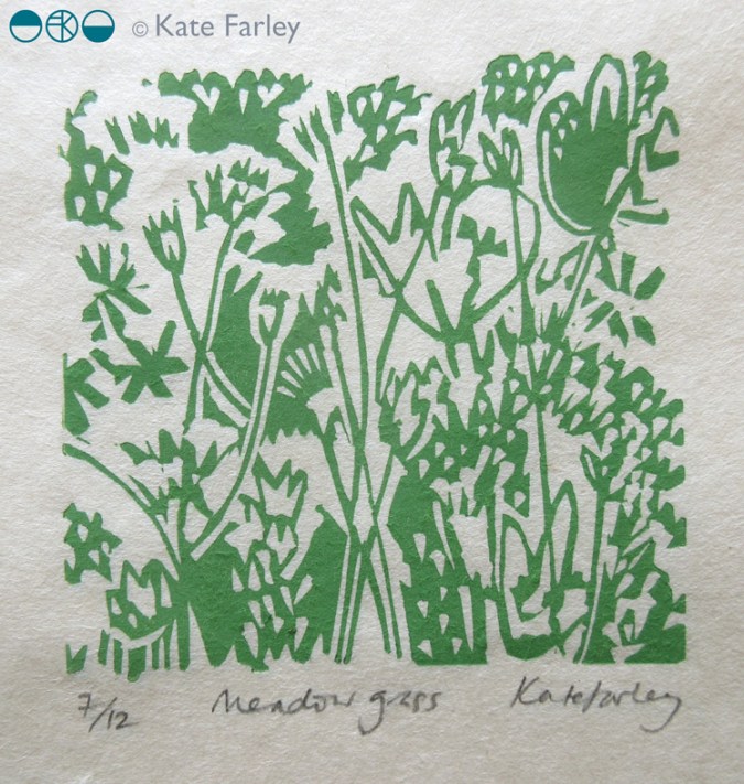
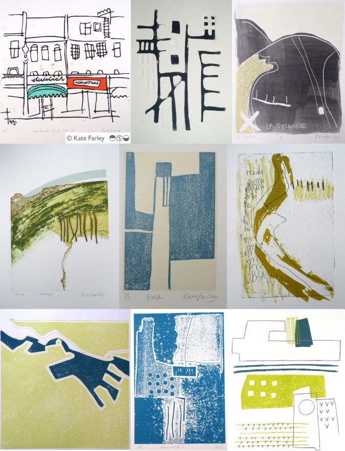
I’ve always enjoyed working with colour; choosing combinations, mixing inks and matching colour. I am interested in how we relate colour to brands, how colour suggests quality, market levels, football teams, trends, and this week in particular political parties. Sometimes people say they do not really like colour – but what they often really mean is that they don’t like strong and vibrant colours, but in my mind bright colours are no more important than the whites on white; equally powerful if used well, just not so extrovert.

KFarley_TfL_tiles100

I like seeing the way an inky grey sky makes fields of corn glow golden, and how the crepuscular blue sings out before the night sky takes over. Relationships that colours have can bring connotations, evoke distant memories and create moods. I remember a bag of hand-me-down clothes was excitedly torn open by my twin sister and I, hoping for fabulous new items to wear – in the eighties, when what was actually presented was everything brown and purple – from the previous decade. So disappointing!

Getting the right colour isn’t about a broad brush of red, it’s about seeing the nuances. You’ve only got to see a sale-rail to see the buyer got the shade of mustard a bit too green, or the pink too candy, and not blush. Any colour can vary hugely, our personal perception of colour not only is affected by the technicalities of sight, but also our own relationships with colour, built on past experiences. It took me a while to wear navy, having had to endure it for school for several years.

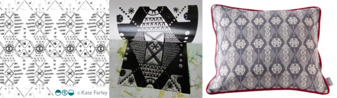
A friend described my ‘black’ screen prints for the Barbican, and I had to explain it was actually dark grey – it makes a considerable difference to the final result, but if both examples are not shown side by side most people would be none the wiser that the designer made a conscious decision to make a grey look not quite a black.

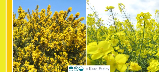
So here’s some yellow, photographed in Norfolk a few weeks ago. Enjoy, what ever it means to you!

KFarley_yellow_norfolk100

gardening spirit

As this is the start of National Gardening Week it seems appropriate that I reflect on how important gardening is to me. Growing up in a gardening family, with a self-sufficient attitude to growing vegetables I suppose it was inevitable that one day I’d have a garden of my own to tend. For years I’d visit mum and be walked around the garden having updates on the state of things, nodding but never knowing the names of things, but seeing the pleasure the process of gardening gives to her. Now I understand.

Here in Birmingham we have an allotment to grow the vegetables and fruit in, and we grow flowers in our garden. We have spent over a decade digging and harvesting plot 8; learning to respect weeds for their various ways of making their presence known – I still want to try weaving couch grass. The feeling of success when we pick the first strawberries of the year, or fill the rucksack with runner beans that can be filling the freezer for wintertime is certainly worth the hours of graft. Last weekend I picked over a kilo of purple sprouting, and we commented that the harvest would probably cost well over £10 in the shops, as organic produce – but with no plastic wrapping or air miles included. Of course our food tastes so much better too! Gardening spells out the seasons as we check for frosts, or pick the first fruits, and enjoy the harvest and flowers of each changing month. The beds of wallflowers make me so happy this time each year, signalling the excitement of the growing year getting underway.

wallflowers_katefarley_blog

It was at the allotment plot that I first developed my pattern collection ‘Plot to Plate‘, launched in 2012. I had been drawing the allotment beds on the site, as well as National Trust kitchen gardens for a while, and a language of graphic pattern made from lino cuts evolved, firstly as limited edition prints, and secondly as motifs to explore repeat pattern with (for example: Plot to Plate VVV textile design – final image with the Auricula). The title design is slightly different in the fact that it was hand drawn, and is an over-sized dog tooth check featuring tools of growing, cooking and eating, such as garden rakes, spades, whisks, wooden spoons and cutlery as a visual narrative up the tea towel, celebrating the journey from plot to plate – available in Brassica green or Brassica purple. plottoplate_ttowels_katefarley150

This collection has evolved to incorporate more formal pattern compositions such as Parterre (below) and Hanbury, inspired by National Trust’s Hanbury Hall and Gardens in Worcestershire, featured on hand screen printed cushions and wallpaper, where I make links between pattern design for textiles and formal garden design.

parterre_katefarley_150

These days my design practice has moved away from the inspiration of the formal gardens but I continue to dig. Our potatoes are in the ground for this year and the greenhouse is working some magic. Gardening provides me with not only creative inspiration but also head-space – a highly valuable asset in today’s world. As a designer and an academic, juggling a young family too, things can be frantic and I’m often running for trains. Faced with two hours of hard clay to dig I’m actually very happy. I can focus on the job in hand while chatting to the friendly robins, making myself physically tired, seeing the result of the work, and at the same time having time to think and mull over some of the other stuff of life. There’s also the sense of community with other allotmenteers; we share the same weather and battles but also share the excess harvests. Every time we get to the point of questioning ourselves about the allotment and if we have time, I remember all that it does for me, how my hard work there actually keeps me well; gives me a sense of well-being I can’t imagine getting from anything else. I shall keep digging, and knowing, for so many reasons, why I do!  Happy National Gardening Week!

vvv_auricular_katefarley

Save

Save

pebble pattern collection

I know I’m not alone in having collections of stones, gathered from walks and adventures over the years. Heads down across the beach, we search for beauty in the lines, colours and patterns of pebbles. We look for skimmers, ones with holes, and stripy ones…

I was looking at some of the stones that are in my studio and realised I had the components of a traditional textile design collection. The key pattern structures often include an all-over design, a spot repeat, a stripe and a plain (from left to right in the image below). I had fun sorting the stones to find the most straightforward ‘collection’.

stonecollection

seeing red

My world is pretty colourful; on a daily basis I’m in contact with colourful textures, materials and surfaces from fashion, interior and architectural contexts. Not only do I work with hard and soft surfaces in my design practice, I also teach undergraduates to work with colour in relation to textile design. It’s important to see beyond the broad definition of colour by name and to think about the context of colour; the surface qualities in that colour, the effect the material has on colour, such as gloss, matt and opaque for example.

Last week I managed to update some colour charts in my studio resources and it made me think about how we tend to have particular favourites when it comes to colour. I certainly have a comfort zone in sections of the colour charts and other areas I’d have to be persuaded to go near. Commissions often include discussions with clients about the intended colours of products, and I enjoy the challenges of pushing the boundaries of my comfort zone – within reason! I have a different palette I’m happy to wear compared with what I’d live with, and I certainly dress in colour relating to the mood. I remember many years ago dressing in very colourful clothes only to receive a rejection for something that mattered. I felt gutted I’d dressed for the wrong outcome!

Here are some REDs… I love the border colours between red and orange.

katefarley_red_100


learning with archives

Recently I have been sharing joys from the fabulous archive of textile samples belonging to Birmingham City University’s library, some dating back from 1901. Myself and a colleague have been showing these treasures to our students, helping them to see their own learning as part of a history of design practices. In an age of the digital file it’s been fabulous to see how much interest these portfolios have generated with our students. It’s a tough call as we worry for the protection of these fragile items, and yet value being able to see and interact with them.

bcu_textiles1901_1

Being able to turn the pages, and reveal the hundreds of printed swatches is really an exciting journey and the students really engaged with the quality and preciousness of the items. The fact that all the samples are beautifully hand mounted and labelled adds to the beauty and experience. The range of design compositions is considerable, and the detail stunning. Tiny little flecks of print; an anchor, a petal of a flower, or coral texture printed on fine cloth demonstrate quality of the day. We noted the generosity of many designs, and discussed commercial appeal and production methods available before screen printing and digital printing possibilities. Of course this is pertinent at this time of financial cuts in the support to local and national libraries and associated archives, and with arts and culture being sold to the nation as a rather nice hobby we just can’t afford at the moment.

Seeing things with our own eyes helps to engage with the subject, making things real, and adding value to the experience. I spent an extremely insightful day at London College of Communication’s Learning Through Objects event #UALOBL last month discussing this subject with fellow academics, researchers and archivists. Yes it’s easier to deliver another ppt to a large group of students, but sessions with objects and physical activity are the ones that are likely to make far more impression, and make the difference to learning we are aiming for.

bcu_textiles1901_2

passing on pattern passion

In my role of academic as well as a designer I am regularly required to enthuse about print and pattern, and to be honest that’s fine, as I love designing and teaching pattern for print. This last week has seen me out and about to pass on my passion for pattern, firstly to Wolverhampton Embroiderers’ Guild where I was invited to talk about my practice. It’s always interesting having to consider what bit of the last twenty years to focus on, requiring reflection and evaluation, and how to tell the most relevant story without missing the bits that might be the most informative to others even if they didn’t seem so to me when living them. The audience were really generous with praise, and were really interested in my creative process, so sharing my sketchbooks, and anecdotes felt very easy to such an interested group of makers.

Tuesday saw me overseeing a morning of filming at Birmingham City University (BCU) with Laurence Llewelyn-Bowen and TV crew, working with our third years and our fabulous Print Technician. It was a morning of celebrating the Arts and Crafts legacy, William Morris in particular, and the importance of understanding the value of drawing to the process of pattern making. It was a pleasure promoting our talented third years, in the closing stages of their time with us.

This leads me to yesterday when I and a colleague took a coach of second year Textile Design degree students to Manchester, specifically the Whitworth Art Gallery to see several exhibitions. On walking in to the first gallery and the exhibition ‘Revolutionary Textiles 1910-1939′ I noticed a number of pieces that I had featured in my Historical Textiles lectures when I had taught this group of students as first years, including Barron & Larcher, Josef Hillebrand and Omega Workshops. It was fabulous to see the students’ excitement on recognising patterns and names of designers that had, until then remained theoretical, and not ‘actually real’. Their knowledge meant something tangible, and I think was empowering to them. It was an honour to share that excitement of learning, and understanding.

Having worked on the Tibor Reich show at BCU it was great to be reunited with the collection, also on show at the Whitworth, and to see the different emphasis this exhibition made to an amazing and extensive archive owned by the family. The students really responded to the way Tibor worked to create pattern, and explored pattern through drawing with layers of colour and line. I couldn’t help but point out Tibor’s excellent use of a sketchbook to explore ideas.

Image below: top row from Revolutionary Textiles, bottom row Tibor Reich

KFarley_whitworth_May16_100

The room that wowed me most was the wallpaper gallery upstairs, and again, this exhibition was exciting and inspiring to the students, leading to some really interesting conversations. There is of course no comparison between seeing metres of wallpaper stretching skywards, to a small screen of Google images. We talked about print production, the scale of motifs useful to a domestic space rather than in relation to a sketchbook page, and why thinking big should be embraced. We admired the Lucienne Day patterns that are so familiar to us, alongside new discoveries, and that is why a curated exhibition, unlike an online search can be so beneficial; the selection provides context. I encouraged the students to question how they would make the marks, the shapes and patterns without computers, and why the variation of hand-made can offer something that digital software excludes. I include an example below to illustrate my point – beauty in the irregular.

KFarley_PalladioMagnus_blog

We did have time to enjoy the beautiful surroundings of the cafe but also took in a quick trip to see the newly opened Fashion & Freedom exhibition at Manchester City Art Gallery, one I really do recommend too.

So, more pattern inspiration for me, and hopefully some more people inspired by pattern too…

Springtime shopping of Plot to Plate gifts

My ‘Plot to Plate’ collection inspired by gardening is celebrating Springtime with a special offer in my online shop. For orders over £20 placed during March and April there will be free gifts included.

All products are printed and made in England. Tea-towels, bags as well Hanbury and Parterre cushions are screen printed. Greetings cards are printed with British paper.

KateFarley_springtime16_Plottoplate

print progress

Recently I have been really busy with a variety of academic duties in Birmingham and further afield, taking me away from studio time, my freelance design practice, and of course blog writing. Also, in my teaching of Textile Design at Birmingham City University I have been leading a module of professional practice, assisting the students in learning about the life of a freelance designer. It’s definitely a double-edged sword, as the discussions between students and staff illustrated: It’s great to be your own boss, but you take all the blame when things don’t work out! You can get up when you want, but nobody pays you for just waking up!

The rhythm of freelance work is varied. Somehow it’s often the way of things that several deadlines coincide, and when you have a schedule to stick to, an urgent press request comes in. On the day you have time to make calls, those people are out of the office, and obviously you don’t get paid when you take a holiday. Yes there can be tough times, but I really like the variety of the weeks’ activities that freelancing gives me, certainly set in tandem with the academic life of very different demands. Each practice informs the other. Obviously there are freelance tasks I prefer and other ones I procrastinate over, lists are created, social media is checked and Radio 4 is listened too!

KFarley_knit1_blog.jpg

With so much to-ing and fro-ing on trains this last month or two and with several commercial projects on slow-cook I decided to give myself time to make, test and resolve some ideas that I have been exploring, with paper and print. The activity of printmaking is a fabulous discipline to work with. I love the excitement of planning a new print, and composing the plate, often taking me back to sketchbooks and previous ideas. The physical process of cutting the block can also be absorbing, and therapeutic and I have to decide the paper stock, the ink colour, and edition size too. It is important to maintain an experimental, inquiring practice and my prints and drawings are the evidence of ideas that have sustained my creative practice for the last twenty years. Between the commercial constraints of projects shaped by clients, costs and repeat patterns, printmaking can seem so free from limitations. This is why I make sure I keep printing – the creative sort, not just the invoices!

both prints featured here are available to buy, at £46 each unframed.

Knit 1, edition of 15, lino print, 9.5 x 9.5 cm print size

Meadow Grass, edition of 12, lino print, 9.5 x 9.5 cm print size

KFarley_meadowgrass_print_blog


looks are deceiving: truth in pattern

As a student at art college I was taught the principles and beliefs of great artists, designers and theorists such as William Morris and John Ruskin, and mantras of the founders of De Stijl and the Bauhaus. As a designer myself I haven’t set out to follow any particular philosophy or approach but have developed my ethos over the last two decades as I experience diverse design contexts, clients, markets, technology and changing industry. Also, in my role as an academic at Birmingham City University delivering lectures on wide ranging art and design contexts in relation to textile design, social change and global influences I have learned considerably more and this has led to me further considering my own approach and philosophy as a designer.

My ‘construct‘ collection was developed as a response to my loathing of ‘fake’ surfaces, and the ever-growing interiors market of printed patterns of wood, stone and other natural materials, copied at ever-higher resolutions on a vast array of substrates. Is it possible to have printed stone effect on wood yet? Why would I want a copy, an imitation rather than the real thing, and would it be right to desire marble in an Edwardian semi in the Midlands of England? In my new ‘construct’ collection I’ve played with this idea by making printed pattern inspired by constructed cloth, not copying directly from the woven threads but evoking a sense of them.

As a pattern designer I spend time considering potential surfaces and contexts that pattern may exist and this leads me to the conclusion that if we stopped using copies of materials as pattern on surfaces we could find space for far more inventive, creative and exciting patterns in our world. I believe that if the material you have is not wood, why don’t you consider alternative patterns, entirely suitable, without relying on copying natural materials. I can’t decide who is providing for who here. Do consumers want fake, or do they have to buy fake because there is little else out there? (btw: If you need laminate with beautiful patterns don’t forget to consider my ‘construct’ range in collaboration with Formica!)

KFarley_construct_grid_logosWEB

The approach to honesty and truth to materials was one of many key philosophies for Augustus Pugin, known for his commitment to the Gothic revival in the 19th century and his design work on the Palace of Westminster as well as St.Chads Cathedral in Birmingham. He considered the neoclassical fashion for painting any surface to look like marble as deceitful, and wholly incorrect. He favoured flat, stylised pattern too, so as not to deceive the viewer,  designing many patterns for tiles, wallpapers and textiles for the buildings he also designed.

This week I was up in the Potteries for a meeting, and as with hourly trains, I’d just missed one so I spent 50+ minutes waiting in very low temperatures at Longport station near Stoke on Trent. Noticing my surroundings I was tickled to identify the ‘mock’ nature of the station building. All the doors and windows on the platform side have been boarded up and painted to look like… doors and windows. I assume this is some sort of security measure. As the paint has started to peel it revealed the deceit below. This sight is the cause of this blog post. I wonder what Pugin would have thought?

longport_kfweb

printed mapping

Printed interpretations of landscape have been a challenge in my practice from the beginning, and really formed the backbone of my practice during my degree course in Printed Textiles at Leeds College of Art and Design in the 1990s. I explored various ways to represent the world around me, and although it might seem odd for those aware of my drawing, as there is little similarity now, I was really inspired by the Norwich School and painters such as Cotman and Crome. I saw the way they formed shapes of colours as elements in the landscape and I set about creating contemporary versions of Kirkstall Abbey in Leeds in term-time, and rural Norfolk in the holidays.

Over the years my focus has shifted from rural to urban, resulting in more geometric, grid-like patterns, fighting the urge to be illustrative. As Print Technician at Central Saint Martins I used to create mono-prints including embossed features, representing the Farringdon skyline and dominant buildings. I also explored experimental processes, such as liquid emulsion and photograms of drawings on acetate in the photographic darkroom. I had a fantastic year on a part-time printmaking course at the London College of Printing (now Communication) at Elephant & Castle, and despite a broken elbow I produced many prints including lithographs, screen prints, collagraphs, etchings and lino prints. The expertise of the staff, and the discipline of the day a week of technical experimentation was a brilliant thing.

KFarley_landscapePRINTSweb

The images above include some of the many ways I have printed the landscapes I’ve experienced, and show some of the ways that I play with line, shape, texture and colour. Those of you who have seen my drawing evolve will probably recognise a preferred line quality, or mark I favour, the economy of mark, and visual rhythms. I am also interested in perspective, elevations and mapping interpretations. I continue to explore landscape in my ongoing sketchbooks, as part of commissions, but also because I simply want to draw and capture the flat fields, the lines of fence posts, and sweeping hills interrupted by a barn.

KFarley_landscapePRINTSbooksweb

I’ve also created many editions of bookworks over the years, and although I’ve written about them here before, I thought I’d include the ones predominantly featuring printed journeys. I love the way the sequence of pages, and folds of paper creates narratives through a landscape. Again there is maybe a familiarity of line quality, and drawn shape, as drawings, prints and books are often developed together, as part of the same creative process. Working summers in France, familiar territory in London and train journeys are regular inspiration for the books shown here. It is a challenge to design the book to work with a particular sized printing plate or sheet size of paper, considering grain direction and readability, but I enjoy the problem solving. Drawing and image has to work with structural content.

Often what is occupying my time in terms of design collections actually grow from ideas explored in those pages many years before. I like to see my relationship with landscape as the constant in the variety of what I do. Having spent some days in the country during the recent holiday I have refuelled that desire to draw horizons again.In hearing of the death of Ellsworth Kelly I am reminded of how instrumental he was at showing me how to see pattern in the environment we live in. I owe the excitement of the journey to many artists who themselves have worked hard to capture the places they know… Patrick Heron, Ben Nicholson, Eduardo Chillida, Eric Ravilious, to name a few.

Since creating these works on paper I show here (some over fifteen years old) I’ve launched ‘Plot to Plate’ and ‘Construct’, but they wouldn’t be here without the many sheets of paper before them. Who knows what else is in store in the next few years…