Good feelings at the allotments

Taking care of an allotment plot is never about saving money on food – and Birmingham Council have ensured it could never be, given the huge plot rent increases. Tending a plot gives so much more than the crops that you harvest. Here’s a few good reasons:

  • Growing your own food provides the gardener with opportunities and excuses to go outside and realise that what looked like a grey, cold winter day is actually rather nice.
  • Digging provides an opportunity for head space, for time to mull things over, while also focusing on the amazing tenacity of bindweed and couch grass that really ought to be put to a constructive use rather than taking up all my time!
  • Making good use of time growing food makes you wonder why other people would want to spend each weekend wandering around indoor shopping centres, missing out on the feeling of muddy fingernails despite the gardening gloves and the sight of the first strawberry beginning to blush.
  • The satisfaction felt from a harvest that provides all the food for your family meal takes a lot of beating
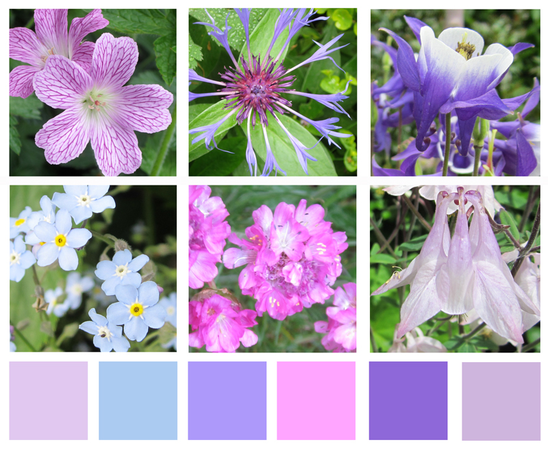
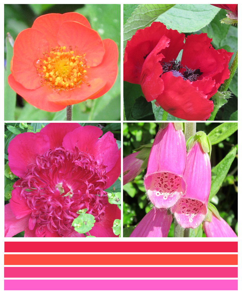
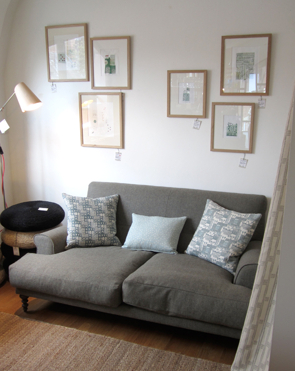
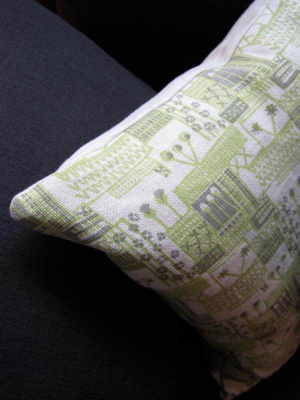
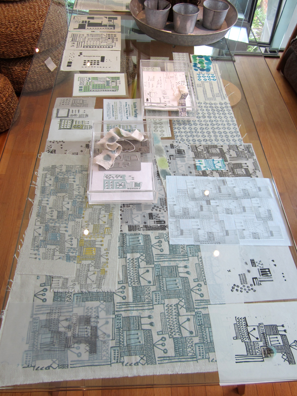
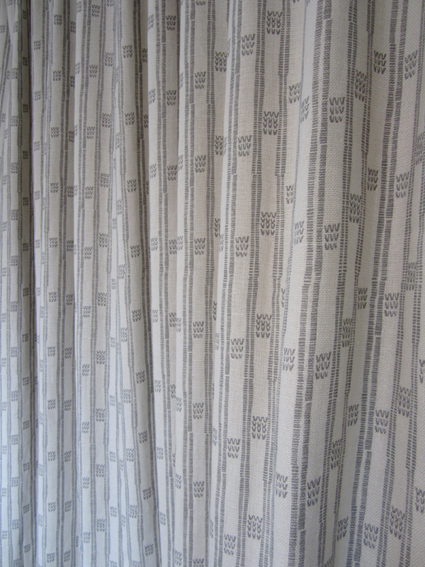
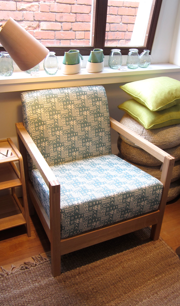
  • and in addition to all this, I can thank the plot for the inspiration in my ‘Plot to Plate‘ design collection too.

Its a really good feeling when the crops are bountiful. The hard work of winter has paid off, the patience with the frosts and the protection from the birds has worked out okay and you get great stuff to eat for the commitment you give. With a fully laden bike and a handful of sweet peas to grasp on the handle bars you head home like a hunter gatherer from a previous age.

The thing is, when all goes well its an amazing feeling to be able to pass on the surplus to others who will also enjoy the success. Some years at the site we all have gluts of the same thing, other years we wonder what we did wrong when others are almost complaining about too many onions, and nothing has come of ours. It’s a great thing that there is never resentment to another successful gardener, but pleasure in their success. We share tips and ideas, timings and tools as well as the odd cast-off seedling and you’d be a fool to pass on the offer of parsnip seeds from Tony!

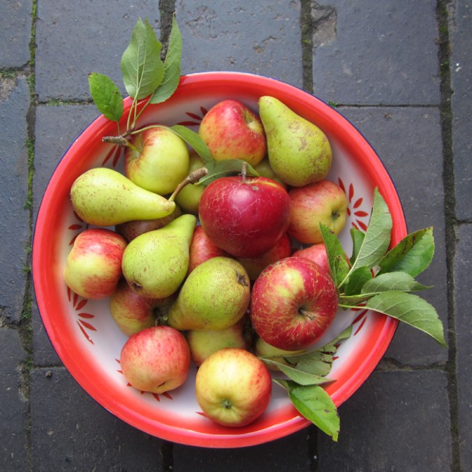
When a fellow plot-holder offered me her excess apples and pears today I politely declined at first, thinking that she would find something else to turn them in to, another apple tart, another crumble – really! too many apples? We have had a poor year in that regard. But there is a great sense of pleasure in offering ‘help’ in accepting the produce. We really are the winners in this hand-me down act, but it also feels as if we are doing a great favour in accepting the gift of free, home-grown food, enabling the grower to experience their own sense of generosity, good-spirit and community mindfulness, and saving them the feeling of not letting down the very fruit that served them so well this year – not bad for a bag of apples and pears – thanks!

applespearsbowl_web


box of colour

I was shown this wonderful Alice in Wonderland paint box that has been looked after for many years. It is so much nicer than much of the branded, TV themed products of today. I especially like the labeling of the names of the colours. Is sap really that green? I would have been a very happy child to have received a box of such size and potential. Note: Made in England!

alice_paintbox_web


Design inspirations 2: the natural world

Second in the series of ‘Design Inspirations’ blog entries…

The natural world has long been an inspiration for textile designers. Many years on from William Morris celebrating the natural world of flora and fauna as decoration for textiles we have had Laura Ashley, Marimekko and Orla Kiely, to only name three companies, who have interpreted the natural world and created stylised patterns and imagery which continue to inspire design students of today.

At times the worst thing as a lecturer of design we can hear from a student is that their project will be “about shells” and we dread the worst examples of static and bland studies which do little to explore the beauty and wonder of the natural world’s creations of form, structure, surface, pattern, colour and more, before approaching the bountiful concepts and metaphors in the ‘dot to dot’ of design processing hidden around the shell!

In my drawings I often aim to distil and to simplify a plant structure or shape of a flower in order to create motifs for prints and surface patterns, exploring perspective, diagrammatic language and relationships with place / context. I have a huge archive of drawings made on locations as well as boxes and bags of samples including plants, stones & leaves and one day they may well feature in designs. You never now what you might need! Going anywhere new, even for a holiday means that I keep my eyes open and often pockets filled as a result of finding new things.

Having visited the Gower peninsula for one last summer camping trip I came across these examples of natural forms, which could and would create different visual interpretations in the hands of each creative prepared for the job. That is one reason why I like to play a part in design education; to facilitate the looking, seeing and interpreting, and it is certainly why I like to keep on collecting, and keep on drawing.


Image

Words of Walberswick, Suffolk

For some reason my first visit to Walberswick has been etched on my mind as a perfect summer holiday, long in length, filled with sunny days on the bridge crabbing, playing in the dunes, and on one day, huddling round a small, borrowed tv set to watch ‘The Royal Wedding’. This was in 1981, with memory’s thick rose-tinted spectacles on. I gather we stayed for a weekend!

Fast forward a few years and we have spent a fabulous week back in the small Suffolk, coastal village this summer, showing the next generation how to crab, and to play in the dunes, with no royal wedding to distract us.

One vivid memory I have of our 1981 visit was of the ferry, the ferryman and his dog. We were confused quite why he seemed to make heavy weather of it, not rowing straight across – which seemed sensible, but instead rowing high up stream, before steering for the jetty on the Southwold bank. It was a real delight to be back on the ferry this time, with knowledge of the tidal waters, and for the small fee of 90 pence, taken across the water. There is pleasure in this simple transaction. If there was a queue, you waited. If it was only you, and not the maximum cargo, he rowed for you. Now that is service!

Image

I doubt the signage originated from the 80s but I really liked the straight forward communications around the jetties. Around the banks of the Blyth the boats and black wooden huts featured many hand-rendered signs, some more formal than others, so I’m sharing them here, hopefully for your pleasure.

Image

July colours in the garden

Following on from the last few months of colour charts that I have created documenting colours growing in the garden I have made a July 13 one too. The weather has been hot and dry but somehow the slugs have enjoyed the marigolds so there is a lack of orange in this colour palette this year. The Foxgloves are pretty much over but the Hollyhocks and Dahlias are stunning in their part of the garden relay race through the summer schedule.

july13gardencolours_web

a textile archive of a different kind

Having worked at Birmingham Institute of Art and Design, BCU at the Gosta Green site for the last few years we are moving to a brand new campus next week. There has been plenty to do packing up the workshops and studios, and during this process the course team have reflected on and recorded the space that has been home to this textile design degree for many years.

There are so many signs of demonstrations given, lectures delivered, course-work carried out and with the heavy use of the workshops comes a fabulous visual archive of the textile careers that we have helped to initiate and support along the way. We are nostalgic in many ways, but excited by the new and very clean slate that we are about to start writing history on at the Parkside building.

ImageImageImageImageImageImageImageImage

The English countryside

We had a beautiful day yesterday involving a quick trip to Ledbury, and specifically Tinsmiths to sort out post-show details. Our visit to this lovely market town coincided with the poetry festival so we also picked up some verse, locally-made pork pies, beer and ice-cream!

It was so hot in the afternoon sun but we did manage to enjoy the scenery around the Malvern Hills to-ing and fro-ing between trees for shade. It’s a stunning landscape, and one that feels so English. I first encountered the area when I cycled Lands End to John O’ Groats back in 1994 and it left its impression on me even then.

The views from the ridge make you feel as if you are a giant overseeing a toy model landscape but it is with this viewpoint I can capture my key interest in the landscape. If I was to draw the view I would have started with lines that recorded the field boundaries defined hundreds of years ago, the footpaths etched in to the land by endless walkers and roads enabling others to pass through. The lines become shapes and a record of that moment of my experience, but what is also captured is hundreds of experiences, of us, living in this English landscape.

summer2

In terms of colours, I was struck by the stark contrast of the dry grass tones compared to the striking pink of the foxgloves and the very green bracken.

summer6 summer5

I’m also a collector of photos of grasses and such-like against blue skies, and so I happily added further imagesummer1s to that collection.

summer4

All in all, a very lovely English day.

scale and context

During a beautiful adventure in the Lickey Hills, south of Birmingham at the weekend I took these photos that showed how similar the environment close to the ground was to the canopy of the much taller pine trees. It highlighted to me the experience of scale and how important the context is. I tend to record this sort of detail in my garden sketches too and so it struck a chord.

Image

Garden flower colour calendar 2013

I posted a ‘yellow’ set of photographs of flowers from our garden for the month of April a few weeks ago and have since noticed quite a change of colour in the garden over the weeks. I have created a May (pinks and purples) and June (reds, orange and magenta) record of flowers too. With such gloomy weather recently its worth noting that some refer to June as ‘flaming June’ – not my thoughts in this particular June 2013!

ImageImage

Kate Farley – Plotting Prints at Tinsmiths

It is a very exciting time for me. It has been about two years in the planning and preparation stages and now we are a week in to my show at Tinsmiths. For those of you unfamiliar with Tinsmiths, it is a beautiful textile and lighting shop in the lovely Herefordshire market town of Ledbury. It is a beautifully considered shop, owned by Phoebe Clive, selling a wide range of fabrics as well as home wares, crafted pieces and artists prints.

I have worked closely with Phoebe to translate my lino printed designs inspired by allotments, to become a collection of heavy weight linen, hand screen printed textiles available to buy as cushions. We have also created larger showroom pieces as curtains and upholstered chairs in preparation for selling some of the designs by the metre later in the year.

Phoebe and the team have styled my products throughout the top floor of the premises in such a way as to create a clean and fresh interior space, working with the other products and furniture pieces in the shop. My prints and drawings are set amongst other exciting colour statements in the form of ceramics & lighting with an understated aesthetic. With plenty of positive feedback at the PV as well as sales throughout the first week it’s a really exciting reward for the long journey to this point.

Tinsmithssofa_web

cushion2_tinsmiths_web

glassdisplayTinsmiths_web


cushionsTinsmiths1web curtain_tinsmiths_webchair_tinsmiths_web