Pattern design, outdoors and in…

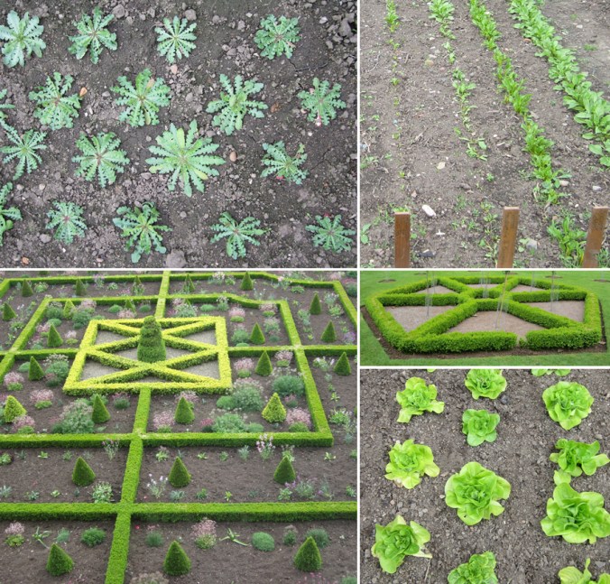
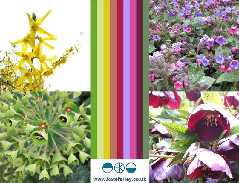
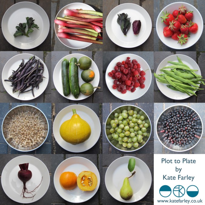
If you are a regular reader of this blog you will already know that for the last few years my personal design practice has been inspired by garden design, and most specifically allotments and kitchen gardens in my ‘Plot to Plate‘ collection, launched in 2012. I have spent many hours walking, almost patrolling, up and down rows of National Trust cabbages and onions, armed with my sketchbook, annotating the patterns, translating them to motifs, documenting the small irregularities, the planting plans, the labeling – fruit and vegetables up and down the country, as well as our allotment, plot 8 in Birmingham. Upton, Packwood, Baddesley Clinton, Blickling, Felbrigg, to name a few National Trust gardens I have surveyed and taken inspiration from. Hanbury is my current favourite garden and I have been working on a number of patterns inspired by this property that will one day be complete, to launch at Tent London this September.

It is with this in mind that I write my thoughts. There are so many similarities between garden design and textile design they seem perfect companions in my practice. Long before Mr W. Morris picked up a pencil the natural world of flora has been a dominant subject of inspiration for pattern in the home. Rather than the bouquets and sprigs, posies and trellis it is the formal gardens, the parterres and kitchen gardens that hold the structure and compositional language that we textile designers and design educators regularly refer to…

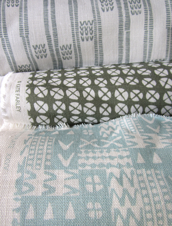
Stripes, spot repeats, all-overs and multi-directionals, geometric grids and diamonds, checks and plaids are all to see. And so it is, that it makes sense that I really have brought two things that I do enjoy together in my creative practice. It’s too early to share artwork for my new ‘Hanbury’ designs but I will share some garden pattern from Hanbury, and my ‘new’ fabrics by the metre, available very soon, in anticipation…

garden_textiles_hanbury_web  fabricrolls1_web

Colours for the arrival of BST

Today we welcome British Summer Time and the weather has been kind. The colours of spring always seem so purposeful after the winter months, with pink trees and purple or yellow blankets of flowers spread across the parks. At the allotment the grass is rearing its greens, and yet the purple sprouting broccoli let us down. Today I celebrate the colours of our garden, noticing the yellows and purples as predominate hues.

Image

Communicating Colour

Evocative, technical, predictive, informative, for matching, mixing, ordering, cataloguing, of materials, surfaces, finishes, whims and traditions…

Working across the fields of surface design, textiles, public art and fine art I have come across many ways to represent colour in order to communicate qualities. Whether it be for perfecting a match for production, or generating an evocative palette for a client, each niche within the industry has its way of doing things. Black for the Northern Line, double yellow for no parking, gold for the winner, and red for wrong. From Global Color, to Farrow & Ball, Pantone to Berisfords the language of colour is key. Some give codes, other names, sometimes a swatch, others a smudge, universal, local, a science and an art!

Seductive, formal, in a book, or on a card, each help to create the colours in the world around us, and while the skills of the individuals choosing, producing and matching will no doubt be overlooked by most, may the colours continue to sing, calm, provoke and much more.

I’ve brought some of the various forms of colour I work with together to brighten up this grey, wet Monday in February.

communicating-colour_web

spring in a vase

Despite us not having had snow yet this winter we have the pleasure of seasonal flowers that are so beautiful and distinctive, its time to celebrate them here, captured today on digital ‘film’.

I’ve drawn both the snow drop and the daffodil so many times over the years (mending from a broken elbow led me to a season of endless daffs drawings as a way to pass time) and yet each year they surprise me in their beauty. Is it too much to expect that spring will be just around the corner, and we can start this year’s digging?

snowdrops_webdaffs_web

micro florals

I’m used to gathering flowers and then drawing them over and over in order to learn more about their colours, shapes, forms and structures in order to develop imagery for prints and textile designs. At home this weekend we looked at flowers in a different way. We investigated last years plants that my daughter had pressed safely, and looked at them under the microscope that my son had become rather too keen on discovering inside the utilitarian wooden box it lives in.

We had great excitement as some rather plain plants revealed stunning patterns and textures and were disappointed when something beautiful at full-scale looked rather scary close-up. On trying to capture these images on camera the results were reminiscent of Len Lye animations and got me thinking about other ideas. Here’s a few images to share…

micro_6_web

noticing Nottingham

Having had such a great ‘destination’ review from Cara of Patternbooth blog fame via Helen’s blog DesignHunter we chose Nottingham for a last minute weekend get-a-way. I had last visited the city as a student in about 1997 and this time we set off looking for a completely different experience from the cider-drinking ‘DM boot wearing’ art student of yesteryear.

We visited lots of independent cafes and restaurants, watched a great art-film in the Lounge at the Broadway Cinema, shopped in vintage shops & design shops and yes, we did find time to sup ale at Ye Olde Trip to Jerusalem. It is a city with a great variety of interesting buildings embracing a myriad of architectural styles; almost a timeline of the design history lectures I give to my Textile Design students. The lace trade is still visible in many ways, and contemporised on the exterior surface on Nottingham Contemporary.

We had a thoroughly great time and returned home with rounder tummies and fuller bags than when we left Brum on Friday night! Thanks Cara, Helen and Nottingham!

images L-R: exterior facade of a car park, dots on a crossing, Nottingham Contemporary exterior, stair detail from the Paul Smith shop

NG_stripe_web

Norfolk lines

I’m naturally biased when it comes to the Norfolk landscape but seeing as it has shaped my aesthetic, colour preferences and my approach to drawing I am happy to consider it to be inspirational. I don’t spend enough of my time in Norfolk these days but every time I visit I take deep breaths, and big eye-fulls of the vast expanse of open landscape, the ever-changing light qualities and the endless colours of the land, sea and sky. Here’s a medley of Norfolk from this Christmas including sights of seals at Horsey Gap, a rainbow & the beach at Wells-next-the-Sea, and fields near Cawston and Alysham.

Norfolklines_web

solid coated, and rather red!

It’s been rather a long time since I posted a Pantone colour as part of my Twitter project  – here’s a beautiful red.

Kate Farley@katefarleyprint

A solid and striking @pantone 186, Coated obviously – its December! Near Chesham. A damp walk cheered up by these. pic.twitter.com/SnEFnBYvJa

Embedded image permalink
For some previous Pantone colours I’ve gathered check out my Facebook page: Kate Farley Print https://www.facebook.com/photo.php?fbid=517821538247455&set=a.517820928247516.132125.503564866339789&type=1&theater

‘Chelsea’ drawings to design for David Mellor Design

Many months ago I had the go-ahead from Corin Mellor to design a bespoke pattern to celebrate the fabulous ‘Chelsea’ salad servers that he designed for David Mellor Design. When I first saw the cutlery I immediately really liked the look of them and when I received the servers they were amazing to hold – they still are. Impressive in weight and size, the shape is simple yet stunning, and they inspired me to set about drawing. With a number of design options I provided Corin Mellor, Creative Director and his retail team, they discussed and advised, and before long we agreed on this design that is now printed on to linen union tea towels and sold on my website, David Mellor shops in Hathersage and London as well as Museums Sheffield.

With the tea towel now listed in the ‘Special Products’ section of the David Mellor catalogue I thought it time to show some of the images I have of the process. I took inspiration from my visit to the factory in Hathersage where they make and display the cutlery production process as well as the objects themselves.

I’ve had great feedback and sales, we are having another print-run and they’ve received press in the form of Elle Decoration!

Thanks also to Patternbooth and Design Hunter:

drawing_mellor1webprintedMellorTags_webmellor_square_web

elledeco_Mellor_dec13_web

the true Plot to Plate harvest of 2013

Today I picked the final handful of beans, harvested the last of the squash in case we are surprised by a frost, and noted the pace had slowed on the rain-battered raspberries. We still have courgettes and the last row or two of potatoes, plenty of beetroot, celery… and parsnips – and for those we wait for positive news of the frost before they accompany our Sunday roasts.

I’ve often returned home from the plot to capture in photographs the success of the allotment on our plates and bowls, capturing the beauty of shape and colour of our fruit and veg. Today I thought it appropriate to put together the photos as the harvest comes to a close. I realise its incomplete; no sweetcorn, no cucumbers, no carrots or peas no blackberries or swede. No disrespect – some were a success, some disappointing – but there’s always next year to make amends.

I have to thank this lot for providing me with constant inspiration for my design collection of the same name – and this really is an example of Plot to Plate.

plottoplate_2013