summer travels to Switzerland

A very overdue post – and while the summer is very definitely behind us, I’m still remembering the hot summer and the family adventures we went on, as the days grow shorter and I reach for the jumper.

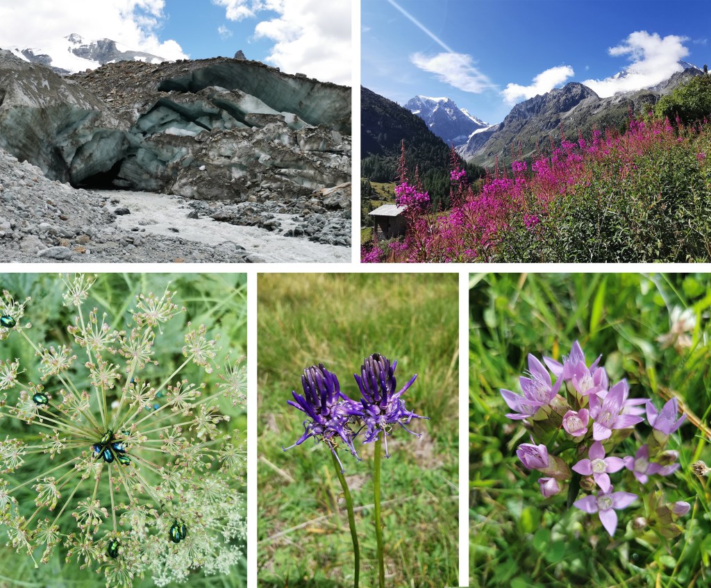
This summer we travelled overland to Switzerland, firstly to Geneva, then up into the mountains from Sion to a little village called Arolla where we explored the mountains and glaciers as well as the flower-filled meadows – precipitous paths and all! Back down from the mountains to Sion via the post bus, we then journeyed into Italy and up to a Swiss hilltop village above Locarno, called Intragna. I remember excellent fig ice-cream and cakes from the brilliant bakery and an early morning swim in the river. We ended the trip with a couple of nights in Zurich exploring the city and found time to swim in the lake too, before getting the train back home via Paris.

Switzerland tested my language skills, particularly as we travelled through French speaking Geneva, Italian speaking Locarno and German speaking Zurich, but we did our best. The food was fairly heavy on cheese and potatoes, and I can recommend the Swiss wine that apparently tends to stay in the country rather than being exported. Of course we sampled the chocolate too!


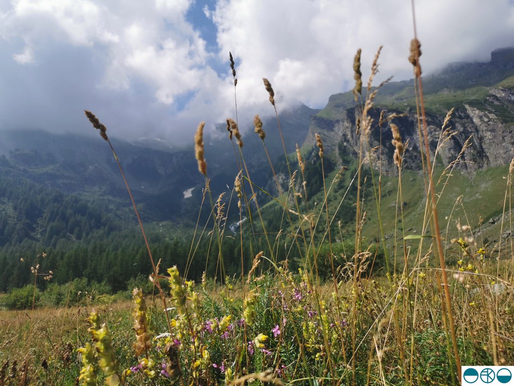
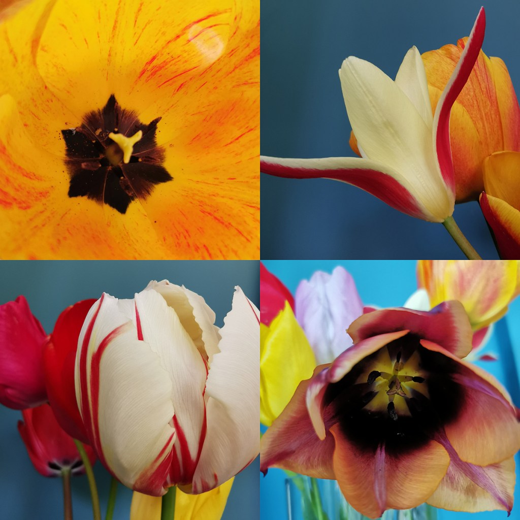
The landscape was beautiful and varied during our holiday, from vineyards to pastures, wide glacial rivers to narrow streets of Geneva. It is sobering to see the pace at which the glaciers are retreating, with dates marked on rocks along the walk up the valley to meet the ice of years gone by. The flowers were stunning and in abundance lower down the mountain passes. We were fortunate with good weather during our time in the mountains so on one day we were able to climb to nearly 3000 metres and lunch at a refuge hut before a rather long decent including steep drops, rickety bridges and large staples to hold on to – via ferrata – some rather scary!

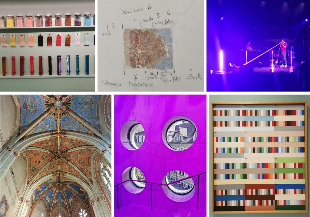
We enjoyed some excellent galleries and museums during our trip including:

Musée Ariana – the Swiss museum for ceramics and glass in Geneva

The Regional Museum for the Centovalli and Terre di Pedemonte in Intragna which also included a climb of the bell tower

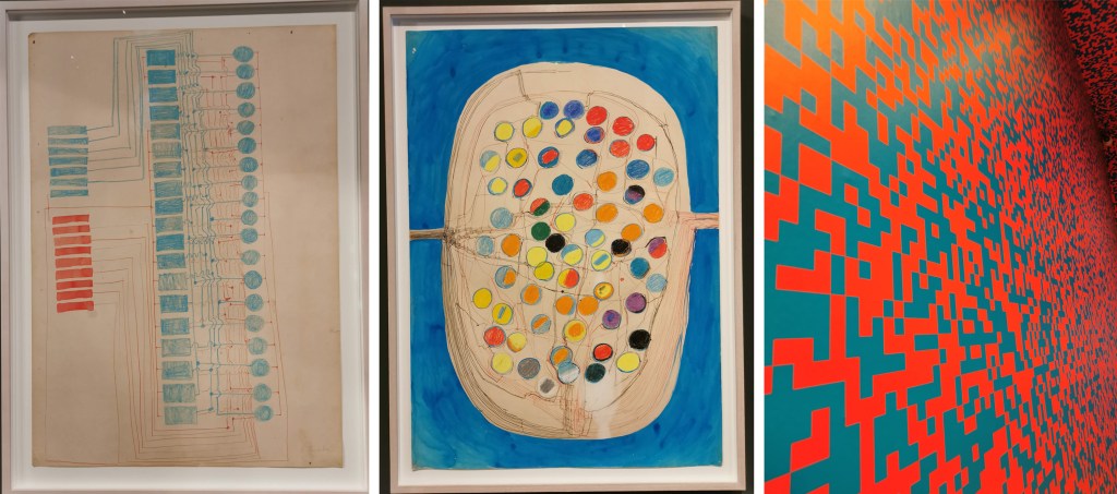
Landesmuseum (Swiss National Museum) Zürich – which housed an exhibition on all things Techno, as well as a sizeable collection of Swiss art and design through the ages and an incredible collection of rings of all shapes and sizes

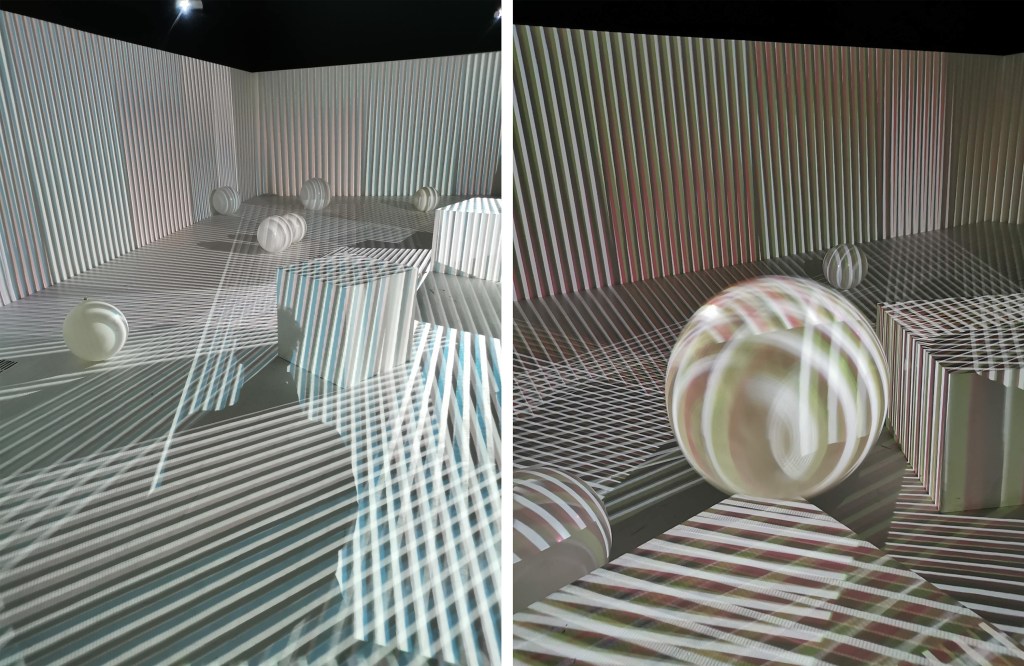
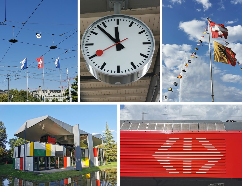
The Pavillon Le Corbusier, also in Zurich, nestled in a park by the lake

A surprise cultural highlight was a festival in Geneva on Swiss National Day (1st August), where we were treated to a performance by Alpenhorn Sound System, as we watched fireworks over Lake Geneva – amazing!

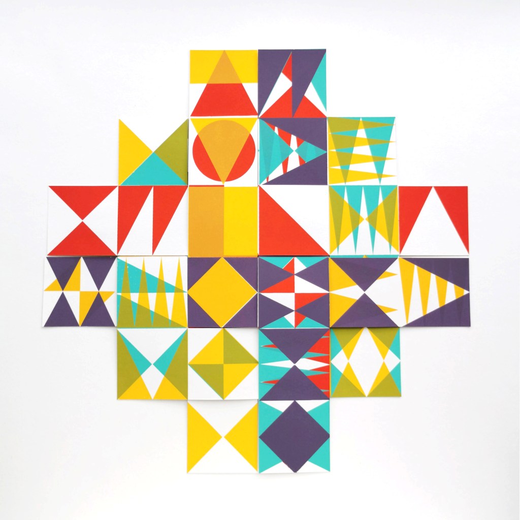
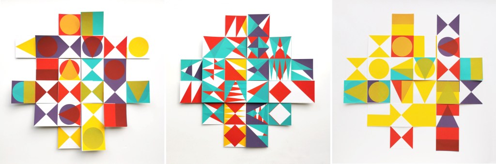
A great holiday, lots of good memories and plenty of inspiration!

PLAY prints on show

I am really pleased to have had two of my most recent works on paper selected to be included in the Print Cromer exhibition this summer, with the Private View on 19th July. This new body of work has been developed as part of my academic practice at Norwich University of the Arts where I have been exploring pattern structures and repeat blocks. I have explored new pattern iterations by rotating the screens to add additional colours of the same artwork, thereby building greater complexity from limited design information. In an age where digital design and the use of Artificial Intelligence provides limitless opportunities, I want to explore the fundamentals of pattern creation to generate new possibilities that are led by the designer, ensuring the creative path is transparent.

The theme of the exhibition is PLAY, and as a result the palette I created feels full of summer carnivals and fairgrounds. The overprinting of inks with differing levels of transparency provides a building of depth and subtlety of harmonious colour.

I created a number of one, two, three and four-colour prints initially, that featured the screen rotation in adding the colours. I then cut strips of the prints and with further rotation of the strips, interwove them into one base print that had been sliced to enable the slotting. I enjoyed bringing back an element of paper engineering from my book art practice into these new pieces.

In designing each piece, I considered the placement of motifs and relationships of colour. The collection provides variation within a collective identity and belonging. Some pieces feature only triangular motifs, while most incorporate the circular and rectangular elements too. My research utilises design thinking by Lewis Foreman Day, and his distribution of elements. This approach results in scattered focal motifs that work across repeating patterns. Although this is not a feature of my new work, I recognise the placement considerations are also useful in this work too.

A number of these pieces will be for sale during the show.

Electric Dreams at Tate Modern

I visited the Electric Dreams exhibition on at Tate Modern, London, until 1st June 2025 and thoroughly enjoyed the exhibition that ranged from 2D artworks, sound, kinetic sculpture, light projections and installations, featuring international artists and groups. Mathematical systems and rules, machine-controlled movement as well as material and pattern play resulted in a fascinating show I thoroughly recommend.

The exhibition was described as ‘art and technology before the internet’ and included C20th items from the Pop Art era through to early computing and video work. Our perception and senses were being challenged in many ways as we experienced the installations and artefacts. Some exhibits performed constantly, others, often featuring movement or light were timed, so I worked my way back and forth between the rooms to ensure I’d seen all I could in performance mode. The current trend for immersive gallery experiences were put in to context in this exhibition.

Left to right: Atsuko Tanaka (pic 1 & 2), Francois Morellet

Left to right / top to bottom: Otto Pine, Julio Le Parc, Martha Boto, Alberto Biasi, Analivia Cordeiro

installation: Carlos Cruz-Diez

Left to right: Mariana Apollonia, Lucia Di Luciano

Moving pattern – 16mm cameraless animation

I’m always looking for other ways to explore my pattern ideas and have been keen to consider options for film making to explore sequential narratives. Animation processes fit well with the work I’ve been doing with pattern evolution I have been testing across pages of books over the years.

Having been a fan of Len Lye’s paintings on film from the 1930s, including A Colour Box from 1935 commissioned to promote the General Post Office I was pleased to be able to attend a workshop in Norwich to to spend a few hours working on strips of 16mm film to make my own experimental animation. We were shown some examples of other people’s films and could then explore the process ourselves. The workshop was led by Jacob Watkinson and was hosted by The Holloway in Norwich.

We were given strips of clear 16mm film I was able to use pens, paint, rubber stamps and Letraset on, as well as pre-exposed film with archive films that we could scratch away the black with a scalpel beautifully. I know it’s obvious to say, but 16mm is tiny, and I’d forgotten my glasses, so that added to the issue of seeing what I was working on! It’s a tiny space to include anything too complex and I was unsure initially how many times to repeat motifs and at what pace to move motifs across the film, but I just had a go and tried not to be too precious. 

Once we’d all had a chance to work on several pieces Jacob spliced the pieces of film together and we ended the session with a screening of everybody’s efforts – it was great to see individual approaches with the same processes and the outcomes have certainly got me thinking about taking my pattern evolution ideas in this direction again. The image below shows some stills from the film I made – all 20 seconds of it! Len Lye’s films are brilliantly paired with music so maybe I need to think about that too – but I’m not sure today’s Post Office will be knocking on my door anytime soon!

If you want to read more about Len Lye this article from the Tate is a good one.

Colours from the Italian Alps

A grey-sky day slowly peeled back by mid-afternoon to reveal beautiful blue sky and high mountains with patches of snow. Following a slow late lunch of polenta and other local cuisine we prepped our bags and headed for the hills. Most people were coming down from the mountain as we started to climb, but we were well prepared, with tummies full ready for the walk upwards, not quite sure how far we’d get or how far we would see, but willing to make the most of the fine weather.

Walking in this sort of landscape can be overwhelming seeing as we live in the famously flat county of Norfolk. The vast scale of the mountains and the views stretching across the valley grabbed our attention initially. The purple greys and intense greens of the mountain sides played with the ever-shifting fluffy pale clouds. As we climbed along with the vastness of the mountain hues it was the pockets of colour, highlights of white, patches of sunshine yellow, pinks and mauves, acid green and deep crimsons and blue that competed as I put one foot in front of the other in the steep ascent. As we climbed new flowers became our companions beside the path, in the nooks and crannies of the rocks and high on the mountain pass.

Edelweiss and buttercups, scabious and azalea amongst plenty of others I was not familiar with. Although late in the summer there was so much colour to enjoy as there had been a very wet spell a few weeks before. Looking back up the valley as we drove back along the valley there was no sign of the colours we had walked amongst, but we knew they were there, ready for others to enjoy.

drawing, looking and seeing

I’ve recently returned from a lovely family holiday, traveling by train from Norfolk to London and via Paris through France to the south and on in to Italy, up into the foothills of the Alps via Turin … and back again. I made lots of small sketchbooks so I could have one close at hand at all times, with a selection of pens and pencils. I’ve always enjoyed drawing from trains, preferably sitting backwards, looking, identifying shapes and details, then hastily capturing what I saw in a few lines.

It’s a great exercise to keep the hand, brain and eyes in check, and although I have previously used this sort of drawing for my design work – including my degree Final Major Project back in 1997 – I only really do it now as a good activity to check in with the view and focus on the places, stations and landscapes I journey between, and as exercise for keeping my drawing practice fit and healthy. A gable-end of a barn, a cluster of trees or mountain horizons can be documented and it’s amazing how these drawings are then able to capture and remind me of the journey years later.

Here are some of the drawing from the trains. I sometimes get a bit more detail down if we sit in the station for a few minutes, and I jot the station name down for interest.

I also managed to do a small amount of drawing while sat in cafes or sheltering from sun while other family members were up to something else. They take a few minutes each, so still pretty quick observations. It’s clear my interest in pattern comes in to how I see the world. Rhythms of windows and balconies, railings, ornamental buildings….

I also made a couple of sketchbooks using tracing paper as I was interested to see how I worked with the transparent pages as the drawings built. I quite like the results and reminds me of how I plan lino blocks and screen prints with the layers of tracing paper.

It was definitely good to spend time drawing and I’m thinking of revisiting some in the studio, no pressure, just a few ideas. I hope you like them, let me know if / how you make drawings from trains!

Greece: pattern, colour, material, finish

A precious holiday to Greece in the early summer has provided plenty of nourishment for my creativity, as well as excellent down-time, walking and eating. It’s just taken me a long time to get this post together!

I’ve been creating photographic records of artefacts collected on holidays for some time – a great way of remembering the specifics of a walk without having to bring it all home! I’ve also enjoyed creating composite images to represent experiences over the years, some featured on the posts here, so I’ve done the same for Greece.

We visited the Cyclades, and specifically the islands of Santorini and Sifnos. The night on Santorini was for old-time’s sake, and the stay on Sifnos was to get to know an island we’d not been to before. It is a beautiful island, with lots to explore – I’d love to go back to one day!

Here’s a collection of precious finds from the 70+km of walks across Sifnos on their excellent trails, some very prickly! As marble was everywhere I thought it appropriate to use the marble table by our room as the background surface:

First up with the composite images – colour:

Next up: pattern, material & finish, including Greek yoghurt and honey of course:

and finally, the streets of Santorini:

spring brings colourful joy

I feel as if I’ve dragged myself through the grey, wet and cold British winter, without the delight of deep snow to play in, and finally the signs of growth in the garden and country lanes are undeniably taking us in firmly to the middle of spring. The magnolias are blooming, the blossom of blackthorn has been and gone in Norfolk and the yellow of the daffodils is being overtaken by the yellow of the oilseed rape fields.

Almost without warning, as if overnight, the garden has transformed from bare earth to borders full of colour; clusters of yellow, of orange-red, hot pinks and fussy white frills. The tulips are here, and with them comes the idea summer may follow spring. I’m not rushing the time by, I’m just more appreciative of the brighter, warmer months.

With the threat of heavy rain over the weekend I gathered up some of the tulips for the house – bringing the outside in. They’ve brought with them such joy, I really do feel better with the colour around me. I spent a little while drawing them a couple of evenings ago to absorb the colour and form of each one, thanking them for bothering.

Tulips have featured in art and design for centuries, in drawings, paintings and textile design, but my favourite has to be by the Austrian designer, Josef Frank, in Tulpaner, see below, for Svensk Tennn. The different flower heads of the tulips bursting from the dark background as if the colour is jumping out of winter is just how I feel, as the warm spring sun encourages the garden to enable colour to thrive and for us all to spend more time enjoying it.

inspiration old and new, near and far

I led a study trip to London with some undergraduate students recently, where I spent several hours in the Victoria and Albert Museum. Having not been there for a while it was fabulous to be back in the company of old friends such as the Arts and Crafts textiles of William Morris and his contemporaries, as well as seeing exhibits new to me. I love the building too and took particular enjoyment in the flooring this time around!

I refer to Arts and Crafts patterns regularly in my teaching and was able to include some fine examples in chapter 1 of the book I’ve written, REPEAT Printed Pattern for Interiors, published by Bloomsbury earlier this year. They tend to show generosity of design, interesting rhythms and motifs working hard with stylised forms that still stand the test of time. Seeing these artefacts in the flesh really made me appreciate how important it is to get off the screen and go to see real things. The scale of the design, the surface and materiality just can’t be appreciated in the same way online. I’d also not seen Portrait of Melissa Thompson, from the series ‘The Yellow Wallpaper’ by Kehinde Wiley. It was stunning and really impactful where it was displayed.

I was there to specifically see the Africa Fashion exhibition which I thoroughly enjoyed. I’ve long known of woven Kente cloth and the Asafo appliquéd flags, but it was wonderful to read and see more of the textiles for fashion, both traditional and new across the exhibition. The textile processes were broad, with fabric manipulation, weaving, printing and embellishments in abundance.

The remaining time I had at the V&A was spent enjoying the international galleries (did I mention the cake break?) where I traveled around the globe by fabric, vessels, garments and objects, enjoying making my own connections between motifs shared by people from centuries and continents apart. To juxtapose a furnishing fabric from 1878 with velvet from Turkey made in 1550, and a tapestry fragment from 400 was rather an enjoyable and fascinating afternoon’s work. I shall try to get back there with less of a lengthy gap next time!

The museum was described by the first Director, Sir Henry Cole as a “a refuge for destitute collections”. I think that’s maybe a little harsh.

REPEAT: Book publication day coming very soon

On the 12th January 2023 my book for Bloomsbury on the subject of repeat printed pattern for interiors will be published, … finally there’s not long to wait having worked on it for years!

If you want to order a copy at a pre-publication discount you can do that here.