knowledge of books

I have taught hundreds of people how to make books. Folded, stitched, and even stuck books have been made under my guidance in school rooms, art college studios, village halls, hospital rehab. suites, commercial company meeting rooms, and at dining room tables, at the very least. Every time I teach a bookbinding workshop there is a sense of wonderment from the participants, a proud moment when they hold the completed book for the first time, and realise what they have made. It’s a good feeling being the facilitator of that experience. Books are one of those objects that carries so much potential; an object that can contain private thoughts, or public rule, but is portable and very cheap to make using very few tools. We bond with books.

I was first taught about Book Art by Les Bicknell of ‘bookness’ fame. He made a studio full of Norfolk kids studying textiles question our preconceived ideas of what a book can be, and I was unique in that group – I saw a future of work that I wanted to make. On my degree course I was taught more practical bookbinding skills, and eventually wrote a 12000 word dissertation on the subject, researching in key collections at the V&A and Manchester Met. as well as interviewing some leading figures of the genre. Books for me at that time fulfilled learning requirements on my design degree while becoming vessels to explore my ‘fine art’ ideas, and this eventually led me to study for the MA in Book Art at Camberwell College of Arts, London. I spent the year investigating a ‘sense of place’ of south London, driven to create a more personal map of my London in contrast to the A-Z map, exploring cinematic flip books, and architecturally inspired structures.

KF_2sides_web

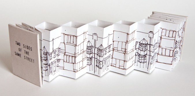
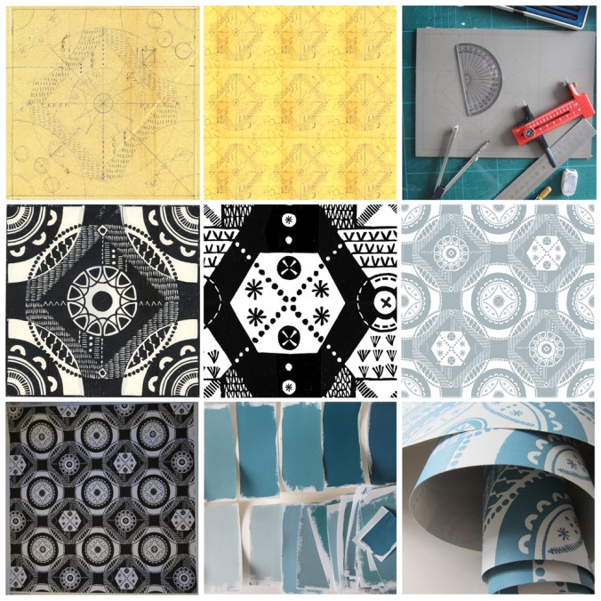
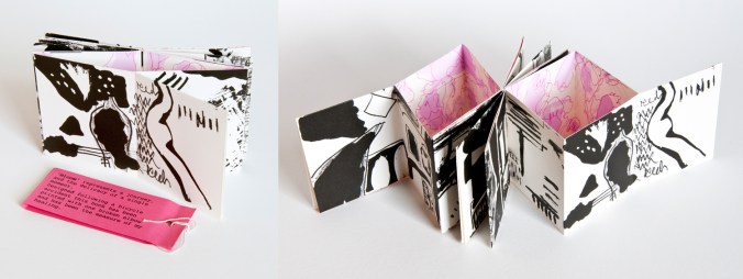
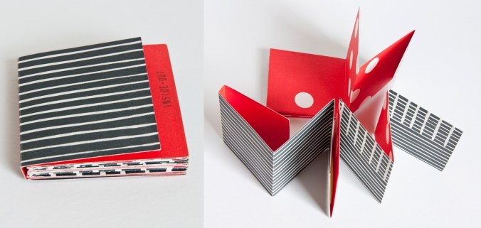
There are tools and skills that are beneficial to know; I was taught by the old boys at London College of Printing, as it was then, how to stitch with curved needles, cover the boards, and press the blocks. More useful to me though was the challenging of how we ‘read’ the book form, how one can be directed by the designer to progress through both visual and structural narratives across pages and along folds. I’ve explored these ideas in many of my limited editions of books I made and exhibited between 1998 and 2008. I’m very proud of this body of work, and I know many people appreciated the pieces. I have work in the Tate collection, the British Library, Manchester Met. to name a few, as well as overseas in collection in America, France and Ireland and within the small world of artists books I became known for the structural book forms I created. Many of my books were inspired by journeys and places I experienced, or events and mindsets I found myself in. A broken elbow falling off a bicycle really did inspire ‘Bloom’ which I describe as the ‘measure of my healing’, as I challenged myself each week to cope with the physical tasks required of printing the book. I have always taken on and enjoyed the challenge of transforming a two-dimensional sheet of paper in to a three-dimensional book structure appropriate for its narrative.

KF_Bloom_web

Sadly not many people make a living selling artists books. It frustrated me that I could sell a print for £80 but once I had folded and stitched it in to a complex structure I couldn’t sell it for £20. So strong is our association with art, that if it can be framed and put on a wall it had greater value. I also got fed up with the ‘I can see how she’s made it’ statements as visitors to shows photographed my work without the courtesy to ask, as if I was a learning resource centre, having paid for the pleasure myself. I see now an increase in awareness of book art and hope things have changed in these regards.

KF_insideout_web

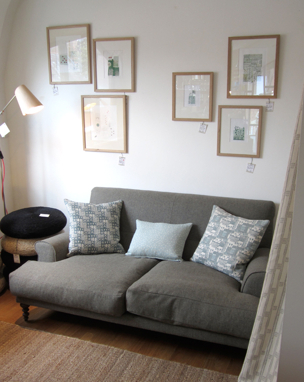
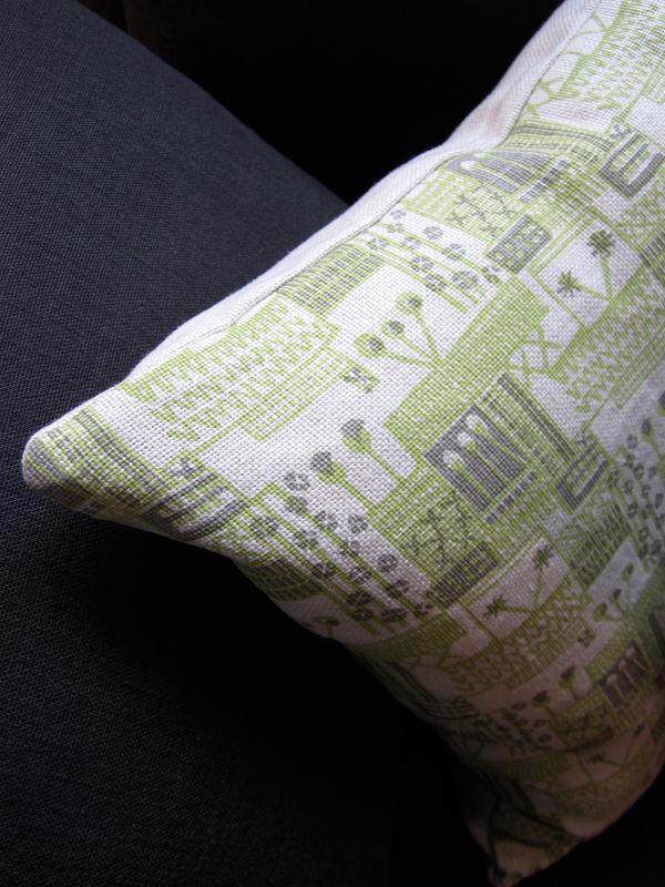
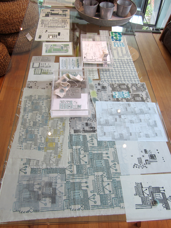
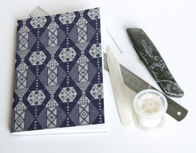
I have continued to use the practical and conceptual skills in my public art commissions, with large-scale visual narratives explored as if pages held in my hand. The sequence of toilet doors in a central Colchester public convenience was just that, a story of passing time. My current design practice benefits from my bookbinding skills and visual communication knowledge, as well as my book art thinking in the design of my marketing material, and sample books. I also continue to produce hand printed and stitched notebooks featuring my patterns – Parterre is the latest.

KF_parterre_toolkit_web

As I pack up my box of tricks ready to teach another fifty students the basics of books let’s hope some of that joy and creative potential is passed on to the next generation, for whatever context they want to think about books in.

Useful links:

http://www.tate.org.uk/research/library/artists-books
http://www.bookarts.uwe.ac.uk/about.htm
http://www.specialcollections.mmu.ac.uk/artists.php
http://www.katefarley.co.uk/gallery/bookworks2.htm

If you haven’t seen the new IKEA video about the book book, check it out: http://www.youtube.com/watch?v=MOXQo7nURs0


Plot to Plate prints and patterns at Tent London

What a week! Several trips to London, lots of bubble-wrap, the wearing of a particular dress and stamina, all in the name of Tent London as part of London Design Festival 2014.

The preparation has taken months, alongside the development of patterns and printing I have worked on marketing & promotion, stand design, costings and sales. I’m delighted that my first commercially available wallpaper called ‘Hanbury’ (see previous blog post) has been really well received by interior designers, the public and the press and I look forward to working with really great people who have shown support.

The fabrics have been fairly consistently described as ‘restful’ and ‘calming’ with the muted colour palette being appreciated and described as ‘mid-century’ and ‘modernist’. Its difficult to know sometimes how much people want to know about the generation of pattern designs, but when I described the inspiration and showed the drawings and limited editions of prints of allotments that helped to generate the motifs there was a sense of pleasure and understanding, especially amongst the gardeners! The linens have been popular, especially the Plot to Plate VVV stripe design. I look forward to seeing these fabrics on chairs and hung as curtains in due course.

After months working away in the studio it’s been a great opportunity to have conversations and feedback, meeting like minded people and making the first steps to some fabulous opportunities and working relationships. Thanks to all who came by to meet me, I really value the feedback and support!

A huge thanks go to all of my sisters who played their significant part in keeping me upright, getting me and my work to where we needed to be, and keeping the children going. Thanks to Gavin, as well as Helen for living in the right place, and huge thanks to Stuart for being a great ‘intern’ – above and beyond!

If you didn’t get a chance to visit my stand here’s what it looked like…

KateFarley_Tent_N20_webKateFarley_stand_details1_1500web KateFarley_stand_details2_1500_web KateFarley_N20standdetail3_1500web

Wallpaper in the creating…

The process of designing my first commercially available wallpaper has been a long & highly considered journey and one I thought would be interesting to share.

Research: I first made drawings in my sketchbook last summer when I visited the National Trust property Hanbury Hall & Gardens in Worcestershire. I really liked the formal parterre and saw a really close link between garden design and textile design – I wrote about this in a previous blog post: https://katefarley.wordpress.com/2014/05/11/pattern-design-outdoors-and-in/

Composition: Sketches became drawings that became more detailed designs, that were then tested in repeat by scanning them in to the computer and using Photoshop. Edge details, scale of motifs, pattern and textural rhythm all needed to be considered.

Cutting the block: I measured and cut the lino block before taking a really clean print in order to scan the print in to work digitally with the repeat tile.

Editing: Further refinements, several print outs and more alterations took place over several weeks as I got used to seeing and living with the design. Additional lino blocks were cut in order to add different motifs to the design. Additional variations across the larger repeat file create visual interests and a play on the traditional repeat expectations. Some tweaks were so minimal that people unfamiliar to the design wouldn’t be able to spot the changes without having them pointed out, but it’s so important that every dot, dash and space has been considered before the production process is underway, saving time and lots of money.

Production: The digital artwork was sent off to the manufacturers of the roller in order for the design to be printed, and a technical proof was sent back for my approval – exciting and scary times!

Colours: Much thought, research, trying and testing went in to the colour combinations and I painted lots of colour chips using gouache in order to communicate the choice to the printer.

Printing: After signing off the colour proof provided by the printer, the wallpaper went in to production, labels were designed and printed, rolls created.

Results: I’m delighted with the results, the efforts by all those involved with the production process, and look forward to launching this at TENT London very soon.

hanbury_BLOGtile1000rolls_100_DSC_0227

A new design: working it all out

I’ve created more designs than I can remember since I began ‘formal’ pattern making back in 1992. Some aren’t worth worrying about, some I’m still extremely proud of and some are still waiting for the right time to make their debut… (I can’t wait to show you some very special ones next year but I’m sworn to secrecy.)

Some designs work themselves out for themselves; I vividly remember shutting my eyes to get some sleep right in the middle of my final major project on my degree, when suddenly my mind spun in to action, and there in my mind was a design, colour separated and waiting to be drawn out for screen the very next day. Other designs I battle for days on, and eventually win through demonstrating more stubbornness than the design itself.  I don’t give up easily.

In all my designing, however hard or easy it was in the making, I aim for them to appear strikingly straightforward, as if they did just happen on their own. I was accused by a tutor for being lazy – he didn’t understand minimalism – when in actual fact, it’s far harder to let the negative space be as important as the motifs we can sometimes throw at a design like pennies to a pond. Space can be beautiful.

I’ve taken a slightly different direction to making the most recent patterns; some would argue they are more traditional, more formal, more fussy even. I’ve certainly battled with the minutiae. I thought it nice to share the journey a little, but do bear in mind, every dot, line AND space have been considered, reconfigured, tested, discussed and revised more times than I’m counting (and that’s before I even think about colour). I hope you like the results. The design will feature in my new work to launch at TentLondon in September, so watch this space.

KF_workings_1000web

The image shows: initial sketch / proportions of the motif, repeat / rhythm testing of the drawing before the lino block is cut, the lino block being printed, and the final digital artwork. The inspiration is a mix of kitchen gardens and formal gardens of the National Trust.


Pattern design, outdoors and in…

If you are a regular reader of this blog you will already know that for the last few years my personal design practice has been inspired by garden design, and most specifically allotments and kitchen gardens in my ‘Plot to Plate‘ collection, launched in 2012. I have spent many hours walking, almost patrolling, up and down rows of National Trust cabbages and onions, armed with my sketchbook, annotating the patterns, translating them to motifs, documenting the small irregularities, the planting plans, the labeling – fruit and vegetables up and down the country, as well as our allotment, plot 8 in Birmingham. Upton, Packwood, Baddesley Clinton, Blickling, Felbrigg, to name a few National Trust gardens I have surveyed and taken inspiration from. Hanbury is my current favourite garden and I have been working on a number of patterns inspired by this property that will one day be complete, to launch at Tent London this September.

It is with this in mind that I write my thoughts. There are so many similarities between garden design and textile design they seem perfect companions in my practice. Long before Mr W. Morris picked up a pencil the natural world of flora has been a dominant subject of inspiration for pattern in the home. Rather than the bouquets and sprigs, posies and trellis it is the formal gardens, the parterres and kitchen gardens that hold the structure and compositional language that we textile designers and design educators regularly refer to…

Stripes, spot repeats, all-overs and multi-directionals, geometric grids and diamonds, checks and plaids are all to see. And so it is, that it makes sense that I really have brought two things that I do enjoy together in my creative practice. It’s too early to share artwork for my new ‘Hanbury’ designs but I will share some garden pattern from Hanbury, and my ‘new’ fabrics by the metre, available very soon, in anticipation…

garden_textiles_hanbury_web  fabricrolls1_web

‘Chelsea’ drawings to design for David Mellor Design

Many months ago I had the go-ahead from Corin Mellor to design a bespoke pattern to celebrate the fabulous ‘Chelsea’ salad servers that he designed for David Mellor Design. When I first saw the cutlery I immediately really liked the look of them and when I received the servers they were amazing to hold – they still are. Impressive in weight and size, the shape is simple yet stunning, and they inspired me to set about drawing. With a number of design options I provided Corin Mellor, Creative Director and his retail team, they discussed and advised, and before long we agreed on this design that is now printed on to linen union tea towels and sold on my website, David Mellor shops in Hathersage and London as well as Museums Sheffield.

With the tea towel now listed in the ‘Special Products’ section of the David Mellor catalogue I thought it time to show some of the images I have of the process. I took inspiration from my visit to the factory in Hathersage where they make and display the cutlery production process as well as the objects themselves.

I’ve had great feedback and sales, we are having another print-run and they’ve received press in the form of Elle Decoration!

Thanks also to Patternbooth and Design Hunter:

drawing_mellor1webprintedMellorTags_webmellor_square_web

elledeco_Mellor_dec13_web

Kate Farley – Plotting Prints at Tinsmiths

It is a very exciting time for me. It has been about two years in the planning and preparation stages and now we are a week in to my show at Tinsmiths. For those of you unfamiliar with Tinsmiths, it is a beautiful textile and lighting shop in the lovely Herefordshire market town of Ledbury. It is a beautifully considered shop, owned by Phoebe Clive, selling a wide range of fabrics as well as home wares, crafted pieces and artists prints.

I have worked closely with Phoebe to translate my lino printed designs inspired by allotments, to become a collection of heavy weight linen, hand screen printed textiles available to buy as cushions. We have also created larger showroom pieces as curtains and upholstered chairs in preparation for selling some of the designs by the metre later in the year.

Phoebe and the team have styled my products throughout the top floor of the premises in such a way as to create a clean and fresh interior space, working with the other products and furniture pieces in the shop. My prints and drawings are set amongst other exciting colour statements in the form of ceramics & lighting with an understated aesthetic. With plenty of positive feedback at the PV as well as sales throughout the first week it’s a really exciting reward for the long journey to this point.

Tinsmithssofa_web

cushion2_tinsmiths_web

glassdisplayTinsmiths_web


cushionsTinsmiths1web curtain_tinsmiths_webchair_tinsmiths_web

Hanbury Hall delights

My creative practice has been inspired by National Trust gardens for the last few years and as a result I’ve had a number of people suggest I visit Hanbury Hall – finally I got round to it at the weekend. Despite the poor weather it was a delight to discover all the pockets of gardens, each carefully considered, and demonstrating the wide variety of formal and informal planting the National Trust excels at.

ImageImageImageImageImageblossom_webImageImageImageImage

Armed with my sketchbook and camera I gathered plenty of inspiration for new prints and will definitely be back later in the season.

Image

Its also a fantastic building inside and out. I dashed around the inside and a particular wallpaper caught my attention.

Image

All in all, I left feeling excited about making new work again having spent so long preparing for my solo show at Tinsmiths, opening later this month… now where did I put that lino?

tulipsHH_web

holding on to the details…

This photo was taken at Birmingham’s old science museum in its last days before demolition as I was carrying out research for subsequent commissions inspired by the site. It goes some way to sum up how things are in the studio at the moment with many lists and scraps of precious information as I am very busy with making new prints & promoting my upcoming show at Tinsmiths, Ledbury next month as well as coordinating suppliers and working on exciting new design work. All this in the break between Spring and Summer terms of my lecturing job…

staples_web

Design inspirations 1: horizon lines

For a while now I’ve been thinking about what has shaped my visual language and informed my art and design tastes. As a result I have planned a few blog entries in which I will evidence some of my thoughts in terms of influence and my art / design practice.

In some recent press interviews I’ve been asked about my inspiration and I tend to consider the formative years as pretty vital in this regard. It makes sense that we develop strong feelings and bonds to what we experience as children, either to reject them or embrace them – either way I believe those early years help to form our adult judgements.

Looking beyond the windows of the house in rural Norfolk where I was brought up is what I consider one of the greatest inspirations to my work. The open fields, the clear horizon lines and sparse distractions across the farmland of Norfolk have stayed with me in relation to my way of seeing, composition and economy of information in much of my work. Why draw ten lines when I can say it with one? I had a particularly horrid visiting tutor in the beginning of my training who felt that I was lazy in my designing, when actually it was he who struggled with some of the simplicity I was aiming for.

Looking back over some of the works I have made in the last fifteen years there are a few key pieces that explain that relationship with the horizon.

‘Nine Perspectives’, a linocut is made up of diagrams where I explore the land, sea and sky in a variety of ways. I consider the horizon in two-dimensional form, in plan view, elevations and diagrammatic perspectives in order to gain a sense of order.

9perspectives_web

‘Meadows (France)’ is a drawing of a beautifully simple valley near Gourdon. It gave me a perfect view to explore further skewed interpretations of perspectives seen in the landscape. I worked with a sense of the view working round a set square, with two horizons, as I looked in front and to the side of me.

stgermain_webThe final image is from a screen printed artist’s book I made several years ago exploring the idea of ‘half full’ as a state of mind, but also from each side of the horizon line. I have used the blue areas as either half full of water (the Norfolk Broads specifically) or half full of sky above the chickens. The folded structure implies a view through the use of perspective, looking in to the distance or reflecting on oneself.

kf_half-full_web

These three works are very old as far as I’m concerned. I have new creative concerns now but they have helped me to test and explore principles in the way that I see and draw that have been important along the way.