PLAY prints on show

I am really pleased to have had two of my most recent works on paper selected to be included in the Print Cromer exhibition this summer, with the Private View on 19th July. This new body of work has been developed as part of my academic practice at Norwich University of the Arts where I have been exploring pattern structures and repeat blocks. I have explored new pattern iterations by rotating the screens to add additional colours of the same artwork, thereby building greater complexity from limited design information. In an age where digital design and the use of Artificial Intelligence provides limitless opportunities, I want to explore the fundamentals of pattern creation to generate new possibilities that are led by the designer, ensuring the creative path is transparent.

The theme of the exhibition is PLAY, and as a result the palette I created feels full of summer carnivals and fairgrounds. The overprinting of inks with differing levels of transparency provides a building of depth and subtlety of harmonious colour.

I created a number of one, two, three and four-colour prints initially, that featured the screen rotation in adding the colours. I then cut strips of the prints and with further rotation of the strips, interwove them into one base print that had been sliced to enable the slotting. I enjoyed bringing back an element of paper engineering from my book art practice into these new pieces.

In designing each piece, I considered the placement of motifs and relationships of colour. The collection provides variation within a collective identity and belonging. Some pieces feature only triangular motifs, while most incorporate the circular and rectangular elements too. My research utilises design thinking by Lewis Foreman Day, and his distribution of elements. This approach results in scattered focal motifs that work across repeating patterns. Although this is not a feature of my new work, I recognise the placement considerations are also useful in this work too.

A number of these pieces will be for sale during the show.

playing with print

I’ve been enjoying some studio time to explore my print research as works on paper with the hope of exhibiting the work. I enjoy paper engineering and construction (that’ll be the book artist in me!) and have previously tested paper manipulation in relation to this current pattern research. I tend to work in this way, creating drawings or prints to exhibit / sell alongside forming pattern ideas, and it has been useful to see the evolution of the sampling in this way here too.

These new artworks utilise my screens of geometric artwork practically exploring research into motif distribution in printed pattern thinking formalised by Lewis Foreman Day in his book Pattern Design, published in 1901. Having printed the artwork in the first colour, I rotate the screen by 90-degrees and print the second colour, turning the artwork / screen up to four times for maximum complexity. To add a further dimension, I’ve been constructing works on paper that utilise several iterations of the prints to build new compositions by weaving and slotting strips of the printed papers in differing combinations of the four colours in the palette, providing the coherency across the series, and an injection of the spirit of summer fairgrounds through the colour and geometric visual language.

There are two screens of artwork used in this collection, therefore two series of original artwork (PLAY – circles and PLAY – triangles) and I shall continue to evolve the body of work over the coming months. I’d love to know your thoughts on this new work!

patterns and maths

I have been fortunate in having my pattern research selected for inclusion in a really exciting exhibition opportunity in Bristol, led by academic Lucy Ward from University of the West of England.

“APERIODIC brings together artists, scientists, musicians and others in an exhibition about pattern. The show presents work that explores ideas relating to the mathematics and science of ‘aperiodic order’: the absence of regular or repetitive patterns. Or, more simply, ‘things that almost repeat, but not quite’. The exhibition is part of the APERIODIC festival of art, science, music and performance taking place this July in Bristol.” official exhibition text (APERIODIC, 3-14 July 2024 at Kit Form Gallery, Bristol)

The two pieces I had selected explore block rotation in the over printing of further colour layers, resulting in a building up of a more complex design:

Geo / grid / star Lino print

Fields of seemingly reliable compositions of geometric motifs provide the rhythm of assurance through repetition of geometric rhythms but the swapping of small details amongst the motifs unsettles the overall pattern and disrupts the repeating design. The block is rotated before printing of the second colour.

6-spot rotation, multi-direction Lino print

Built upon Lewis F. Days’ principles of distribution of motifs in pattern design (1901), motifs are placed within a tile, 6 x 6 to provide balance and direction when repeated. As the second colour is applied the block has been rotated by 90 degrees in each printing of the tile over the original blue. The repeat is broken and a disorder is established.

One of the highlights of having the work selected for exhibition was the opportunity to have a mathematician review my work aligned to their own interests in pattern. Yotam Smilansky is a Lecturer in Dynamical Systems and Analysis at the University of Manchester, with a special interest in aspects of order and disorder in geometric patterns so I was interested in what they had to say about the work on exhibition.

Yotam Smilansky on Kate Farley, ‘Geo / grid / star’ and ‘6-spot rotation, multi-direction’:

We notice a certain form, a sense balance, but it might take us a little while before we realise exactly what’s going on. Then we get it: the complicated object before us is made of a single ingredient, copied and superpositioned. It is surprising, even magical, how the unassuming process of layering rotated copies of a single pattern can result in a rich family of objects with a wide range of properties. This is evident, for example, in the moiré patterns of twisted bilayer graphene, where a slight change of angle results in completely different electrical properties, and is beautifully demonstrated in Farley’s mesmerising prints.

Yotam’s response interested me as I’ve been exploring ways to disrupt and challenge the repeating tiles through transformation and evolution of individual elements within an apparently repeating pattern. I’m certainly keen to continue with this work and am grateful for this opportunity to gain feedback as well as discover the work of other pattern-makers. You can read other reviews of exhibiting artists by mathematicians here.

Thank you Lucy, Yotam and all those supporting the event.

REPEAT panel and contributor book signing

It’s been a while since I last wrote here – the summer term at university has been very busy, … I’ve hosted an Industry Awards Day, assessed a lot of work, put up a degree show and taken students to the graduate showcase of New Designers in London, to name a few activities, so not much headspace I’m afraid.

In the middle of all that I agreed to chair a panel at New Designers titled Contemporary Printed Textiles and Surface Design Practice. I had the amazing designers Emma J Shipley, Sarah Campbell and Deborah Bowness as panellists, sharing their expertise – all three designers are interviewees in my REPEAT book. I had some questions up my sleeves to shape the discussions, and despite not having done this sort of thing before I thoroughly enjoyed leading it. To a pretty much packed venue we discussed our individual design processes, clients and customers, how we work through licensing deals, and the decisions behind establishing brand identities. Sarah, Emma and Deborah have decades of experience between them so it was so valuable to share their generous and hard-earned experiences with the attentive audience. We could have carried on for much longer! There was also the highlight of meeting my publisher from Bloomsbury, Georgia, who I’d not met in real life before then, but came along to support me.

I also had another idea in my mind, to ask Sarah, Emma and Deborah to sign my REPEAT book to make it a special keepsake. As New Designers is a textile design industry event I also managed to cross paths with several other contributors and asked them to sign it too, including Mark and Keith of Mini Moderns, Clarissa Hulse, Daniel Heath, Jules of @thepatternsocial fame, as well as past students Tasha, now designer at Habitat and Molly, currently floral print designer at Bay and Brown. It has become a mission to find opportunities to cross paths with the many others included, but this could be a very long task!

The day ended in celebration for my colleague Jill, who retired this month after 38+ years at Norwich University of the Arts. Jill taught me when I was 18 years old, and we’ve worked together over the last five years in Norwich. She came along with Grainne, also one of my tutors, to support our graduates on the stand at the show, so I grabbed a picture with them both and the book. They earned a mention in the acknowledgments as they were hugely supportive of me as a student, introducing me to their love of drawing, colour and pattern that has stood me in the many years since.

It was a really successful few days in London with our graduates doing themselves and us proud, as they jumped with both feet in to this great industry experience, just weeks before I proudly read their names out as they crossed the graduation stage at Norwich City football ground. Now it’s time for some holiday!

pattern project potential

I’ve been keen to get back to designing and printing having spent my practice time writing and developing the book for publication over the last few years. I’ve been testing ideas of pattern evolution and pattern construction for some time in a limited way, specifically looking at pattern structure evolution through drawing investigations, but the ideas at the heart of this investigation have themselves evolved over the last couple of years.

With more time and fresh energy I’ve defined a new project brief and research rationale, and I’m excited to have got off to a good start. I’m looking at repeat tiles and construction of pattern formations, so cut shapes and sketches were an obvious way in for idea development. I’m trying not to be too precious with outcomes at this stage, so I’m trusting the process.

I’ve started by testing ideas with geometric shapes as subject matter to keep the aesthetic clean and graphic, focusing on the laying down of colour blocks. I’ve started by working up some ideas for screen printing but anticipate many more drawings, maybe lino prints and certainly digital work will be created over time too. The colour palette will certainly change, but with an exhibition I’m making work for at the same time dictating pieces to be black and one other colour I’ve gone with black and green.

I don’t want to give too much away at this stage, but look forward to discovering the potential over the next few months.

updated website – live now

I’ve been meaning to make changes to my website for some time, and finally I’ve got around to it. Check it out here

Katefarley_webupdate


New drawings for sale

I have made some pencil drawings from my recent trees project (previously featured on the blog) available to buy – there are currently eight still available.

They measure approximately 28 x 19cm, on heavy weight paper, £55 each, with 30% going to Cancer Research UK.

Do take a look over on instagram where they are all listed, & message me if you are interested in reserving one. Feel free to spread the news – I don’t often sell my original drawings ….

Here’s drawing 1, 2, & 3 …

KF_drawing1KF_drawing2KF_Drawing3

international pattern collaboration

It all began in an email with the subject line, ‘Hello from Tokyo’ I received in November 2017, letting me know how much my tea towels for David Mellor were admired in a Japanese design company. The email went on to ask if we could discuss a potential collaboration for a capsule fashion collection featuring a print designed by me. Firstly I was excited to think my patterns had made their way to Japan, but secondly, that sounded a great idea, tell me more! A few email exchanges later, and we agreed to meet the next time the company director of Stamps Inc. was in London so I could show him my portfolio to discuss the idea for the new pattern they would like to commission for their fashion collection.

The meeting with Shu and his colleague Yoko in a central London hotel was exciting; I showed my work and it was met with positive discussion. I was also reintroduced to the tea towels that had made it to Japan all the way from my studio, via a David Mellor Design shop! We sat at a large table and I showed them my portfolio, spreading the many sheets out covering the whole surface. Having shown all the other work and following some discussion in Japanese between colleagues, the director chose the very first page he had seen – the cover page! The choice was not what I was expecting but we shared and developed ideas for me to sample: colours, time-lines and garments. We then took some photographs to record the start of the project together, for when we would be able to share our story – and even asked the hotel doorman to take a pictures of the three of us with a London bus behind us.

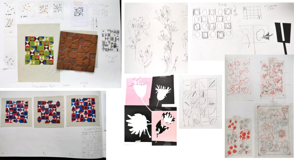
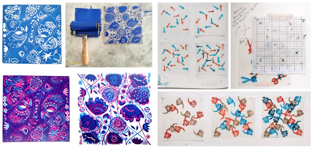
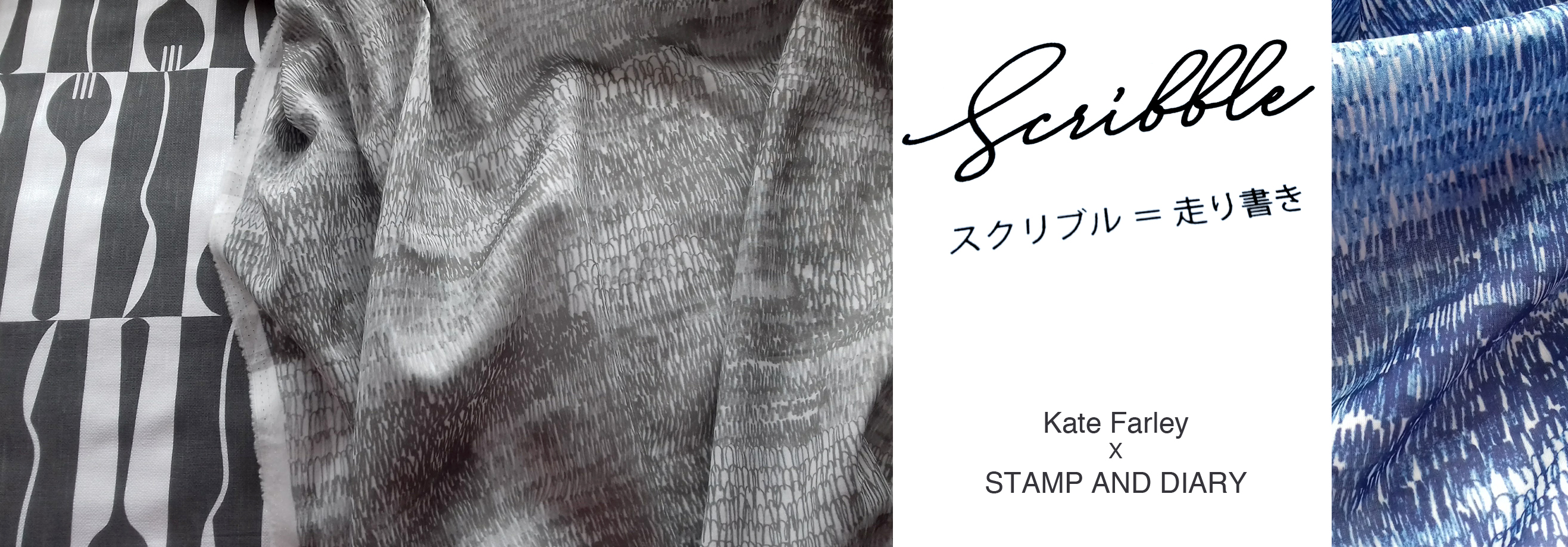
The selected design was a graphite pattern of pencil scribbles of varying tones and rhythms, later to become the title of the collection: Scribble. There are lots of variables such as scale, rhythm, tone and  overall order in the pattern we had to make decisions before I set about creating the final artwork. I emailed across some small sketches to explain the repeat process for production to check we were understanding each other as we had to ensure we understood the terminology that each of us used in our different languages.

KateFarley_SCRIBBLEwip_1_1500

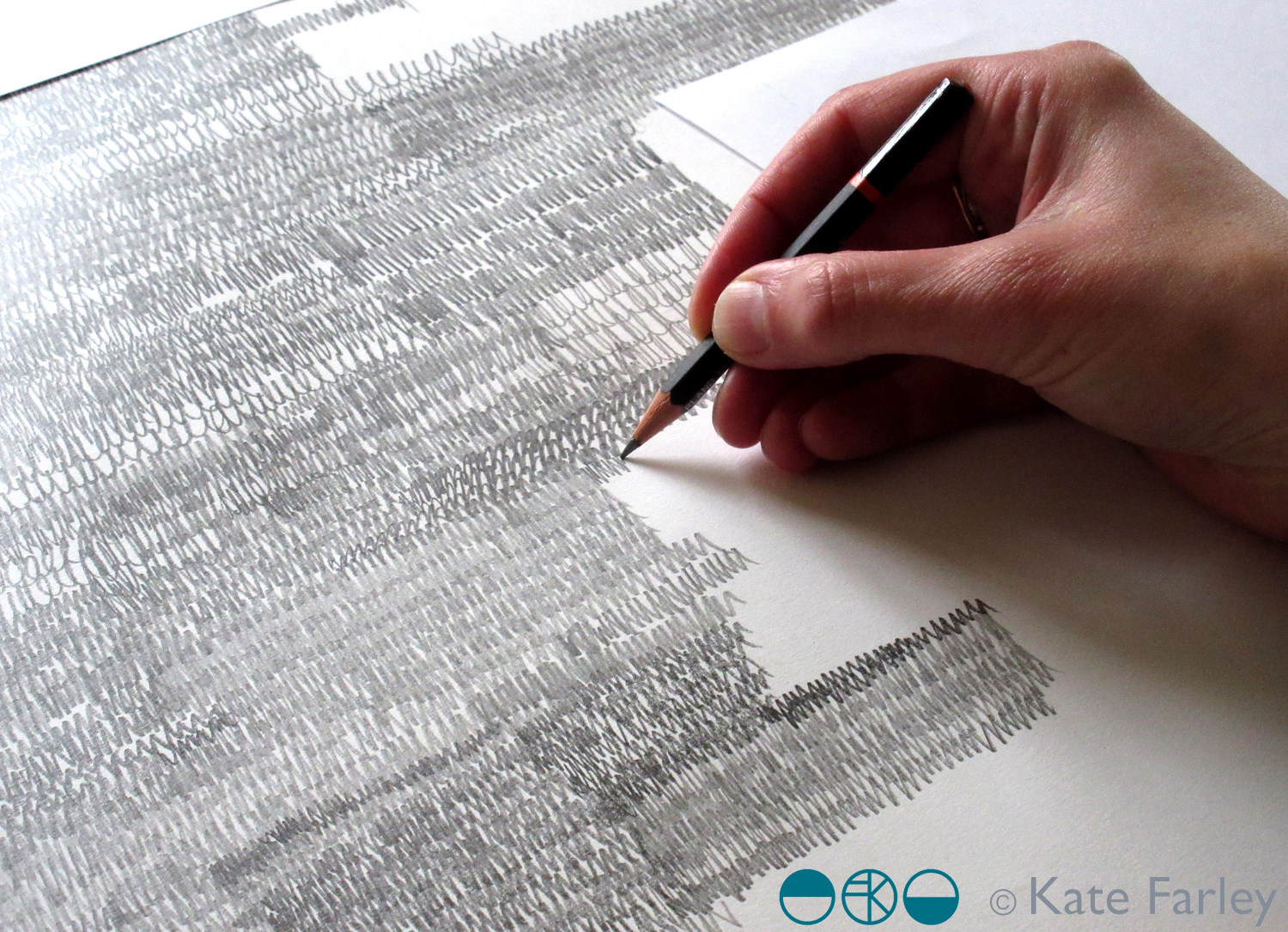
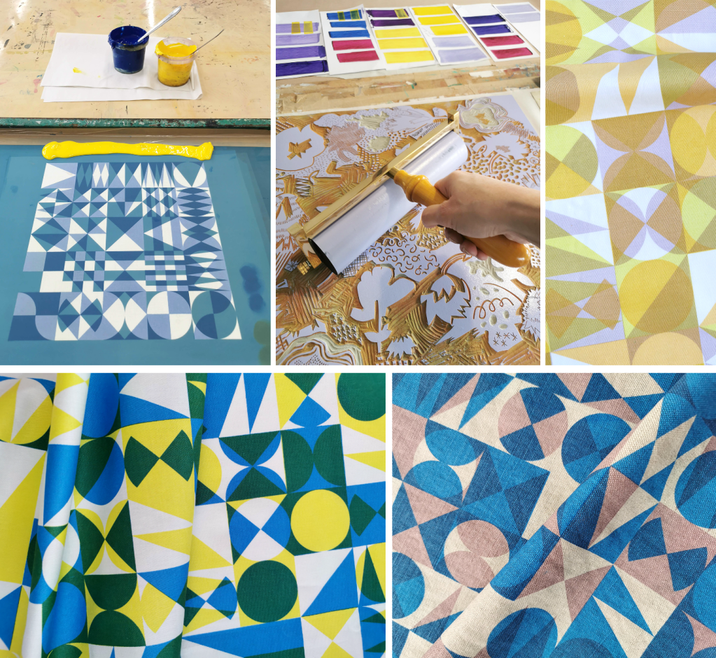
I shared several images of new drawings to provide the variations / considerations over email before committing to the final design. The final fabrics were to be screen printed so I planned to draw out the whole design in full repeat by hand (approximately 60 x 90cm), scan it in and transfer it to Japan for screen print production. I started the large final drawing twice as I wasn’t happy with the first one. Initially the marks I drew appeared tense, but I also had to work out how to create the different qualities with the pencils across a vast piece of paper, and how not to smudge the areas I had drawn. I drew the design at 80% scale to make scanning it in possible, meaning I had to take in to account the slight increase in the size of the marks in the final result. I also had to ensure the top of the design matched the bottom, as the edges were to act as a cut-through for the screen printing process of repeating the pattern, fitting like a jigsaw, top to bottom. The design was edge to edge, left to right, fitting the width of the fabric so there was no horizontal pattern-repeat.

KFARLEY_SCRIBBLEwip_1500crop

The final artwork took almost ten hours to draw, and I did that mainly over two long evenings. I had it scanned in at a very high resolution, adapted the size of artwork to 100% and sent the digital file to Japan – with my fingers crossed that the printer could work their magic, including colour separating the graphite tones for the two screens each colourway would require!

There was a wholesale launch in Tokyo so I sent some of my original drawing samples over to feature as framed artwork in the exhibition and I was sent photographs of the lengths of fabric on show. Very exciting! Orders were placed and there was a good response. A further email request came from Japan, to meet again in London to see the fabric. Another exciting moment – also scary – what if I didn’t like the results!? In the stylish interior of the St Pancras Renaissance Hotel lounge there was no need to worry. Great care had been taken to translate my drawing to screen printed cotton lawn fabric, in two colours – referencing the two colours of my David Mellor patterns Chelsea, in grey, and Pride in blue. The fabric felt beautiful and the printing fabulous. It was a special meeting.

I was able to see the marketing material including my name alongside Japanese text I couldn’t decipher, describing our meeting and the collaboration. I have had to be patient while the wholesale launch orders were being produced before we can promote the project I’ve had to keep under wraps for well over a year … until now!

It has been an absolute pleasure working with Shu and Yoko, learning about the company and their pride in who they work with including the products they develop. It has been a highly successful collaboration from my perspective in that we have discussed all the aspects of the process and trusted each other to do the best for it, each learning about the other and having good communication throughout. We have shared news of the differing seasons and national events over the course of the project, and they’ve watched via instagram as I’ve moved homes and jobs. I’ve loved having this connection with people in another corner of our world, created as a result of some tea towels I designed over five years ago!

mellor_scribble_1500_banner

Save

book lovers unite in support!

You may have already heard about the fire that has destroyed a storage unit in Croydon that includes an irreplaceable collection of family photographs and research, as well as a precious collection of prints and books belonging to Joe Pearson of Design for Today. This includes stock of all the books that he has had published including our ‘Gardening with Mr Bawden’ published last May, as well as many other beautiful books.

There has been a gofundme page set up by Alice Pattullo and Joe’s family to raise money to get the collection re-established and the books reprinted. This will be a huge task but there has been an amazing wave of online support in the first 24 hours, and long may it continue.

Joe is fully committed to publishing beautiful books by illustrators, creating special publications that are often intriguing structures and subjects, with more than a hint of mid-century admiration! He is involved with all aspects of the book development and spends hours working to achieve. He researches, discusses design decisions, organises printing etc, and puts in the time folding and constructing books, packing them up, exhibiting at fairs and promoting the designers he collaborates with. He is an absolute joy to work with and I’m so gutted that this has happened. My sadness goes far beyond knowing that my own books are destroyed – as any collector knows, it’s the experience of building a collection, making choices, keeping an eye out and committing to the task. Joe has built a substantial following on social media as he shares his love of printed matter with the wider world and now needs our help to get things up and running again.

Check out his website if you’ve not done so before, and if you are a lover of printed matter and can spare some change do support the fundraising effort to get Design for Today back up in business and collecting again.

You can read about our book collaboration here.

DesignforToday_KF_1.jpg


women designers, lost and found

Sometimes themes seem to rattle around in my head, connecting with other dialogues I have had. Last week I attended a really interesting Study Day at the House of Illustration as part of the Women in Print series organised by Desdemona McCannon on the theme of Enid Marx and contemporaries. The subject of women’s careers, and specifically their profile compared with their male counterpoints was discussed – not a new idea, but as a recurring theme I thought it worth revisiting here. In the same week Stylist magazine featured an article about the price of artwork made by women compared to men. It was such a coincidence I’ll expand some thoughts here.

It’s not a secret that women often have a harder time gaining recognition in many lines of work in comparison to their male peers. I wrote in a previous blog post about Eric Ravilious and friends at Compton Verney that it certainly wasn’t lack of skill that kept the women such as Helen Binyon from comparable public attention, and therefore further opportunities through their careers. There are highly talented women in history who we are only just giving air-time to, but the fact is their careers may not have excelled in the way their male counterparts did, or if they did they may well have been paid less for the work because they were women.

Enid Marx chose not to take issue with gender-bias in her career, and got on with a multi-disciplined design portfolio, with impressive outputs including books, textiles and patterns which were beautifully communicated through the exhibition at the House of Illustration (sorry it’s just ended!) – but you can visit Compton Verney instead. We got to see the exhibition as well as listen to knowledgeable speakers such as Enid Marx expert Lottie Crawford giving a really insightful illustrated paper about the legacy that Enid Marx and her peers have created for us today, as well as Jane Audas taking us through a fascinating journey of clients and sales put in to a broader context of who’s who.

I have heard people wonder why we need to make a point about this being a gender issue, but I would say that this has been said from a male perspective, and not from those being subjected now and in the future to selective opportunities due to gender. As a woman designer, and female academic training mostly women to have design careers where there is a history of undervaluing female contribution, I remain concerned.

EnidMarx_patterns

It is sometimes the case that research can be discovered more easily about men because they were promoted more and as a result have a higher profile, whether through greater self-confidence, the social / commercial networks or marketing material, from family or company archives, past exhibitions or publications. During the study day in London the point was made that there was also a sense that women got on with the designing, often alongside raising a family or carrying out other domestic tasks. Did they lack the opportunity to promote themselves, didn’t see the need, or couldn’t find the time? Working in isolation at home can certainly challenge one’s self-belief compared to working in an office with colleagues who can praise you and your work as and when required. This reminds me of the freelance work of Sheila Bownas, almost accidentally discovered and collected by Chelsea Cefai, and brought to a new appreciative public in the last few years. The family knew little of the extent of her prolific output of designs as a textile designer until Chelsea pieced the jigsaw together, and thank goodness we know of her now!

There is another consideration here. Does the discipline these women are working in make a difference to their profile? Enid Marx worked across illustration and textiles, but her illustrations are better known. Is this because as an illustrator your name is usually on the cover of the book, even if it is on the inside, or on the poster? For freelance textile designers it can be quite different. The name of the company is usually printed as legend details on the selvedge, but historically not always the name of the designer. If this is the case we may never trace the designer. This remains the case today in industry when big name brands buy in freelance patterns and the designer’s name is not carried through.

The article in Stylist compares Mark Rothko and his fine art paintings to Anni Albers’ textile practice; the subject of a show coming to Tate this Autumn. When the Bauhaus opened its doors in Germany in the Twentieth century the founder, Walter Gropius, stated anyone could study any discipline, and yet the women were rather heavily steered towards the weaving workshop, considered suitable for women. That was where Anni Albers learned her skill, fell in love with the teacher Josef Albers, took his name on marriage and continued to live in his shadow; he led a fine art practice of painting while she made textiles. I can’t wait to see the Anni Albers show – and for Anni to have the publicity men with lesser creative careers have had before.

stylist_magazine_Sept18

Craft, seen as a second-rate subject to Fine Art is part of the discussion throughout the article in Stylist, and it also makes the point that textiles is seen as a domestic activity, thanks to the increased leisure time during Victorian era. Grayson Perry has made significant strides in opening up the conversation about value of craft, but far more needs to be done to change opinions. As an academic one of my biggest concerns is the lack of respect textile design currently receives as a subject in the education curriculum and agenda. It’s becoming one of my catch phrases but I really mean it – we all wear pants! How can textiles be seen predominantly as a past-time, a hobby – when we all wear textiles, sleep under textiles and protect ourselves with textiles? How dare this government puts at risk the supply chain of future textile designers because it doesn’t see it as important enough to be a GCSE? Fashion is nothing without textiles, and this industry is one of the big ones on the global stage – don’t get me started on that!

Refocusing back on the study day, we also discussed the nature of research carried out by women, and that the particular approach / nature of research writing holds a female voice that may not be considered intellectual enough; often relating to social networks, domestic arrangements and family life. Several female audience members agreed that they doubted their own confidence when finding their research voice alongside the traditional academic tone / content they believed was expected by their male counterparts. Are women undermining themselves and lacking confidence in their own abilities?

I don’t have the answers but this is not a conversation that should stop. More dialogues involving men and women about historical and contemporary design practice, craft and textiles are needed. There is not one way, this is not binary, but we need to make sure the different voices, approaches, strategies and practices in the creative subjects and beyond are given a platform. The diverse ways of being whatever it is we are should be valued, and represented by a diverse community. Wouldn’t it be lovely if talent and opportunity were really the key ingredients for building profiles, gaining opportunities, and writing about it!

Save

Save