posted pattern

As those nearest to me know too well I am something of a collector, and regular readers of this blog will have been rewarded for their time, by being lucky enough to read of some of those precious collections.

As printed pattern is my thing it’s not a surprise this collection is all about pattern, but I also have a thing for post, and stationery, and graphic / lined paper, so this collection is really a celebration of many things.

kfarley_envelopeinsides1

So when did it become a collection? I remember collecting – I’m not so keen on the word hoarding! – when I was an undergrad textile design student as I made lots of collages using the inside of envelopes as visual noise. I also read something about Matisse saying that drawn and printed patterns were rhythms, as if textures in his work – I think in relation to his Jazz collages, and I completely agreed, sat there on the college library floor making sense of what I had been doing in my sketchbook and being excited at the verification. I worked for Royal Mail in the sorting office in both Norwich and Leeds during my college holidays and I was fascinated by the thousands of envelopes I saw each night shift, making their way across the world, from the sorting frames we sat at. I still have a fairly impressive memory for postcodes as a result of this time twenty years ago! I also realised at that time that if you didn’t pay your BT bill on time they sent the red reminder, and that envelope had the same criss-cross pattern but printed in red – I have a few of those. So this collection started two decades ago!

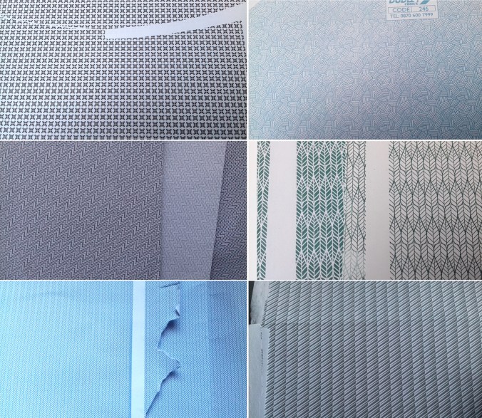
What is it about the envelope insides? I like the idea that the feature is hidden; a discreet treasure tucked away rather like an exciting lining in a suit pocket. Some of these patterns are busy performing a task that may go unnoticed. Particularly with pay-slips with number-related graphic rhythms, the patterns act in a similar way to patterns of the dazzle ships: distorting, obstructing or distracting from reality.

The inside of envelopes are not the most popular context designers dream of but despite the inconspicuous nature of the envelope interior, even if it’s lucky enough to have a window, I like the fact that someone somewhere was commissioned to design a pattern for the humble envelope. Some of the patterns are fabulous examples of micro prints and I can be partial to those tightly repeating and often graphic rhythms. The colours are rather limited to blue, a rather institutional hue, but there are greys, greens and of course the red of the debt reminder.

Having moved boxes of this archive around the country to various addresses I have lived at I formalised the collection in to sections in lever-arch files, including variations of colour and scale, with another box I’m prepared to sacrifice to collage. Over the last few years, and with a clearer idea of what design, and specifically pattern interests me I’m really proud of the collection. Brick patterns feature, as well as checks, the ones with numbers and the few flowing, more organic ones. Some feature company logos, there are envelope graphics and the beautiful and no-messing dots. Some people still send me ones to add to the collection, and I do still keep an eye out, but sadly there are fewer new ones being added. These days I can appreciate a beautiful pattern but if I have some already (note: obviously I need more than one sample of each!) I can even get them in to the recycling bag! … only to be discovered by the next generation of collage makers in the family, and it comes back out as treasure to someone else. Oh well!

If you want to see more, or share your envelope treasures head to instagram and use #envelopeinsides

kfarley_envelopeinsides2


a fine line

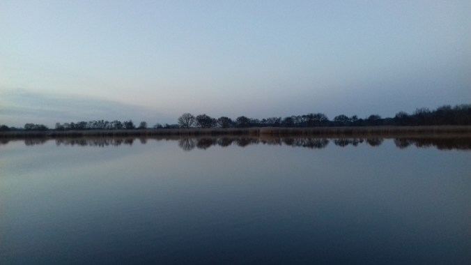
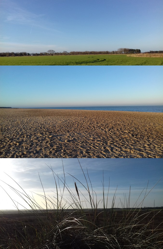
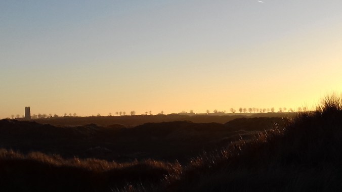
Once again, and not a surprise, a trip back to my homeland of Norfolk this Christmas resulted in me taking many photos of the beautiful horizon lines, across fields, marshes, the broads and beach.  Stunning light resulted in ever-changing colours that really showed the landscape off at its best.

kfarley_norfolk_horizon2kfarley_norfolk_horizon1kfarley_norfolk_horizon4

learning with archives

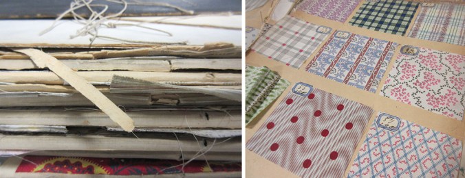
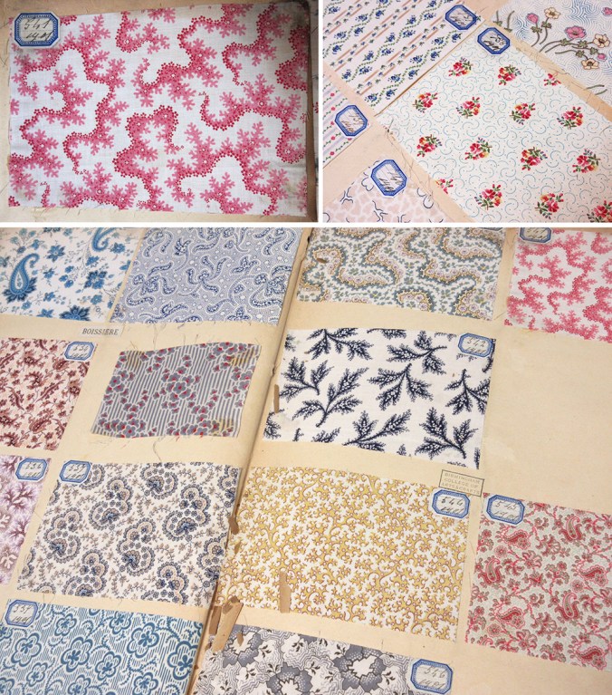
Recently I have been sharing joys from the fabulous archive of textile samples belonging to Birmingham City University’s library, some dating back from 1901. Myself and a colleague have been showing these treasures to our students, helping them to see their own learning as part of a history of design practices. In an age of the digital file it’s been fabulous to see how much interest these portfolios have generated with our students. It’s a tough call as we worry for the protection of these fragile items, and yet value being able to see and interact with them.

bcu_textiles1901_1

Being able to turn the pages, and reveal the hundreds of printed swatches is really an exciting journey and the students really engaged with the quality and preciousness of the items. The fact that all the samples are beautifully hand mounted and labelled adds to the beauty and experience. The range of design compositions is considerable, and the detail stunning. Tiny little flecks of print; an anchor, a petal of a flower, or coral texture printed on fine cloth demonstrate quality of the day. We noted the generosity of many designs, and discussed commercial appeal and production methods available before screen printing and digital printing possibilities. Of course this is pertinent at this time of financial cuts in the support to local and national libraries and associated archives, and with arts and culture being sold to the nation as a rather nice hobby we just can’t afford at the moment.

Seeing things with our own eyes helps to engage with the subject, making things real, and adding value to the experience. I spent an extremely insightful day at London College of Communication’s Learning Through Objects event #UALOBL last month discussing this subject with fellow academics, researchers and archivists. Yes it’s easier to deliver another ppt to a large group of students, but sessions with objects and physical activity are the ones that are likely to make far more impression, and make the difference to learning we are aiming for.

bcu_textiles1901_2

season’s colour

A beautiful pocket of Norfolk provided this colour palette for us at the weekend. Surrounded by greying reeds and rotting down leaves the bright sunshine lit up the sulphur-yellow lichens, orange shooting willow whips and mauve feathery seed heads of the reeds. The more we looked the more colour we saw. I took several photos and as I focused the lens on details the overall variety of colour and tones were lost, hence the palette I’ve made here.

tedellis_naturereserve_palette_100

If you ever get the chance to visit, I strongly recommend this place. Wheatfen is a nature reserve in Norfolk, managed by the Ted Ellis Trust, founded to continue his valuable work in raising awareness of this fragile environment and to make accessible this landscape for others to learn about and to enjoy. It doesn’t feature dramatic mountain passes or high waterfalls, but for me it is perfect. If you are lucky, as we have been over the years, you might spot an otter, a heron or a Swallowtail butterfly, and lots of reeds! It’s a pocket of tranquility that I could lose myself in for hours.

Save

building aesthetics

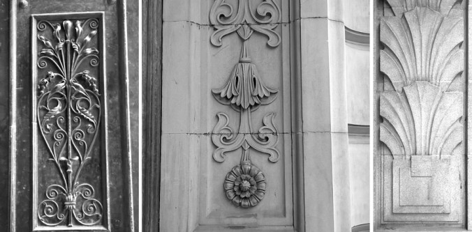
For the last few years, I’ve been lecturing on the subject of design history to first year students of Textile Design at Birmingham City University as part of a module aimed at introducing historical design considerations. Styles specific to an era, the influence of globalisation, the role of Fine Art, architecture, film and graphic design in shaping textile design, and where we are now, in context to where we have come from are presented alongside social commentary, introductions to colourful characters, controversy and a spot of light entertainment! It’s a huge ask to expect students to remember all the information I share, but my main focus is showing them how much it matters that what has gone before are the results of the times in which things were designed, whether it be superfluous decoration or trailblazing technology. From contemporary trends in fashion, to why we don’t choose certain colours for our bedrooms, I think it vital that our students have a working knowledge of design history as a foundation of understanding, as designers themselves. This knowledge feeds back in to their studio projects in the working knowledge of aesthetics, linking the look of something with the connotations that others might bring to a piece. Is it beautiful? Now there’s a rather complex question!
katefarley_buildingdetail_blog100

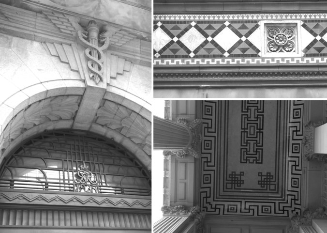
Last week I shared my ‘interest’ in forks, and more can be read on that matter here. As I move towards the present day, bit by bit each week – Arts & Crafts, Morris et al, Art Nouveau etc this Friday, I introduce words to help grow their critical vocabulary, and help them to see and read this history that remains around us. Walking through Birmingham demonstrates how different styles of ornamentation jostle for attention. Arts and Crafts flourishes appear fussy in contrast to the rather robust Deco motifs. Twenty first century obsession with flimsy superficial solutions such as the facade of New Street station’s mirror panels, and other examples not far away, are put to shame by the care and craftsmanship of carved stone, worked iron, and intricate tile work of over a century ago – still intact. Now as the wrong library remains standing (in my opinion) I dread the day I hear that the concertina signal box loses the fight to stand. I digress…

katefarley_buildings1blog

I’m fascinated in how something can contain the belonging of a time, a style, a movement, just in the detail of a line, or a point in a curve – I’m specifically referring to pattern and decoration here but this observation can also be made with architectural detail. The shape of a leaf, the ‘stylisation’ of a flower, has the ability to communicate its belonging or differences in a glance. As a designer it’s important to know these references, especially in relation to a client’s brief – you wouldn’t want to offer Baroque when Neo-Classical is required! This knowledge of visual language crosses design disciplines and it’s fascinating to identify the same aesthetic approach on printed cloth that is also worked in silver with a terrine.

I enjoy the challenge of creating design motifs that tell the story, the unwritten references in the pattern, making a statement to belong. My recent commission for the Barbican shop illustrates this point; that architectural styles, in this case Brutalism, and the approach in which I take to the design process is fundamental in demonstrating through the aesthetic, the design language of the project.

It’s difficult for me to imagine not being able to hear the jazz age when spying an Art Deco border, or to think of Athens with the hint of the Greek key pattern. Despite not exactly loving history at school I now see the importance of it in adulthood. It’s a sad week as it’s announced we lose Art History A-Level as a subject in school, making it harder still for those with an interest in art and design to learn their passion. In Birmingham we have examples of Pugin’s design work in St. Chads cathedral and the hand of the Pre-Raphaelites in St. Phillips.  I hope my lectures feed the students’ imagination to want to know more, to feel proud when they differentiate the Deco from the Nouveau, and to go on to be informed designers, telling the right stories with the curve of a line and the style of a flower.

All photos taken in Birmingham by ©Kate Farley 2016

katefarley_buildingdetail1_blog100

katefarley_buildingdetail3_blog100

threads of an idea

It’s perfectly normal for me to begin a project by looking back at work I have made but not quite resolved. I keep sketchbooks of ideas and samples of constructions that will never see the light of day but somewhere among the pages there will be inklings of ideas that appear to connect and weave in to something right for now.

I wanted to get back to printing so I took the opportunity to explore a number of processes, including mono printing and lino printing to explore line qualities I’d sampled before, and soon I was back on the idea of woven yarns, linking my construct collection launched in 2015. This was a collection inspired by woven cloth, with drawings using hand-made tools dipped in ink that were used to create a series of repeating patterns I went on to collaborate with Formica with. I wanted to challenge the abundance of ‘faux’ material surfaces on the market, digitally printed wood-effect pattern, for example. Ideas were still left open…

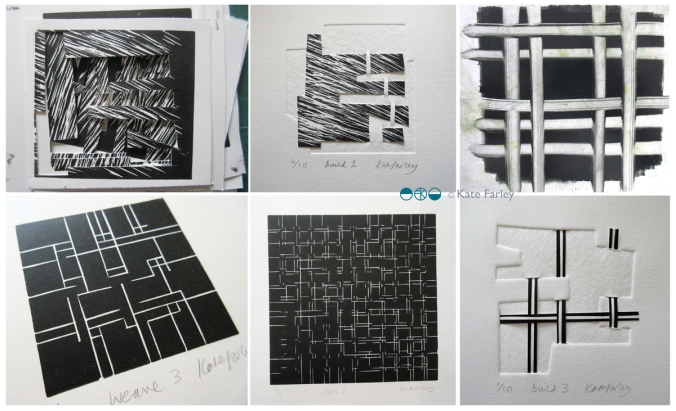
Running in parallel to this has been a long term paper project I have been toying with since about 2002; paper constructions that explore the depth of space beyond the page, a sculpture, but also a book. The build series grew to explore woven space of over and under. You can see some of the pieces below.

threads_devpaper1200
I see the threads collection as an extension to construct, but is equally quite able to stand on it’s own. I have produced several editions of prints and paper constructions that led to where I have come and I enjoyed printing in Payne’s Grey to not be distracted by colour.  All of a sudden I’m working with clear, colourless window film – it all makes sense. I am delighted to have worked with The Window Film Company to develop the patterns for windows. They have been an amazing company to work with. Cheerful, prompt, generous and supportive in all aspects of working with the team – a big thanks to you guys!

I was also pleased to return to laminate and Formica to enable bespoke production and am delighted with the results. I’m enjoying working on designs for harder surfaces but I still can’t help but sample other materials, so the collection I shall show at London Design Festival includes a new rug sample, screen printed cloth, and hand-made notebooks featuring patterns from the collection as well as vinyl and laminate.
If you are visiting London Design Festival I hope you will come and say hello at Tent at London Design Fair. Hall T1 stand G18

threads_products_blog1200

Modernist patterns in the making

Over the last few months, actually for most of this year, I’ve been working on a commission with the Barbican Centre London to create bespoke patterns for products in their newly developed retail space, ready to launch in the Autumn. It’s been a fabulous project as I’ve developed the designs with plenty of dialogue with Head of Retail, Adam Thow, to-ing & fro-ing by email. The brief has altered only slightly since the beginning and I feel really proud of what we’ve produced. There’s a more detailed interview about the project over on their blog.

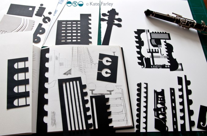
The idea was to explore the Barbican Centre, famous for its architecture, but to also include its activities as a cultural centre of music and performance. I explored lots of ideas and pattern compositions but settled on the idea of a sheet of music, and ended bottom right with the bold double bar lines. Within the patterns I referred to musical notation, and made links between the architectural features and those of instruments, including a violin and oboe, to create a sense of narrative, playing with strong negative and positive shapes. Each of the motifs were hand cut in paper, scanned in, and combined using Adobe Photoshop.

KF_Barbican_print_paperBLOG

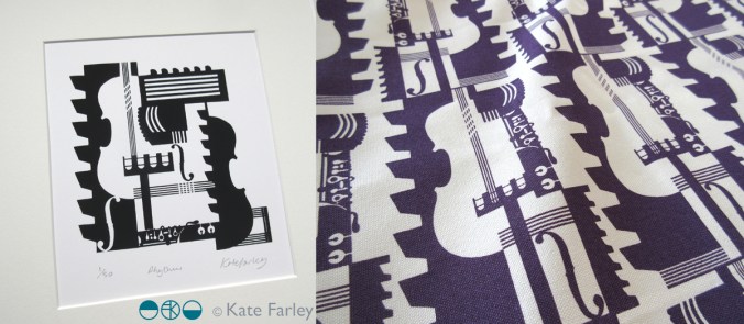
Last week we shared the first images of the design work so I thought I’d share here too. The images here show my developmental design work above, and the final limited edition screen print and pattern for products. Visit @barbicancentre on instagram for more final product shots.

KateFarley_BarbicanPRINTPATTERN1200


Save

pattern prints

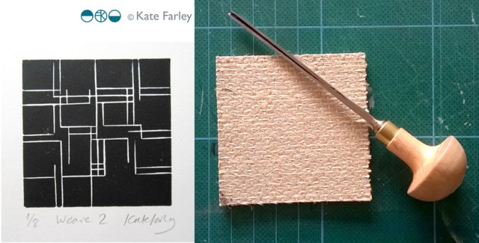
I’ve been working behind the scenes, offline at least, making new prints, mainly lino prints, and developing repeat patterns with them. I’ve not wanted to show the progress until I’ve worked out where I’m going with them, but finally I’ve decided to go public, in a small way, revealing one of the new prints, hinting at the direction my new patterns are going in…

KateFarley_weave2

I’m exhibiting at TentLondon again in September so between now and then I’ll show more on instagram, Twitter, Facebook and here on my blog.

seeing things

I’ve been giving a lot of thought to the idea of looking and seeing, and particularly how we evidence what we have seen. I have boxes of photographic prints of things I’ve seen: cracks in pavements, postboxes around the country, vapour trails in the sky, flowers I’ve grown and plants I wish I’d grown – and much more. When the world turned digital I stopped filling real boxes and filled virtual boxes, and some I look back at, but rarely do I touch the surface of the sights I have collected.

The engagement in social media, and the sharing of pictures begs me to think again about why we take pictures, and why we share them. As I spend most of my time in some sort of real or virtual context of people in the creative industries my Twitter and Instagram feeds are heavily laden with considerately photographed shadows of railings, colour combinations of socks on patterned tiles, recently obtained vintage finds, and dare I say it, beautiful breakfasts! Not only are we collecting imagery, we are proving that we are seeing and experiencing interesting / beautiful / different things and places, judged by us and hopefully ‘liked’ by others. Yes it’s marketing; a branding tool to evidence our aesthetic judgements.

KateFarley_seeing things_detail

Some questions then, are we seeing more? Do we notice more, and appreciate more?

It does seem as if there have always been people who see faces in clouds, and beauty in peeling paint, but I wonder if social media is driving us to become a load of aesthetes. In my world it may seem that way.

As a pattern maker I’m always on the lookout for eye-candy, and usually of the ‘just happened to be there’ kind of pattern, rather than a designed pattern – having said that, I’m equally likely to be stopped in my tracks by a well-designed wallpaper. There have been many books over the years, and more recently blogs that feature the beauty in the overlooked, or the ugly, or the mundane. The desire to collate / curate these sights are no more in evidence than in the world of Patternity a design-savyy duo with a manifesto about pattern! Their stunning website and book and interesting collaborations are clearly tapping in to this moment of ‘seeing’. Check them out if you are so far unaware.

KateFarley_seeing things_stripes

Pattern really is everywhere, formally and informally and that’s the pleasure. I remember the day I was taught the mysteries of repeat pattern making, and that evening in a pub in Great Yarmouth, Norfolk, I took great pride in identifying the repeat ’tiles’ in the carpet, wallpaper and curtains of the glorious / hideous 1990s pub decor.

I had the pleasure to spend time with the fabulous Sarah Campbell last month, and much of our conversation, as we were at New Designers, was about pattern making; why we do it, how we do it, and getting people to pay for us to do it. During the conversation Sarah spotted a lady beside us in a polka dot blouse, and we noted that pattern-makers never really switch off from pattern spotting (pun intended!), pattern making, and pattern appreciating. When we departed we both commented that we look forward to reading each others next blog post – well here you are, this one is for you Sarah – it was a pleasure to see pattern with you!